<DataTableInput>
<DataTableInput> is an Enterprise Edition input from
 @react-admin/ra-form-layout that lets users select one or many choices in a dialog containing a <DataTable>.
It combines:
- an input showing the current selection(s),
- and a dialog with sorting, filtering, and pagination to pick records.
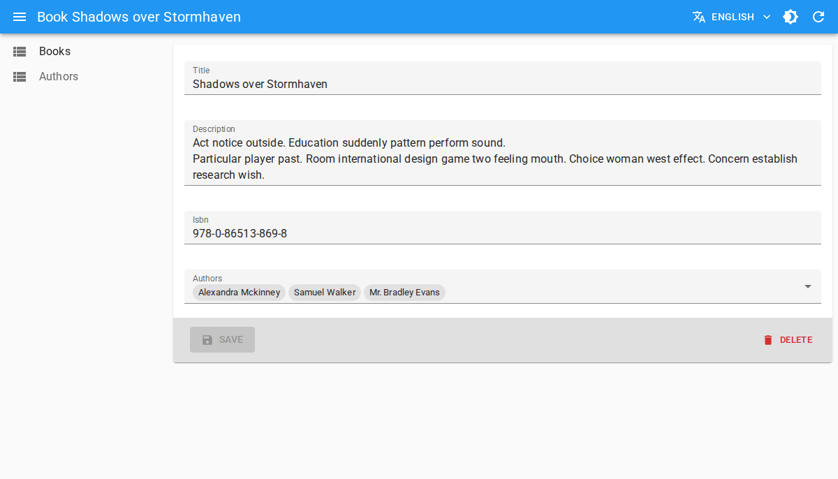
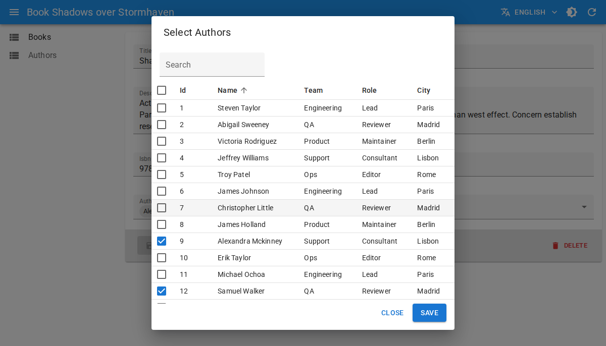
<DataTableInput> is a good alternative to <SelectInput>, <AutocompleteInput>, and <AutocompleteArrayInput> when you have many choices, or when users need more than one field to identify each choice.
Test it live in the Enterprise Storybook.
Usage
First, install the @react-admin/ra-form-layout package:
npm install --save @react-admin/ra-form-layout
# or
yarn add @react-admin/ra-form-layout
Tip: @react-admin/ra-form-layout is hosted in a private npm registry. You need an Enterprise Edition subscription to access it.
Like <SelectInput>, <DataTableInput> can be used with a choices array. The difference is that you define table columns as children with <DataTable.Col>.
import { Edit, SimpleForm, DataTable, TextInput } from 'react-admin';
import { DataTableInput } from '@react-admin/ra-form-layout';

const suppliers = [
    {
        id: 101,
        company_name: 'Acme Industrial',
        category: 'Machining',
        city: 'Detroit',
        country: 'US',
        lead_time_days: 7,
        reliability_score: 98,
    },
    {
        id: 102,
        company_name: 'Nordic Components',
        category: 'Electronics',
        city: 'Stockholm',
        country: 'SE',
        lead_time_days: 11,
        reliability_score: 95,
    },
];

export const ProductEdit = () => (
    <Edit>
        <SimpleForm>
            <TextInput source="sku" />
            <TextInput source="name" />
            <DataTableInput
                source="preferred_supplier_id"
                resource="suppliers"
                choices={suppliers}
                optionText="company_name"
            >
                <DataTable.Col source="company_name" />
                <DataTable.Col source="category" />
                <DataTable.Col source="city" />
                <DataTable.Col source="country" />
                <DataTable.NumberCol source="lead_time_days" label="Lead Time (days)" />
                <DataTable.NumberCol source="reliability_score" label="Reliability %" />
            </DataTableInput>
        </SimpleForm>
    </Edit>
);
With Reference Inputs
You can use <DataTableInput> as a child of:
In that case, choices are fetched automatically from the reference resource.
import {
    DataTable,
    Edit,
    ReferenceArrayInput,
    SimpleForm,
    TextInput,
} from 'react-admin';
import { DataTableInput } from '@react-admin/ra-form-layout';

export const ReleaseEdit = () => (
    <Edit>
        <SimpleForm>
            <TextInput source="version" />
            <ReferenceArrayInput source="reviewer_ids" reference="users">
                <DataTableInput multiple>
                    <DataTable.Col source="full_name" />
                    <DataTable.Col source="team" />
                    <DataTable.Col source="role" />
                    <DataTable.Col source="timezone" />
                    <DataTable.Col source="location" />
                </DataTableInput>
            </ReferenceArrayInput>
        </SimpleForm>
    </Edit>
);
Multiple Selection
Set multiple to true when the field stores an array of identifiers.
import { Create, DataTable, SimpleForm } from 'react-admin';
import { DataTableInput } from '@react-admin/ra-form-layout';

const tags = [
    { id: 'backend', name: 'Backend', group: 'Engineering' },
    { id: 'frontend', name: 'Frontend', group: 'Engineering' },
    { id: 'design', name: 'Design', group: 'Product' },
];

export const ArticleCreate = () => (
    <Create>
        <SimpleForm>
            <DataTableInput source="tag_ids" choices={tags} multiple>
                <DataTable.Col source="name" />
                <DataTable.Col source="group" />
            </DataTableInput>
        </SimpleForm>
    </Create>
);
Props
In addition to the common input props, <DataTableInput> accepts:
| Prop | Required | Type | Default | Description |
|---|---|---|---|---|
actions |
Optional | ReactElement | false |
auto (false when no filters) |
Actions toolbar displayed in the dialog |
children |
Required | ReactNode |
- | <DataTable.Col> elements defining displayed columns |
choices |
Optional | RaRecord[] |
- | Choices for standalone usage (not needed inside reference inputs) |
dataTableProps |
Optional | DataTableProps |
- | Props forwarded to the inner <DataTable> |
dialogProps |
Optional | DialogProps |
- | Props forwarded to the selection dialog |
filters |
Optional | ReactElement | ReactElement[] | false |
- | Filters displayed in the dialog toolbar |
multiple |
Optional | boolean |
false |
Enables multiple selection (value becomes an array of ids) |
optionText |
Optional | OptionText |
resource record Representation or name |
Field used as label for selected chips in standalone mode |
optionValue |
Optional | string |
id |
Field used as choice value in standalone mode |
pagination |
Optional | ReactNode |
<Pagination /> |
Pagination element rendered below the table |
title |
Optional | string |
ra-form-layout. inputs. datatable_input. dialog_title |
Dialog title (translation key or plain string) |
translate Choice |
Optional | boolean |
true |
Whether to translate optionText values |
filters and actions
Use filters and actions to provide list-style controls in the dialog toolbar:
import {
    DataTable,
    FilterButton,
    ReferenceInput,
    TextInput,
    TopToolbar,
} from 'react-admin';
import { DataTableInput } from '@react-admin/ra-form-layout';

const supplierFilters = [
    <TextInput key="q" source="q" label="Search" alwaysOn />,
    <TextInput key="country" source="country" />,
    <TextInput key="category" source="category" />,
];

const SupplierActions = () => (
    <TopToolbar>
        <FilterButton />
    </TopToolbar>
);

<ReferenceInput source="preferred_supplier_id" reference="suppliers">
    <DataTableInput filters={supplierFilters} actions={<SupplierActions />}>
        <DataTable.Col source="company_name" />
        <DataTable.Col source="category" />
        <DataTable.Col source="country" />
        <DataTable.NumberCol source="lead_time_days" />
    </DataTableInput>
</ReferenceInput>;
dataTableProps
Use dataTableProps to customize table behavior (hidden columns, row selectability, etc.). You can use any of the <DataTable> props except children, which is reserved for columns:
<ReferenceInput source="preferred_supplier_id" reference="suppliers">
    <DataTableInput
        dataTableProps={{
            hiddenColumns: ['city'],
            isRowSelectable: record => record.reliability_score >= 90,
        }}
    >
        <DataTable.Col source="company_name" />
        <DataTable.Col source="category" />
        <DataTable.Col source="city" />
        <DataTable.NumberCol source="reliability_score" />
    </DataTableInput>
</ReferenceInput>
dialogProps
Use dialogProps to customize the underlying Material UI dialog (size, transition, etc.). You can use any of the <Dialog> props:
<ReferenceInput source="preferred_supplier_id" reference="suppliers">
    <DataTableInput
        title="Select a supplier"
        dialogProps={{ maxWidth: 'lg', fullWidth: true }}
    >
        <DataTable.Col source="company_name" />
        <DataTable.Col source="country" />
        <DataTable.Col source="city" />
    </DataTableInput>
</ReferenceInput>