
<DeletedRecordsList>
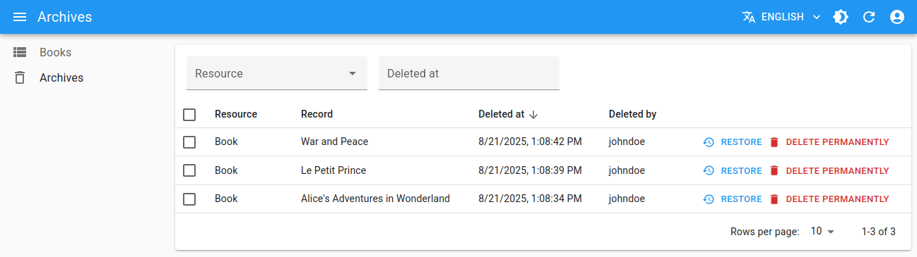
The <DeletedRecordsList> component fetches a list of deleted records from the data provider and display them in a <DataTable> with pagination, filters and sort.
The rendered <DataTable> includes buttons for restoring or permanently deleting the deleted records, and allows to show the deleted record data in a dialog when clicking on a row.
Usage
<DeletedRecordsList> uses dataProvider.getListDeleted() to get the deleted records to display, so in general it doesn’t need any property.
However, you need to define the route to reach this component manually using <CustomRoutes>.
// in src/App.js
import { Admin, CustomRoutes } from 'react-admin';
import { Route } from 'react-router-dom';
import { DeletedRecordsList } from '@react-admin/ra-soft-delete';

export const App = () => (
    <Admin>
        ...
        <CustomRoutes>
            <Route path="/deleted" element={<DeletedRecordsList />} />
        </CustomRoutes>
    </Admin>
);
That’s enough to display the deleted records list, with functional simple filters, sort and pagination.
Props
| Prop | Required | Type | Default | Description |
|---|---|---|---|---|
authLoading |
Optional | ReactNode |
- | The component to render while checking for authentication and permissions. |
debounce |
Optional | number |
500 |
The debounce delay in milliseconds to apply when users change the sort or filter parameters. |
children |
Optional | Element |
<DeletedRecordsTable> |
The component used to render the list of deleted records. |
detailComponents |
Optional | Record<string, ComponentType> |
- | The custom show components for each resource in the deleted records list. |
disable Authentication |
Optional | boolean |
false |
Set to true to disable the authentication check. |
disable SyncWithLocation |
Optional | boolean |
false |
Set to true to disable the synchronization of the list parameters with the URL. |
empty |
Optional | ReactNode |
- | The component to display when the list is empty. |
error |
Optional | ReactNode |
- | The component to render when failing to load the list of records. |
filter |
Optional | object |
- | The permanent filter values. |
filter DefaultValues |
Optional | object |
- | The default filter values. |
loading |
Optional | ReactNode |
- | The component to render while loading the list of records. |
mutation Mode |
Optional | string |
'undoable' |
Mutation mode ('undoable', 'pessimistic' or 'optimistic'). |
offline |
Optional | ReactNode |
<Offline> |
The component to render when there is no connectivity and there is no data in the cache |
pagination |
Optional | ReactElement |
<Pagination> |
The pagination component to use. |
perPage |
Optional | number |
10 |
The number of records to fetch per page. |
queryOptions |
Optional | object |
- | The options to pass to the useQuery hook. |
resource |
Optional | string |
- | The resource of deleted records to fetch and display |
sort |
Optional | object |
{ field: 'deleted_at', order: 'DESC' } |
The initial sort parameters. |
storeKey |
Optional | string or false |
- | The key to use to store the current filter & sort. Pass false to disable store synchronization |
title |
Optional | string | ReactElement | false |
- | The title to display in the App Bar. |
sx |
Optional | object |
- | The CSS styles to apply to the component. |
authLoading
By default, <DeletedRecordsList> renders <Loading> while checking for authentication and permissions. You can display a custom component via the authLoading prop:
import { DeletedRecordsList } from '@react-admin/ra-soft-delete';

export const CustomDeletedRecords = () => (
    <DeletedRecordsList authLoading={<p>Checking for permissions...</p>} />
);
children
By default, <DeletedRecordsList> renders a <DeletedRecordsTable> component that displays the deleted records in a <DataTable>, with buttons to restore or permanently delete them. You can customize this table by passing custom children.
import { DataTable } from 'react-admin';
import { DeletedRecordsList } from '@react-admin/ra-soft-delete';

export const CustomDeletedRecords = () => (
    <DeletedRecordsList>
        <DataTable>
            <DataTable.Col source="id" />
            <DataTable.Col source="resource" />
            <DataTable.Col source="deleted_at" />
            <DataTable.Col source="deleted_by" />
            <DataTable.Col source="data.title" label="Title" />
        </DataTable>
    </DeletedRecordsList>
);
debounce
By default, <DeletedRecordsList> does not refresh the data as soon as the user enters data in the filter form. Instead, it waits for half a second of user inactivity (via lodash.debounce) before calling the dataProvider on filter change. This is to prevent repeated (and useless) calls to the API.
You can customize the debounce duration in milliseconds - or disable it completely - by passing a debounce prop to the <DeletedRecordsList> component:
// wait 1 seconds instead of 500 milliseconds befoce calling the dataProvider
const DeletedRecordsWithDebounce = () => <DeletedRecordsList debounce={1000} />;
detailComponents
By default, <DeletedRecordsList> will show the deleted records data on click on a row of the <DataTable> in a <ShowGuesser>.
If you wish to customize the content in this show dialog, you can use the detailComponents prop to customize the dialog content for every resource in the list.
The content is the same as a classic <Show> page.
However, you must use <ShowDeleted> component instead of <Show> to write a custom view for a deleted record. This is because <Show> gets a fresh version of the record from the data provider to display it, which is not possible in the deleted records list as the record is now deleted.
import { Admin, CustomRoutes, SimpleShowLayout, TextField } from 'react-admin';
import { Route } from 'react-router-dom';
import { DeletedRecordsList, ShowDeleted } from '@react-admin/ra-soft-delete';

const ShowDeletedBook = () => (
    <ShowDeleted>
        <SimpleShowLayout>
            <TextField source="title" />
            <TextField source="description" />
        </SimpleShowLayout>
    </ShowDeleted>
);

export const App = () => (
    <Admin>
        ...
        <CustomRoutes>
            <Route path="/deleted" element={
                <DeletedRecordsList detailComponents={{
                    books: ShowDeletedBook,
                }} />
            } />
        </CustomRoutes>
    </Admin>
);
disableAuthentication
By default, <DeletedRecordsList> requires the user to be authenticated - any anonymous access redirects the user to the login page.
If you want to allow anonymous access to the deleted records list page, set the disableAuthentication prop to true.
const AnonymousDeletedRecords = () => <DeletedRecordsList disableAuthentication />;
disableSyncWithLocation
By default, react-admin synchronizes the <DeletedRecordsList> parameters (sort, pagination, filters) with the query string in the URL (using react-router location) and the Store.
You may want to disable this synchronization to keep the parameters in a local state, independent for each <DeletedRecordsList> instance. To do so, pass the disableSyncWithLocation prop. The drawback is that a hit on the “back” button doesn’t restore the previous parameters.
const DeletedRecordsWithoutSyncWithLocation = () => <DeletedRecordsList disableSyncWithLocation />;
Tip: disableSyncWithLocation also disables the persistence of the deleted records list parameters in the Store by default. To enable the persistence of the deleted records list parameters in the Store, you can pass a custom storeKey prop.
const DeletedRecordsSyncWithStore = () => <DeletedRecordsList disableSyncWithLocation storeKey="deletedRecordsListParams" />;
error
By default, <DeletedRecordsList> renders the children when an error happens while loading the list of deleted records. You can render an error component via the error prop:
import { DeletedRecordsList } from '@react-admin/ra-soft-delete';

export const CustomDeletedRecords = () => (
    <DeletedRecordsList error={<p>Something went wrong while loading your posts!</p>} />
);
filter: Permanent Filter
You can choose to always filter the list, without letting the user disable this filter - for instance to display only published posts. Write the filter to be passed to the data provider in the filter prop:
const DeletedPostsList = () => (
    <DeletedRecordsList filter={{ resource: 'posts' }} />
);
The actual filter parameter sent to the data provider is the result of the combination of the user filters (the ones set through the filters component form), and the permanent filter. The user cannot override the permanent filters set by way of filter.
filterDefaultValues
To set default values to filters, you can pass an object literal as the filterDefaultValues prop of the <DeletedRecordsList> element.
const CustomDeletedRecords = () => (
    <DeletedRecordsList filterDefaultValues={{ resource: 'posts' }} />
);
Tip: The filter and filterDefaultValues props have one key difference: the filterDefaultValues can be overridden by the user, while the filter values are always sent to the data provider. Or, to put it otherwise:
const filterSentToDataProvider = { ...filterDefaultValues, ...filterChosenByUser, ...filter };
loading
By default, <DeletedRecordsList> renders the children while loading the list of deleted records. You can display a component during this time via the loading prop:
import { Loading } from 'react-admin';
import { DeletedRecordsList } from '@react-admin/ra-soft-delete';

export const CustomDeletedRecords = () => (
    <DeletedRecordsList loading={<Loading />} />
);
mutationMode
The <DeletedRecordsList> list exposes restore and delete permanently buttons, which perform “mutations” (i.e. they alter the data). React-admin offers three modes for mutations. The mode determines when the side effects (redirection, notifications, etc.) are executed:
pessimistic: The mutation is passed to the dataProvider first. When the dataProvider returns successfully, the mutation is applied locally, and the side effects are executed.optimistic: The mutation is applied locally and the side effects are executed immediately. Then the mutation is passed to the dataProvider. If the dataProvider returns successfully, nothing happens (as the mutation was already applied locally). If the dataProvider returns in error, the page is refreshed and an error notification is shown.undoable(default): The mutation is applied locally and the side effects are executed immediately. Then a notification is shown with an undo button. If the user clicks on undo, the mutation is never sent to the dataProvider, and the page is refreshed. Otherwise, after a 5 seconds delay, the mutation is passed to the dataProvider. If the dataProvider returns successfully, nothing happens (as the mutation was already applied locally). If the dataProvider returns in error, the page is refreshed and an error notification is shown.
By default, <DeletedRecordsList> uses the undoable mutation mode. This is part of the “optimistic rendering” strategy of react-admin; it makes user interactions more reactive.
You can change this default by setting the mutationMode prop - and this affects all buttons in deleted records table. For instance, to remove the ability to undo the changes, use the optimistic mode:
const OptimisticDeletedRecords = () => (
    <DeletedRecordsList mutationMode="optimistic" />
);
And to make the actions blocking, and wait for the dataProvider response to continue, use the pessimistic mode:
const PessimisticDeletedRecords = () => (
    <DeletedRecordsList mutationMode="pessimistic" />
);
Tip: When using any other mode than undoable, the <DeletePermanentlyButton> and <RestoreButton> display a confirmation dialog before calling the dataProvider.
offline
By default, <DeletedRecordsList> renders the <Offline> component when there is no connectivity and there are no records in the cache yet for the current parameters (page, sort, etc.). You can provide your own component via the offline prop:
import { DeletedRecordsList } from '@react-admin/ra-soft-delete';
import { Alert } from '@mui/material';

const offline = <Alert severity="warning">No network. Could not load the posts.</Alert>;

export const CustomDeletedRecords = () => (
    <DeletedRecordsList offline={offline} />
);
pagination
By default, the <DeletedRecordsList> view displays a set of pagination controls at the bottom of the list.
The pagination prop allows to replace the default pagination controls by your own.
import { Pagination } from 'react-admin';
import { DeletedRecordsList } from '@react-admin/ra-soft-delete';

const DeletedRecordsPagination = () => <Pagination rowsPerPageOptions={[10, 25, 50, 100]} />;

export const DeletedRecordsWithCustomPagination = () => (
    <DeletedRecordsList pagination={<DeletedRecordsPagination />} />
);
See Paginating the List for details.
perPage
By default, the deleted records list paginates results by groups of 10. You can override this setting by specifying the perPage prop:
const DeletedRecordsWithCustomPagination = () => <DeletedRecordsList perPage={25} />;
Note: The default pagination component’s rowsPerPageOptions includes options of 5, 10, 25 and 50. If you set your deleted records list perPage to a value not in that set, you must also customize the pagination so that it allows this value, or else there will be an error.
const DeletedRecordsWithCustomPagination = () => (
-   <DeletedRecordsList perPage={6} />
+   <DeletedRecordsList perPage={6} pagination={<Pagination rowsPerPageOptions={[6, 12, 24, 36]} />} />
);
queryOptions
<DeletedRecordsList> accepts a queryOptions prop to pass query options to the react-query client. Check react-query’s useQuery documentation for the list of available options.
This can be useful e.g. to pass a custom meta to the dataProvider.getListDeleted() call.
import { DeletedRecordsList } from '@react-admin/ra-soft-delete';

const CustomDeletedRecords = () => (
    <DeletedRecordsList queryOptions={{ meta: { foo: 'bar' } }} />
);
With this option, react-admin will call dataProvider.getListDeleted() on mount with the meta: { foo: 'bar' } option.
You can also use the queryOptions prop to override the default error side effect. By default, when the dataProvider.getListDeleted() call fails, react-admin shows an error notification. Here is how to show a custom notification instead:
import { useNotify, useRedirect } from 'react-admin';
import { DeletedRecordsList } from '@react-admin/ra-soft-delete';

const CustomDeletedRecords = () => {
    const notify = useNotify();
    const redirect = useRedirect();

    const onError = (error) => {
        notify(`Could not load list: ${error.message}`, { type: 'error' });
        redirect('/dashboard');
    };

    return (
        <DeletedRecordsList queryOptions={{ onError }} />
    );
}
The onError function receives the error from the dataProvider call (dataProvider.getListDeleted()), which is a JavaScript Error object (see the dataProvider documentation for details).
resource
<DeletedRecordsList> fetches the deleted records from the data provider using the dataProvider.getListDeleted() method. When no resource is specified, it will fetch all deleted records from all resources and display a filter.
If you want to display only the deleted records of a specific resource, you can pass the resource prop:
const DeletedPosts = () => (
    <DeletedRecordsList resource="posts" />
);
When a resource is specified, the filter will not be displayed, and the list will only show deleted records of that resource.
The title is also updated accordingly. Its translation key is ra-soft-delete.deleted_records_list.resource_title.
sort
Pass an object literal as the sort prop to determine the default field and order used for sorting:
const PessimisticDeletedRecords = () => (
    <DeletedRecordsList sort={{ field: 'id', order: 'ASC' }} />
);
sort defines the default sort order ; the list remains sortable by clicking on column headers.
For more details on list sort, see the Sorting The List section.
storeKey
By default, react-admin stores the list parameters (sort, pagination, filters) in localStorage so that users can come back to the list and find it in the same state as when they left it.
The <DeletedRecordsList> component uses a specific identifier to store the list parameters under the key ra-soft-delete.listParams.
If you want to use multiple <DeletedRecordsList> and keep distinct store states for each of them (filters, sorting and pagination), you must give each list a unique storeKey property. You can also disable the persistence of list parameters and selection in the store by setting the storeKey prop to false.
In the example below, the deleted records lists store their list parameters separately (under the store keys 'deletedBooks' and 'deletedAuthors'). This allows to use both components in the same app, each having its own state (filters, sorting and pagination).
import { Admin, CustomRoutes } from 'react-admin';
import { Route } from 'react-router-dom';
import { DeletedRecordsList } from '@react-admin/ra-soft-delete';

const Admin = () => {
    return (
        <Admin dataProvider={dataProvider}>
            <CustomRoutes>
                <Route path="/books/deleted" element={
                    <DeletedRecordsList filter={{ resource: 'books' }} storeKey="deletedBooks" />
                } />
                <Route path="/authors/deleted" element={
                    <DeletedRecordsList filter={{ resource: 'authors' }} storeKey="deletedAuthors" />
                } />
            </CustomRoutes>
            <Resource name="books" />
        </Admin>
    );
};
Tip: The storeKey is actually passed to the underlying useDeletedRecordsListController hook, which you can use directly for more complex scenarios. See the useDeletedRecordsListController doc for more info.
Note: Selection state will remain linked to a global key regardless of the specified storeKey string. This is a design choice because if row selection is not stored globally, then when a user permanently deletes or restores a record it may remain selected without any ability to unselect it. If you want to allow custom storeKey’s for managing selection state, you will have to implement your own useDeletedRecordsListController hook and pass a custom key to the useRecordSelection hook. You will then need to implement your own delete buttons to manually unselect rows when deleting or restoring records. You can still opt out of all store interactions including selection if you set it to false.
title
The default title for a list view is the translation key ra-soft-delete.deleted_records_list.title.
You can also customize this title by specifying a custom title prop:
const DeletedRecordsWithTitle = () => <DeletedRecordsList title="Beautiful Trash" />;
The title can be a string, a React element, or false to disable the title.
sx: CSS API
The <DeletedRecordsList> component accepts the usual className prop, but you can override many class names injected to the inner components by React-admin thanks to the sx property (see the sx documentation for syntax and examples). This property accepts the following subclasses:
| Rule name | Description |
|---|---|
& .RaDeletedRecordsList-filters |
Applied to the filters container |
& .RaDeletedRecordsList-table |
Applied to the <DataTable> |
& .RaDeletedRecordsList-dialog |
Applied to the dialog shown when clicking on a row |
For example:
const BeautifulDeletedRecordsList = () => (
    <DeletedRecordsList
        sx={{
            backgroundColor: 'yellow',
            '& .RaDeletedRecordsList-filters': {
                backgroundColor: 'red',
            },
        }}
    />
);
Tip: The <DeletedRecordsList> component classes can also be customized for all instances of the component with its global css name RaDeletedRecordsList as described here.
Access Control
If your authProvider implements Access Control, <DeletedRecordsList> will only be shown if the user has the "deleted_records" access on the virtual "ra-soft-delete" resource.
<DeletedRecordsList> will call authProvider.canAccess() using the following parameters:
{ action: "list_deleted_records", resource: "ra-soft-delete" }
Users without access will be redirected to the Access Denied page.
The permission action for the restore button is "restore", which means that authProvider.canAccess() will be called with the following parameters:
{ action: "restore", resource: "ra-soft-delete", record: [current record] }
Likewise, the permission action for the delete permanently button is "delete", which means that authProvider.canAccess() will be called with the following parameters:
{ action: "delete", resource: "ra-soft-delete", record: [current record] }