<FilterValue>
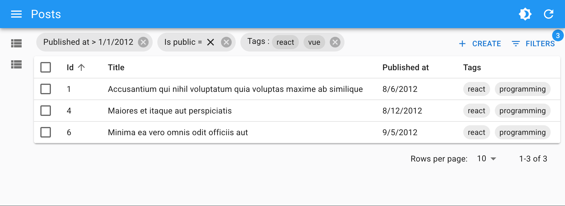
<FilterValue> is an Enterprise Edition component that displays the active filters as MUI Chips. Usually combined with
 <StackedFilters>. It must be used inside a react-admin <List>.
Usage
Put <FilterValue> inside the <List> actions, for instance in a custom toolbar. Define how each filter should be displayed by adding <FilterValue.Field> children.
import {
    BooleanField,
    CreateButton,
    DataTable,
    List,
    ReferenceArrayField,
    TopToolbar,
} from 'react-admin';
import {
    FilterValue,
    StackedFilters,
    FiltersConfig,
    booleanFilter,
    choicesArrayFilter,
    dateFilter,
    numberFilter,
    referenceFilter,
    textFilter,
} from '@react-admin/ra-form-layout';

const postListFilters: FiltersConfig = {
    id: textFilter({ operators: ['eq', 'neq'] }),
    title: textFilter(),
    published_at: dateFilter(),
    is_public: booleanFilter(),
    tags: choicesArrayFilter({
        choices: [
            { id: 'solid', name: 'Solid' },
            { id: 'react', name: 'React' },
            { id: 'vue', name: 'Vue' },
            { id: 'programming', name: 'Programming' },
        ],
    }),
};

const PostListToolbar = () => (
    <TopToolbar sx={{ flex: 1 }}>
        <FilterValue sx={{ flex: 1 }}>
            <FilterValue.Field source="id" />
            <FilterValue.Field source="title" />
            <FilterValue.Field source="published_at" field={DateField} />
            <FilterValue.Field source="is_public" field={BooleanField} />
            <FilterValue.Field source="tags" field={TextArrayField} />
        </FilterValue>
        <CreateButton />
        <StackedFilters config={PostListFilters} />
    </TopToolbar>
);

const PostList = () => (
    <List actions={<PostListToolbar />}>
        <DataTable>
            <DataTable.Col source="title" />
            <DataTable.NumberCol source="views" />
            <DataTable.Col source="tag_ids">
                <ReferenceArrayField tags="tags" source="tag_ids" />
            </DataTable.Col>
            <DataTable.Col source="published" field={BooleanField} />
        </DataTable>
    </List>
);
Props
| Prop | Required | Type | Default | Description |
|---|---|---|---|---|
children |
Required | ReactNode | - | The <FilterValue.Field> children defining how each filter should be displayed. |
operators |
Optional | string[] | All | The list of accepted operators. |
Additional props are passed to the underlying MUI <Stack> component.
children
By default, <FilterValue> does not display any filter. You must pass <FilterValue.Field> children to define how each filter should be displayed.
Foe instance, to display filters on the firstName and age fields:
<FilterValue direction="row" spacing={2}>
    <FilterValue.Field source="firstName" />
    <FilterValue.Field source="age" />
</FilterValue>
<FilterValue.Field> must be given a source prop, which is the name of the field to display. One <FilterValue.Field> may render multiple chips, for instance when the user has applied two filters on the same field with different operators (e.g. age_gt=18 and age_lt=60).
As for the filter value, it renders as text by default, but you can customize its formatting by using one of the following props:
-
field: A react-admin field component (e.g.DateField,NumberField, etc.) to use to display the filter value.<FilterValue.Field source="age" field={NumberField} /> -
children: The field element to use to display the filter value, passed as a child.<FilterValue.Field source="userId" label="User"> <ReferenceField source="userId" reference="users" /> </FilterValue.Field> -
render: A function to render the filter. It receives an object withsource,operator, andvalueproperties.<FilterValue.Field source="age" render={({ record, operator, label }) => { if (operator === 'gte') return <>{label}: {record.age} or older</>; if (operator === 'lte') return <>{label}: {record.age} or younger</>; return <>{label} = {record.age}</>; }} />
Check the <FilterValue.Field> section below for more details.
operators
<FilterValue> needs to distinguish operators from field names containing the _ symbol. By default, it handles all the operators added by the <StackedFilters> Filter Configuration Builders: eq, neq, eq_any, neq_any, gt, gte, lt, lte, q, inc, inc_any, ninc_any.
If your filters use other operators, or if you want to restrict the list of accepted operators, you can pass an operators prop to customize the list of accepted operators.
<FilterValue direction="row" spacing={2} operators={['eq', 'neq', 'lt', 'gt']} />
<FilterValue.Field>
Children of <FilterValue>, these components define how each filter should be displayed.
Usage
Pass a source prop, and optionally a field component if you want to customize the display of the filter value. You can also pass the desired component as children or via a render prop.
<FilterValue>
<FilterValue.Field source="firstName" />
<FilterValue.Field source="age" field={NumberField} />
 <FilterValue.Field source="userId" label="User">
   <ReferenceField source="userId" reference="users" />
 </FilterValue.Field>
<FilterValue.Field source="sex">
<SelectField source="sex" choices={choices} />
</FilterValue.Field>
 <FilterValue.Field source="age" render={({ record, operator, label }) => {
   if (operator === 'gte') return <>{label}: {record.age} or older</>;
   if (operator === 'lte') return <>{label}: {record.age} or younger</>;
   return <>{label} = {record.age}</>;
 }} />
</FilterValue>
Props
| Prop | Required | Type | Default | Description |
|---|---|---|---|---|
source |
Required | string | - | The source of the filter to display. |
children |
Optional | ReactNode | - | The field component to use to display the filter value. |
disableDelete |
Optional | boolean | false | If true, the user won’t be able to remove this filter. |
field |
Optional | ReactElement | TextField |
The field component to use to display the filter value. |
label |
Optional | string | - | The label to display for the filter. If not provided, it will be inferred from the source. |
render |
Optional | function | - | A function to render the filter. It receives an object with source, operator, and value properties. |
sx |
Optional | Object | - | An object containing the MUI style overrides to apply to the Chip component |
Additional props are passed to the underlying MUI <Chip> component.
I18n
<FilterValue.Field> uses translation messages for fields and operators, so you can leverage react-admin’s i18nProvider to translate them.
The following filter values:
{
    age_gt: 18,
    price_lt: 100,
    status_neq: 'draft',
}
Will render differently depending on the locale:

Use the resources.[resource].fields.[field] key to translate field names, and the ra-form-layout.filters.operators_shorthand.[operator] key to translate operators.
const i18nProvider = polyglotI18NProvider(() =>
    ({
        resources: {
            posts: {
                fields: {
                    age: 'Âge',
                    price: 'Prix',
                    status: 'Statut',
                },
            },
        },
        'ra-form-layout': {
            filters: {
                operators_shorthand: {
                    gt: 'plus grand que',
                    lt: 'inférieur à',
                    neq: 'autre que',
                },
            },
        },
    }),
    'fr'
);

<Admin i18nProvider={i18nProvider} ... />