
<TranslatableInputs>
You may have inputs which are translated in multiple languages and want users to edit translations for each language separately. To display them, you can use the <TranslatableInputs> component.
Usage
<TranslatableInputs> allows to edit several fields at a time. The fields must have one value per language, for instance:
{
    id: 1234,
    name: {
        en: 'White trousers',
        fr: 'Pantalon blanc',
    },
    description: {
        en: 'Slim fit trousers for every day use'
        fr: 'Pantalon ajusté pour un usage quotidien',
    }
}
<TranslatableInputs> does not require a source prop. But it requires one or more child <Input>, each one with a source prop. And you must pass the locales prop determine the languages to display.
<TranslatableInputs locales={['en', 'fr']}>
    <TextInput source="name" />
    <RichTextInput source="description" />
</TranslatableInputs>
Props
| Prop | Required | Type | Default | Description |
|---|---|---|---|---|
locales |
Required | Array |
- | An array of locales. |
defaultLocale |
Optional | string |
en |
The default locale to display |
fullWidth |
Optional | boolean |
true |
If false, the inputs will not expand to fill the form width |
groupKey |
Optional | string |
- | A unique key for accessibility purpose |
selector |
Optional | ReactNode |
- | A selector to choose the locale to display |
StackProps |
Optional | object |
- | Props passed to the rendered MUI Stack |
sx |
Optional | SxProps |
- | Material UI shortcut for defining custom styles |
defaultLocale
React-admin uses the user locale as the default locale in this field. You can override this setting using the defaultLocale prop.
<TranslatableInputs locales={['en', 'fr']} defaultLocale="fr">
    <TextInput source="name" />
    <RichTextInput source="description" />
</TranslatableInputs>
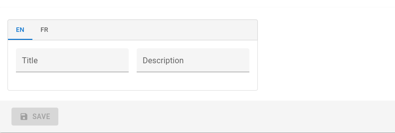
By default, <TranslatableInputs> will allow users to select the displayed locale using Material UI tabs with the locale code as their labels.
fullWidth
By default, a <TranslatableInputs> group expands to fill the form width. You can disable this behaviour by setting the fullWidth prop to false:
<TranslatableInputs locales={['en', 'fr']} fullWidth={false}>
    <TextInput source="title" />
    <TextInput source="description" />
</TranslatableInputs>
groupKey
If you have multiple TranslatableInputs on the same page, you should specify a groupKey so that react-admin can create unique identifiers for accessibility.
<TranslatableInputs locales={['en', 'fr']} groupKey="essential-fields">
    <TextInput source="name" />
    <RichTextInput source="description" />
</TranslatableInputs>
locales
Set the locales to display with an array of strings - each string becoming a key in the input value - . The order of the locales will be the order of the tabs.
<TranslatableInputs locales={['en', 'fr']}>
    <TextInput source="name" />
    <RichTextInput source="description" />
</TranslatableInputs>
You may override the tab labels using translation keys following this format: ra.locales.[locale_code]. For instance, ra.locales.en or ra.locales.fr.
selector
You may override the language selector using the selector prop, which accepts a React element:
const Selector = () => {
    const {
        locales,
        selectLocale,
        selectedLocale,
    } = useTranslatableContext();

    const handleChange = event => {
        selectLocale(event.target.value);
    };

    return (
        <select
            aria-label="Select the locale"
            onChange={handleChange}
            value={selectedLocale}
        >
            {locales.map(locale => (
                <option
                    key={locale}
                    value={locale}
                    // This allows to correctly link the containers for each locale to their labels
                    id={`translatable-header-${locale}`}
                >
                    {locale}
                </option>
            ))}
        </select>
    );
};

<TranslatableInputs
    record={record}
    resource="products"
    locales={['en', 'fr']}
    selector={<Selector />}
>
    <TextInput source="name" />
    <RichTextInput source="description" />
</TranslatableInputs>
StackProps
Use the StackProps prop to pass props to the rendered MUI Stack component.
For instance, you can use direction: 'row' to display the inputs side by side instead of stacked:
<TranslatableInputs
    locales={['en', 'fr']}
    StackProps={{ direction: 'row' }}
>
    <TextInput source="title" />
    <TextInput source="description" sx={{ marginLeft: 2 }} />
</TranslatableInputs>
sx
Use the sx prop to pass additional styles to the component:
<TranslatableInputs
    locales={['en', 'fr']}
    sx={{ border: 'solid 1px red' }}
>
    <TextInput source="title" />
    <TextInput source="description" />
</TranslatableInputs>
Validation
You can add validators to any of the inputs inside a TranslatableInputs. If an input has some validation error, the label of its parent tab will be highlighted as invalid:
<TranslatableInputs locales={['en', 'fr']}>
    <TextInput source="name" validate={[required()]} />
    <RichTextInput source="description" validate={[maxLength(100)]} />
</TranslatableInputs>