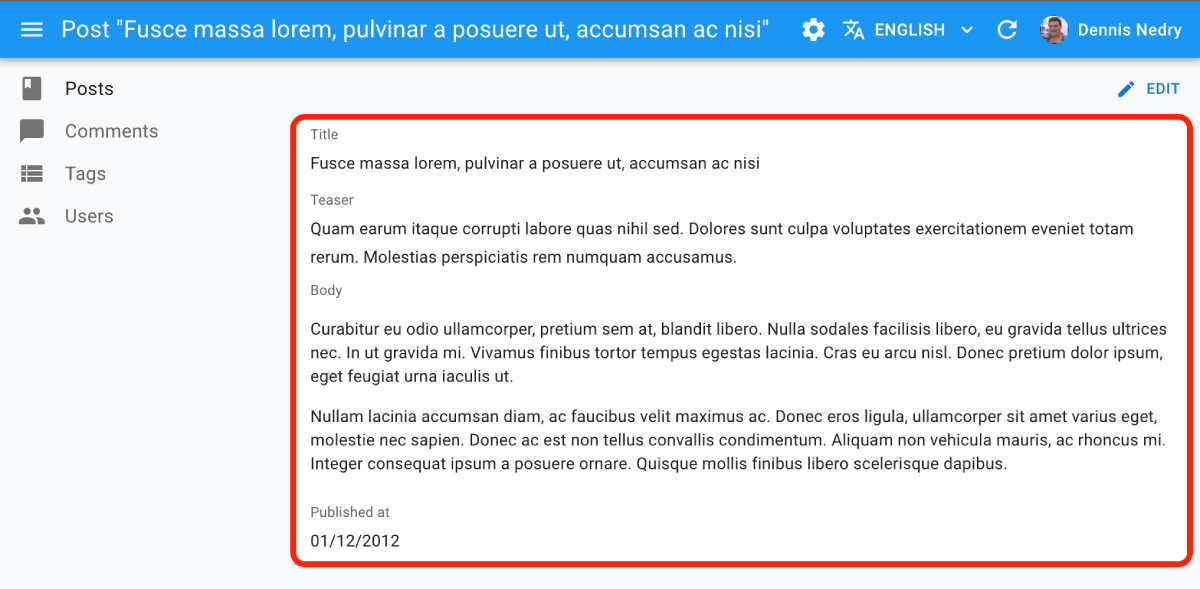
<SimpleShowLayout>
The <SimpleShowLayout> pulls the record from the RecordContext. It renders the record fields in a single-column layout (via Material UI’s <Stack> component). <SimpleShowLayout> delegates the actual rendering of fields to its children. It wraps each field inside a <Labeled> component to add a label.

Usage
Use <SimpleShowLayout> as descendant of a <Show> component (or any component creating a <RecordContext>), and set the fields to be displayed as children:
const PostShow = () => (
    <Show>
        <SimpleShowLayout>
            <TextField source="title" />
            <RichTextField source="body" />
            <NumberField source="nb_views" />
        </SimpleShowLayout>
    </Show>
);
Props
The <SimpleShowLayout> component accepts the following props:
| Prop | Required | Type | Default | Description |
|---|---|---|---|---|
children |
Required | ReactNode |
The components rendering the record fields | |
className |
Optional | string |
The class name applied to the root element | |
direction |
Optional | string |
column |
The direction of the layout. Passed to the <Stack> component |
divider |
Optional | ReactElement |
Optional element to render between each field | |
record |
Optional | object |
The record to render. Passed to the RecordContext |
|
spacing |
Optional | number |
1 |
The spacing between fields. Passed to the <Stack> component |
sx |
Optional | object |
Override the styles applied to the root element |
Additional props are passed to the root component (<div>).
children
<SimpleShowLayout> renders each child inside a <Labeled> component. The above snippet roughly translates to:
const PostShow = () => (
    <Show>
        <Stack>
            <Labeled label="Title">
                <TextField source="title" />
            </Labeled>
            <Labeled label="Body">
                <RichTextField source="body" />
            </Labeled>
            <Labeled label="Nb Views">
                <NumberField source="nb_views" />
            </Labeled>
        </Stack>
    </Show>
);
The <Labeled label> uses the humanized source by default. You can customize it by passing a label prop to the fields:
const PostShow = () => (
    <Show>
        <SimpleShowLayout>
            <TextField label="My Custom Title" source="title" />
            <TextField label="my.custom.translationKey" source="description" />
        </SimpleShowLayout>
    </Show>
);

// translates to
const PostShow = () => (
    <Show>
        <Stack>
            <Labeled label="My Custom Title">
                <TextField source="title" />
            </Labeled>
            <Labeled label="my.custom.translationKey">
                <TextField source="description" />
            </Labeled>
        </Stack>
    </Show>
);
You can disable the <Labeled> decoration by passing setting label={false} on a field:
const PostShow = () => (
    <Show>
        <SimpleShowLayout>
            <TextField label={false} source="title" />
        </SimpleShowLayout>
    </Show>
);

// translates to
const PostShow = () => (
    <Show>
        <Stack>
            <TextField source="title" />
        </Stack>
    </Show>
);
<SimpleShowLayout> children can be anything you want. Try passing your own components:
const PostTitle = () => {
    const record = useRecordContext();
    return <span>Post "{record.title}"</span>;
};

const PostShow = () => (
    <Show>
        <SimpleShowLayout>
            <PostTitle label="title" />
        </SimpleShowLayout>
    </Show>
);
spacing
<SimpleShowLayout> renders a Material UI <Stack>. You can customize the spacing of each row by passing a spacing prop:
const PostShow = () => (
    <Show>
        <SimpleShowLayout spacing={2}>
            <PostTitle label="title" />
        </SimpleShowLayout>
    </Show>
);
The default spacing is 1.
direction
<SimpleShowLayout> renders a Material UI <Stack>. You can customize the direction of the layout by passing a direction prop:
const PostShow = () => (
    <Show>
        <SimpleShowLayout direction="row">
            <PostTitle label="title" />
            <PostTitle label="author" />
            <PostTitle label="published_at" />
        </SimpleShowLayout>
    </Show>
);
divider
<Stack> accepts an optional divider prop - a component rendered between each row. <SimpleShowLayout> also accepts this props, and passes it to the <Stack> component.
import { Divider } from '@mui/material';

const PostShow = () => (
    <Show>
        <SimpleShowLayout divider={<Divider flexItem />}>
            <PostTitle label="title" />
        </SimpleShowLayout>
    </Show>
);
sx: CSS API
The <SimpleShowLayout> component accepts the usual className prop, but you can override many class names injected to the inner components by React-admin thanks to the sx property (see the sx documentation for syntax and examples). This property accepts the following subclasses:
| Rule name | Description |
|---|---|
& .RaSimpleShowLayout-stack |
Applied to the <Stack> element |
& .RaSimpleShowLayout-row |
Applied to each child of the stack (i.e. to each field) |
To override the style of all instances of <SimpleShowLayout> using the application-wide style overrides, use the RaSimpleShowLayout key.
Controlled Mode
By default, <SimpleShowLayout> reads the record from the ResourceContext. But by passing a record prop, you can render the component outside a ResourceContext.
const StaticPostShow = () => (
    <SimpleShowLayout record={{ id: 123, title: 'Hello world' }}>
        <TextField source="title" />
    </SimpleShowLayout>
);
When passed a record, <SimpleShowLayout> creates a RecordContext with the given record.
Rendering More Than One Column
<SimpleShowLayout> arranges fields with labels in a single column. If you need more than one column, you can use this component several times, for instance in a grid:
const BookShow = () => (
    <Show>
        <Grid container spacing={2}>
            <Grid item xs={6}>
                <SimpleShowLayout>
                    <TextField source="id" />
                    <TextField source="title" />
                </SimpleShowLayout>
            </Grid>
            <Grid item xs={6}>
                <SimpleShowLayout>
                    <TextField source="author" />
                    <TextField source="summary" />
                    <NumberField source="year" />
                </SimpleShowLayout>
            </Grid>
        </Grid>
    </Show>
);
You can also nest <SimpleShowLayout> components with different direction props to create complex layouts:
const BookShow = () => (
    <Show>
        <SimpleShowLayout>
            <TextField source="title" />
            <TextField source="summary" />
            <SimpleShowLayout direction="row">
                <TextField source="author" />
                <TextField source="category" />
                <NumberField source="year" />
            </SimpleShowLayout>
        </SimpleShowLayout>
    </Show>
);
Hiding The Field Labels
You can disable the <Labeled> decoration added by <SimpleShowLayout> by setting label={false} on a field:
const PostShow = () => (
    <Show>
        <SimpleShowLayout>
            <TextField label={false} source="title" />
        </SimpleShowLayout>
    </Show>
);
See Also
- Field components
- Show Guesser guesses the fields based on the record type
- TabbedShowLayout provides a more complex layout with tabs

