<DateRangeInput>
This Enterprise Edition component
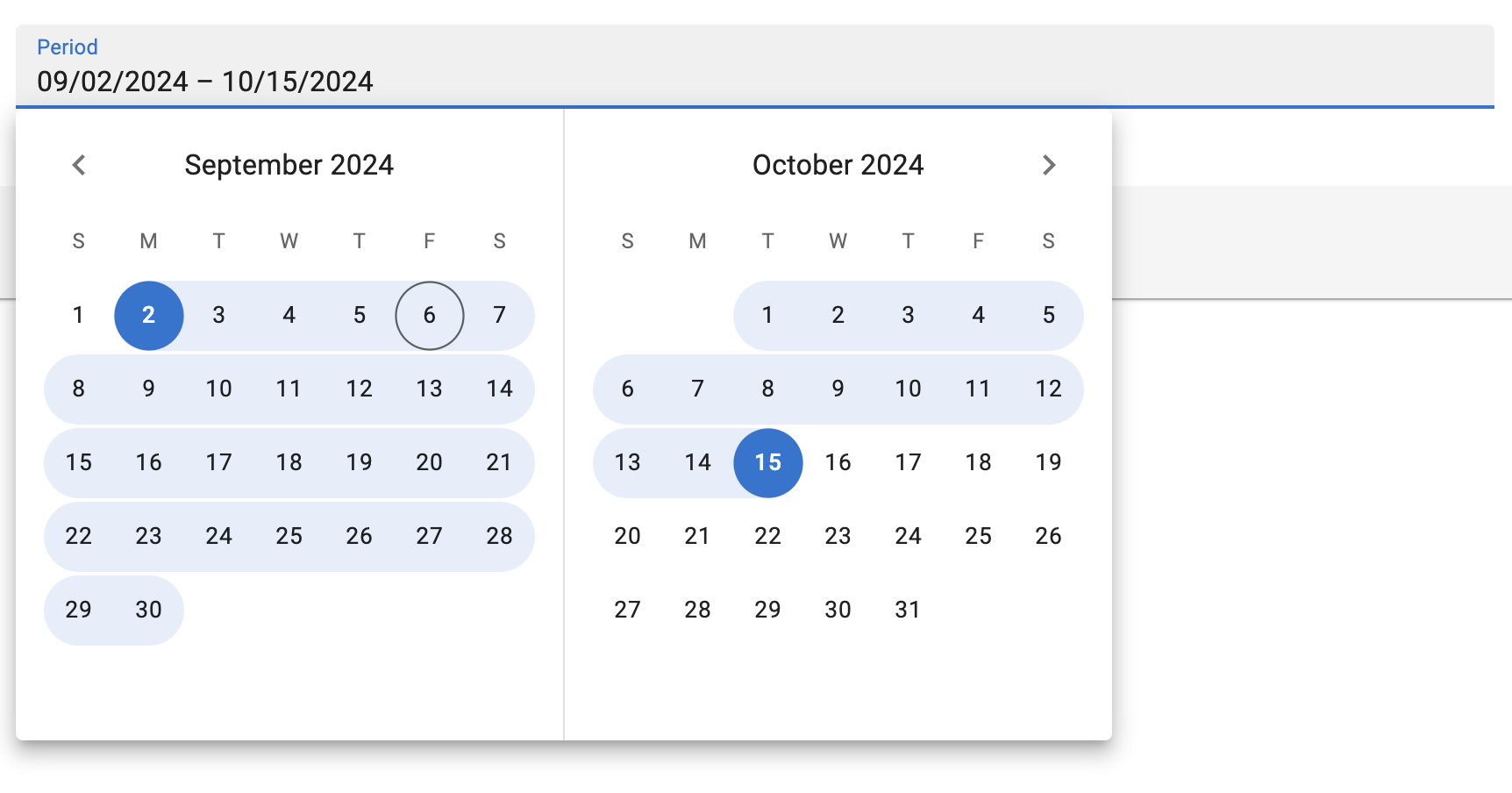
 <DateRangeInput> is a date range picker, allowing users to pick an interval by selecting a start and an end date. It is ideal for filtering records based on a date range. It is designed to work with various locales and date formats.
Note: <DateRangeInput> is a wrapper around the Material UI X Date Range Picker, which is a MUI X Pro package. This means that you need to own a MUI X Pro license to use it.
Usage
Use <DateRangeInput> inside a form component (<SimpleForm>, <TabbedForm>, <LongForm>, etc.) to allow users to pick a start and an end date.
import { DateRangeInput } from '@react-admin/ra-form-layout';
import { Edit, SimpleForm } from 'react-admin';

export const EventEdit = () => (
    <Edit>
        <SimpleForm>
            <DateRangeInput source="subscription_period" />
        </SimpleForm>
    </Edit>
);
<DateRangeInput> reads and writes date ranges as arrays of Date objects. It also accepts arrays of strings that can be parsed into Date values. It will return null if any of the dates is invalid.
// example valid date range values
['2024-01-01', '2024-01-31']
['2024-01-01T00:00:00.000Z', '2024-01-31T23:59:59.999Z']
[new Date('2024-01-01T00:00:00.000Z'), new Date('2024-01-31T23:59:59.999Z')]
Tip: You can use the parse prop to change the format of the returned value. See Parsing the date/time as an ISO string for an example.
Props
| Prop | Required | Type | Default | Description |
|---|---|---|---|---|
source |
Required | string | - | The name of the field in the record. |
defaultValue |
- | Array | - | The default value of the input. |
disabled |
- | boolean | - | If true, the input will be disabled. |
format |
- | function | - | Callback taking the value from the form state, and returning the input value. |
fullWidth |
- | boolean | - | If false, the input will not expand to fill the form width |
helperText |
- | string | - | Text to be displayed under the input |
label |
- | string | - | Input label. In i18n apps, the label is passed to the translate function. When omitted, the source property is humanized and used as a label. Set label={false} to hide the label. |
mask |
- | string | - | Alias for the MUI format prop. Format of the date/time when rendered in the input. Defaults to localized format. |
parse |
- | Function | - | Callback taking the input values, and returning the values you want stored in the form state. |
readOnly |
- | boolean | - | If true, the input will be read-only. |
sx |
- | SxProps |
- | The style to apply to the component. |
validate |
- | function|Array |
- | Validation rules for the input. See the Validation Documentation for details. |
<DateRangeInput> also accept the same props as MUI X’s <DateRangePicker>, except for the format prop (renamed mask),
Tip: Since <DateRangeInput> stores its value as a date array, react-admin’s validators like minValue or maxValue won’t work out of the box.
parse and format
By default, <DateRangeInput> stores the dates as an array of Date objects in the form state. When sent to the API, these dates will be stringified using the ISO 8601 format via Date.prototype.toISOString().
If you wish to store the dates in any other format, you can use the parse prop to change the Date objects into the desired format.
<DateRangeInput
    source="subscription_period"
    parse={(dates: Date[]) => (
        dates
            ? dates.map(date => (date ? date.toUTCString()() : null))
            : null
    )}
/>
Similarly, if your database stores your dates in a format that can’t be interpreted by Date.parse(), you can use the format prop.
import { parse } from 'date-fns';
// ...
<DateRangeInput
    source="subscription_period"
    format={(dates: Date[]) => (
        dates
            ? dates.map(date => date ? parse(date, 'dd/MM/yyyy', new Date()) : null)
            : null
    )}
/>
validate
The value of the validate prop must be a function taking the record as input, and returning an object with error messages indexed by fields. The record could be null or an array of objects that could be null or a Date object. So the react-admin’s built-in field validators will not be useful for <DateRageInput>, you will need to build your own.
Here is an example of custom validators for a <DateRangeInput>:
import {
    Edit,
    isEmpty,
    required,
    SimpleForm,
    TextInput,
} from "react-admin";
import { DateRangeInput } from '@react-admin/ra-form-layout';

const requiredValues = dates =>
    !dates || isEmpty(dates[0]) || isEmpty(dates[1])
        ? 'ra.validation.required'
        : null;

const thisMonth = dates => {
    if (!dates || !dates[0] || !dates[1]) {
        return
    }
    const firstOfTheMonth = new Date();
    firstOfTheMonth.setDate(1);
    firstOfTheMonth.setHours(0, 0, 0, 0);
    const lastOfTheMonth = new Date();
    lastOfTheMonth.setMonth(lastOfTheMonth.getMonth() + 1);
    lastOfTheMonth.setDate(0);
    lastOfTheMonth.setHours(23, 59, 59, 999);
    return dates[0] < firstOfTheMonth || dates[1] > lastOfTheMonth
        ? 'ra.validation.dateRange.invalid'
        : null;
}

const EventEdit = () => {
    return (
        <Edit>
            <SimpleForm>
                <TextInput source="title" validate={required} />
                <DateRangeInput source="communication_period" validate={requiredValues} />
                <DateRangeInput source="subscription_period" validate={[requiredValues(), tothisMonthay()]} />
            </SimpleForm>
        </Edit>
    );
};
Providing your own LocalizationProvider
MUI X Pickers need to be wrapped in a LocalizationProvider to work properly. <DateRangeInput> already includes a default <LocalizationProvider> using the date-fns adapter and the enUS locale.
You can change the locale and the date format for the entire app by wrapping the <Admin> with your own <LocalizationProvider>.
Here is how to set up the pickers to use the fr locale:
import { Admin, Resource } from 'react-admin';
import { fr } from 'date-fns/locale/fr'
import { EventEdit } from './events';

import { LocalizationProvider } from '@mui/x-date-pickers-pro';
import { AdapterDateFns } from '@mui/x-date-pickers-pro/AdapterDateFnsV3';

export const App = () => (
    <LocalizationProvider dateAdapter={AdapterDateFns} adapterLocale={fr}>
        <Admin>
            <Resource name="events" edit={EventEdit} />
        </Admin>
    </LocalizationProvider>
);
Note: To wrap your admin using a <DateInput>, a <DateTimeInput> or a <TimeInput>, you need to import LocalizationProvider from @mui/x-date-pickers and AdapterDateFns from @mui/x-date-pickers/AdapterDateFnsV3. But, to wrap your admin using a <DateRangeInput>, you need to import LocalizationProvider from @mui/x-date-pickers-pro and AdapterDateFns from @mui/x-date-pickers-pro/AdapterDateFnsV3. If you use both components, please use @mui/x-date-pickers-pro imports.
Note: React-admin only supports the date-fns adapter for now.
Tip: React-admin already depends on date-fns v3 but your package manager may require you to add it to your dependencies.