Input Components
An Input component displays an input, or a dropdown list, a list of radio buttons, etc. Such components allow to edit a record property, and are common in the <Edit>, <Create>, and <Filter> views.
// in src/posts.js
import React from 'react';
import { Edit, DisabledInput, LongTextInput, ReferenceInput, SelectInput, SimpleForm, TextInput } from 'admin-on-rest';

export const PostEdit = (props) => (
    <Edit title={<PostTitle />} {...props}>
        <SimpleForm>
            <DisabledInput source="id" />
            <ReferenceInput label="User" source="userId" reference="users">
                <SelectInput optionText="name" />
            </ReferenceInput>
            <TextInput source="title" />
            <LongTextInput source="body" />
        </SimpleForm>
    </Edit>
);
All input components accept the following attributes:
source: Property name of your entity to view/edit. This attribute is required.defaultValue: Value to be set when the property isnullorundefined.validate: Validation rules for the current property (see the Validation Documentation)label: Used as a table header of an input label. Defaults to thesourcewhen omitted.style: A style object to customize the look and feel of the field container (e.g. the<div>in a form).elStyle: A style object to customize the look and feel of the field element itself
Some other props are progressively implemented. The <TextInput /> and <NumberInput /> inputs also accept following props:
onBlur: a function to call when the form field loses focus. It expects to either receive the React SyntheticEvent, or the current value of the field.onChange: a function to call when the form field is changed. It expects to either receive the React SyntheticEvent, or the new value of the field.onFocus: a function to call when the field receives focus. It takes theeventas argument.
<TextInput source="zb_title" label="Title" />
Tip: If you edit a record with a complex structure, you can use a path as the source parameter. For instance, if the API returns the following ‘book’ record:
{
    id: 1234,
    title: 'War and Peace',
    author: {
        firstName: 'Leo',
        lastName: 'Tolstoi'
    }
}
Then you can display a text input to edit the author first name as follows:
<TextInput source="author.firstName" />
Tip: If your interface has to support multiple languages, don’t use the label prop, and put the localized labels in a dictionary instead. See the Translation documentation for details.
<AutocompleteInput>
To let users choose a value in a list using a dropdown with autocompletion, use <AutocompleteInput>. It renders using Material ui’s <AutoComplete> component and a fuzzySearch filter. Set the choices attribute to determine the options list (with id, name tuples).
import { AutocompleteInput } from 'admin-on-rest';

<AutocompleteInput source="category" choices={[
    { id: 'programming', name: 'Programming' },
    { id: 'lifestyle', name: 'Lifestyle' },
    { id: 'photography', name: 'Photography' },
]} />
You can also customize the properties to use for the option name and value, thanks to the optionText and optionValue attributes:
const choices = [
    { _id: 123, full_name: 'Leo Tolstoi', sex: 'M' },
    { _id: 456, full_name: 'Jane Austen', sex: 'F' },
];
<AutocompleteInput source="author_id" choices={choices} optionText="full_name" optionValue="_id" />
optionText also accepts a function, so you can shape the option text at will:
const choices = [
   { id: 123, first_name: 'Leo', last_name: 'Tolstoi' },
   { id: 456, first_name: 'Jane', last_name: 'Austen' },
];
const optionRenderer = choice => `${choice.first_name} ${choice.last_name}`;
<AutocompleteInput source="author_id" choices={choices} optionText={optionRenderer} />
You can customize the filter function used to filter the results. By default, it’s AutoComplete.fuzzyFilter, but you can use any of the functions provided by AutoComplete, or a function of your own ((searchText: string, key: string) => boolean):
import { AutocompleteInput } from 'admin-on-rest';
import AutoComplete from 'material-ui/AutoComplete';

<AutocompleteInput source="category" filter={AutoComplete.caseInsensitiveFilter} choices={choices} />
The choices are translated by default, so you can use translation identifiers as choices:
const choices = [
   { id: 'M', name: 'myroot.gender.male' },
   { id: 'F', name: 'myroot.gender.female' },
];
However, in some cases (e.g. inside a <ReferenceInput>), you may not want the choice to be translated. In that case, set the translateChoice prop to false.
<AutocompleteInput source="gender" choices={choices} translateChoice={false}/>
Lastly, use the options attribute if you want to override any of Material UI’s <AutoComplete> attributes:
<AutocompleteInput source="category" options={{
    fullWidth: true,
    filter: AutoComplete.fuzzyFilter,
}} />
Refer to Material UI Autocomplete documentation for more details.
Tip: If you want to populate the choices attribute with a list of related records, you should decorate <AutocompleteInput> with <ReferenceInput>, and leave the choices empty:
import { AutocompleteInput, ReferenceInput } from 'admin-on-rest'

<ReferenceInput label="Post" source="post_id" reference="posts">
    <AutocompleteInput optionText="title" />
</ReferenceInput>
Tip: <AutocompleteInput> is a stateless component, so it only allows to filter the list of choices, not to extend it. If you need to populate the list of choices based on the result from a fetch call (and if <ReferenceInput> doesn’t cover your need), you’ll have to write your own Input component based on material-ui <AutoComplete> component.
Tip: Admin-on-rest’s <AutocompleteInput> has only a capital A, while material-ui’s <AutoComplete> has a capital A and a capital C. Don’t mix up the components!
<BooleanInput> and <NullableBooleanInput>
<BooleanInput /> is a toggle button allowing you to attribute a true or false value to a record field.
import { BooleanInput } from 'admin-on-rest';

<BooleanInput label="Allow comments?" source="commentable" />

This input does not handle null values. You would need the <NullableBooleanInput /> component if you have to handle non-set booleans.
You can use the options prop to pass any option supported by the Material UI Toggle components.
<BooleanInput source="finished" options={{
    labelPosition: 'right'
}} />
Refer to Material UI Toggle documentation for more details.
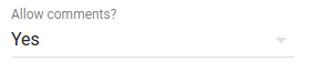
<NullableBooleanInput /> renders as a dropdown list, allowing to choose between true, false, and null values.
import { NullableBooleanInput } from 'admin-on-rest';

<NullableBooleanInput label="Allow comments?" source="commentable" />
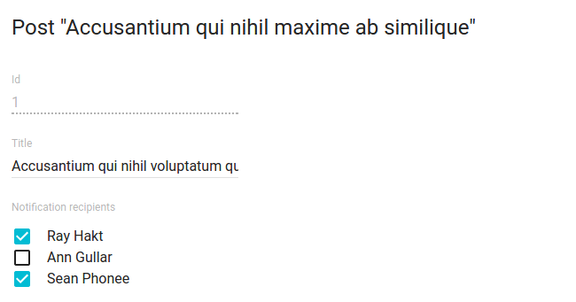
<CheckboxGroupInput>
If you want to let the user choose multiple values among a list of possible values by showing them all, <CheckboxGroupInput> is the right component. Set the choices attribute to determine the options (with id, name tuples):
import { CheckboxGroupInput } from 'admin-on-rest';

<CheckboxGroupInput source="category" choices={[
    { id: 'programming', name: 'Programming' },
    { id: 'lifestyle', name: 'Lifestyle' },
    { id: 'photography', name: 'Photography' },
]} />
You can also customize the properties to use for the option name and value, thanks to the optionText and optionValue attributes:
const choices = [
    { _id: 123, full_name: 'Leo Tolstoi', sex: 'M' },
    { _id: 456, full_name: 'Jane Austen', sex: 'F' },
];
<CheckboxGroupInput source="author_id" choices={choices} optionText="full_name" optionValue="_id" />
optionText also accepts a function, so you can shape the option text at will:
const choices = [
   { id: 123, first_name: 'Leo', last_name: 'Tolstoi' },
   { id: 456, first_name: 'Jane', last_name: 'Austen' },
];
const optionRenderer = choice => `${choice.first_name} ${choice.last_name}`;
<CheckboxGroupInput source="author_id" choices={choices} optionText={optionRenderer} />
optionText also accepts a React Element, that will be cloned and receive the related choice as the record prop. You can use Field components there.
const choices = [
   { id: 123, first_name: 'Leo', last_name: 'Tolstoi' },
   { id: 456, first_name: 'Jane', last_name: 'Austen' },
];
const FullNameField = ({ record }) => <span>{record.first_name} {record.last_name}</span>;
<CheckboxGroupInput source="gender" choices={choices} optionText={<FullNameField />}/>
The choices are translated by default, so you can use translation identifiers as choices:
const choices = [
    { id: 'programming', name: 'myroot.category.programming' },
    { id: 'lifestyle', name: 'myroot.category.lifestyle' },
    { id: 'photography', name: 'myroot.category.photography' },
];
However, in some cases (e.g. inside a <ReferenceInput>), you may not want the choice to be translated. In that case, set the translateChoice prop to false.
<CheckboxGroupInput source="gender" choices={choices} translateChoice={false}/>
Lastly, use the options attribute if you want to override any of Material UI’s <Checkbox> attributes:
<CheckboxGroupInput source="category" options={{
    labelPosition: 'right'
}} />
Refer to Material UI Checkbox documentation for more details.
<DateInput>
Ideal for editing dates, <DateInput> renders a beautiful Date Picker with full localization support.
import { DateInput } from 'admin-on-rest';

<DateInput source="published_at" />
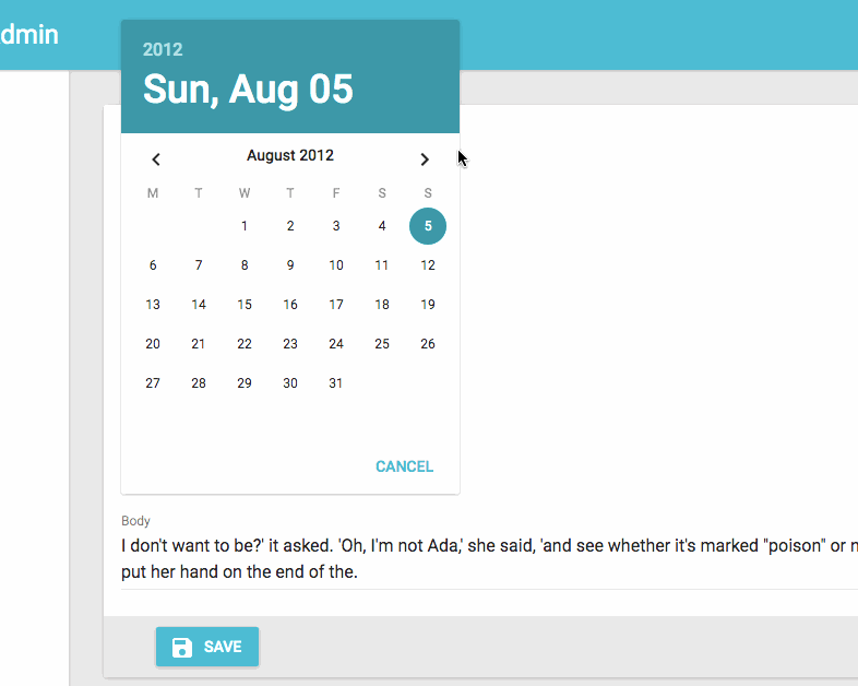
You can override any of Material UI’s <DatePicker> attributes by setting the options attribute:
<DateInput source="published_at" options={{
    mode: 'landscape',
    minDate: new Date(),
    hintText: 'Choisissez une date',
    DateTimeFormat,
    okLabel: 'OK',
    cancelLabel: 'Annuler',
    locale: 'fr'
}} />
Refer to Material UI Datepicker documentation for more details.
<DateInput> and time zone
The <DateInput> component will transmit the input’s value to redux-form with toISOString() method. This method takes into account the user’s time zone.
That’s means that if a user with a local time UTC+2 selects 2017-10-31 in the datePicker, the value transmitted to the redux-form will be 2017-10-30T22:00:00.000Z.
It’s not a problem if you manage this date as a dateTime (with timezone) but if you store this date as simple date, you could save 2017-10-30 without reference to the user time zone…
You can fix that type of problem using a parser function :
const _tz_offset = new Date().getTimezoneOffset() / 60;
export const dateParser = v => {
  const regexp = /(\d{4})-(\d{2})-(\d{2})/
  var match = regexp.exec(v);
  if (match === null) return;

  var year = match[1];
  var month = match[2];
  var day = match[3];

  if (_tz_offset < 0) {
    // negative offset means our picked UTC date got converted to previous day
    var date = new Date(v);
    date.setDate(date.getDate() + 1);
    match = regexp.exec(date.toISOString())
    year = match[1];
    month = match[2];
    day = match[3];
  }
  const d = [year, month, day].join("-");
  return d;
};

...

<DateInput parse={dateParser} source="date_start" label="Start date" />
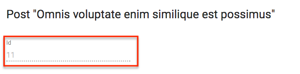
<DisabledInput>
When you want to display a record property in an <Edit> form without letting users update it (such as for auto-incremented primary keys), use the <DisabledInput>:
import { DisabledInput } from 'admin-on-rest';

<DisabledInput source="id" />
Tip: To add non-editable fields to the <Edit> view, you can also use one of admin-on-rest Field components:
// in src/posts.js
import { Edit, LongTextInput, SimpleForm, TextField } from 'admin-on-rest';

export const PostEdit = (props) => (
    <Edit {...props}>
        <SimpleForm>
            <TextField source="title" /> {/* NOT EDITABLE */}
            <LongTextInput source="body" />
        </SimpleForm>
    </Edit>
);
Tip: You can even use a component of your own, provided it accepts a record prop:
// in src/posts.js
import { Edit, LongTextInput, SimpleForm } from 'admin-on-rest';
const titleStyle = { textOverflow: 'ellipsis', overflow: 'hidden', maxWidth: '20em' };
const Title = ({ record }) => <span style={titleStyle}>{record.title}</span>;
Title.defaultProps = {
    addLabel: true,
};

export const PostEdit = (props) => (
    <Edit {...props}>
        <SimpleForm>
            <Title label="Title" />
            <LongTextInput source="body" />
        </SimpleForm>
    </Edit>
);
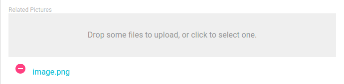
<ImageInput>
<ImageInput> allows to upload some pictures using react-dropzone.

Previews are enabled using <ImageInput> children, as following:
<ImageInput source="pictures" label="Related pictures" accept="image/*">
    <ImageField source="src" title="title" />
</ImageInput>
Writing a custom field component for displaying the current value(s) is easy: it’s a standard field.
When receiving new files, ImageInput will add a rawFile property to the object passed as the record prop of children. This rawFile is the File instance of the newly added file. This can be useful to display informations about size or mimetype inside a custom field.
The ImageInput component accepts all react-dropzone properties, in addition to those of admin-on-rest. For instance, if you need to upload several images at once, just add the multiple DropZone attribute to your <ImageInput /> field.
If the default Dropzone label doesn’t fit with your need, you can pass a placeholder attribute to overwrite it. The attribute can be anything React can render (PropTypes.node):
<ImageInput source="pictures" label="Related pictures" accept="image/*" placeholder={<p>Drop your file here</p>}>
    <ImageField source="src" title="title" />
</ImageInput>
Note that the image upload returns a File object. It is your responsibility to handle it depending on your API behavior. You can for instance encode it in base64, or send it as a multi-part form data. Check this example for base64 encoding data by extending the REST Client.
<FileInput>
<FileInput> allows to upload some files using react-dropzone.
Previews (actually a simple list of files names) are enabled using <FileInput> children, as following:
<FileInput source="files" label="Related files" accept="application/pdf">
    <FileField source="src" title="title" />
</FileInput>
Writing a custom field component for displaying the current value(s) is easy: it’s a standard field.
When receiving new files, FileInput will add a rawFile property to the object passed as the record prop of children. This rawFile is the File instance of the newly added file. This can be useful to display informations about size or mimetype inside a custom field.
The FileInput component accepts all react-dropzone properties, in addition to those of admin-on-rest. For instance, if you need to upload several files at once, just add the multiple DropZone attribute to your <FileInput /> field.
If the default Dropzone label doesn’t fit with your need, you can pass a placeholder attribute to overwrite it. The attribute can be anything React can render (PropTypes.node):
<FileInput source="files" label="Related files" accept="application/pdf" placeholder={<p>Drop your file here</p>}>
    <ImageField source="src" title="title" />
</FileInput>
Note that the file upload returns a File object. It is your responsibility to handle it depending on your API behavior. You can for instance encode it in base64, or send it as a multi-part form data. Check this example for base64 encoding data by extending the REST Client.
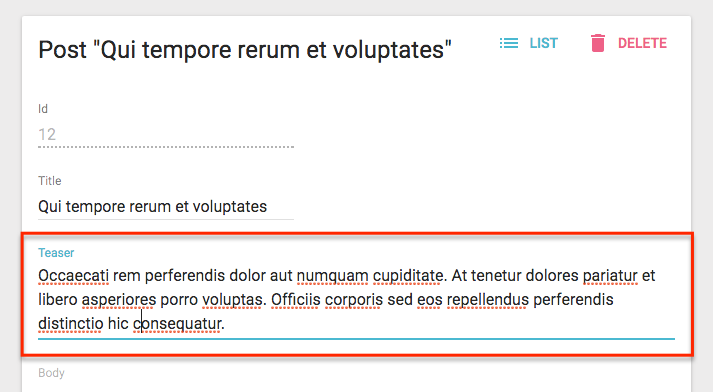
<LongTextInput>
<LongTextInput> is the best choice for multiline text values. It renders as an auto expandable textarea.
import { LongTextInput } from 'admin-on-rest';

<LongTextInput source="teaser" />
<NumberInput>
<NumberInput> translates to a HTML <input type="number">. It is necessary for numeric values because of a known React bug, which prevents using the more generic <TextInput> in that case.
import { NumberInput } from 'admin-on-rest';

<NumberInput source="nb_views" />
You can customize the step props (which defaults to “any”):
<NumberInput source="nb_views" step={1} />
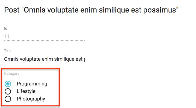
<RadioButtonGroupInput>
If you want to let the user choose a value among a list of possible values by showing them all (instead of hiding them behind a dropdown list, as in <SelectInput>), <RadioButtonGroupInput> is the right component. Set the choices attribute to determine the options (with id, name tuples):
import { RadioButtonGroupInput } from 'admin-on-rest';

<RadioButtonGroupInput source="category" choices={[
    { id: 'programming', name: 'Programming' },
    { id: 'lifestyle', name: 'Lifestyle' },
    { id: 'photography', name: 'Photography' },
]} />
You can also customize the properties to use for the option name and value, thanks to the optionText and optionValue attributes:
const choices = [
    { _id: 123, full_name: 'Leo Tolstoi', sex: 'M' },
    { _id: 456, full_name: 'Jane Austen', sex: 'F' },
];
<RadioButtonGroupInput source="author_id" choices={choices} optionText="full_name" optionValue="_id" />
optionText also accepts a function, so you can shape the option text at will:
const choices = [
   { id: 123, first_name: 'Leo', last_name: 'Tolstoi' },
   { id: 456, first_name: 'Jane', last_name: 'Austen' },
];
const optionRenderer = choice => `${choice.first_name} ${choice.last_name}`;
<RadioButtonGroupInput source="author_id" choices={choices} optionText={optionRenderer} />
optionText also accepts a React Element, that will be cloned and receive the related choice as the record prop. You can use Field components there.
const choices = [
   { id: 123, first_name: 'Leo', last_name: 'Tolstoi' },
   { id: 456, first_name: 'Jane', last_name: 'Austen' },
];
const FullNameField = ({ record }) => <span>{record.first_name} {record.last_name}</span>;
<RadioButtonGroupInput source="gender" choices={choices} optionText={<FullNameField />}/>
The choices are translated by default, so you can use translation identifiers as choices:
const choices = [
   { id: 'M', name: 'myroot.gender.male' },
   { id: 'F', name: 'myroot.gender.female' },
];
However, in some cases (e.g. inside a <ReferenceInput>), you may not want the choice to be translated. In that case, set the translateChoice prop to false.
<RadioButtonGroupInput source="gender" choices={choices} translateChoice={false}/>
Lastly, use the options attribute if you want to override any of Material UI’s <RadioButtonGroup> attributes:
<RadioButtonGroupInput source="category" options={{
    labelPosition: 'right'
}} />
Refer to Material UI SelectField documentation for more details.
Tip: If you want to populate the choices attribute with a list of related records, you should decorate <RadioButtonGroupInput> with <ReferenceInput>, and leave the choices empty:
import { RadioButtonGroupInput, ReferenceInput } from 'admin-on-rest'

<ReferenceInput label="Author" source="author_id" reference="authors">
    <RadioButtonGroupInput optionText="last_name" />
</ReferenceInput>
<ReferenceInput>
Use <ReferenceInput> for foreign-key values, i.e. to let users choose a value from another REST endpoint. This component fetches the possible values in the reference resource (using the GET_LIST REST method), then delegates rendering to a subcomponent, to which it passes the possible choices as the choices attribute.
This means you can use <ReferenceInput> with any of <SelectInput>, <AutocompleteInput>, or <RadioButtonGroupInput>, or even with the component of your choice, provided it supports the choices attribute.
The component expects a source and a reference attributes. For instance, to make the post_id for a comment editable:
import { ReferenceInput, SelectInput } from 'admin-on-rest'

<ReferenceInput label="Post" source="post_id" reference="posts">
    <SelectInput optionText="title" />
</ReferenceInput>
Note: You must add a <Resource> for the reference resource - admin-on-rest needs it to fetch the reference data. You can omit the list prop in this reference if you want to hide it in the sidebar menu.
<Admin restClient={myRestClient}>
    <Resource name="comments" list={CommentList} />
    <Resource name="posts" />
</Admin>
Set the allowEmpty prop when you want to add an empty choice with a value of null in the choices list.
Disabling allowEmpty does not mean that the input will be required. If you want to make the input required, you must add a validator as indicated in Validation Documentation. Enabling the allowEmpty props just adds an empty choice (with null value) on top of the options, and makes the value nullable.
import { ReferenceInput, SelectInput } from 'admin-on-rest'

<ReferenceInput label="Post" source="post_id" reference="posts" allowEmpty>
    <SelectInput optionText="title" />
</ReferenceInput>
Tip: allowEmpty is set by default for all Input components children of the <Filter> component:
const CommentFilter = (props) => (
    <Filter {...props}>
        <ReferenceInput label="Post" source="post_id" reference="posts"> // no need for allowEmpty
            <SelectInput optionText="title" />
        </ReferenceInput>
    </Filter>
);
You can tweak how this component fetches the possible values using the perPage, sort, and filter props.
// by default, fetches only the first 25 values. You can extend this limit
// by setting the `perPage` prop.
<ReferenceInput
     source="post_id"
     reference="posts"
     perPage={100}>
    <SelectInput optionText="title" />
</ReferenceInput>

// by default, orders the possible values by id desc. You can change this order
// by setting the `sort` prop (an object with `field` and `order` properties).
<ReferenceInput
     source="post_id"
     reference="posts"
     sort={{ field: 'title', order: 'ASC' }}>
    <SelectInput optionText="title" />
</ReferenceInput>

// you can filter the query used to populate the possible values. Use the
// `filter` prop for that.
<ReferenceInput
     source="post_id"
     reference="posts"
     filter={{ is_published: true }}>
    <SelectInput optionText="title" />
</ReferenceInput>
The enclosed component may further filter results (that’s the case, for instance, for <AutocompleteInput>). ReferenceInput passes a setFilter function as prop to its child component. It uses the value to create a filter for the query - by default { q: [searchText] }. You can customize the mapping
searchText => searchQuery by setting a custom filterToQuery function prop:
<ReferenceInput
     source="post_id"
     reference="posts"
     filterToQuery={searchText => ({ title: searchText })}>
    <SelectInput optionText="title" />
</ReferenceInput>
<ReferenceArrayInput>
Use <ReferenceArrayInput> to edit an array of reference values, i.e. to let users choose a list of values (usually foreign keys) from another REST endpoint.
<ReferenceArrayInput> fetches the related resources (using the CRUD_GET_MANY REST method) as well as possible resources (using the
CRUD_GET_MATCHING REST method) in the reference endpoint.
For instance, if the post object has many tags, a post resource may look like:
{
    id: 1234,
    tag_ids: [1, 23, 4]
}
Then <ReferenceArrayInput> would fetch a list of tag resources from these two calls:
http://myapi.com/tags?id=[1,23,4]
http://myapi.com/tags?page=1&perPage=25
Once it receives the deduplicated reference resources, this component delegates rendering to a subcomponent, to which it passes the possible choices as the choices attribute.
This means you can use <ReferenceArrayInput> with <SelectArrayInput>, or with the component of your choice, provided it supports the choices attribute.
The component expects a source and a reference attributes. For instance, to make the tag_ids for a post editable:
import { ReferenceArrayInput, SelectArrayInput } from 'admin-on-rest'

<ReferenceArrayInput source="tag_ids" reference="tags">
    <SelectArrayInput optionText="name" />
</ReferenceArrayInput>
Note: You must add a <Resource> for the reference resource - admin-on-rest needs it to fetch the reference data. You can omit the list prop in this reference if you want to hide it in the sidebar menu.
<Admin restClient={myRestClient}>
    <Resource name="posts" list={PostList} edit={PostEdit} />
    <Resource name="tags" />
</Admin>
Set the allowEmpty prop when you want to add an empty choice with a value of null in the choices list.
Disabling allowEmpty does not mean that the input will be required. If you want to make the input required, you must add a validator as indicated in Validation Documentation. Enabling the allowEmpty props just adds an empty choice (with null value) on top of the options, and makes the value nullable.
import { ReferenceArrayInput, SelectArrayInput } from 'admin-on-rest'

<ReferenceArrayInput source="tag_ids" reference="tags" allowEmpty>
    <SelectArrayInput optionText="name" />
</ReferenceArrayInput>
Tip: allowEmpty is set by default for all Input components children of the <Filter> component
You can tweak how this component fetches the possible values using the perPage, sort, and filter props.
// by default, fetches only the first 25 values. You can extend this limit
// by setting the `perPage` prop.
<ReferenceArrayInput
     source="tag_ids"
     reference="tags"
     perPage={100}>
    <SelectArrayInput optionText="name" />
</ReferenceArrayInput>

// by default, orders the possible values by id desc. You can change this order
// by setting the `sort` prop (an object with `field` and `order` properties).
<ReferenceArrayInput
     source="tag_ids"
     reference="tags"
     sort={{ field: 'title', order: 'ASC' }}>
    <SelectArrayInput optionText="name" />
</ReferenceArrayInput>

// you can filter the query used to populate the possible values. Use the
// `filter` prop for that.
<ReferenceArrayInput
     source="tag_ids"
     reference="tags"
     filter={{ is_published: true }}>
    <SelectArrayInput optionText="name" />
</ReferenceArrayInput>
The enclosed component may further filter results (that’s the case, for instance, for <SelectArrayInput>). ReferenceArrayInput passes a setFilter function as prop to its child component. It uses the value to create a filter for the query - by default { q: [searchText] }. You can customize the mapping
searchText => searchQuery by setting a custom filterToQuery function prop:
<ReferenceArrayInput
     source="tag_ids"
     reference="tags"
     filterToQuery={searchText => ({ name: searchText })}>
    <SelectArrayInput optionText="name" />
</ReferenceArrayInput>
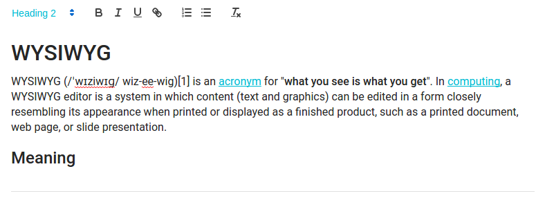
<RichTextInput>
<RichTextInput> is the ideal component if you want to allow your users to edit some HTML contents. It
is powered by Quill.
Note: Due to its size, <RichTextInput> is not bundled by default with admin-on-rest. You must install it first, using npm:
npm install aor-rich-text-input --save
Then use it as a normal input component:
import RichTextInput from 'aor-rich-text-input';

<RichTextInput source="body" />
You can customize the rich text editor toolbar using the toolbar attribute, as described on the Quill official toolbar documentation.
<RichTextInput source="body" toolbar={[ ['bold', 'italic', 'underline', 'link'] ]} />
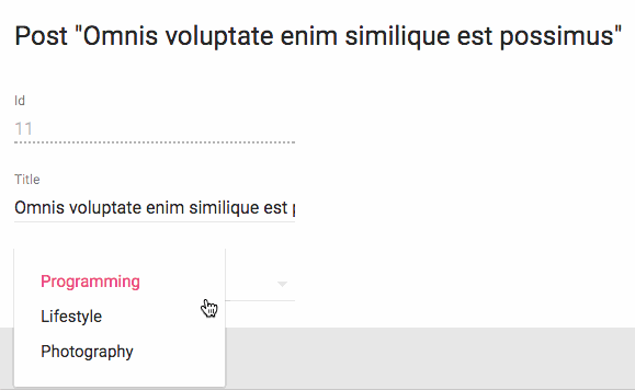
<SelectInput>
To let users choose a value in a list using a dropdown, use <SelectInput>. It renders using Material ui’s <SelectField>. Set the choices attribute to determine the options (with id, name tuples):
import { SelectInput } from 'admin-on-rest';

<SelectInput source="category" choices={[
    { id: 'programming', name: 'Programming' },
    { id: 'lifestyle', name: 'Lifestyle' },
    { id: 'photography', name: 'Photography' },
]} />
You can also customize the properties to use for the option name and value, thanks to the optionText and optionValue attributes:
const choices = [
    { _id: 123, full_name: 'Leo Tolstoi', sex: 'M' },
    { _id: 456, full_name: 'Jane Austen', sex: 'F' },
];
<SelectInput source="author_id" choices={choices} optionText="full_name" optionValue="_id" />
optionText also accepts a function, so you can shape the option text at will:
const choices = [
   { id: 123, first_name: 'Leo', last_name: 'Tolstoi' },
   { id: 456, first_name: 'Jane', last_name: 'Austen' },
];
const optionRenderer = choice => `${choice.first_name} ${choice.last_name}`;
<SelectInput source="author_id" choices={choices} optionText={optionRenderer} />
optionText also accepts a React Element, that will be cloned and receive the related choice as the record prop. You can use Field components there.
const choices = [
   { id: 123, first_name: 'Leo', last_name: 'Tolstoi' },
   { id: 456, first_name: 'Jane', last_name: 'Austen' },
];
const FullNameField = ({ record }) => <span>{record.first_name} {record.last_name}</span>;
<SelectInput source="gender" choices={choices} optionText={<FullNameField />}/>
Enabling the allowEmpty props adds an empty choice (with null value) on top of the options, and makes the value nullable:
<SelectInput source="category" allowEmpty choices={[
    { id: 'programming', name: 'Programming' },
    { id: 'lifestyle', name: 'Lifestyle' },
    { id: 'photography', name: 'Photography' },
]} />
The choices are translated by default, so you can use translation identifiers as choices:
const choices = [
   { id: 'M', name: 'myroot.gender.male' },
   { id: 'F', name: 'myroot.gender.female' },
];
However, in some cases, you may not want the choice to be translated. In that case, set the translateChoice prop to false.
<SelectInput source="gender" choices={choices} translateChoice={false}/>
Note that translateChoice is set to false when <SelectInput> is a child of <ReferenceInput>.
Lastly, use the options attribute if you want to override any of Material UI’s <SelectField> attributes:
<SelectInput source="category" options={{
    maxHeight: 200
}} />
Refer to Material UI SelectField documentation for more details.
Tip: If you want to populate the choices attribute with a list of related records, you should decorate <SelectInput> with <ReferenceInput>, and leave the choices empty:
import { SelectInput, ReferenceInput } from 'admin-on-rest'

<ReferenceInput label="Author" source="author_id" reference="authors">
    <SelectInput optionText="last_name" />
</ReferenceInput>
If, instead of showing choices as a dropdown list, you prefer to display them as a list of radio buttons, try the <RadioButtonGroupInput>. And if the list is too big, prefer the <AutocompleteInput>.
<SelectArrayInput>
To let users choose several values in a list using a dropdown, use <SelectArrayInput>. It renders using material-ui-chip-input. Set the choices attribute to determine the options (with id, name tuples):
import { SelectArrayInput } from 'admin-on-rest';
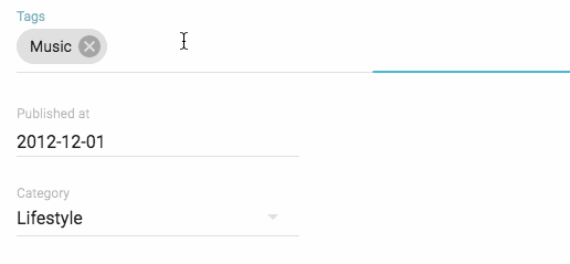
<SelectArrayInput label="Tags" source="categories" choices={[
{ id: 'music', name: 'Music' },
{ id: 'photography', name: 'Photo' },
{ id: 'programming', name: 'Code' },
{ id: 'tech', name: 'Technology' },
{ id: 'sport', name: 'Sport' },
]} />
You can also customize the properties to use for the option name and value,
thanks to the optionText and optionValue attributes.
const choices = [
   { _id: '1', name: 'Book', plural_name: 'Books' },
   { _id: '2', name: 'Video', plural_name: 'Videos' },
   { _id: '3', name: 'Audio', plural_name: 'Audios' },
];
<SelectArrayInput source="categories" choices={choices} optionText="plural_name" optionValue="_id" />
optionText also accepts a function, so you can shape the option text at will:
const choices = [
   { id: '1', name: 'Book', quantity: 23 },
   { id: '2', name: 'Video', quantity: 56 },
   { id: '3', name: 'Audio', quantity: 12 },
];
const optionRenderer = choice => `${choice.name} (${choice.quantity})`;
<SelectArrayInput source="categories" choices={choices} optionText={optionRenderer} />
The choices are translated by default, so you can use translation identifiers as choices:
const choices = [
   { id: 'books', name: 'myroot.category.books' },
   { id: 'sport', name: 'myroot.category.sport' },
];
However, in some cases, you may not want the choice to be translated. In that case, set the translateChoice prop to false.
<SelectArrayInput source="gender" choices={choices} translateChoice={false}/>
Note that translateChoice is set to false when <SelectArrayInput> is a child of <ReferenceArrayInput>.
Lastly, use the options attribute if you want to override any of the <ChipInput> attributes:
<SelectArrayInput source="category" options={{ fullWidth: true }} />
Refer to the ChipInput documentation for more details.
Tip: If you want to populate the choices attribute with a list of related records, you should decorate <SelectArrayInput> with <ReferenceArrayInput>, and leave the choices empty:
import { SelectArrayInput, ReferenceArrayInput } from 'admin-on-rest'

<ReferenceArrayInput source="tag_ids" reference="tags">
    <SelectArrayInput optionText="name" />
</ReferenceArrayInput>
<TextInput>
<TextInput> is the most common input. It is used for texts, emails, URL or passwords. In translates to an HTML <input> tag.
import { TextInput } from 'admin-on-rest';

<TextInput source="title" />
You can choose a specific input type using the type attribute, for instance text (the default), email, url, or password:
<TextInput label="Email Address" source="email" type="email" />
Warning: Do not use type="number", or you’ll receive a string as value (this is a known React bug). Instead, use <NumberInput>.
Transforming Input Value to/from Record
The data format returned by the input component may not be what your API desires. Since Admin-on-rest uses Redux Form, we can use its parse() and format() functions to transform the input value when saving to and loading from the record. It’s better to understand the input value’s lifecycle before you start.
Mnemonic for the two functions:
parse(): input -> recordformat(): record -> input
Say the user would like to input values of 0-100 to a percentage field but your API (hence record) expects 0-1.0. You can use simple parse() and format() functions to archive the transform:
<NumberInput source="percent" format={v => v*100} parse={v => v/100} label="Formatted number" />
<DateInput> stores and returns a Date object. If you would like to store the ISO date "YYYY-MM-DD" in your record:
const dateFormatter = v => {
  // v is a string of "YYYY-MM-DD" format
  const match = /(\d{4})-(\d{2})-(\d{2})/.exec(v);
  if (match === null) return;
  const d = new Date(match[1], parseInt(match[2], 10) - 1, match[3]);
  if (isNaN(d)) return;
  return d;
};

const dateParser = v => {
  // v is a `Date` object
  if (!(v instanceof Date) || isNaN(v)) return;
  const pad = '00';
  const yy = v.getFullYear().toString();
  const mm = (v.getMonth() + 1).toString();
  const dd = v.getDate().toString();
  return `${yy}-${(pad + mm).slice(-2)}-${(pad + dd).slice(-2)}`;
};

<DateInput source="isodate" format={dateFormatter} parse={dateParser} label="ISO date" />
Third-Party Components
You can find components for admin-on-rest in third-party repositories.
- dreinke/aor-color-input: a color input using React Color, a collection of color pickers.
- LoicMahieu/aor-tinymce-input: a TinyMCE component, useful for editing HTML
Writing Your Own Input Component
If you need a more specific input type, you can also write it yourself. You’ll have to rely on redux-form’s <Field> component, so as to handle the value update cycle.
For instance, let’s write a component to edit the latitude and longitude of the current record:
// in LatLongInput.js
import { Field } from 'redux-form';
const LatLngInput = () => (
<span>
<Field name="lat" component="input" type="number" placeholder="latitude" />
<Field name="lng" component="input" type="number" placeholder="longitude" />
</span>
);
export default LatLngInput;
// in ItemEdit.js
const ItemEdit = (props) => (
<Edit {...props}>
<SimpleForm>
<LatLngInput />
</SimpleForm>
</Edit>
);
LatLngInput takes no props, because the <Field> component can access the current record via its context. The name prop serves as a selector for the record property to edit. All Field props except name and component are passed to the child component/element (an <input> in that example). Executing this component will render roughly the following code:
<span>
    <input type="number" placeholder="longitude" value={record.lat} />
    <input type="number" placeholder="longitude" value={record.lng} />
</span>
This component lacks a label. Admin-on-rest provides the <Labeled> component for that:
// in LatLongInput.js
import { Field } from 'redux-form';
import { Labeled } from 'admin-on-rest';
const LatLngInput = () => (
<Labeled label="position">
<span>
<Field name="lat" component="input" type="number" placeholder="latitude" />
<Field name="lng" component="input" type="number" placeholder="longitude" />
</span>
</Labeled>
);
export default LatLngInput;
Now the component will render with a label:
<label>Position</label>
<span>
    <input type="number" placeholder="longitude" value={record.lat} />
    <input type="number" placeholder="longitude" value={record.lng} />
</span>
Adding a label to an input component is such a common operation that admin-on-rest has the ability to do it automatically: just set the addLabel prop, and specify the label in the label prop:
// in LatLongInput.js
import { Field } from 'redux-form';
const LatLngInput = () => (
<span>
<Field name="lat" component="input" type="number" placeholder="latitude" />
<Field name="lng" component="input" type="number" placeholder="longitude" />
</span>
);
export default LatLngInput;
// in ItemEdit.js
const ItemEdit = (props) => (
<Edit {...props}>
<SimpleForm>
<LatLngInput addLabel label="Position" />
</SimpleForm>
</Edit>
);
Tip: To avoid repeating them each time you use the component, you should define label and addLabel as defaultProps:
// in LatLongInput.js
import { Field } from 'redux-form';
const LatLngInput = () => (
<span>
<Field name="lat" component="input" type="number" placeholder="latitude" />
<Field name="lng" component="input" type="number" placeholder="longitude" />
</span>
);
LatLngInput.defaultProps = {
addLabel: true,
label: 'Position',
}
export default LatLngInput;
// in ItemEdit.js
const ItemEdit = (props) => (
<Edit {...props}>
<SimpleForm>
<LatLngInput />
</SimpleForm>
</Edit>
);
Tip: The <Field> component supports dot notation in the name prop, to edit nested props:
const LatLongInput = () => (
<span>
<Field name="position.lat" component="input" type="number" placeholder="latitude" />
<Field name="position.lng" component="input" type="number" placeholder="longitude" />
</span>
);
Instead of HTML input elements, you can use admin-on-rest components in <Field>. For instance, <NumberInput>:
// in LatLongInput.js
import { Field } from 'redux-form';
import { NumberInput } from 'admin-on-rest';
const LatLngInput = () => (
<span>
<Field name="lat" component={NumberInput} label="latitude" />
<Field name="lng" component={NumberInput} label="longitude" />
</span>
);
export default LatLngInput;
// in ItemEdit.js
const ItemEdit = (props) => (
<Edit {...props}>
<SimpleForm>
<DisabledInput source="id" />
<LatLngInput />
</SimpleForm>
</Edit>
);
<NumberInput> receives the props passed to the <Field> component - label in the example. <NumberInput> is already labelled, so there is no need to also label the <LanLngInput> component - that’s why addLabel isn’t set as default prop this time.
Tip: If you need to pass a material ui component to Field, use a field renderer function to map the props:
import TextField from 'material-ui/TextField';
const renderTextField = ({ input, label, meta: { touched, error }, ...custom }) => (
<TextField
hintText={label}
floatingLabelText={label}
errorText={touched && error}
{...input}
{...custom}
/>
);
const LatLngInput = () => (
<span>
<Field name="lat" component={renderTextField} label="latitude" />
<Field name="lng" component={renderTextField} label="longitude" />
</span>
);
For more details on how to use redux-form’s <Field> component, please refer to the redux-form doc.
Tip: If you only need one <Field> component in a custom input, you can let admin-on-rest do the <Field> decoration for you by setting the addField default prop to true:
// in PersonEdit.js
import SexInput from './SexInput.js';
const PersonEdit = (props) => (
    <Edit {...props}>
        <SimpleForm>
            <SexInput source="sex" />
        </SimpleForm>
    </Edit>
);

// in SexInput.js
import SelectField from 'material-ui/SelectField';
import MenuItem from 'material-ui/MenuItem';
const SexInput = ({ input, meta: { touched, error } }) => (
    <SelectField
        floatingLabelText="Sex"
        errorText={touched && error}
        {...input}
    >
        <MenuItem value="M" primaryText="Male" />
        <MenuItem value="F" primaryText="Female" />
    </SelectField>
);
SexInput.defaultProps = {
    addField: true, // require a <Field> decoration
}
export default SexInput;

// equivalent of

import SelectField from 'material-ui/SelectField';
import MenuItem from 'material-ui/MenuItem';
import { Field } from 'redux-form';
const renderSexInput = ({ input, meta: { touched, error } }) => (
    <SelectField
        floatingLabelText="Sex"
        errorText={touched && error}
        {...input}
    >
        <MenuItem value="M" primaryText="Male" />
        <MenuItem value="F" primaryText="Female" />
    </SelectField>
);
const SexInput = ({ source }) => <Field name={source} component={renderSexInput} />
export default SexInput;
Most admin-on-rest input components use addField: true in default props.
Tip: <Field> injects two props to its child component: input and meta. To learn more about these props, please refer to the <Field> component documentation in the redux-form website.