<Datagrid>
Note: React-admin v5.8.0 introduced a successor to
<Datagrid>called<DataTable>. It offers a better developer experience by removing child inspection, and avoids ‘polluting’ the field components with props only serving in datagrid columns (e.g. sortBy, label, etc). Hence, we recommend using<DataTable>instead of<Datagrid>for new projects.<Datagrid>is of course still available for backward compatibility. If you want to migrate to<DataTable>, we offer a codemod that makes it easier.
The <Datagrid> component renders a list of records as a table. It supports sorting, row selection for bulk actions, and an expand panel. It is usually used as a descendant of the <List> and <ReferenceManyField> components. Outside these components, it must be used inside a ListContext.
Usage
<Datagrid> renders as many columns as it receives <Field> children. It uses the field label as column header (or, for fields with no label, the field source).
// in src/posts.tsx
import * as React from "react";
import { List, Datagrid, TextField, ReferenceField, EditButton } from 'react-admin';

export const PostList = () => (
    <List>
        <Datagrid>
            <TextField source="id" />
            <ReferenceField source="user_id" reference="users" />
            <TextField source="title" />
            <EditButton />
        </Datagrid>
    </List>
);
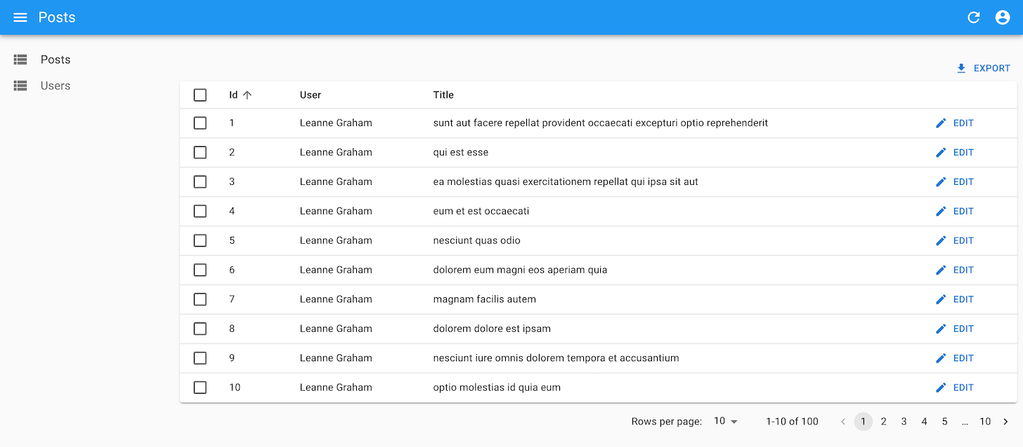
You can find more advanced examples of <Datagrid> usage in the demos.
The <Datagrid> is an iterator component: it gets an array of records from the ListContext, and iterates to display each record in a row. Other examples of iterator component are <SimpleList> and <SingleFieldList>.
Tip: If you need more Datagrid features, check out these two alternative components:
<EditableDatagrid> lets users edit the content right in the datagrid
<DatagridAG> adds suport for column reordering, aggregation, pivoting, row grouping, infinite scroll, etc.
Both are Enterprise Edition components.
Props
| Prop | Required | Type | Default | Description |
|---|---|---|---|---|
children |
Required | ReactNode |
n/a | The list of <Field> components to render as columns. |
body |
Optional | ReactNode |
<Datagrid Body> |
The component used to render the body of the table. |
bulkActionButtons |
Optional | ReactNode |
<BulkDelete Button> |
The component used to render the bulk action buttons. |
empty |
Optional | ReactNode |
<Empty> |
The component used to render the empty table. |
expand |
Optional | ReactNode |
The component used to render the expand panel for each row. | |
expandSingle |
Optional | Boolean | false |
Whether to allow only one expanded row at a time. |
header |
Optional | ReactNode |
<Datagrid Header> |
The component used to render the table header. |
hover |
Optional | Boolean | true |
Whether to highlight the row under the mouse. |
isRowExpandable |
Optional | Function | () => true |
A function that returns whether a row is expandable. |
isRowSelectable |
Optional | Function | () => true |
A function that returns whether a row is selectable. |
optimized |
Optional | Boolean | false |
Whether to optimize the rendering of the table. |
rowClick |
Optional | mixed | The action to trigger when the user clicks on a row. | |
rowStyle |
Optional | Function | A function that returns the style to apply to a row. | |
rowSx |
Optional | Function | A function that returns the sx prop to apply to a row. | |
size |
Optional | 'small' or 'medium' |
'small' |
The size of the table. |
sx |
Optional | Object | The sx prop passed down to the Material UI <Table> element. |
Additional props are passed down to the Material UI <Table> element.
body
By default, <Datagrid> renders its body using <DatagridBody>, an internal react-admin component. You can pass a custom component as the body prop to override that default. And by the way, <DatagridBody> has a row prop set to <DatagridRow> by default for the same purpose. <DatagridRow> receives the row record, the resource, and a copy of the <Datagrid> children. That means you can create custom <Datagrid> logic without copying several components from the react-admin source.
For instance, the <Datagrid isRowSelectable> prop allows to disable the selection checkbox for some records. To hide checkboxes instead of disabling them, you can override <DatagridRow> and <DatagridBody> as follows:
// in src/PostList.tsx
import * as React from "react";
import {
    Datagrid,
    DatagridBody,
    List,
    TextField,
    RecordContextProvider,
    DatagridRowProps,
    DatagridBodyProps,
    DatagridProps,
    FieldProps,
} from "react-admin";
import { TableCell, TableRow, Checkbox } from "@mui/material";

const MyDatagridRow = ({
    onToggleItem,
    children,
    selected,
    selectable,
}: DatagridRowProps) => {
    const record = useRecordContext();
    return record ? (
        <TableRow>
            {/* first column: selection checkbox */}
            <TableCell padding="none">
                {selectable && (
                    <Checkbox
                        checked={selected}
                        onClick={event => {
                            if (onToggleItem) {
                                onToggleItem(record.id, event);
                            }
                        }}
                    />
                )}
            </TableCell>
            {/* data columns based on children */}
            {React.Children.map(children, field =>
                React.isValidElement<FieldProps>(field) &&
                field.props.source ? (
                    <TableCell key={`${record.id}-${field.props.source}`}>
                        {field}
                    </TableCell>
                ) : null
            )}
        </TableRow>
    ) : null;
};

const MyDatagridBody = (props: DatagridBodyProps) => (
    <DatagridBody {...props} row={<MyDatagridRow />} />
);
const MyDatagrid = (props: DatagridProps) => (
    <Datagrid {...props} body={<MyDatagridBody />} />
);

const PostList = () => (
    <List>
        <MyDatagrid>
            <TextField source="title" />
            ...
        </MyDatagrid>
    </List>
);

export default PostList;
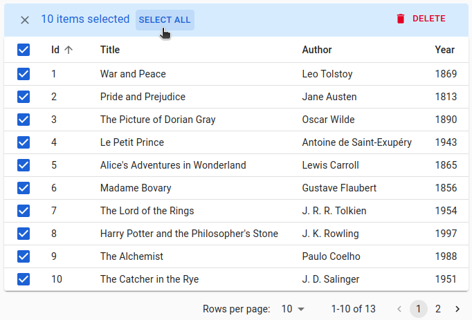
bulkActionButtons
Bulk action buttons appear when users select one or several rows. Clicking on a bulk action button affects all the selected records. This is useful for actions like mass deletion or mass edition.
You disable this feature by setting the bulkActionButtons prop to false:
import { Datagrid, List } from 'react-admin';

export const PostList = () => (
    <List>
        <Datagrid bulkActionButtons={false}>
            ...
        </Datagrid>
    </List>
);
By default, all Datagrids have a single bulk action button, the bulk delete button. You can add other bulk action buttons by passing a custom element as the bulkActionButtons prop of the <Datagrid> component:
import { List, Datagrid, BulkUpdateButton, BulkDeleteButton, BulkExportButton } from 'react-admin';
import { VisibilityOff } from '@mui/icons-material';

const PostBulkActionButtons = () => (
    <>
        <BulkUpdateButton label="Reset Views" data={{ views: 0 }} icon={<VisibilityOff/>} />
        <BulkDeleteButton />
        <BulkExportButton />
    </>
);

export const PostList = () => (
    <List>
        <Datagrid bulkActionButtons={<PostBulkActionButtons />}>
            ...
        </Datagrid>
    </List>
);
React-admin provides four components that you can use in bulkActionButtons:
<BulkDeleteButton>(enabled by default)<BulkExportButton>to export only the selection<BulkUpdateButton>to immediately update the selection<BulkUpdateFormButton>to display a form allowing to update the selection
Tip: Users can select a range of rows by pressing the shift key while clicking on a row checkbox.
Tip: When users select all the records of the current page using the “select all” checkbox in the header, the bulk actions toolbar shows a “Select All” button to let them select all the recorfds regardless of pagination.
You can write a custom bulk action button components using the useListContext hook to get the following data and callbacks:
selectedIds: the identifiers of the currently selected items.onUnselectItems: a callback to empty the selection.resource: the currently displayed resource (egposts,comments, etc.)filterValues: the filter values. This can be useful if you want to apply your action on all items matching the filter.
Here is an example leveraging the useUpdateMany hook, which sets the views property of all posts to 0:
// in ./CustomResetViewsButton.tsx
import {
    useListContext,
    useUpdateMany,
    useRefresh,
    useNotify,
    useUnselectAll,
    Button,
} from 'react-admin';
import { VisibilityOff } from '@mui/icons-material';

const CustomResetViewsButton = () => {
    const { selectedIds } = useListContext();
    const refresh = useRefresh();
    const notify = useNotify();
    const unselectAll = useUnselectAll('posts');
    const [updateMany, { isPending }] = useUpdateMany();
    const handleClick = () => {
        updateMany(
            'posts',
            { ids: selectedIds, data: { views: 0 } },
            {
                onSuccess: () => {
                    notify('Posts updated');
                    unselectAll();
                },
                onError: () => {
                    notify('Error: posts not updated', { type: 'error' });
                    refresh();
                },
            }
        );
    }

    return (
        <Button label="Reset views" onClick={handleClick} disabled={isPending}>
            <VisibilityOff />
        </Button>
    );
};
But most of the time, bulk actions are mini-applications with a standalone user interface (in a Dialog). Here is the same <CustomResetViewsAction> implemented behind a confirmation dialog:
// in ./CustomResetViewsButton.tsx
import { useState } from 'react';
import {
    Button,
    Confirm,
    useListContext,
    useUpdateMany,
    useNotify,
    useRefresh,
    useUnselectAll,
} from 'react-admin';

const CustomResetViewsButton = () => {
    const { selectedIds } = useListContext();
    const [open, setOpen] = useState(false);
    const refresh = useRefresh();
    const notify = useNotify();
    const unselectAll = useUnselectAll('posts');
    const [updateMany, { isPending }] = useUpdateMany(
        'posts',
        { ids: selectedIds, data: { views: 0 } },
        {
            onSuccess: () => {
                notify('Posts updated');
                unselectAll();
            },
            onError: error => {
                notify('Error: posts not updated', { type: 'error' });
                refresh();
            },
        }
    );
    const handleClick = () => setOpen(true);
    const handleDialogClose = () => setOpen(false);

    const handleConfirm = () => {
        updateMany();
        setOpen(false);
    };

    return (
        <>
            <Button label="Reset Views" onClick={handleClick} />
            <Confirm
                isOpen={open}
                loading={isPending}
                title="Update View Count"
                content="Are you sure you want to reset the views for these items?"
                onConfirm={handleConfirm}
                onClose={handleDialogClose}
            />
        </>
    );
};

export default CustomResetViewsButton;
Tip: <Confirm> leverages Material UI’s <Dialog> component to implement a confirmation popup. Feel free to use it in your admins!
Tip: <Confirm> text props such as title and content are translatable. You can pass translation keys in these props. Note: content is only translatable when value is string, otherwise it renders the content as a ReactNode.
Tip: You can customize the text of the two <Confirm> component buttons using the cancel and confirm props which accept translation keys. You can customize the icons by setting the ConfirmIcon and CancelIcon props, which accept a SvgIcon type.
Tip: React-admin doesn’t use the <Confirm> component internally, because deletes and updates are applied locally immediately, then dispatched to the server after a few seconds, unless the user chooses to undo the modification. That’s what we call optimistic rendering. You can do the same for the <ResetViewsButton> by setting undoable: true in the last argument of useUpdateMany(), as follows:
// in ./CustomResetViewsButton.js
import * as React from "react";
import {
    Button,
-   Confirm,
    useListContext,
    useUpdateMany,
-   useRefresh,
    useNotify,
    useUnselectAll,
} from 'react-admin';
import { VisibilityOff } from '@mui/icons-material';

const CustomResetViewsButton = () => {
    const { selectedIds } = useListContext();
-   const refresh = useRefresh();
    const notify = useNotify();
    const unselectAll = useUnselectAll('posts');
    const [updateMany, { isPending }] = useUpdateMany(
        'posts',
        { ids: selectedIds, data: { views: 0 } },
        {
            onSuccess: () => {
-               refresh();
-               notify('Posts updated');
+               notify('Posts updated', { undoable: true }); // the last argument forces the display of 'undo' in the notification
                unselectAll();
            },
            onError: error => notify('Error: posts not updated', { type: 'error' }),
+           mutationMode: 'undoable'
        }
    );

    return (
        <Button
            label="simple.action.resetViews"
            disabled={isPending}
            onClick={updateMany}
        >
            <VisibilityOff />
        </Button>
    );
};
children
<Datagrid> accepts a list of Field components as children. It inspects each child’s source and/or label props to determine the name of the column.
What’s a Field component? Simply a component that reads the record (via useRecordContext) and renders a value. React-admin includes many Field components that you can use as children of <Datagrid> (<TextField>, <NumberField>, <DateField>, <ReferenceField>, and many more). Check the Fields documentation for more information.
You can even create your own field components.
// in src/users.tsx
import * as React from 'react';
import { useRecordContext, List, Datagrid, TextField, DateField } from 'react-admin';

const FullNameField = () => {
    const record = useRecordContext();
    return <span>{record.firstName} {record.lastName}</span>;
}

export const UserList = () => (
    <List>
        <Datagrid>
            <FullNameField source="last_name" label="Name" />
            <DateField source="dob" />
            <TextField source="city" />
        </Datagrid>
    </List>
);
<Datagrid> also inspects its children for headerClassName and cellClassName props, and gives the class names to the headers and the cells of that column.
Finally, <Datagrid> inspects children for props that indicate how it should be sorted (see the Customizing The Sort Order For Columns section) below.
empty
It’s possible that a Datagrid will have no records to display. If the Datagrid’s parent component does not handle the empty state, the Datagrid will display a message indicating there are no results. This message is translatable and its key is ra.navigation.no_results.
You can customize the empty state by passing a component to the empty prop:
const CustomEmpty = () => <div>No books found</div>;

const PostList = () => (
    <List>
        <Datagrid empty={<CustomEmpty />}>
            <TextField source="id" />
            <TextField source="title" />
            <TextField source="views" />
        </Datagrid>
    </List>
);
expand
To show more data from the resource without adding too many columns, you can show data in an expandable panel below the row on demand, using the expand prop.
For instance, this code shows the body of a post in an expandable panel:
import { useRecordContext } from 'react-admin';

const PostPanel = () => {
    const record = useRecordContext();
    return (
        <div dangerouslySetInnerHTML={{ __html: record.body }} />
    );
};

const PostList = () => (
    <List>
        <Datagrid expand={<PostPanel />}>
            <TextField source="id" />
            <TextField source="title" />
            <DateField source="published_at" />
            <BooleanField source="commentable" />
            <EditButton />
        </Datagrid>
    </List>
)
The expand prop expects a React element as value. When the user chooses to expand the row, the Datagrid renders the component inside a RecordContext.
Tip: You can actually use a Show Layout component for the expand prop:
const PostShow = () => (
    <SimpleShowLayout>
        <RichTextField source="body" />
    </SimpleShowLayout>
);

const PostList = () => (
    <List>
        <Datagrid expand={<PostShow />}>
            <TextField source="id" />
            <TextField source="title" />
            <DateField source="published_at" />
            <BooleanField source="commentable" />
            <EditButton />
        </Datagrid>
    </List>
)
Tip: You can go one step further and use an <Edit> view as expand component:
const PostEdit = () => {
    const record = useRecordContext();
    const resource = useResourceContext();
    return (
        <Edit
            resource={resource}
            id={record.id}
            /* disable the app title change when shown */
            title=" "
        >
            <SimpleForm>
                <RichTextInput source="body" />
            </SimpleForm>
        </Edit>
    );
};

const PostList = () => (
    <List>
        <Datagrid expand={<PostEdit />}>
            <TextField source="id" />
            <TextField source="title" />
            <DateField source="published_at" />
            <BooleanField source="commentable" />
            <EditButton />
        </Datagrid>
    </List>
)
expandSingle
By default, when using an expand panel, users can expand as many rows as they want. The expandSingle prop changes that behavior: when a user clicks on the expand button of a row, other expanded rows collapse. As a consequence, only a single row can be expanded at a time.
export const PostList = () => (
    <List>
        <Datagrid expand={<PostPanel />} expandSingle>
            ...
        </Datagrid>
    </List>
);
header
By default, <Datagrid> renders the table head using <DatagridHeader>, an internal react-admin component. You can pass a custom component as the header prop to override that default. This can be useful e.g. to add a second header row, or to create headers spanning multiple columns.
For instance, here is a simple datagrid header that displays column names with no sort and no “select all” button:
import * as React from "react";
import { TableHead, TableRow, TableCell } from "@mui/material";
import { DatagridHeaderProps, FieldProps, List, Datagrid } from "react-admin";

const DatagridHeader = ({ children }: DatagridHeaderProps) => (
    <TableHead>
        <TableRow>
            <TableCell></TableCell>
            {/* empty cell to account for the select row checkbox in the body */}
            {React.Children.map(children, (child) =>
                React.isValidElement<FieldProps>(child) ? (
                    <TableCell key={child.props.source}>{child.props.source}</TableCell>
                ) : null
            )}
        </TableRow>
    </TableHead>
);

const PostList = () => (
    <List>
        <Datagrid header={<DatagridHeader />}>{/* ... */}</Datagrid>
    </List>
);
Tip: To handle sorting in your custom Datagrid header component, check out the Building a custom sort control section.
hover
By default, the rows of the datagrid are highlighted when the user hovers over them. To disable this behavior, set the hover prop to false.
const PostList = () => (
    <List>
        <Datagrid hover={false}>
            <TextField source="id" />
            <TextField source="title" />
            <TextField source="views" />
        </Datagrid>
    </List>
);
isRowExpandable
You can customize which rows can have an expandable panel by using the isRowExpandable prop. It expects a function that receives the row record and returns a boolean.
For instance, this code shows an expand button only for rows that have a detail to show:
import { List, Datagrid, EditButton, BooleanField, DateField, TextField, useRecordContext } from 'react-admin';

const PostPanel = () => {
    const record = useRecordContext();
    return (
        <div dangerouslySetInnerHTML={{ __html: record.body }} />
    );
};

const PostList = () => (
    <List>
        <Datagrid
            expand={<PostPanel />}
            isRowExpandable={row => row.has_detail}
        >
            <TextField source="id" />
            <TextField source="title" />
            <DateField source="published_at" />
            <BooleanField source="commentable" />
            <EditButton />
        </Datagrid>
    </List>
)
isRowSelectable
You can customize which rows show an enabled selection checkbox using the isRowSelectable prop. It expects a function that receives the row record and returns a boolean.
For instance, this code enables a checkbox only for rows with an id greater than 300:
import { List, Datagrid } from 'react-admin';

export const PostList = () => (
    <List>
        <Datagrid isRowSelectable={ record => record.id > 300 }>
            ...
        </Datagrid>
    </List>
);
optimized
When displaying large pages of data, you might experience some performance issues.
This is mostly due to the fact that we iterate over the <Datagrid> children and clone them.
In such cases, you can opt-in for an optimized version of the <Datagrid> by setting its optimized prop to true.
Be aware that you can’t have dynamic children, such as those displayed or hidden by checking permissions, when using this mode.
import { List, Datagrid, TextField } from 'react-admin';

const PostList = () => (
    <List>
        <Datagrid optimized>
            <TextField source="id" />
            <TextField source="title" />
            <TextField source="views" />
        </Datagrid>
    </List>
);
rowClick
By default, <Datagrid> will look at the current resource definition to determine what to do when the user clicks on a row. If the resource has a show page, it will redirect to the Show view. If the resource has an edit page, it will redirect to the Edit view. Otherwise, the row will not be clickable.
Note that if your authProvider implements the canAccess method and you don’t provide the rowClick prop, React-Admin will also verify whether users have access to the Show and Edit views. For instance, given the following Datagrid:
import { List, Datagrid } from 'react-admin';

export const PostList = () => (
    <List>
        <Datagrid>
            ...
        </Datagrid>
    </List>
);
React-Admin will call canAccess with the following parameters for each record:
- If the
postsresource has a Show view:{ action: "show", resource: 'posts', record: Object } - If the
postsresource has an Edit view:{ action: "edit", resource: 'posts', record: Object }
You can choose what happens when the user clicks on a row by setting the rowClick prop. For instance, set the rowClick prop to "edit" to redirect to the Edit view:
import { List, Datagrid } from 'react-admin';

export const PostList = () => (
    <List>
        <Datagrid rowClick="edit">
            ...
        </Datagrid>
    </List>
);
rowClick accepts the following values:
"edit"to redirect to the edition view"show"to redirect to the show view"expand"to open theexpandpanel"toggleSelection"to trigger theonToggleItemfunctionfalseto do nothing- a function
(id, resource, record) => paththat may return any of the above values or a custom path
Tip: If you pass a function, it can return 'edit', 'show', false or a router path. This allows to redirect to either the Edit or Show view after checking a condition on the record. For example:
import { Identifier, RaRecord } from 'react-admin';
const postRowClick = (id: Identifier, resource: string, record: RaRecord) => record.editable ? 'edit' : 'show';
Tip: If you pass a function, it can also return a promise allowing you to check an external API before returning a path. For example:
import { Identifier, RaRecord } from 'react-admin';
import fetchUserRights from './fetchUserRights';

const getPermissions = useGetPermissions();
const postRowClick = (id: Identifier, resource: string, record: RaRecord) =>
    useGetPermissions()
    .then(permissions => permissions === 'admin' ? 'edit' : 'show');
rowStyle
Deprecated - use rowSx instead.
You can customize the <Datagrid> row style (applied to the <tr> element) based on the record, thanks to the rowStyle prop, which expects a function. React-admin calls this function for each row, passing the current record and index as arguments. The function should return a style object, which react-admin uses as a <tr style> prop.
For instance, this allows to apply a custom background to the entire row if one value of the record - like its number of views - passes a certain threshold.
import { List, Datagrid } from 'react-admin';

const postRowStyle = (record, index) => ({
    backgroundColor: record.nb_views >= 500 ? '#efe' : 'white',
});
export const PostList = () => (
    <List>
        <Datagrid rowStyle={postRowStyle}>
            ...
        </Datagrid>
    </List>
);
rowSx
You can customize the styles of rows and cells in <Datagrid> (applied to the <DatagridRow> element) based on the record, thanks to the rowSx prop, which expects a function. React-admin calls this function for each row, passing the current record and index as arguments. The function should return a Material UI sx, which react-admin uses as a <TableRow sx> prop.
For instance, this allows to apply a custom background to the entire row if one value of the record - like its number of views - passes a certain threshold.
import { List, Datagrid } from 'react-admin';

const postRowSx = (record, index) => ({
    backgroundColor: record.nb_views >= 500 ? '#efe' : 'white',
});
export const PostList = () => (
    <List>
        <Datagrid rowSx={postRowSx}>
            ...
        </Datagrid>
    </List>
);
size
The <Datagrid> is designed for a high density of content, so the row padding is low. If you want to add more margin to each cell, set the size prop to medium.
export const PostList = () => (
    <List>
        <Datagrid size="medium">
            ...
        </Datagrid>
    </List>
);
Tip: size is actually a prop of the Material UI <Table> component. Just like all additional <Datagrid> props, it is passed down to the <Table> component.
sx: CSS API
The <Datagrid> component accepts the usual className prop. You can also override many styles of the inner components thanks to the sx property (see the sx documentation for syntax and examples).
This property accepts the following subclasses:
| Rule name | Description |
|---|---|
& .RaDatagrid-root |
Applied to the root div element |
& .RaDatagrid-tableWrapper |
Applied to the div that wraps table element |
& .RaDatagrid-table |
Applied to the table element |
& .RaDatagrid-thead |
Applied to the table header |
& .RaDatagrid-tbody |
Applied to the table body |
& .RaDatagrid-headerCell |
Applied to each header cell |
& .RaDatagrid-headerRow |
Applied to each header row |
& .RaDatagrid-row |
Applied to each row |
& .RaDatagrid-rowEven |
Applied to each even row |
& .RaDatagrid-rowOdd |
Applied to each odd row |
& .RaDatagrid-rowCell |
Applied to each row cell |
& .RaDatagrid-selectable |
Applied to each selectable row |
& .RaDatagrid-expandHeader |
Applied to each expandable header cell |
& .RaDatagrid-clickableRow |
Applied to each row if rowClick prop is truthy |
& .RaDatagrid-expandIconCell |
Applied to each expandable cell |
& .RaDatagrid-expandIcon |
Applied to each expand icon |
& .RaDatagrid-expandable |
Applied to each expandable row |
& .RaDatagrid-expanded |
Applied to each expanded icon |
& .RaDatagrid-expandedPanel |
Applied to each expandable panel |
& .RaDatagrid-checkbox |
Applied to each checkbox cell |
For instance, here is how you can leverage these styles to implement zebra stripes (a.k.a. alternate row styles)
const PostList = () => (
    <List>
        <Datagrid
            sx={{
                '& .RaDatagrid-rowOdd': {
                    backgroundColor: '#fee',
                },
            }}
        >
            <TextField source="id" />
            <TextField source="title" />
            <TextField source="author" />
            <TextField source="year" />
        </Datagrid>
    </List>
);
Tip: The Datagrid component classes can also be customized for all instances of the component with its global css name "RaDatagrid" as describe here
Header Pinning
<Datagrid> has sticky headers, which means that the header row will remain visible even when scrolling down the page.
You don’t need to do anything for this to work, as it’s enabled by default.
Configurable
You can let end users customize the fields displayed in the <Datagrid> by using the <DatagridConfigurable> component instead.
import {
    List,
-   Datagrid,
+   DatagridConfigurable,
    TextField,
} from 'react-admin';

const PostList = () => (
    <List>
-       <Datagrid>
+       <DatagridConfigurable>
            <TextField source="id" />
            <TextField source="title" />
            <TextField source="author" />
            <TextField source="year" />
-       </Datagrid>
+       </DatagridConfigurable>
    </List>
);
When users enter the configuration mode and select the <Datagrid>, they can show / hide datagrid columns. They can also use the <SelectColumnsButton>
By default, <DatagridConfigurable> renders all child fields. But you can also omit some of them by passing an omit prop containing an array of field sources:
// by default, hide the id and author columns
// users can choose to show them in configuration mode
const PostList = () => (
    <List>
        <DatagridConfigurable omit={['id', 'author']}>
            <TextField source="id" />
            <TextField source="title" />
            <TextField source="author" />
            <TextField source="year" />
        </DatagridConfigurable>
    </List>
);
If you render more than one <DatagridConfigurable> in the same page, you must pass a unique preferenceKey prop to each one:
const PostList = () => (
    <List>
        <DatagridConfigurable preferenceKey="posts.datagrid">
            <TextField source="id" />
            <TextField source="title" />
            <TextField source="author" />
            <TextField source="year" />
        </DatagridConfigurable>
    </List>
);
If you include a <SelectColumnsButton> in a page that has more than one <DatagridConfigurable>, you have to link the two components by giving them the same preferenceKey:
const PostListActions = () => (
    <TopToolbar>
        <SelectColumnsButton preferenceKey="posts.datagrid" />
    </TopToolbar>
);

const PostList = () => (
    <List actions={<PostListActions />}>
        <DatagridConfigurable preferenceKey="posts.datagrid">
            <TextField source="id" />
            <TextField source="title" />
            <TextField source="author" />
            <TextField source="year" />
        </DatagridConfigurable>
    </List>
);
The inspector uses the field source (or label when it’s a string) to display the column name. If you use non-field children (e.g. action buttons), then it’s your responsibility to wrap them in a component with a label prop, that will be used by the inspector. You can use a <WrapperField> for that purpose:
const PostList = () => (
    <List>
        <DatagridConfigurable>
            <TextField source="id" />
            <TextField source="title" />
            <TextField source="author" />
            <TextField source="year" />
            <WrapperField label="Actions">
                <EditButton />
            </WrapperField>
        </DatagridConfigurable>
    </List>
);
Tip: You may need to clear your local storage to reflect the changes, as react-admin saves the computed column names in the Store. For the same reason, your users may need to log out and in again to see the changes. Alternatively, you can leverage Store Invalidation to do it automatically.
<DatagridConfigurable> accepts the same props as <Datagrid>.
Tip: For even more column customization (resizable columns, column grouping, etc.), check out the <DatagridAG> component.
Editable Spreadsheet
The separation between list pages and edit pages is not always relevant. Sometimes, you want to let users edit records directly in the list page. React-admin provides two alternative components to edit records in a Datagrid:
<EditableDatagrid>leverages the react-admin input components to turn a row into an editable form.<DatagridAG>provides a spreadsheet-like interface, “à la” Excel, using the ag-Grid library.
<EditableDatagrid>: Editable Rows
<EditableDatagrid> is a drop-in replacement for <Datagrid>. It expects 2 additional props: createForm and editForm, the components to be displayed when a user creates or edits a row. The <RowForm> component allows to create such forms using react-admin Input components.
import {
    List,
    ListActions,
    TextField,
    TextInput,
    DateField,
    DateInput,
    SelectField,
    SelectInput,
    required,
} from 'react-admin';
import { EditableDatagrid, RowForm } from '@react-admin/ra-editable-datagrid';

const professionChoices = [
    { id: 'actor', name: 'Actor' },
    { id: 'singer', name: 'Singer' },
    { id: 'other', name: 'Other' },
];

const ArtistList = () => (
    <List actions={<ListActions hasCreate />} empty={false}>
        <EditableDatagrid
            mutationMode="undoable"
            createForm={<ArtistForm />}
            editForm={<ArtistForm />}
        >
            <TextField source="id" />
            <TextField source="firstname" />
            <TextField source="name" />
            <DateField source="dob" label="born" />
            <SelectField
                source="prof"
                label="Profession"
                choices={professionChoices}
            />
        </EditableDatagrid>
    </List>
);

const ArtistForm = () => (
    <RowForm>
        <TextField source="id" />
        <TextInput source="firstname" validate={required()} />
        <TextInput source="name" validate={required()} />
        <DateInput source="dob" label="born" validate={required()} />
        <SelectInput
            source="prof"
            label="Profession"
            choices={professionChoices}
        />
    </RowForm>
);
Check the <EditableDatagrid> documentation for more details.
<DatagridAG>: Spreadsheet-like Interface
<DatagridAG> is an advanced Datagrid component based on ag-grid. Here is a (non-exhaustive) list of features that <DatagridAG> offers:
- In place editing of cells or rows
- Advanced filtering
- Columns resizing and reordering
- Automatic page size
- Automatic column size
- Themes
- Row selection and bulk actions
- Compatibility with React Admin fields
Additionally, <DatagridAG> is compatible with the Enterprise version of ag-grid, which offers even more features:
- Row Grouping
- Aggregation
- Tree Data
- Pivoting
- More advanced filtering
- Master Detail views
- Range Selection
- Excel Export
- And more…
Check the <DatagridAG> documentation for more details.
Standalone Usage
You can use the <Datagrid> component to display data that you’ve fetched yourself. You’ll need to pass all the props required for its features:
import { useGetList, Datagrid, TextField } from 'react-admin';

const sort = { field: 'id', order: 'DESC' };

const MyCustomList = () => {
    const { data, total, isPending } = useGetList('books', {
        pagination: { page: 1, perPage: 10 },
        sort,
    });

    return (
        <Datagrid
            resource="books"
            data={data}
            total={total}
            isPending={isPending}
            sort={sort}
            bulkActionButtons={false}
        >
            <TextField source="id" />
            <TextField source="title" />
        </Datagrid>
    );
};
This list has no filtering, sorting, or row selection - it’s static. If you want to allow users to interact with the <Datagrid>, use the useList hook to build callbacks to manipulate local data. You will have to put the result in a <ListContextProvider> parent component:
import {
    useGetList,
    useList,
    ListContextProvider,
    Datagrid,
    TextField
} from 'react-admin';

const sort = { field: 'id', order: 'DESC' };

const MyCustomList = () => {
    const { data, isPending } = useGetList('books', {
        pagination: { page: 1, perPage: 10 },
        sort,
    });
    const listContext = useList({ data, isPending });

    return (
        <ListContextProvider value={listContext}>
            <Datagrid>
                <TextField source="id" />
                <TextField source="title" />
            </Datagrid>
        </ListContextProvider>
    );
};
Styling Specific Columns
If you want to style a particular column, you can take advantage of the generated class names per column. For instance, for a column formed for a <TextField source="title" /> both the column header and the cells will have the class column-title.
Using the sx prop, the column customization is just one line:
import { List, Datagrid, TextField } from 'react-admin';

const PostList = () => (
    <List>
        <Datagrid
            sx={{
                '& .column-title': { backgroundColor: '#fee' },
            }}
        >
            <TextField source="id" />
            <TextField source="title" /> {/* will have different background */}
            <TextField source="author" />
            <TextField source="year" />
        </Datagrid>
    </List>
);
You can even style the header cells differently by passing a more specific CSS selector (e.g. & tr.column-title).
A common practice is to hide certain columns on smaller screens. You can use the same technique:
import { List, Datagrid, TextField } from 'react-admin';

const PostList = () => (
    <List>
        <Datagrid
            sx={{
                '& .column-title': {
                    sm: { display: 'none' },
                    md: { display: 'table-cell' },
                },
            }}
        >
            <TextField source="id" />
            <TextField source="title" />
            <TextField source="author" />
            <TextField source="year" />
        </Datagrid>
    </List>
);
Showing / Hiding Columns
The <SelectColumnsButton> component lets users hide, show, and reorder datagrid columns.
import {
    DatagridConfigurable,
    List,
    SelectColumnsButton,
    FilterButton,
    CreateButton,
    ExportButton,
    TextField,
    TopToolbar,
} from "react-admin";

const PostListActions = () => (
    <TopToolbar>
        <SelectColumnsButton />
        <FilterButton />
        <CreateButton />
        <ExportButton />
    </TopToolbar>
);

const PostList = () => (
    <List actions={<PostListActions />}>
        <DatagridConfigurable>
            <TextField source="id" />
            <TextField source="title" />
            <TextField source="author" />
            <TextField source="year" />
        </DatagridConfigurable>
    </List>
);
<SelectColumnsButton> must be used in conjunction with <DatagridConfigurable>, the configurable version of <Datagrid>, described in the next section.
Tip: For even more column customization (resizable columns, column grouping, etc.), check out the <DatagridAG> component.
Hiding Checkboxes
You can hide the checkbox column by passing false to the bulkActionButtons prop:
import { Datagrid, List } from 'react-admin';

export const PostList = () => (
    <List>
        <Datagrid bulkActionButtons={false}>
            ...
        </Datagrid>
    </List>
);
Customizing Column Sort
The column headers are buttons allowing users to change the list sort field and order. This feature requires no configuration and works out fo the box. The next sections explain how you can disable or modify the field used for sorting on a particular column.
Disabling Sorting
It is possible to disable sorting for a specific <Field> by passing a sortable property set to false:
// in src/posts.tsx
import { List, Datagrid, TextField } from 'react-admin';

export const PostList = () => (
    <List>
        <Datagrid>
            <TextField source="id" sortable={false} />
            <TextField source="title" />
            <TextField source="body" />
        </Datagrid>
    </List>
);
Specifying A Sort Field
By default, a column is sorted by the source property. To define another attribute to sort by, set it via the <Field sortBy> property:
// in src/posts.tsx
import { List, Datagrid, FunctionField, ReferenceField, TextField } from 'react-admin';

export const PostList = () => (
    <List>
        <Datagrid>
            <ReferenceField label="Post" source="id" reference="posts" sortBy="title">
                <TextField source="title" />
            </ReferenceField>
            <FunctionField
                label="Author"
                sortBy="last_name"
                render={record => `${record.author.first_name} ${record.author.last_name}`}
            />
            <TextField source="body" />
        </Datagrid>
    </List>
);
Specifying The Sort Order
By default, when the user clicks on a column header, the list becomes sorted in the ascending order. You change this behavior by setting the sortByOrder prop to "DESC" in a <Datagrid> <Field>:
// in src/posts.tsx
import { List, Datagrid, FunctionField, ReferenceField, TextField } from 'react-admin';

export const PostList = () => (
    <List>
        <Datagrid>
            <ReferenceField label="Post" source="id" reference="posts" sortByOrder="DESC">
                <TextField source="title" />
            </ReferenceField>
            <FunctionField
                label="Author"
                sortBy="last_name"
                sortByOrder="DESC"
                render={record => `${record.author.first_name} ${record.author.last_name}`}
            />
            <TextField source="body" />
        </Datagrid>
    </List>
);
Access Control
If you need to hide some columns based on a set of permissions, use the <Datagrid> component from the @react-admin/ra-rbac package.
-import { Datagrid } from 'react-admin';
+import { Datagrid } from '@react-admin/ra-rbac';
This component adds the following RBAC controls:
- Users must have the
'read'permission on a resource column to see it in the export:
{ action: "read", resource: `${resource}.${source}` }.
// or
{ action: "read", resource: `${resource}.*` }.
-
Users must have the
'delete'permission on the resource to see the<BulkExportButton>. -
The default
rowClickdepends on the user permissions:"edit"if the user can access the current resource with theeditaction"show"if the user can access the current resource with theshowaction- empty otherwise
Here is an example of <Datagrid> with RBAC:
import { canAccessWithPermissions, List, Datagrid } from '@react-admin/ra-rbac';
import {
    ImageField,
    TextField,
    ReferenceField,
    NumberField,
} from 'react-admin';

const authProvider = {
    // ...
    canAccess: async ({ action, record, resource }) =>
        canAccessWithPermissions({
            permissions: [
                { action: 'list', resource: 'products' },
                { action: 'read', resource: 'products.thumbnail' },
                { action: 'read', resource: 'products.reference' },
                { action: 'read', resource: 'products.category_id' },
                { action: 'read', resource: 'products.width' },
                { action: 'read', resource: 'products.height' },
                { action: 'read', resource: 'products.price' },
                { action: 'read', resource: 'products.description' },
                // { action: 'read', resource: 'products.stock' },
                // { action: 'read', resource: 'products.sales' },
                // { action: 'delete', resource: 'products' },
                { action: 'show', resource: 'products' },
            ],
            action,
            record,
            resource
        }),
};

const ProductList = () => (
    <List>
        {/* The datagrid has no bulk actions as the user doesn't have the 'delete' permission */}
        <Datagrid>
            <ImageField source="thumbnail" />
            <TextField source="reference" />
            <ReferenceField source="category_id" reference="categories">
                <TextField source="name" />
            </ReferenceField>
            <NumberField source="width" />
            <NumberField source="height" />
            <NumberField source="price" />
            <TextField source="description" />
            {/** These two columns are not visible to the user **/}
            <NumberField source="stock" />
            <NumberField source="sales" />
        </Datagrid>
    </List>
);
Tip: Adding the ‘read’ permission on the resource itself doesn’t grant the ‘read’ permission on the columns. If you want a user to see all possible columns, add the ‘read’ permission on columns using a wildcard:
{ action: "read", resource: "products.*" }.
Fow simple cases, you can also use the useCanAccess hook to check whether users have access to a field:
import { List, Datagrid, TextField, TextInput, ShowButton, useCanAccess } from 'react-admin';

const getUserFilters = (canAccessRole) => ([
    <TextInput label="user.list.search" source="q" alwaysOn />,
    <TextInput source="name" />,
    canAccessRole ? <TextInput source="role" /> : null,
    ].filter(filter => filter !== null)
);

export const UserList = ({ permissions, ...props }) => {
    const { canAccess, error, isPending } = useCanAccess({
        resource: 'users.role',
        action: 'read'
    });
    return (
        <List
            {...props}
            filters={getUserFilters(canAccess)}
            sort={{ field: 'name', order: 'ASC' }}
        >
            <Datagrid>
                <TextField source="id" />
                <TextField source="name" />
                {canAccess ? <TextField source="role" /> : null}
                <EditButton />
                <ShowButton />
            </Datagrid>
        </List>
    )
};
Note how the canAccess value is passed down to the custom filters component to allow Filter customization, too.