Admin-on-rest Becomes React-admin, and Gets a Major 2.0 Release

We’ve announced the upcoming renaming of admin-on-rest to react-admin in the past. Today, I have the pleasure to announce the immediate release of react-admin 2.0, a deep refactoring of admin-on-rest, bringing tons of new features, easier development, and better performance. There is a lot to say about this release, so let’s start right away.
Tip: Here is the upgrade guide for your admin-on-rest application, if you’re already convinced to make the version jump.
Vimeo might track you and we would rather have your consent before loading this video.
Material-ui 1.0: Better Design
If you’re an admin-on-rest user, you were probably expecting this one. React-admin follows the Material Design UI guidelines, thanks to material-ui, the best React UI Kit to date. Material-ui was rewritten from the ground up, and the new version, material-ui 1.0, is not backward compatible with the previous ones.
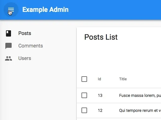
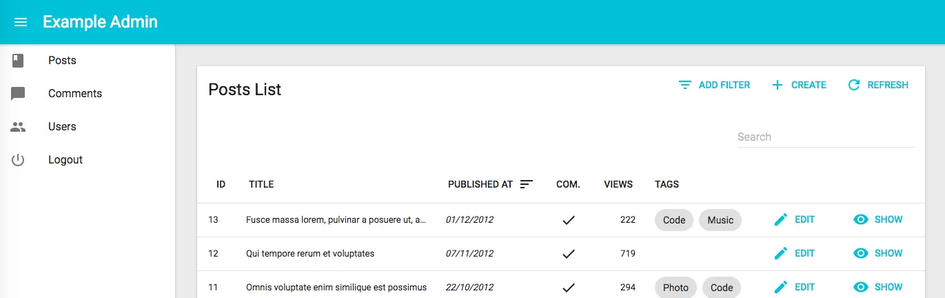
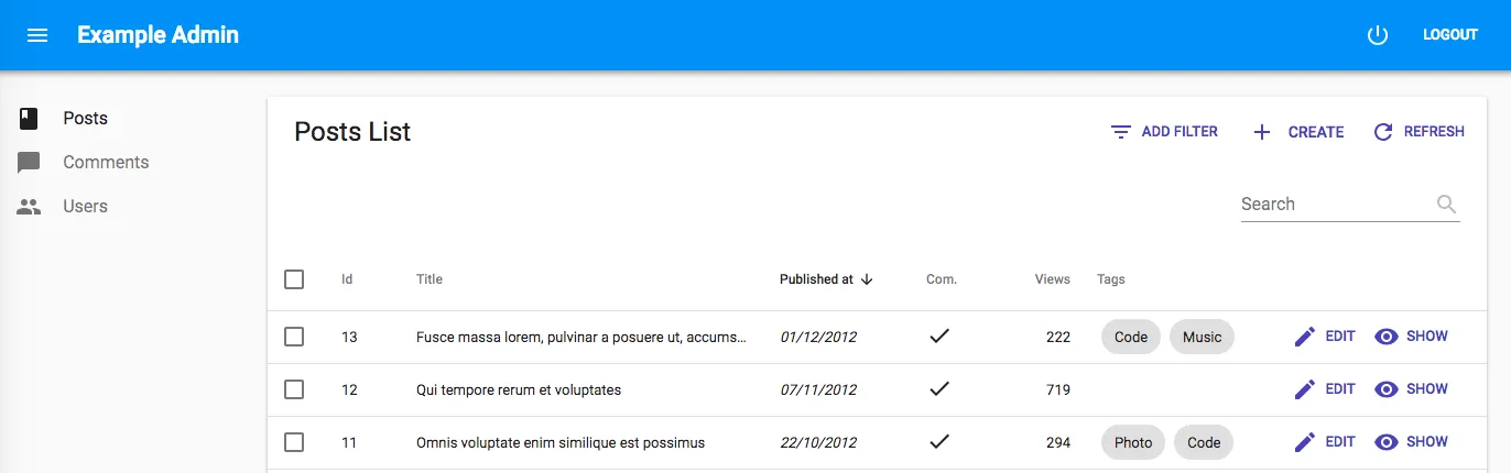
Upgrading the material-ui version was the initial motivation for forking admin-on-rest. With the new material-ui, react-admin is easier to theme, closer to the Material Design specification, and it renders faster out of the box. It’s also better looking, too. Compare the sidebar in admin-on-rest vs in react-admin:
 |  |
You will see many adjustments in the react-admin UI, from the “Logout” button, moved to the top bar, to the nicer login page, smaller buttons, and including a warning notification when a form doesn’t validate. Overall, the user experience of react-admin is definitely better and makes usual tasks more productive.
The API of most admin-on-rest components hasn’t changed in react-admin. But the material-ui specific code in your applications will need a rewrite. For instance:
import FlatButton from 'material-ui/FlatButton';import Button from '@material-ui/core/Button';
const MyButton = ({ handleClick }) =>    <FlatButton label="Approve" onClick={handleClick} />;    <Button onClick={handleClick}>Approve</Button>;
But there is more. We’ve decoupled the react-admin code between UI-independent components (which we call “the core”) and components using material-ui. That means that it’s now possible to write a whole different UI, based e.g. on Bootstrap, without having to fork react-admin. We’ve already heard of developers working on such implementations, stay tuned for upcoming announcements!
CSS-in-JS
Admin-on-rest used inline styles to allow the styling of its components. For instance, here is how you would override the default style of an <EmailField> in a List;
import { EmailField, List, Datagrid } from "admin-on-rest";
const UserList = (props) => (  <List {...props}>    <Datagrid>      ...      <EmailField source="email" elStyle={{ textDecoration: "none" }} />    </Datagrid>  </List>);
export default UserList;
This had serious drawbacks, including lack of media queries support, larger generated code, wasted render cycles, and bad readability. The JavaScript community has been tremendously active in the past years to find better solutions for styling components, in a collective effort called “CSS-in-JS”. React-admin now relies on JSS, a powerful CSS-in-JS library, which offers easy theming, media queries, style override, and probably the best performance in the CSS-in-JS landscape.
import { EmailField, List, Datagrid } from 'react-admin'; import { withStyles } from '@material-ui/core/styles';
 const styles = {     field: {         textDecoration: 'none',     }, };
 const UserList = props => ( const UserList = ({ classes, ...props }) => (     <List {...props}>         <Datagrid>            ...             <EmailField source="email" elStyle={{ textDecoration: 'none' }} />             <EmailField source="email" className={classes.field} />         </Datagrid>     </List>);
 export default UserList export default withStyles(styles)(UserList);
Just to give you a glimpse of what JSS can do, the styles object passed to the new withStyles HOC can be a function, in which case JSS injects the current theme:
const styles = (theme) => ({ root: { backgroundColor: theme.palette.background.default, [theme.breakpoints.down("md")]: { // on mobile backgroundColor: theme.palette.background.primary, }, },});CSS-in-JS open tons of new possibilities, and will allow you to customize the look and feel of react-admin to better fit your design constraints - with no limit and an excellent performance.
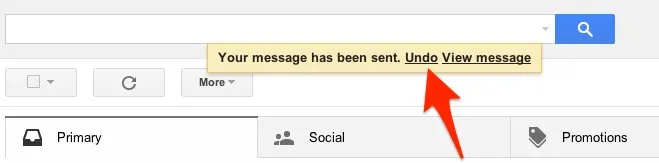
Optimistic Updates and Undo
This is my favorite feature of react-admin:

When a user edits or deletes a record, the admin takes it into account right away, without calling the API backend. A notification pops up, confirming the change, and offering to undo it. If the user doesn’t click the “Undo” button, after a few seconds, the change is sent to the API backend. The API response usually doesn’t change the UI, as the change was already taken into account by react-admin. If the user clicks the “Undo” button, the change is never sent to the API backend, and react-admin renders the state previous to the change.
If you’re a GMail user, you’ve already seen that behavior. GMail allows you to cancel sending a message for a few seconds after you hit the “Send” button.
This brings huge usability improvements, including:
- A more reactive UI. Most edition tasks now respond instantly, without hitting the server. Even on fast networks, the difference is very noticeable. And on slow networks, it’s just incredible.
- No more confirmation popup after the user clicks on a “Delete” button. If the user clicked on delete by mistake, they can always undo it. But in most cases, the click on “Delete” is deliberate, and the absence of confirmation makes the whole operation a lot faster.
- The possibility to have an “offline mode”. This is not implemented in the core yet, but it can already be achieved in userland.
Optimistic updates are turned on by default and require no change in your code. For cases when the server confirmation is compulsory, they can be disabled on a per-resource basis.
As a side note, Optimistic Deletes mean that Resources no longer need a Delete component.
Your users will love Optimistic Updates because they will be more efficient with it. I personally think it’s a killer feature, and enough motivation to use react-admin right away.
But there is more.
Bulk Actions In List
By popular demand, react-admin now supports bulk actions, i.e. actions that operate on several selected records in a list.
Bulk actions are passed as the bulkActions prop of the List component:
import Button from "@material-ui/core/Button";import { BulkActions, BulkDeleteAction } from "react-admin";import ResetViewsAction from "./ResetViewsAction";
const PostBulkActions = (props) => (  <BulkActions {...props}>    <ResetViewsAction label="Reset Views" />    {/* Add the default bulk delete action */}    <BulkDeleteAction />  </BulkActions>);
export const PostList = (props) => (  <List {...props} bulkActions={<PostBulkActions />}>    ...  </List>);
You can easily create your own bulk actions. A bulk action component receives the list of selected ids, the name of the current resource, and an onExit callback that the action should call when it ends (this allows asynchronous actions). So the implementation of a <ResetViewsAction> bulk action component boils down to:
// in ./ResetViewsAction.jsimport { Component } from "react";import { connect } from "react-redux";import { crudUpdateMany } from "react-admin";
class ResetViewsAction extends Component {  componentDidMount = () => {    const { resource, basePath, selectedIds, onExit, crudUpdateMany } =      this.props;
    crudUpdateMany(resource, selectedIds, { views: 0 }, basePath);    onExit();  };
  render() {    return null;  }}
export default connect(undefined, { crudUpdateMany })(ResetViewsAction);
Render Props
The React community was taken by storm by render props, an innovation popularized by react-router v4. React-admin makes no exception and uses render props to decouple controller and view logic.
Under the hood, many react-admin components look like the following:
const List = (props) => ( <ListController {...props}> {(controllerProps) => <ListView {...props} {...controllerProps} />} </ListController>);The ListController component fetches the records from the API, and provides callbacks for pagination, sorting, and filtering. It delegates the rendering to the ListView component, in charge of displaying the title, the filters, and the list of records.
Render props mean that there is no limit to the kind of layout you can implement with react-admin. For instance, if you want to replace the List layout with an Amazon-inspired products list, with a filter sidebar, it’s possible!
When designing react-admin, we did our best to avoid getting in the way of the developer, and to offer escape hatches for when the framework doesn’t fit the use case. Render props are the ultimate escape hatch.
GraphQL As a First-Class Citizen
Admin-on-rest was built with REST in mind. We discovered that the architecture we had designed (mostly the restClient function) allowed to support a much larger set of communication protocols - including GraphQL. And when I say “discovered”, it’s not a lie - it was almost by accident.
GraphQL is a great API design, and we already use it a lot at marmelab. We think it’s the future of client-server communication on the web. So it made sense to support GraphQL in react-admin from the ground up. That explains the renaming (“react-admin” de-emphasizes the word “rest”), and the fact that the GraphQL clients are now part of the core. We are committed to supporting them.
Plugging a react-admin application into a GraphQL backend is not hard. We’ve built several dataProvider implementations, that take advantage of GraphQL Schema introspection. For instance, if you want to build a “Post” admin on top of a GraphCool server, here is the gist of the code you need to write:
// in App.jsimport React, { Component } from "react";import buildGraphcoolProvider from "ra-data-graphcool";import { Admin, Resource, Delete } from "react-admin";
import posts from "./posts";
const client = new ApolloClient();
class App extends Component {  constructor() {    super();    this.state = { dataProvider: null };  }  componentDidMount() {    buildGraphcoolProvider({      clientOptions: { uri: "https://api.graph.cool/simple/v1/graphcool_id" },    }).then((dataProvider) => this.setState({ dataProvider }));  }
  render() {    const { dataProvider } = this.state;
    if (!dataProvider) {      return <div>Loading</div>;    }
    return (      <Admin dataProvider={dataProvider}>        <Resource name="Post" {...posts} />      </Admin>    );  }}
export default App;
If you have a GraphQL backend, you will love react-admin even better!
Embedded Arrays
Whether you use GraphQL or not, your API backend may expose resources with embedded arrays, like for instance the following post object:
{ id: 123, title: 'Lorem ipsum sic dolor amet', tags: [ { name: 'foo', added: '2018-04-12' }, { name: 'bar', added: '2018-04-18' } ],}React-admin supports editing embedded arrays, thanks to the new <ArrayInput> component. It creates an array of sub-forms, with buttons to add and remove entries.
import {  ArrayInput,  SimpleFormIterator,  DateInput,  UrlInput,} from "react-admin";
<ArrayInput source="tags">  <SimpleFormIterator>    <TextInput source="name" />    <DateInput source="added" />  </SimpleFormIterator></ArrayInput>;
Thanks to an intuitive UI, <ArrayInput> lets users manipulate embedded data easily. But don’t abuse it! Users usually don’t like forms, and they like form arrays even less.
React-admin also introduces the <ArrayField> component, which uses an iterator child to render embedded arrays in List and Show views. For instance, to display the post tags as a list of <ChipField> components:
<ArrayField source="tags"> <SingleFieldList> <ChipField source="name" /> </SingleFieldList></ArrayField>You can even display an embedded array as a <Datagrid>:
<ArrayField source="tags"> <Datagrid> <TextField source="name" /> <DateField source="added" /> </Datagrid></ArrayField>Improved Permissions Handling
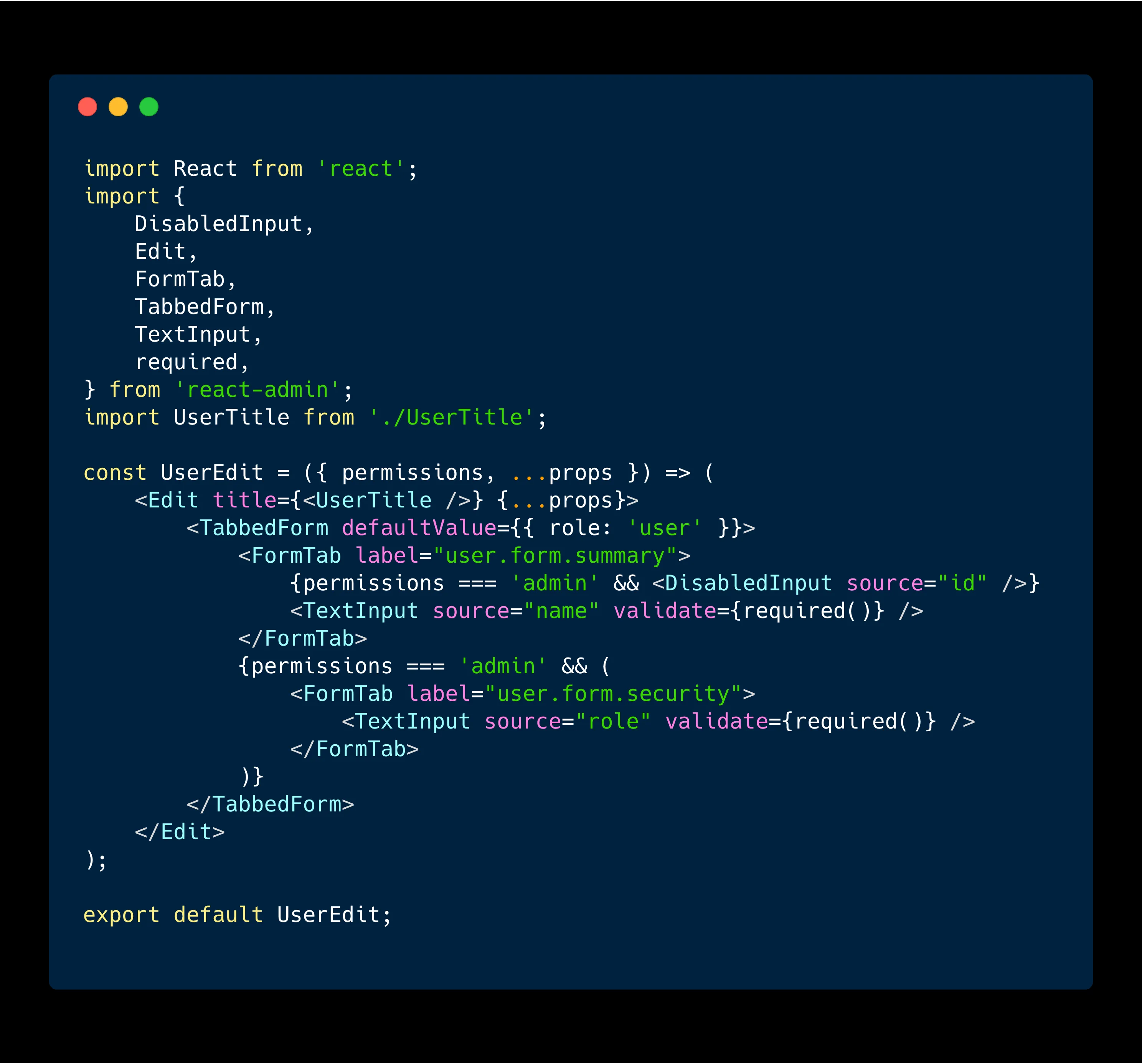
When rendering the <List>, <Create> and <Edit> components, react-admin passes a permissions prop that contains the user permissions. This facilitates the development of role-based admin UIs. For instance, you can hide filters, columns, and buttons in the <List> view for non-admin users:
const UserFilter = ({ permissions, ...props }) => (  <Filter {...props}>    <TextInput label="user.list.search" source="q" alwaysOn />    <TextInput source="name" />    {permissions === "admin" ? <TextInput source="role" /> : null}  </Filter>);
export const UserList = ({ permissions, ...props }) => (  <List    {...props}    filters={<UserFilter permissions={permissions} />}    sort={{ field: "name", order: "ASC" }}  >    <Datagrid>      <TextField source="id" />      <TextField source="name" />      {permissions === "admin" && <TextField source="role" />}      {permissions === "admin" && <EditButton />}      <ShowButton />    </Datagrid>  </List>);
What the permissions prop contains depends on your implementation of the authProvider (which used to be called authClient in admin-on-rest). React-admin calls it with the AUTH_GET_PERMISSIONS verb each time it displays a new page, passing the location and route parameters as arguments.
Here is an example authProvider implementation for JWT authentication, that stores the permissions at login, and grabs them from local storage when called with AUTH_GET_PERMISSIONS:
// in src/authProvider.jsimport {  AUTH_LOGIN,  AUTH_LOGOUT,  AUTH_ERROR,  AUTH_GET_PERMISSIONS,} from "react-admin";import decodeJwt from "jwt-decode";
export default (type, params) => {  if (type === AUTH_LOGIN) {    const { username, password } = params;    const request = new Request("https://mydomain.com/authenticate", {      method: "POST",      body: JSON.stringify({ username, password }),      headers: new Headers({ "Content-Type": "application/json" }),    });    return fetch(request)      .then((response) => {        if (response.status < 200 || response.status >= 300) {          throw new Error(response.statusText);        }        return response.json();      })      .then(({ token }) => {        const decodedToken = decodeJwt(token);        localStorage.setItem("token", token);        // store role from JWT token        localStorage.setItem("role", decodedToken.role);      });  }  // ...  if (type === AUTH_GET_PERMISSIONS) {    const token = localStorage.getItem("token");    if (!token) {      return Promise.reject();    }    const role = localStorage.getItem("role");    Promise.resolve(role);  }
  return Promise.reject("Unkown method");};
Side Effect Support for Custom Actions
React-admin relies on Redux to manage the state and actions. You can already dispatch react-admin and custom Redux actions from your components. You can also use the fetch meta to tell react-admin to call an action on the API backend. For instance, this reviewApprove action creator will trigger a call to the UPDATE verb in your dataProvider when dispatched:
export const reviewApprove = (id, data, basePath) => ({ type: REVIEW_APPROVE, payload: { id, data: { ...data, status: "approved" }, basePath }, meta: { resource: "reviews", fetch: UPDATE, },});This is fine, and it was already possible with admin-on-rest. But it’s usually not enough. An action fetching the backend takes time and may need a redirection, or a notification. These are called side effects, because they change something else than the Redux state. So far, the only way you could add side effects to custom actions was by adding a custom saga (react-admin relies on redux-saga to manage “side effects”), and that was cumbersome. Especially since most side effects you need are side effects that react-admin already implements for its own actions: redirection, notification, refresh.
Using the same meta approach as for fetch, react-admin now checks for side effects in actions. That means you can create an action creator with a notification and a redirection using the following construct:
export const reviewApprove = (id, data, basePath) => ({ type: REVIEW_APPROVE, payload: { id, data: { ...data, status: 'approved' }, basePath }, meta: { resource: 'reviews', fetch: UPDATE, notification: { body: 'Review approved', level: 'info', }, redirectTo: '/reviews', },});But that’s not really useful. Most of the time, when you use the fetch meta, you need to dispatch side effects only after fetch returns - whether it succeeds, or fails. That’s why react-admin introduces the onSuccess and onFailure action metas:
export const reviewApprove = (id, data, basePath) => ({ type: REVIEW_APPROVE, payload: { id, data: { ...data, status: 'approved' }, basePath }, meta: { resource: 'reviews', fetch: UPDATE, onSuccess: { notification: { body: 'Review approved', level: 'info', }, redirectTo: '/reviews', }; onFailure: { notification: { body: 'Review approval failed, please retry.', level: 'warning', }, }; },});React-admin can handle the following side effects metas:
notification: Display a notification. The property value should be an object describing the notification to display. Thebodycan be a translation key.levelcan be eitherinfoorwarning.redirectTo: Redirect the user to another page. The property value should be the path to redirect the user to.refresh: Force a rerender of the current view (equivalent to pressing the Refresh button). Set to true to enable.unselectAll: Unselect all lines in the current datagrid. Set to true to enable.
This new construct simplifies custom actions a great deal and reduces the need for custom sagas.
Easier Custom Inputs
React-admin relies on redux-form for Form management. That means that if you need to define a custom input component, you must decorate it with a redux-form <Field> component to connect it to the form state.
Admin-on-rest could automatically decorate a component with <Field> if the component had an addField prop set to true. This proved problematic for two reasons:
- This relied on the Form inspecting its children for the
addFieldprop. Inspecting children is a bad pattern, it’s a form of inversion of control (the parent takes in charge some of the child logic) that breaks basic developer assumptions. - Every time a developer decorates an existing Input component, they have to redeclare the
addField: truedefault prop. This caused numerous headaches and many interrogations.
As a consequence, react-admin doesn’t inspect a form’s children anymore. It’s the responsibility of every Input to connect itself to the redux-form state. And if adding a <Field> component is too much for you, react-admin offers an addField higher-order-component (HOC). That means that migrating your admin-on-rest custom inputs to react admin should be as simple as:
import { addField } from 'react-admin';const MyCustomInput = ({ input }) => /* ... */
MyCustomInput.defaultProps = {    addField: true,}export default MyCustomInput;export default addField(MyCustomInput);
This explicit decoration actually makes custom inputs easier to write, especially if you reuse react-admin input components, which already use addField:
// in LatLongInput.jsimport { NumberInput } from "react-admin";const LatLngInput = () => ( <span> <NumberInput source="lat" label="latitude" /> <NumberInput source="lng" label="longitude" /> </span>);// no need for addField here, as NumberInput is already connected to redux-formexport default LatLngInput;Easier Dependent Inputs
Developers often need to show or hide an input depending on the value of another one. The typical example is a city input, which should show only after a country input is filled. To support these dependent inputs in admin-on-rest, we had introduced the aor-dependent-input package. This use case is so common that we’ve decided to support it in react-admin core. But we changed the way it works a little, by using render props:
import { FormDataConsumer } from "react-admin";
const OrderEdit = (props) => (  <Edit {...props}>    <SimpleForm>      <SelectInput source="country" choices={countries} />      <FormDataConsumer>        {({ formData, ...rest }) => (          <SelectInput            source="city"            choices={getCitiesFor(formData.country)}            {...rest}          />        )}      </FormDataConsumer>    </SimpleForm>  </Edit>);
The new <FormDataConsumer> replaces the <DependentInput> component, and as it passes the entire form data to its child function, there is no limit to the logic you can have for hiding, switching, or customizing an input depending on another input’s value.
Tip: As for <DependentField>, used in the List and Show views, it was so basic that it was removed. You can easily replicate its effect by wrapping a component inside a condition, e.g.:
import React from "react";import { EmailField } from "react-admin";
const ConditionalEmailField = ({ record, ...rest }) =>  record && record.hasEmail ? (    <EmailField source="email" record={record} {...rest} />  ) : null;
export default ConditionalEmailField;
Asynchronous i18n
Just like admin-on-rest, react-admin is fully internationalized. But react-admin can now support async translations, i.e. translations loaded when the user chooses a language instead of at startup. The net effect is a drastic decrease in bundle size for internationalized apps, as you only have to load one language (the default one) at startup, and not all the possible languages.
This changes the way translations work a bit, since the messages can’t be an object literal anymore. That’s why the <Admin> commponent now expects an i18nProvider prop instead of a message prop:
 import { Admin, enMessages } from 'admin-on-rest'; import frMessages from 'aor-language-french'; import { Admin } from 'react-admin'; import enMessages from 'ra-language-english'; import frMessages from 'ra-language-french';
const messages = {    en: enMessages,    fr: frMessages,};
 const App = () => <Admin locale="en" messages={messages} />; const i18nProvider = locale => messages[locale]; const App = () => <Admin locale="en" i18nProvider={i18nProvider} />;
The i18nProvider function returns the messages. It should return the messages in a synhronous way for the default locale, and can return a promise for other locales. So you can load only one set of messages by default, and load the others on demand, by writing the following instead:
import { Admin } from 'react-admin';import enMessages from 'ra-language-english'; import frMessages from 'ra-language-french';
 const messages = {     en: enMessages,     fr: frMessages, }; const asyncMessages = {     fr: () => import('ra-language-french').then(messages => messages.default),};
 const i18nProvider = locale => messages[locale]; const i18nProvider = locale => {     if (locale === 'en') {         // initial call, must return synchronously         return enMessages;     }     // change of locale after initial call returns a promise    return asyncMessages[params.locale](); }
const App = () => <Admin locale="en" i18nProvider={i18nProvider} />;
Extra Props Passed Transparently
Most react-admin components are wrappers around components of another library (mostly material-ui, and redux-form). The components of these libraries usually offer a large API, supporting many props to alter the way they work. For instance, material-ui <TextField> component supports the fullWidth prop. It wouldn’t make any sense to replicate this API in react-admin components, because that would duplicate the material-ui code without added value, and delay the availability of new material-ui features until react-admin catches up.
Instead, we’ve chosen to pass every prop a component doesn’t need to its children. That means that if you need a react-admin <TextInput> to be full width, knowing that it relies on material-ui’s <TextField>, you can simply write:
import { TextInput } from "react-admin";
// ...
<TextInput source="foo" fullWidth />;
In this case, react-admin’s <TextInput> doesn’t know the fullWidth prop, so it will pass it to its child - a material-ui <TextField> component.
Expect implicit passing of extra props to the child to be a general behavior in react-admin - we’ve added it everywhere. This requires extra care about which props you actually pass to react-admin components, because these props may end up in DOM elements if they are not used by a react-admin or a material-ui component in the chain, causing React warnings in the console.
// this will cause a React warning<TextInput source="foo" gursikso />Reference Implementations Demo
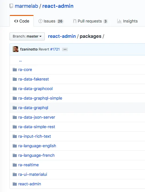
The react-admin Github repository now hosts the source of several packages (following the monorepo pattern). In fact, the react-admin npm package is just a distribution of certain packages from marmelab/react-admin. But we could imagine other distributions (like Linux distributions), for instance bundling a different UI Kit, data providers, or languages by default.
In addition, the react-admin Github repository also contains a few example apps, in the examples/ directory. Consider these examples as reference implementations, and use them as a guide for writing your own apps with react-admin. In particular, the Posters Galore Demo is now available in the examples/demo/ directory of the main react-admin repository.
Examples are great learning material, don’t hesitate to dive into their code to discover new tricks and best practices!
Upgrade in Dependencies
React-admin breaks backwards compatibility - if only because of the name change. We’ve tried to make the upgrade path smoother. But breaking BC opens the possiblity to upgrade dependencies that also broke BC. As a consequence, react-admin depends on the latest versions of many packages, from React 16 to react-router v4, and including jest and prettier.
Not only do these upgrades offer better performance and security, they improve the developer experience, and our own productivity for adding new features.
Conclusion
We’ve started the work on the next branch of admin-on-rest more than 7 months ago. It was a tough job, with very large refactorings and hard decisions. In the meantime, all the bug fixes added in admin-on-rest were ported to react-admin.
We believe react-admin is a huge step forward for web developers, and a major enabler for future features. We hope you will appreciate it as much as we do. As always, please don’t hesitate to file a GitHub issue is you meet a problem with react-admin. Just open it on the right repository: The home of react-admin on GitHub is now
https://github.com/marmelab/react-admin
As for admin-on-rest, it’s now in maintenance mode - we won’t add any new features to it. We encourage you to migrate to react-admin soon.
It’s a great pleasure to finally release react-admin as a stable package, upgrade our own projects using admin-on-rest, and announce the progress we’ve made. Please give us your feedback on this new release!

Authors
Marmelab founder and CEO, passionate about web technologies, agile, sustainability, leadership, and open-source. Lead developer of react-admin, founder of GreenFrame.io, and regular speaker at tech conferences.