React-admin 2.8: Query Component, Data Loss Protection, Top Bar Customization, And More

React-admin, the frontend framework for building admin user interfaces on top of REST/GraphQL APIs, continues its near-monthly release cycle. We’ve just released version 2.8, and we released 2.7 about a month ago. These 2 versions bring exciting new features, without any breaking change. Here are the highlights:
- Query and Mutation components
- Delete with confirmation
- Warn users when they exit in optimistic mode
- Top bar content customization
- Miscellaneous changes
- Large collection of data providers
- Search engine for the documentation
- Demo Improvements
- Status of the TypeScript migration
Query and Mutation Components
Calling the API directly from react-admin components is a bit cumbersome. In particular, if you have to wait for the return of the API to trigger other side effects (like calling another API route or displaying a notification), all the solutions proposed in the documentation require a lot of code. Since it’s such a common requirement, we worked on a better way to communicate with your API. Here is what we came up with.
The <Query> component takes 3 props (type, resource and payload). It passes them to your dataProvider, then passes the result to its child (using the render prop pattern).
For instance, this <UserProfile> component fetches one user from the API, and displays its name:
const UserProfile = ({ record }) => ( <Query type="GET_ONE" resource="users" payload={{ id: record.userId }}> {({ data, loading, error }) => loading ? ( <Loading /> ) : error ? ( <Error /> ) : ( <div>User {data.username}</div> ) } </Query>);In addition to the data from the API, <Query> also passes a loading parameter, which is true until the response comes from the data provider. And if the response is in error, the error parameter is non-empty. This lets you handle the 3 states of a component depending on remote data (loading, success, error) without managing state manually.
If you need to chain API calls, you can just nest <Query> components:
const UserAvatar = ({ record }) => ( <Query type="GET_ONE" resource="users" payload={{ id: record.userId }}> {(result1) => result1.loading ? ( <Loading /> ) : result1.error ? ( <Error /> ) : ( <Query type="GET_ONE" resource="avatar" payload={{ id: result1.data.avatarId }} > {(result2) => result2.loading ? ( <Loading /> ) : result2.error ? ( <Error /> ) : ( <img src={result2.data.src} /> ) } </Query> ) } </Query>);And if you need to trigger a query based on user input (e.g. on the click of a button), use the <Mutation> component instead of <Query>. Like, for instance, in this <ApproveButton>, which calls the API with the UPDATE verb on the comments resource on click:
const ApproveButton = ({ record }) => ( <Mutation type="UPDATE" resource="comments" payload={{ id: record.id, data: { isApproved: true } }} > {(approve) => <FlatButton label="Approve" onClick={approve} />} </Mutation>);The child of <Mutation> is a function, which receives a callback to trigger the query that you can pass to another component.
Both the <Query> and <Mutation> components accept an options prop where you can declare side effects to be executed on success or failure. For instance:
const options = {  undoable: true,  onSuccess: {    notification: "Comment approved",    redirectTo: "/comments",  },  onError: {    notification: { body: "Error: comment not approved", level: "warning" },  },};
const ApproveButton = ({ record }) => (  <Mutation    type="UPDATE"    resource="comments"    payload={{ id: record.id, data: { isApproved: true } }}    options={options}  >    {(approve) => <FlatButton label="Approve" onClick={approve} />}  </Mutation>);
We’ve overhauled the custom actions documentation to promote and document these two new components. We believe this will make API interactions so straightforward that you’ll probably build many more custom components, and use them instead of the react-admin core components. That’s a good sign!
Note: The signature of the <Query> and <Mutation> components is heavily inspired by react-apollo, which is the de facto standard for calling GraphQL APIs. We prefer using conventions that people know and use, instead of reinventing the wheel.
Note: As soon as react-redux publishes a useRedux hook, we’ll provide the functionality of <Query> and <Mutation> as hooks, too.
Confirm Dialog for Non-Undoable Delete Buttons
When we introduced undoable actions in version 2.0, we saw it as a great UX enhancement. Well, it turns out that in some cases, it’s a net loss of usability. Both undoable actions and actions with a compulsory confirmation have their use cases.
With react-admin 2.8, we’re making <DeleteWithConfirmButton> a first-class citizen. But you probably won’t need to use it directly: simply adding undoable=false to the <Edit> component disables optimistic updates, and adds a confirmation dialog to delete (and bulk delete) actions.
const PostEdit = (props) => ( <Edit undoable={false} {...props}> ... </Edit>);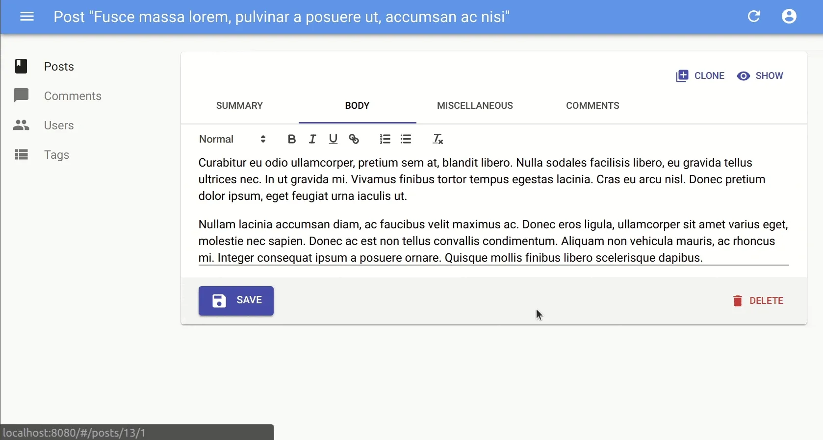
Tip: If you want a confirmation dialog for the Delete button but don’t mind undoable Edits, then pass a custom toolbar to the form, as follows:
import {  Toolbar,  SaveButton,  DeleteButton,  Edit,  SimpleForm,} from "react-admin";import { withStyles } from "@material-ui/core";
const toolbarStyles = {  toolbar: {    display: "flex",    justifyContent: "space-between",  },};
const CustomToolbar = withStyles(toolbarStyles)((props) => (  <Toolbar {...props}>    <SaveButton />    <DeleteButton undoable={false} />  </Toolbar>));
const PostEdit = (props) => (  <Edit {...props}>    <SimpleForm toolbar={<CustomToolbar />}>...</SimpleForm>  </Edit>);
Prevent Data Loss When Exiting in Optimistic Mode
While we are speaking about the optimistic mode, committing changes after a small delay can have bad consequences. If a user quits the app just after submitting an edition or a deletion, the server never gets informed of the change. However, the app does display a notification saying that the change was taken into account, and that is misleading.
To overcome that problem, react-admin now warns the user if they try to close the window while an optimistic update isn’t fully committed to the data provider yet.
You don’t need to change anything in your code to benefit from that protection.
Top Bar Content Customization
Material Design doesn’t leave much latitude to brand the UI. Of course, it’s easy to change the colors, fonts, and margins using a material-ui theme. But as for adding a company logo, developers often wonder where they can place it.
React-admin 2.7 makes it easy to customize the content of the top bar, which we call the <AppBar>. Here is an example where a custom <MyAppBar> includes a company logo:
To achieve that, just pass children to react-admin’s <AppBar>. These children will replace the default AppBar content (the page title).
// in src/MyAppBar.jsimport { AppBar } from "react-admin";import { withStyles } from "@material-ui/core/styles";
import Logo from "./Logo";
const styles = {  spacer: {    flex: 1,  },};
const MyAppBar = ({ classes, ...props }) => (  <AppBar {...props}>    <span className={classes.spacer} />    <Logo />    <span className={classes.spacer} />  </AppBar>);
export default withStyles(styles)(MyAppBar);
If you still want to include the page title in addition to the company logo, make sure you include an element with id react-admin-title in the top bar (react-admin uses React Portals to display the title).
// in src/MyAppBar.jsimport { AppBar } from 'react-admin';import Typography from '@material-ui/core/Typography';import { withStyles } from '@material-ui/core/styles';
import Logo from './Logo';
const styles = {    title: {        flex: 1,        textOverflow: 'ellipsis',        whiteSpace: 'nowrap',        overflow: 'hidden',    },    spacer: {        flex: 1,    },};
const MyAppBar = ({ classes, ...props }) => (    <AppBar {...props}>        <Typography            variant="title"            color="inherit"            className={classes.title}            id="react-admin-title"        />        <Logo />        <span className={classes.spacer} />    </AppBar>));
export default withStyles(styles)(MyAppBar);
Miscellaneous Changes
We added a few minor features worth mentioning here:
- Add
emptyValueprop to<SelectInput>(#2780) to let developers customize the value of the empty option displayed whenallowEmpty=true - Add support for
<Redirect>incustomRoutes(#2771) so that you can move custom pages to a new URL without harming users with bookmarks (or SEO) - Add support for
rowClick="expand"in<Datagrid>(#2880) because, when a datagrid only has an expansion panel, users are tempted to click on the entire line and not just the arrow on the left.
Large Collection of Data Providers
Community contributors keep on writing new adapters for react-admin. At the time of writing, there are about… a gazillion dataProviders, for all sorts of backends:
- Django Rest Framework: ra-data-drf
- Epilogue: dunghuynh/aor-epilogue-client
- Feathersjs: josx/ra-data-feathers
- Firebase: aymendhaya/ra-data-firebase-client.
- Firestore: rafalzawadzki/ra-data-firestore-client.
- GraphCool: marmelab/ra-data-graphcool (uses Apollo)
- GraphQL: marmelab/ra-data-graphql (uses Apollo)
- HAL: b-social/ra-data-hal
- Hasura: hasura/ra-data-hasura
- Hydra / JSON-LD: api-platform/admin/hydra
- JSON API: henvo/ra-jsonapi-client
- JSON HAL: ra-data-json-hal
- JSON server: marmelab/ra-data-json-server.
- Loopback: kimkha/aor-loopback
- Parse Server: leperone/aor-parseserver-client
- Parse: almahdi/ra-data-parse
- PostgREST: tomberek/aor-postgrest-client
- Prisma: weakky/ra-data-prisma
- REST-HAPI: ra-data-rest-hapi
- Sails.js: mpampin/ra-data-json-sails
- Spring Boot: vishpat/ra-data-springboot-rest
- Strapi: nazirov91/ra-strapi-rest
- Xmysql: soaserele/aor-xmysql
- Local JSON: marmelab/ra-data-fakerest
- Simple REST: marmelab/ra-data-simple-rest.
Kudos to all the contributors who took the time to write a dataProvider.
If you have an API of any kind, you’re not far from being able to plug react-admin to it!
Search Engine For The Documentation
The title says it all: you no longer need to leave the documentation to make a full-text search.
In addition to finding answers by keyword, this feature will let you discover Qwant, a search engine that respects your privacy.
Demo Improvements
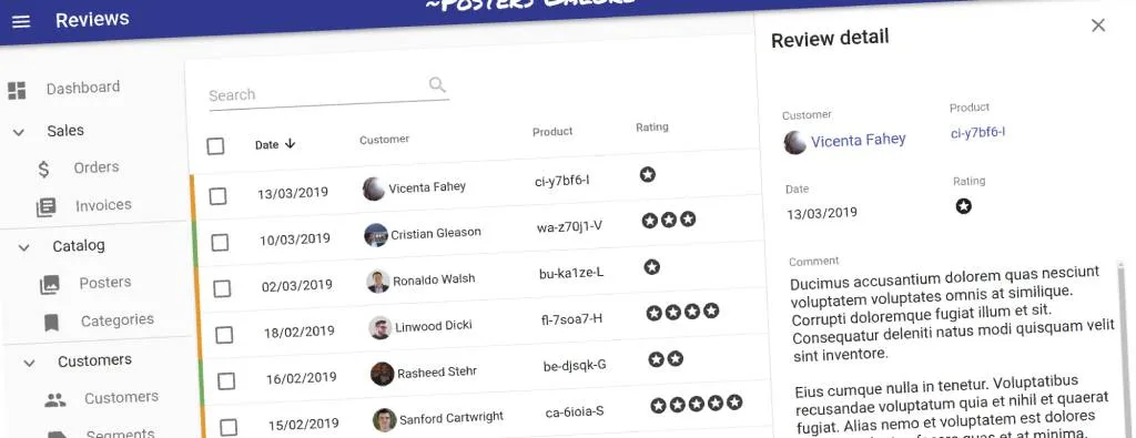
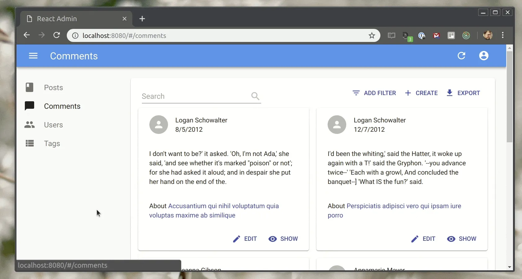
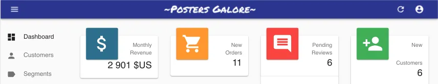
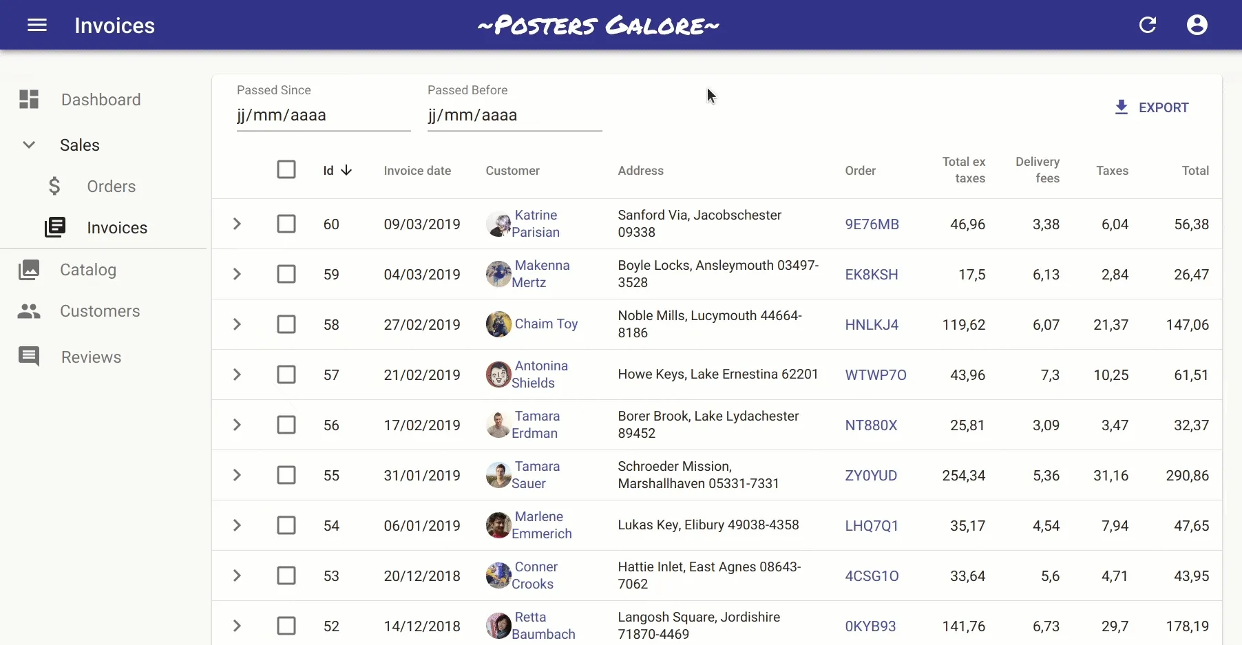
We use the Posters Galore Demo both as a live demo of what react-admin can do and as documentation for the best practices of react-admin development.
When we add new features to react-admin, we often include these features somewhere in the demo. And version 2.8 was the occasion to showcase advanced customization beyond the components that react-admin provides.
Menu tree? Sliding Edit view? Yep, all of that is possible with react-admin:
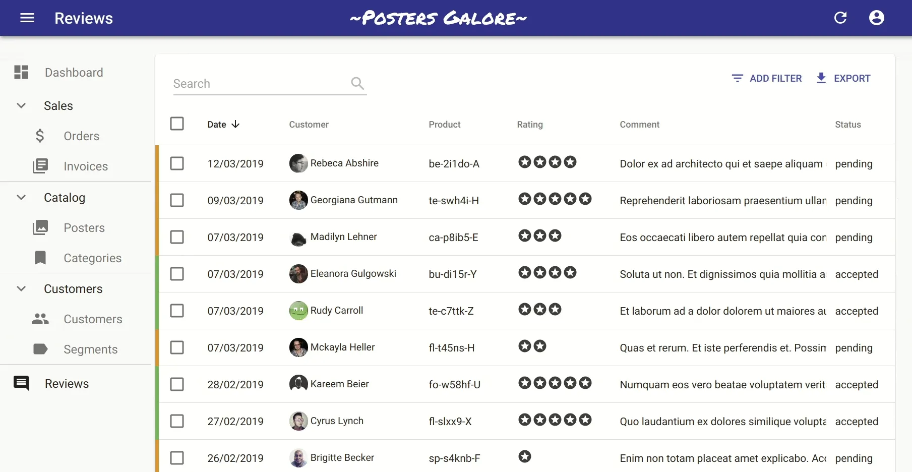
Take a look at the demo source code to learn advanced customization techniques and good practices.
Status of the TypeScript Migration
We’ve started migrating react-admin to TypeScript a few months ago, little by little. According to GitHub, we’re at about one-third of the 60,000 lines of code already migrated:
There is still a lot to do, and unfortunately, you will have to wait until we finish to benefit from TypeScript in your IDE. This is because TypeScript doesn’t allow packages to publish types if they still contain JavaScript files (only full TypeScript packages can publish types).
As we migrate files to TypeScript, we discover subtle bugs and harden the code against corner cases. But we also sometimes introduce bugs by mistake, for instance by enforcing a required argument in a component used by other components without that argument. We apologize for the inconvenience, which will only last during the course of the TypeScript migration.
Once react-admin types are published, you will be able to detect many bugs directly within the IDE, instead of at runtime.
Conclusion
As always, please report any regression using the react-admin issue tracker on GitHub. You can find the entire changelog for versions 2.7 and 2.8 at the root of the react-admin repository.
There are two important changes we didn’t mention yet: React hooks and material-ui v4. Both aren’t totally ready for prime time (most notably, react hooks miss the option to bail out of rendering, and that prevents libraries like Redux to migrate to Hooks). So we didn’t start implementing them in react-admin. We’ll wait until every dependency is ready - probably a few months - to start our migration to Hooks and material-ui v4. And that will be for the next major release, v3.0.

Authors
Marmelab founder and CEO, passionate about web technologies, agile, sustainability, leadership, and open-source. Lead developer of react-admin, founder of GreenFrame.io, and regular speaker at tech conferences.