React Admin October 2020 Update

React-admin, the open-source frontend Framework for building B2B applications running in the browser on top of REST/GraphQL APIs, received a lot of new features during the past quarter. These features will help you build more sophisticated admins, with improved user experience for complex tasks, and better developer experience for you. Let’s dive in!
- TypeScript Support
- Filter Sidebar
- Live Search Form
- User Menu Improvements
useListContextFor Easier List Layout Customization<ListBase>: A Layout-Less List Component- New Look For The Ecommerce Demo
- Miscellaneous Changes
- A Word About React-Admin Enterprise Edition
TypeScript Support
This is probably the most requested and the most visible feature: starting with version 3.9, react-admin exports TypeScript types.
Let’s first reiterate one important fact: react-admin is and will remain a JavaScript library. You can still use react-admin without TypeScript. In fact, react-admin 3.9 exports an additional set of files that contain TypeScript types. If you don’t use TypeScript in your codebase, you can simply ignore these files and continue working as before.
Whether your codebase uses TypeScript or not, you will see a dramatic improvement in the developer experience. Thanks to TypeScript types, your IDE should be able to autocomplete react-admin component props and hook parameters. It’s like inline documentation, and it’s a pleasure to use.
If your codebase uses TypeScript, you’ll get an additional benefit: at compilation time, TypeScript will check that your code uses the react-admin code correctly, and detect errors that might happen at runtime. So upgrading to react-admin 3.9 in a TypeScript project may require additional work to allow your project to compile, but it will make your codebase more robust.
Please note that we’ve published types for a subset of the entire react-admin codebase. We’ll improve type coverage gradually over the next releases.
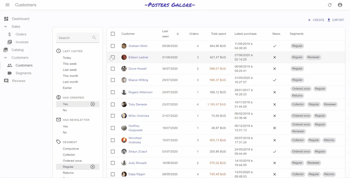
Filter Sidebar
React-admin lists traditionally used a <Filter> Button/Form combo: the user can click on a filter button to add filters in a form displayed on the top of the list. This user experience has one major drawback: the possible filter values are only apparent after a couple of clicks.
React-admin 3.8 introduces a new component for list filters: the <FilterList> sidebar.
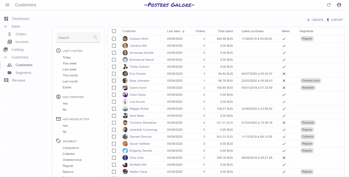
Similar to what users usually see on e-commerce websites, it’s a panel with many simple filters that can be enabled and combined using the mouse. The user experience is better than the Button/Form Combo, because the filter values are explicit, and it doesn’t require typing anything in a form. But it’s a bit less powerful, as only filters with a finite set of values (or intervals) can be used in the <FilterList>.
The <FilterList> component expects a list of <FilterListItem> as children. Each <FilterListItem> defines a filter label and a value, which is merged with the current filter value when enabled by the user. Here is an example usage for a list of customers:
import * as React from "react";import AccessTimeIcon from "@material-ui/icons/AccessTime";import MonetizationOnIcon from "@material-ui/icons/MonetizationOnOutlined";import MailIcon from "@material-ui/icons/MailOutline";import LocalOfferIcon from "@material-ui/icons/LocalOfferOutlined";import { FilterList, FilterListItem } from "react-admin";import {  endOfYesterday,  startOfWeek,  subWeeks,  startOfMonth,  subMonths,} from "date-fns";
import segments from "../segments/data";
const LastVisitedFilter = () => (  <FilterList label="Last visited" icon={<AccessTimeIcon />}>    <FilterListItem      label="Today"      value={{        last_seen_gte: endOfYesterday().toISOString(),        last_seen_lte: undefined,      }}    />    <FilterListItem      label="This week"      value={{        last_seen_gte: startOfWeek(new Date()).toISOString(),        last_seen_lte: undefined,      }}    />    <FilterListItem      label="Last week"      value={{        last_seen_gte: subWeeks(startOfWeek(new Date()), 1).toISOString(),        last_seen_lte: startOfWeek(new Date()).toISOString(),      }}    />    <FilterListItem      label="This month"      value={{        last_seen_gte: startOfMonth(new Date()).toISOString(),        last_seen_lte: undefined,      }}    />    <FilterListItem      label="Last month"      value={{        last_seen_gte: subMonths(startOfMonth(new Date()), 1).toISOString(),        last_seen_lte: startOfMonth(new Date()).toISOString(),      }}    />    <FilterListItem      label="Earlier"      value={{        last_seen_gte: undefined,        last_seen_lte: subMonths(startOfMonth(new Date()), 1).toISOString(),      }}    />  </FilterList>);
const HasOrderedFilter = () => (  <FilterList label="Has ordered" icon={<MonetizationOnIcon />}>    <FilterListItem      label="True"      value={{        nb_commands_gte: 1,        nb_commands_lte: undefined,      }}    />    <FilterListItem      label="False"      value={{        nb_commands_gte: undefined,        nb_commands_lte: 0,      }}    />  </FilterList>);
const HasNewsletterFilter = () => (  <FilterList label="Has newsletter" icon={<MailIcon />}>    <FilterListItem label="True" value={{ has_newsletter: true }} />    <FilterListItem label="False" value={{ has_newsletter: false }} />  </FilterList>);
const SegmentFilter = () => (  <FilterList label="Segment" icon={<LocalOfferIcon />}>    {segments.map((segment) => (      <FilterListItem        label={segment.name}        key={segment.id}        value={{ groups: segment.id }}      />    ))}  </FilterList>);
You can place these <FilterList> anywhere inside a <List>. The most common case is to put them in a sidebar that is on the left-hand side of the Datagrid. You can use the aside property for that:
import * as React from "react";import { Card as MuiCard, CardContent, withStyles } from "@material-ui/core";
import {  LastVisitedFilter,  HasOrderedFilter,  HasNewsletterFilter,  SegmentFilter,} from "./filters";
const Card = withStyles((theme) => ({  root: {    [theme.breakpoints.up("sm")]: {      order: -1, // display on the left rather than on the right of the list      width: "15em",      marginRight: "1em",    },    [theme.breakpoints.down("sm")]: {      display: "none",    },  },}))(MuiCard);
const FilterSidebar = () => (  <Card>    <CardContent>      <LastVisitedFilter />      <HasOrderedFilter />      <HasNewsletterFilter />      <SegmentFilter />    </CardContent>  </Card>);
const CustomerList = (props) => <List aside={<FilterSidebar />}>// ...</List>;Tip: The <FilterList> Sidebar is not a good UI for small screens. You can choose to hide it on small screens (as in the previous example). A good tradeoff is to use <FilterList> on large screens, and the <Filter> Button/Form combo on Mobile.
While working on the <FilterList> component, we realized that the instructions to set up a custom list filter weren’t good enough for advanced use cases. So we took the opportunity to rewrite the filters documentation completely. Check out the new documentation in Filtering the List, you’ll probably learn some new tricks.
Live Search Form
The filter sidebar is not a form. Therefore, if your users need to enter complex filters, you’ll have to recreate a filter form using react-final-form. However, if you only need one text input with a filter-as-you-type behavior, you’ll find the <FilterLiveSearch> component convenient.
It outputs a form containing a single <SearchInput>, which modifies the page filter on change. That’s usually what users expect for a full-text filter. <FilterLiveSearch> only needs a source field.
So for instance, to add a search filter on the customer full name, add the following line to the Sidebar:
import { FilterLiveSearch } from 'react-admin';
const FilterSidebar = () => (    <Card>        <CardContent>           <FilterLiveSearch source="full_name" />            <LastVisitedFilter />            <HasOrderedFilter />            <HasNewsletterFilter />            <SegmentFilter />        </CardContent>    </Card>);
User Menu Improvements
React-admin 3.9 facilitates the display of the name and avatar of the currently logged in user.
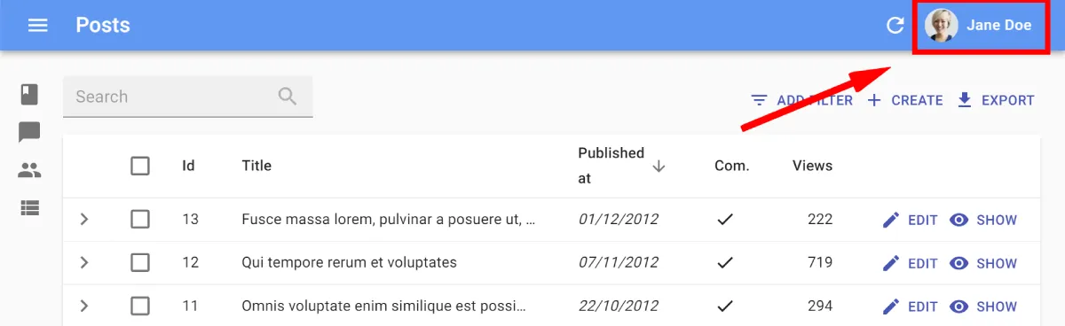
You just have to implement a new method in your authProvider: authProvider.getIdentity(), and return the current user id, fullName, and avatar url:
// in src/authProvider.jslet userIdentity = {};
const authProvider = {  login: ({ username, password }) => {    // call the login endpoint, which returns id, fullName, avatar    // ...    // and store it in the closure    userIdentity = { id, fullName, avatar };  },  getIdentity: () => {    return userIdentity;  },  // ...};
export default authProvider;
useListContext For Easier List Layout Customization
When you want to build a custom List layout, it’s hard to know which variables are provided by react-admin, and which ones you have to pass down to other components like Filter, Datagrid, or Pagination. As a consequence, it used to be hard to develop a custom List layout (e.g. using a grid instead of a table).
Starting with react-admin 3.7, the components that you can use in a List don’t expect props to be passed down by their parents anymore. Instead, they grab these props from a ListContext using the useListContext hook, as in the following example;
import * as React from 'react';import { GridList, GridListTile, GridListTileBar } from '@material-ui/core';import { List, linkToRecord, NumberField, useListContext } from 'react-admin';import { Link } from 'react-router-dom';
const PosterGrid = () => { const { ids, data, basePath } = useListContext();
if (!ids || !data) return null; // when data isn't loaded yet
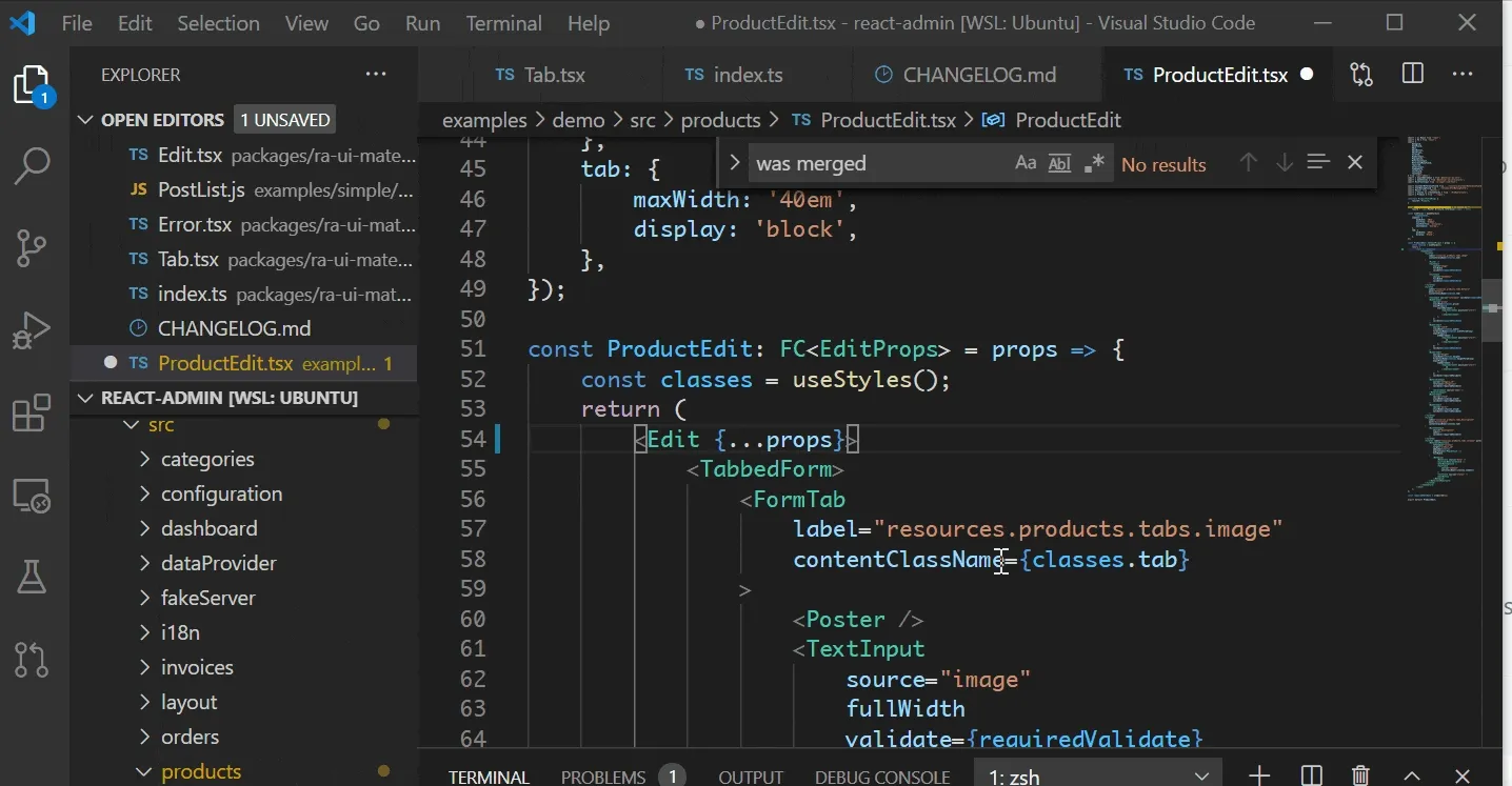
return ( <GridList cellHeight={180} cols={8}> {ids.map(id => ( <GridListTile component={Link} key={id} to={linkToRecord(basePath, data[id].id)} > <img src={data[id].thumbnail} alt="" /> <GridListTileBar title={data[id].reference} subtitle={ <span> {data[id].width}x{data[id].height},{' '} <NumberField source="price" record={data[id]} color="inherit" options={{ style: 'currency', currency: 'USD', }} /> </span> } /> </GridListTile> ))} </MuiGridList> );};
const PosterList = props => ( <List {...props}> <PosterGrid /> </List>)If you developed custom List components, get the list controller data from the ListContext using the useListContext hook rather than from props:
const Aside = ({ data, ids }) => {const Aside = () => { const { data, ids } = useListContext(); return ( <div style={{ width: 200, margin: '1em' }}> <Typography variant="h6">Posts stats</Typography> <Typography variant="body2"> Total views: {ids.map(id => data[id]).reduce((sum, post) => sum + post.views, 0)} </Typography> </div> );};The ListContext dramatically simplifies custom List layouts and lets you customize the User Experience to the tasks your users need to achieve. It’s particularly useful in “embedded” lists, e.g. in an <ArrayField>.
<ListBase>: A Layout-Less List Component
We’ve even introduced a new component called <ListBase>, which fetches the data for the list and stores them in a ListContext, but renders nothing but its children. This new component allows building completely custom List layouts, like for instance a List width an Edit view in the sidebar.
The following code snippet shows how to leverage <ListBase> for custom List layouts:
import { ListBase } from "rect-admin";
const PostList = (props) => (  <ListBase {...props} perPage={10}>    <div>      <Filter />    </div>    <Grid container>      <Grid item xs={8}>        <SimpleList primaryText={(record) => record.title} />      </Grid>      <Grid item xs={4}>        List instructions...      </Grid>    </Grid>    <Pagination />    <div>Post related links...</div>  </ListBase>);
New Look For The Ecommerce Demo
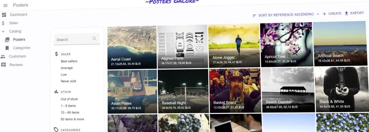
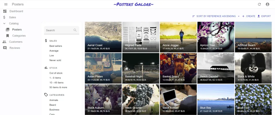
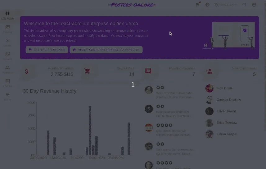
We’ve revamped the Posters Galore demo to make it look less Googly.
We wanted to showcase the power of the Material-UI theming capabilities (recently explained in an article in this blog). Also, one major criticism we’ve heard is that Material Design makes every app look like it’s edited by Google. That’s why the e-commerce demo now uses a new skin. Check its source for inspiration!
Miscellaneous Changes
- You can now define custom success and error side effects in
<DeleteButton>using theonSuccessandonFailureprops - You can use the
ra-data-simple-restdata provider with a backend that uses theX-total-Countheader rather than theContent-Rangeheader - We’ve added a new local Data Provider called
ra-data-localstorage, which persists data between sessions. It makes react-admin suitable for local-first web apps. - We’ve removed
recomposefrom the react-admin dependencies. This reduces the bundle size and marks an important step in the migration from higher-order components to hooks. - We’ve added a
<SortButton>component to let users sort Lists when it’s not using a<Datagrid>. - You can now force an always enabled
<SaveButton>in the Form components (using thetoolbar={<Toolbar alwaysEnableSaveButton />}prop). - You can now customize the Add and Remove buttons in
<SimpleFormIterator> - You can now customize the true and false labels of
<NullableBooleanInput> - You can now pass custom icons to
<BooleanField>to show as values - You can now disable the notifications of the
useCheckAuth()anduseLogoutIfAccessDenied()hooks
In addition to three minor releases (3.7.0, 3.8.0, and 3.9.0), we’ve published 9 bug fix releases and made the react-admin code base more robust and capable of handling more corner cases. Check the Changelog for a list of all the changes.
We want to thank all the contributors for their work on features, bug fixes, documentation, and tests. React-admin wouldn’t be such a high quality library without your contributions!
A Word About React-Admin Enterprise Edition
A month ago, we published a new react-admin edition dedicated to Enterprise customers. Since then, Marmelab kept on developing, testing and documenting additional modules for this edition. We’ll soon publish a description of the latest features published in React-admin Enterprise Edition, but here is a quick glimpse:
- A new package,
ra-enterprise, bundling most of the Enterprise features in a zero-configuration replacement for react-admin - New form layouts (
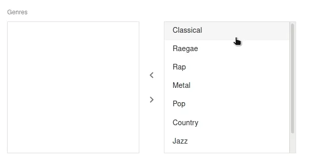
<AccordionForm>,<WizardForm>,<DialogForm>) - New Input component for editing one-to-many and many-to-many relationships:
<DualListInput> - Lock support for real time apps
- Mercure adapter for real time updates powered by API Platform
- Support for branch deletion in tree structures
- Support for expand in
<EditableDatagrid>
If you’re interested in any of these new features, give React-admin Enterprise Edition a try!

Authors
Marmelab founder and CEO, passionate about web technologies, agile, sustainability, leadership, and open-source. Lead developer of react-admin, founder of GreenFrame.io, and regular speaker at tech conferences.