
React Admin Enterprise Edition - October 2020 Update

In September, we published a new react-admin edition dedicated to Enterprise customers. Since then, Marmelab has kept on developing, testing, and documenting additional features for this edition. As promised in the last react-admin update article, here is a description of Accordion Forms, Wizard Forms, Edit in dialog, Dual List Inputs, and Content Locks. These features are already available in the latest version of the Enterprise Edition modules.
ra-form-layout: New Package With Alternative Form Layouts
To create or update complex entities with many fields, the form layouts bundled with react-admin (<SimpleForm>, <TabbedForm>) may seem too limited. The new ra-form-layouts package introduces alternative form layouts for these cases:
- The
<AccordionForm>and<WizardForm>components offer an easy way to split your forms into multiple sections to make them more approachable. - The
<CreateDialog>and<EditDialog>components allow users to create or edit records right from the list view. No more fiddling with the routes and Material UI dialogs!
<AccordionForm>: Collapsible Form Sections
This component allows you to split a complex form into multiple collapsible sections, which can optionally auto collapse when another is expanded:
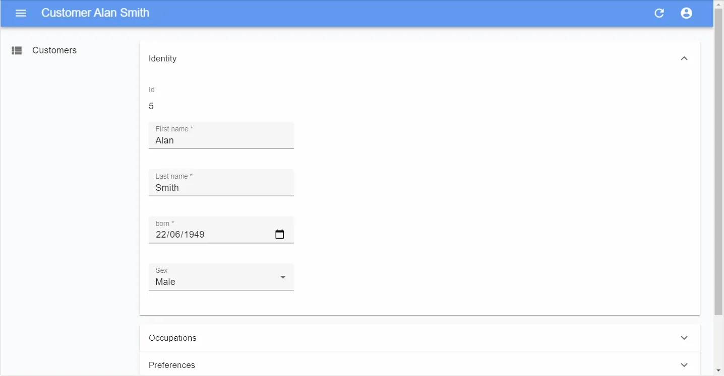
It can be used in place of a <SimpleForm> or <TabbedForm> and follows the same principles. It expects inputs or fields inside its panels, it accepts a custom toolbar, etc.. Here is a usage example:
import React from 'react';import {    Edit,    TextField,    TextInput,    DateInput,    SelectInput,    ArrayInput,    SimpleFormIterator,    BooleanInput,} from 'react-admin';import { AccordionForm, AccordionFormPanel } from '@react-admin/ra-form-layout';
const CustomerEdit: FC = props => (    // don't forget the component="div" prop on the main component to disable the main Card    <Edit {...props} component="div">        <AccordionForm autoClose>            <AccordionFormPanel label="Identity">                <TextField source="id" />                <TextInput source="first_name" validate={required()} />                <TextInput source="last_name" validate={required()} />                <DateInput source="dob" label="born" validate={required()} />                <SelectInput source="sex" choices={sexChoices} />            </AccordionFormPanel>            <AccordionFormPanel label="Occupations">                <ArrayInput source="occupations" label="">                    <SimpleFormIterator>                        <TextInput source="name" validate={required()} />                        <DateInput source="from" validate={required()} />                        <DateInput source="to" />                    </SimpleFormIterator>                </ArrayInput>            </AccordionFormPanel>            <AccordionFormPanel label="Preferences">                <SelectInput                    source="language"                    choices={languageChoices}                    defaultValue="en"                />                <BooleanInput source="dark_theme" />                <BooleanInput source="accepts_emails_from_partners" />            </AccordionFormPanel>        </AccordionForm>    </Edit>);
This package also introduces the <AccordionSection> component, which you can use inside any other form to group inputs into collapsible sections. Very useful when you want to keep the main form simple while allowing to edit advanced options:
import React from 'react';import { Edit, TextField, TextInput, DateInput, SelectInput, ArrayInput, SimpleForm, SimpleFormIterator, BooleanInput,} from 'react-admin';import { AccordionForm, AccordionFormPanel } from '@react-admin/ra-form-layout';
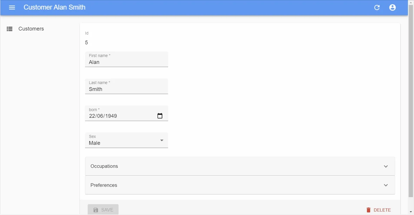
const CustomerEdit: FC = props => ( <Edit {...props}> <SimpleForm> <TextField source="id" /> <TextInput source="first_name" validate={required()} /> <TextInput source="last_name" validate={required()} /> <DateInput source="dob" label="born" validate={required()} /> <SelectInput source="sex" choices={sexChoices} /> <AccordionSection label="Occupations" fullWidth> <ArrayInput source="occupations" label=""> <SimpleFormIterator> <TextInput source="name" validate={required()} /> <DateInput source="from" validate={required()} /> <DateInput source="to" /> </SimpleFormIterator> </ArrayInput> </AccordionSection> <AccordionSection label="Preferences" fullWidth> <SelectInput source="language" choices={languageChoices} defaultValue="en" /> <BooleanInput source="dark_theme" /> <BooleanInput source="accepts_emails_from_partners" /> </AccordionSection> </SimpleFormForm> </Edit>);AccordionForms don’t suffer from the same usability problem as TabbedForms. With TabbedForms, the first tab looks like the only set of required inputs. We’ve often seen users “forget” to fill inputs hidden in a secondary tab. Also, when a user can’t submit a form because of a failed input validation in a secondary section, TabbedForms highlight the tab headers, far from the user’s attention.
With AccordionForms, the secondary input sections appear above the submit button, just after the main inputs, so users can’t miss them. And AccordionForms show the error closer to the submit button, in the section header, much closer to the submit button.
We’ve witnessed several times how Accordion layouts make users more efficient in their update tasks. Don’t hesitate to use them instead of <TabbedForm>!
<WizardForm>: Step-By-Tep Data Entry
While the <AccordionForm> already makes complex forms more approachable, long forms with many sections can be intimidating - especially when adding new content. Users often prefer to be guided in a step-by-step process when they create new records. And for long data entry tasks, users need a clear indication of their progression. This is where the <WizardForm> can help:
import React, { FC } from 'react';import { Create, TextInput, required } from 'react-admin';import { WizardForm, WizardFormStep } from '@react-admin/ra-form-layout';
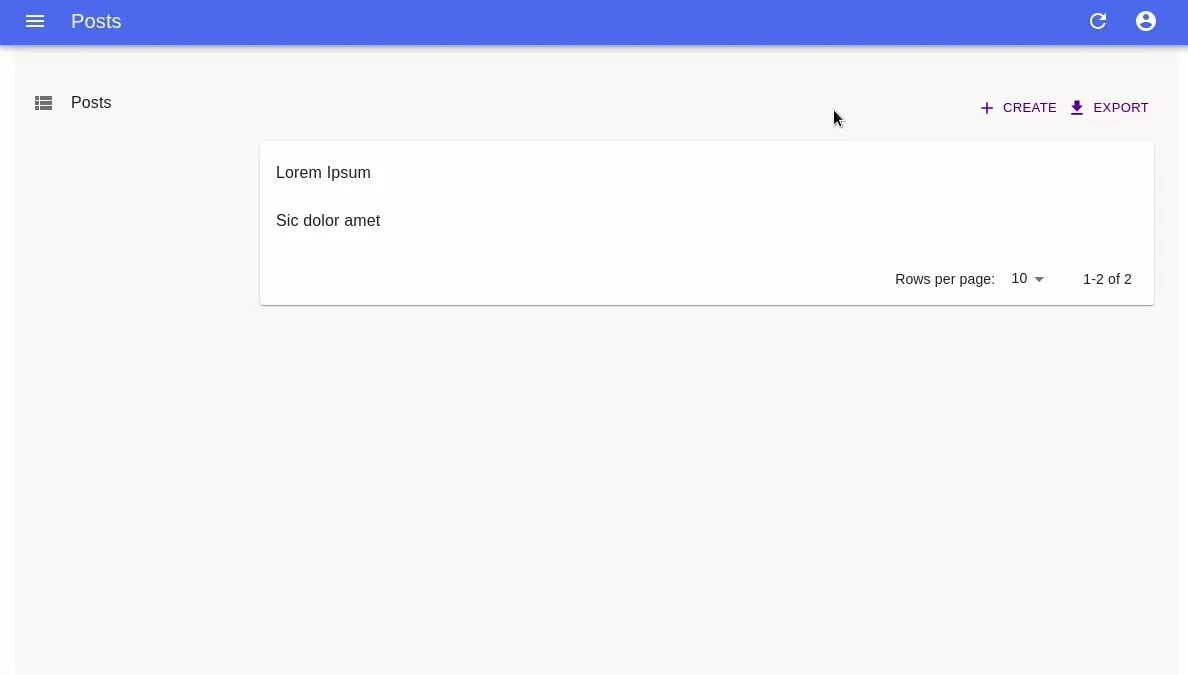
const PostCreate: FC = props => ( <Create {...props}> <WizardForm> <WizardFormStep label="First step"> <TextInput source="title" validate={required()} /> </WizardFormStep> <WizardFormStep label="Second step"> <TextInput source="description" /> </WizardFormStep> <WizardFormStep label="Third step"> <TextInput source="fullDescription" validate={required()} /> </WizardFormStep> </WizardForm> </Create>);Just like the <AccordionForm>, the <WizardForm> expects form sections as children, only this time they must be <WizardFormStep> elements.
In our tests, users are less reluctant to enter a new record with many fields when they use <WizardForm> than when they use any other form layout. Even for simple records, a WizardForm prevents an entire category of usability problems with data validation and visual clutter.
<CreateDialog> and <EditDialog>
Sometimes, users may need to create or edit records without leaving the list view. React-admin already makes that possible, as explained in a tutorial on this blog. However, it requires some knowledge of the react-admin routing rules. Not to mention the tricks needed to make Material UI dialogs play nicely with react-router.
Fear no more, the <CreateDialog> and <EditDialog> components offer a quick way to integrate any form inside a dialog:
Use these components as siblings of the <List> - this allows to display both the list and a form at the same time:
import React from "react";import { List, Datagrid, SimpleForm, TextField, TextInput, DateInput, required,} from "react-admin";import { EditDialog, CreateDialog } from "@react-admin/ra-form-layout";
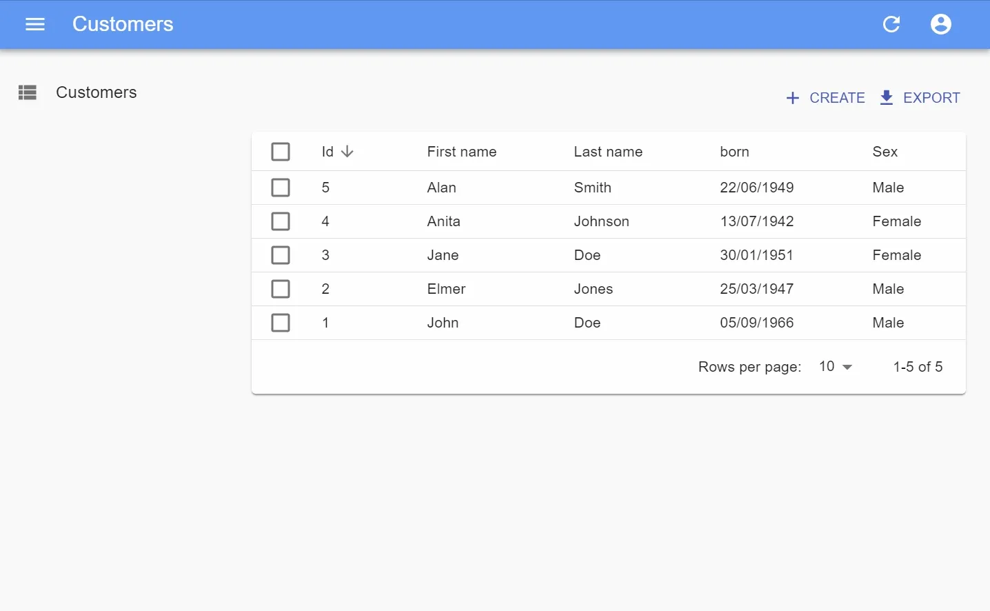
const CustomerList = (props) => ( <> <List {...props} hasCreate> <Datagrid>...</Datagrid> </List> <EditDialog {...props}> <SimpleForm> <TextField source="id" /> <TextInput source="first_name" validate={required()} /> <TextInput source="last_name" validate={required()} /> <DateInput source="date_of_birth" label="born" validate={required()} /> </SimpleForm> </EditDialog> <CreateDialog {...props}> <SimpleForm> <TextField source="id" /> <TextInput source="first_name" validate={required()} /> <TextInput source="last_name" validate={required()} /> <DateInput source="date_of_birth" label="born" validate={required()} /> </SimpleForm> </CreateDialog> </>);When using these components, you no longer need to pass create and edit to the <Resource>. However, to show the create button in the <List> action, you must set the hasCreate prop of the <List> element.
Dialog forms give users an impression of fluidity, of snappiness. They no longer feel that they are switching to another page when editing - the list is still right behind. The entire admin feels more like an app, and less like an interface to a database.
One drawback to take into consideration: if your users frequently open new admin tabs by clicking on links to an edit view, they’ll feel the page a bit slower to display, because the edit view now loads the list in the background. Prefer classical (page) forms in this use case.
<DualListInput>: A New Input Component For Editing Array Values
When selecting multiple values for an array input, users may need to see all the available choices upfront. In those cases the <SelectArrayInput> or <AutocompleteArrayInput> aren’t appropriate. Besides, these components require users to click three times to add or remove an item. You may use the <CheckboxGroupInput> instead, but it doesn’t emphasize the difference between selected and not selected items very much. Also, when there are more than a dozen possible choices, <CheckboxGroupInput> takes the entire screen real estate.
The ra-relationships package introduces a new alternative component for selecting multiple choices: the <DualListInput>.
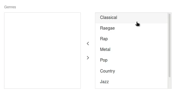
Just like <SelectArrayInput>, it expects a source and a choice prop:
import React from "react";import { Edit, SimpleForm, TextInput } from "react-admin";import { DualListInput } from "@react-admin/ra-relationships";
const choices = [  { id: 123, name: "Sports" },  { id: 456, name: "Politics" },  { id: 987, name: "Breaking" },];
const PostEdit = (props) => (  <Edit {...props}>    <SimpleForm>      <TextInput source="title" />      <DualListInput source="categories" choices={choices} />    </SimpleForm>  </Edit>);
Just like the other choice selection components, you can use the optionText and optionValue props to customize the display of choices. <DualListInput> is also great as a child of a <ReferenceArrayInput>, to edit one-to-many and many-to-many relationships.
New In ra-realtime: Lock Support For Real-Time Edition
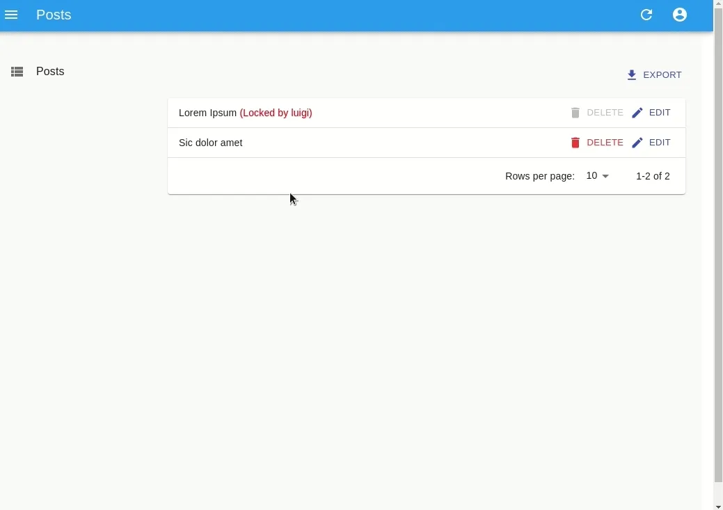
When a user edits an existing record, you should prevent other users from editing the same record to avoid edition conflicts. This is especially useful in apps with many users working on similar tasks.
The ra-realtime package now provides a lock system for records. As usual, it is agnostic as to how you manage locks in your API, thanks to a few new custom methods on the dataProvider. It offers a set of hooks (useLock, useHasLock, useHasLocks) that you can integrate into your components.
You can test the lock system live in the Enterprise Edition Demo.
For instance, to have an Edit view lock the current record on mount, use the useLock hook:
import React, { useState } from 'react';import { Edit, SimpleForm, TextInput, CircularProgress } from 'react-admin';import { useLock, useHasLock, useHasLocks } from '@react-admin/ra-realtime';
const MyLockedEditView: FC<any> = props => {    const { resource, id } = props;    const { error, loading } = useLock(resource, id, 'mario');
    // while the lock is being acquired, display a loader    if (loading) {        return <CircularProgress />;    }
    // if the content is already locked, the hook returns an error    if (error) {        return <div>This content is locked by someone else</div>;    }
    // once the content is locked, displayu the edit form    return (        <Edit {...props}>            <SimpleForm>                <TextInput source="title" />            </SimpleForm>        </Edit>    );};
Here is another example leveraging the 3 hooks to give users some feedback about locked records in the List view:
import React, { useState } from 'react';import { Layout, useNotify } from 'react-admin';import { useLock, useHasLock, useHasLocks } from '@react-admin/ra-realtime';
const CustomGridRow = ({ locks, ...props }) => {    const recordId = props.record.id;    const lock = locks.find(lock => lock.recordId === recordId);
    return (        <TableRow id={recordId}>            <TableCell>                <TextField source="title" {...props} />                {lock && (                    <span style={{ color: 'red' }}>                        {` (Locked by ${lock.identity})`}                    </span>                )}            </TableCell>            <TableCell align="right">                <EditButton {...props} />            </TableCell>        </TableRow>    );};
const CustomGridBody: FC<any> = ({ locks, ...props }) => (    <DatagridBody {...props} row={<CustomGridRow locks={locks} />} />);
const CustomGrid: FC<any> = props => {    const { data: locks } = useHasLocks(props.resource);    return <Datagrid {...props} body={<CustomGridBody locks={locks} />} />;};
const MyListView = props => (    <List {...props}>        <CustomGrid />    </List>);
const LockedEdit = (props) => {    const notify = useNotify();    const [messages, setMessages] = useState([]);
    // Supposing I'm Mario. But use your own identity for example an auth token.    const { loading } = useLock(resource, id, 'mario', {        onSuccess: () => {            notify('ra-realtime.notification.lock.lockedByMe');        },        onFailure: () => {            notify('ra-realtime.notification.lock.lockedBySomeoneElse');        },        onUnlockSuccess: () => {            notify('ra-realtime.notification.lock.unlocked');        },    });
    if (loading) {        return <div>Loading...</div>;    }
    return (        <Edit {...props}>            <SimpleForm>                <TextInput source="title" />            </SimpleForm>        </Edit>    );};
function CustomToolbar(props): FC<Props> {    const { resource, record } = props;
    const { data: lock } = useHasLock(resource, record.id);
    const amILocker = lock?.identity === 'mario'; // I'm Mario
    return (        <Toolbar {...props}>            <SaveButton disabled={!isMarioLocker} />            {!amILocker && <LockMessage identity={lock?.identity} />}        </Toolbar>    );}
function LockMessage(props): FC<Props> {    const { identity, variant = 'body1' } = props;    const classes = useLockMessageStyles(props);
    const message = `This record is locked by ${identity}.`;
    return (        <Typography className={classes.root} variant={variant}>            {message}        </Typography>    );}
By pushing information to users instead of waiting for an update failure, the Locks feature removes an entire category of errors in collaboration scenarios.
Conclusion
We estimate that these features will save about 2 to 4 weeks of development time to your team. It took us much more than that to build them because we thoroughly tested and documented each corner case. Subscribers of the Enterprise Edition can use these new features right now, at any extra cost.
As a reminder, the React-admin Enterprise Edition starts at 125€ per month, and we’ll continue adding more features like these in the future.
This concludes the October update. We hope these new additions will make you even more productive with react-admin!

Authors
Full-stack web developer at marmelab, Gildas has a strong appetite for emerging technologies. If you want an informed opinion on a new library, ask him, he's probably used it on a real project already.