React Admin February 2021 Update


Marmelab and the open-source community contributed a lot to react-admin, the open-source frontend Framework for building B2B applications running in the browser on top of REST/GraphQL APIs, over the past quarter. This article lists the highlights published in the 3 latest minor versions (3.10, 3.11, and 3.12).
There is a lot to say, so let’s dive in!
- AutocompleteInput Now Has A Reset Button
- TranslatableInput and TranslatableField
- Server-Side Validation And Validation Upon Submission
- Optimistic Mutations
- Improved Keyboard Navigation
- Use
<List>Everywhere You Want - Contexts And Avoiding Cloning Elements
- Easier Customization for Create, Edit and Show
- Customize The Ready Screen
- Customize Failed Authentication Side Effects
- Performance Improvements
- Domain Telemetry
- Miscellaneous Changes
- ra-search, ra-calendar and saved queries in the Enterprise Edition
AutocompleteInput Now Has A Reset Button
By popular demand, the <AutocompleteInput> now allows users to reset the text they entered by clicking a reset button.
You just need to add the resettable prop to the <AutocompleteInput> components in your forms:
const CommentEdit = props => ( <Edit {...props}> <SimpleForm> <TextInput disabled source="id" /> <ReferenceInput source="post_id" reference="posts"> <AutocompleteInput optionText={<OptionRenderer />} resettable /> </ReferenceInput> ... </SimpleForm> </Edit>)The feedback we received from users about this simple change in react-admin 3.10 is overwhelmingly positive. It’s these little tweaks that make the user experience fluid and efficient!
TranslatableInput and TranslatableField
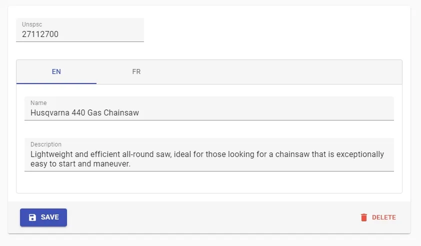
In localized (l10n) apps, it’s common to store string values in different locales.
For instance, let’s consider an Outdoor Tools & Equipment store available in English and French. A typical product record would contain the following data, where the name and description fields have one value per locale:
{ id: 1234, unspsc: '27112700', name: { en: 'Husqvarna 440 Gas Chainsaw', fr: 'Tronçonneuse Husqvarna 440', }, description: { en: 'Lightweight and efficient all-round saw, ideal for those looking for a chainsaw that is exceptionally easy to start and maneuver.', fr: "Légère et économique, idéale pour les professionnels à la recherche d'une tronçonneuse facile à manier.", } price: 299}To allow users to edit the translatable fields, you can use inputs with a nested source prop:
const ProductEdit = (props) => ( <Edit {...props}> <SimpleForm> <TextInput source="unspsc" /> <TextInput source="name.en" label="English name" /> <TextInput source="name.fr" label="French name" /> <TextInput source="description.en" label="English description" /> <TextInput source="description.fr" label="French description" /> </SimpleForm> </Edit>);But the visual result isn’t very good, you have to invent one label per field, and this doesn’t scale to an undetermined number of locales.
To improve the user experience when editing translatable fields, react-admin 3.12 introduces the <TranslatableInputs> component. It’s a wrapper around <Input> components for translatable fields, and it allows to group them in tabs:
import { TranslatableInputs } from "react-admin";
const ProductEdit = (props) => (  <Edit {...props}>    <SimpleForm>      <TextInput source="unspsc" />      <TranslatableInputs locales={["en", "fr"]}>        <TextInput source="name" />        <TextInput source="description" />      </TranslatableInputs>    </SimpleForm>  </Edit>);
Just like for <TabbedForm>, the tab headers turn red when one of the inputs in the tab contains an error. We’ve refactored the way react-admin detects errors in a group of inputs (and introduced the concept of <FormGroup>) to make that possible.
You can use the corresponding Field component, <TranslatableFields>, to display translatable content in a Show view.
Server-Side Validation And Validation Upon Submission
In a form, even though the client-side validation passes, the server-side validation may fail (e.g. if a unicity constraint can only be applied securely on the server).
That means you must be able to support server-side validators and to react to a failed form submission. React-final-form (the form library used by react-admin) supports these two features, but react-admin used to force you to write a custom form component to benefit from them.
Starting with react-admin 3.10, form validators can be asynchronous, and this lets you use server-side validators:
const validateUserCreation = async (values) => { const errors = {}; if (!values.firstName) { errors.firstName = ["The firstName is required"]; } if (!values.age) { errors.age = ["The age is required"]; } else if (values.age < 18) { errors.age = ["Must be over 18"]; } const isEmailUnique = await checkEmailIsUnique(values.userName); if (!isEmailUnique) { errors.email = ["Email already used"]; } return errors;};export const UserCreate = (props) => ( <Create {...props}> <SimpleForm validate={validateUserCreation}> <TextInput label="First Name" source="firstName" /> <TextInput label="Email" source="email" /> <TextInput label="Age" source="age" /> </SimpleForm> </Create>);This also works at the input level:
const validateEmailUnicity = async (value) => { const isEmailUnique = await checkEmailIsUnique(value); if (!isEmailUnique) { return "Email already used"; } return errors;};const emailValidators = [required(), validateEmailUnicity];export const UserCreate = (props) => ( <Create {...props}> <SimpleForm> ... <TextInput label="Email" source="email" validate={emailValidators} /> ... </SimpleForm> </Create>);And starting with react-admin 3.12, forms can be validated on the server-side upon submission. To display the validation errors, you must use a custom save function to pass the { returnPromise: true } option to the dataProvider:
import { useMutation } from "react-admin";
export const UserCreate = (props) => {  const [mutate] = useMutation();  const save = useCallback(    async (values) => {      try {        await mutate(          {            type: "create",            resource: "users",            payload: { data: values },          },          { returnPromise: true },        );      } catch (error) {        if (error.body.errors) {          return error.body.errors;        }      }    },    [mutate],  );  return (    <Create undoable={false} {...props}>      <SimpleForm save={save}>        <TextInput label="First Name" source="firstName" />        <TextInput label="Age" source="age" />      </SimpleForm>    </Create>  );};
This change facilitates the integration of react-admin with API Platform, a popular PHP framework for building web APIs.
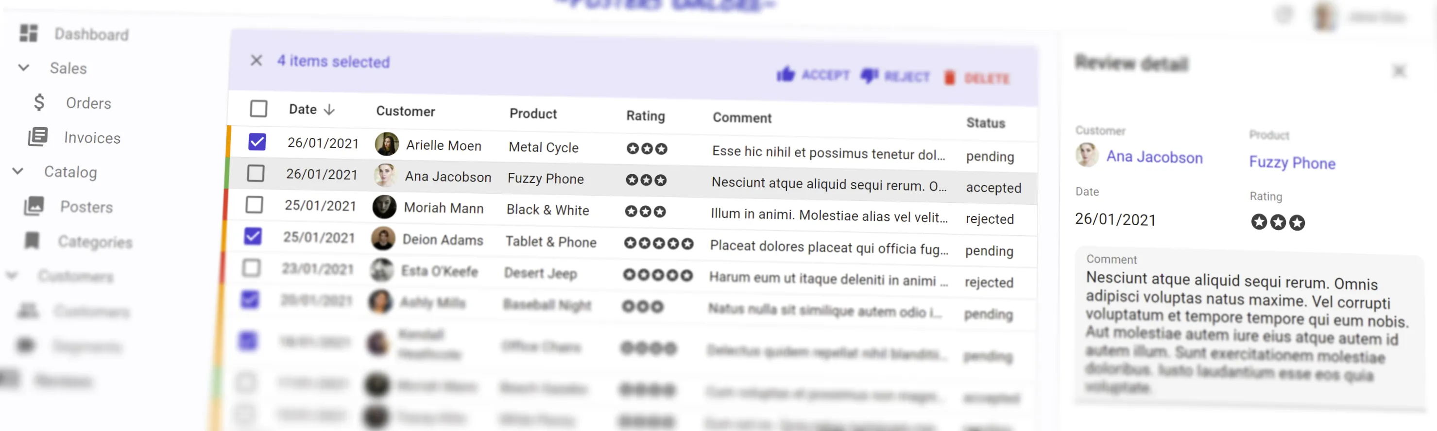
Optimistic Mutations
By default, react-admin uses optimistic updates - i.e. it applies updates locally and pushes them to the server after a delay that allows users to undo their changes. You can already opt-out and force the interface to wait for the server response to apply updates locally, by setting the undoable prop to false. We call that “pessimistic” updates.
In some cases, the ability to undo a mutation isn’t necessary, but the mutation shouldn’t be blocking either. A good example is a command that takes several minutes to complete: the user shouldn’t be forced to wait for the completion to continue using the admin.
To support these cases, react-admin 3.12 introduces the concept of mutationMode, which supersedes the undoable option. It can take 3 values: pessimistic, optimistic, and undoable:
| pessimistic | optimistic | undoable | |
|---|---|---|---|
| dataProvider call | immediate | immediate | delayed |
| local changes | when dataProvider returns | immediate | immediate |
| side effects | when dataProvider returns | immediate | immediate |
| cancellable | no | no | yes |
You can use the mutationMode as an option in your own dataProvider calls:
import * as React from "react";import { useUpdate, useNotify, useRedirect, Button } from "react-admin";
const ApproveButton = ({ record }) => {  const notify = useNotify();  const redirect = useRedirect();  const [approve, { loading }] = useUpdate(    "comments",    record.id,    { isApproved: true },    record,    {      // useUpdate is pessimistic by default, use optimistic instead      mutationMode: "optimistic",      onSuccess: ({ data }) => {        redirect("/comments");        notify("Comment approved", "info", {}, true);      },      onFailure: (error) => notify(`Error: ${error.message}`, "warning"),    },  );  return <Button label="Approve" onClick={approve} disabled={loading} />;};
You can also pass the mutationMode prop to the <Edit> component to change the behavior of the Save and Delete actions:
const PostEdit = (props) => ( <Edit mutationMode="optimistic" {...props}> // ... </Edit>);Use this prop unstead of undoable=false to make the actions pessimistic:
const PostEdit = (props) => ( <Edit mutationMode="pessimistic" {...props}> // ... </Edit>);Improved Keyboard Navigation
Power users, and users with motor disabilities, rely on the keyboard rather than the mouse to navigate. React-admin 3.12 introduces 2 very important improvements for keyboard navigation:
- The sidebar menu is now navigable with the keyboard (you can select a Menu with Tab and Enter)
- After loading the admin, hitting the “Tab” key reveals a “Skip to content” button that allows to skip the app bar items and the menu items, and to jump directly to the content zone.
This change is automatic and doesn’t require any configuration.
Accessibility is one of our priorities in react-admin, and we’re determined to continue improving it. Expect more changes like these in the future!
Use <List> Everywhere You Want
We’ve designed the <List> component to be used as the list route for a <Resource>. That means it’s a page component, which reads and stores the state in the URL. But we’ve noticed many developers trying to use <List> (or <ListBase>) outside of a <Resource> context (e.g. in a custom route, or in a tab in another view). They are surprised that it doesn’t work out of the box.
So we’ve updated the <List> and <ListBase> components to support that case and made the dependency to the route state explicit in the <Resource> code. That means you can now use <List> everywhere you want - provided you put it inside a ResourceContextProvider:
const TagsEdit = (props) => ( <> <Edit {...props}>// ...</Edit> <ResourceContextProvider resource="posts"> <ListBase basePath="/posts" filter={{ tags: [id] }}> <Datagrid> <TextField source="title" /> </Datagrid> </ListBase> </ResourceContextProvider> </>);When not used as <Resource list>, a <List> component stores its state (current sort, filters, and pagination) in memory rather than in the URL.
Contexts And Avoiding Cloning Elements
The first time you’ve seen this snippet, you may have thought: “What is this magic?”
const PostList = (props) => ( <List {...props}> <Datagrid> <TextField source="title" /> <TextField source="author" /> <DateField source="publication_date" /> </Datagrid> </List>);How does the <Datagrid> component know the records it has to show, the current sort field, the list of selected ids?
In order to provide a better Developer Experience (DX), we made an early decision to clone the elements you provide (like the <Datagrid>) so that we can inject them data computed at runtime or fetched from the server. So internally, the <List> component does something like this:
const List = ({ children, ...props }) => { const listControllerProps = useListControllerProps(props); return ( <div> <ListToolbar {...listControllerProps} /> {React.cloneElement(children, listControllerProps)} <Pagination {...listControllerProps} /> </div> );};This simple approach has several drawbacks:
- Even though the
<Datagrid>requires some of thelistControllerPropsto work, we cannot mark them as required in propTypes and TypeScript types because you must be able to pass<Datagrid>with no props as a child of<List>. This leads to runtime bugs that can’t be detected at compilation. - The
<Datagrid>code doesn’t make a difference between injected props (that are considered private) and props that developers can override. It makes the code harder to maintain. - Cloning elements prevents optimizations with
React.memo()to work on large trees.
One alternative would be to use the function-as-child pattern:
const PostList = (props) => ( <List {...props}> {(listControllerProps) => ( <Datagrid {...listControllerProps}> {(datagridProps) => ( <> <TextField source="title" {...datagridProps} /> <TextField source="author" {...datagridProps} /> <DateField source="publication_date" {...datagridProps} /> </> )} </Datagrid> )} </List>);This is more explicit, but it’s also much more cumbersome to write. Besides, it causes performance problems and forbids some of the advanced react-admin functionality. We’ve opted out of that technique in the react-admin core.
Instead, starting with version 3.7, we’ve started inverting the responsibilities for props passing: The parent (e.g. <List>) no longer has to push props to its children, it’s the child (e.g. <Datagrid>) that must pull the props from a React context.
So basically <List> now works as follows:
const List = ({ children, ...props }) => { const listControllerProps = useListControllerProps(props); return ( <div> <ListContextProvider value={listControllerProps}> <ListToolbar /> {children} <Pagination /> </ListContextProvider> </div> );};Components used inside a <List> can request props computed above them by calling useListContext().
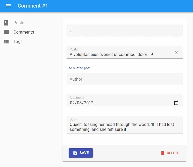
With version 3.10, we generalized this principle and introduced more contexts: ResourceContext, RecordContext and SaveContext, usable in <Create>, <Edit> and <Show> views. These contexts allow to write custom components without expecting props to be passed by the parent. For instance, if you want to write a custom button for updating a record in an <Edit> view:
const ResetViews = ({ record, resources }) => {const ResetViews = () => { const record = useRecordContext(); const resource = useResourceContext();
  const [handleClick, { loading }] = useUpdate(        resource,        record.id,        { views: 0 },        record,    );
return ( <button onClick={handleClick} disabled={loading}> Reset views </button> );}Tip: React-admin still uses React.cloneElement() for backwards compatibility reasons. So even though it’s now easier to write a custom component for react-admin views, the performance benefits will only appear once we remove that compatibility layer - in the next major release, 4.0.
We encourage you to use these contexts in your custom components to prepare for future major versions.
React-admin already uses them a lot, especially <SaveContext>, which allows some advanced scenarios around Create and Edit that were very difficult before.
Easier Customization for Create, Edit, and Show
The 3.7 version introduced the <ListBase> component and several hooks which allow one to create completely custom list views, leveraging the ListContext. In the same spirit, we introduced the same base components for the other views: <CreateBase>, <EditBase>, and <ShowBase>. They render nothing but their children and handle all the heavy lifting required for those views (fetching, updating, etc) by leveraging several new contexts.
Use these components e.g. to create custom layouts for an Edit page, as in the following example:
import * as React from "react";import { EditBase, SimpleForm } from "react-admin";import { Grid } from "@material-ui/core";
const PostEdit = ({ children, ...props }) => (  <EditBase {...props}>    <Grid container>      <Grid item xs={8}>        <SimpleForm>...</SimpleForm>      </Grid>      <Grid item xs={4}>        Edit instructions...      </Grid>    </Grid>    <div>Post related links...</div>  </EditBase>);
Customize The Ready Screen
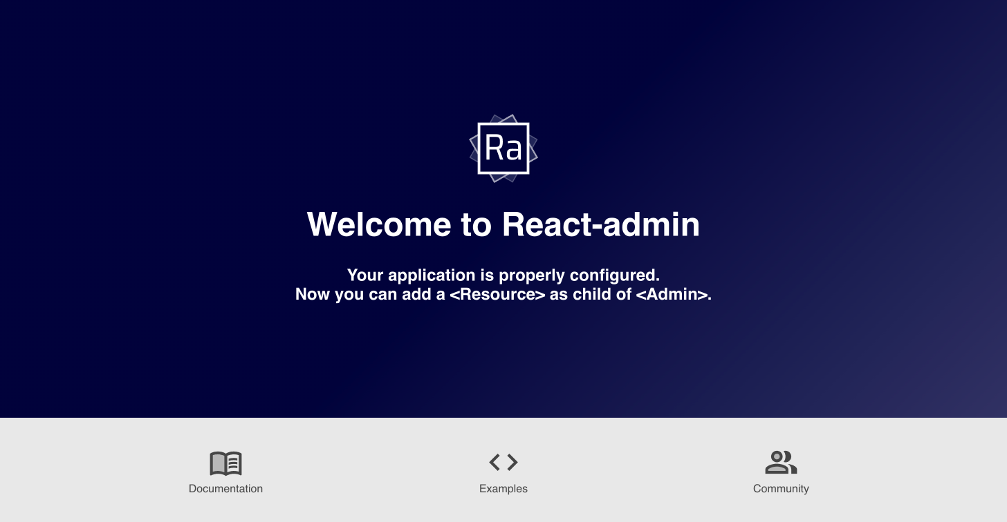
When a react-admin <Admin> component renders with no child <Resource>, react-admin assumes the user is a developer starting a new app and displays the following screen, which we call the “Ready screen”:
But there are legitimate cases where you may have an admin without any child <Resource>, e.g. to allow users to add resources dynamically. In that case, you must be able to display alternative content for the ready screen.
The ability to do just this was added in react-admin 3.10:
import * as React from "react";import { Admin } from "react-admin";
const Ready = () => (  <div>    <h1>Admin ready</h1>    <p>You can now add resources</p>  </div>);
const App = () => <Admin ready={Ready}>...</Admin>;
Customize Failed Authentication Side Effects
The authProvider.checkAuth() and authProvider.checkError() methods should return a rejected Promise when the user isn’t authenticated. By default, the user is then redirected to the Login screen with a notification inviting them to log in.
Starting with react-admin 3.10, you can now customize the redirection and the error message, by returning a custom object in the rejected Promise:
// in src/authProvider.jsexport default { login: ({ username, password }) => { /* ... */ }, getIdentity: () => { /* ... */ }, logout: () => { /* ... */ }, checkError: (error) => { const status = error.status; if (status === 401 || status === 403) { localStorage.removeItem('auth'); return Promise.reject(); return Promise.reject({ redirectTo: '/credentials-required', message: 'login.required' }); } // other error code (404, 500, etc): no need to log out return Promise.resolve(); }, checkAuth: () => { if (!localStorage.getItem('auth')) { return Promise.reject(); return Promise.reject({ redirectTo: '/credentials-required', message: 'login.required' }); } return Promise.resolve(); } // ...}You can even disable the notification altogether by passing false to message. This is useful in scenarios where the login page belongs to another app, as when using OpenId Connect (OIDC).
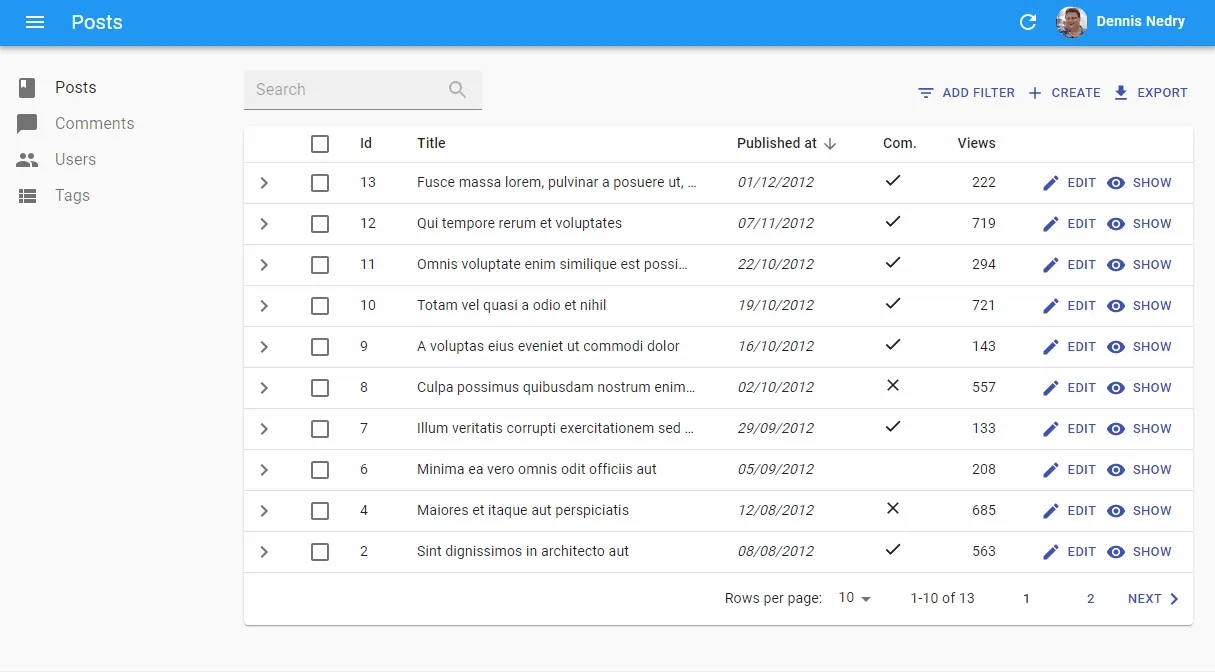
Performance Improvements
We’ve once again profiled react-admin in complex apps, tracked down bottlenecks, and removed the most offending ones. Users with old computers should benefit the most from these changes, as react-admin now needs fewer render cycles upon user interaction.
The following capture shows how fast react-admin feels when the data has already been fetched from the API. Navigation is instantaneous, even for complex pages:

In particular, we disabled the Material Design ripple effect on buttons. That change really speeds up large lists, which usually contain at least one button per row. The ripple effect is mostly intended for mobile users, so desktop users should see a net gain. You can reenable it via the global application theme.
Also, we’ve changed the way the <List> controller handles filter addition and removal. Users should see a major speedup when they change the filters in a list - especially if the data was already fetched in the past.
Finally, we’ve tweaked how the <ReferenceField> and <ReferenceArrayField> load data. We only display a loader animation if loading references takes more than one second. Not rendering these animations make the navigation experience snappier, especially on large lists.
Speaking of performance and large lists, a reminder: In a <Datagrid>, if the fields never change, use the optimized prop to avoid re-renders and make the UI more responsive:
import { List, Datagrid, TextField } from 'react-admin';
const PostList = props => (  <List {...props}>   <Datagrid>   <Datagrid optimized>      <TextField source="title">      <TextField source="body">      <TextField source="author">  </List>)
Domain Telemetry
Starting 3.11, react-admin applications send an anonymous request on mount to a telemetry server operated by marmelab. You can see this request by looking at the Network tab of your browser DevTools:
https://react-admin-telemetry.marmelab.com/react-admin-telemetry
The only data sent to the telemetry server is the admin domain (e.g. “example.com”) - no personal data is ever sent, and no cookie is included in the response. The react-admin team uses these domains to track the usage of the framework.
You can opt out of telemetry by simply adding disableTelemetry to the <Admin> component:
// in src/App.jsimport * as React from "react";import { Admin } from "react-admin";
const App = () => <Admin disableTelemetry>// ...</Admin>;
Miscellaneous Changes
There are many, many more minor changes in 3.10, 3.11, and 3.12, including;
- Add support for
<ArrayInput disabled> - Add ability to disable redirection after logout
- Add ability to customize the notification element in the
<Login>page - Add ability to disable redirection after logout
- Add ability to disable the
<UserMenu>without rewriting the<AppBar> - Add loading state support to the children of
<ReferenceInput> - Add
<MenuItemLink TooltipPops>to override tooltips in menus - Add
<SimpleForm component>to override the root component in forms
Check out the react-admin changelog for more details.
A Word About React-Admin Enterprise Edition
The open-source version of react-admin is not the only one to benefit from great new features. Over the past months, Marmelab has been hard at work polishing 3 new modules for the Enterprise Version:
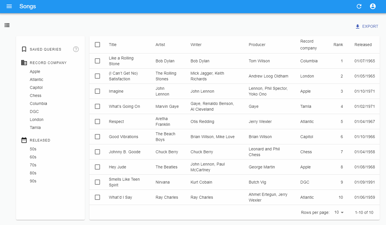
- ra-search integrates your search engine with an “Omnibox” experience, allowing users to find content much faster than before.
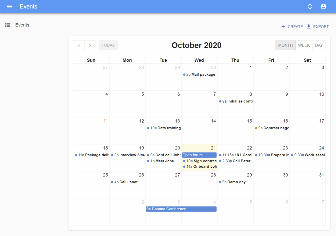
- ra-calendar lets you display and manipulate events, drag and resize appointments, and browse a calendar.
-
ra-enterprise offers preconfigured components replacing the default react-admin ones to quickly integrate the Enterprise Edition modules.
-
And let’s not forget Saved Queries a new feature of the ra-preferences module, allowing users to save custom combinations of filter & sort parameters for later reuse.
We’ve published a separate blog post covering these new Enterprise features. And if you’re interested in any of these new features, give React-admin Enterprise Edition a try!

Authors
Full-stack web developer at marmelab, Gildas has a strong appetite for emerging technologies. If you want an informed opinion on a new library, ask him, he's probably used it on a real project already.
Marmelab founder and CEO, passionate about web technologies, agile, sustainability, leadership, and open-source. Lead developer of react-admin, founder of GreenFrame.io, and regular speaker at tech conferences.