React Admin Enterprise Edition - February 2021 Update

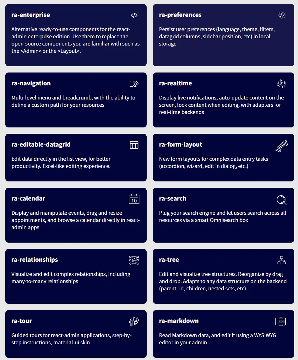
The Enterprise Edition of react-admin speeds up the development of complex admin apps by offering 9 additional modules, ranging from editable datagrid to tree structure handling. We’ve been continuously adding new functionality to these modules, in reaction to feedback from our customers. We’ve also added 3 entirely new modules! Here is a summary of the most important changes of the past 3 months.
First, let’s introduce the 3 new modules:
- ra-search: Plug your search engine and let users search the entire admin via a smart Omnibox.
- ra-calendar: Display and manipulate events, drag and resize appointments, and browse a calendar
- ra-enterprise: Alternative ready-to-use components for the react-admin enterprise edition
Next: check out these exciting new features added to existing modules:
- ra-preferences: Saved filters
- ra-relationships: Support for multiple many-to-many inputs in the same form
Note: There are many more changes in the Open-Source Edition or react-admin. We’ve already described them in a separate blog post.
Now, let’s go into the details.
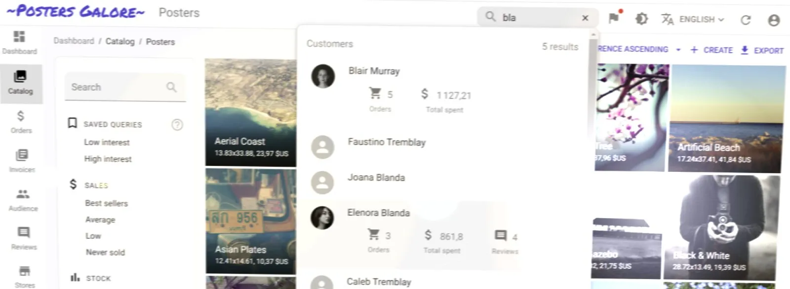
ra-search: Plug your search engine and let users search the entire admin via a smart Omnibox
In large admins, users need several clicks to get to one record. For repetitive tasks, this ends up costing minutes every day. The ra-search Omnibox simplifies navigation by providing a global, always-on search engine for records.
Ra-search can take advantage of a search engine like ElasticSearch if you have one, or it can rely on your REST API by searching across multiple resources in parallel.
Ra-search passes search strings to the dataProvider.search() method, which should return an array of search results:
dataProvider.search("roll").then((response) => console.log(response));// {// data: [// { id: 'a7535', type: 'artist', url: '/artists/7535', content: { label: 'The Rolling Stones', description: 'English rock band formed in London in 1962' } }// { id: 'a5352', type: 'artist', url: '/artists/5352', content: { label: 'Sonny Rollins', description: 'American jazz tenor saxophonist' } }// { id: 't7524', type: 'track', url: '/tracks/7524', content: { label: 'Like a Rolling Stone', year: 1965, recordCompany: 'Columbia', artistId: 345, albumId: 435456 } }// { id: 't2386', type: 'track', url: '/tracks/2386', content: { label: "It's Only Rock 'N Roll (But I Like It)", year: 1974, artistId: 7535, albumId: 6325 } }// { id: 'a6325', type: 'album', url: '/albums/6325', content: { label: "It's Only rock 'N Roll", year: 1974, artistId: 7535 }}// ],// total: 5// }It is your responsibility to add this search method to your dataProvider.
If your API doesn’t expose a full-text search endpoint, no worries! You can use the simple addSearchMethod helper function. It adds the search() method to an existing dataProvider, relying on the dataProvider.getList() method on the configured resources.
import simpleRestProvider from "ra-data-simple-rest";import { addSearchMethod } from "@react-admin/ra-search";
const dataProvider = simpleRestProvider("http://path.to.my.api/");
const dataProviderWithSearch = addSearchMethod(dataProvider, [  "artists",  "tracks",  "albums",]);
Now calling dataProvider.search('roll') will issue the following queries in parallel and aggregate the results into a single response:
dataProvider.getList("artists", { filter: { q: "roll" } });dataProvider.getList("tracks", { filter: { q: "roll" } });dataProvider.getList("albumns", { filter: { q: "roll" } });To integrate the search omnibox in the app bar or a react-admin application, use the <Search> component:
import { Admin, AppBar, Layout, Resource } from 'react-admin';import { Typography } from '@material-ui/core';import { Search } from '@react-admin/ra-search';
const MyAppbar = (props) => (    <AppBar {...props}>        <Typography id="react-admin-title" variant="h6" color="inherit" />        <Search />    </AppBar>);
const MyLayout = (props) => (    <Layout {...props} appBar={MyAppbar} />);
export const App = () => (    <Admin dataProvider={searchDataProvider} layout={MyLayout}>        {...}    </Admin>);
And there you go:
You can customize pretty much everything in the way search results appear: grouping, search result items, etc. Refer to the ra-search documentation for details.
ra-calendar: Display and manipulate events, drag and resize appointments, and browse a calendar
To manipulate events, meetings, schedules, the best UI is that of a calendar. Don’t build it yourself! The ra-calendar module integrates Full Calendar with react-admin:
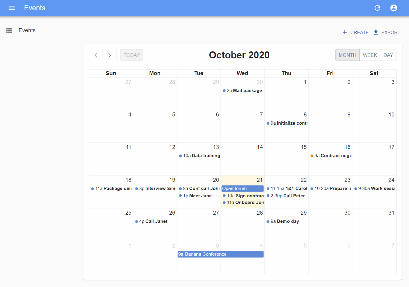
It offers an impressive amount of features:
- month, week, day views
- list view
- drag and resize events
- whole-day events
- creating an event by clicking on the calendar
- edition of the event title, and metadata
- events spanning multiple days
- recurring events
- background events
- theming
- locales and timezones
- resource time grid (e.g. rooms) (requires an additional license from Full Calendar)
The easiest way to use it is via <CompleteCalendar>. It’s an all-in-one component that renders a calendar, as well as a form to edit or create new events that opens in a dialog. It is deeply integrated with react-admin, and benefits from the same speed optimizations.
Use it as the list prop of a <Resource>. No need to specify an edit or create prop for this resource, but you’ll have to pass a form component (like <SimpleForm>) as the child of <CompleteCalendar> to define the event edition form.
Here is an example:
import React, { FC } from 'react';import {    Admin,    Resource,    List,    ListProps,    SimpleForm,    TextInput,    DateTimeInput,} from 'react-admin';import { CompleteCalendar } from '@react-admin/ra-calendar';
import dataProvider from './dataProvider';
const EventList: FC<ListProps> = props => (    <CompleteCalendar {...props}>        <SimpleForm>            <TextInput source="title" autoFocus />            <DateTimeInput source="start" />            <DateTimeInput source="end" />        </SimpleForm>    </CompleteCalendar>);
export const Basic: FC = () => (    <Admin dataProvider={dataProvider}>        <Resource name="events" list={EventList} />    </Admin>);
<CompleteCalendar> lets you customize pretty much everything about the calendar view and the event edition and creation forms. The ra-calendar documentation page gives all the details.
ra-enterprise: Alternative ready-to-use components for the react-admin enterprise edition
Adding react-admin Enterprise Edition modules to your app may require a bit of configuration. To facilitate the installation of the private modules, ra-enterprise lets you change only one import by providing alternative components to <Admin>, <Layout>, <AppBar>, and <Breadcrumb>.
 import { Admin, Resource } from 'react-admin'; import { Admin } from '@react-admin/ra-enterprise'; import { Resource } from 'react-admin';import posts from './posts';
const App = () => (    <Admin dataProvider={dataProvider}>        <Resource name="posts" {...posts}>    </Admin>);
This alternative <Admin> component pre-configures many of the ra-enterprise modules. It comes with:
- A breadcrumb based on resources (from ra-navigation)
- A light and dark mode for the theme (from ra-preferences)
- A language switcher (from ra-preferences)
- A preference based sidebar state (from ra-preferences)
- Augmented reducers for tree structures and realtime locks (from ra-tree and ra-realtime)
- A compact menu with submenus in sliding panels (from ra-navigation)
- The Tour provider, allowing to show guided tours everywhere in the admin (from ra-tour)
- English messages including the additional messages required by ra-realtime, ra-relationships, and ra-tree
This modifies the default look and feel of react-admin:
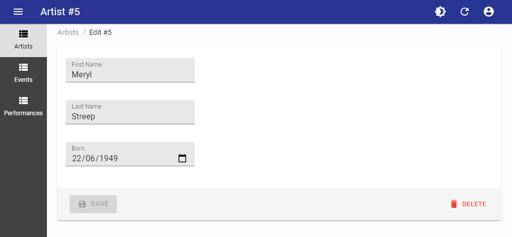
To be compared with the default admin:
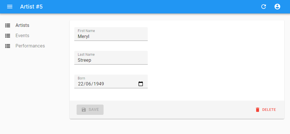
ra-enterprise makes it easy to start a new admin app with React-admin Enterprise Edition. It comes with sensible defaults that match most common cases. You should be able to start working on your business logic in no time!
Saved Filters: Store The Current Query For Later Reuse
Some lists offer many individual filters and sort options, and users may need to repeatedly apply a certain combination of those - in other words, a custom query. ra-preferences offers users a way to store the current query in local storage, so as to find it later in a list of “saved queries”.
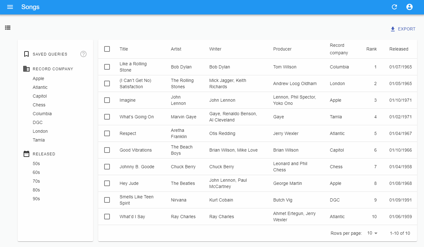
If your list uses the <FilterList> sidebar, add the <SavedQueriesList> component before the first <FilterList> to enable saved queries:
import { FilterList, FilterListItem, List, Datagrid } from 'react-admin';import { Card, CardContent } from '@material-ui/core';
import { SavedQueriesList } from '@react-admin/ra-preferences';
const SongFilterSidebar: FC = () => (    <Card>        <CardContent>           <SavedQueriesList />            <FilterList label="Record Company" icon={<BusinessIcon />}>                ...            </FilterList>            <FilterList label="Released" icon={<DateRangeeIcon />}>               ...            </FilterList>        </CardContent>    </Card>);
const SongList: FC<Props> = props => (    <List {...props} aside={<SongFilterSidebar />}>        <Datagrid>            ...        </Datagrid>    </List>);
If your list uses the <Filter> Button/Form Combo, replace react-admin’s <Filter> with ra-preference’s <FilterWithSave> to enable saved queries:
import {   Filter,    SelectInput,    DateInput,    List,    Datagrid,    TextField,    NumberField,    DateField} from 'react-admin';import { FilterWithSave } from '@react-admin/ra-preferences';
const SongFilter: FC = props => (   <Filter {...props}>   <FilterWithSave {...props}>        <SelectInput            choices={[                { id: 'Apple', name: 'Apple' },                { id: 'Atlantic', name: 'Atlantic' },                { id: 'Capitol', name: 'Capitol' },                { id: 'Chess', name: 'Chess' },                { id: 'Columbia', name: 'Columbia' },                { id: 'DGC', name: 'DGC' },                { id: 'London', name: 'London' },                { id: 'Tamla', name: 'Tamla' },            ]}            source="recordCompany"        />        <DateInput source="released_gte" label="Released after" />        <DateInput source="released_lte" label="Released before" />   </Filter>   </FilterWithSave>);
const SongList: FC<Props> = props => (    <List {...props} filters={<SongFilter />}>        <Datagrid rowClick="edit">            <TextField source="title" />            <TextField source="artist" />            <TextField source="writer" />            <TextField source="producer" />            <TextField source="recordCompany" />            <NumberField source="rank" />            <DateField source="released" />        </Datagrid>    </List>);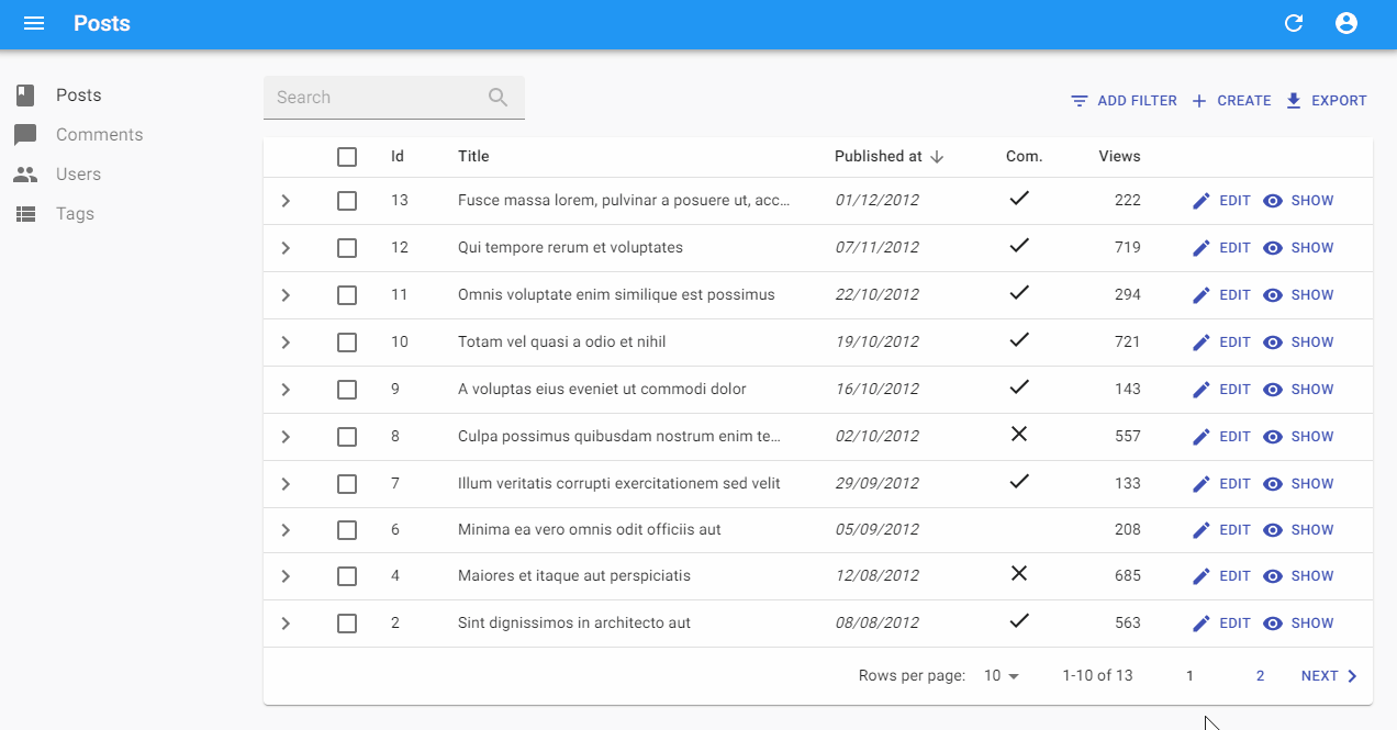
Multiple Many To Many Input Components In One Form
The ra-relationships module offers the <ReferenceManyToManyInput> component to edit many-to-many relationships:
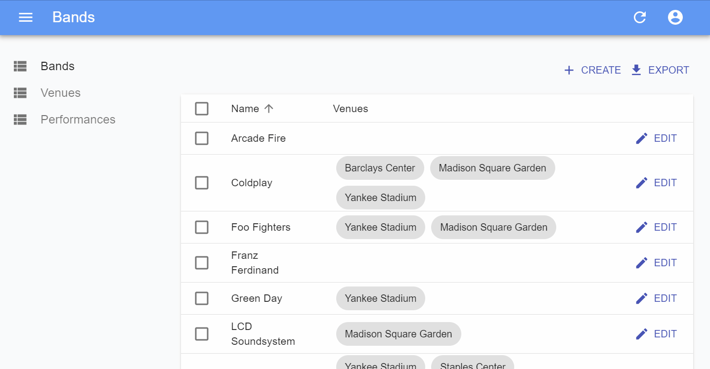
In previous versions of this module, you could only have one <ReferenceManyToManyInput> per form. This limit was lifted in version 2.0 of the ra-relationships module. That change was not possible in a backward-compatible way, that’s why we bumped the major version number of the ra-relationships module.
To enable one or many <ReferenceManyToManyInput> inside a form, you must now wrap the form inside a <ManyToManyReferenceContextProvider>:
import React from "react";import { Edit, SelectArrayInput, SimpleForm, TextInput } from "react-admin";
import {  ReferenceManyToManyInput,  ManyToManyReferenceContextProvider,} from "@react-admin/ra-many-to-many";
const ArtistEdit = (props) => (  <Edit {...props}>    {/*            The ManyToManyReferenceContextProvider wrapper around the form is needed.            This component is responsible for handling the references updates even when            there are multiple ReferenceManyToManyInput targeting different relations.        */}    <ManyToManyReferenceContextProvider>      <SimpleForm>        <TextInput disabled source="id" />        <TextInput source="first_name" />        <TextInput source="last_name" />        <ReferenceManyToManyInput          source="id"          reference="events"          through="performances"          using="artist_id,event_id"          fullWidth          label="Performances"        >          <SelectArrayInput optionText="name" />        </ReferenceManyToManyInput>      </SimpleForm>    </ManyToManyReferenceContextProvider>  </Edit>);
export default ArtistEdit;
Conclusion
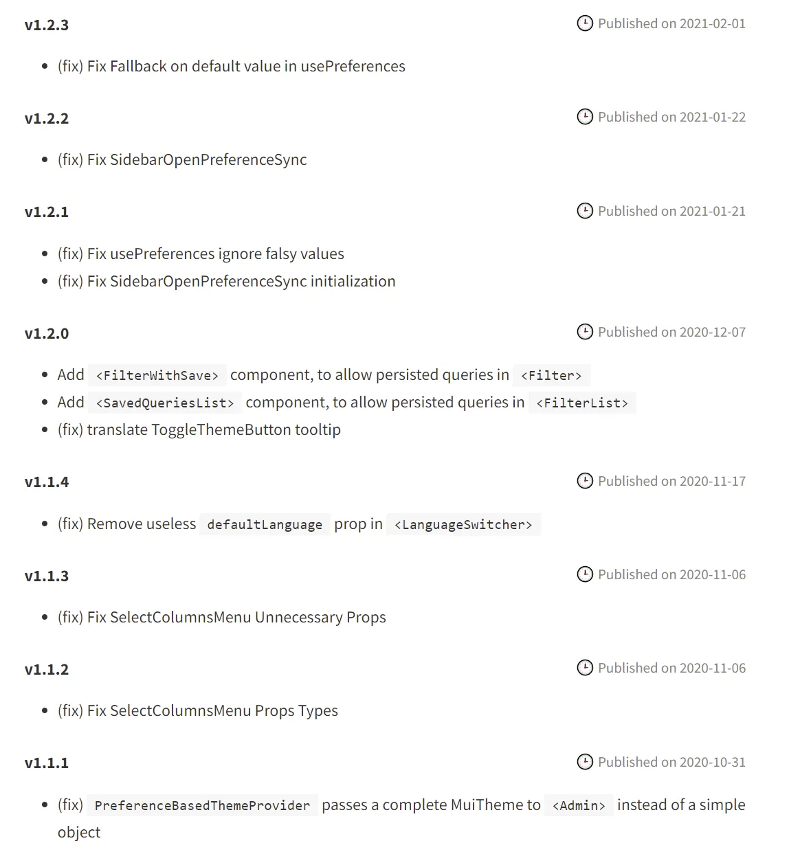
Each private module now shows a changelog section on its documentation page, so make sure you check the ones of the modules you use. For instance, here is a glimpse of the ra-preferences changelog:
Overall, since the last time we published a blog post about react-admin Enterprise Edition, we’ve pushed more than 70 changes (bug fixes, UI tweaks, documentation changes, new features) to the private modules.
If you’re an Enterprise Edition customer, you get all these updates for free! Just run yarn upgrade to get the latest version of the @react-admin/XXX modules.
If you’re not an Enterprise Edition customer yet, check out our plans: from 125€/month, you can dramatically speed up your development by using these modules that we’ve carefully crafted, tested, and documented, instead of writing your own code. A single one of these modules would already provide enough value to justify the subscription - but by subscribing, you get access to all 12 of them. And unlimited professional support!

Authors
Marmelab founder and CEO, passionate about web technologies, agile, sustainability, leadership, and open-source. Lead developer of react-admin, founder of GreenFrame.io, and regular speaker at tech conferences.