React-Admin April 2021 Update

It’s only been two months since our latest update about react-admin, but many new features have landed in the latest two versions. If you haven’t followed the regular updates from our @ReactAdmin Twitter account, now is a good time to catch up about the changes in react-admin 3.13 to 3.14.
- UX Improvements: Select a range of rows in a Datagrid, scroll to top on navigate, etc.
- New Features: Dependent queries,
useRecordContext,useGetResourceLabel, etc. - Developer Experience Improvements: Easier overrides, better defaults, improved docs
- Internal Changes: Switch simple example from Webpack to Vite.js, extract test utils to
ra-test
For a complete changelog, check the react-admin releases page.
UX Improvements
With each release, we polish the interface to make the user experience more delightful. We don’t try to invent interface conventions. Instead, we do our best to let users use the same interactions as they do in other software.
- Add support for selecting a range of
<Datagrid>rows by using shift + click - Add scroll to top on key navigation links
- Improve
<AutocompleteArrayInput>filtering performance - Fix
<AutocompleteInput>and<AutocompletearrayInput>options appear behind Dialog (long-standing issue)
New Features
React-admin 3.13 and 3.14 introduce two major features and many smaller ones.
Dependent Queries
Developers love the dataProvider query hooks (useQuery, useQueryWithStore, useGetOne, useGetList, useGetMany, etc.). These hooks offer an intuitive way to handle loading, empty, and error states without pain.
But when a page needs to make several of these calls in a row, one query depending on the result of the other, developers used to have to call the dataProvider directly.
With the introduction of the enabled option, react-admin can skip queries altogether when their dependencies aren’t ready yet:
// fetch postsconst {  ids,  data: posts,  loading: isLoading,} = useGetList <Post >("posts", { page: 1, perPage: 20 }, { field: "name", order: "ASC" }, {});
// then fetch categories for these postsconst { data: categories, loading: isLoading } =  useGetMany <  Category >  ("categories",  ids.map((id) => posts[id].category_id),  // run only if the first query returns non-empty result  { enabled: ids.length > 0 });
useRecordContext
React-admin now creates a context everywhere there is a record available. For instance, in an <Edit> or <Show> view, in a <ReferenceField>, in <Datagrid> rows, or in <SimpleList> items. You can grab the record in descendent components by calling useRecordContext().
This greatly simplifies the creation of custom Show layouts, custom fields, and custom sidebars.
For instance, to display an avatar based on a record field, you no longer need to worry about whether the record is injected or not. Just pull it from the context:
import { Avatar } from "@material-ui/core";import { useRecordContext } from "react-admin";
export const AvatarField = () => {  const record = useRecordContext();  if (!record) return null;  return (    <Avatar src={record.avatar}>      {record.first_name.charAt(0)}      {record.last_name.charAt(0)}    </Avatar>  );};
You can use this Field with no props, e.g. in a Show page:
const ContactShow = () => ( <Box display="flex"> <AvatarField /> <Box flex="1"> <TextField source="name" component="p" /> <TextField source="profession" component="p" /> </Box> </Box>);Tip: React-admin creates a RecordContext where there can be a record, but during the loading phase, the record isn’t defined yet. Don’t forget to test for existence!
All Field components now use useRecordContext, so you don’t need to pass an explicit record prop when inside a RecordContext (i.e. virtually everywhere).
We’re relying more and more on contexts, in addition to child cloning and props injection. We’ve understood that props injection is confusing for developers who don’t understand where the props come from and when they are injected or not. In the future major version, we’ll remove child cloning and rely exclusively on contexts.
Other New Features
Many individual components gained new capabilities in the recent releases:
- Add
<Datagrid isRowExpandable>prop to control when to allow users to expand rows - Add support for
<Labeled fullWidth>for better Show layouts - Add support for
<ArrayInput helperText> - Add
successnotification type, to show a green toast message when users need to know their action ended successfully - Add ability to display disabled options in
<SelectArrayInput> - Add support for array values in
<ReferenceArrayField>filter - Add ability to disable routing in
<TabbedForm>and<TabbedShowLayout>(and to use more than one such layout per page) <Admin customRoutes>withnoLayoutnow render even though there is no<Resource>- useful for fined-grained permissions<ReferenceArrayInput>now creates aListContext, which allows using regular iterators (like<Datagrid>) as child- Add
useGetResourceLabelhook to get the (translated) page name for a resource
Developer Experience Improvements
We’ve been working on the react-admin code for more than 4 years, and we know all its intricacies. Maybe a little too much. When React developers discover react-admin, they usually hit many small bumps that make the developer experience a bit painful.
We’ve put ourselves in such shoes by building new react-admin projects from scratch. We’ve also interviewed junior developers who learn both React and react-admin at the same time to understand their pain points.
The feedback we got helped us make the developer experience smoother by removing many little frictions. Here is the list.
Less Boilerplate / WTF
These changes reduce the amount of code you need to write to develop a custom component. For example, a custom Aside component for a contact Show view:
const ContactAside = ({ record }) => {const ContactAside = () => {    return (        <div>            <h3>Age</h3>           <NumberField record={record} source="age" />           <NumberField source="age" />

            <h3>First Seen</h3>           <DateField record={record} source="created_at" />           <DateField source="created_at" />
            <h3>Company</h3>            <ReferenceField             record={record}             basePath="/contacts"              source="company_id"              reference="companies"            >                <TextField source="name">            </ReferenceManyField>
<EditButton basePath="/contacts" record={record} /> <EditButton /> </div> );}- Add ability to omit
recordandbasePathin Buttons and Reference Fields when building a custom page layout - Add ability to call useGetList without pagination, sort, or filter params
- You can now use
<List>as a standalone component, in which case it doesn’t sync the sorting, pagination, and filter parameters with the URL - Improve
<Datagrid>and<SimpleList>defaults to make them less verbose in the general case - Remove translation warnings when an admin doesn’t use any
i18nProvider - Remove translation warnings about error messages in the
<Error>component - Fix TypeScript types preventing simple usage of useGetList ,
<SimpleList>and<Datagrid>
Easier Overrides
We’ve been through this so many times: a react-admin component seems to do the job for one particular requirement. Unfortunately, the customer has one specific demand about labels, styles, or layout that isn’t supported by the react-admin component. So you end up copying the component code into your project and change only one line.
This is what we want to avoid by providing more ways to override defaults.
- Add support for a React element as
<Confirm content>prop value - Add support for
<SingleFieldList component> - Add ability to use an element as the label in
<FormTab> - Add ability to use an element as the label in
<FilterListItem> - Add ability to override the
<UserMenu>component style
So now, if you want to use a <SingleFieldList> inside a <p> element without warning about bad DOM hierarchy, no need to rewrite it from scratch: just pass <SingleFieldList component="span">!
Improved Docs & Types
One of our goals is to minimize the time a developer spends on the documentation. We can always improve APIs to make them more intuitive, but throughout the past 2 releases, we’ve found other ways to do so.
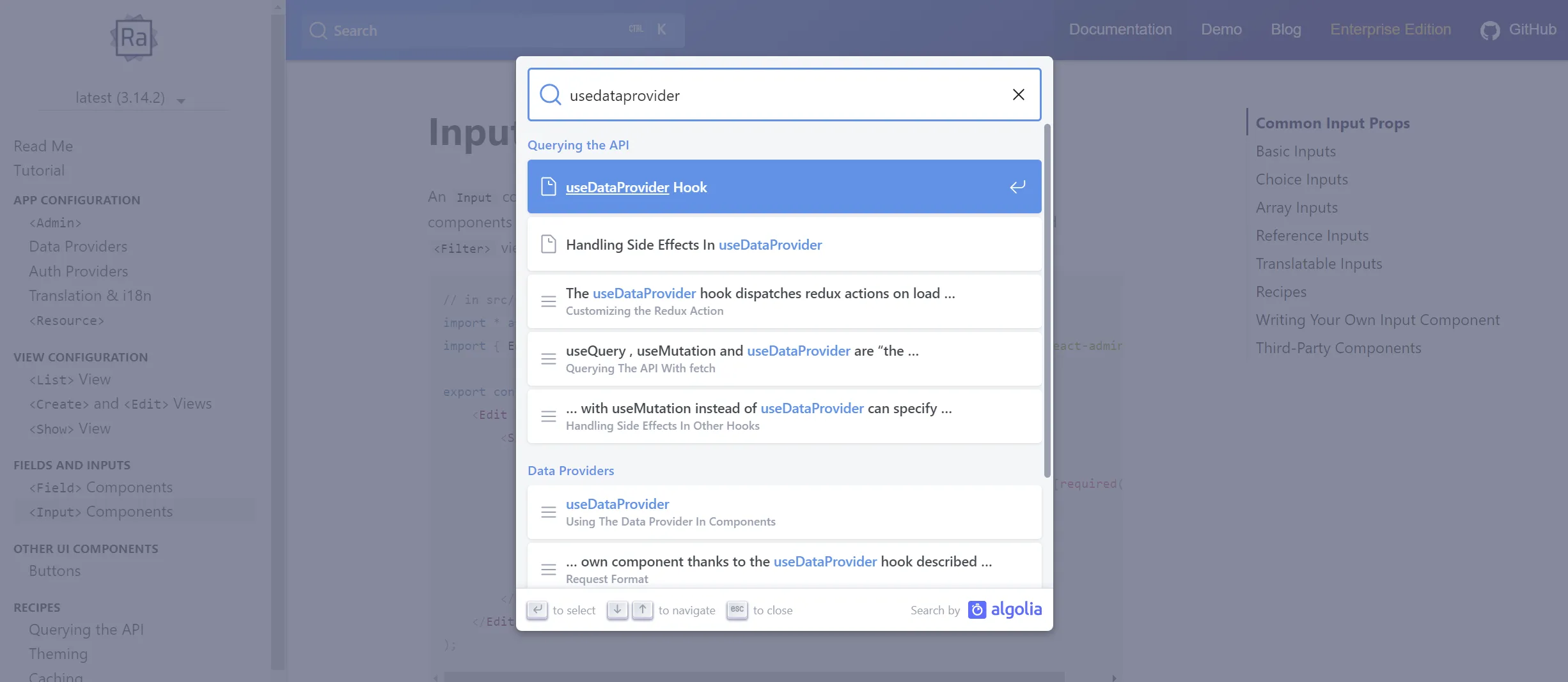
- Improve documentation search and add keyboard shortcut (Ctrl + K)
- Bootstrap new doc chapter about buttons
- “Go to definition” on a react-admin component now goes to the source (uncompiled) code in VSCode
- Improve TypeScript types for Inputs and dataProvider hooks
Internal Changes
We’ve moved the test utils (<TextContext>, renderWithRedux, renderHook) out of ra-core into a new ra-test package. that’s technically a breaking change, but not on production code, and the upgrade path takes 1 line:
import { renderWithRedux, useMatchingReferences} from 'react-admin';import { useMatchingReferences} from 'react-admin';import { renderWithRedux } from 'ra-test';Our simple example now uses Vite.js instead of Webpack, and this has boosted our productivity. the Simple example CodeSandbox still relies on Webpack, though.
A Word About React-Admin Enterprise Edition
If you like the new features we’ve added to react-admin, you’re going to love what we’ve also published in react-admin Enterprise Edition. We’ll publish a dedicated blog post about it, but here are the highlights:
- ra-audit-log is a new module that allows to track the changes in every resource
- The
<Breadcrumb>component fromra-navigationgot a major overhaul, allowing deeper customization - The
ra-realtimepackage now allows customizing the side effects triggered when a real-time update occurs. <TreeWithDetails>, from thera-treepackage, now allows to hide the root node
If you’re interested in any of these new features, give React-admin Enterprise Edition a try!

Authors
Marmelab founder and CEO, passionate about web technologies, agile, sustainability, leadership, and open-source. Lead developer of react-admin, founder of GreenFrame.io, and regular speaker at tech conferences.