Building A Retro React-Admin Theme For Fun And Profit

React-admin v4, currently in the works, is scheduled for the first quarter of 2022 (see the v4 roadmap). But it’s a long time waiting. So in the meantime, I decided to explore the past.
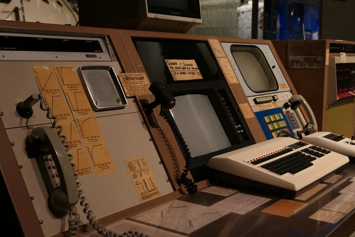
Is there a best period than the end-of-year celebrations to reminisce nostalgically about the glorious past of IT? Who has never dreamed of being able to navigate on their latest laptop as our ancestors did in the 80s?
Thanks to retro-admin, it’s now possible! Find all the advantages and simplicity of react-admin in an exceptional retro mode.
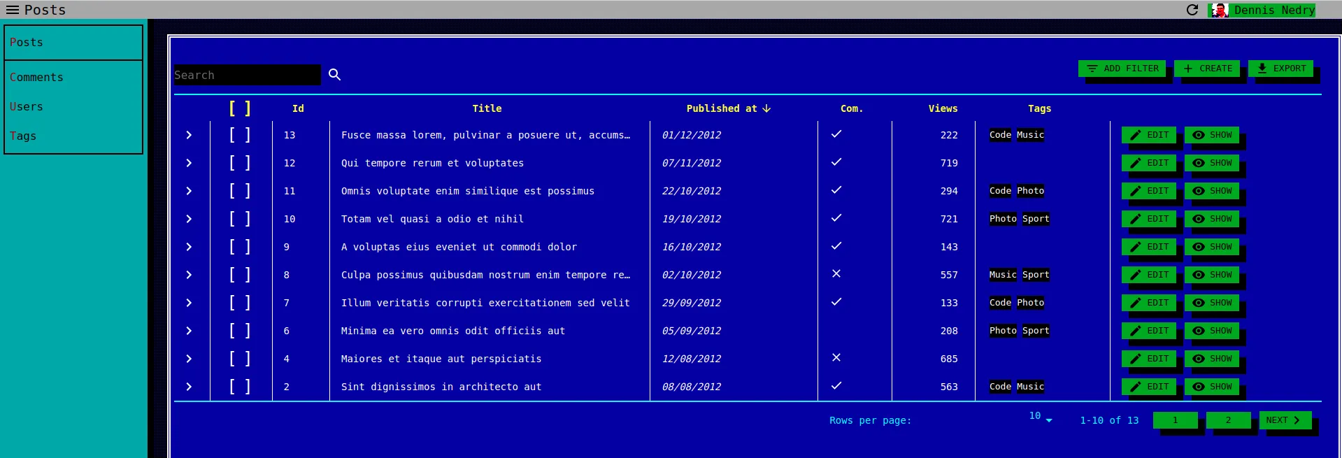
Countless benefits are coming with this version:
- No more responsive issues.
- Over-optimized contrast, ideal for the visually impaired.
- A dark ecological display mode by default (and the only one)
- CRT compatible
This post explains how I build retro-admin in a couple days.
TuiCss
The theme applied in react-admin is directly inspired by the TuiCss library. It provides a set of classes that allow designing very quickly pages with this retro look and feel. There are tui-checkbox, tui-window, tui-input-fieldset, and so on.
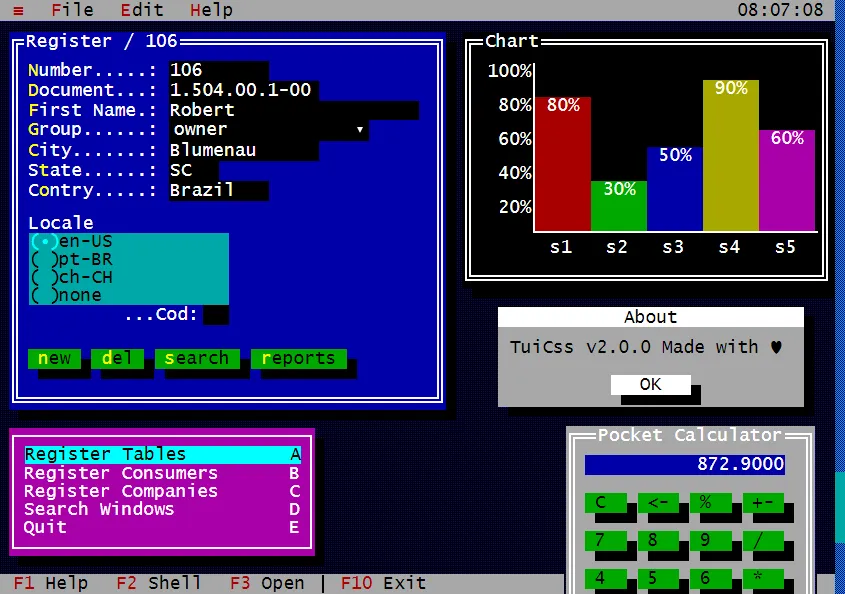
The initial idea was to directly use these classes and elements provided by TuiCss. But react-admin is built using MaterialUI. And MaterialUI’s internal styling is full of rules and style overlays to handle all possible cases and events of the different elements. It is absolutely not intended to be overridden by applying classes to high-level elements.
So I had to find another way.
Theming Material UI
MaterialUI, however, is designed to be overridded via an extensive theming system. And so it was enough to redefine all the rules necessary to implement the retro mode in a custom theme.
The theme is a JS object defining the display and behavior of each element of MaterialUI and/or React-admin.
{ typography: { fontFamily: "inherit", }, overrides: { MuiButtonBase: { root: { //some rules }, }, MuiAppBar: { colorSecondary: { //some rules } } }}Tips and Tricks
It was often tricky to block the behavior of MaterialUI, such as sliding labels:

MuiInputLabel: { animated: { transition: "none", }, formControl: { display: "flex", transform: "scale(1) !important", alignItems: "center", position: "relative", }, shrink: { display: "flex", transform: "scale(1) !important", alignItems: "center", position: "relative", }, marginDense: { transform: "scale(1) !important", }, },![]()
Or to get checkboxes in “text” mode:

MuiCheckbox: { root: { "&.Mui-checked": { "&:before": { content: '"[■]"', }, }, "&:before": { content: '"[ ]"', minWidth: "50px", letterSpacing: -3, }, "& span": { display: "none", }, }, },
The code line that appears most often is:
transition: "none";Necessary to deactivate any modern animation of the elements, totally unthinkable and the worst taste in for 80s.
And so we get the first MaterialUI theme that does not respect at all the principles of Material Design ;).
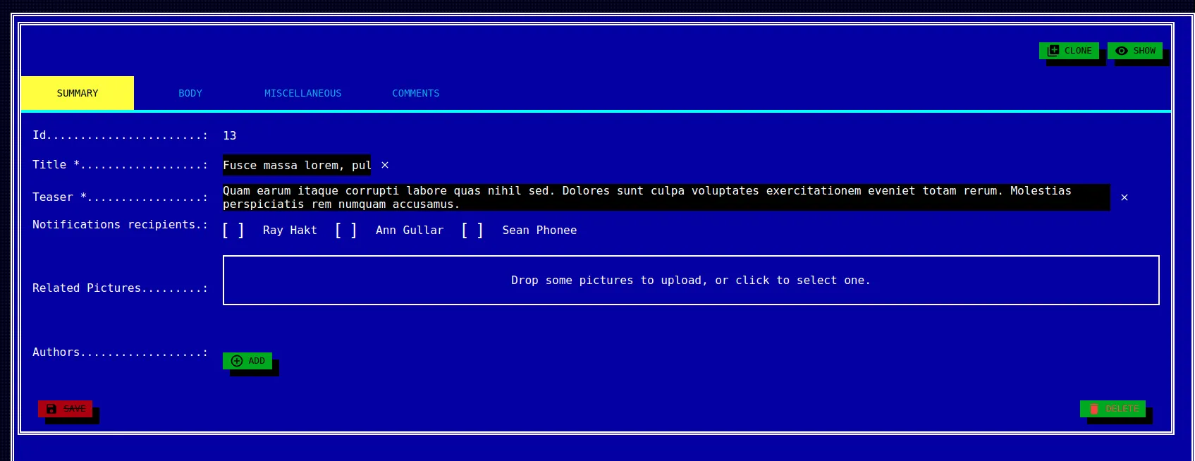
Beware though, some custom or forgotten elements may not be displayed as desired, you will simply have to add your own rules in the theme.
There Is Nothing Left To Do But To Try It
If you already use react-admin, feel free to add the retro theme to your administration. Your users will love the surprise. We’ve tested it with great success. Please send us pictures of their faces while they discover you latest update.
And if you don’t use react-admin yet, this is your chance to try. Check the blog demo with retro theme and you’ll be convinced. Just use login/password or admin/password as credentials. Compare it with the regular blog demo to see how Material Design looks dated in retrospect.
The github repository containing all the sources is here: JulienMattiussi/retro-admin
I wish you happy holidays.

And don’t worry, I don’t think I’m initiating a trend, Material Design is certainly not dead.

Authors

Full-stack web developer at marmelab, Julien follows a customer-centric approach and likes to dig deep into hard problems. He also plugs Legos to computers. He doesn't know who is Irene...