
Building a B2B app with Strapi and React-Admin

A good way to build a B2B app is to use a backend-as-a-service (BaaS) like Strapi and a low-code tool like React-Admin. This combination lets you develop web apps super fast. Let’s see how in practice.
This tutorial requires a basic knowledge of **Javascript, React, and **REST APIs****.
Introducing Strapi
Strapi defines itself as an open-source headless CMS. It allows us to create, manage, and persist structured data via a dedicated admin. It also exposes resources via its Content API, which we’ll use with react-admin in the second part. It’s 100% JavaScript, fully customizable, and developer-first.
To install Strapi, you can either use the CLI or the Docker image. In this tutorial, we’ll use the docker image. It allows us to orchestrate the back-end and our database with docker-compose.
Create a new directory for this project. At its root, create a docker-compose.yml file and add the following content:
version: "3"services:  strapi:    image: strapi/strapi    environment:      DATABASE_CLIENT: postgres      DATABASE_NAME: strapi      DATABASE_HOST: postgres      DATABASE_PORT: 5432      DATABASE_USERNAME: strapi      DATABASE_PASSWORD: strapi    volumes:      - ./app:/srv/app    ports:      - "1337:1337"    depends_on:      - postgres
  postgres:    image: postgres    environment:      POSTGRES_DB: strapi      POSTGRES_USER: strapi      POSTGRES_PASSWORD: strapi
We have two services here. The first one is the Strapi server. It uses the official docker image. The second service is the Postgres database that stores the content edited with Strapi.
We can start the services by running the following command:
docker-compose upOnce the installation is complete, follow the CLI invite and open the http://localhost:1337/admin URL to set up Strapi.
Configuring Strapi
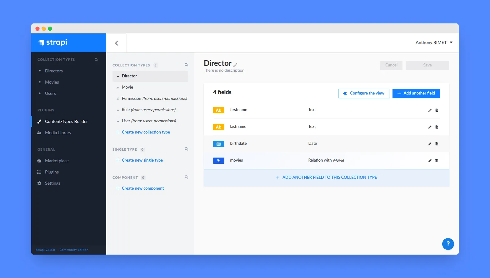
After creating the admin user, we can describe the data structure for our application. Let’s create two resources called Directors and Movies. To create new resources, go to the Content-Type Builder link on the left menu and click ”+ Create new collection type”. For more information about the Content-Type Builder, you can read the Strapi documentation.
Directors should have the following fields:
firstname(text)lastname(text)birthdate(date)movies(relationship to Movie)
Movies should have the following fields:
title(text)release(date)director(Relation with Director)
After creating the resources, we can add some data. Go to the Collection Type link on the left menu and click on the resource you want to add data to. For example, we can add a director named Quentin Tarantino and a movie named Pulp Fiction.
Note: For the first time, we will open access to these resources to everyone. So go to the Settings link on the left menu and click on Roles & Permissions. Then click on Public and check permissions for the Directors and Movies resources.
And voilà, our API is ready. We can now consume it via the Content API.
Setting Up React-Admin
React-Admin is a frontend framework that lets you build internal tools / ERPs / B2B apps on top of REST or GraphQL APIs. It is based on React, MUI, react-query, react-router, and react-hook-form. You can follow the react-admin tutorial to discover it, but you don’t need it to follow this tutorial.
We’ll use Vite to create a react-admin project, using the react-ts template:
yarn create vite my-crud-app --template react-tsNext, add the react-admin package.
cd my-crud-appyarn add react-adminBootstrap the admin app by replacing the src/App.tsx with the following code:
// in src/App.tsximport * as React from "react";import { Admin } from "react-admin";import strapiRestProvider from "./dataProvider";
// change the URL to your Strapi APIconst dataProvider = strapiRestProvider("http://localhost:1337");
const App = () => <Admin dataProvider={dataProvider} />;
export default App;
Create the src/dataProvider.ts with the code from this Gist. This file contains a dataProvider for Strapi V4, i.e. an adapter to let react-admin communicate with the API.
Note: Usually, you can use existing dataProvider packages instead of copying code, but the existing ra-strapi-rest package has not yet been updated for Strapi V4.
That’s enough for react-admin to render an empty app and confirm that the setup is done.

Mapping API Endpoints With Resources
The <Admin> component expects one or more <Resource> child components. Each resource maps a name to an endpoint in the API. Update the src/App.js file to add the movies resources:
const App = () => ( <Admin dataProvider={dataProvider}> <Resource name="movies" list={ListGuesser} /> </Admin>);Note: You may face some CORS issues. To solve them, you can add the following code to your strapi/config/middleware.js file:
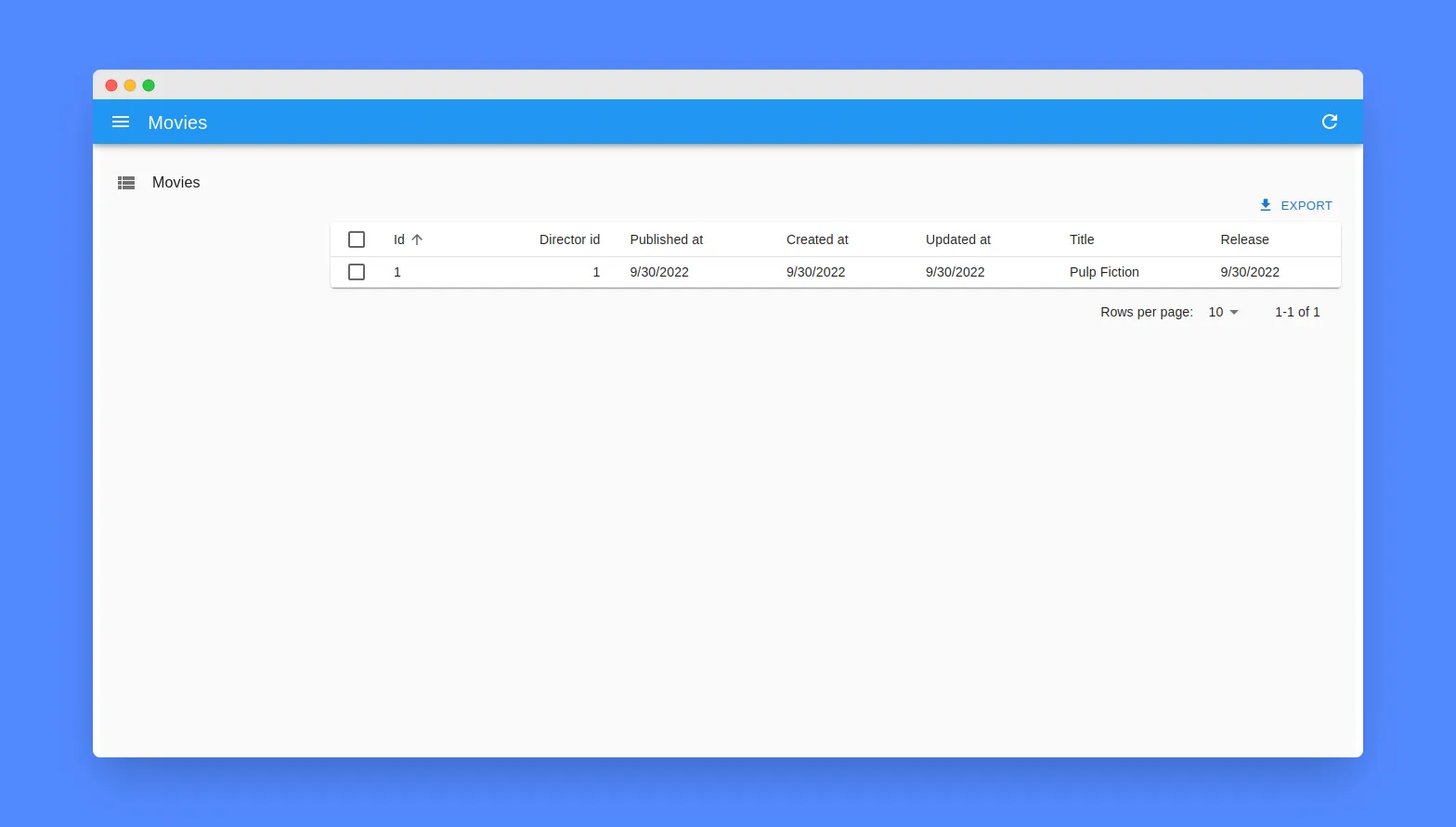
module.exports = ({ env }) => ({ settings: { cors: { enabled: true, origin: ["http://localhost:5173"], }, },});The line <Resource name="movies" /> informs react-admin to fetch the movie records from the http://localhost:1337/movies URL. <Resource> also defines the React components to use for each CRUD operation (list, create, edit, and show). In this case, the list={ListGuesser} prop means that react-admin should use the <ListGuesser> component to display the movies list. This component guesses the format to use for the columns of the list based on the data fetched from the API.
The movies list is already functional:
We can also use our own component for the movies list. For example, we can create a MovieList component that displays the title and the release date of the movies.
// in src/MovieList.tsximport {  List,  Datagrid,  TextField,  DateField,  BooleanField,} from "react-admin";
export const MovieList = () => (  <List>    <Datagrid rowClick="edit">      <TextField source="id" />      <TextField source="title" />      <DateField source="published_at" />    </Datagrid>  </List>);
// in src/App.tsximport { MovieList } from "./MovieList";// ...const App = () => (  <Admin dataProvider={dataProvider}>    <Resource name="movies" list={MovieList} />  </Admin>);
Editing a Record
An admin interface isn’t just about displaying remote data, it should also allow editing records. React-admin provides an <Edit> component for that purpose.
First, create a MovieEdit component that renders a form to edit the movie title and release date.
// in src/MovieEdit.tsximport { Edit, SimpleForm, TextInput, DateInput } from "react-admin";
export const MovieEdit = () => (  <Edit>    <SimpleForm>      <TextInput disabled source="id" />      <TextInput source="title" />      <DateInput source="published_at" />    </SimpleForm>  </Edit>);
Then, add the edit prop to the movie <Resource> component:
// in src/App.tsximport { MovieList } from "./MovieList";import { MovieEdit } from "./MovieEdit";// ...const App = () => ( <Admin dataProvider={dataProvider}> <Resource name="movies" list={MovieList} edit={MovieEdit} /> </Admin>);React-admin maps the MovieEdit component to the http://localhost:1337/movies/:id URL, and the List view now leads to the Edit view when clicking on a movie.
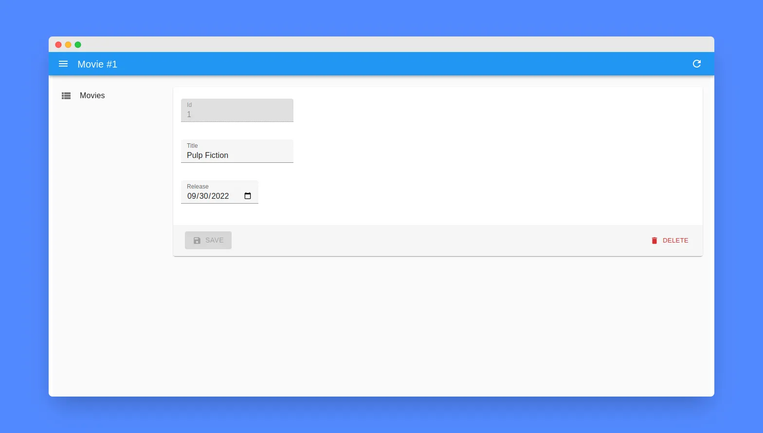
Note: The edit component also displays a delete button.
Creating a Record
For creating new records, react-admin provides a <Create> component. While the <Edit> component fetches a record based on the URL and populates a form with it, the <Create> component renders an empty form.
Create a MovieCreate component that renders a form to create a new movie.
// in src/MovieCreate.tsximport { Create, SimpleForm, TextInput, DateInput } from "react-admin";
export const MovieCreate = () => (  <Create>    <SimpleForm>      <TextInput source="title" />      <DateInput source="release" />    </SimpleForm>  </Create>);
Then, add the create prop to the movie <Resource> component:
// in src/App.tsximport { MovieList } from "./MovieList";import { MovieEdit } from "./MovieEdit";import { MovieCreate } from "./MovieCreate";// ...const App = () => ( <Admin dataProvider={dataProvider}> <Resource name="movies" list={MovieList} edit={MovieEdit} create={MovieCreate} /> </Admin>);Handling Relationships
We’ve just added CRUD (Create, Update, Retrieve, Delete) capabilities for the Movies resource. We can use the same technique for the Directors resource. Once you add <Resource name="directors" list={ListGuesser} />, react-admin adds a “Directors” menu item to the sidebar, and the directors list is already functional.
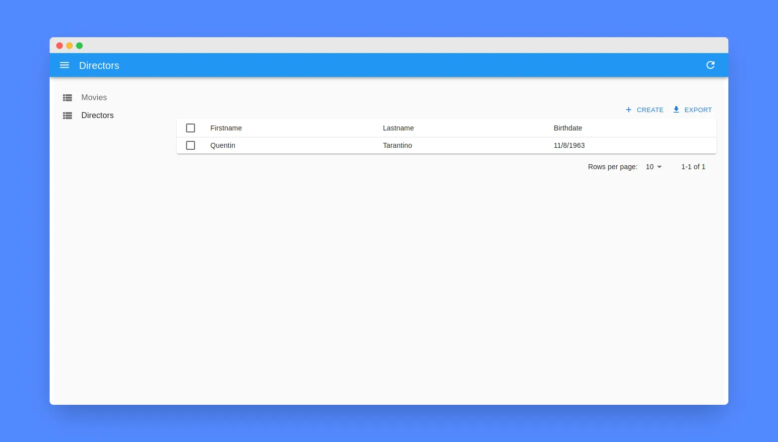
Earlier in this tutorial, when working on the data model, we’ve defined that a Director has many Movies. React-admin supports relationships between resources and provides shortcuts to common features for related resources.
In the Movies list, to display the director of a movie, we’ll use the <ReferenceField> component. It fetches the reference record (a Director in that case) and displays one of its fields.
// in src/MovieList.tsximport {  List,  Datagrid,  ReferenceField,  TextField,  DateField,} from "react-admin";
export const MovieList = () => (  <List>    <Datagrid rowClick="edit">      <TextField source="id" />      <TextField source="title" />      <ReferenceField source="director.id" reference="directors">        <TextField source="lastname" />      </ReferenceField>      <DateField source="published_at" />    </Datagrid>  </List>);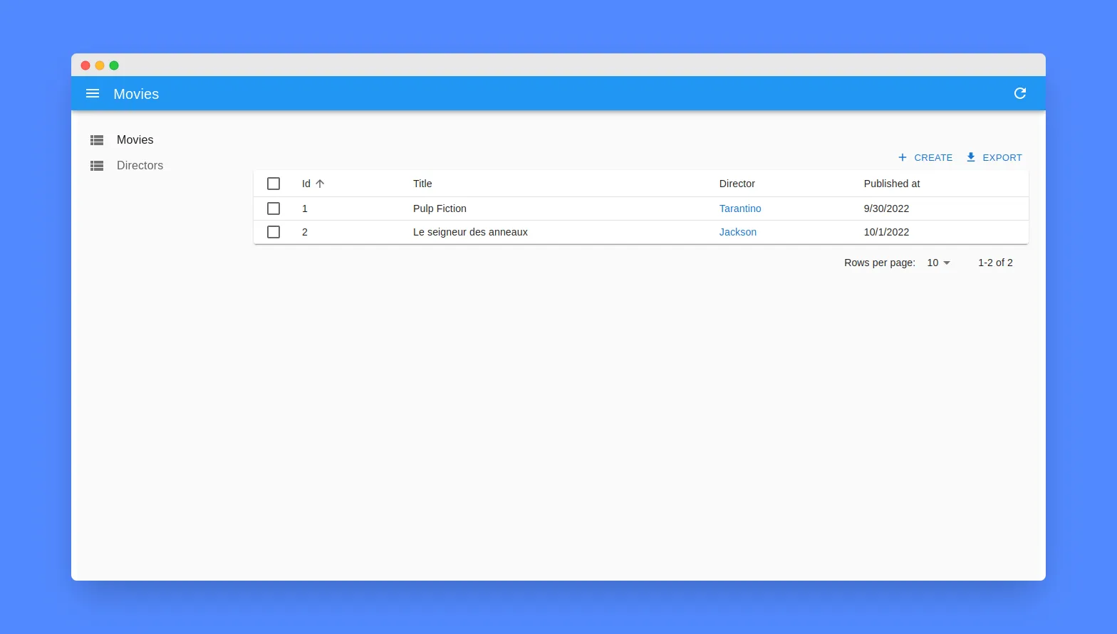
Note: To learn more about relationships, check the Relationships documentation.
Tweaking Styles
React-admin is highly customizable. You can change the styles, the layout, and the theme of the app. React-admin relies on MUI for the UI components, so you can use any MUI component in your custom components.
And most react-admin components support the sx prop, which is a CSS-in-JS solution to customize the styles of a component. It supports media queries, pseudo-elements, shorthand properties, and much more!
For instance, you can use this technique to hide certain columns on small screens:
// in src/MovieList.tsximport {  List,  Datagrid,  ReferenceField,  TextField,  DateField,} from "react-admin";
export const MovieList = () => (  <List>    <Datagrid      rowClick="edit"      sx={{        "& .column-published_at": {          sm: { display: "none" },          md: { display: "table-cell" },        },      }}    >      <TextField source="id" />      <TextField source="title" />      <ReferenceField source="director.id" reference="directors">        <TextField source="lastname" />      </ReferenceField>      <DateField source="published_at" />    </Datagrid>  </List>);
For themes, you can read the theming documentation.
Conclusion

In this article, you saw how Strapi and React-Admin can be combined to create a fully functional admin panel in a few minutes.
React-admin goes beyond simple CRUD screens and provides hundreds of ready-to-use components for common use cases. When a react-admin feature doesn’t suit your needs, it’s super easy to swap one of react-admin’s components for your own. So react-admin is the ideal tool for building admin panels and B2B apps.
To get further than basic CRUD screens, check out the react-admin demos for inspiration and good practices.
You can find the code of this article on GitHub: marmelab/ra-strapi-demo

Authors
Full-stack web developer at marmelab, Anthony seeks to improve and learn every day. He likes basketball, motorsports and is a big Harry Potter fan