
Creating Custom Form Layouts With React Admin

React Admin is a very convenient tool to create fully-featured forms very quickly. But sometimes you need more control over the layout of the form, for example to group inputs together or to optimize the screen space. Let’s have a look at several ways to customize a form layout to improve its readability and user experience.
The SimpleForm Component
When creating a new Creation or Edition form, we usually start by adding a <SimpleForm>. This initializes a <Form> with the current record fetched from the RecordContext, and renders its children in an MUI <Stack>.
import { DateInput, Edit, NullableBooleanInput, PasswordInput, SimpleForm, TextInput,} from "react-admin";import SegmentsInput from "./SegmentsInput";
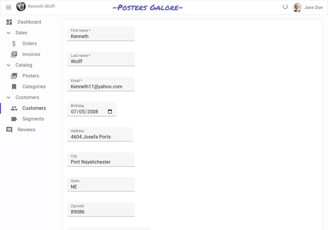
const VisitorEdit = () => ( <Edit> <SimpleForm> <TextInput source="first_name" isRequired /> <TextInput source="last_name" isRequired /> <TextInput type="email" source="email" isRequired /> <DateInput source="birthday" /> <TextInput source="address" multiline /> <TextInput source="city" /> <TextInput source="stateAbbr" /> <TextInput source="zipcode" /> <PasswordInput source="password" /> <PasswordInput source="confirm_password" /> <SegmentsInput /> <NullableBooleanInput source="has_newsletter" /> </SimpleForm> </Edit>);This allows to quickly create a form with, admittedly, a very simple layout, but already functional with input labels, input types and validation.
Customizing the Form Layout
Although you may not realize it at first, the SimpleForm component already allows for quite a bit of customization of the form layout. All this comes from the MUI <Stack> component being very flexible. For example, you can include a <Grid> layout in it, and add some titles to group the inputs together.
import { Box, Grid, Typography } from "@mui/material";import { DateInput, Edit, NullableBooleanInput, PasswordInput, SimpleForm, TextInput,} from "react-admin";import SegmentsInput from "./SegmentsInput";
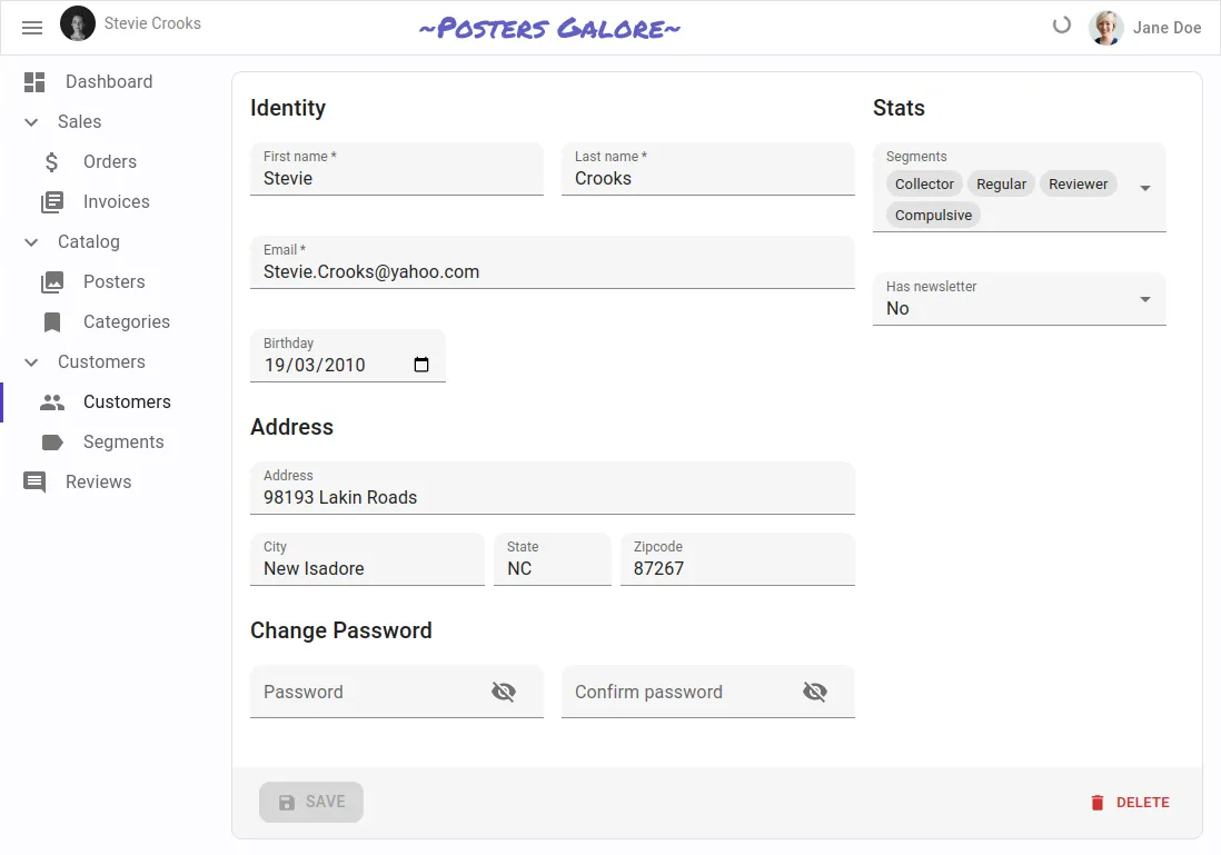
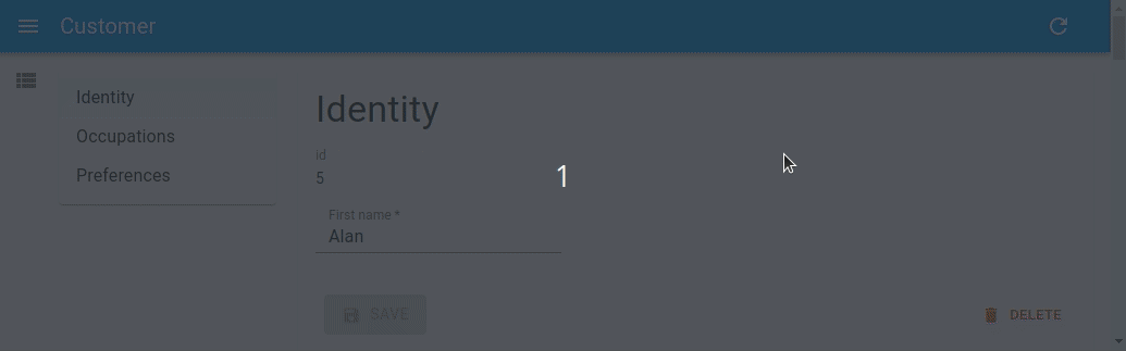
const VisitorEdit = () => ( <Edit> <SimpleForm> <Grid container width="100%" spacing={2}> <Grid item xs={8}> <Typography variant="h6" gutterBottom> Identity </Typography> <Box display="flex"> <Box flex={1} mr="0.5em"> <TextInput source="first_name" isRequired fullWidth /> </Box> <Box flex={1} ml="0.5em"> <TextInput source="last_name" isRequired fullWidth /> </Box> </Box> <TextInput type="email" source="email" isRequired fullWidth /> <Box display="flex"> <Box flex={1} mr="0.5em"> <DateInput source="birthday" fullWidth helperText={false} /> </Box> <Box flex={2} ml="0.5em" /> </Box> <Box mt="1em" />
<Typography variant="h6" gutterBottom> Address </Typography> <TextInput source="address" multiline fullWidth helperText={false} /> <Box display="flex"> <Box flex={2} mr="0.5em"> <TextInput source="city" fullWidth helperText={false} /> </Box> <Box flex={1} mr="0.5em"> <TextInput source="stateAbbr" fullWidth helperText={false} /> </Box> <Box flex={2}> <TextInput source="zipcode" fullWidth helperText={false} /> </Box> </Box> <Box mt="1em" />
<Typography variant="h6" gutterBottom> Change Password </Typography> <Box display="flex"> <Box flex={1} mr="0.5em"> <PasswordInput source="password" fullWidth /> </Box> <Box flex={1} ml="0.5em"> <PasswordInput source="confirm_password" fullWidth /> </Box> </Box> </Grid>
<Grid item xs={4}> <Typography variant="h6" gutterBottom> Stats </Typography> <SegmentsInput fullWidth /> <NullableBooleanInput fullWidth source="has_newsletter" /> </Grid> </Grid> </SimpleForm> </Edit>);The code above produces the following result, which drastically improves the form’s readability and user experience.
This example was heavily inspired by the React Admin E-commerce demo, for which you can find the source code on Github.
Alternative Layouts Provided by React Admin
In addition to the SimpleForm component, which as we saw is already highly customizable, React Admin provides several other components to create forms with different layouts, aiming at addressing various needs.
<TabbedForm>: allows to group inputs in tabs
<AccordionForm>: allows to group inputs into expandable panels
<LongForm>: useful if you need to create a long form, with many input fields divided into several sections
<WizardForm>: allows users to enter data step-by-step
<EditDialog>and<EditInDialogButton>: allow users to update records without leaving the context of the list page
Some of the components presented above are part of the Enterprise Edition of React Admin. Feel free to check them out by reading the ra-form-layout documentation.
Advanced Layouts
Most of the components listed above will automatically include additional content in the UI, such as an MUI <Card> to render the content and a toolbar including a <SaveButton> and a <DeleteButton>.
In some cases, you might not want that. Fortunately, you can use the <Form> component directly in such cases.
<Form> will handle the integration of react-hook-form with React Admin. As such, it will:
- instantiate a new form using the
useFormhook - read the current
recordfrom theRecordContext, and use it to initialize the form’sdefaultValues - turn the
validatefunction info areact-hook-formcompatible form validator - notify the user when the input validation fails
- create a form context via
<FormProvider>
Since <Form> is a headless component, it means you can use it with any UI component to build your own layout. Here is a simple example with a <Grid>:
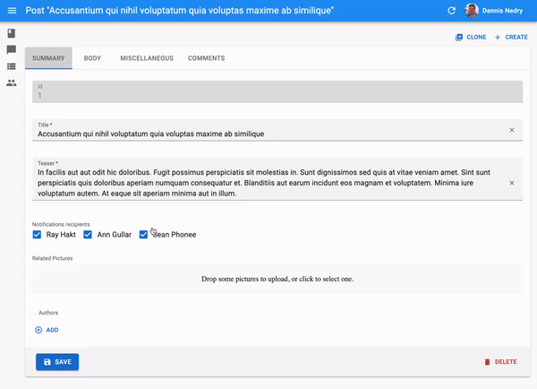
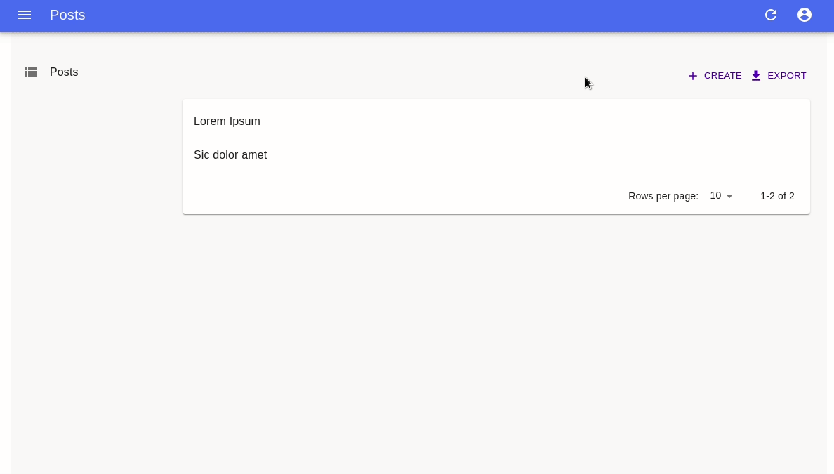
import {  Create,  Form,  TextInput,  RichTextInput,  SaveButton,} from "react-admin";import { Grid } from "@mui/material";
export const PostCreate = () => (  <Create>    <Form>      <Grid container>        <Grid item xs={6}>          <TextInput source="title" fullWidth />        </Grid>        <Grid item xs={6}>          <TextInput source="author" fullWidth />        </Grid>        <Grid item xs={12}>          <RichTextInput source="body" fullWidth />        </Grid>        <Grid item xs={12}>          <SaveButton />        </Grid>      </Grid>    </Form>  </Create>);
As you can see, with <Form>, you have full control over where to integrate the buttons (such as <SaveButton>) into the UI.
Conclusion
In conclusion, React Admin provides a powerful and flexible way to create forms with a minimum boilerplate. However, when you need more control over the form layout, you can easily customize it to your liking by leveraging other components such as MUI <Stack> and <Grid>, and/or use one of the alternative layouts provided by React Admin.
This allows you to group inputs together, optimize screen space, and create a more user-friendly experience. By taking the time to design a good form layout, you can make your application more intuitive and efficient, and improve overall user satisfaction.

Authors
Full-stack web developer at marmelab, JB is a Software Engineer with a strong Java experience. He plays the piano and runs fast, and not only because he has long fingers and tall legs.