
<CheckboxGroupInput>
If you want to let the user choose multiple values among a list of possible values by showing them all, <CheckboxGroupInput> is the right component.
This input allows editing values that are arrays of scalar values, e.g. [123, 456].
Tip: React-admin includes other components allowing the edition of such values:
<TextArrayInput>lets you edit an array of strings<SelectArrayInput>renders a dropdown list of choices<AutocompleteArrayInput>renders an autocomplete input of choices<DualListInput>renders a list of choices that can be moved from one list to another
And if you are looking for a way to edit a list of embedded objects (e.g. [{ id: 123, title: 'Hello' }, { id: 456, title: 'World' }]), check the <ArrayInput> component.
Usage
In addition to the source, <CheckboxGroupInput> requires one prop: the choices listing the possible values.
import { CheckboxGroupInput } from 'react-admin';

<CheckboxGroupInput source="roles" choices={[
    { id: 'admin', name: 'Admin' },
    { id: 'u001', name: 'Editor' },
    { id: 'u002', name: 'Moderator' },
    { id: 'u003', name: 'Reviewer' },
]} />
By default, the possible choices are built from the choices prop, using:
- the
idfield as the option value, - the
namefield as the option text
The form value for the source must be an array of the selected values, e.g.
{
    id: 123,
    name: 'John Doe',
    roles: ['u001', 'u003'],
}
Props
| Prop | Required | Type | Default | Description |
|---|---|---|---|---|
choices |
Required | Object[] |
- | List of choices |
labelPlacement |
Optional | "bottom" |"end"|"start"|"top" |
"end" |
The position of the checkbox label. |
options |
Optional | Object |
- | Props to pass to the Material UI <CheckboxGroup> component. |
optionText |
Optional | string | Function |
name |
Field name of record to display in the suggestion item or function which accepts the correct record as argument (record => {string}) |
optionValue |
Optional | string |
id |
Field name of record containing the value to use as input value |
row |
Optional | boolean |
true |
Display group of elements in a compact row. |
translateChoice |
Optional | boolean |
true |
Whether the choices should be translated |
<CheckboxGroupInput> also accepts the common input props.
choices
The list of choices must be an array of objects - one object for each possible choice. In each object, id is the value, and the name is the label displayed to the user.
<CheckboxGroupInput source="roles" choices={[
    { id: 'admin', name: 'Admin' },
    { id: 'u001', name: 'Editor' },
    { id: 'u002', name: 'Moderator' },
    { id: 'u003', name: 'Reviewer' },
]} />
You can also use an array of objects with different properties for the label and value, given you specify the optionText and optionValue props:
<CheckboxGroupInput source="roles" choices={[
    { _id: 'admin', label: 'Admin' },
    { _id: 'u001', label: 'Editor' },
    { _id: 'u002', label: 'Moderator' },
    { _id: 'u003', label: 'Reviewer' },
]} optionValue="_id" optionText="label" />
The choices are translated by default, so you can use translation identifiers as choices:
const choices = [
    { id: 'admin', label: 'myroot.roles.admin' },
    { id: 'u001', label: 'myroot.roles.u001' },
    { id: 'u002', label: 'myroot.roles.u002' },
    { id: 'u003', label: 'myroot.roles.u003' },
];
You can opt-out of this translation by setting the translateChoice prop to false.
If you need to fetch the options from another resource, you’re actually editing a one-to-many or a many-to-many relationship. In this case, wrap the <CheckboxGroupInput> in a <ReferenceArrayInput> or a <ReferenceManyToManyInput> component. You don’t need to specify the choices prop - the parent component injects it based on the possible values of the related resource.
<ReferenceArrayInput source="tag_ids" reference="tags">
    <CheckboxGroupInput />
</ReferenceArrayInput>
You can also pass an array of strings for the choices:
const roles = ['Admin', 'Editor', 'Moderator', 'Reviewer'];
<CheckboxGroupInput source="roles" choices={roles} />
// is equivalent to
const choices = roles.map(value => ({ id: value, name: value }));
<CheckboxGroupInput source="roles" choices={choices} />
labelPlacement
By default, this inputs renders a checkbox and a label for each choice, with the label on the right of the checkbox. You can change this behavior with the labelPlacement prop:
<CheckboxGroupInput source="options" choices={choices} labelPlacement="bottom" />
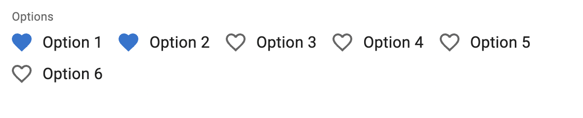
options
Use the options attribute if you want to override any of Material UI’s Material UI Checkbox documentation attributes:
import { FavoriteBorder, Favorite } from '@mui/icons-material';

<CheckboxGroupInput source="options" options={{
    icon: <FavoriteBorder />,
    checkedIcon: <Favorite />
}} />
optionText
You can customize the properties to use for the option name (instead of the default name) thanks to the optionText prop:
const choices = [
    { id: 'admin', label: 'Admin' },
    { id: 'u001', label: 'Editor' },
    { id: 'u002', label: 'Moderator' },
    { id: 'u003', label: 'Reviewer' },
];
<CheckboxGroupInput source="roles" choices={choices} optionText="label" />
optionText is especially useful when the choices are records coming from a <ReferenceArrayInput> or a <ReferenceManyToManyInput>. By default, react-admin uses the recordRepresentation function to display the record label. But if you set the optionText prop, react-admin will use it instead.
<ReferenceArrayInput source="tag_ids" reference="tags">
    <CheckboxGroupInput optionText="tag" />
</ReferenceArrayInput>
optionText also accepts a function, so you can shape the option text based on the entire choice object:
const choices = [
   { id: 123, first_name: 'Leo', last_name: 'Tolstoi' },
   { id: 456, first_name: 'Jane', last_name: 'Austen' },
];
const optionRenderer = choice => `${choice.first_name} ${choice.last_name}`;

<CheckboxGroupInput source="authors" choices={choices} optionText={optionRenderer} />
optionText also accepts a React Element, that will be rendered inside a <RecordContext> using the related choice as the record prop. You can use Field components there.
const choices = [
   { id: 123, first_name: 'Leo', last_name: 'Tolstoi' },
   { id: 456, first_name: 'Jane', last_name: 'Austen' },
];

const FullNameField = () => {
    const record = useRecordContext();
    return <span>{record.first_name} {record.last_name}</span>;
}

<CheckboxGroupInput source="authors" choices={choices} optionText={<FullNameField />}/>
optionValue
You can customize the properties to use for the option value (instead of the default id) thanks to the optionValue prop:
const choices = [
    { _id: 'admin', name: 'Admin' },
    { _id: 'u001', name: 'Editor' },
    { _id: 'u002', name: 'Moderator' },
    { _id: 'u003', name: 'Reviewer' },
];
<CheckboxGroupInput source="roles" choices={choices} optionValue="_id" />
Note: optionValue is only supported when the choices are provided directly via the choices prop. If you use <CheckboxGroupInput> inside a <ReferenceArrayInput>, the optionValue is always set to id, as the choices are records fetched from the related resource, and records should always have an id field.
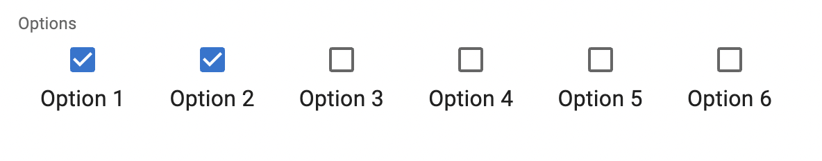
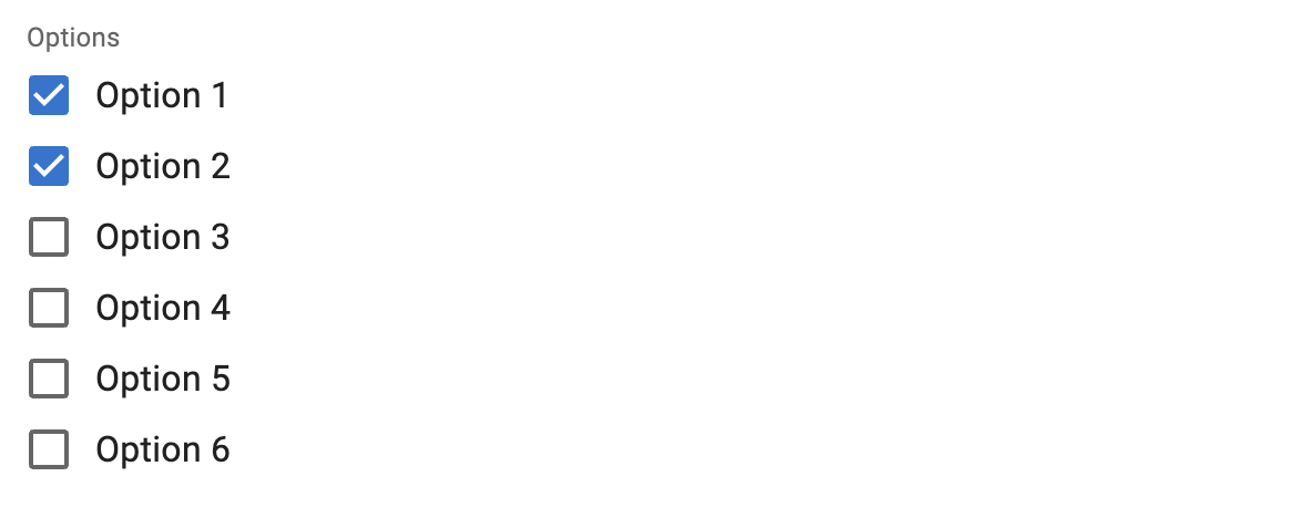
row
By default, the checkboxes are displayed in a row. You can change that and let react-admin render one choice per row by setting the row prop to false:
<CheckboxGroupInput source="options" choices={choices} row={false} />
sx: CSS API
The <CheckboxGroupInput> component accepts the usual className prop. You can also override many styles of the inner components thanks to the sx property (see the sx documentation for syntax and examples). This property accepts the following subclasses:
| Rule name | Description |
|---|---|
& .RaCheckboxGroupInput-label |
Applied to the underlying Material UI’s FormLabel component |
To override the style of all instances of <CheckboxGroupInput> using the application-wide style overrides, use the RaCheckboxGroupInput key.
translateChoice
The choices are translated by default, so you can use translation identifiers as choices:
const choices = [
    { id: 'admin', name: 'myroot.roles.admin' },
    { id: 'u001', name: 'myroot.roles.u001' },
    { id: 'u002', name: 'myroot.roles.u002' },
    { id: 'u003', name: 'myroot.roles.u003' },
];
However, in some cases (e.g. inside a <ReferenceArrayInput>), you may not want the choice to be translated. In that case, set the translateChoice prop to false.
<CheckboxGroupInput source="roles" choices={choices} translateChoice={false}/>
Fetching Choices
If you want to populate the choices attribute with a list of related records, you should decorate <CheckboxGroupInput> with <ReferenceArrayInput>, and leave the choices empty:
import { AutocompleteArrayInput, ReferenceArrayInput } from 'react-admin';

<ReferenceArrayInput label="Tags" reference="tags" source="tags">
    <CheckboxGroupInput />
</ReferenceArrayInput>
Check the <ReferenceArrayInput> documentation for more details.