

AutocompleteArrayInput
Lets users choose multiple values in a list using a dropdown with autocompletion.
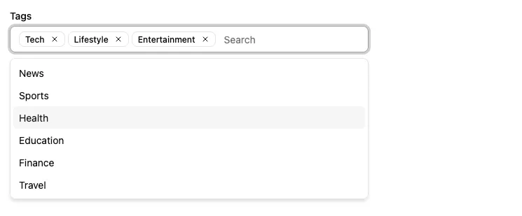
This input allows editing values that are arrays of scalar values, e.g. [123, 456].
In addition to the source, <AutocompleteArrayInput> requires one prop: the choices listing the possible values.
import { AutocompleteArrayInput } from '@/components/admin';
<AutocompleteArrayInput source="tags" choices={[  { id: "u001", name: "Tech" },  { id: "u002", name: "News" },  { id: "u003", name: "Lifestyle" },  { id: "u004", name: "Entertainment" },  { id: "u005", name: "Sports" },  { id: "u006", name: "Health" },  { id: "u007", name: "Education" },  { id: "u008", name: "Finance" },  { id: "u009", name: "Travel" },]} />
By default, the possible choices are built from the choices prop, using:
- the
idfield as the option value, - the
namefield as the option text
The form value for the source must be an array of the selected values, e.g.
{ id: 123, title: 'Lorem Ipsum', roles: ['u001', 'u003', 'u004'],}| Prop | Required | Type | Default | Description |
|---|---|---|---|---|
source | Required* | string | - | Field name (inferred in ReferenceArrayInput) |
choices | Required* | any[] | - | List of choices |
className | Optional | string | - | CSS Classes |
create | Optional | Element | - | A React Element to render when users want to create a new choice |
createItemLabel | Optional | string | (filter: string) => ReactNode | ra.action .create_item | The label for the menu item allowing users to create a new choice. Used when the filter is not empty. |
createLabel | Optional | string | ReactNode | - | The label used as hint to let users know they can create a new choice. Displayed when the filter is empty. |
disableValue | Optional | string | disabled | The value to use for the disabled state |
filterToQuery | Optional | (text:string)=>object | { q: text } | Server filter mapping |
format | Optional | function | - | Function to convert the value sent by the API to the value used by the form |
helperText | Optional | ReactNode | - | Help text |
inputText | Optional | ReactNode | (choice) =>string | Choice text | Required if optionText is a custom Component, this function must return the text displayed for the current selection. |
onCreate | Optional | Function | - | A function called with the current filter value when users choose to create a new choice. |
optionText | Optional | string | function | name or record repr | Field name of record to display in the suggestion item or function which accepts the correct record as argument ((record)=> {string}) |
optionValue | Optional | string | id | Field name of record containing the value to use as input value |
parse | Optional | function | - | Function to convert the value from the form to the value sent to the API |
placeholder | Optional | string | ’Search…’ | Input placeholder |
translateChoice | Optional | boolean | !isFromReference | Translate labels |
validate | Optional | Validator | Validator[] | - | Validation |
* source and choices are optional inside <ReferenceArrayInput>.
Defining Choices
Section titled “Defining Choices”The list of choices must be an array of objects - one object for each possible choice. In each object, id is the value, and the name is the label displayed to the user.
<AutocompleteArrayInput source="roles" choices={[ { id: 'admin', name: 'Admin' }, { id: 'u001', name: 'Editor' }, { id: 'u002', name: 'Moderator' }, { id: 'u003', name: 'Reviewer' },]} />You can also use an array of objects with different properties for the label and value, given you specify the optionText and optionValue props:
<AutocompleteArrayInput source="roles" choices={[ { _id: 'admin', label: 'Admin' }, { _id: 'u001', label: 'Editor' }, { _id: 'u002', label: 'Moderator' }, { _id: 'u003', label: 'Reviewer' },]} optionValue="_id" optionText="label" />The choices are translated by default, so you can use translation identifiers as choices:
const choices = [ { id: 'admin', name: 'myroot.roles.admin' }, { id: 'u001', name: 'myroot.roles.u001' }, { id: 'u002', name: 'myroot.roles.u002' }, { id: 'u003', name: 'myroot.roles.u003' },];You can opt-out of this translation by setting the translateChoice prop to false.
If you need to fetch the options from another resource, you’re actually editing a one-to-many or a many-to-many relationship. In this case, wrap the <AutocompleteArrayInput> in a <ReferenceArrayInput> component. You don’t need to specify the choices prop - the parent component injects it based on the possible values of the related resource.
<ReferenceArrayInput source="tag_ids" reference="tags"> <AutocompleteArrayInput /></ReferenceArrayInput>You can also pass an array of strings for the choices:
const roles = ['Admin', 'Editor', 'Moderator', 'Reviewer'];<AutocompleteArrayInput source="roles" choices={roles} />// is equivalent toconst choices = roles.map(value => ({ id: value, name: value }));<AutocompleteArrayInput source="roles" choices={choices} />Using Inside <ReferenceArrayInput>
Section titled “Using Inside <ReferenceArrayInput>”When used inside a <ReferenceArrayInput>, whenever users type a string in the autocomplete input, <AutocompleteArrayInput> calls dataProvider.getList() using the string as filter, to return a filtered list of possible options from the reference resource. This filter is built using the filterToQuery prop.
By default, the filter is built using the q parameter. This means that if the user types the string ‘lorem’, the filter will be { q: 'lorem' }.
You can customize the filter by setting the filterToQuery prop. It should be a function that returns a filter object.
const filterToQuery = searchText => ({ name_ilike: `%${searchText}%` });
<ReferenceArrayInput source="tag_ids" reference="tags">    <AutocompleteArrayInput filterToQuery={filterToQuery} /></ReferenceArrayInput>
Creating New Choices On The Fly
Section titled “Creating New Choices On The Fly”Users often discover that a choice is missing while they are filling the form. To let them add it without leaving the page, pass a React element as the create prop. <AutocompleteArrayInput> then renders an extra item at the bottom of the list, which renders the passed element when clicked. Once created, the new choice is added to the selection.
This is generally useful when the choices are fetched from a reference resource, i.e. when using <ReferenceArrayInput>:
import {    Edit,    SimpleForm,    ReferenceArrayInput,    AutocompleteArrayInput,    TextInput,} from '@/components/admin';import {  Dialog,  DialogContent,  DialogHeader,  DialogTitle,} from "@/components/ui/dialog";import { CreateBase, useCreateSuggestionContext } from 'ra-core';
const CreateTag = () => {  const { onCancel, onCreate, filter } = useCreateSuggestionContext();
  return (    <Dialog open onOpenChange={onCancel}>      <DialogContent>        <DialogHeader>          <DialogTitle>Create a tag</DialogTitle>        </DialogHeader>        <CreateBase          resource="tags"          redirect={false}          mutationOptions={{ onSuccess: onCreate }}        >          <SimpleForm defaultValues={{ name: filter }}>            <TextInput source="name" autoFocus />          </SimpleForm>        </CreateBase>      </DialogContent>    </Dialog>  );};
const PostEdit = () => (    <Edit>        <SimpleForm>          <ReferenceArrayInput            reference="tags"            resource="posts"            source="tags_ids"          >            <AutocompleteArrayInput              create={<CreateTag />}              createLabel="Start typing to create a new tag"              createItemLabel="Create %{item}"            />          </ReferenceArrayInput>        </SimpleForm>    </Edit>);
The element passed to create must call the useCreateSuggestionContext hook, which provides:
filter: the text users typed in the input, to use as a default value,onCreate: to call with the created choice once saved,onCancel: to call when users dismiss the creation.
If you just need to ask users for a single string to create the new option, you can use the onCreate prop instead:
<AutocompleteArrayInput source="tags" choices={tags} onCreate={filter => { const newTag = { id: filter.toLowerCase(), name: filter }; tags.push(newTag); return newTag; }} createLabel="Start typing to create a new tag" createItemLabel="Create %{item}"/>If you want to customize the label of the “Create XXX” item, use the createItemLabel prop. The createLabel prop is the hint displayed instead, as a disabled item, as long as the filter is empty.
Working With Object Values
Section titled “Working With Object Values”When working with a field that contains an array of objects, use parse and format to turn the value into an array of scalar values.
So for instance, for editing the tags field of records looking like the following:
{ "id": 123, "tags": [ { "id": "lifestyle" }, { "id": "photography" } ]}You should use the following syntax:
<AutocompleteArrayInput source="tags" parse={value => value && value.map(v => ({ id: v }))} format={value => value && value.map(v => v.id)} choices={[ { id: 'programming', name: 'Programming' }, { id: 'lifestyle', name: 'Lifestyle' }, { id: 'photography', name: 'Photography' }, ]}/>