DateTimeInput
<DateTimeInput> renders an HTML <input type="datetime-local"> element, allowing users to enter a date and a time using a date picker.
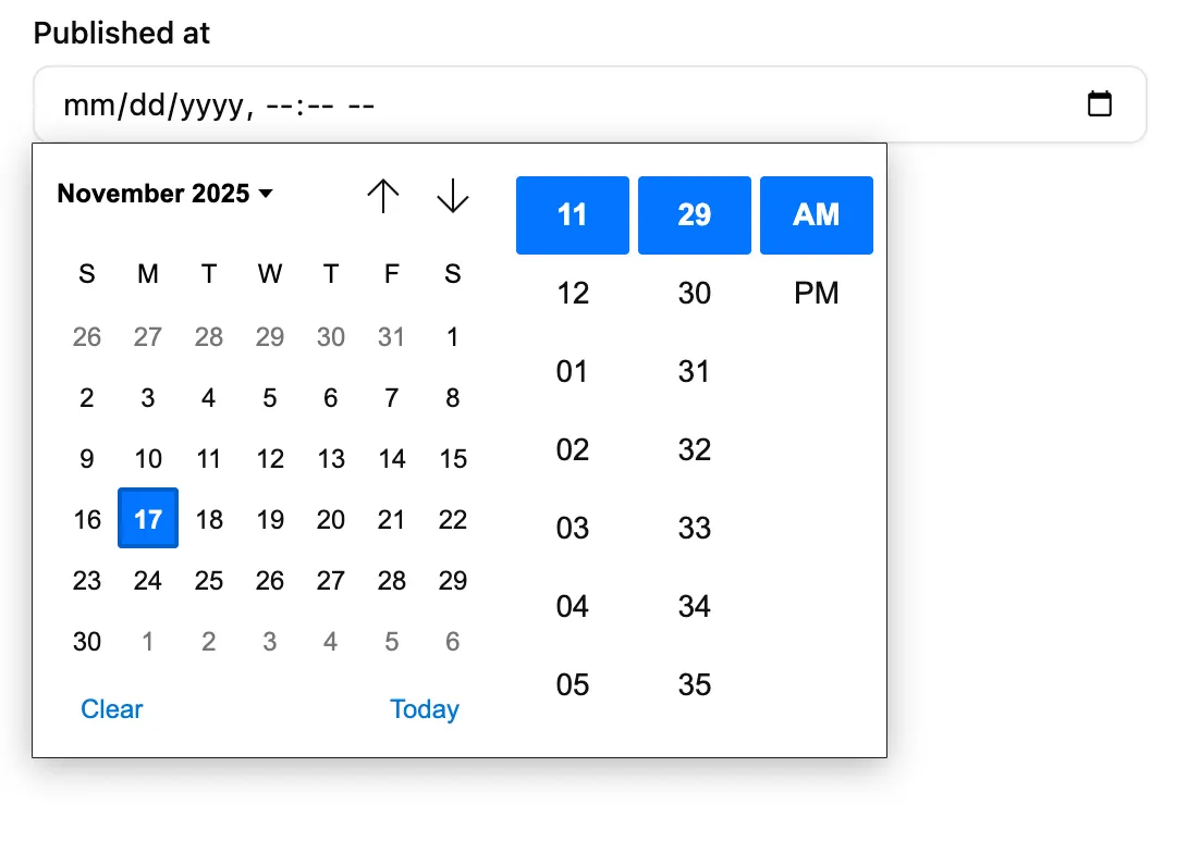
The appearance of <DateTimeInput> depends on the browser, and falls back to a text input on browsers that do not support <input type="datetime-local">. The date formatting in this input depends on the user’s locale.
import { DateTimeInput } from '@/components/admin/date-time-input';
<DateTimeInput source="published_at" />;
The field value should be an ISO date and time string with timezone using the pattern YYYY-MM-DDTHH:mm:ss.sssZ (ISO 8601 Extended Format), e.g. '2025-11-17T10:10:32.390Z'. The returned input value will also be in this format, regardless of the browser locale.
<DateTimeInput> also accepts values that can be converted to a Date object, such as:
- a
datetime-localvalue string (e.g.'2022-04-30T14:30'), - a localized date string (e.g.
'30/04/2022'), - a
Dateobject, or - a Linux timestamp (e.g.
1648694400000).
In these cases, <DateTimeInput> will automatically convert the value to the ISO 8601 Extended Format, and will return a string, or null if the date is invalid.
| Prop | Required | Type | Default | Description |
|---|---|---|---|---|
source | Required | string | - | Field name |
className | Optional | string | - | CSS classes |
defaultValue | Optional | string or Date | - | Default value |
disabled | Optional | boolean | - | Disable input |
format | Optional | function | - | Callback taking the value from the form state, and returning the input value. |
helperText | Optional | ReactNode | - | Help text |
label | Optional | string | false | Inferred | Custom / hide label |
parse | Optional | (value:string) => string or Date | - | Callback taking the value from the input, and returning the value to be stored in the form state. |
placeholder | Optional | string | - | Placeholder text |
validate | Optional | Validator | Validator[] | - | Validation |
defaultValue
Section titled “defaultValue”The defaultValue prop can be used to set the initial value of the input. It can be a ISO date and time string, a Date object, or a timestamp.
For instance, to set the default value to the current date and time:
<DateTimeInput source="publishedAt" defaultValue={new Date()} />format
Section titled “format”The format prop accepts a callback taking the value from the form state, and returning the input value (which should be a string).
form state value --> format --> form input value (string)<DateTimeInput source="publishedAt" format={(value) => new Date(value).toISOString()} parse={(value) => new Date(value)}/>format often comes in pair with parse to transform the input value before storing it in the form state.
The parse prop accepts a callback taking the value from the input (which is a string), and returning the value to put in the form state.
form input value (string) ---> parse ---> form state value<DateTimeInput source="publishedAt" format={(value) => new Date(value).toISOString()} parse={(value) => new Date(value)}/>parse often comes in pair with format to transform the form value before passing it to the input.
validate
Section titled “validate”To validate that a date is before or after a given date, use the maxValue and minValue validators with a date string.
import { minValue } from 'ra-core';import { DateTimeInput } from '@/components/admin/date-input';
// requires dates after October 10th, 2022<DateTimeInput source="published" validate={minValue('2022-10-26')} />;
Internationalization
Section titled “Internationalization”It is not possible to customize the date format. Browsers use the user locale to display the date in the correct format.