RichTextInput
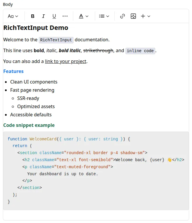
Use <RichTextInput> to edit rich text content in a WYSIWYG editor (TipTap) and store it as HTML.
Installation
Section titled “Installation”This is an optional component and is not included in the admin registry block by default. Install it with:
npx shadcn@latest add https://marmelab.com/shadcn-admin-kit/r/rich-text-input.jsonimport { Edit, SimpleForm } from '@/components/admin';import { RichTextInput } from '@/components/rich-text-input';
const PostEdit = () => ( <Edit> <SimpleForm> <RichTextInput source="body" /> </SimpleForm> </Edit>);| Prop | Required | Type | Default | Description |
|---|---|---|---|---|
source | Required | string | - | Field name |
className | Optional | string | - | CSS classes applied to the field wrapper |
defaultValue | Optional | string | - | Default editor value |
disabled | Optional | boolean | - | Disable the editor |
editorOptions | Optional | Object | - | Options object passed to the underlying TipTap editor |
format | Optional | function | - | Callback taking the value from the form state and returning the input value |
helperText | Optional | ReactNode | - | Help text displayed below the input |
label | Optional | string | false | Inferred from source | Custom label, or false to hide it |
parse | Optional | function | - | Callback taking the editor value and returning the stored form value |
readOnly | Optional | boolean | - | Make the editor read-only |
toolbar | Optional | ReactNode | default toolbar | Toolbar to render above the editor |
validate | Optional | Validator | Validator[] | - | Validation rules |
editorOptions
Section titled “editorOptions”Use editorOptions to pass TipTap configuration.
import { DefaultEditorOptions, RichTextInput } from '@/components/rich-text-input';import type { Editor } from '@tiptap/react';
<RichTextInput    source="body"    editorOptions={{        ...DefaultEditorOptions,        onCreate: ({ editor }: { editor: Editor }) => {            console.log(editor);        },    }}/>
toolbar
Section titled “toolbar”By default, <RichTextInput> renders the kit toolbar. The default toolbar includes:
- Undo / Redo
- Bold / Italic / Underline / Strikethrough / Code
- Heading 1 / Heading 2
- Text color
- Bulleted / Numbered lists
- Blockquote
- Add link / Remove link
- Clear formatting
- Image actions
You can also provide custom toolbar children:
import {    RichTextInput,    RichTextInputToolbar,    useRichTextInputEditor,} from '@/components/rich-text-input';import { Button } from '@/components/ui/button';
const BoldOnlyButton = () => {    const editor = useRichTextInputEditor();    if (!editor) return null;
    return (        <Button            type="button"            onClick={() => {                editor.chain().focus().toggleBold().run();            }}        >            Bold        </Button>    );};
<RichTextInput    source="body"    toolbar={        <RichTextInputToolbar>            <BoldOnlyButton />        </RichTextInputToolbar>    }/>
Accessing The Editor Instance
Section titled “Accessing The Editor Instance”To call editor commands outside the toolbar, keep a ref in editorOptions.onCreate:
import React from 'react';import type { Editor } from '@tiptap/react';import {    FormToolbar,    SaveButton,    SimpleForm,} from '@/components/admin';import { DefaultEditorOptions, RichTextInput } from '@/components/rich-text-input';import { Button } from '@/components/ui/button';
const PostForm = () => {    const editorRef = React.useRef<Editor | null>(null);
    return (        <SimpleForm            toolbar={                <FormToolbar>                    <SaveButton />                    <Button                        type="button"                        onClick={() => {                            editorRef.current?.commands.setContent('<h3>Template content</h3>');                        }}                    >                        Use template                    </Button>                </FormToolbar>            }        >            <RichTextInput                source="body"                editorOptions={{                    ...DefaultEditorOptions,                    onCreate: ({ editor }: { editor: Editor }) => {                        editorRef.current = editor;                    },                }}            />        </SimpleForm>    );};
Lazy Loading
Section titled “Lazy Loading”<RichTextInput> depends on TipTap/ProseMirror and adds noticeable JavaScript size.
If you don’t need it on every screen, lazy-load it:
const RichTextInput = React.lazy(() => import('@/components/rich-text-input').then((module) => ({ default: module.RichTextInput, })),);