TextArrayInput
Lets users enter multiple free-text values (like tags or email addresses) displayed as removable badges.
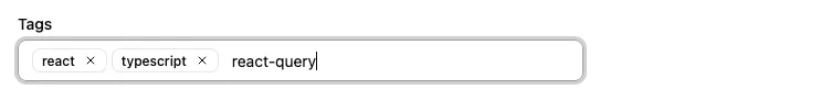
This input allows editing values that are arrays of strings, e.g. ["tag1", "tag2"].
import { TextArrayInput } from '@/components/admin';
<TextArrayInput source="tags" />
Users type text and press Enter to add items. Items appear as removable badges. Press Backspace when the input is empty to remove the last item.
Tip: If you need to let users choose values from a predefined list instead, use <AutocompleteArrayInput>.
| Prop | Required | Type | Default | Description |
|---|---|---|---|---|
source | Required | string | - | Field name |
className | Optional | string | - | CSS classes |
defaultValue | Optional | string[] | - | Default value |
disabled | Optional | boolean | - | Disable the input |
format | Optional | function | - | Callback to convert API value to form value |
helperText | Optional | ReactNode | - | Help text displayed below the input |
label | Optional | string | false | Inferred from source | Custom label, or false to hide it |
parse | Optional | function | - | Callback to convert form value to API value |
placeholder | Optional | string | - | Input placeholder (shown when no values exist) |
readOnly | Optional | boolean | - | Make the input read-only |
validate | Optional | Validator | Validator[] | - | Validation rules |
Keyboard Shortcuts
Section titled “Keyboard Shortcuts”| Key | Action |
|---|---|
| Enter | Add the typed text as a new value |
| Backspace | Remove the last value (when input is empty) |
| Escape | Blur the input |
Format and Parse
Section titled “Format and Parse”<TextArrayInput source="tags" format={v => v?.map(tag => tag.toLowerCase())} parse={v => v?.map(tag => tag.trim().toLowerCase())}/>