admin-on-rest 0.7 is out

We’ve been working on marmelab/admin-on-rest, the React admin GUI for REST APIs, since summer. We’ve already announced the initial release and the highlights of versions 0.4 and 0.5. Since then, two major versions were released - at a steady pace of one major version every month.
Version 0.7 was just released, and here are the highlights of versions 0.6 and 0.7.
- Form Layouts
- Use Your Own Component
- Autocomplete Input
- Better Reference Lists
- Localized Date and Number Fields
- Boolean Field and Input
- Default Values
- Easier Styling of Fields and Inputs
- Backward Incompatible Changes
Form Layouts
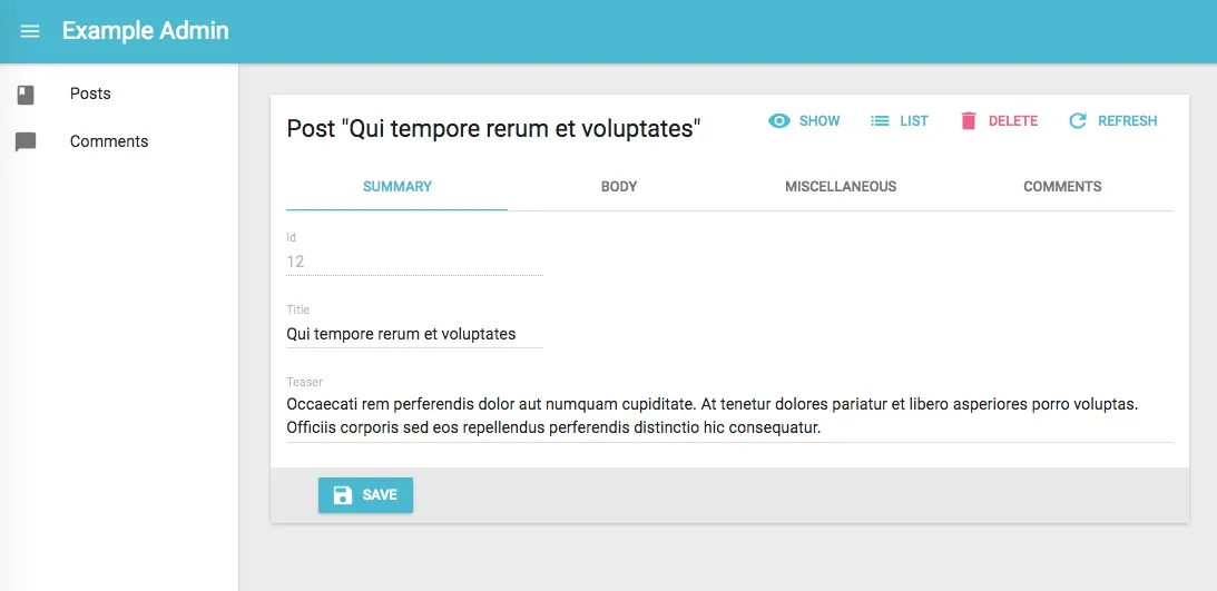
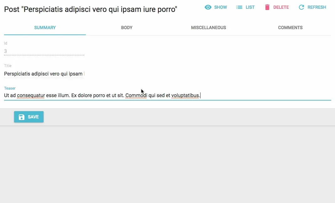
When editing large resources, it’s common to desire a form layout more user-friendly than a simple list of form inputs. Since 0.7, it’s very easy to write your own form layout, or to use one of the two bundled form layouts: <SimpleForm> and <TabbedForm>:
// simple formimport { Edit, SimpleForm } from 'admin-on-rest/lib/mui'export const PostEdit = (props) => (    <Edit {...props}>        <SimpleForm>            <DisabledInput label="Id" source="id" />            <TextInput source="title" validation={{ required: true }} />            <LongTextInput source="teaser" validation={{ required: true }} />            <RichTextInput source="body" validation={{ required: true }} addLabel={false} />        </TabbedForm>    </Edit>);
// tabbed formimport { Edit, TabbedForm, FormTab } from 'admin-on-rest/lib/mui'export const PostEdit = (props) => (    <Edit {...props}>        <TabbedForm>            <FormTab label="summary">                <DisabledInput label="Id" source="id" />                <TextInput source="title" validation={{ required: true }} />                <LongTextInput source="teaser" validation={{ required: true }} />            </FormTab>            <FormTab label="body">                <RichTextInput source="body" validation={{ required: true }} addLabel={false} />            </FormTab>        </TabbedForm>    </Edit>);
Use Your Own Component
It’s now much easier to use your own component as Field or Input. You have total liberty, and admin-on-rest will not get in the way.
// in LatLongInput.jsimport { Field } from "redux-form";import { NumberInput } from "admin-on-rest/lib/mui";const LatLngInput = () => ( <span> <Field name="lat" component={NumberInput} label="latitude" /> <Field name="lng" component={NumberInput} label="longitude" /> </span>);export default LatLngInput;
// in ItemEdit.jsconst ItemEdit = (props) => ( <Edit {...props}> <SimpleForm> <LatLngInput /> </SimpleForm> </Edit>);Autocomplete Input
When editing references, or filtering by reference, if the referenced resource has thousands of records, the <SelectInput> isn’t a good choice. Version 0.7 introduces <AutocompleteInput>, which makes it possible to deal with large databases:
import { AutocompleteInput, ReferenceInput } from "admin-on-rest/lib/mui";
<ReferenceInput label="Post" source="post_id" reference="posts">  <AutocompleteInput optionText="title" /></ReferenceInput>;
<AutocompleteInput> can even be used as a standalone input - just provide the choices you want to use for the suggestions list.
Lists of references can now be limited, sorted, or filtered
<ReferenceInput> used to fetch all related records (using the GET_MATCHING REST verb). It now uses the same REST query as the datagrid (GET_LIST), which allows to limit, sort, and filter the results:
// by default, fetches only the first 25 values. You can extend this limit// by setting the `perPage` prop.<ReferenceInput     source="post_id"     reference="posts"     perPage={100}>    <SelectInput optionText="title" /></ReferenceInput>
// by default, orders the possible values by id desc. You can change this order// by setting the `sort` prop (an object with `field` and `order` properties).<ReferenceInput     source="post_id"     reference="posts"     sort={{ field: 'title', order: 'ASC' }}>    <SelectInput optionText="title" /></ReferenceInput>
// you can filter the query used to populate the possible values. Use the// `filter` prop for that.<ReferenceInput     source="post_id"     reference="posts"     filter={{ is_published: true }}>    <SelectInput optionText="title" /></ReferenceInput>
Localized Date and Number Fields
Displaying dates and numbers in the user’s locale can be a pain. Fortunately, all modern browsers can do it perfectly, thanks to the Intl library. <DateField> and <NumberField> (new in 0.7) take advantage of this feature:
<DateField source="publication_date" />// renders the record { id: 1234, publication_date: new Date('2017-04-23') } as<span>4/23/2017</span>
<DateField source="publication_date" options={{ weekday: 'long', year: 'numeric', month: 'long', day: 'numeric' }} />// renders the record { id: 1234, publication_date: new Date('2017-04-23') } as<span>Sunday, April 23, 2017</span>
<DateField source="publication_date" locales="fr-FR" />// renders the record { id: 1234, publication_date: new Date('2017-04-23') } as<span>23/04/2017</span>
<NumberField source="score" />// renders the record { id: 1234, score: 567 } as<span>567</span>
<NumberField source="score" options={{ maximumFractionDigits: 2 }}/>// renders the record { id: 1234, score: 567.3567458569 } as<span>567.35</span>
<NumberField source="share" options={{ style: 'percent' }} />// renders the record { id: 1234, share: 0.2545 } as<span>25%</span>
<NumberField source="price" options={{ style: 'currency', currency: 'USD' }} />// renders the record { id: 1234, price: 25.99 } as<span>$25.99</span>
<NumberField source="price" locales="fr-FR" options={{ style: 'currency', currency: 'USD' }} />// renders the record { id: 1234, price: 25.99 } as<span>25,99 $US</span>
Boolean Field and Input
If you have boolean values, you can now display and edit them with ease, thanks to <BooleanField>, <BooleanInput>, and <NullableBooleanInput>:
import { BooleanInput } from "admin-on-rest/lib/mui";
<BooleanInput label="Allow comments?" source="commentable" />;
Default Values
You can now specify default values in forms, or directly in input components:
// specify default values in form componentconst postDefaultValue = { created_at: new Date(), nb_views: 0 };export const PostCreate = (props) => (  <Create {...props}>    <SimpleForm defaultValue={postDefaultValue}>      <TextInput source="title" />      <RichTextInput source="body" />      <NumberInput source="nb_views" />    </SimpleForm>  </Create>);
// specify default value in input componentexport const PostCreate = (props) => (  <Create {...props}>    <SimpleForm>      <TextInput source="title" />      <RichTextInput source="body" />      <NumberInput source="nb_views" defaultValue={0} />    </SimpleForm>  </Create>);
Easier Styling of Fields and Inputs
While you could already style Field and Input components using the style prop, this prop was often useless. It was passed to the underlying element, often a material-ui element, and couldn’t be used to highlight an entire datagrid cell, or make a form input float.
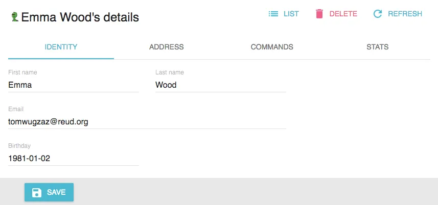
Well, this style prop was renamed to elStyle, and now the style prop applies to the container element (a <td> in the datagrid, a <div> in the forms). This allows much more powerful styling:
export const VisitorEdit = (props) => ( <Edit title={<VisitorTitle />} {...props}> <TabbedForm> <FormTab label="Identity"> <TextInput source="first_name" style={{ display: "inline-block" }} /> <TextInput source="last_name" style={{ display: "inline-block", marginLeft: 32 }} /> <TextInput type="email" source="email" style={{ width: 544 }} options={{ fullWidth: true }} /> <DateInput source="birthday" /> </FormTab> ... </TabbedForm> </Edit>);
Backward Incompatible Changes
We’ve changed the API in a few places to take care of pain points we noticed while using admin-on-rest. If you have code running v0.5, you’ll have to do the following to upgrade:
-
import
<RichTextInput>fromaor-rich-text-inputinstead of `admin-on-rest/lib/mui`
// beforeimport { RichRextInput } from "admin-on-rest/lib/mui";//...<RichTextInput source="body" />;
// afterimport RichRextInput from "aor-rich-text-input";//...<RichTextInput source="body" />;- Insert a
<SimpleForm>between<Edit>/<Create>and Input components
// beforeimport { Edit, TextInput } from "admin-on-rest/lib/mui";export const PostEdit = (props) => (  <Edit {...props}>    <TextInput source="title" />  </Edit>);
// afterimport { Edit, SimpleForm, TextInput } from "admin-on-rest/lib/mui";export const PostEdit = (props) => ( <Edit {...props}> <SimpleForm> <TextInput source="title" /> </SimpleForm> </Edit>);- Insert a
<SimpleShowLayout>between<Show>and Field components
// beforeimport { Show, TextField } from "admin-on-rest/lib/mui";export const PostShow = (props) => (  <Show {...props}>    <TextField source="title" />  </Show>);
// afterimport { Show, SimpleShowLayout, TextField } from "admin-on-rest/lib/mui";export const PostShow = (props) => ( <Show {...props}> <SimpleShowLayout> <TextField source="title" /> </SimpleShowLayout> </Show>);- Pass an element rather than a component as
filterprops in<List>
// beforeimport { Datagrid, Filter, List } from "admin-on-rest/lib/mui";const PostFilter = (props) => <Filter {...props}>...</Filter>;export const PostList = (props) => (  <List {...props} filter={PostFilter}>    <Datagrid>...</Datagrid>  </List>);
// afterimport { Datagrid, Filter, List } from "admin-on-rest/lib/mui";const PostFilter = (props) => <Filter {...props}>...</Filter>;export const PostList = (props) => ( <List {...props} filter={<PostFilter />}> <Datagrid>...</Datagrid> </List>);- Pass an element rather than a component as
titleprops in<Create>/<Edit>
// beforeimport { Edit } from "admin-on-rest/lib/mui";const PostTitle = ({ record }) => <span>{record.title}</span>;export const PostEdit = (props) => (  <Edit {...props} title={PostTitle}>    ...  </Edit>);
// afterimport { Edit } from "admin-on-rest/lib/mui";const PostTitle = ({ record }) => <span>{record.title}</span>;export const PostEdit = (props) => ( <Edit {...props} title={<PostTitle />}> ... </Edit>);- Rename
styleprops toelStylein field and form components
// before<TextField source="title" style={{ backgroundColor: 'red' }} />
// after<TextField source="title" elStyle={{ backgroundColor: 'red' }} />-
Remove
GET_MATCHINGcase in your custom REST client - it’s now handled byGET_LIST -
If you wrote custom Input components, add
{ addLabel: true, addField: true }to theirdefaultPropsto have them working as before.
And Much More
The Changelog for the two versions takes more than 50 lines, there is much more in there than what a blog post can reasonably describe! Most notably, the documentation was considerably improved and expanded.
If you find a bug with the latest version, please report an issue in the admin-on-rest bug tracker. We release minor (bugfix) versions more often than major versions (usually as soon as we fix it).
We intend to publish one more major version before releasing version 1.0, labeled as stable. That means we keep the possibility to break BC once or twice before reaching the 1.0 milestone - but probably not as hard as with 0.7.
Also, we’re hard at work ironing out the admin-on-rest demo, which will showcase the possibilities of the library in a real world use case. Watch out for the announcement of its release in this blog.

Authors

Marmelab founder and CEO, passionate about web technologies, agile, sustainability, leadership, and open-source. Lead developer of react-admin, founder of GreenFrame.io, and regular speaker at tech conferences.