React-admin: October 2024 Update

React-admin v5 was released in June this year. Since then, we’ve published two minor versions of the open-source library (5.1 and 5.2) and several updates in the Enterprise Edition packages. Read on to learn about the new features and improvements we’ve added to the library since the summer.
In a Nutshell
-
List View
<FilterButton>dropdown shows displayed filters with a checkmarkdataProvider.getList()supports response metadata (e.g., facets)<Datagrid>row click depends on the<Resource>configuration<List>shows a reset filter button in empty filtered lists<DatagridAG>is out of beta- Preserved extra query parameters
-
Show and Edit Views
<SelectInput>supports an array of strings as choices<DateRangeInput>allows editing and filtering on date ranges<ReferenceField>click depends on the<Resource>configuration<ReferenceManyField>can be used twice for the same resource on any given page
-
Security
- Third-party authentication providers are open-source and compatible with react-admin v5
<Login avatarIcon>allows you to customize the Login page icon
-
Miscellaneous
<Admin>adds a global CSS reset- The page title can be disabled to add your own title
- The page title can be excluded from the configurable mode
<Search>highlights search terms in results<Breadcrumb>usesrecordRepresentationto display the current record
-
Ecosystem
- 2 new data providers (NestJs Query and Supabase Graphql)
- New template: Atomic CRM, based on Supabase
- YouTube Channel revamp
- API Platform v5 with Laravel support
- Material UI v6
List View Improvements
The filter button dropdown now always shows all filters, including the displayed ones. This makes it easier to understand which filters are active and which are not. Selected filters are now displayed with a checkmark icon. Released in 5.2.

If dataProvider.getList() returns additional metadata in the response under the meta key, you can access it in the list view using the meta property of the ListContext. This is often used by APIs to return facets, statistics, or other metadata about the list of records. Released in 5.2.
By default, clicking on a <Datagrid> row will redirect to the show or edit views, depending on the Resource configuration. Released in 5.1.

When the list is empty due to the current filter, a message invites the user to reset the filter. This is especially useful when the filter is set by the URL, and the user doesn’t know how to reset it. Released in 5.2.

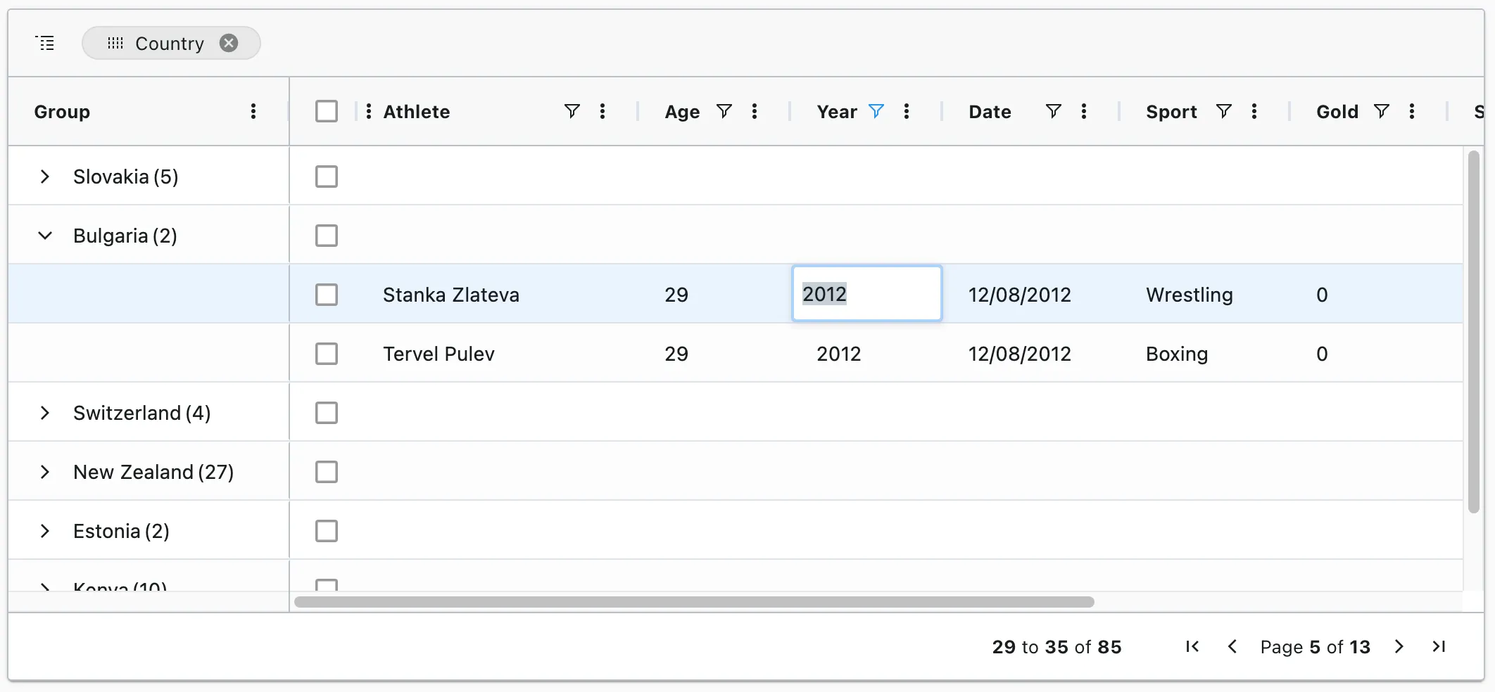
Our alternative data grid component, <DatagridAG>, is now out of beta. It’s a full-featured grid component based on ag-grid. Released in ra-datagrid-ag 5.1.
<DatagridAG> supports all the features of the regular <Datagrid>, plus some highly requested features like:
- In-place editing of cells or rows
- Columns resizing and reordering
- Row and column pinning
- DOM Virtualization
- Draggable rows
- Advanced filtering
- Multi-column sorting
- Row animation
- Keyboard navigation
- Page size adjusted to the grid height
Additionally, <DatagridAG> is compatible with the Enterprise version of ag-grid, which offers even more features:
- Row Grouping
- Range selection
- Aggregation
- Tree Data
- Pivoting
- Master Detail views
- Range Selection
- Excel Export
- Status bar
- Context menu
- More advanced filtering
<DatagridAG> is a paid module, part of react-admin Enterprise Edition.
Finally, if you’re using the query string to pass extra parameters to the list view, react-admin now preserves them when navigating between pages. This is especially useful when you want to keep the current filter or sort order when navigating back to the list view. Released in 5.1.
Detail View Improvements
<SelectInput> supports an array of strings as choices. You no longer need to pass an array of objects if the keys and values are the same. Released in 5.1.
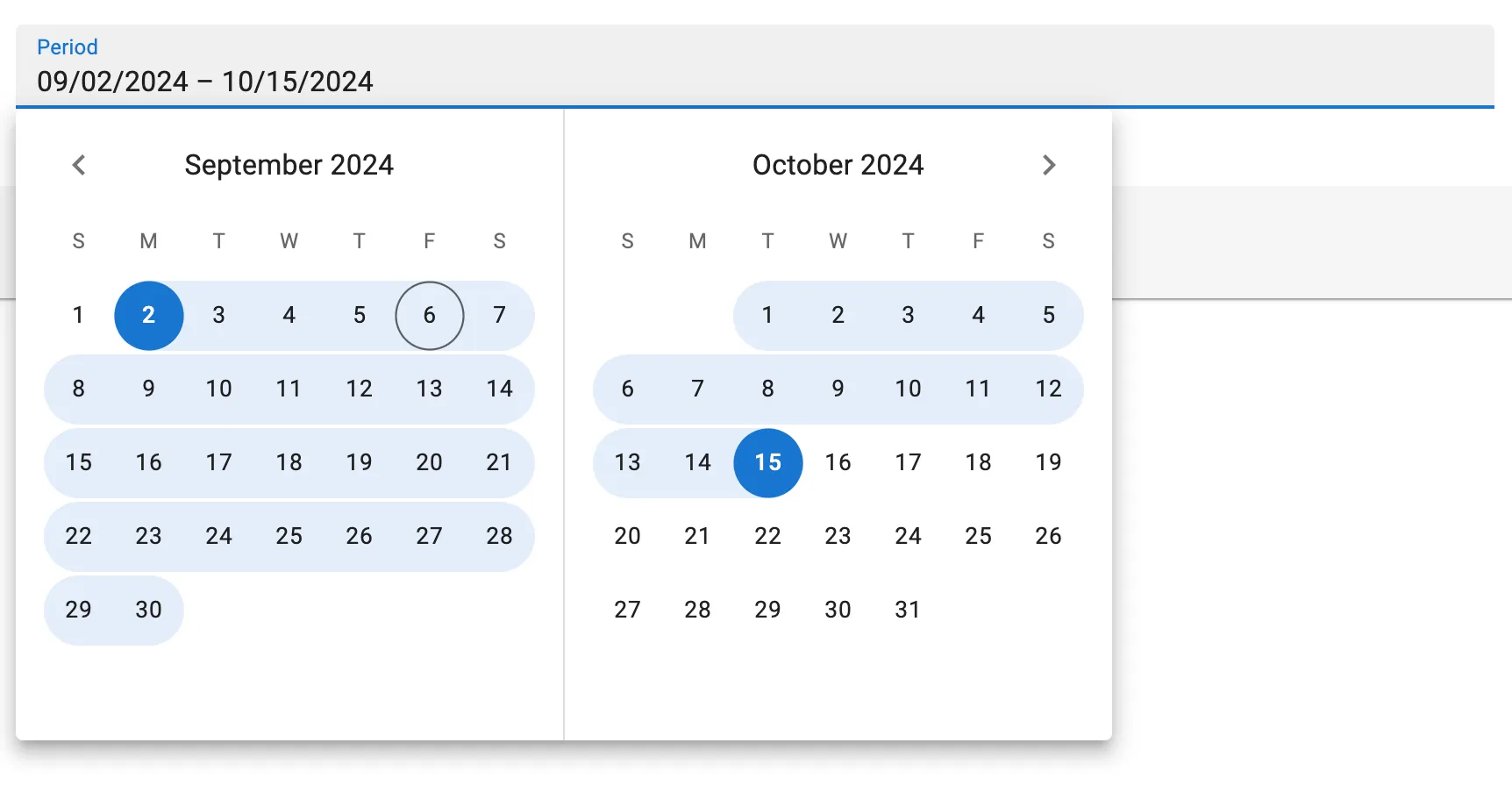
const categories = ["tech", "lifestyle", "people"];<SelectInput source="category" choices={categories} />;// is equivalent toconst choices = categories.map((value) => ({ id: value, name: value }));<SelectInput source="category" choices={choices} />;<DateRangeInput> is a new input component that allows users to enter a date range. It’s especially useful when you want to filter records based on a start and end date. Released in ra-form-layout 5.1.
By default, clicking on a <ReferenceField> will redirect to the show or edit view depending on the Resource configuration. Released in 5.1.
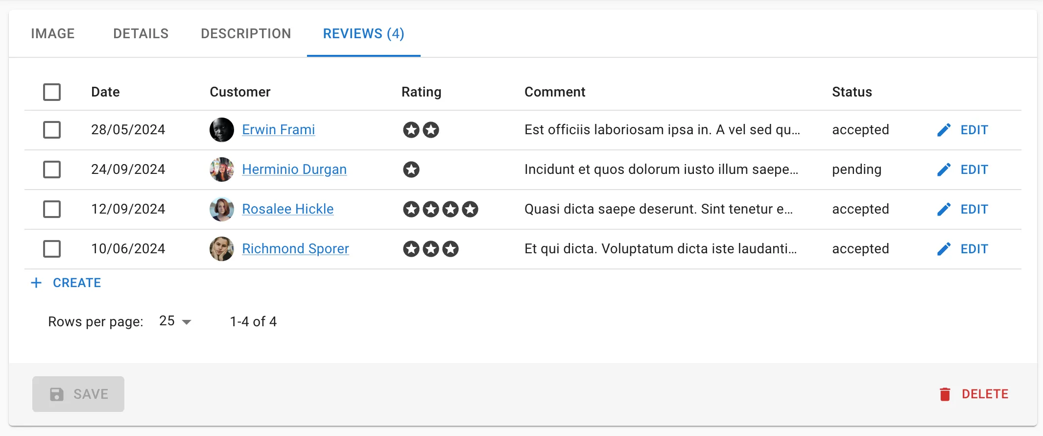
<ReferenceManyField> can be used twice for the same resource on any page, thanks to the storeKey prop. Released in 5.1.
Security
Using an external authentication provider is easier than ever. The following connectors are all open-source and compatible with react-admin v5:
Microsoft Entra ID / Azure Active Directory,
Auth0 / Okta,
 AWS Cognito,
Google Identity & Google Workspace
Supabase
Directus
If you’re using another authentication backend, check out the source of one of these connectors for inspiration.
A popular feature request was to allow customization of the Login page icon. To do so, you can now pass an avatarIcon prop to the <Login> component. Released in 5.1.
Miscellaneous
React-admin removes the default browser margin and padding. This will fix the extra margin seen on new projects that don’t use create-react-admin. Released in 5.2.
You can now disable the page title in <List>, <Edit>, <Create>, and <Show>. Some users have their own title component and don’t want react-admin to render a title. Released in 5.1.
export const PostEdit = () => <Edit title={false}>...</Edit>;Speaking of the page title, you can now disable the ability to customize the page title while in configurable mode. Some users were confused by the feature and wanted to turn it off. Also released in 5.1.
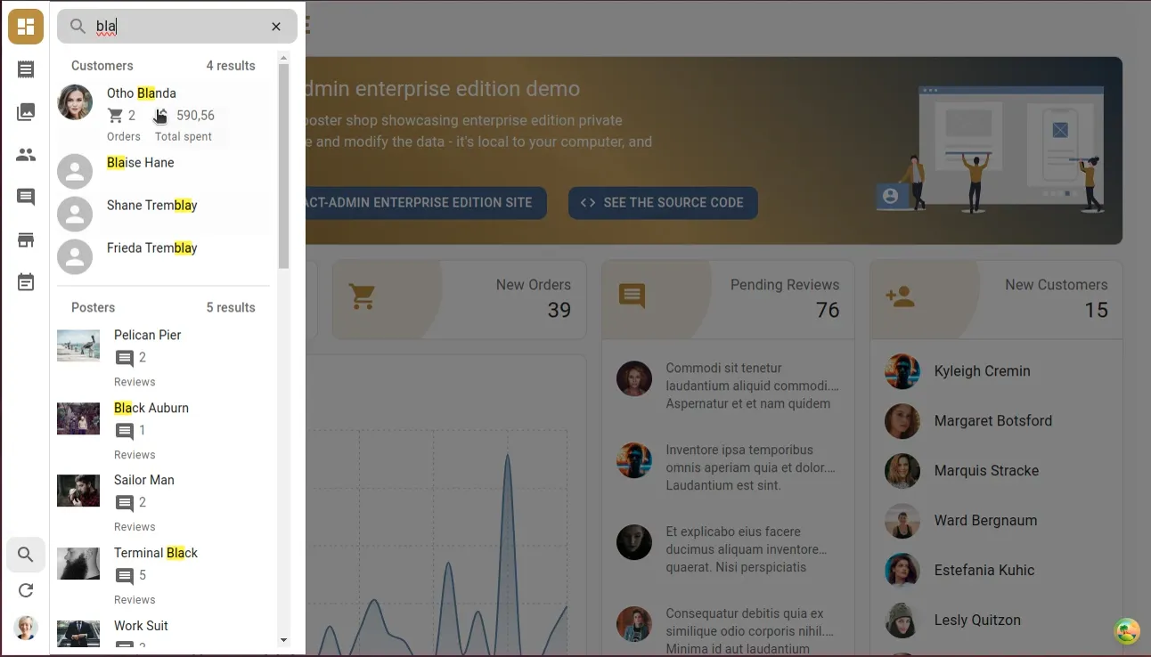
The <Search> component, which lets you query any search engine from react-admin, now highlights the search query in the results. Users understand better why they see a result. It also works with custom representations of the search results! Released in ra-search 5.1.
The <Breadcrumb> component now uses the recordRepresentation prop to display the current record in the breadcrumb. This is especially useful when the record has a custom representation. Released in ra-navigation 5.0.
And while we’re talking about Enterprise Edition packages, all the EE packages are now updated to work with react-admin v5. No new features will be released for v4 of these packages, so you’ll need to upgrade to v5 to get the latest features.
Ecosystem
We’ve added two new data providers to the list of supported providers: ra-data-nestjs-query and ra-data-graphql-supabase, both contributed by the community. This brings the number of supported data providers to 58, which means connecting react-admin to your API is easier than ever.
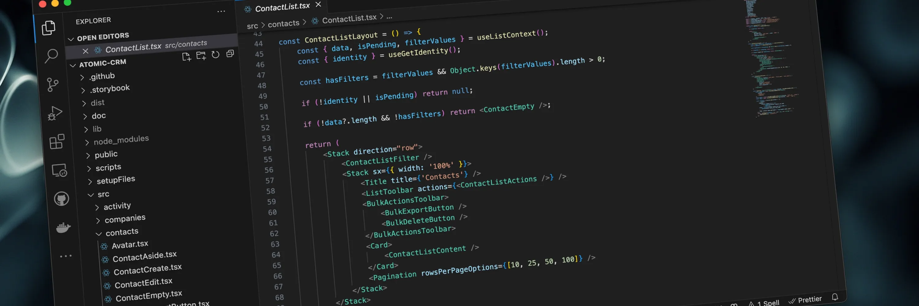
We’ve published Atomic CRM, an open-source CRM framework based on Supabase and react-admin. Atomic CRM is a great starting point whether you want to build a CRM or learn how to develop with Supabase.
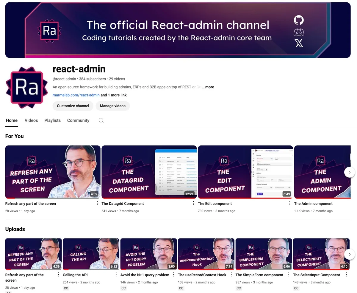
Our YouTube channel is getting new colors and clear thumbnails. We’re also adding more content weekly, so make sure to subscribe!
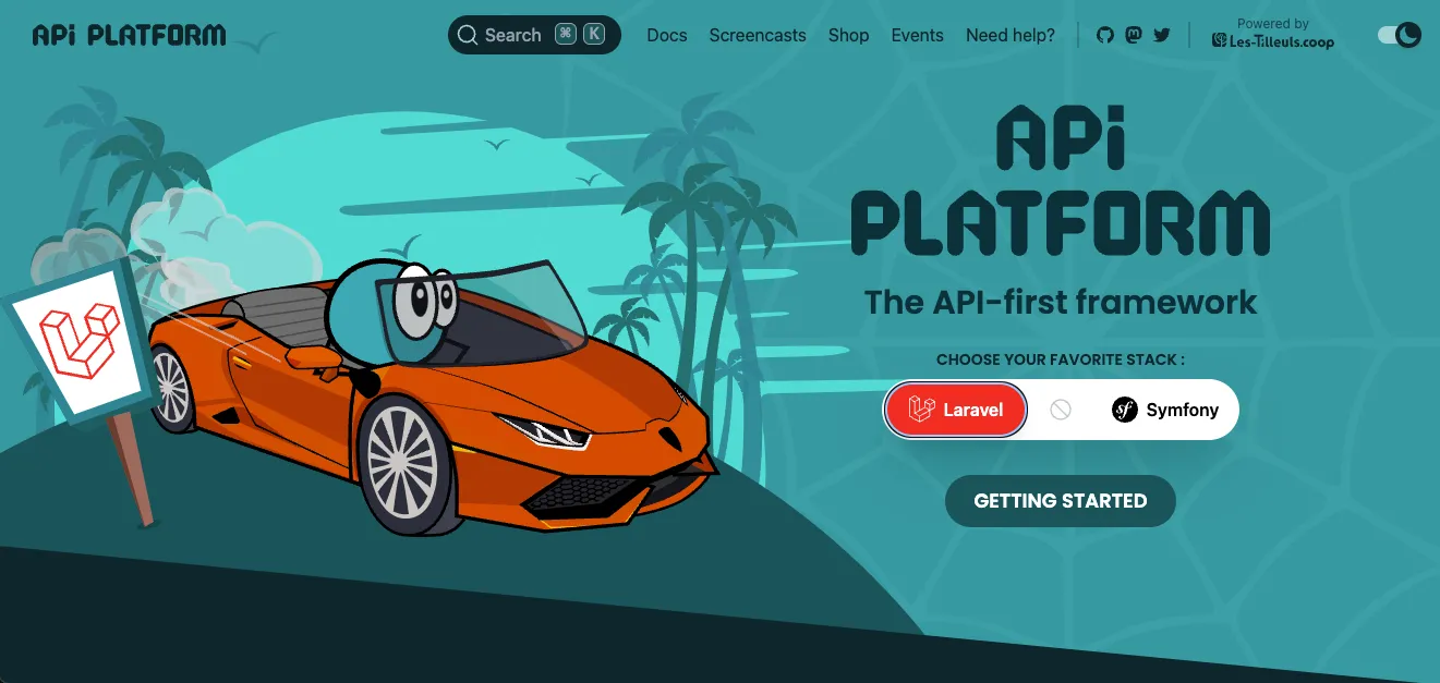
The PHP Framework API Platform, which embeds react-admin, is now compatible with Laravel. So Laravel developers now have an alternative to the Nova admin generator.
Material UI announced its version 6. React-admin isn’t yet compatible with this version, which is a transitional release before the upcoming v7. We’re working on it and’ll keep you updated on our progress.
Conclusion
If you still need to upgrade your react-admin v4 application to v5, now is the time to do it. The new features and improvements we’ve added since the summer will make your life easier. And if you’re already using v5, update to the latest version to get the latest features and bug fixes!

Authors

Marmelab founder and CEO, passionate about web technologies, agile, sustainability, leadership, and open-source. Lead developer of react-admin, founder of GreenFrame.io, and regular speaker at tech conferences.
