React-admin With Shadcn UI

React-admin, the SPA framework for B2B apps, comes with a Material Design look and feel by default. However, react-admin is a design-agnostic framework, and you can use it with any design system. Today, we’re announcing premium support for Shadcn UI, the popular component library.
You can use Shadcn UI with react-admin in two ways:
- Just the Look: Change the theme of your react-admin app to a Shadcn UI-inspired theme.
- The Shadcn UI DX: Use the
shadcn-admin-kitlibrary, which provides a set of Shadcn UI components built on top of react-admin’s headless core.
Just the Look: Change The Theme
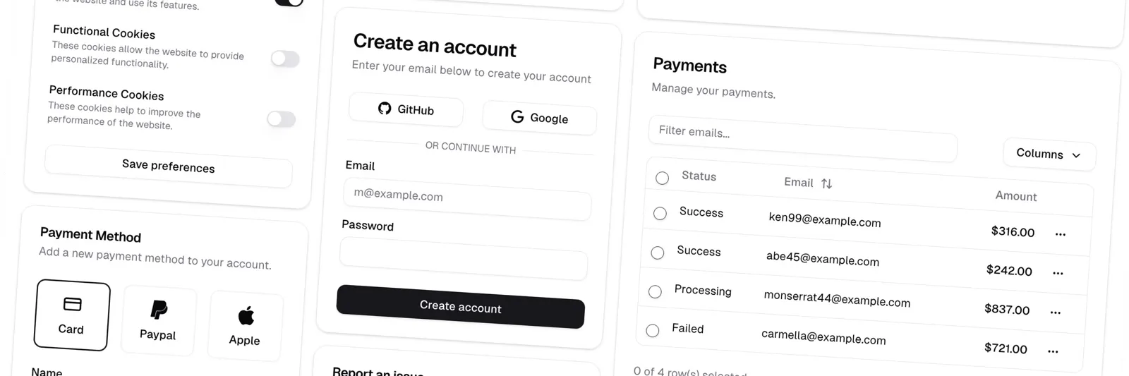
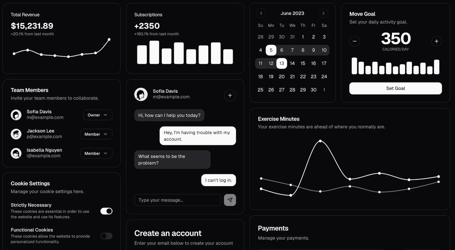
React-admin comes with 5 built-in themes, including a theme inspired by Shadcn UI called B&W.
To use this theme in your react-admin app, change the theme and darkTheme props of the <Admin> component.
import { Admin, bwLightTheme, bwDarkTheme } from 'react-admin';
export const App = () => (    <Admin        dataProvider={dataProvider}        theme={bwLightTheme}        darkTheme={bwDarkTheme}    >        {/* ... */}    </Admin>);
You must also import the Geist font in your index.html file:
<link href="https://fonts.googleapis.com/css2?family=Geist:wght@100..900&display=swap" rel="stylesheet">Now the application skin is Shadcn UI.
Under the hood, react-admin still uses Material UI, so you get all the power of Material UI’s theming system.
Customizing the B&W theme
If you need to customize the theme, you can extend the bwLightTheme and bwDarkTheme themes. For example, to change the primary color to indigo, you can do the following:
import { Admin, bwDarkTheme } from 'react-admin';import { deepmerge } from '@mui/utils';
// Define a custom theme by merging customizations into the base bwDarkThemeconst myTheme = deepmerge(bwDarkTheme, {    palette: {        secondary: { main: '#536dfe' },    },});
The theme also allows you to customize components globally across the app. For example, to change the default style for all buttons:
import { Admin, bwDarkTheme } from 'react-admin';import { deepmerge } from '@mui/utils';
// Define a custom theme with button overridesconst myTheme = deepmerge(bwDarkTheme, {    components: {        // Target the MuiButton component        MuiButton: {            defaultProps: {                // Set default variant for all buttons                variant: 'contained',            },            styleOverrides: {                // Override specific styles                root: {                    // Disable text transformation (e.g., uppercase)                    textTransform: 'none',                },            }        },    },});
Finally, you can override the theme for individual component instances using the sx prop. For example, to change the color of a specific DeleteButton:
import { DeleteButton } from 'react-admin';
const MyDeleteButton = () => (    <DeleteButton        sx={{            backgroundColor: 'red',            '&:hover': {                backgroundColor: 'darkred',            },        }}    />);
Refer to the react-admin theming documentation for more details on theme customization.
Getting The Shadcn Developer Experience
Shadcn UI isn’t only about design. It also provides a different way to customize UI components, by copying UI components in the project source code rather than offering extension points in each component.
React-admin relies on a headless core, which provides hooks and components independent of any specific UI library. This means it’s possible to build another version of react-admin that uses Shadcn UI components instead of Material UI components.
That’s exactly what we did with shadcn-admin-kit. It’s an open-source library that provides a set of React components using Shadcn UI and react-admin headless core.
The syntax is very similar to react-admin, so most of the react-admin documentation applies to shadcn-admin-kit as well. For example, the <ProductEdit> component looks like this:
import {  AutocompleteInput,  Edit,  ReferenceInput,  SimpleForm,  TextInput,} from "@/components/admin";import { required } from "ra-core";
export const ProductEdit = () => (  <Edit>    <SimpleForm>      <TextInput source="reference" label="Reference" validate={required()} />      <ReferenceInput source="category_id" reference="categories">        <AutocompleteInput label="Category" validate={required()} />      </ReferenceInput>      <TextInput source="width" type="number" />      <TextInput source="height" type="number" />      <TextInput source="price" type="number" />      <TextInput source="stock" label="Stock" type="number" />    </SimpleForm>  </Edit>);
But the components are entirely built with Shadcn UI - no Material UI components in sight. So you can entirely customize the admin components by modifying the files in the components/admin directory.
Shadcn-admin-kit relies on the following tech stack:
- UI: shadcn/ui & Radix UI
- Styling: Tailwind CSS
- Icons: Lucide
- Routing: React Router
- API calls: TanStack Query
- Forms & Validation: React Hook Form
- Admin Framework: React Admin
- Type safety: TypeScript
- Build tool: Vite (SPA mode)
It already proposes the most important features of react-admin, such as:
- CRUD: working List, Show, Edit and Create pages
- Data Table with sorting, filtering, export, bulk actions, and pagination
- Form components with data binding and validation
- View and edit references (one-to-many, many-to-one)
- Sidebar menu
- Login page (compatible with any authentication backend)
- Dashboard page
- Automatically guess the code based on the data, using Guessers
- i18n support
- Light/dark mode
- Responsive
- Accessible
- Compatible with any API (REST, GraphQL, etc.)
So if the Material UI developer experience is not your cup of tea, you can use shadcn-admin-kit to get the Shadcn UI look and feel, while keeping the react-admin architecture and robustness.
Conclusion
React-admin is a design-agnostic framework adaptable to any design system. We’ve already documented how to integrate react-admin with various UI libraries in a previous article: Using React-Admin With Your Favorite UI Library.
With the B&W theme and the shadcn-admin-kit library, we’re going a step further by making Shadcn a first-class citizen in the react-admin ecosystem. Look for more Shadcn UI components in the future, as we continue to build a rich ecosystem around react-admin.

Authors
Marmelab founder and CEO, passionate about web technologies, agile, sustainability, leadership, and open-source. Lead developer of react-admin, founder of GreenFrame.io, and regular speaker at tech conferences.