Using React-Admin With Your Favorite UI Library

React-admin, our frontend framework for building applications using React, relies on Material UI for its user interface by default. However, you can use react-admin with any UI library, like Ant Design, Bootstrap, Shadcn UI, or even your own. This is made possible by the very architecture of react-admin, built over a headless package named ra-core.
In this article, I’ll explain how to build a react-admin application with DaisyUI, Tailwind CSS, and React-aria, and without Material UI. This example illustrates some techniques that you can use with any UI library.
You can find the code for this article in the marmelab/ra-tailwind-demo repository.
Building the Application Shell
React-admin apps start with a component called <Admin>, which sets up all the required configurations for the app to work. This means both headless configuration (data provider, auth provider, i18n provider, etc.) and UI configuration (theme, layout, etc).
To build an application without Material UI, I’ll use <CoreAdminContext> and <CoreAdminUI> instead of <Admin>. These low-level components are part of the ra-core package.
// in src/App.tsximport { CoreAdminContext, CoreAdminUI, Resource } from "ra-core";import { dataProvider } from "./dataProvider";import { i18nProvider } from "./i18nProvider";
export const App = () => (  <CoreAdminContext dataProvider={dataProvider} i18nProvider={i18nProvider}>    <CoreAdminUI>      <Resource name="products" />      <Resource name="categories" />    </CoreAdminUI>  </CoreAdminContext>);
If I run this application, I won’t see anything as I didn’t provide a dashboard or a list page for my first resource. Let’s add a fake dashboard for now:
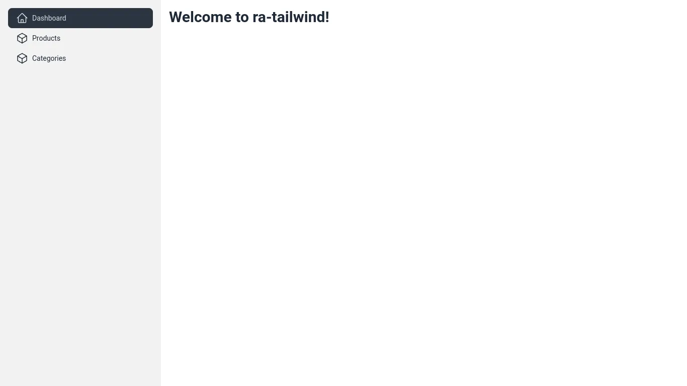
// in src/Dashboard.tsxexport const Dashboard = () => ( <div> <h2>Welcome to ra-tailwind!</h2> </div>);And update the App component to use it:
// in src/App.tsximport { CoreAdminContext, CoreAdminUI, Resource } from 'ra-core';import { dataProvider } from './dataProvider';import { i18nProvider } from './i18nProvider';import { Dashboard } from './Dashboard';
export const App = () => (    <CoreAdminContext dataProvider={dataProvider} i18nProvider={i18nProvider}>        <CoreAdminUI>        <CoreAdminUI dashboard={Dashboard}>            <Resource name="products" />            <Resource name="categories" />        </CoreAdminUI>    </CoreAdminContext>);
Now, I can see my dashboard when I run the application, which means that the react-admin core is properly configured:

That’s not very nice though. Let’s introduce a layout!
Setting Up The UI Library
I’ll use Daisy UI and Tailwind CSS to build my layout. To set these libraries up, I follow the Daisy UI installation instructions and the Tailwind CSS installation instructions for Vite:
npm install -D tailwindcss postcss autoprefixer daisyuinpx tailwindcss init -pThen I create a tailwind.config.js file:
// in tailwind.config.jsmodule.exports = { content: ["./src/**/*.{js,ts,jsx,tsx}"], theme: { extend: {}, }, plugins: [require("daisyui")],};Next, I add Tailwind directives to the CSS:
/* in src/App.css */@tailwind base;@tailwind components;@tailwind utilities;And finally, I add this CSS file to the root App component:
// in src/App.tsximport { CoreAdminContext, CoreAdminUI, Resource } from 'ra-core';import { dataProvider } from './dataProvider';import { i18nProvider } from './i18nProvider';import { Dashboard } from './Dashboard';import "./App.css";
export const App = () => (    <CoreAdminContext dataProvider={dataProvider} i18nProvider={i18nProvider}>        <CoreAdminUI dashboard={Dashboard}>            <Resource name="products" />            <Resource name="categories" />        </CoreAdminUI>    </CoreAdminContext>);
Now I’m ready to use Daisy UI classes in my application.
Adding a Layout with a Sidebar Showing the Resources
I’ll start by creating a sidebar component that displays one menu item per resource.
// in src/layout/Sidebar.tsximport { NavLink } from "react-router-dom";import { CubeIcon, HomeIcon } from "@heroicons/react/24/outline";import {  ResourceDefinition,  useGetResourceLabel,  useResourceDefinitions,} from "ra-core";
export const Sidebar = () => {  const resources = useResourceDefinitions();
  return (    <div className="drawer-side">      <label        htmlFor="sidebar"        aria-label="Close sidebar"        className="drawer-overlay"      ></label>      <ul className="menu p-4 w-80 min-h-full bg-base-200 text-base-content">        <li>          <NavLink to="/">            <HomeIcon className="inline-block w-6 h-6 stroke-current" />            Dashboard          </NavLink>        </li>        {Object.keys(resources).map((resource) => (          <SidebarItem key={resource} definition={resources[resource]} />        ))}      </ul>    </div>  );};
const SidebarItem = ({ definition }: { definition: ResourceDefinition }) => {  const getResourceLabel = useGetResourceLabel();  const Icon = definition.icon || CubeIcon;  return (    <li>      <NavLink to={`/${definition.name}`}>        <Icon className="inline-block w-6 h-6 stroke-current" />        {getResourceLabel(definition.name, 2)}      </NavLink>    </li>  );};
drawer-side and drawer-overlay are Daisy UI classes for rendering a drawer. The useResourceDefinitions hook lets the menu use introspection to generate the menu items based on the <Resource> components in the <CoreAdminUI> component.
Then I write the JSX for the layout itself. A react-admin layout is just a component that renders its children and the page title:
// in src/layout/Layout.tsximport { CoreLayoutProps } from "ra-core";import { Bars3Icon } from "@heroicons/react/24/outline";import { Sidebar } from "./Sidebar";
export const Layout = ({ children, title }: CoreLayoutProps) => {  return (    <div className="drawer lg:drawer-open min-h-screen">      <input id="sidebar" type="checkbox" className="drawer-toggle" />      <div className="drawer-content flex flex-col flex-grow">        <div className="w-full navbar bg-base-300 lg:hidden">          <div className="flex-none">            <label              htmlFor="sidebar"              aria-label="Open sidebar"              className="btn btn-square btn-ghost"            >              <Bars3Icon className="inline-block w-6 h-6 stroke-current" />            </label>          </div>          <div className="flex-1 px-2 mx-2">{title}</div>        </div>        <div className="flex flex-row flex-grow">          <div className="flex flex-col grow p-4">{children}</div>        </div>      </div>      <Sidebar />    </div>  );};
I can now update my application to use this new layout:
// in src/App.tsximport { CoreAdminContext, CoreAdminUI, Resource } from 'ra-core';import { dataProvider } from './dataProvider';import { i18nProvider } from './i18nProvider';import { Dashboard } from './Dashboard';import "./App.css";import { Layout } from './layout/Layout';
export const App = () => (    <CoreAdminContext dataProvider={dataProvider} i18nProvider={i18nProvider}>        <CoreAdminUI dashboard={Dashboard}>        <CoreAdminUI dashboard={Dashboard} layout={Layout} title="React Admin">            <Resource name="products" />            <Resource name="categories" />        </CoreAdminUI>    </CoreAdminContext>);
And I get a nice layout with a sidebar:
It’s time to render data from the API!
Adding a List Page For The Products Resource
React-admin provides headless controller hooks for all its core features. For the list view, I can leverage the useListController hook and the ListContext.
The List page itself uses the useListController hook to get the data from the API, based on the URL parameters. In the ProductList below, I put the data from the List controller in a ListContext to let descendants like the datagrid access it.
// in src/products/ProductList.tsximport { ListContextProvider, useListController } from "ra-core";import { createColumnHelper } from "@tanstack/react-table";import { type Product } from "./types";import { ProductDatagrid } from "./ProductDatagrid";
export const ProductList = () => { const listContext = useListController<Product>({ sort: { field: "reference", order: "ASC" }, });
if (listContext.isLoading || !listContext.data) { return <div>Loading...</div>; }
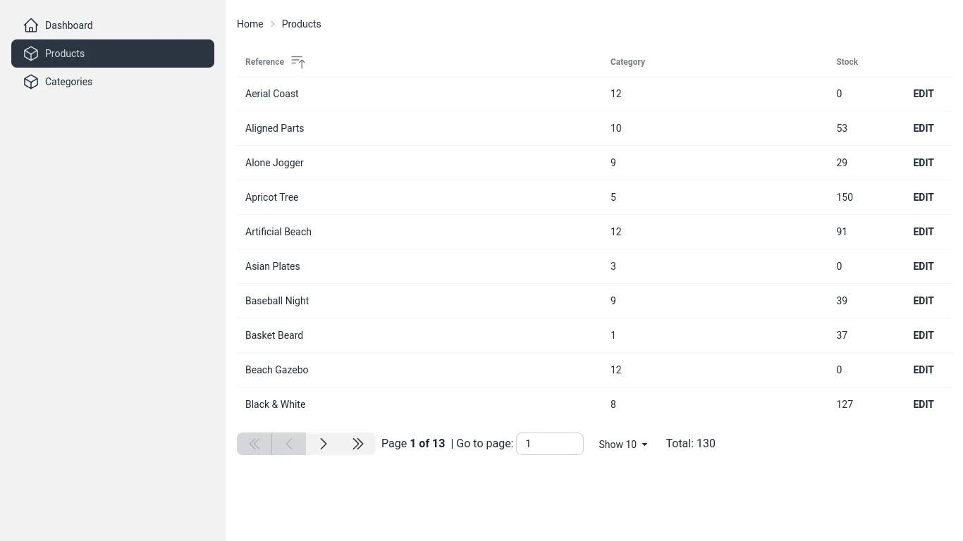
return ( <ListContextProvider value={listContext}> <div className="text-sm breadcrumbs mb-4"> <ul> <li> <Link to="/">Home</Link> </li> <li>Products</li> </ul> </div> <div className="flex flex-col gap-4"> <ProductDatagrid /> </div> </ListContextProvider> );};The <ProductDatagrid> component defines the columns for the product’s datagrid. As I need more than one datagrid in my application, it is just a wrapper around a generic <Datagrid> component built with tanstack-table.
// in src/products/ProductDatagrid.tsximport { createColumnHelper } from "@tanstack/react-table";import { Datagrid } from "../ui/Datagrid";import { type Product } from "./types";
const columnHelper = createColumnHelper<Product>();
const columns = [  columnHelper.accessor("reference", {    header: () => "Reference",    cell: (info) => info.getValue(),  }),  columnHelper.accessor("category_id", {    header: () => "Category",    cell: (info) => {      return info.renderValue();    },  }),  columnHelper.accessor("stock", {    header: () => "Stock",    cell: (info) => info.renderValue(),    meta: {      headerClassName: "w-24",    },  }),  columnHelper.accessor((row) => row.id, {    id: "actions",    cell: (info) => (      <Link className="btn btn-sm btn-ghost" to={info.getValue().toString()}>        Edit      </Link>    ),    enableSorting: false,    header: () => <span />,    meta: {      headerClassName: "w-12",    },  }),];
export const ProductDatagrid = () => <Datagrid columns={columns} />;
Here is my <Datagrid> component, using Daisy UI’s table classes to style the powerful Tanstack table. It leverages the useListContext hook to get the controller data and callbacks from the ListContext:
// in src/ui/Datagrid.tsximport { useMemo } from "react";import { RaRecord, useListContext } from "ra-core";import {  ColumnDef,  SortingState,  Table,  flexRender,  getCoreRowModel,  useReactTable,} from "@tanstack/react-table";
export const Datagrid = <RecordType extends RaRecord = RaRecord>({  columns,}: {  columns: ColumnDef<RecordType, any>[];}) => {  // Get the react-admin list data from the ListContext  const { data, page, perPage, setSort, sort, total } =    useListContext<RecordType>();
  // Create the pagination model expected by react-table  const pagination = useMemo(    () => ({      pageIndex: page - 1,      pageSize: perPage,    }),    [page, perPage],  );
  // Create the sorting model expected by react-table  const sorting = useMemo<SortingState>(    () => [      {        id: sort.field,        desc: sort.order === "DESC",      },    ],    [sort],  );
  // Create the react-table instance  const table = useReactTable({    data,    columns,    getCoreRowModel: getCoreRowModel(),    pageCount: Math.ceil(total / perPage),    state: {      pagination,      sorting,    },    manualPagination: true,    manualSorting: true,  });
  return (    <>      <table className="table table-sm">        <thead>          {table.getHeaderGroups().map((headerGroup) => (            <tr key={headerGroup.id}>              {headerGroup.headers.map((header) => (                <th                  key={header.id}                  className={header.column.columnDef.meta?.headerClassName}                >                  {header.isPlaceholder ? null : header.column.getCanSort() ? (                    <button                      className="flex items-center gap-2 cursor-pointer select-none"                      onClick={() => {                        if (!header.column.getCanSort() || !header.column.id) {                          return;                        }                        const order =                          !header.column.getIsSorted() ||                          header.column.getIsSorted() === "desc"                            ? "ASC"                            : "DESC";
                        setSort({                          field: header.column.id,                          order,                        });                      }}                    >                      {flexRender(                        header.column.columnDef.header,                        header.getContext(),                      )}                      {{                        asc: <BarsArrowUpIcon className="h-6 w-6" />,                        desc: <BarsArrowDownIcon className="h-6 w-6" />,                      }[header.column.getIsSorted() as string] ?? null}                    </button>                  ) : (                    flexRender(                      header.column.columnDef.header,                      header.getContext(),                    )                  )}                </th>              ))}            </tr>          ))}        </thead>        <tbody>          {table.getRowModel().rows.map((row) => (            <tr key={row.id}>              {row.getVisibleCells().map((cell) => (                <td key={cell.id}>                  {flexRender(cell.column.columnDef.cell, cell.getContext())}                </td>              ))}            </tr>          ))}        </tbody>      </table>      <Pagination table={table} />    </>  );};
I omitted the <Pagination> component code for brevity but feel free to check it out in the marmelab/ra-tailwind-demo.
Finally, I define my <ProductList> component as the list component for the products resource:
// in src/App.tsx// ...import { ProductList } from './products/ProductList';
export const App = () => (    <CoreAdminContext dataProvider={dataProvider} i18nProvider={i18nProvider}>        <CoreAdminUI dashboard={Dashboard} layout={Layout} title="React Admin">           <Resource name="products" />           <Resource name="products" list={ProductList} />            <Resource name="categories" />        </CoreAdminUI>    </CoreAdminContext>);
I now have a datagrid with sorting and pagination:
Adding Filters To The List
A good list page needs search controls. Let’s create a <SearchInput> component that uses the useListContext hook to update the list filters when the user types in the search input.
I use react-aria-components to build the search input. It’s a set of unstyled components that implement the WAI-ARIA 1.2 specification. I use Daisy UI and Tailwind CSS to style these components.
// in src/ui/SearchInput.tsximport { SearchField, Label, Input, Button } from "react-aria-components";import { MagnifyingGlassIcon, XMarkIcon } from "@heroicons/react/24/outline";import { useListContext } from "ra-core";
export const SearchInput = () => {  const { setFilters, filterValues } = useListContext();  return (    <SearchField      className="join"      defaultValue={filterValues.q ?? ""}      onChange={(value) => setFilters({ q: value }, {})}    >      <Label className="hidden">Search</Label>      <Input        className="input input-sm input-bordered border-base-300 border-r-0 join-item appearance-none"        placeholder="Search"      />      <Button className="join-item border border-base-300 border-l-0 px-2">        <XMarkIcon className="w-3 h-3" />      </Button>      <span className="join-item btn btn-sm btn-active">        <MagnifyingGlassIcon className="w-6 h-6" />      </span>    </SearchField>  );};
I put the filter above my datagrid:
// in src/products/ProductList.tsxexport const ProductList = () => { // ... return ( <ListContextProvider value={listContext}> {/* ... */} <div className="flex flex-col gap-4"> <SearchInput /> <ProductDatagrid /> </div> </ListContextProvider> );};Now, users have a search-as-you-type input to filter the list:
Now, let’s talk about mutating data!
Adding an Edition Page For The Products Resource
Just like for list pages, react-admin provides controller hooks and contexts for edition pages. However, I’d like to show another way: the ...Base components. One such component is <EditBase>. It calls the useEditController hook and puts its result in an EditContext context, just like I did for the list earlier.
I use react-admin’s <Form> component to build the form. It’s a wrapper around react-hook-form that automatically uses the current record for the default values among other things.
import { EditBase, Form, required, useEditContext } from "ra-core";import { Button } from "react-aria-components";import { Link } from "react-router-dom";import { TextInput } from "../ui/inputs/TextInput";import { ReferenceInput } from "../ui/inputs/ReferenceInput";import { AutocompleteInput } from "../ui/inputs/AutocompleteInput";
export const ProductEdit = () => (  <EditBase mutationMode="pessimistic">    <ProductEditView />  </EditBase>);
const ProductEditView = () => {  const context = useEditContext();
  if (context.isLoading || !context.record) {    return null;  }
  return (    <>      <div className="text-sm breadcrumbs mb-4">        <ul>          <li>            <Link to="/">Home</Link>          </li>          <li>            <Link to="/products">Products</Link>          </li>          <li>{context.record.reference}</li>        </ul>      </div>      <Form>        <div className="flex flex-col gap-4 w-full max-w-lg">          <TextInput            source="reference"            label="Reference"            validate={required()}          />          <ReferenceInput source="category_id" reference="categories">            <AutocompleteInput label="Category" />          </ReferenceInput>          <div className="flex flex-row gap-4">            <Button className="btn btn-primary" type="submit">              Save            </Button>          </div>        </div>      </Form>    </>  );};
Let’s dive into my <TextInput> component. It uses react-aria-components and Daisy UI to render the input. It also leverages the useInput hook from ra-core, to built a controlled input component:
import { InputProps, useInput, useTranslate } from "ra-core";import clsx from "clsx";import { TextField, Label, Input, Text } from "react-aria-components";
export const TextInput = (props: InputProps) => {  const input = useInput(props);  const translate = useTranslate();
  return (    <TextField className="form-control w-full">      <Label className="label">        <span className="label-text">          {typeof props.label === "string"            ? translate(props.label, { _: props.label })            : props.label}        </span>      </Label>      <Input        type="text"        className={clsx("input input-bordered w-full", {          "input-error": input.fieldState.invalid && input.fieldState.isTouched,        })}        {...input.field}      />    </TextField>  );};
This is enough to get a working edition page:
I could apply the same process for create and show pages but I’ll leave that as an exercise for the reader.
Conclusion
There’s a lot more in the marmelab/ra-tailwind-demo repository, including the <ReferenceField> and <ReferenceInput> components, a theme switcher, and a login page. Feel free to browse this repository to see how to build a full react-admin application with Tailwind CSS and Daisy UI.
This new UI layer for react-admin required a few hours of work mainly because I wasn’t familiar with the react-table and react-aria-components libraries.
I also implemented another demo using shadcn/ui in the marmelab/ra-shadcn-demo repository if you’re curious.
Note that some of the hooks and components are not yet documented in react-admin but you can browse the code to learn more about them.
I hope this article convinced you that react-admin is not tied to Material UI and that you can use any UI library without giving up on all the features it provides.

Authors
Full-stack web developer at marmelab, Gildas has a strong appetite for emerging technologies. If you want an informed opinion on a new library, ask him, he's probably used it on a real project already.