useNotify
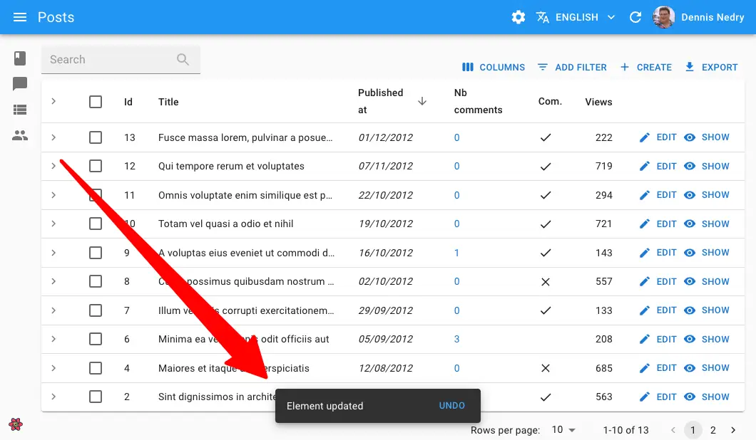
This hook returns a function that displays a notification at the bottom of the page.

Usage
import { useNotify } from 'react-admin';

const NotifyButton = () => {
    const notify = useNotify();
    const handleClick = () => {
        notify(`Comment approved`, { type: 'success' });
    }
    return <button onClick={handleClick}>Notify</button>;
};
The hook takes no argument and returns a callback. The callback takes 2 arguments:
- The message to display (a string, or a React node)
- an
optionsobject with the following keys:type: The notification type (info,success,errororwarning- the default isinfo)messageArgs: options to pass to thetranslatefunction (because notification messages are translated if your admin has ani18nProvider). It is useful for inserting variables into the translation.undoable: Set it totrueif the notification should contain an “undo” buttonautoHideDuration: Duration (in milliseconds) after which the notification hides. Set it to0if the notification should not be dismissible.multiLine: Set it totrueif the notification message should be shown in more than one line.anchorOrigin: The position of the notification. The default is{ vertical: 'top', horizontal: 'right' }. See the Material UI documentation for more details.
Here are more examples of notify calls:
// notify an error
notify(`This is an error`, { type: 'error' });
// notify a warning
notify(`This is a warning`, { type: 'warning' });
// pass translation arguments
notify('item.created', { type: 'info', messageArgs: { resource: 'post' } });
// send an undoable notification
notify('Element updated', { type: 'info', undoable: true });
anchorOrigin
You can change the default position of the notification by passing an anchorOrigin option. The value is passed to the Material UI <Snackbar anchorOrigin> prop.
notify(
    'Form submitted successfully',
    { anchorOrigin: { vertical: 'top', horizontal: 'right' }
});
autoHideDuration
You can define a custom delay for hiding a given notification.
import { useNotify } from 'react-admin';

const LogoutButton = () => {
    const notify = useNotify();
    const logout = useLogout();

    const handleClick = () => {
        logout().then(() => {
            notify('Form submitted successfully', { autoHideDuration: 5000 });
        });
    };

    return <button onClick={handleClick}>Logout</button>;
};
To change the default delay for all notifications, check the <Admin notification> documentation.
messageArgs
useNotify calls the translate function to translate the notification message. You often need to pass variables to the translate function. The messageArgs option allows you to do that.
For instance, if you want to display a notification message like “Post 123 created”, you need to pass the post id to the translation function.
notify('post.created', { messageArgs: { id: 123 } });
Then, in your translation files, you can use the id variable:
{
    "post": {
        "created": "Post %{id} created"
    }
}
messageArgs also let you define a default translation using the _ key:
notify('post.created', { messageArgs: { _: 'Post created' } });
Finally, messageArgs lets you define a smart_count variable, which is useful for pluralization:
notify('post.created', { messageArgs: { smart_count: 2 } });
translate uses the smart_count value to choose the right translation in the post.created key:
{
    "post": {
        "created": "One post created |||| %{smart_count} posts created"
    }
}
multiLine
You can display a notification message on multiple lines.
notify(
    'This is a very long message that will be displayed on multiple lines',
    { multiLine: true }
);
type
This option lets you choose the notification type. It can be info, success, warning or error. The default is info.
notify('This is an info', { type: 'info' });
notify('This is a success', { type: 'success' });
notify('This is a warning', { type: 'warning' });
notify('This is an error', { type: 'error' });
undoable
When using useNotify as a side effect for an undoable mutation, you MUST set the undoable option to true, otherwise the “undo” button will not appear, and the actual update will never occur.
import * as React from 'react';
import { useNotify, Edit, SimpleForm } from 'react-admin';

const PostEdit = () => {
    const notify = useNotify();

    const onSuccess = () => {
        notify('Changes saved`', { undoable: true });
    };

    return (
        <Edit mutationMode="undoable" mutationOptions=>
            <SimpleForm>
                ...
            </SimpleForm>
        </Edit>
    );
}
Custom Notification Content
You may want a notification message that contains HTML or other React components. To do so, you can pass a React node as the first argument of the notify function.
This allows e.g. using Material UI’s <Alert> component to display a notification with a custom icon, color, or action.

import { useSubscribe } from "@react-admin/ra-realtime";
import { useNotify, useDataProvider } from "react-admin";
import { Alert } from "@mui/material";

export const ConnectionWatcher = () => {
  const notify = useNotify();
  const dataProvider = useDataProvider();
  useSubscribe("connectedUsers", (event) => {
    if (event.type === "connected") {
      dataProvider
        .getOne("agents", { id: event.payload.agentId })
        .then(({ data }) => {
          notify(
            <Alert severity="info">
                Agent ${data.firstName} ${data.lastName} just logged in
            </Alert>
            );
        });
    }
    if (event.type === "disconnected") {
      dataProvider
        .getOne("agents", { id: event.payload.agentId })
        .then(({ data }) => {
          notify(
            <Alert severity="info">
                Agent ${data.firstName} ${data.lastName} just logged out
            </Alert>
          );
        });
    }
  });
  return null;
};
Note that if you use this ability to pass a React node, the message will not be translated - you’ll have to translate it yourself using useTranslate.

