Error
App-wide error component. It displays the error message and a back button. In development, it also shows the component stack trace.
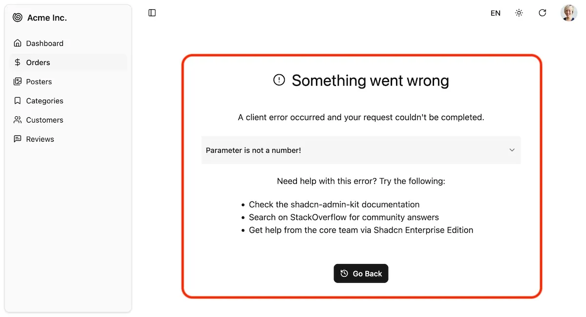
The default Shadcn Admin Kit <Layout> renders <Error> as the error boundary fallback component. This means that any time a React component throws an error, instead of crashing the entire application, users will see the <Error> component decorated by the layout instead. They’ll be able to navigate to other parts of the app using the menu or the back button.
To customize it, edit the @/components/admin/error.tsx file and adapt the JSX to your needs.
For example, here is a simplified error component without the stack trace and help links:
// in @/components/admin/error.tsximport { useResetErrorBoundaryOnLocationChange, Translate } from "ra-core";import { CircleAlert, History } from "lucide-react";import { Button } from "@/components/ui/button";
export const Error = (props: InternalErrorProps & {}) => {  const { error, errorInfo, resetErrorBoundary, ...rest } = props;  useResetErrorBoundaryOnLocationChange(resetErrorBoundary);
  return (    <div className="flex flex-col items-center md:p-16 gap-5" {...rest}>      <h1 className="flex items-center text-3xl mt-5 mb-5 gap-3" role="alert">        <CircleAlert className="w-2em h-2em" />        <Translate i18nKey="ra.page.error" />      </h1>      <div>        <Translate i18nKey="ra.message.error" />      </div>      <div className="mt-8">        <Button onClick={goBack}>          <History />          <Translate i18nKey="ra.action.back" />        </Button>      </div>    </div>  );};
function goBack() {  window.history.go(-1);}
If you want to create your own error boundary for a specific part of the app, you can use the ErrorBoundary component from the react-error-boundary package and pass <Error> as the FallbackComponent prop.
import { ErrorBoundary } from "react-error-boundary";import { Error } from "@/components/admin/error";
const MyComponent = ({ children }) => (    <ErrorBoundary FallbackComponent={Error} >        <div className="flex flex-1 flex-col px-4 ">            {props.children}        </div>    </ErrorBoundary>);