Layout
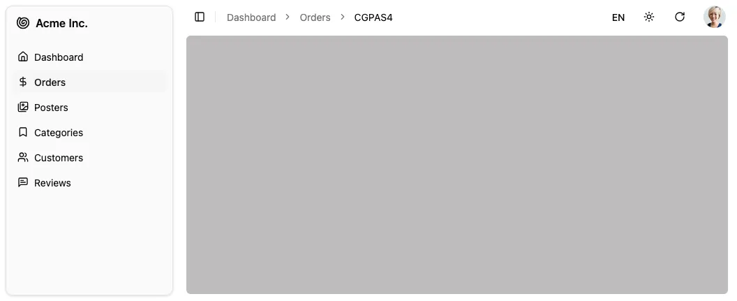
Application shell including sidebar, header (breadcrumb portal, locale & theme toggles, refresh, user menu) and notification area.
<Layout> wraps the main content of the page. It includes:
- The AppSidebar component for navigation
- A header with a breadcrumb portal, locale and theme toggles, refresh button, and user menu
- An error boundary for error handling (renders the
<Error>component by default) - A Suspense boundary for loading states (renders the
<Loading>component by default) - A notification area for displaying toasts
To customize all these elements, edit the @/components/admin/layout.tsx file.
Here is a short version of the default layout component.
import { Suspense, useState, type ErrorInfo, type ReactNode } from "react";import { cn } from "@/lib/utils";import { ErrorBoundary } from "react-error-boundary";import { SidebarProvider, SidebarTrigger } from "@/components/ui/sidebar";import { UserMenu } from "@/components/admin/user-menu";import { ThemeModeToggle } from "@/components/admin/theme-mode-toggle";import { Notification } from "@/components/admin/notification";import { AppSidebar } from "@/components/admin/app-sidebar";import { RefreshButton } from "@/components/admin/refresh-button";import { LocalesMenuButton } from "@/components/admin/locales-menu-button";import { Error } from "@/components/admin/error";import { Loading } from "@/components/admin/loading";
export const Layout = (props: { children: ReactNode }) => { const [errorInfo, setErrorInfo] = useState<ErrorInfo | undefined>(undefined); const handleError = (_: Error, info: ErrorInfo) => { setErrorInfo(info); }; return ( <SidebarProvider> <AppSidebar /> <main className={/* ... */}> <header className="flex h-16 md:h-12 shrink-0 items-center gap-2 px-4"> <SidebarTrigger className="scale-125 sm:scale-100" /> <div className="flex-1 flex items-center" id="breadcrumb" /> <LocalesMenuButton /> <ThemeModeToggle /> <RefreshButton /> <UserMenu /> </header> <ErrorBoundary onError={handleError} fallbackRender={({ error, resetErrorBoundary }) => ( <Error error={error} errorInfo={errorInfo} resetErrorBoundary={resetErrorBoundary} /> )} > <Suspense fallback={<Loading />}> <div className="flex flex-1 flex-col px-4 ">{props.children}</div> </Suspense> </ErrorBoundary> </main> <Notification /> </SidebarProvider> );};When rendering the <Layout> component, Shadcn Admin Kit passes it a single prop, children, which is the main content of the page (the current resource view, depending on the current route).
Building a Custom Layout
Section titled “Building a Custom Layout”Instead of customizing the Layout, you can also provide your own layout component by passing it to the <Admin> component:
import { Admin } from "react-admin";import { MyLayout } from "./layout";
const App = () => (  <Admin layout={MyLayout} /* ... */>    {/* ... */}  </Admin>);
A custom layout can be of any shape, but must render its children (the main content of the page). For example, here is a minimal layout:
import type { ReactNode } from "react";import { Notification } from "@/components/admin/notification";
export const MyLayout = (props: { children: ReactNode }) => (  <div>    <header>My custom header</header>    <main>{props.children}</main>    <footer>My custom footer</footer>    <Notification />  </div>);