ThemeModeToggle
Lets users switch between light and dark UI themes.
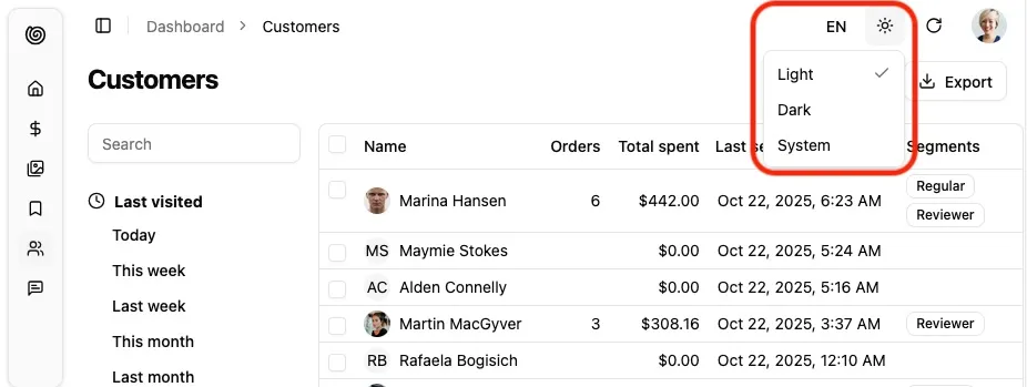
It leverages the store so that their selection is persisted.
For most users, this component will be automatically added to the header of shadcn-admin-kit’s default <Layout>.
For custom layouts, or to put the theme switcher in a settings menu, simply render the component without props:
import { ThemeModeToggle } from '@/components/admin';
<ThemeModeToggle />
Setting The Preferred Theme
Section titled “Setting The Preferred Theme”Shadcn Admin Kit defaults to the system theme mode. You can force another default theme by passing the defaultThemeMode prop to the <Admin> component:
import { Admin } from '@/components/admin';
const App = () => (    <Admin defaultThemeMode="dark" dataProvider={dataProvider}>        ...    </Admin>);
Customizing the Themes
Section titled “Customizing the Themes”Shadcn Admin Kit leverages Shadcn/ui Theming to provide light and dark themes out of the box using CSS variables. You can customize these themes by editing the src/index.css file in your project.
:root {  /* Light theme overrides */  --primary: oklch(0.205 0 0);  --primary-foreground: oklch(0.985 0 0);  /* Add more CSS variable overrides as needed */}
.dark {  /* Dark theme overrides */  --primary: oklch(0.615 0.2 0);  --primary-foreground: oklch(0.215 0 0);  /* Add more CSS variable overrides as needed */}
Check out the list of CSS variables provided by Shadcn/ui for more customization options.