Loading
Loading indicator used for slow element or page loads. It displays a spinner and a loading message.
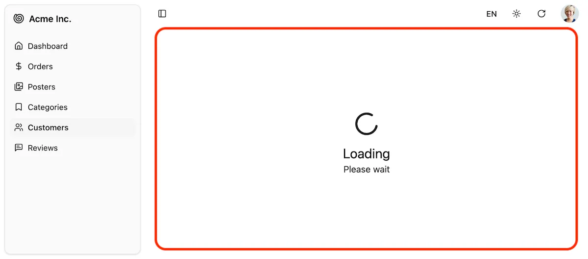
The default Shadcn Admin Kit <Layout> displays the Loading component in the main content area when a page component is loading and the loading takes more than 1 second. This is done automatically using React Suspense and requires no special setup.
For example, if you use code splitting to lazy load your resource views, the <Loading> component will be displayed while the component is being loaded:
import * as React from 'react';import { Admin } from "@/components/admin";import { Resource } from "ra-core";
import { dataProvider } from './dataProvider';
const OrderList = React.lazy(() => import('./orders/OrderList'));const OrderEdit = React.lazy(() => import('./orders/OrderEdit'));
const App = () => (    <Admin dataProvider={dataProvider}>        <Resource name="orders" list={OrderList} edit={OrderEdit} />        ...    </Admin>);
You can customize the loading component by editing the @/components/admin/loading.tsx file.
| Prop | Required | Type | Default | Description |
|---|---|---|---|---|
loadingPrimary | string | ra.page.loading | Main heading i18n key | |
loadingSecondary | string | ra.message.loading | Secondary text key | |
delay | number | 1000 | Delay before showing (ms) |
Usage in Custom Components
Section titled “Usage in Custom Components”You can also use the <Loading> component inside your custom pages or components to display a loading indicator while waiting for some data to load. It works perfectly as a fallback for React’s Suspense component:
import { Loading } from "@/components/admin/loading";import { Suspense } from "react";
export const MyComponent = () => (  <Suspense fallback={<Loading loadingPrimary="Loading data..." />}>    <div>      {/* Your component content that may take time to load */}    </div>  </Suspense>);