Breadcrumb
Responsive breadcrumb that helps users navigate the app. On mobile, it collapses into a button listing intermediate links. It leverages shadcn/ui’s Breadcrumb component.
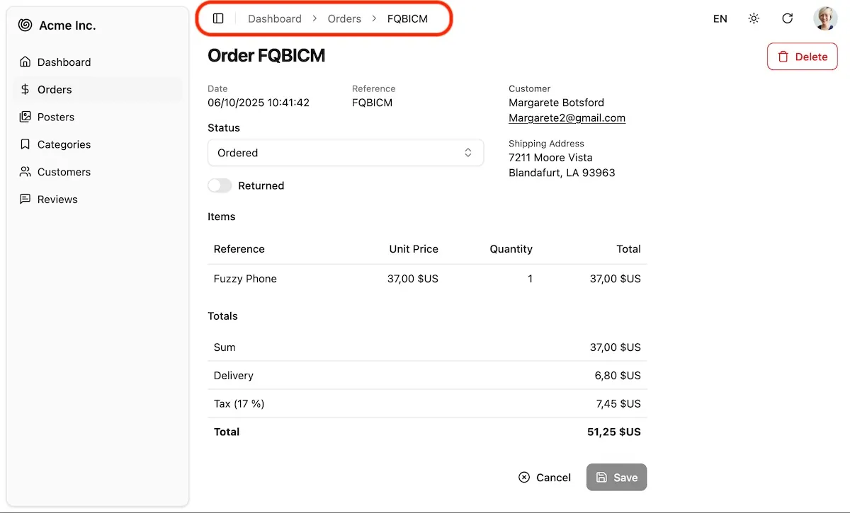
<Breadcrumb> defines a breadcrumb path and renders it in the <div id="breadcrumb"> portal, located in the header of the default <Layout> component.
Default page components (<List>, <Show>, <Edit>, <Create>) automatically set the breadcrumb based on the current resource and action. For detail pages, it uses the <Resource recordRepresentation> to display the current record.
So for the CRUD pages of a posts resource with recordRepresentation="title", the default breadcrumb paths are:
list: Home > Postsedit: Home > Posts > Hello Worldshow: Home > Posts > Hello Worldcreate: Home > Posts > Create
To customize the breadcrumb for these pages, disable the default breadcrumb by using the disableBreadcrumb prop on the page component, then use the <Breadcrumb> component as a descendent. For example, to customize the breadcrumb for the Edit page of the posts resource:
import { Edit, Breadcrumb, SimpleForm } from "@/components/admin";import { RecordRepresentation } from 'ra-core';import { Link } from "react-router";
const PostEdit = () => (    <Edit disableBreadcrumb>        <Breadcrumb>            <Breadcrumb.Item><Link to="/">Home</Link></Breadcrumb.Item>            <Breadcrumb.Item><Link to="/posts">Articles</Link></Breadcrumb.Item>            <Breadcrumb.PageItem>                Edit Article "<RecordRepresentation />"            </Breadcrumb.Item>        </Breadcrumb>        <SimpleForm>            ...        </SimpleForm>    </Edit>)
This example shows that you can use <Breacrumb.Item> for intermediate links and <Breadcrumb.PageItem> for the current page. You can also use the <RecordRepresentation> component to display the current record.
Custom Pages
Section titled “Custom Pages”To add a breadcrumb to a custom page component, simply use the <Breadcrumb> component as a descendent of your page component. For example:
import { Breadcrumb } from "@/components/admin";
const SettingsPage = () => (    <>        <Breadcrumb>            <Breadcrumb.Item><Link to="/">Home</Link></Breadcrumb.Item>            <Breadcrumb.PageItem>Settings</Breadcrumb.PageItem>        </Breadcrumb>        <h1>Settings</h1>        ...    </>)
Custom Layout
Section titled “Custom Layout”If your application defines a custom <Admin layout> component, make sure to include a <div id="breadcrumb"> element where you want the breadcrumb to be rendered.
const MyLayout = ({ children }: { children: ReactNode }) => ( <div> <header> <div id="breadcrumb" /> ... </header> <main>{children}</main> <footer>...</footer> </div>);