List
The <List> component is the root component for list pages. It fetches a list of records from the data provider (via ra-core hooks), puts them in a ListContext, renders a default layout (breadcrumb, title, action buttons, inline filters, pagination), then renders its children (usually a <DataTable>).
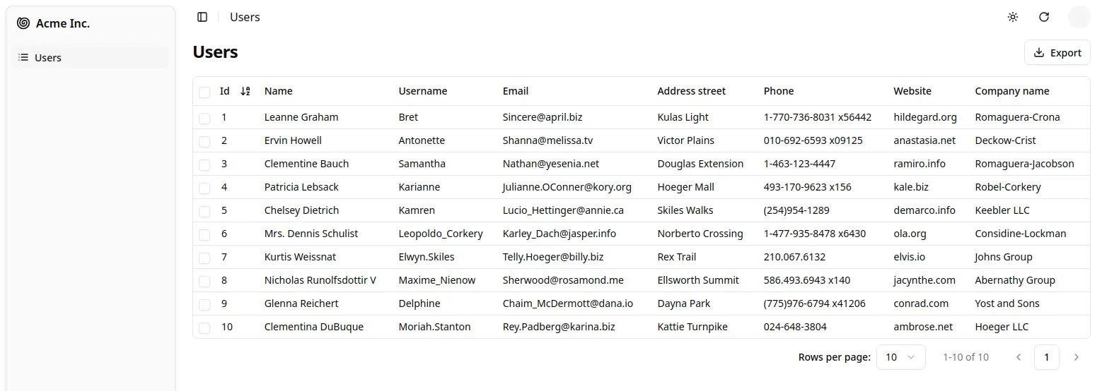
Here is a minimal example to display a list of users with a <DataTable>:
// in src/users.jsximport { DataTable, List } from "@/components/admin";
export const UserList = () => (    <List>        <DataTable>            <DataTable.Col source="id" />            <DataTable.Col source="name" />            <DataTable.Col source="username" />            <DataTable.Col source="email" />            <DataTable.Col source="address.street" />            <DataTable.Col source="phone" />            <DataTable.Col source="website" />            <DataTable.Col source="company.name" />        </DataTable>    </List>);
// in src/App.jsximport { Admin } from '@/components/admin';import { Resource } from 'ra-core';import jsonServerProvider from 'ra-data-json-server';
import { UserList } from './users';
const App = () => (    <Admin dataProvider={jsonServerProvider('https://jsonplaceholder.typicode.com')}>        <Resource name="users" list={UserList} />    </Admin>);
export default App;
That’s enough to display a basic list with sorting and pagination.
You can find more advanced examples of <List> usage in the demo.
| Prop | Required | Type | Default | Description |
|---|---|---|---|---|
children | Optional* | ReactNode | - | Component(s) that display the records (e.g. <DataTable>) |
render | Optional* | (ctx) => ReactNode | - | Alternate render function receiving the list context |
actions | Optional | ReactNode | default action bar | Custom actions area (right side of header) |
debounce | Optional | number | 500 | Debounce (ms) for filter & sort changes |
disableAuthentication | Optional | boolean | false | Skip auth check for this page |
disableBreadcrumb | Optional | boolean | false | Set to true to define a custom breadcrumb for the page, instead of the default one |
disableSyncWithLocation | Optional | boolean | false | Keep list params local (not in the URL) |
exporter | Optional | `false | (records, fetchRelated, dataProvider) => void` | - |
filters | Optional | ReactElement[] | - | Array of filter input elements (displayed inline) |
filter | Optional | object | - | Permanent filters always applied |
filterDefaultValues | Optional | object | - | Initial filter form values |
pagination | Optional | ReactNode | <ListPagination /> | Custom pagination component |
perPage | Optional | number | 10 | Records per page |
queryOptions | Optional | object | - | Extra TanStack Query options |
resource | Optional | string | inferred | Resource name, defaults to the current <ResourceContext> |
sort | Optional | `{ field: string; order: ‘ASC' | 'DESC’ }` | - |
storeKey | Optional | `string | false` | derived |
title | Optional | `string | ReactNode | false` |
* Provide either children or render.
These props will soon be supported: aside, empty, emptyWhileLoading.
Main Content Area
Section titled “Main Content Area”<List> itself doesn’t render the list of records. It delegates this task to its children components. These children components grab the data from the ListContext and render them on screen.
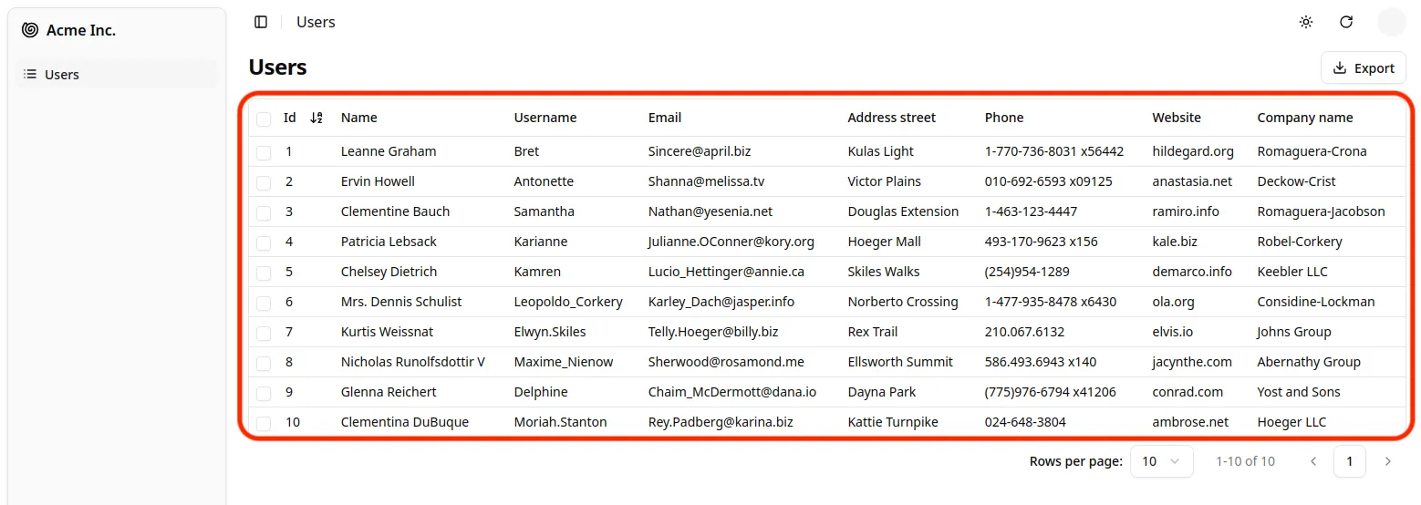
shadcn-admin-kit provides several components that can read and display a list of records from a ListContext, each with a different layout:
<DataTable>displays records in a table<SingleFieldList>displays records inline, showing one field per record
Alternatively to children, you can pass a render prop to <List>. It will receive the ListContext as its argument, and should return a React node. This allows to inline the render logic for the list page.
const PostList = () => ( <List render={({ isPending, error, data }) => { if (isPending) { return <div>Loading...</div>; } if (error) { return <div>Error: {error.message}</div>; } return ( <ul> {data.map(post => ( <li key={post.id}> <strong>{post.title}</strong> - {post.author} </li> ))} </ul> ); }} />);Actions toolbar
Section titled “Actions toolbar”By default the page header shows a toolbar with 2 buttons:
<CreateButton>(if the resource has a create view)<ExportButton>(unlessexporter={false})
Provide an actions prop to completely replace that area:
import { List, CreateButton, ExportButton, ColumnsButton } from '@/components/admin';
const MyActions = () => (    <div className="flex items-center gap-2">        <ColumnsButton />        <CreateButton />        <ExportButton />    </div>);
export const PostList = () => (    <List actions={<MyActions />}>        ...    </List>);
You can also build contextual actions using anything from the list context (isPending, total, selectedIds, etc.).
Page Title
Section titled “Page Title”The default title for a list view is the translation key ra.page.list that translates to the plural name of the resource (e.g. “Posts”).
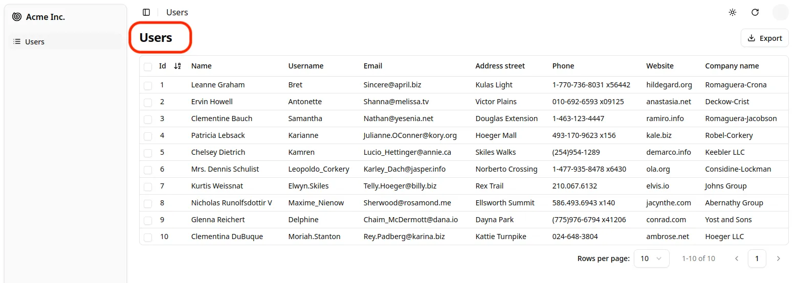
You can customize this title by providing a resource specific translation with the key resources.RESOURCE.page.list (e.g. resources.posts.page.list):
// in src/i18n/en.jsimport englishMessages from 'ra-language-english';
export const en = {    ...englishMessages,    resources: {        posts: {            name: 'Post |||| Posts',            page: {                list: 'Post list'            }        },    },    ...};
You can also customize this title by specifying a custom title prop:
export const PostList = () => ( <List title="List of posts"> ... </List>);The title can be a string, a React element, or false to disable the title.
Pagination
Section titled “Pagination”By default, <List> displays a set of pagination controls at the bottom of the list.
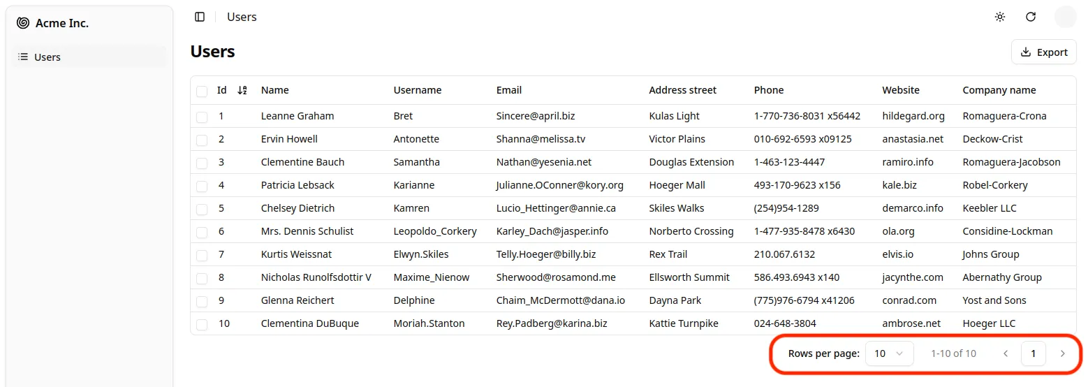
The pagination prop allows to replace the default pagination controls by your own.
// in src/MyPagination.jsimport { List, ListPagination } from '@/components/admin';
const PostPagination = () => <ListPagination rowsPerPageOptions={[10, 25, 50, 100]} />;
export const PostList = () => (    <List pagination={<PostPagination />}>        ...    </List>);
By default, the list paginates results by groups of 10. You can override this setting by specifying the perPage prop:
// in src/posts.jsexport const PostList = () => ( <List perPage={25}> ... </List>);Pass an object literal as the sort prop to determine the default field and order used for sorting:
export const PostList = () => ( <List sort={{ field: 'published_at', order: 'DESC' }}> ... </List>);sort defines the default sort order ; users can change the sort order, e.g. by clicking on column headers when using a <DataTable>, or by selecting another option in the <SortButton>.
Permanent Filter
Section titled “Permanent Filter”You can choose to always filter the list, without letting the user disable this filter - for instance to display only published posts. Write the filter to be passed to the data provider in the filter props:
// in src/posts.jsexport const PostList = () => ( <List filter={{ is_published: true }}> ... </List>);The actual filter parameter sent to the data provider is the result of the combination of the user filters (the ones set through the filters component form), and the permanent filter. The user cannot override the permanent filters set by way of filter.
Filter Button / Form Combo
Section titled “Filter Button / Form Combo”You can add an array of filter Inputs to the List using the filters prop:
const postFilters = [    <SearchInput source="q" alwaysOn />,    <TextInput label="Title" source="title" defaultValue="Hello, World!" />,];
export const PostList = () => ( <List filters={postFilters}> ... </List>);Filter Inputs are regular inputs. <List> hides them all by default, except those that have the alwaysOn prop. Note that inputs with alwaysOn don’t accept defaultValue. You have to use the filterDefaultValues for those.
// in src/posts.jsconst postFilters = [    <TextInput label="Search" source="q" alwaysOn />,    <BooleanInput source="is_published" alwaysOn />,    <TextInput source="title" defaultValue="Hello, World!" />,];
export const PostList = () => ( <List filters={postFilters} filterDefaultValues={{ is_published: true }}> ... </List>);For more details about customizing filters, see the Filtering the List documentation.
Exported Data
Section titled “Exported Data”Among the default list actions, shadcn-admin-kit includes an <ExportButton>.
By default, clicking this button will:
- Call the
dataProviderwith the current sort and filter (but without pagination), - Transform the result into a CSV string,
- Download the CSV file.
The columns of the CSV file match all the fields of the records in the dataProvider response. That means that the export doesn’t take into account the selection and ordering of fields in your <List> via Field components. If you want to customize the result, pass a custom exporter function to the <List>. This function will receive the data from the dataProvider (after step 1) and replace steps 2-3 (i.e. it’s in charge of transforming, converting, and downloading the file).
In many cases, you’ll need more than simple object manipulation. You’ll need to augment your objects based on relationships. For instance, the export for comments should include the title of the related post - but the export only exposes a post_id by default. For that purpose, the exporter receives a fetchRelatedRecords function as the second parameter. It fetches related records using your dataProvider.getMany() method and returns a promise.
Here is an example for a Comments exporter, fetching related Posts:
// in CommentList.jsimport { List } from '@/components/admin';import { downloadCSV, type FetchRelatedRecords } from 'ra-core';import jsonExport from 'jsonexport/dist';
const exporter = async (comments: Comments[], fetchRelatedRecords: FetchRelatedRecords) => {    // will call dataProvider.getMany('posts', { ids: records.map(record => record.post_id) }),    // ignoring duplicate and empty post_id    const posts = await fetchRelatedRecords<Post>(comments, 'post_id', 'posts')    const commentsWithPostTitle = comments.map(comment => ({            ...comment,            post_title: posts[comment.post_id].title,    }));    return jsonExport(commentsWithPostTitle, {        headers: ['id', 'post_id', 'post_title', 'body'],    }, (err, csv) => {        downloadCSV(csv, 'comments');    });};
const CommentList = () => ( <List exporter={exporter}> ... </List>);Data Fetching Options
Section titled “Data Fetching Options”<List> accepts a queryOptions prop to pass query options to the react-query client. Check react-query’s useQuery documentation for the list of available options.
This can be useful e.g. to pass a custom meta to the dataProvider.getList() call.
import { List } from '@/components/admin';
const PostList = () => (    <List queryOptions={{ meta: { foo: 'bar' } }}>        ...    </List>);
With this option, shadcn-admin-kit will call dataProvider.getList() on mount with the meta: { foo: 'bar' } option.
You can also use the queryOptions prop to override the default error side effect. By default, when the dataProvider.getList() call fails, shadcn-admin-kit shows an error notification. Here is how to show a custom notification instead:
import { useNotify, useRedirect, List } from '@/components/admin';
const PostList = () => {    const notify = useNotify();    const redirect = useRedirect();
    const onError = (error) => {        notify(`Could not load list: ${error.message}`, { type: 'error' });        redirect('/dashboard');    };
    return (        <List queryOptions={{ onError }}>            ...        </List>    );}
The onError function receives the error from the dataProvider call (dataProvider.getList()), which is a JavaScript Error object (see the dataProvider documentation for details).
If dataProvider.getList() returns additional metadata in the response under the meta key, you can access it in the list view using the meta property of the ListContext.

This is often used by APIs to return facets, aggregations, statistics, or other metadata about the list of records.
// dataProvider.getLists('books') returns response like// {// data: [ ... ],// total: 293,// meta: {// genres: [// { value: 'Fictions', count: 134 },// { value: 'Essays', count: 24 },// ],// centuries: [// { value: '18th', count: 23 },// { value: '19th', count: 78 },// { value: '20th', count: 57 },// { value: '21st', count: 34 },// ],// },// }const Facets = () => { const { isPending, error, meta } = useListContext(); if (isPending || error) return null; return ( <div className="space-y-4 rounded-md border p-4 bg-background"> <div> <h4 className="text-sm font-semibold tracking-wide text-foreground/80 mb-2">Genres</h4> <ul className="space-y-1 text-sm"> {meta.genres.map(facet => ( <li key={facet.value}> <Link href="#" className="hover:underline"> {facet.value} <span className="text-muted-foreground">({facet.count})</span> </Link> </li> ))} </ul> </div> <div> <h4 className="text-sm font-semibold tracking-wide text-foreground/80 mb-2">Century</h4> <ul className="space-y-1 text-sm"> {meta.centuries.map(facet => ( <li key={facet.value}> <Link href="#" className="hover:underline"> {facet.value} <span className="text-muted-foreground">({facet.count})</span> </Link> </li> ))} </ul> </div> </div> );};You might want to allow data to be fetched only when at least some filters have been set. You can leverage TanStack react-query enabled option for that. It accepts a function that receives the query as its only parameter. As shadcn-admin-kit always format the queryKey as [ResourceName, DataProviderMethod, DataProviderParams], you can check that there is at least a filter in this function:
export const PostList = () => ( <List filters={postFilter} queryOptions={{ enabled: query => { const listParams = query.queryKey[2] as GetListParams; return listParams.filter.q?.length > 2; } }} render={context => context.filterValues.q?.length > 2 ? ( <CardContentInner> Type a search term to fetch data </CardContentInner> ) : ( <Datagrid> {/* your fields */} </Datagrid> ) } />)Parameters Persistence
Section titled “Parameters Persistence”By default, when users change the list parameters (sort, pagination, filters), shadcn-admin-kit stores them in localStorage so that users can come back to the list and find it in the same state as when they left it, using the internal Store.
Shadcn-admin-kit uses the current resource as the identifier to store the list parameters (under the key ${resource}.listParams).
If you want to display multiple lists of the same resource and keep distinct store states for each of them (filters, sorting and pagination), you must give each list a unique storeKey property. You can also disable the persistence of list parameters and selection in the store by setting the storeKey prop to false.
In the example below, both lists NewerBooks and OlderBooks use the same resource (‘books’), but their list parameters are stored separately (under the store keys 'newerBooks' and 'olderBooks' respectively). This allows to use both components in the same app, each having its own state (filters, sorting and pagination).
import {    Admin,    CustomRoutes,    Resource,    List,    DataTable,} from '@/components/admin';import { Route } from 'react-router';
const NewerBooks = () => (    <List        resource="books"        storeKey="newerBooks"        sort={{ field: 'year', order: 'DESC' }}    >        <DataTable>            <DataTable.Col source="id" />            <DataTable.Col source="title" />            <DataTable.Col source="author" />            <DataTable.Col source="year" />        </DataTable>    </List>);
const OlderBooks = () => (    <List        resource="books"        storeKey="olderBooks"        sort={{ field: 'year', order: 'ASC' }}    >        <DataTable>            <DataTable source="id" />            <DataTable source="title" />            <DataTable source="author" />            <DataTable source="year" />        </DataTable>    </List>);
const Admin = () => { return ( <Admin dataProvider={dataProvider}> <CustomRoutes> <Route path="/newerBooks" element={<NewerBooks />} /> <Route path="/olderBooks" element={<OlderBooks />} /> </CustomRoutes> <Resource name="books" /> </Admin> );};::note
Selection state will remain linked to a resource-based key regardless of the specified storeKey string. This is a design choice because if row selection is not tied to a resource, then when a user deletes a record it may remain selected without any ability to unselect it. If you want to allow custom storeKey’s for managing selection state, you will have to implement your own useListController hook and pass a custom key to the useRecordSelection hook. You will then need to implement your own DeleteButton and BulkDeleteButton to manually unselect rows when deleting records. You can still opt out of all store interactions including selection if you set it to false.
:::
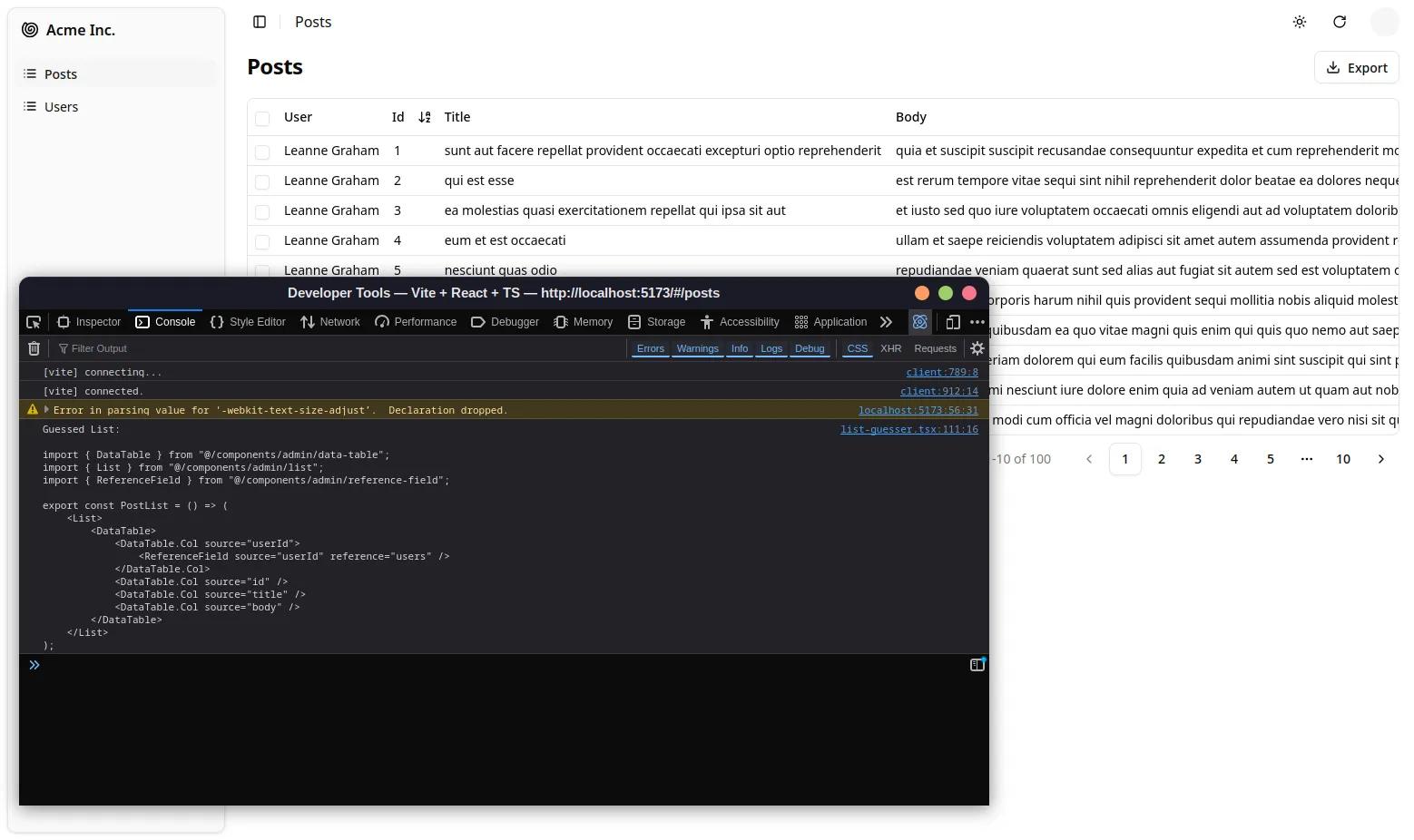
Scaffolding a List page
Section titled “Scaffolding a List page”You can use <ListGuesser> to quickly bootstrap a List view on top of an existing API, without adding the fields one by one.
// in src/App.jsimport { Admin, ListGuesser } from '@/components/admin';import { Resource } from 'ra-core';import { dataProvider } from './dataProvider';
const App = () => (    <Admin dataProvider={dataProvider}>        {/* ... */}        <Resource name="posts" list={ListGuesser} />    </Admin>);
Just like <List>, <ListGuesser> fetches the data. It then analyzes the response, and guesses the fields it should use to display a basic <DataTable> with the data. It also dumps the components it has guessed in the console, so you can copy it into your own code.
When the data provider returns no records, <ListGuesser> renders an empty state by default. You can override it using the empty prop (including empty={null} to render nothing).
Live Updates
Section titled “Live Updates”Shadcn Admin Kit offers Realtime features to automatically refresh the data on screen when it has been changed by another user.
If you want to subscribe to live updates on the list of records, add the <ListLiveUpdate> component in your <List> children.
import { List } from '@/components/admin';import { ListLiveUpdate } from '@react-admin/ra-core-ee';
const PostList = () => (    <List>        ...       <ListLiveUpdate />    </List>);
The list will automatically update when a new record is created, or an existing record is updated or deleted (check out the CRUD events format for details)
Rendering An Empty List
Section titled “Rendering An Empty List”When there is no data, shadcn-admin-kit displays a special page inviting the user to create the first record. This page can be customized using the empty prop.
You can set the empty props value to false to disable the empty page and render the list layout instead.
import { List } from '@/components/admin';
const ProductList = () => (    <List empty={false}>        ...    </List>)
Controlled Mode
Section titled “Controlled Mode”<List> deduces the resource and the list parameters from the URL. This is fine for a page showing a single list of records, but if you need to display more than one list in a page, you probably want to define the list parameters yourself.
In that case, use the resource, sort, filter, and perPage props to set the list parameters.
import { List, DataTable, DateField } from '@/components/admin';
const Dashboard = () => ( <div className="space-y-10"> <section> <h2 className="text-lg font-semibold mb-3">Latest posts</h2> <List resource="posts" sort={{ field: 'published_at', order: 'DESC' }} filter={{ is_published: true }} perPage={10} > <DataTable bulkActionButtons={false} size="sm"> <DataTable.Col source="title" /> <DataTable.NumberCol source="views" /> <DataTable.Col source="published_at" field={DateField} /> </DataTable> </List> </section> <section> <h2 className="text-lg font-semibold mb-3">Latest comments</h2> <List resource="comments" sort={{ field: 'published_at', order: 'DESC' }} perPage={10} > <DataTable bulkActionButtons={false} size="sm"> <DataTable.Col source="author.name" /> <DataTable.Col source="body" /> <DataTable.Col source="published_at" field={DateField} /> </DataTable> </List> </section> </div>)If the <List> children allow to modify the list state (i.e. if they let users change the sort order, the filters, the selection, or the pagination), then you should also use the disableSyncWithLocation prop to prevent shadcn-admin-kit from changing the URL. This is the case e.g. if you use a <DataTable>, which lets users sort the list by clicking on column headers.
import { List, DataTable, DateField } from '@/components/admin';
const Dashboard = () => ( <div className="space-y-10"> <section> <h2 className="text-lg font-semibold mb-3">Latest posts</h2> <List resource="posts" sort={{ field: 'published_at', order: 'DESC' }} filter={{ is_published: true }} perPage={10} disableSyncWithLocation > <DataTable bulkActionButtons={false} size="sm"> <DataTable.Col source="title" /> <DataTable.NumberCol source="views" /> </DataTable> </List> </section> <section> <h2 className="text-lg font-semibold mb-3">Latest comments</h2> <List resource="comments" sort={{ field: 'published_at', order: 'DESC' }} perPage={10} disableSyncWithLocation > <DataTable bulkActionButtons={false} size="sm"> <DataTable.Col source="author.name" /> <DataTable.Col source="body" /> <DataTable.Col source="published_at" field={DateField} /> </DataTable> </List> </section> </div>)Headless Version
Section titled “Headless Version”Besides fetching a list of records from the data provider, <List> renders the default list page layout (title, buttons, filters, a <Card>, pagination) and its children. If you need a custom list layout, you may prefer the <ListBase> component, which only renders its children in a ListContext.
import { ListBase, WithListContext } from 'ra-core';
const ProductList = () => (    <ListBase>        <div className="space-y-6">            <h2 className="text-xl font-semibold tracking-tight">All products</h2>            <WithListContext                render={({ isPending, data }) => (                    !isPending && (                        <ul className="space-y-2">                            {data.map(product => (                                <li                                    key={product.id}                                    className="rounded-md border p-3 bg-background"                                >                                    <span className="font-medium">{product.name}</span>                                </li>                            ))}                        </ul>                    )                )}            />            <WithListContext                render={({ isPending, total }) => (                    !isPending && (                        <p className="text-sm text-muted-foreground">{total} results</p>                    )                )}            />        </div>    </ListBase>);
The previous example leverages <WithListContext> to grab the data that <ListBase> stores in the ListContext.
If you don’t need the ListContext, you can use the useListController hook, which does the same data fetching as <ListBase> but lets you render the content.
import { useListController } from '@/components/admin';import { Card, CardContent, Container, Stack, Typography } from '@mui/material';
const ProductList = () => {    const { isPending, data, total } = useListController();    return (        <Container>            <Typography variant="h4">All products</Typography>                {!isPending && (                    <Stack spacing={1}>                        {data.map(product => (                            <Card key={product.id}>                                <CardContent>                                    <Typography>{product.name}</Typography>                                </CardContent>                            </Card>                        ))}                    </Stack>                )}            {!isPending && <Typography>{total} results</Typography>}        </Container>    );};
useListController returns callbacks to sort, filter, and paginate the list, so you can build a complete List page. Check the useListControllerhook documentation for details.
Access Control
Section titled “Access Control”If your authProvider implements Access Control, <List> will only render if the user can access the resource with the “list” action.
For instance, to render the <PostList> page below:
import { List, DataTable } from '@/components/admin';
// Resource name is "posts"const PostList = () => (    <List>        <DataTable>            <DataTable.Col source="title" />            <DataTable.Col source="author" />            <DataTable.Col source="published_at" />        </DataTable>    </List>);
<List> will call authProvider.canAccess() using the following parameters:
{ action: "list", resource: "posts" }Users without access will be redirected to the Access Denied page.