Edit
The <Edit> component is the main component for edition pages. It fetches a record based on the URL, prepares a form submit handler, and renders the page title and actions. It is not responsible for rendering the actual form - that’s the job of its child component (usually a form component, like <SimpleForm>). This form component uses its children (<Input> components) to render each form input.
The <Edit> component calls dataProvider.getOne(), using the id from the URL. It creates a RecordContext with the result. It also creates a SaveContext containing a save callback, which calls dataProvider.update() when executed, and an EditContext containing both the record and the callback.
Wrap the <Edit> component around the form you want to create, then pass it as edit prop of a given <Resource>. <Edit> requires no prop by default - it deduces the resource and the id from the current URL.
For instance, the following component will render an edition form for posts when users browse to /posts/edit/1234:
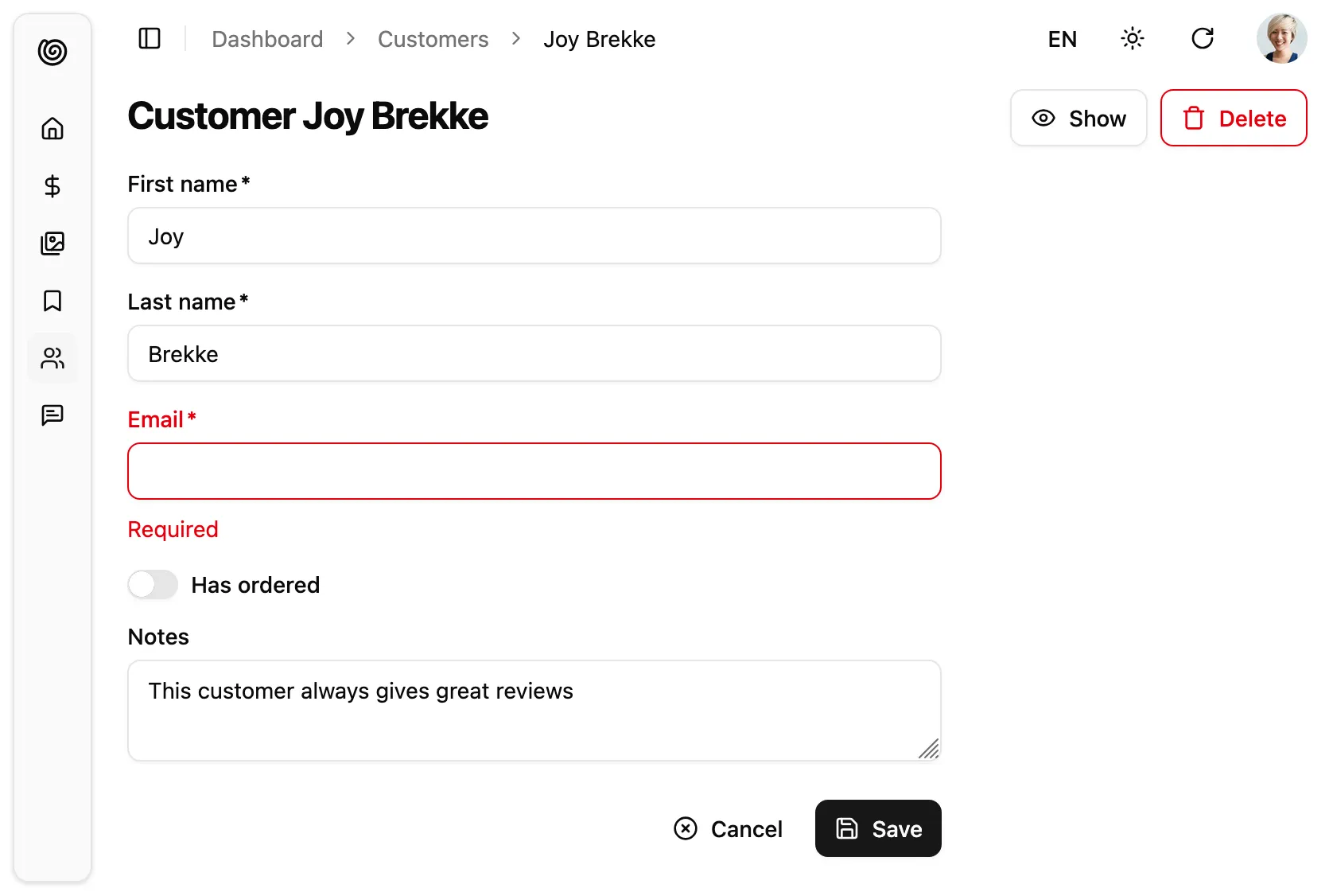
// in src/customers.jsimport { Edit, SimpleForm, BooleanInput, TextInput } from "@/components/admin";import { required } from 'ra-core';
export const CustomerEdit = () => (  <Edit>    <SimpleForm>      <TextInput source="first_name" validate={required()} />      <TextInput source="last_name" validate={required()} />      <TextInput source="email" validate={required()} />      <BooleanInput source="has_ordered" />      <TextInput multiline source="notes" />    </SimpleForm>  </Edit>);
// in src/App.jsimport { Admin } from '@/components/admin';import { Resource } from 'ra-core';
import { dataProvider } from './dataProvider';import { CustomerEdit } from './customers';
const App = () => (    <Admin dataProvider={dataProvider}>        <Resource name="customers" edit={CustomerEdit} />    </Admin>);
export default App;You can customize the <Edit> component using the following props:
| Prop | Required | Type | Default | Description |
|---|---|---|---|---|
children | Optional * | ReactNode | - | The components that render the form |
render | Optional * | function | - | Function to render the form, receives the editContext as argument |
actions | Optional | ReactNode | - | Override the actions toolbar with a custom component |
className | Optional | string | - | Passed to the root component |
disableAuthentication | Optional | boolean | false | Disable the authentication check |
disableBreadcrumb | Optional | boolean | false | Set to true to define a custom breadcrumb for the page, instead of the default one |
emptyWhileLoading | Optional | boolean | false | Set to true to return null while the edit is loading |
id | Optional | string/number | - | The id of the record to edit |
mutationMode | Optional | 'undoable' | 'optimistic' | 'pessimistic' | 'undoable' | Switch to optimistic or pessimistic mutations |
mutationOptions | Optional | object | - | Options for the dataProvider.update() call |
queryOptions | Optional | object | - | Options for the dataProvider.getOne() call |
redirect | Optional | 'list' | 'show' | false | function | 'list' | Change the redirect location after successful update |
resource | Optional | string | - | Override the name of the resource to edit |
title | Optional | string/ReactNode/false | - | Override the page title |
transform | Optional | function | - | Transform the form data before calling dataProvider.update() |
* You must provide either children or render.
Main Content Area
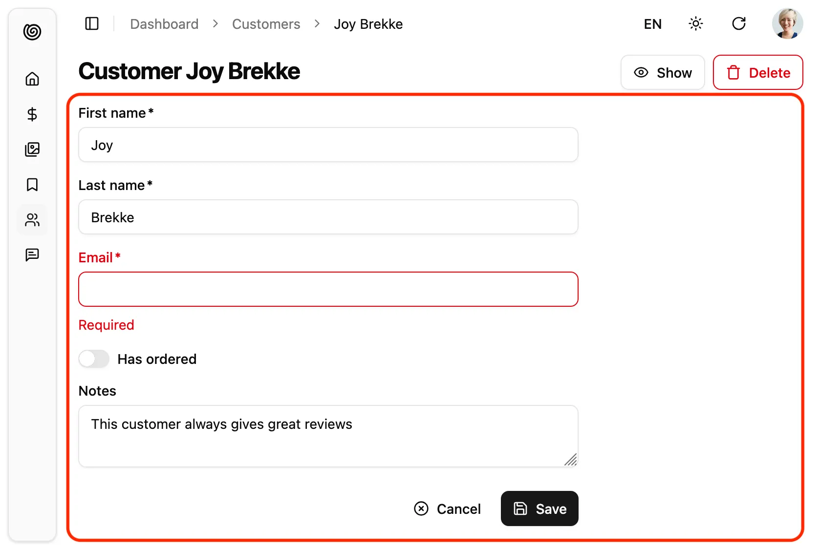
Section titled “Main Content Area”The <Edit> component will render its children inside a EditContext provider, which the save function. Children can be any React node, but are usually a form component like <SimpleForm>, or the headless <Form> component.
import {    Edit,    SimpleForm,    TextInput,    BooleanInput,} from "@/components/admin";import { required } from 'ra-core';
export const CustomerEdit = () => (  <Edit>    <SimpleForm>      <TextInput source="first_name" validate={required()} />      <TextInput source="last_name" validate={required()} />      <TextInput source="email" validate={required()} />      <BooleanInput source="has_ordered" />      <TextInput multiline source="notes" />    </SimpleForm>  </Edit>);
Alternatively to children, you can use a render prop. It will receive the EditContext as its argument, and should return a React node.
This allows to inline the render logic for the edition page.
export const PostEdit = () => ( <Edit render={({ isPending, record, save, saving }) => ( <div> <h1>Edit Post</h1> {!isPending && ( <form onSubmit={save}> <input type="text" name="title" defaultValue={record.title} required /> <textarea name="teaser" defaultValue={record.teaser} rows={3} /> <textarea name="body" defaultValue={record.body} rows={5} /> <input type="date" name="published_at" defaultValue={redord.published_at} /> <button type="submit" disabled={saving}> {saving ? 'Saving...' : 'Save'} </button> </form> )} </div> )} />);Tip: When receiving a render prop, the <Edit> component will ignore the children prop.
Actions Toolbar
Section titled “Actions Toolbar”By default, the Edit component includes a toolbar with a button to navigate to the show view (if present) and a button to delete the current record.
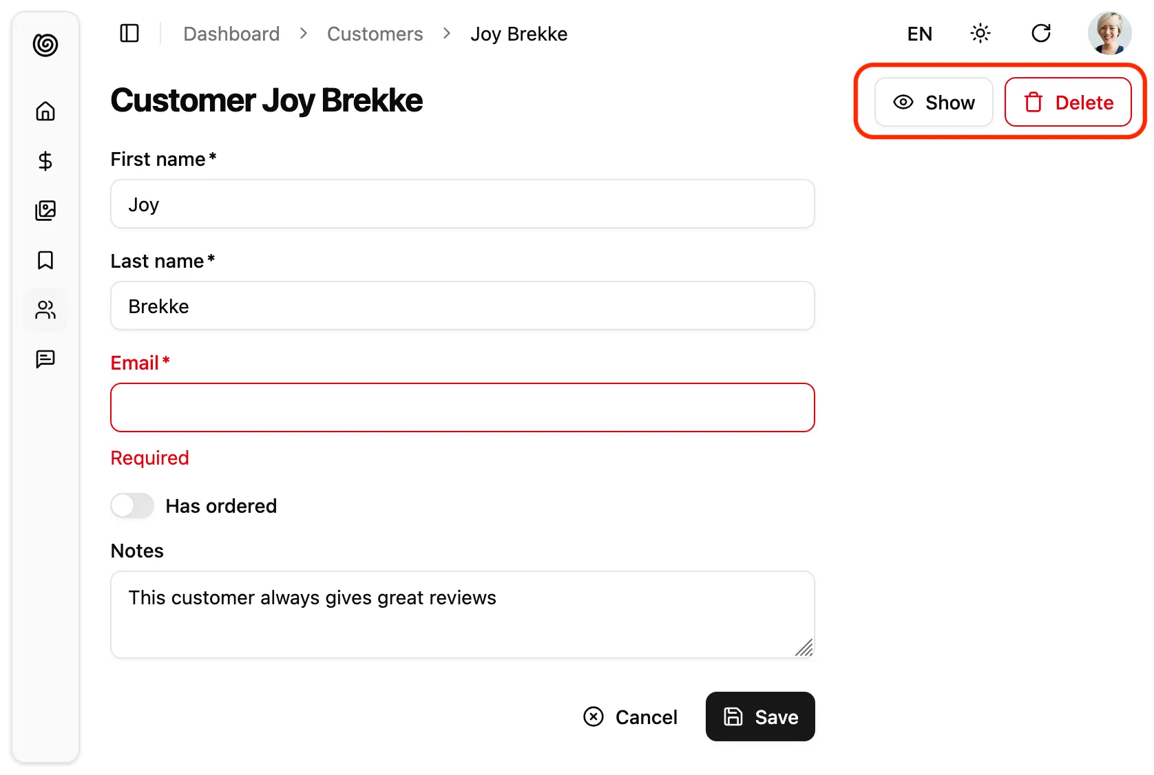
You can replace these actions by your own elements using the actions prop:
import { Edit, ShowButton, CreateButton, DeleteButton } from '@/components/admin';
const PostEditActions = () => (    <div className="flex items-center gap-2">        <ShowButton />        <CreateButton />        <DeleteButton />    </div>);
export const PostEdit = () => (    <Edit actions={<PostEditActions />}>        ...    </Edit>);
Common buttons used as Edit actions are:
<CreateButton>to create a new record<ListButton>to go back to the list<ShowButton>to go to the show page<DeleteButton>to delete the current record
And you can add your own button, leveraging the useRecordContext() hook:
import { useRecordContext, useUpdate, useNotify } from 'ra-core';import { Button } from '@a/components/ui';
const ResetViewsButton = () => {    const record = useRecordContext();    const [update, { isPending }] = useUpdate();    const notify  = useNotify();    const handleClick = () => {        update(            'posts',            { id: record.id, data: { views: 0 }, previousData: record },            {                onSuccess: () => {                    notify('Views reset');                },                onFailure: error => notify(`Error: ${error.message}`, 'warning'),            }        );    };    return (        <Button onClick={handleClick} disabled={isPending}>            Reset views        </Button>    );};
Page Title
Section titled “Page Title”By default, the title for the Edit view is the translation key ra.page.edit that translates to “Edit [resource_name] [record representation]”. Check the <Resource recordRepresentation> prop for more details.
You can customize this title by providing a resource specific translation with the key resources.RESOURCE.page.edit (e.g. resources.posts.page.edit):
// in src/i18n/en.jsimport englishMessages from 'ra-language-english';
export const en = {    ...englishMessages,    resources: {        posts: {            name: 'Post |||| Posts',            page: {                edit: 'Update post "%{recordRepresentation}"'            }        },    },    ...};
You can also customize this title by specifying a custom title string:
export const PostEdit = () => ( <Edit title="Edit post"> ... </Edit>);More interestingly, you can pass an element as title. This element can access the current record via useRecordContext. This allows to customize the title according to the current record:
const PostTitle = () => {    const record = useRecordContext();    return <span>Post {record ? `"${record.title}"` : ''}</span>;};
export const PostEdit = () => (    <Edit title={<PostTitle />}>        ...    </Edit>);
Finally, you can also pass false to disable the title:
export const PostEdit = () => ( <Edit title={false}> ... </Edit>);Data Fetching Options
Section titled “Data Fetching Options”<Edit> calls dataProvider.getOne() on mount via react-query’s useQuery hook. You can customize the options you pass to this hook by setting the queryOptions prop.
This can be useful e.g. to pass a custom meta to the dataProvider.getOne() call.
import { Edit, SimpleForm } from '@/components/admin';
export const PostEdit = () => (    <Edit queryOptions={{ meta: { foo: 'bar' } }}>        <SimpleForm>            ...        </SimpleForm>    </Edit>);
You can also use queryOptions to force a refetch on reconnect:
const PostEdit = () => ( <Edit queryOptions={{ refetchOnReconnect: true }}> ... </Edit>);Refer to the useQuery documentation in the react-query website for a list of the possible options.
Mutation Options
Section titled “Mutation Options”<Edit> calls dataProvider.update() via react-query’s useMutation hook. You can customize the options you pass to this hook, e.g. to pass a custom meta to the dataProvider.update() call.
import { Edit, SimpleForm } from '@/components/admin';
const PostEdit = () => (    <Edit mutationOptions={{ meta: { foo: 'bar' } }}>        <SimpleForm>            ...        </SimpleForm>    </Edit>);
Refer to the useMutation documentation in the react-query website for a list of the possible options.
You can also use mutationOptions to override success or error side effects.
Success and Error Side Effects
Section titled “Success and Error Side Effects”By default, when the save action succeeds, Shadcn Admin Kit shows a notification, and redirects to the list page.
You can override this behavior and pass custom success side effects by providing a mutationOptions prop with an onSuccess key:
import { Edit, SimpleForm } from '@/components/admin';import { useNotify, useRefresh, useRedirect } from 'ra-core';
const PostEdit = () => {    const notify = useNotify();    const refresh = useRefresh();    const redirect = useRedirect();
    const onSuccess = () => {        notify(`Changes saved`);        redirect('/posts');        refresh();    };
    return (        <Edit mutationOptions={{ onSuccess }}>            <SimpleForm>                ...            </SimpleForm>        </Edit>    );}
The default onSuccess function is:
() => { notify('ra.notification.updated', { messageArgs: { smart_count: 1 }, undoable: mutationMode === 'undoable' }); redirect('list', resource, data.id, data);}Similarly, you can override the failure side effects with an onError option. By default, when the save action fails at the dataProvider level, Shadcn Admin Kit shows a notification error.
import { Edit, SimpleForm } from '@/components/admin';import { useNotify, useRefresh, useRedirect } from 'ra-core';
const PostEdit = () => {    const notify = useNotify();    const refresh = useRefresh();    const redirect = useRedirect();
    const onError = (error) => {        notify(`Could not edit post: ${error.message}`);        redirect('/posts');        refresh();    };
    return (        <Edit mutationOptions={{ onError }}>            <SimpleForm>                ...            </SimpleForm>        </Edit>    );}
The onError function receives the error from the dataProvider.update() call. It is a JavaScript Error object (see the dataProvider documentation for details).
The default onError function is:
(error) => { notify(typeof error === 'string' ? error : error.message || 'ra.notification.http_error', { type: 'error' }); if (mutationMode === 'undoable' || mutationMode === 'pessimistic') { refresh(); }}Changing The Notification Message
Section titled “Changing The Notification Message”Once the dataProvider.update() request returns successfully, users see a success notification.

<Edit> uses two successive translation keys to build the success message:
resources.{resource}.notifications.updatedas a first choicera.notification.updatedas a fallback
To customize the notification message, you can set custom translation for these keys in your i18nProvider.
Tip: If you choose to use a custom translation, be aware that Shadcn Admin Kit uses the same translation message for the <BulkUpdateButton>, so the message must support pluralization:
const englishMessages = { resources: { orders: { notifications: { updated: 'Order updated |||| %{smart_count} orders updated', // ... }, }, },};Alternately, you can customize this message by passing a custom success side effect function in the mutationOptions prop:
import { Edit, SimpleForm } from '@/components/admin';import { useNotify, useRedirect } from 'ra-core';
const OrderEdit = () => {    const notify = useNotify();    const redirect = useRedirect();
    const onSuccess = () => {        notify(`Order updated successfully`);        redirect('list', 'orders');    };
return ( <Edit mutationOptions={{ onSuccess }}> <SimpleForm> ... </SimpleForm> </Edit> );}You can do the same for error notifications, by passing a custom onError callback.
Redirection After Submission
Section titled “Redirection After Submission”By default, submitting the form in the <Edit> view redirects to the <List> view.
You can customize the redirection by setting the redirect prop to one of the following values:
'list': redirect to the List view (the default)'show': redirect to the Show viewfalse: do not redirect- A function
(resource, id, data) => stringto redirect to different targets depending on the record
const PostEdit = () => ( <Edit redirect="show"> ... </Edit>);Mutation Mode
Section titled “Mutation Mode”The <Edit> view exposes two buttons, Save and Delete, which perform “mutations” (i.e. they alter the data). Shadcn Admin Kit offers three modes for mutations. The mode determines when the side effects (redirection, notifications, etc.) are executed:
pessimistic: The mutation is passed to the dataProvider first. When the dataProvider returns successfully, the mutation is applied locally, and the side effects are executed.optimistic: The mutation is applied locally and the side effects are executed immediately. Then the mutation is passed to the dataProvider. If the dataProvider returns successfully, nothing happens (as the mutation was already applied locally). If the dataProvider returns in error, the page is refreshed and an error notification is shown.undoable(default): The mutation is applied locally and the side effects are executed immediately. Then a notification is shown with an undo button. If the user clicks on undo, the mutation is never sent to the dataProvider, and the page is refreshed. Otherwise, after a 5 seconds delay, the mutation is passed to the dataProvider. If the dataProvider returns successfully, nothing happens (as the mutation was already applied locally). If the dataProvider returns in error, the page is refreshed and an error notification is shown.
By default, pages using <Edit> use the undoable mutation mode. This is part of the “optimistic rendering” strategy of Shadcn Admin Kit; it makes user interactions more reactive.
You can change this default by setting the mutationMode prop - and this affects both the Save and Delete buttons. For instance, to remove the ability to undo the changes, use the optimistic mode:
const PostEdit = () => ( <Edit mutationMode="optimistic"> // ... </Edit>);And to make both the Save and Delete actions blocking, and wait for the dataProvider response to continue, use the pessimistic mode:
const PostEdit = () => ( <Edit mutationMode="pessimistic"> // ... </Edit>);Transforming Data
Section titled “Transforming Data”To transform a record after the user has submitted the form but before the record is passed to dataProvider.update(), use the transform prop. It expects a function taking a record as argument, and returning a modified record. For instance, to add a computed field upon edition:
export const UserEdit = () => { const transform = data => ({ ...data, fullName: `${data.firstName} ${data.lastName}` }); return ( <Edit transform={transform}> ... </Edit> );}The transform function can also return a Promise, which allows you to do all sorts of asynchronous calls (e.g. to the dataProvider) during the transformation.
Scaffolding An Edit Page
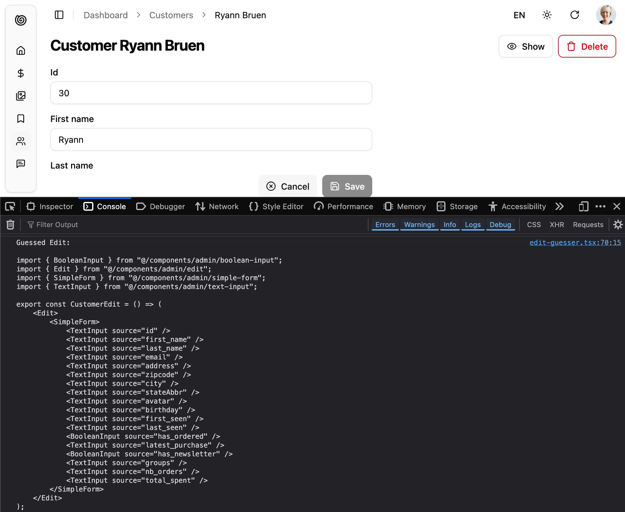
Section titled “Scaffolding An Edit Page”You can use <EditGuesser> to quickly bootstrap an Edit view on top of an existing API, without adding the inputs one by one.
// in src/App.jsimport { Admin, EditGuesser } from '@/components/admin';import { Resource } from 'ra-core';import dataProvider from './dataProvider';
const App = () => (    <Admin dataProvider={dataProvider}>        {/* ... */}        <Resource name="customers" edit={EditGuesser} />    </Admin>);
Just like <Edit>, <EditGuesser> fetches the data. It then analyzes the response, and guesses the inputs it should use to display a basic <SimpleForm> with the data. It also dumps the components it has guessed in the console, so you can copy it into your own code.
Cleaning Up Empty Strings
Section titled “Cleaning Up Empty Strings”As a reminder, HTML form inputs always return strings, even for numbers and booleans. So the empty value for a text input is the empty string, not null or undefined. This means that the data sent to dataProvider.update() will contain empty strings:
{ title: '', average_note: '', body: '', // etc.}If you prefer to have null values, or to omit the key for empty values, use the transform prop to sanitize the form data before submission:
export const UserEdit = () => { const transform = (data) => { const sanitizedData = {}; for (const key in data) { if (typeof data[key] === "string" && data[key].trim().length === 0) continue; sanitizedData[key] = data[key]; } return sanitizedData; }; return ( <Edit transform={transform}> ... </Edit> );}As an alternative, you can clean up empty values at the input level, using the parse prop.
Prefilling the Form
Section titled “Prefilling the Form”You sometimes need to pre-populate the form changes to a record. For instance, to revert a record to a previous version, or to make some changes while letting users modify others fields as well.
By default, the <Edit> view starts with the current record. However, if the location object (injected by react-router-dom) contains a record in its state, the <Edit> view uses that record to prefill the form.
That means that if you want to create a link to an edition view, modifying immediately some values, all you have to do is to set the state prop of the <EditButton>:
import * as React from 'react';import { EditButton, DataTable, List } from '@/components/admin';
const ApproveButton = () => (    <EditButton state={{ record: { status: 'approved' } }} />);
export default PostList = () => ( <List> <DataTable> ... <DataTable.Col> <ApproveButton /> </DataTable.Col> </DataTable> </List>)Should you use the location state or the location search? The latter modifies the URL, so it’s only necessary if you want to build cross-application links (e.g. from one admin to the other). In general, using the location state is a safe bet.
Linking Two Inputs
Section titled “Linking Two Inputs”Edition forms often contain linked inputs, e.g. country and city (the choices of the latter depending on the value of the former).
Shadcn Admin Kit relies on react-hook-form for form handling. You can grab the current form values using react-hook-form’s useWatch hook.
import { Edit, SimpleForm, SelectInput } from '@/components/admin';import { useWatch } from 'react-hook-form';
const countries = ['USA', 'UK', 'France'];const cities = {    USA: ['New York', 'Los Angeles', 'Chicago', 'Houston', 'Phoenix'],    UK: ['London', 'Birmingham', 'Glasgow', 'Liverpool', 'Bristol'],    France: ['Paris', 'Marseille', 'Lyon', 'Toulouse', 'Nice'],};const toChoices = items => items.map(item => ({ id: item, name: item }));
const CityInput = () => {    const country = useWatch({ name: 'country' });    return (        <SelectInput            choices={country ? toChoices(cities[country]) : []}            source="cities"        />    );};
const OrderEdit = () => (    <Edit>        <SimpleForm>            <SelectInput source="country" choices={toChoices(countries)} />            <CityInput />        </SimpleForm>    </Edit>);
export default OrderEdit;Controlled Mode
Section titled “Controlled Mode”<Edit> deduces the resource and the record id from the URL. This is fine for an edition page, but if you need to let users edit records from another page, you probably want to define the edit parameters yourself.
In that case, use the resource and id props to set the edit parameters regardless of the URL.
import { Edit, SimpleForm, TextInput, SelectInput } from "@/components/admin";
export const BookEdit = ({ id }) => ( <Edit resource="books" id={id} redirect={false}> <SimpleForm> <TextInput source="title" /> <TextInput source="author" /> <SelectInput source="availability" choices={[ { id: "in_stock", name: "In stock" }, { id: "out_of_stock", name: "Out of stock" }, { id: "out_of_print", name: "Out of print" }, ]} /> </SimpleForm> </Edit>);Headless Version
Section titled “Headless Version”Besides fetching a record and preparing a save handler, <Edit> renders the default edition page layout (title, actions, a Material UI <Card>) and its children. If you need a custom edition layout, you may prefer the <EditBase> component, which only renders its children in an EditContext.
import { EditBase } from "ra-core";import { SelectInput, SimpleForm, TextInput} from "@/components/admin";import { Card, CardContent } from "@/commponents/ui";
export const BookEdit = () => (    <EditBase>        <h1>Book Edition</h1>        <Card>            <CardContent>                <SimpleForm>                    <TextInput source="title" />                    <TextInput source="author" />                    <SelectInput source="availability" choices={[                        { id: "in_stock", name: "In stock" },                        { id: "out_of_stock", name: "Out of stock" },                        { id: "out_of_print", name: "Out of print" },                    ]} />                </SimpleForm>            </CardContent>        </Card>    </EditBase>);
In the previous example, <SimpleForm> grabs the record and the save handler from the EditContext.
If you don’t need the EditContext, you can use the useEditController hook, which does the same data fetching as <EditBase> but lets you render the content.
import { useEditController } from "ra-core";import { SelectInput, SimpleForm, TextInput } from "@/components/admin";import { Card, CardContent } from "@/components/ui";
export const BookEdit = () => {    const { record, save } = useEditController();    return (        <>            <h1>                Edit book {record?.title}            </h1>            <Card>                <CardContent>                    <SimpleForm record={record} onSubmit={values => save(values)}>                        <TextInput source="title" />                        <TextInput source="author" />                        <SelectInput source="availability" choices={[                            { id: "in_stock", name: "In stock" },                            { id: "out_of_stock", name: "Out of stock" },                            { id: "out_of_print", name: "Out of print" },                        ]} />                    </SimpleForm>                </CardContent>            </Card>        </>    );};
Access Control
Section titled “Access Control”If your authProvider implements Access Control, <Edit> will only render if the user has the “edit” access to the related resource.
For instance, for the <PostEdit>page below:
import { Edit, SimpleForm, TextInput } from '@/components/admin';
// Resource name is "posts"const PostEdit = () => (    <Edit>        <SimpleForm>            <TextInput source="title" />            <TextInput source="author" />            <TextInput source="published_at" />        </SimpleForm>    </Edit>);
<Edit> will call authProvider.canAccess() using the following parameters:
{ action: "edit", resource: "posts" }Users without access will be redirected to the Access Denied page.
Live Updates
Section titled “Live Updates”Shadcn Admin Kit offers Realtime features to automatically refresh the data on screen when it has been changed by another user.
If you want to subscribe to live updates the record, you can rely on the useSubscribeToRecord hook.
As sample use case, let’s show how to warn the user when the record they’re editing has been updated by another user.
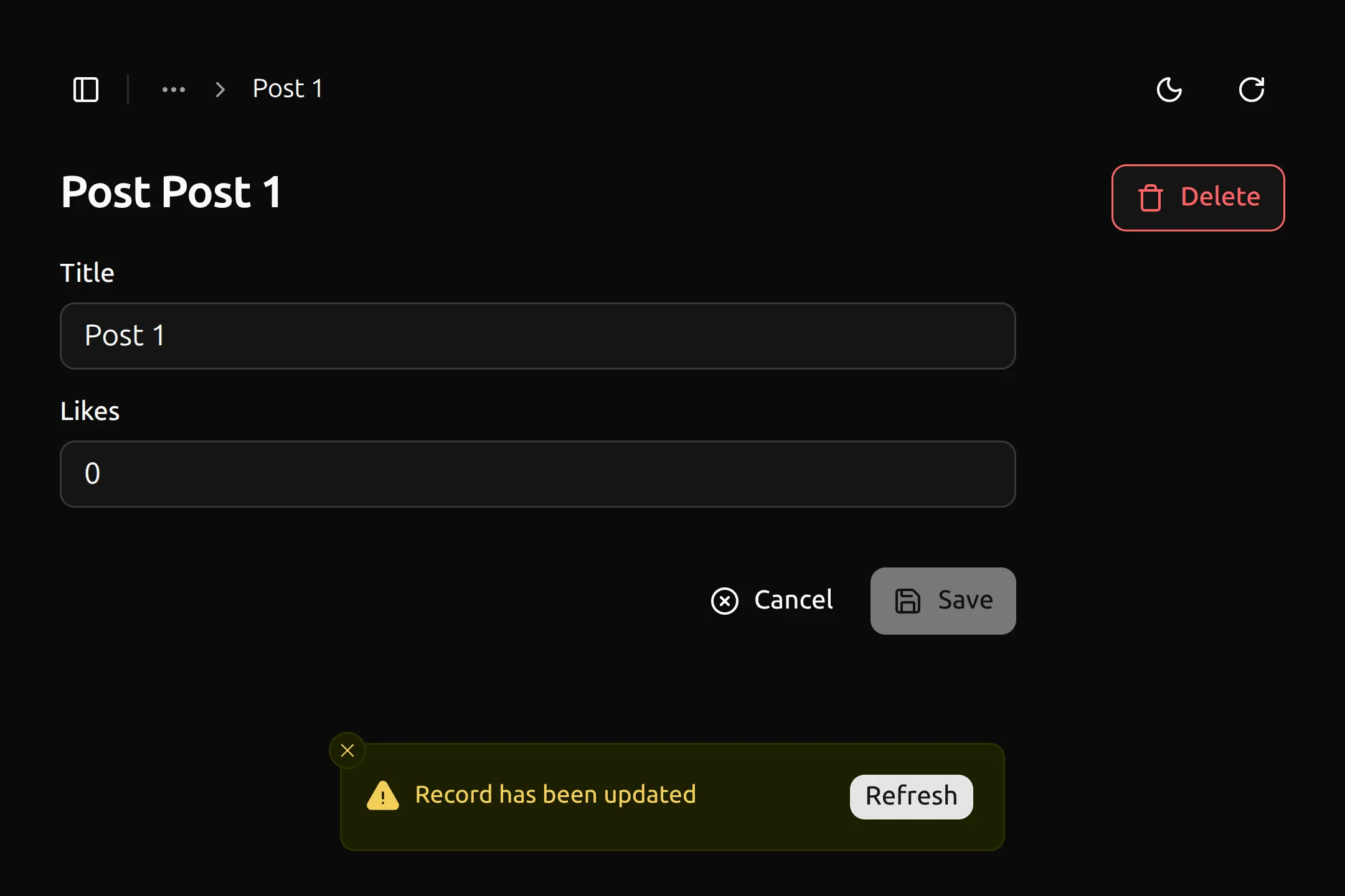
First, create an EditLiveUpdate component that uses the useSubscribeToRecord hook to subscribe to updates on the current record. When an update is received, it shows a notification with a “Refresh” button that refetches the record when clicked.
import { useSubscribeToRecord } from '@react-admin/ra-core-ee';import { useCloseNotification, useEditContext, useNotify } from 'ra-core';import { useCallback, useMemo, useRef } from 'react';import { Button } from './button';
export function EditLiveUpdate() {    const hasNotifiedRef = useRef(false);    const notify = useNotify();
    const { refetch } = useEditContext();
    const notificationContent = useMemo(() => {        return (            <RecordUpdatedNotification                refetch={async () => {                    await refetch();                    hasNotifiedRef.current = false;                }}            />        );    }, [refetch]);
    const onLiveUpdate = useCallback(() => {        if (hasNotifiedRef.current) {            return;        }
        hasNotifiedRef.current = true;        notify(notificationContent, {            type: 'warning',            autoHideDuration: null,        });    }, [notify, notificationContent]);
    useSubscribeToRecord(onLiveUpdate);
    return null;}
function RecordUpdatedNotification({    refetch,}: RecordUpdatedNotificationProps) {    const close = useCloseNotification();    const handleClick = async () => {        await refetch();        close();    };
    return (        <div className="h-6 inline-flex items-center">            <span>Record has been updated</span>            <Button                onClick={handleClick}                className="absolute top-50% right-4 h-6 px-2"            >                Refresh            </Button>        </div>    );}
type RecordUpdatedNotificationProps = {    refetch(): Promise<void>;};
Then, add the <EditLiveUpdate> in your <Edit> children:
import { Edit } from '@/components/admin/edit';import { EditLiveUpdate } from '@/components/admin/edit-live-update';
const PostList = () => (    <Edit>        ...        <EditLiveUpdate />    </Edit>);
To trigger warning with <EditLiveUpdate> with the record changes, the API has to publish events containing at least the followings:
{ topic : '/resource/{resource}/{id}', event: { type: 'updated', payload: { ids: [{listOfRecordIdentifiers}]}, }}Locking Edition
Section titled “Locking Edition”Shadcn Admin Kit offers Content locking features to automatically place a lock on a record when a user is editing it, preventing other users from editing the same record concurrently.
To avoid concurrent edition of the same record by multiple users, you can use the useLockOnCall hook inside your <Edit> view.
For example, the following form locks a ticket record when the user focuses on the message input. If another user has already locked the ticket, the form inputs are disabled:
import { Form, useCreate, useGetIdentity, useRecordContext } from 'ra-core';import { useGetLockLive, useLockOnCall } from '@react-admin/ra-core-ee';import { TextInput, SelectInput, SaveButton } from '@components/admin';
export const NewMessageForm = () => {    const record = useRecordContext();
    const { identity } = useGetIdentity();    const { data: lock } = useGetLockLive('tickets', { id: record.id });    const isLocked = lock && lock.identity !== identity?.id;
    const [doLock] = useLockOnCall({ resource: 'tickets' });
    return (        <Form onSubmit={handleSubmit}>            <TextInput                source="message"                multiline                onFocus={doLock}                disabled={isLocked}            />            <SelectInput                source="status"                choices={statusChoices}                onFocus={doLock}                disabled={isLocked}            />            <SaveButton disabled={isLocked} />        </Form>    );};
Use it in your <Edit> view as follows:
import { Edit } from '@/components/admin/edit';import { NewMessageForm } from './NewMessageForm';
const PostEdit = () => (    <Edit>        <NewMessageForm />    </Edit>);