SimpleForm
<SimpleForm> creates a <form> to edit a record, and renders its children (usually Input components) in a simple layout, one child per row, and a toolbar at the bottom (Cancel + Save buttons).
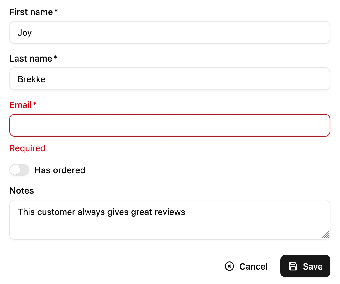
<SimpleForm> is often used as child of <Create> or <Edit>. It accepts Input components as children. It requires no prop by default.
import { Edit, SimpleForm, TextInput, BooleanInput } from '@/components/admin';
export const ProductEdit = () => (  <Edit>    <SimpleForm>      <TextInput source="name" />      <BooleanInput source="available" />    </SimpleForm>  </Edit>);
<SimpleForm> reads the record from the RecordContext, uses it to initialize the form default values, renders its children and a toolbar with a <SaveButton> that calls the save callback prepared by the edit or the create controller when pressed.
It relies on react-hook-form for form handling. It calls react-hook-form’s useForm hook, and places the result in a FormProvider component. This means you can take advantage of the useFormContext and useFormState hooks to access the form state.
| Prop | Required | Type | Default | Description |
|---|---|---|---|---|
children | Required | ReactNode | - | The form content (usually Input elements). |
className | Optional | string | - | Extra classes appended to base layout |
defaultValues | Optional | `object | function` | - |
id | Optional | string | - | The id of the underlying <form> tag. |
noValidate | Optional | boolean | - | Set to true to disable the browser’s default validation. |
onSubmit | Optional | function | save | A callback to call when the form is submitted. |
sanitizeEmptyValues | Optional | boolean | - | Set to true to remove empty values from the form state. |
toolbar | Optional | element | - | The toolbar component. |
validate | Optional | function | - | A function to validate the form values. |
warnWhenUnsavedChanges | Optional | boolean | - | Set to true to warn the user when leaving the form with unsaved changes. |
Additional props are passed to the useForm hook and to the underlying <div> wrapping the form.
Validation
Section titled “Validation”To validate the form values, provide a validate function taking the record as input, and returning an object with error messages indexed by field. For instance:
const validateUserCreation = (values) => {    const errors = {};    if (!values.firstName) {        errors.firstName = 'The firstName is required';    }    if (!values.age) {        // You can return translation keys        errors.age = 'ra.validation.required';    } else if (values.age < 18) {        // Or an object if the translation messages need parameters        errors.age = {            message: 'ra.validation.minValue',            args: { min: 18 }        };    }    return errors};
export const UserCreate = () => ( <Create> <SimpleForm validate={validateUserCreation}> <TextInput label="First Name" source="firstName" /> <TextInput label="Age" source="age" /> </SimpleForm> </Create>);Alternatively, you can specify a validate prop directly in <Input> components, taking either a function or an array of functions. Ra-core already bundles a few validator functions, that you can just require, and use as input-level validators:
required(message)if the field is mandatory,minValue(min, message)to specify a minimum value for integers,maxValue(max, message)to specify a maximum value for integers,minLength(min, message)to specify a minimum length for strings,maxLength(max, message)to specify a maximum length for strings,number(message)to check that the input is a valid number,email(message)to check that the input is a valid email address,regex(pattern, message)to validate that the input matches a regex,choices(list, message)to validate that the input is within a given list,unique()to validate that the input is unique (seeuseUnique),
Example usage:
import {    required,    minLength,    maxLength,    minValue,    maxValue,    number,    regex,    email,    choices} from 'ra-core';
const validateFirstName = [required(), minLength(2), maxLength(15)];const validateEmail = email();const validateAge = [number(), minValue(18)];const validateZipCode = regex(/^\d{5}$/, 'Must be a valid Zip Code');const validateGender = choices(['m', 'f', 'nc'], 'Please choose one of the values');
export const UserCreate = () => ( <Create> <SimpleForm> <TextInput label="First Name" source="firstName" validate={validateFirstName} /> <TextInput label="Email" source="email" validate={validateEmail} /> <TextInput label="Age" source="age" validate={validateAge}/> <TextInput label="Zip Code" source="zip" validate={validateZipCode}/> <SelectInput label="Gender" source="gender" choices={[ { id: 'm', name: 'Male' }, { id: 'f', name: 'Female' }, { id: 'nc', name: 'Prefer not say' }, ]} validate={validateGender}/> </SimpleForm> </Create>);You can also define your own validator functions. These functions should return undefined when there is no error, or an error string.
const required = (message = 'Required') =>    value => value ? undefined : message;const maxLength = (max, message = 'Too short') =>    value => value && value.length > max ? message : undefined;const number = (message = 'Must be a number') =>    value => value && isNaN(Number(value)) ? message : undefined;const minValue = (min, message = 'Too small') =>    value => value && value < min ? message : undefined;
const ageValidation = (value, allValues) => {    if (!value) {        return 'The age is required';    }    if (value < 18) {        return 'Must be over 18';    }    return undefined;};
const validateFirstName = [required(), maxLength(15)];const validateAge = [required(), number(), ageValidation];
export const UserCreate = () => (    <Create>        <SimpleForm>            <TextInput label="First Name" source="firstName" validate={validateFirstName} />            <TextInput label="Age" source="age" validate={validateAge}/>        </SimpleForm>    </Create>);
Input validation functions receive the current field value and the values of all fields of the current record. This allows for complex validation scenarios (e.g. validate that two passwords are the same).
Default Values
Section titled “Default Values”The form is prepopulated based on the current RecordContext. For new records, or for empty fields, you can define the default values using the defaultValues prop. It must be an object, or a function returning an object, specifying default values for the created record. For instance:
const postDefaultValue = () => ({ id: uuid(), created_at: new Date(), nb_views: 0 });
export const PostCreate = () => ( <Create> <SimpleForm defaultValues={postDefaultValue}> <TextInput source="title" /> <TextInput source="body" /> <NumberInput source="nb_views" /> </SimpleForm> </Create>);You can also define default values at the input level using the <Input defaultValue> prop:
export const PostCreate = () => ( <Create> <SimpleForm> <TextInput source="title" /> <TextInput source="body" /> <NumberInput source="nb_views" defaultValue={0} /> </SimpleForm> </Create>);Shadcn-admin-kit will ignore the Input default values if the Form already defines a global defaultValues (form > input).
Warn On Unsaved Changes
Section titled “Warn On Unsaved Changes”Shadcn Admin Kit keeps track of the form state, so it can detect when the user leaves an Edit or Create page with unsaved changes. To avoid data loss, you can use this ability to ask the user to confirm before leaving a page with unsaved changes.
Warning about unsaved changes is an opt-in feature: you must set the warnWhenUnsavedChanges prop in the form component to enable it:
export const TagEdit = () => ( <Edit> <SimpleForm warnWhenUnsavedChanges> <TextInput source="id" /> <TextInput source="name" /> ... </SimpleForm> </Edit>);Toolbar
Section titled “Toolbar”The default <FormToolbar> renders two buttons:
<div className="flex flex-row gap-2 justify-end"> <CancelButton /> <SaveButton /></div>You can provide a custom toolbar to override the form buttons:
const FormToolbar = () => (  <div className="flex flex-row gap-2 justify-end">    <DeleteButton />    <SaveButton variant="outline"/>  </div>);
const PostEdit = () => ( <Edit> <SimpleForm toolbar={<FormToolbar />}> ... </SimpleForm> </Edit>);Using Fields As Children
Section titled “Using Fields As Children”The basic usage of <SimpleForm> is to pass Input components as children. For non-editable fields, you can pass readOnly inputs, or even a <RecordField> component.
import { Edit, SimpleForm, TextInput, RecordField, TextField } from '@/components/admin';
const PostEdit = () => (    <Edit>        <SimpleForm>            <TextInput source="id" />            <RecordField source="title" />            <TextInput source="body" />        </SimpleForm>    </Edit>);
Subscribing To Form Changes
Section titled “Subscribing To Form Changes”You can grab the current form values using react-hook-form’s useWatch hook. This allows to link two inputs, e.g., a country and a city input:
import { Edit, SimpleForm, SelectInput } from '@/components/admin';import { useWatch } from 'react-hook-form';
const countries = ['USA', 'UK', 'France'];const cities = {    USA: ['New York', 'Los Angeles', 'Chicago', 'Houston', 'Phoenix'],    UK: ['London', 'Birmingham', 'Glasgow', 'Liverpool', 'Bristol'],    France: ['Paris', 'Marseille', 'Lyon', 'Toulouse', 'Nice'],};const toChoices = items => items.map(item => ({ id: item, name: item }));
const CityInput = () => {    const country = useWatch({ name: 'country' });    return (        <SelectInput            choices={country ? toChoices(cities[country]) : []}            source="cities"        />    );};
const OrderEdit = () => (    <Edit>        <SimpleForm>            <SelectInput source="country" choices={toChoices(countries)} />            <CityInput />        </SimpleForm>    </Edit>);
Headless Version
Section titled “Headless Version”To render a form without wrapping div and without toolbar, use ra-core’s <Form> component directly. It accepts the same props as <SimpleForm>, except className and toolbar.
This lets you implement custom layouts and submit behaviors.
import { Form } from 'ra-core';import { Edit, SaveButton, TextInput } from '@/components/admin';
const PostEdit = () => (    <Edit>        <Form>          <div className="grid gap-4 md:grid-cols-2">              <TextInput source="title" />              <TextInput source="author" />              <TextInput source="body" />          </div>          <SaveButton />        </Form>    </Edit>);
Access Control
Section titled “Access Control”If you need to hide some columns based on a set of permissions, wrap these columns with <CanAccess>.
import { CanAccess } from 'ra-core';import { Edit, SimpleForm, TextInput } from '@/components/admin';
const PostEdit = () => (    <Edit>        <SimpleForm>            <TextInput source="id" />            <TextInput source="title" />            <CanAccess action="write" resource="posts.author">                <TextInput source="author" />            </CanAccess>            <TextInput source="body" />        </SimpleForm>    </Edit>);