
Supplying your own Defaults to React Admin

I hope the previous react-admin tutorials already convinced you that we built react-admin with heavy customization in mind. We tried very hard to ensure our framework does not get in your way and that customization shouldn’t be harder than writing React components as you are used too. We already saw how to:
- Create a Record Related to the Current One
- Add Related Records Inline With Custom Forms
- Build a Timeline as a replacement for a List component
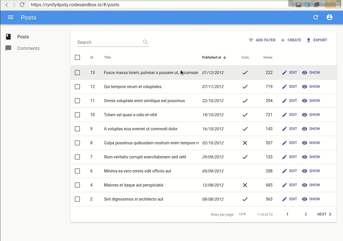
- Create and Edit a Record From the List Page
- Manage a Resource which has a Single Item (such as a User Profile)
React-admin Has An Opinionated UI
We did our best to provide a rich usable interface by leveraging optimistic UI and optimizing the space used to give your data maximum visibility.
However, you might not share our vision of what a rich usable interface is.
For example, some users reported they didn’t like our optimistic updates, or the undo feature. Others think that having a back button to return to the list page from a detail page is a must have. Finally, some don’t like Material Design or the react implementation we chose, Material-ui.
None of these preferences should force developers to stop using react-admin. Although react-admin has opinionated defaults, everything is replaceable. This article will show you how you can customize many parts of the framework without repeating yourself.
As always, you’ll find the end result code in the following codesandbox.
Overriding Default Options
Let’s start with the optimistic updates, as this is probably the easiest thing to customize. You may already be aware that components supporting optimistic mutations (update or delete) accept an undoable prop. This prop allows to disable this behavior.
However, if you really don’t want optimistic updates anywhere in your application, you might find cumbersome to specify undoable={false} on every component and for every resource.
There is a very simple solution to avoid such repetition: export your own version of these components with your own defaults! For example, I may have my own <Edit> component:
import { Edit as ReactAdminEdit } from "react-admin";
const Edit = ReactAdminEdit;
Edit.defaultProps = {  undoable: false,};
export default Edit;
Now, I can simply import my own component in place of React Admin <Edit>, and I won’t have optimistic updates anywhere anymore. No more undo!
Note: With the 2.8 version, an additional benefit in this case is that the delete action won’t be optimistic either and will show a confirmation dialog. See the announcement for more details.
Overriding Default Injected Components
Next stop, adding a back button to the details page. This will require a little more work. Let’s first review how I can override it.
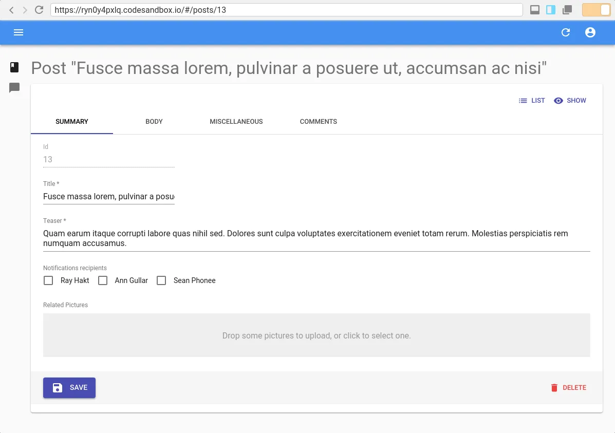
All resource view components (<List>, <Create>, <Edit> and <Show>) accept an actions prop. This prop can be used to replace the default actions which are displayed in the upper right part of the page. For example with the Edit view:
Besides, React Admin still exports a <ListButton> component, which was used in older versions, to preserve backward compatibility. I’ll add it back by creating my own <EditActions> component:
import React from "react";import { CardActions, ListButton, ShowButton } from "react-admin";
const EditActions = ({  basePath,  className,  data,  hasList,  hasShow,  resource,}) => (  <CardActions className={className}>    {hasList && <ListButton basePath={basePath} />}    {hasShow && <ShowButton basePath={basePath} record={data} />}  </CardActions>);
I could pass this component to every Edit view, but let’s leverage what we saw in the previous paragraph:
import React from 'react';import { Edit as ReactAdminEdit } from 'react-admin';import EditActions from './EditActions';
const Edit = ReactAdminEdit;
Edit.defaultProps = {   actions: <EditActions />    undoable: false,};
export default Edit;
And voila, I have my very own Edit view with a button to return to the list view for all my resources.
This technique can be used on any component which accepts React elements in its props, and there are too many to list them here. Please refer to the documentation for more details.
Providing Your Own views
Finally, sometimes you may want to customize the view itself, and overriding styles may not be enough. For example, what if I wanted to display the view title in the gray area above the <Card> component instead of the AppBar?
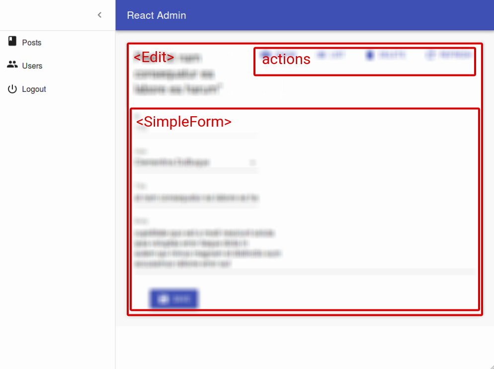
If you read François’ article about building a <Timeline> component, you may remember that the List view logic is handled by a <ListController> component, using the render prop pattern. This component injects data and handlers to a view component named <ListView>. The <List> component simply wraps the <ListView> inside the <ListController>:
export const List = (props) => ( <ListController {...props}> {(controllerProps) => <ListView {...props} {...controllerProps} />} </ListController>);Well, this also applies to the other views (<Create>, <Edit> and <Show>) as well as to some components such as <ReferenceInput> or ReferenceManyField. This means react-admin exports the <EditController> and <EditView> components, and I can supply my own view without having to rewrite the logic itself.
Let’s take a look at the EditView code. Sorry this snippet is a bit long, I’ll comment it along the way.
export const EditView = ({ // It receives a lot of props actions, aside, basePath, children, classes, className, defaultTitle, hasList, hasShow, record, redirect, resource, save, title, undoable, version, ...rest}) => { // By default, it does not display the actions if there is no show view if (typeof actions === "undefined" && hasShow) { actions = <DefaultActions />; } if (!children) { return null; } return ( <div className={classnames("edit-page", classes.root, className)} {...sanitizeRestProps(rest)} > // This components uses React Portal to *teleport* the title in the Appbar <TitleForRecord title={title} record={record} defaultTitle={defaultTitle} /> // Here's the Card <Card className={classes.card}> // My default actions will be cloned here {actions && ( <CardContentInner> {cloneElement(actions, { basePath, data: record, hasShow, hasList, resource, })} </CardContentInner> )} // Here, the view content is cloned (usually a SimpleForm or a TabbedForm) {record ? ( cloneElement(Children.only(children), { basePath, record, redirect: typeof children.props.redirect === "undefined" ? redirect : children.props.redirect, resource, save, undoable, version, }) ) : ( <CardContent> </CardContent> )} </Card> // The aside is cloned here if available {aside && React.cloneElement(aside, { basePath, record, resource, version, })} </div> );};So, it may be fat, but it doesn’t contain any logic other than pure UI. Let’s change it to put my title where I want to:
import Typography from '@material-ui/core/Typography';import EditActions from './EditActions';
export const EditView = ({    actions,    actions = <EditActions />, // My own default actions with the ListButton   undoable,   undoable = false, // My own default to disable optimistic updates    // Other props omitted from brevity}) => {    // I removed this because I have my own default actions which adds the ListButton even when there is no show view   if (typeof actions === 'undefined' && hasShow) {       actions = <DefaultActions />;   }    if (!children) {        return null;    }    return (        <div            className={classnames('edit-page', classes.root, className)}            {...sanitizeRestProps(rest)}        >            // I don't want to replace the AppBar title anymore           <TitleForRecord               title={title}               record={record}               defaultTitle={defaultTitle}           />           <Typography variant="display1" gutterBottom>               {isValidElement(title) // I may want to use a custom components for some resources                   ? cloneElement(title, { record })                   : title || defaultTitle               }           </Typography>            // Rest of the code not included for brevity as it did not change        </div>    );};
I now have to change my <Edit> component to make use of the <EditController>:
const Edit = (props) => (  <EditController {...props}>    {(controllerProps) => <EditView {...props} {...controllerProps} />}  </EditController>);
export default Edit;
I can now use my own <Edit> component everywhere with my own defaults and design.
Conclusion
Hopefully, this article showed you that you can customize react-admin very deeply while not repeating yourself. It’s fine to not agree with our vision of what’s best for 80% of users. We strived to ensure that if you do not agree with us, you’re not forced to do things the way we envisioned.
We also made sure you can override pretty much anything, and this article barely scratched the surface!
Indeed, although it’s not documented yet, the ra-core package includes all react-admin logic with no UI components at all. You may very well provide your own UI package and I can’t wait to see a ra-ui-bootstrap or ra-ui-semanticui package.

Authors
Full-stack web developer at marmelab, Gildas has a strong appetite for emerging technologies. If you want an informed opinion on a new library, ask him, he's probably used it on a real project already.