React Admin September 2022 Update

Since the release of version 4 last April, react-admin, the open-source frontend framework for building B2B applications on top of REST/GraphQL APIs, has received numerous updates. Beyond weekly bugfix releases, we’ve released 3 minor versions (4.1, 4.2, and 4.3). And the Enterprise Edition packages also got new features. So, what’s new?
- Core
- References
- Forms
- Guessers
- UI Changes
- Menus
- Documentation improvements
- Miscellaneous
Default Record Representation
Reference fields and inputs always seem weird to newcomers: they need a child to represent the related record. For instance, every <ReferenceField> needs a child field like <TextField>:
<ReferenceField source="category_id" reference="categories"> <TextField source="name" /></ReferenceField>This feels surprising at best, and cumbersome when using references a lot - especially since the field used to represent a reference record is often the same. A “category” is usually represented by its “name”, a “user” by its “first name + last name”, a “book” by its “title”, etc. Some frameworks have a notion of “default record representation”, that allows developers to specify once and for all how a record must be stringified.
React-admin v4.3 introduces the <Resource recordRepresentation> to define a field, a function, or an element to use by default when rendering a record. For instance:
const MyAdmin = () => ( <Admin dataProvider={dataProvider}> <Resource name="categories" recordRepresentation="name" list={CategoriesList} /> <Resource name="users" recordRepresentation={(record) => `${record.firstName} ${record.lastName}` } list={UsersList} /> <Resource name="books" recordRepresentation="title" list={BooksList} /> </Admin>);Once the default representation is defined for a resource, many react-admin components can become smarter. For instance, <ReferenceField> and <ReferenceOneField> components no longer need a child element, as they can default to a <TextField> using the recordRepresentation as the source:
<ReferenceField source="category_id" reference="categories"> <TextField source="name" /></ReferenceField><ReferenceField source="category_id" reference="categories" />The same happens for <ReferenceInput>, which defaults to using an <AutocompleterInput> when it has no child:
<ReferenceInput source="category_id" reference="categories"> <AutocompleteInput optionText="name" /></ReferenceInput><ReferenceInput source="category_id" reference="categories" />React-admin v4.3 goes even further, using the record representation to provide a better page title. The Guesser components generate code using childless references, too. Finally, we’ve updated the docs of Reference fields and inputs to be childless-first. It makes them much easier to learn.
Of course, if you need to render a Reference Field with a custom record representation, it’s still possible to pass a child - the feature is entirely backward compatible.
You can access the default record representation in your components, using a new public hook called useGetRecordRepresentation:
// with <Resource name="posts" recordRepresentation="title" />const getRecordRepresentation = useGetRecordRepresentation("posts");getRecordRepresentation({ id: 1, title: "Hello" }); // => "Hello"Default record representation is a time saver, especially in apps that heavily use Reference fields.
Set Query meta In Page Components
React-admin v4 introduced the meta option in dataProvider queries, letting you add extra parameters to any API call. For instance:
const { data, isLoading, error } = useGetOne("books", { id: 1234, meta: { _embed: "authors" },});The meta parameter is a great way to pass metadata to the API, e.g. to ask for embedded relationships or a subset of fields.
But the support for meta was only available at lower levels - only the data provider hooks supported them.
Starting with react-admin v4.2, you can now specify a custom meta in <List>, <Show>, <Edit> and <Create> components, via the queryOptions and mutationOptions props.
For instance, to set a custom meta for the update mutation of an <Edit> component:
import { Edit, SimpleForm } from "react-admin";
const PostEdit = () => (  <Edit mutationOptions={{ meta: { foo: "bar" } }}>    <SimpleForm>...</SimpleForm>  </Edit>);
One note of caution, though: Although this change makes it easier to embed relationships in the main record, this is not “The React-Admin Way™”. Instead, you should keep on relying on Reference fields and inputs, which reduce API calls and speed up rendering. Embedding relationships may lead to worse performance than using References. Similarly, avoid using meta to select a different subset of columns for the same resource, as react-admin shares the record cache between views.
Mutation Middlewares
React-admin 4.1 introduces a powerful new feature for <Create> and <Edit> pages. The idea behind mutation middlewares is to let individual components register side effects to be executed before or after the main mutation.
You can already alter the main mutation by using the transform and mutationOptions.onSuccess props. But these props have two limitations:
- There is no built-in way to transfer data from the
transformfunction to theonSuccesscallback - You have to set these props at the top level - they can’t be altered by a descendent component
This lead us to introduce mutation middlewares, which are functions that can be registered by any component in the <Create> or <Edit> page. They can add logic to be executed before or after the main mutation. If you know how middlewares work in server-side microframeworks like Express.js, the concept is the same.
A mutation middleware is a callback with the following signature:
const middleware = (resource, params, options, next) => {};The first three arguments (resource, params and options) are the same as the ones passed to the main mutation (dataProvider.update() or dataProvider.create()). The next argument is a function that must be called to execute the next middleware in the chain (or the mutation itself if there is no other middleware). It takes the same arguments as the middleware itself.
Any component descendent of <Create> or <Edit> can register a middleware using the useRegisterMutationMiddleware hook:
import { useRegisterMutationMiddleware } from "react-admin";
useRegisterMutationMiddleware(middleware);
Typical usage is to let users enter complex data in a form, and save parts of it in the main resource, and other parts in another resource. For instance, imagine an order creation form that lets users enter not only the order details but also the customer’s details.
First, let’s look at the main form:
import { Create, SimpleForm, DateInput, NumberInput } from "react-admin";
const OrderCreate = () => (  <Create>    <SimpleForm>      <DateInput source="date" />      <NumberInput source="total" />      <CustomerSubForm />    </SimpleForm>  </Create>);
Nothing fancy here - apart from this <CustomerSubForm> component. This is the interesting part:
import {  useRegisterMutationMiddleware,  useCreate,  TextInput,} from "react-admin";
const CustomerSubForm = (props) => {  const [createCustomer] = useCreate();
  const middleware = useCallback(    async (resource, params, options, next) => {      // params is the data to be sent to dataProvider.update()      const { data } = params;      // all user fields are in the `user` key      // extract the user data from the main data      const { user, ...orderData } = data;      // create the customer resource before saving the order      await createCustomer(        "customers",        { data: user },        {          onSuccess: (newCustomer) => {            // update the order data with the new customer id            const orderDataWithCustomer = {              ...orderData,              customerId: newCustomer.id,            };            // and call the next middleware to save the modified order            next(resource, { data: orderDataWithCustomer }, options);          },        },      );    },    [createCustomer],  );
  useRegisterMutationMiddleware(middleware);
  return (    <>      <TextInput source="user.email" />      <TextInput source="user.firstName" />      <TextInput source="user.lastName" />    </>  );};
Another example is the new <ReferenceManyInput> component, which we’ll describe later in this post. It lets users edit a list of related records right from the main form - e.g. to edit the items in an order.
Mutation middleware may not be a feature you’ll use much in your admins, but it lets us build powerful features on top of it. Watch for more middleware-based features in the future
Custom Login Redirection
Some authentication providers (like Auth0) do their own redirection after login, which conflicts with react-admin’s redirection logic. Because of this, users saw a flicker after login in certain cases.
Starting with react-admin 4.3, authProvider.login() can now return a route to redirect to, or false to disable redirection altogether:
// in src/authProvider.jsconst authProvider = { login: ({ username, password }) => { const request = new Request("https://mydomain.com/authenticate", { method: "POST", body: JSON.stringify({ username, password }), headers: new Headers({ "Content-Type": "application/json" }), }); return fetch(request) .then((response) => { // ... // disable redirection to the homepage return { redirectTo: false }; }) .catch(() => { throw new Error("Network error"); }); }, checkAuth: () => { /* ... */ }, getPermissions: () => { /* ... */ }, // ...};This makes the login experience smoother for all users, whatever the underlying authentication provider.
Specify Available Locales On The i18nProvider
Supporting multiple languages used to require several steps, in several parts of a react-admin app. Developers had to:
- configure the
i18nProvider.changeLocale()to support all the locales - create a custom component using
<LocalesMenuButton>and set the available locales there, - create a custom
<AppBar>to include the custom component and add it to the<Layout>, - sync the i18nProvider locales with the
<LocalesMenuButton>options.
React-admin 4.2 makes it easier. You can now define the available locales directly in the i18nProvider, thanks to a new getLocales method:
const i18nProvider = { translate: (key, options) => { /* ... */}, changeLocale: locale => { /* ... */}, getLocale: () => { /* ... */}, getLocales: () => { return [ { locale: 'en-US'; name: 'English' }, { locale: 'fr-FR'; name: 'Français' }, ] };}When this i18nProvider.getLocales() method returns more than one element, react-admin automatically inserts the <LocalesMenuButton> in the <AppBar>, so there is nothing more to do!
<Reference> Fields Accept More Than One Child
When rendering a <ReferenceField>, developers often need to render more than one field, but Reference field components used to accept only a single child.
For instance, if the users table has a first_name and a last_name field, you couldn’t render them both via a <TextField>:
// not possible before 4.2<ReferenceField label="Author" source="user_id" reference="users"> <TextField source="first_name" /> <TextField source="last_name" /></ReferenceField>Instead, developers had to wrap the two fields into another component or use the <FunctionField>, preventing them from taking advantage of the large collection of Field types.
<ReferenceField label="Author" source="user_id" reference="users"> <FunctionField label="Name" render={(record) => `${record.firstName} ${record.lastName}`} /></ReferenceField>React-admin 4.2 lifts the restriction on the number of children for <ReferenceField>, <ReferenceManyField>, <ReferenceOneField>, and <ReferenceArrayField>. You can now use any number of children in these components.
This allows e.g. to include custom filters and pagination in a <ReferenceManyField>:
export const AuthorShow = () => ( <Show> <SimpleShowLayout> <TextField source="first_name" /> <TextField source="last_name" /> <ReferenceManyField label="Books" reference="books" target="author_id"> <BookFilterForm /> <Datagrid> <TextField source="title" /> <TextField source="year" /> </Datagrid> <Pagination /> </ReferenceManyField> </SimpleShowLayout> </Show>);<ReferenceManyInput> Allows To Edit Related Records
<ReferenceManyField> already allows displaying related records via a one-to-many relationship (e.g. the variants of a product or the books of an author). But react-admin didn’t yet provide a component for easily editing these related records.
The new <ReferenceManyInput> component fills that gap. It lets users add, update or remove related records right in the main form.
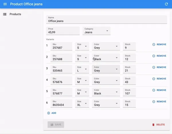
<ReferenceManyInput> fetches the related records, and renders them in a sub-form. As users change the related records, the <ReferenceManyInput> component stores these changes locally. When users submit the form, <ReferenceManyInput> saves the main record, then it translates the changes in the references into a series of mutations (additions, deletions, and updates) that it executes in parallel. It also delays the notification that confirms the success of the user action until all the mutations are saved.
The code will look familiar if you’ve already used <ReferenceManyField>, as <ReferenceManyInput> leverages <SimpleFormIterator>, which is already the default component for editing embedded objects via <ArrayInput>:
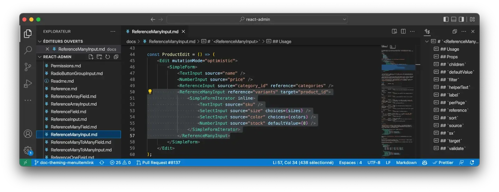
const ProductEdit = () => ( <Edit mutationMode="optimistic"> <SimpleForm> <TextInput source="name" /> <NumberInput source="price" /> <ReferenceInput source="category_id" reference="categories" /> <ReferenceManyInput reference="variants" target="product_id"> <SimpleFormIterator inline> <TextInput source="sku" /> <SelectInput source="size" choices={sizes} /> <SelectInput source="color" choices={colors} /> <NumberInput source="stock" defaultValue={0} /> </SimpleFormIterator> </ReferenceManyInput> </SimpleForm> </Edit>);<ReferenceManyInput> persists the changes in the reference records (variants in the above example) after persisting the changes in the main resource (product in the above example). This means that you can use <ReferenceManyInput> both on <Edit> and in <Create> views.
There is a lot of engineering under the hood - tweaking the form values to insert the related records, adding validation rules to the sub-form, computing the diff between the current and the modified related records, handling errors, etc. But this is transparent for end users, who don’t actually see that the related records are saved in a separate step. And the developer experience is also straightforward, thanks to the similarity with <ArrayInput>.
<ReferenceManyInput> is only available to Enterprise Edition customers for now. Check the full documentation at @react-admin/ra-relationships.
Improved Default Labels For References
Default labels in Reference Inputs were always wrong in 4.0, to the point that developers always had to set a label prop by hand.
The explanation is a bit complicated. React-admin 4.0 doesn’t inject props anymore, and <ReferenceInput> creates a ResourceContext with the reference name. So the children of a <ReferenceInput> have no way of knowing the original resource name. This is unfortunate because react-admin uses the resource context to build the default field name (and its label) for the <ReferenceInput> child.
Starting with react-admin 4.1, the default label of Reference Input children is right most of the time. For instance:
const PostEdit = () => ( <Edit> <SimpleForm> <ReferenceInput source="user_id" reference="users" /> </SimpleForm> </Edit>);The reference input will have a default label of “User”, and you can customize it by setting the resources.posts.fields.user_id translation in the i18nProvider - which is just what you’d expect anyway.
With better defaults, developers can focus on bringing business value instead of fighting against the framework.
This change was made possible by the introduction of a new context called LabelPrefixContext, which is used by react-admin’s field title generator, <FieldTitle>. The new context decorrelates the resource used for fetching references, and the one used for labels.
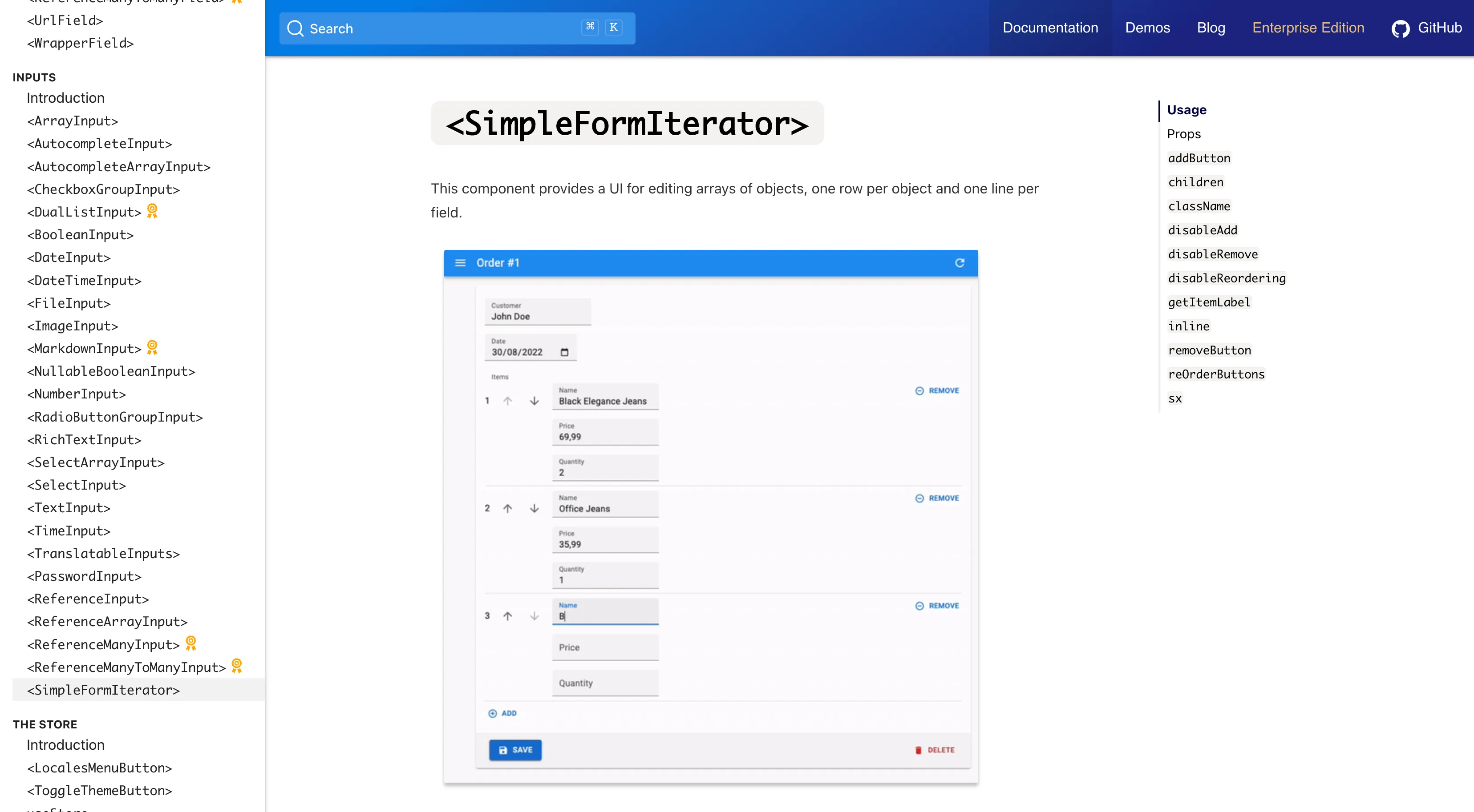
<SimpleFormIterator inline>
The <SimpleFormIterator> component is the default component used by <ArrayInput> to edit an array of objects. It renders a list of sub-forms, one for each item in the array. It’s useful e.g. to edit the items in an order.
The default layout for <SimpleFormIterator> renders one input per line - which is great for editing a list of large strings, but not so great for editing a list of small inputs.
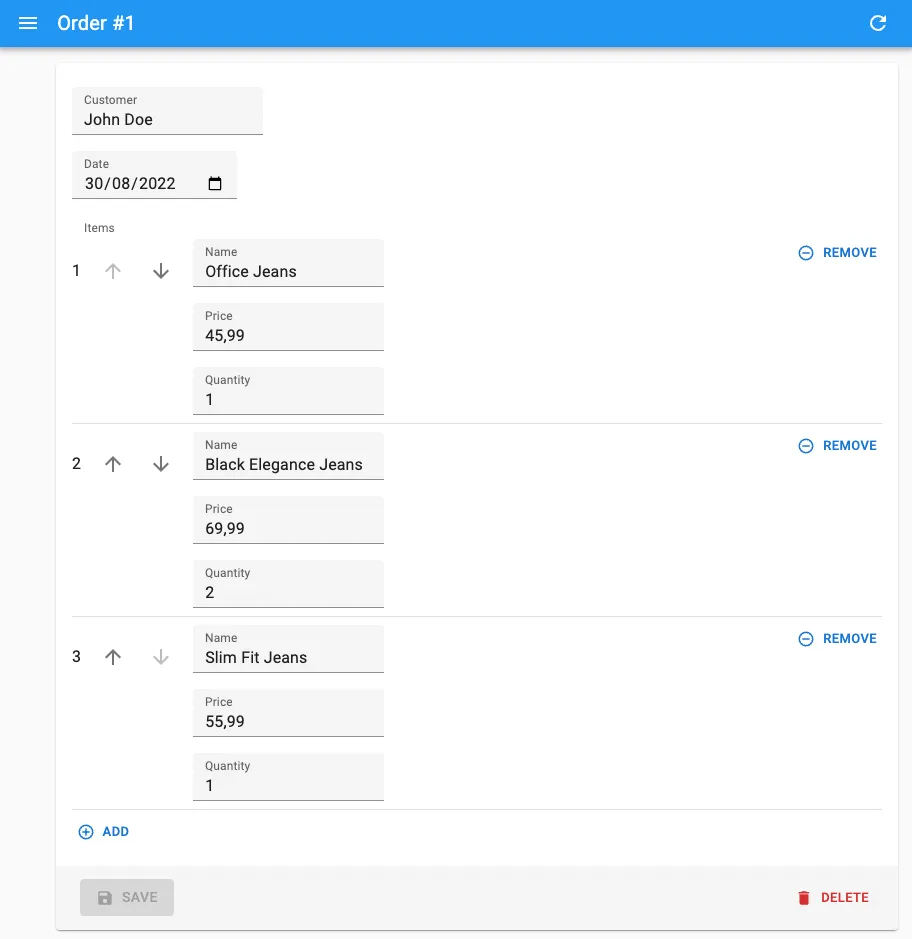
React-admin 4.3 introduces a new inline prop for <SimpleFormIterator>, which renders the sub-forms in a single line:
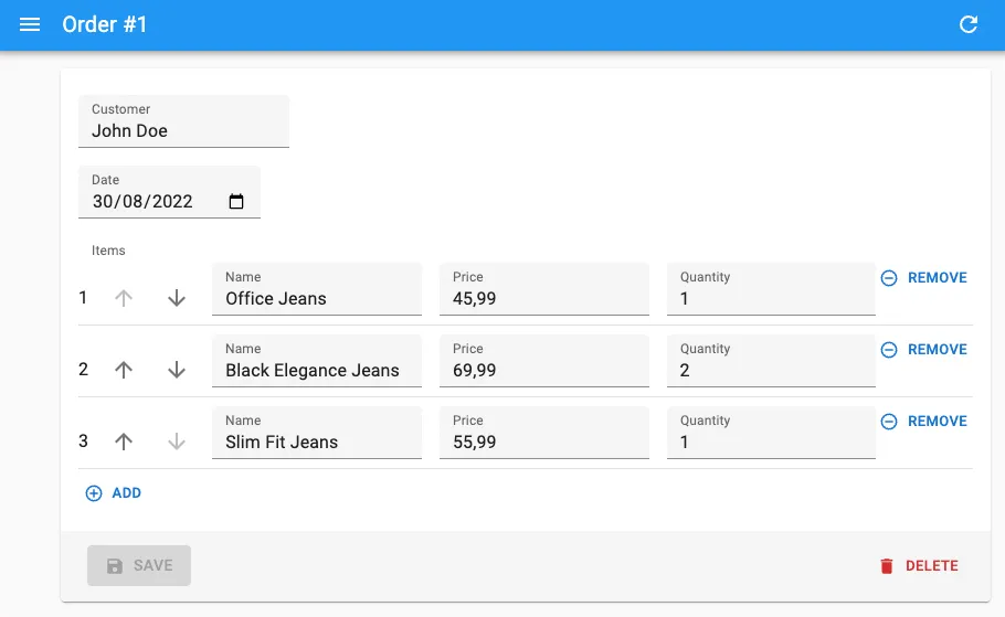
Usage is straightforward: Just add the inline prop to <SimpleFormIterator> and you’re good to go.
const OrderEdit = () => ( <Edit> <SimpleForm> <TextInput source="customer" /> <DateInput source="date" /> <ArrayInput source="items"> <SimpleFormIterator inline> <TextInput source="name" /> <NumberInput source="price" /> <NumberInput source="quantity" /> </SimpleFormIterator> </ArrayInput> </SimpleForm> </Edit>);This option produces denser, more readable forms. It doesn’t work in all cases, but we’ve noticed that end users appreciate it a lot on large forms.
<JSONSchemaForm>
React JSON Schema Form is an open-source package that lets you describe a form in JSON, and render it with React. This is super useful to let privileged users alter the configuration of your application, or to let users create custom forms for their tasks.
Here is an example form configuration for editing a resume, including an array of embedded occupation objects:
const schema = { type: "object", properties: { id: { type: "number" }, first_name: { type: "string", title: "First name" }, last_name: { type: "string", minLength: 3 }, dob: { type: "string", format: "date" }, sex: { type: "string", enum: ["male", "female"] }, employer_id: { type: "number" }, occupations: { type: "array", items: { type: "object", properties: { name: { type: "string" }, from: { type: "string", format: "date" }, to: { type: "string", format: "date" }, }, }, }, }, required: ["id", "last_name", "employer_id"],};React JSON Schema Form also lets you customize the look and feel of the form, thanks to another configuration object called the UI Schema. This lets you render some fields as disabled inputs, or use a custom widget for a given field.
const uiSchema = { id: { "ui:disabled": true }, employer_id: { "ui:widget": "reference", "ui:options": { reference: "employers", optionText: "name", }, },};If your admin lets users edit a JSON object, this tool gives them the power to edit forms without writing a single line of code.
<JsonSchemaForm> integrates JSON Schema Form into react-admin. It’s a drop-in replacement for <SimpleForm>, that you can use in <Edit> and <Create> views:
import { Edit } from "react-admin";import { JsonSchemaForm } from "@react-admin/ra-json-schema-form";
const ApplicantEdit = () => (  <Edit>    <JsonSchemaForm      schema={schema}      uiSchema={uiSchema}      onChange={(change) =>        process.env.NODE_ENV !== "test" && console.log("changed", change)      }      onError={(error) =>        process.env.NODE_ENV !== "test" && console.log("error", error)      }    />  </Edit>);
The result is a fully-functional form, with default values, validation, and error handling. <JSONSchemaForm> populates the form with the current record values, and it integrates react-admin’s <ReferenceInput> to let users edit relationships.
<JsonSchemaForm> is only available to Enterprise Edition customers for now. Check the full documentation at @react-admin/ra-json-schema-form.
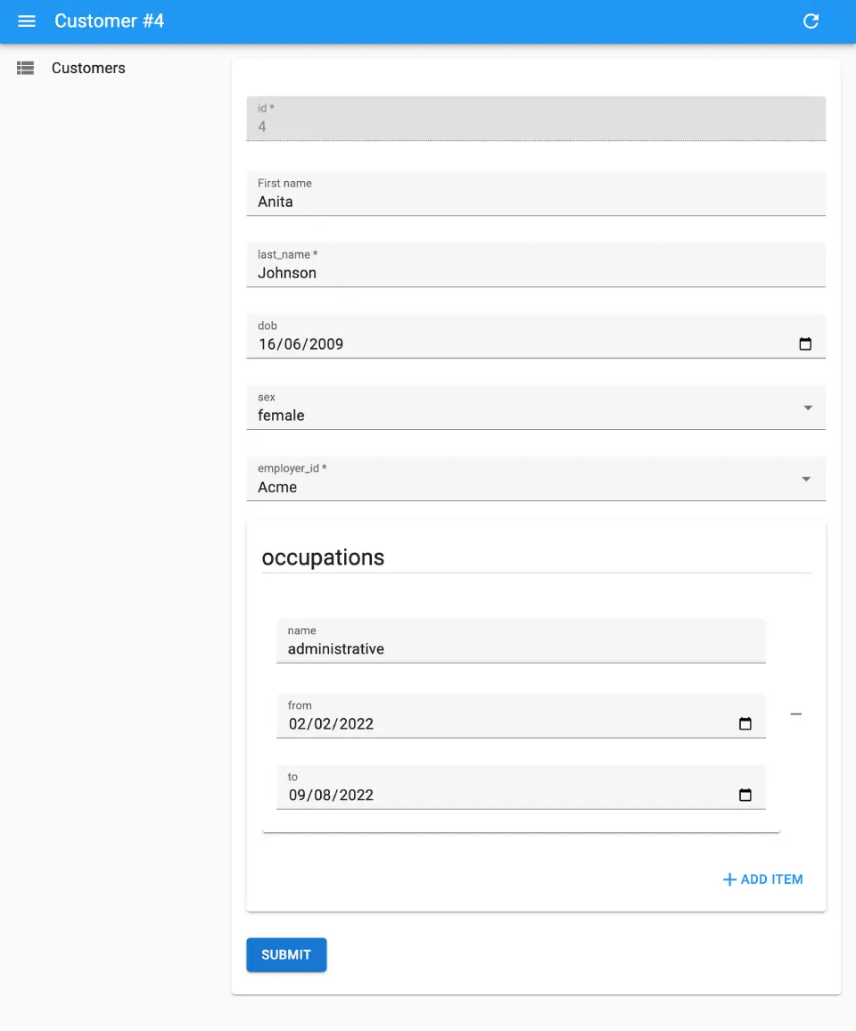
<LongForm>
When a form has lots of inputs (let’s say, more than 10), the <SimpleForm> layout is not very flexible. You can use a <TabbedForm> to separate the forms into sections, but it “hides” some of the inputs, so it may not work in all cases.
<LongForm> is a drop-in replacement for <SimpleForm>, that lets you use organize inputs into sections that are displayed vertically, with a navigation bar at the top.

Use it just like a <TabbedForm>: Children must be <LongForm.Section> elements with a label prop.
const sexChoices = [  { id: "male", name: "Male" },  { id: "female", name: "Female" },];
const languageChoices = [  { id: "en", name: "English" },  { id: "fr", name: "French" },];
const CustomerEdit = () => (  <Edit component="div">    <LongForm>      <LongForm.Section label="Identity">        <Labeled label="id">          <TextField source="id" />        </Labeled>        <TextInput source="first_name" validate={required()} />        <TextInput source="last_name" validate={required()} />        <DateInput source="dob" label="born" validate={required()} />        <SelectInput source="sex" choices={sexChoices} />      </LongForm.Section>      <LongForm.Section label="Occupations">        <ArrayInput source="occupations" label="">          <SimpleFormIterator>            <TextInput source="name" validate={required()} />            <DateInput source="from" validate={required()} />            <DateInput source="to" />          </SimpleFormIterator>        </ArrayInput>      </LongForm.Section>      <LongForm.Section label="Preferences">        <SelectInput          source="language"          choices={languageChoices}          defaultValue="en"        />        <BooleanInput source="dark_theme" />        <BooleanInput source="accepts_emails_from_partners" />      </LongForm.Section>    </LongForm>  </Edit>);
If there is a validation error, the section(s) containing an error will appear in red in the navigation bar.
We’ve tested this new layout with several users, and they love it! It makes the task of entering/editing data in a long form more predictable, and it makes it easy to spot errors.
<LongForm> is only available to Enterprise Edition customers for now. Check the full documentation at @react-admin/ra-form-layout.
<TimeInput>
React-admin already has a <DateInput> that lets user edit a date, and a <DateTimeInput> for editing a date with time. Both rely on the browser Date picker, so the look and feel may vary depending on the browser.
<TimeInput>, a new component introduced in react-admin 4.3, allows editing just the time part.
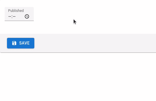
This component works with Date objects to handle the timezone using the browser locale. You can still pass string values as long as those can be converted to a JavaScript Date object.
import { TimeInput } from "react-admin";
<TimeInput source="published_at" />;
Form Sanitization Clarifications
React-admin v4 uses react-hooks-form instead of react-final-form to manage forms. One of the key differences between the two libraries is that react-hook-form requires that all form inputs have values (empty strings '' are valid input values) and doesn’t sanitize empty strings when submitting.
This means that given a user clears the content input in a form, your backend now receives payloads looking like the following in v4:
{ data: { id: 123, title: 'Hello, world', content: '', }}While it used to receive a payload like this in v3 (notice the absence of the content field):
{ data: { id: 123, title: 'Hello, world', }}This change leads to migration issues for some of our users. React-admin won’t replicate the v3 behavior anymore, because we want to stick as much as possible to the philosophy of the underlying form library. But we modified the documentation to make the default behavior explicit, and to explain how you can replicate the v3 behavior in userland thanks to the transform option.
export const UserCreate = (props) => { const transform = (data) => { const sanitizedData = {}; for (const key in data) { if (typeof data[key] === "string" && data[key].length === 0) continue; sanitizedData[key] = data[key]; } return sanitizedData; }; return ( <Create {...props} transform={transform}> ... </Create> );};The docs for <Create>, <Edit> and Inputs now mention this gotcha.
Guesser Code Can Be Copy/Pasted
You probably already know react-admin’s guesser components, which build dynamic views based on the schema of the data returned by the dataProvider:
With these components, all you have to do to scaffold a CRUD UI for a resource is to add one line to your admin:
<Resource name="comments" list={ListGuesser} edit={EditGuesser} show={ShowGuesser}/>The result is a basic - but working - UI for the comments resource. And when you open the developer tools in the browser, the code inferred by the guesser component is ready to be copy-pasted to bootstrap your own custom views.
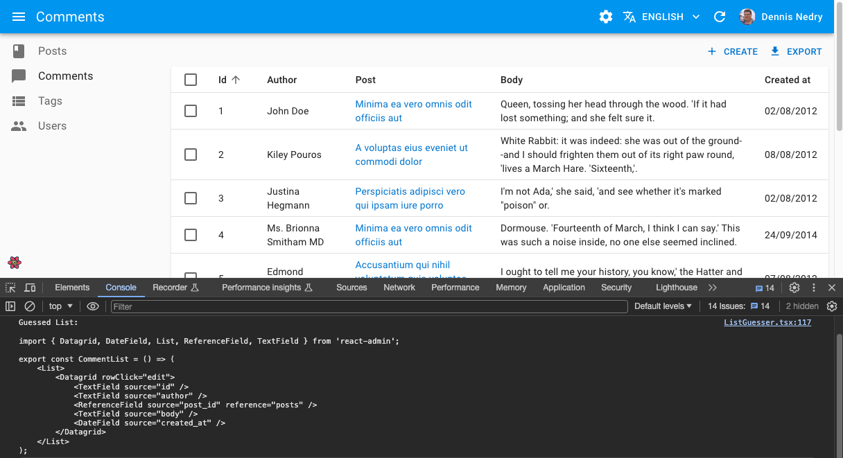
Well, it’s ALMOST ready to be copied/pasted, but the code dumped in the console lacks a key fragment: the imports.
React-admin 4.1 fills this gap: the guessed code is now fully functional.
import { DateField, ReferenceField, Show, SimpleShowLayout, TextField } from 'react-admin';
export const CommentShow = () => (    <Show>        <SimpleShowLayout>            <TextField source="id" />            <DateField source="author.undefined" />            <ReferenceField source="post_id" reference="posts"><TextField source="id" /></ReferenceField>            <TextField source="body" />            <DateField source="created_at" />        </SimpleShowLayout>    </Show>);
Scaffolding CRUD UIs for new resources with react-admin just got faster!
Remove All Filters Button
The Filter Button/Form Combo is the default filtering UI for list views. It lets users add filters from a dropdown list, then configure this filter via a form input.
Feedback from end users showed that clearing all filters is a common task that requires too many clicks on complex filter forms. That’s why the filter dropdown now shows a new option, “Remove all filters”, as soon as at least one filter is applied. Clicking on it clears all filters at once.

You have nothing to do to enable this feature - upgrade to react-admin 4.3 and it’s there!
Improved Loading State For <SelectInput>
When used as a child of <ReferenceInput>, the <SelectInput> component temporarily displays a loading state while the reference data is being fetched. This loading UI was using MUI’s <LinearProgress> component, which resulted in a visual jump once the fetching was complete.
Starting with react-admin v4.2, <SelectInput> always renders a select-like component. During the loading step, this control is disabled and shows a circular progress.
Improved <RichTextInput> Toolbar
The <RichTextInput> toolbar now features buttons for colors and images. Besides, the toolbar is now responsive!

This feature doesn’t require any change in your code. Just upgrade to react-admin >= 4.2 and you’re good to go!
New <Menu.Item> component
To build a custom menu in a react-admin app, you had to use the <MenuItemLink> component - and sometimes the <DashboardMenuItem> component, too. Its name wasn’t super intuitive, and we noticed that many developers had to look at the documentation every time they had to implement a custom menu.
To fix this, and starting with react-admin 4.2, <MenuItemLink> is now available as <Menu.Item>, <DashboardMenuItem> is available as <Menu.DashboardItems>, custom menus components should be more discoverable.
import { Menu, MenuItemLink, DashboardMenuItem } from 'react-admin';import { Menu } from 'react-admin';
const MyMenu = () => (    <Menu>       <DashboardMenuItem />       <MenuItemLink to="/posts" primaryText="Posts" leftIcon={<BookIcon />}/>       <MenuItemLink to="/comments" primaryText="Comments" leftIcon={<ChatBubbleIcon />}/>       <MenuItemLink to="/users" primaryText="Users" leftIcon={<PeopleIcon />}/>       <MenuItemLink to="/custom-route" primaryText="Miscellaneous" leftIcon={<LabelIcon />}/>       <Menu.DashboardItem />       <Menu.item to="/posts" primaryText="Posts" leftIcon={<BookIcon />}/>       <Menu.item to="/comments" primaryText="Comments" leftIcon={<ChatBubbleIcon />}/>       <Menu.item to="/users" primaryText="Users" leftIcon={<PeopleIcon />}/>       <Menu.item to="/custom-route" primaryText="Miscellaneous" leftIcon={<LabelIcon />}/>    </Menu>);
React-admin is using this convention of <ComponentName.SubComponentName> in other places, whenever a component cannot be used without another one. It’s a common practice in other libraries as well, and we believe it’s a good way to improve de developer experience bit by bit.
Also, if you’re using the ra-rbac package for fine-grained permissions, you can use the <Menu.Item> exported by that module. It supports setting permissions on menu items, to hide them when the user doesn’t have the required permissions.
import { Menu } from "@react-admin/ra-rbac";
export const MyMenu = () => (  <Menu>    {/* these menu items will only render for users with the right permissions */}    <Menu.Item      to="/products"      resource="products"      action="list"      primaryText="Products"    />    <Menu.Item      to="/categories"      resource="categories"      action="list"      primaryText="Categories"    />    <Menu.Item      to="/commands"      resource="commands"      action="list"      primaryText="Commands"    />    {/* this menu item will render for all users */}    <Menu.Item to="/preferences" primaryText="Preferences" />  </Menu>);
<IconMenu> renders the main menu as an icon bar
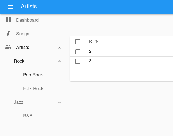
If the default menu layout doesn’t suit you, perhaps you’ll find <IconMenu> a better alternative. It renders a reduced menu bar with a sliding panel for second-level menu items. This menu UI saves a lot of screen real estate and allows for sub-menus of any level of complexity.

Usage is the same as for <Menu>: <IconMenu> expects <IconMenu.Item> children. In addition, an <IconMenu.Item> component can have children, too - they render as a sub-menu when users click on the menu item.
const MyMenu = () => ( <IconMenu> <IconMenu.Item name="dashboard" to="/" label="Dashboard" icon={<DashboardIcon />} /> <IconMenu.Item name="songs" icon={<MusicIcon />} to="/songs" label="Songs" /> <IconMenu.Item name="artists" to={"/artists?filter={}"} label="Artists" icon={<PeopleIcon />} > <CardContent> {/* to get consistent spacing */} <Typography variant="h3" gutterBottom> Artist Categories </Typography> {/* Note that we must wrap our MenuItemNode components in a MenuItemList */} <MenuItemList> <MenuItemNode name="artists.rock" to={'/artists?filter={"type":"rock"}'} label="Rock" /> <MenuItemNode name="artists.jazz" to={'/artists?filter={"type":"jazz"}'} label="Jazz" /> <MenuItemNode name="artists.classical" to={'/artists?filter={"type":"classical"}'} label="Rock" /> </MenuItemList> </CardContent> </IconMenu.Item> <IconMenu.Item name="configuration" to="/" exact label="Configuration" icon={<SettingsIcon />} sx={{ marginTop: "auto" }} /> </IconMenu>);<IconMenu> used to be known as <MultiLevelMenu variant="categories">, and is only available to Enterprise Edition customers. Check the full documentation at @react-admin/ra-navigation.
<MultiLevelMenu> improvements
<MultiLevelMenu> is another alternative to the default <Menu>, which supports multi-level items. Users can show/hide child menu items like a classic collapsible menu.
You can now specify which sub-menus are open on load thanks to the openItemList prop:
const MyMenu = () => ( <MultiLevelMenu openItemList={["artists", "artists.rock", "artists.rock.pop"]} > (...) </MultiLevelMenu>);This is very handful to open an admin in the same state as it was when a user closed it - provided you persist the menu state in your backend.
In addition, you can omit the link in items of <MultiLevelMenu> (which are now called <MultiLevelMenu.Item>) if the item has children:
const MyMenu = () => ( <MultiLevelMenu> <MultiLevelMenu.Item name="dashboard" to="/" exact label="Dashboard" /> <MultiLevelMenu.Item name="songs" to="/songs" label="Songs" /> {/* no `to` prop */} <MultiLevelMenu.Item name="artists" label="Artists"> <MultiLevelMenu.Item name="artists.rock" to={'/artists?filter={"type":"Rock"}'} label="Rock" > <MultiLevelMenu.Item name="artists.rock.pop" to={'/artists?filter={"type":"Pop Rock"}'} label="Pop Rock" /> <MultiLevelMenu.Item name="artists.rock.folk" to={'/artists?filter={"type":"Folk Rock"}'} label="Folk Rock" /> </MultiLevelMenu.Item> <MultiLevelMenu.Item name="artists.jazz" to={'/artists?filter={"type":"Jazz"}'} label="Jazz" /> </MultiLevelMenu.Item> </MultiLevelMenu>);<MultiLevelMenu> is only available to Enterprise Edition customers. Check the full documentation at @react-admin/ra-navigation.
Documentation Improvements
Perhaps the most spectacular changes since the 4.0 release come from the online documentation at marmelab.com/react-admin. In general, it’s now easier to start a new project with react-admin, understand its philosophy, find the right components, and learn how to use them.
The landscape of React frameworks is evolving, and we want to make sure react-admin is easy to use with the latest tools. The react-admin installation documentation now includes instructions for
- Create-React-App,
- Vite,
- Next.js, and
- Remix.
We’ve rewritten the i18n Translation, and split it into several chapters. Hopefully, it should become easier to set up and use the translation features of react-admin, such as useTranslate.
If you browse the sidebar, you’ll see that we’ve added new chapters to better document some components. For instance:
Many of the Input components have completely new documentation. For instance, check out the <electInput> chapter to see an example.
Finally, we’ve tried to improve the discoverability of Enterprise Edition features by adding dedicated sections about EE components in the main documentation. This includes documentation for:
<IconMenu><Breadcrumb><Search><ReferenceManyToManyInput><LongForm><AccordionForm><WizardFoem><EditDialog><CredateDialog><useCanAccess><useSubscribe><useGetTree>
Graphql Data Provider Packages Are Published
When react-admin v4.0 got out, it didn’t contain the GraphQL data providers - we couldn’t migrate them on time for the new version.
We released ra-data-graphql-simple and ra-data-graphql shortly afterward (in 4.0.2), so if you were waiting for them to start migrating your react-admin application, go for it!
The ra-data-graphql-simple package exposes a single function, which is a constructor for a dataProvider based on a GraphQL endpoint. When executed, this function runs an introspection query against the GraphQL endpoint. It uses the result of this query (the GraphQL schema) to automatically configure the dataProvider accordingly.
// in App.jsimport React from "react";import { Component } from "react";import buildGraphQLProvider from "ra-data-graphql-simple";import { Admin, Resource } from "react-admin";
import { PostCreate, PostEdit, PostList } from "./posts";
const App = () => {  const [dataProvider, setDataProvider] = React.useState(null);  React.useEffect(() => {    buildGraphQLProvider({      clientOptions: { uri: "http://localhost:4000" },    }).then((graphQlDataProvider) =>      setDataProvider(() => graphQlDataProvider),    );  }, []);
  if (!dataProvider) {    return <div>Loading </div>;  }
  return (    <Admin dataProvider={dataProvider}>      <Resource        name="Post"        list={PostList}        edit={PostEdit}        create={PostCreate}      />    </Admin>  );};
export default App;
<Arrayinput> Validation Now Works Seamlessly
Due to limitations in react-hook-form, the underlying form library used by react-admin, <ArrayInput> validation was not working properly. The react-hook-form maintainers have fixed the problem upstream. We’ve bumped the required version of react-hook-form to 7.34, which fixes the problems.
{ /* validation now works for ArrayInput just like for other input types */}<ArrayInput source="backlinks" validate={required()}> <SimpleFormIterator> <DateInput source="date" defaultValue="" /> <TextInput source="url" defaultValue="" /> </SimpleFormIterator></ArrayInput>;<Search> Entries Can Redirect To An Edit Or Show View
The global <Search> widget lets users do a site-wide search. It can leverage a server-side search index like ElasticSearch. And it can even work without any search index, by searching across several resources using dataProvider.getList().
To enable that feature, you have to add a new method in your dataProvider: search. The addSearchMethod automatically ‘augments’ your dataProvider with a search method across the resources you want:
const dataProvider = simpleRestProvider("http://path.to.my.api/");
const dataProviderWithSearch = addSearchMethod(dataProvider, [  "artists",  "tracks",  "albums",]);
With this feature, when users click on a search result, they are redirected to the Edition view for the record. But not all admins have an edition page for all records - some only have a show view.
In its latest version, addSearchMethod lets you specify the route you want to redirect to when a user clicks on a search result:
const dataProviderWithSearch = addSearchMethod(dataProvider, { artists: { label: "full_name", description: (record) => `${record.born_at}-${record.died_at} ${record.biography}`, redirect: "show", }, albums: { // no label specified, fallback on inference description: (record) => `${record.released_at.getFullYear()} by ${record.recordCompany}`, },});<addSearchMethod> is only available to Enterprise Edition customers. Check the full documentation at @react-admin/ra-search.
Conclusion
That was a long post! And I didn’t even mention the myriad of small adjustments and bug fixes that were released since April. Check the changelog for the full list of 250+ changes since 4.0.
We’ve fixed lots of corner and edge cases early, thanks to early adopters who tested the 4.0 alphas and betas. And we’ve fixed even more since the 4.0 release - in fact, we’ve discovered that some developers implemented features that we didn’t even think were possible with react-admin! Thanks again to all the contributors who opened a bug report, a feature request, or a pull request to help us improve react-admin. This framework couldn’t exist without you❤️!
During these past months, we’ve received a lot of overwhelmingly positive feedback on version 4. The vast majority of developers love the changes in the DX and the increased productivity. Version 4 was more than 6 months in the making, and some of the choices we made weren’t easy. But your feedback shows us that we’re on the right track.
And we’re already working on improving react-admin even more. Stay tuned for more news in the coming months, or subscribe to our Twitter feed for fresh updates.

Authors
Marmelab founder and CEO, passionate about web technologies, agile, sustainability, leadership, and open-source. Lead developer of react-admin, founder of GreenFrame.io, and regular speaker at tech conferences.