<TimeInput>
An input for editing time. <TimeInput> renders a standard browser Time Picker, so the appearance depends on the browser.
| Firefox | Edge |
|---|---|
This component works with Date objects to handle the timezone using the browser locale. You can still pass string values as long as those can be converted to a JavaScript Date object.
React-admin also proposes a TimeInput styled with Material UI documented at the end of this page.
Usage
import { TimeInput } from 'react-admin';

<TimeInput source="published_at" />
Tip: For a Material UI styled <TimeInput> component, check out vascofg/react-admin-date-inputs.
Props
<TimeInput> accepts the common input props.
Material UI
React-admin Enterprise Edition
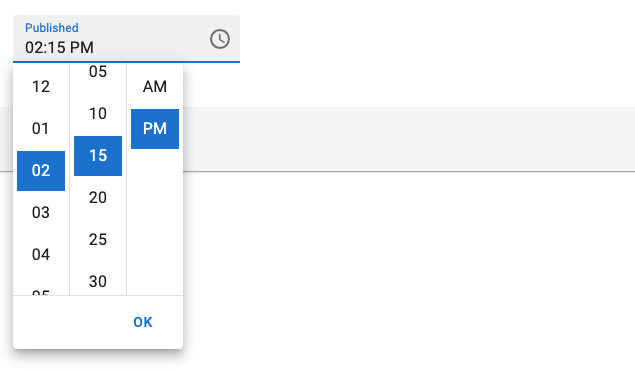
<TimeInput> styled with Material UI.

It allows for more customization of the UI than the default browser pickers. It also make it easier to work with specific locale and date formats.
Usage
import { TimeInput } from '@react-admin/ra-form-layout';
import { Edit, SimpleForm } from 'react-admin';

export const EventEdit = () => (
    <Edit>
        <SimpleForm>
            <TimeInput source="event_date" />
        </SimpleForm>
    </Edit>
);
<TimeInput> will accept either a Date object or any string that can be parsed into a Date as value. It will return a Date object, or null if the date is invalid.
Tip: You can use the parse prop to change the format of the returned value. See Parsing the date/time as an ISO string for an example.
Props
| Prop | Required | Type | Default | Description |
|---|---|---|---|---|
fullWidth |
- | boolean | false |
If true, the input will expand to fill the form width |
helperText |
- | string | - | Text to be displayed under the input |
mask |
- | string | - | Alias for the MUI format prop. Format of the date/time when rendered in the input. Defaults to localized format. |
parse |
- | Function | value => value === '' ? null : value |
Callback taking the input value, and returning the value you want stored in the form state. |
validate |
- | Function or Array | - | Validation rules for the input. See the Validation Documentation for details. |
Except for the format prop (renamed mask), <TimeInput> accepts the same props as the MUI X Date/Time pickers. They also accept the common input props.
Providing your own LocalizationProvider
MUI X Pickers need to be wrapped in a LocalizationProvider to work properly. <TimeInput> already includes a default <LocalizationProvider> using the date-fns adapter and the enUS locale.
You can change the locale and the date format globally by wrapping the <Admin> with your own <LocalizationProvider>.
Here is how to set up the pickers to use the fr locale:
import { Admin, Resource } from 'react-admin';
import { LocalizationProvider } from '@mui/x-date-pickers';
import { AdapterDateFns } from '@mui/x-date-pickers/AdapterDateFns';
import { fr } from 'date-fns/locale';
import { EventEdit } from './events';

export const App = () => (
    <LocalizationProvider dateAdapter={AdapterDateFns} adapterLocale={fr}>
        <Admin>
            <Resource name="events" edit={EventEdit} />
        </Admin>
    </LocalizationProvider>
);
Note: React Admin only supports the date-fns adapter for now.
Parsing the date/time as an ISO string
By default, <TimeInput> stores the date/time as a Date object in the form state. If you wish to store the date/time as an ISO string instead (or any other format), you can use the parse prop.
<TimeInput
    source="published"
    parse={(date: Date) => (date ? date.toISOString() : null)}
/>
