The Create and Edit Views
The Create and Edit views both display a form, initialized with an empty record (for the Create view) or with a record fetched from the API (for the Edit view). The <Create> and <Edit> components then delegate the actual rendering of the form to a form component - usually <SimpleForm>. This form component uses its children (<Input> components) to render each form input.
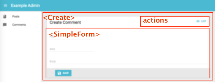
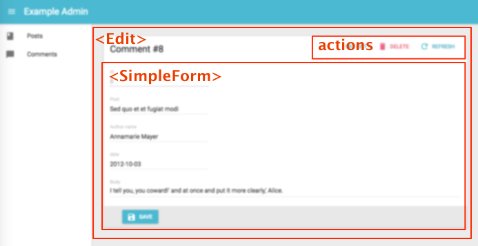
The <Create> and <Edit> components
The <Create> and <Edit> components render the page title and actions, and fetch the record from the REST API. They are not responsible for rendering the actual form - that’s the job of their child component (usually <SimpleForm>), to which they pass the record as prop.
Here are all the props accepted by the <Create> and <Edit> components:
Here is the minimal code necessary to display a form to create and edit comments:
// in src/App.js
import React from 'react';
import { jsonServerRestClient, Admin, Resource } from 'admin-on-rest';

import { PostCreate, PostEdit } from './posts';

const App = () => (
    <Admin restClient={jsonServerRestClient('http://jsonplaceholder.typicode.com')}>
        <Resource name="posts" create={PostCreate} edit={PostEdit} />
    </Admin>
);

export default App;

// in src/posts.js
import React from 'react';
import { Create, Edit, SimpleForm, DisabledInput, TextInput, DateInput, LongTextInput, ReferenceManyField, Datagrid, TextField, DateField, EditButton } from 'admin-on-rest';
import RichTextInput from 'aor-rich-text-input';

export const PostCreate = (props) => (
    <Create {...props}>
        <SimpleForm>
            <TextInput source="title" />
            <TextInput source="teaser" options={{ multiLine: true }} />
            <RichTextInput source="body" />
            <DateInput label="Publication date" source="published_at" defaultValue={new Date()} />
        </SimpleForm>
    </Create>
);

export const PostEdit = (props) => (
    <Edit title={<PostTitle />} {...props}>
        <SimpleForm>
            <DisabledInput label="Id" source="id" />
            <TextInput source="title" validate={required} />
            <LongTextInput source="teaser" validate={required} />
            <RichTextInput source="body" validate={required} />
            <DateInput label="Publication date" source="published_at" />
            <ReferenceManyField label="Comments" reference="comments" target="post_id">
                <Datagrid>
                    <TextField source="body" />
                    <DateField source="created_at" />
                    <EditButton />
                </Datagrid>
            </ReferenceManyField>
        </SimpleForm>
    </Edit>
);
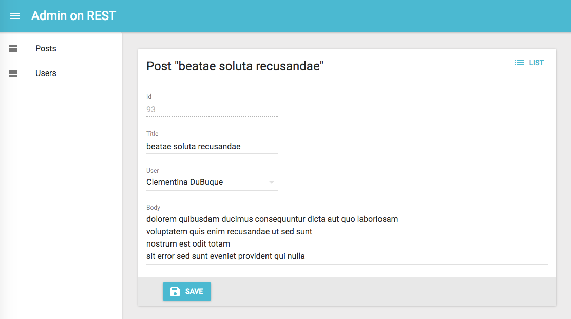
That’s enough to display the post edit form:
Tip: You might find it cumbersome to repeat the same input components for both the <Create> and the <Edit> view. In practice, these two views almost never have exactly the same form inputs. For instance, in the previous snippet, the <Edit> views shows related comments to the current post, which makes no sense for a new post. Having two separate sets of input components for the two view is therefore a deliberate choice. However, if you have the same set of input components, export them as a custom Form component to avoid repetition.
Page Title
By default, the title for the Create view is “Create [resource_name]”, and the title for the Edit view is “Edit [resource_name] #[record_id]”.
You can customize this title by specifying a custom title prop:
export const PostEdit = (props) => (
    <Edit title="Post edition" {...props}>
        ...
    </Edit>
);
More interestingly, you can pass a component as title. Admin-on-rest clones this component and, in the <EditView>, injects the current record. This allows to customize the title according to the current record:
const PostTitle = ({ record }) => {
    return <span>Post {record ? `"${record.title}"` : ''}</span>;
};
export const PostEdit = (props) => (
    <Edit title={<PostTitle />} {...props}>
        ...
    </Edit>
);
Actions
You can replace the list of default actions by your own element using the actions prop:
import { CardActions } from 'material-ui/Card';
import FlatButton from 'material-ui/FlatButton';
import { DeleteButton, ListButton, RefreshButton, ShowButton } from 'admin-on-rest';

const cardActionStyle = {
    zIndex: 2,
    display: 'inline-block',
    float: 'right',
};

const PostEditActions = ({ basePath, data }) => (
    <CardActions style={cardActionStyle}>
        <ShowButton basePath={basePath} record={data} />
        <ListButton basePath={basePath} />
        <DeleteButton basePath={basePath} record={data} />
        <RefreshButton />
        {/* Add your custom actions */}
        <FlatButton primary label="Custom Action" onClick={customAction} />
    </CardActions>
);

export const PostEdit = (props) => (
    <Edit actions={<PostEditActions />} {...props}>
        ...
    </Edit>
);
The <SimpleForm> component
The <SimpleForm> component receives the record as prop from its parent component. It is responsible for rendering the actual form. It is also responsible for validating the form data. Finally, it receives a handleSubmit function as prop, to be called with the updated record as argument when the user submits the form.
By default the <SimpleForm> submits the form when the user presses ENTER, if you want
to change this behaviour you can pass false for the submitOnEnter property.
The <SimpleForm> renders its child components line by line (within <div> components). It uses redux-form.
Here are all the props accepted by the <SimpleForm> component:
export const PostCreate = (props) => (
    <Create {...props}>
        <SimpleForm>
            <TextInput source="title" />
            <RichTextInput source="body" />
            <NumberInput source="nb_views" />
        </SimpleForm>
    </Create>
);
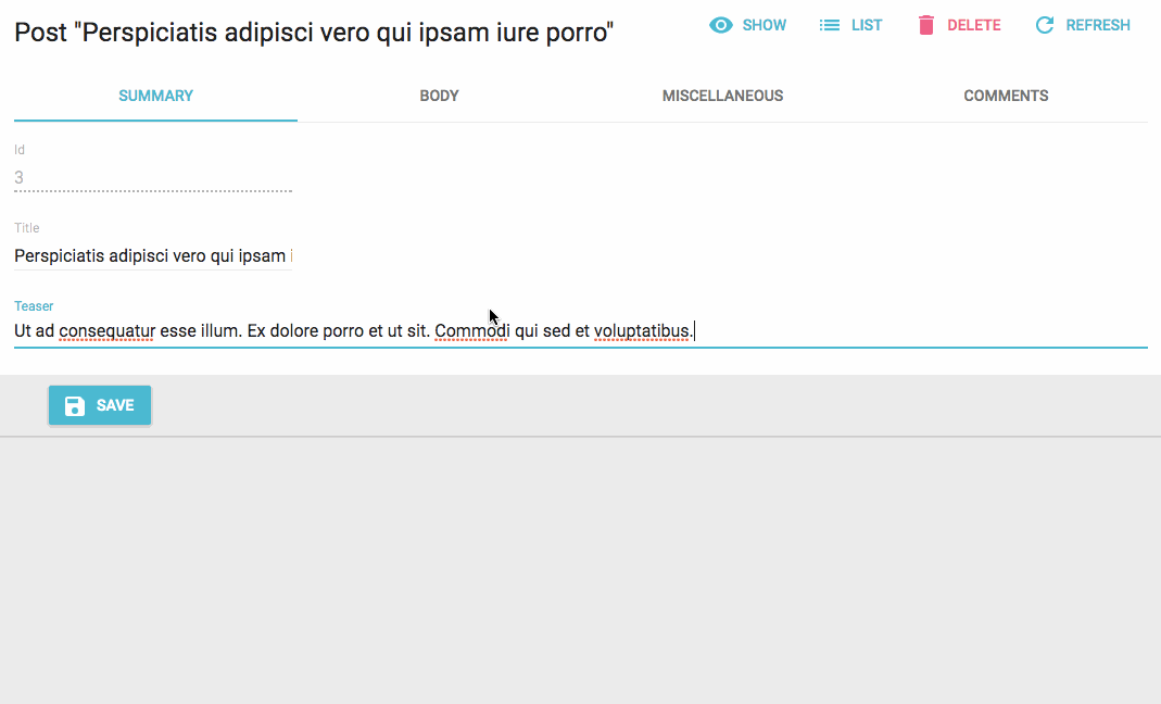
The <TabbedForm> component
Just like <SimpleForm>, <TabbedForm> receives the record prop, renders the actual form, and handles form validation on submit. However, the <TabbedForm> component renders inputs grouped by tab. The tabs are set by using <FormTab> components, which expect a label and an icon prop.
By default the <TabbedForm> submits the form when the user presses ENTER, if you want
to change this behaviour you can pass false for the submitOnEnter property.
Here are all the props accepted by the <TabbedForm> component:
import { TabbedForm, FormTab } from 'admin-on-rest'

const validateAverageNote = [number, minValue(0)];

export const PostEdit = (props) => (
    <Edit {...props}>
        <TabbedForm>
            <FormTab label="summary">
                <DisabledInput label="Id" source="id" />
                <TextInput source="title" validate={required} />
                <LongTextInput source="teaser" validate={required} />
            </FormTab>
            <FormTab label="body">
                <RichTextInput source="body" validate={required} addLabel={false} />
            </FormTab>
            <FormTab label="Miscellaneous">
                <TextInput label="Password (if protected post)" source="password" type="password" />
                <DateInput label="Publication date" source="published_at" />
                <NumberInput source="average_note" validate={validateAverageNote} />
                <BooleanInput label="Allow comments?" source="commentable" defaultValue />
                <DisabledInput label="Nb views" source="views" />
            </FormTab>
            <FormTab label="comments">
                <ReferenceManyField reference="comments" target="post_id" addLabel={false}>
                    <Datagrid>
                        <TextField source="body" />
                        <DateField source="created_at" />
                        <EditButton />
                    </Datagrid>
                </ReferenceManyField>
            </FormTab>
        </TabbedForm>
    </Edit>
);
Default Values
To define default values, you can add a defaultValue prop to form components (<SimpleForm>, <Tabbedform>, etc.), or add a defaultValue to individual input components.
Global Default Value
The value of the form defaultValue prop can be an object or a function returning an object, specifying default value for the created record. For instance:
const postDefaultValue = { created_at: new Date(), nb_views: 0 };
export const PostCreate = (props) => (
    <Create {...props}>
        <SimpleForm defaultValue={postDefaultValue}>
            <TextInput source="title" />
            <RichTextInput source="body" />
            <NumberInput source="nb_views" />
        </SimpleForm>
    </Create>
);
Tip: You can include properties in the form defaultValue that are not listed as input components, like the created_at property in the previous example.
Per Field Default Value
Alternatively, you can specify a defaultValue prop directly in <Input> components. Admin-on-rest will merge the child default values with the form default value (input > form):
export const PostCreate = (props) => (
    <Create {...props}>
        <SimpleForm>
            <DisabledInput source="id" defaultValue={() => uuid()}/>
            <TextInput source="title" />
            <RichTextInput source="body" />
            <NumberInput source="nb_views" defaultValue={0} />
        </SimpleForm>
    </Create>
);
Validation
Admin-on-rest relies on redux-form for the validation.
To validate values submitted by a form, you can add a validate prop to the form component, to individual inputs, or even mix both approaches.
Global Validation
The value of the form validate prop must be a function taking the record as input, and returning an object with error messages indexed by field. For instance:
const validateUserCreation = (values) => {
    const errors = {};
    if (!values.firstName) {
        errors.firstName = ['The firstName is required'];
    }
    if (!values.age) {
        errors.age = ['The age is required'];
    } else if (values.age < 18) {
        errors.age = ['Must be over 18'];
    }
    return errors
};

export const UserCreate = (props) => (
    <Create {...props}>
        <SimpleForm validate={validateUserCreation}>
            <TextInput label="First Name" source="firstName" />
            <TextInput label="Age" source="age" />
        </SimpleForm>
    </Create>
);
Tip: The props you pass to <SimpleForm> and <TabbedForm> end up as reduxForm() parameters. This means that, in addition to validate, you can also pass warn or asyncValidate functions. Read the reduxForm() documentation for details.
Per Field Validation: Function Validator
Alternatively, you can specify a validate prop directly in <Input> components, taking either a function, or an array of functions. These functions should return undefined when there is no error, or an error string.
Admin-on-rest will mash all the individual functions up to a single function looking just like the previous one:
const required = value => value ? undefined : 'Required';
const maxLength = max => value =>
  value && value.length > max ? `Must be ${max} characters or less` : undefined;
const number = value => value && isNaN(Number(value)) ? 'Must be a number' : undefined;
const minValue = min => value =>
  value && value < min ? `Must be at least ${min}` : undefined;

const ageValidation = (value, allValues) => {
    if (!value) {
        return 'The age is required';
    }
    if (value < 18) {
        return 'Must be over 18';
    }
    return [];
}

const validateFirstName = [required, maxLength(15)];
const validateAge = [number, ageValidation];

export const UserCreate = (props) => (
    <Create {...props}>
        <SimpleForm>
            <TextInput label="First Name" source="firstName" validate={validateFirstName} />
            <TextInput label="Age" source="age" validate={validateAge}/>
        </SimpleForm>
    </Create>
);
Input validation functions receive the current field value, and the values of all fields of the current record. This allows for complex validation scenarios (e.g. validate that two passwords are the same).
Note: Be sure to declare any validation which uses validator factories (such as minValue or minLength) outside the render function, otherwise it will make your component rerender indefinitely.
Tip: Validator functions receive the form props as third parameter, including the translate function. This lets you build internationalized validators:
const required = (value, allValues, props) => value ? undefined : props.translate('myroot.validation.required');
Tip: The props of your Input components are passed to a redux-form <Field> component. So in addition to validate, you can also use warn.
Tip: You can use both Form validation and input validation.
Built-in Field Validators
Admin-on-rest already bundles a few validator functions, that you can just require and use as field validators:
requiredif the field is mandatory,minValue(min, message)to specify a minimum value for integers,maxValue(max, message)to specify a maximum value for integers,minLength(min, message)to specify a minimum length for strings,maxLength(max, message)to specify a maximum length for strings,numberto check that the input is a valid number,emailto check that the input is a valid email address,regex(pattern, message)to validate that the input matches a regex,choices(list, message)to validate that the input is within a given list,
Example usage:
import { required, minLength, maxLength, minValue, maxValue, number, regex, email, choices } from 'admin-on-rest';

const validateFirstName = [required, minLength(2), maxLength(15)];
const validateAge = [number, minValue(18)];
const validateZipCode = regex(/^\d{5}$/, 'Must be a valid Zip Code');
const validateSex = choices(['m', 'f'], 'Must be Male or Female');

export const UserCreate = (props) => (
    <Create {...props}>
        <SimpleForm>
            <TextInput label="First Name" source="firstName" validate={validateFirstName} />
            <TextInput label="Email" source="email" validate={email} />
            <TextInput label="Age" source="age" validate={validateAge}/>
            <TextInput label="Zip Code" source="zip" validate={validateZipCode}/>
            <SelectInput label="Sex" source="sex" choices={[
                { id: 'm', name: 'Male' },
                { id: 'f', name: 'Female' },
            ]} validate={validateSex}/>
        </SimpleForm>
    </Create>
);
Note: Be sure to declare any validation which uses validator factories (such as minValue or minLength) outside the render function, otherwise it will make your component rerender indefinitely.
Submit On Enter
By default, pressing ENTER in any of the form fields submits the form - this is the expected behavior in most cases. However, some of your custom input components (e.g. Google Maps widget) may have special handlers for the ENTER key. In that case, to disable the automated form submission on enter, set the submitOnEnter prop of the form component to false:
export const PostEdit = (props) => (
    <Edit {...props}>
        <SimpleForm submitOnEnter={false}>
            ...
        </SimpleForm>
    </Edit>
);
Redirection After Submission
By default:
- Submitting the form in the
<Create>view redirects to the<Edit>view - Submitting the form in the
<Edit>view redirects to the<List>view
You can customize the redirection by setting the redirect prop of the form component. Possible values are “edit”, “show”, “list”, and false to disable redirection. For instance, to redirect to the <Show> view after edition:
export const PostEdit = (props) => (
    <Edit {...props}>
        <SimpleForm redirect="show">
            ...
        </SimpleForm>
    </Edit>
);
This affects both the submit button, and the form submission when the user presses ENTER in one of the form fields.
Toolbar
At the bottom of the form, the toolbar displays the submit button. You can override this component by setting the toolbar prop, to display the buttons of your choice.
The most common use case is to display two submit buttons in the <Create> view:
- one that creates and redirects to the
<Show>view of the new resource, and - one that redirects to a blank
<Create>view after creation (allowing bulk creation)
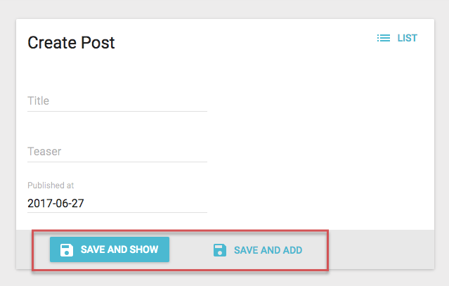
For that use case, use the <SaveButton> component with a custom redirect prop:
import { SaveButton, Toolbar } from 'admin-on-rest';

const PostCreateToolbar = props => <Toolbar {...props} >
    <SaveButton label="post.action.save_and_show" redirect="show" submitOnEnter={true} />
    <SaveButton label="post.action.save_and_add" redirect={false} submitOnEnter={false} raised={false} />
</Toolbar>;

export const PostEdit = (props) => (
    <Edit {...props}>
        <SimpleForm toolbar={<PostCreateToolbar />} redirect="show">
            ...
        </SimpleForm>
    </Edit>
);
Tip: Use admin-on-rest’s <Toolbar> component instead of material-ui’s <Toolbar> component. The former builds up on the latter, and adds support for an alternative mobile layout (and is therefore responsive).
Tip: Don’t forget to also set the redirect prop of the Form component to handle submission by the ENTER key.