The Show View
The Show view displays a record fetched from the API in a readonly fashion. It delegates the actual rendering of the record to a layout component - usually <SimpleShowLayout>. This layout component uses its children (<Fields> components) to render each record field.

The <Show> component
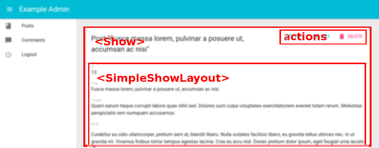
The <Show> component renders the page title and actions, and fetches the record from the REST API. It is not responsible for rendering the actual record - that’s the job of its child component (usually <SimpleShowLayout>), to which they pass the record as prop.
Here are all the props accepted by the <Show> component:
Here is the minimal code necessary to display a view to show a post:
// in src/App.js
import React from 'react';
import { jsonServerRestClient, Admin, Resource } from 'admin-on-rest';

import { PostCreate, PostEdit, PostShow } from './posts';

const App = () => (
    <Admin restClient={jsonServerRestClient('http://jsonplaceholder.typicode.com')}>
        <Resource name="posts" show={PostShow} create={PostCreate} edit={PostEdit} />
    </Admin>
);

export default App;

// in src/posts.js
import React from 'react';
import { Show, SimpleShowLayout, TextField, DateField, EditButton, RichTextField } from 'admin-on-rest';

export const PostShow = (props) => (
    <Show {...props}>
        <SimpleShowLayout>
            <TextField source="title" />
            <TextField source="teaser" />
            <RichTextField source="body" />
            <DateField label="Publication date" source="created_at" />
        </SimpleShowLayout>
    </Show>
);
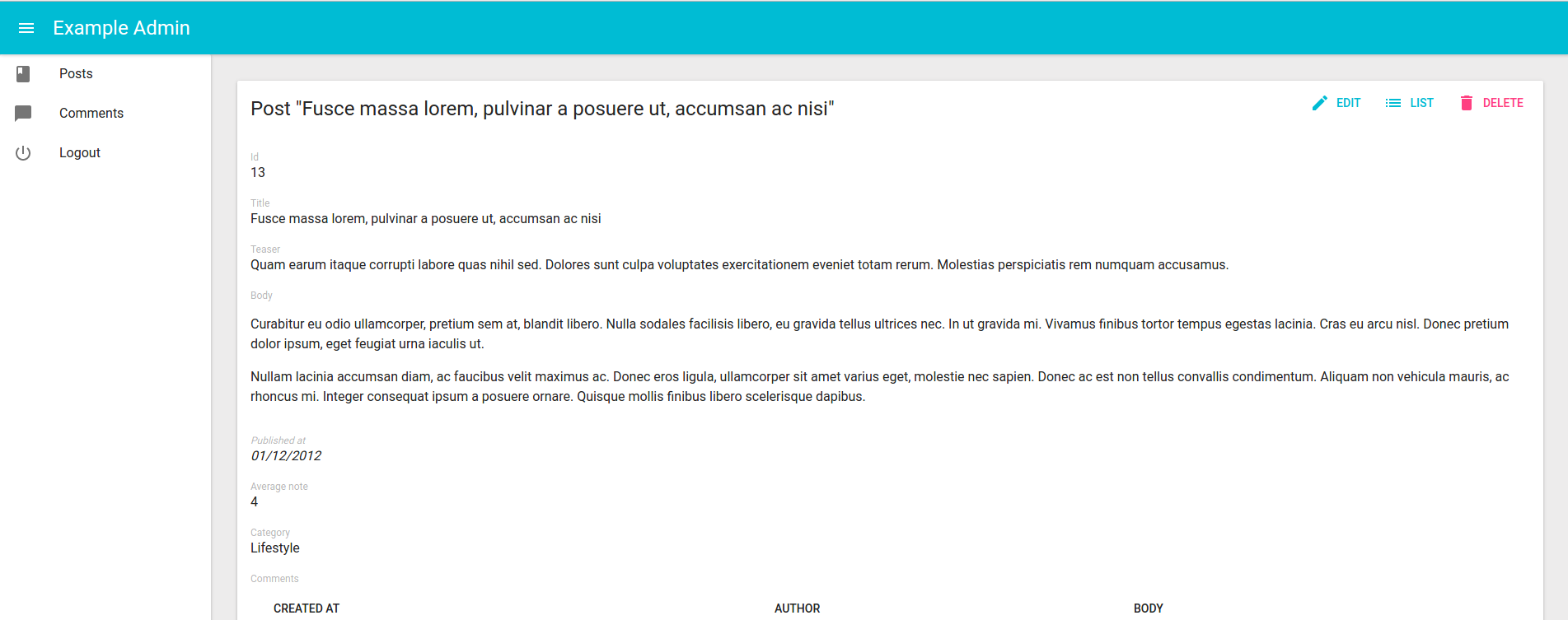
That’s enough to display the post show view:

Page Title
By default, the title for the Show view is “[resource_name] #[record_id]”.
You can customize this title by specifying a custom title prop:
export const PostShow = (props) => (
    <Show title="Post view" {...props}>
        ...
    </Show>
);
More interestingly, you can pass a component as title. Admin-on-rest clones this component and, in the <ShowView>, injects the current record. This allows to customize the title according to the current record:
const PostTitle = ({ record }) => {
    return <span>Post {record ? `"${record.title}"` : ''}</span>;
};
export const PostShow = (props) => (
    <Show title={<PostTitle />} {...props}>
        ...
    </Show>
);
Actions
You can replace the list of default actions by your own element using the actions prop:
import { CardActions } from 'material-ui/Card';
import FlatButton from 'material-ui/FlatButton';
import { DeleteButton, EditButton, ListButton, RefreshButton } from 'admin-on-rest';

const cardActionStyle = {
    zIndex: 2,
    display: 'inline-block',
    float: 'right',
};

const PostShowActions = ({ basePath, data }) => (
    <CardActions style={cardActionStyle}>
        <EditButton basePath={basePath} record={data} />
        <ListButton basePath={basePath} />
        <DeleteButton basePath={basePath} record={data} />
        <RefreshButton />
        {/* Add your custom actions */}
        <FlatButton primary label="Custom Action" onClick={customAction} />
    </CardActions>
);

export const PostShow = (props) => (
    <Show actions={<PostShowActions />} {...props}>
        ...
    </Show>
);
The <SimpleShowLayout> component
The <SimpleShowLayout> component receives the record as prop from its parent component. It is responsible for rendering the actual view.
The <SimpleShowLayout> renders its child components line by line (within <div> components).
export const PostShow = (props) => (
    <Show {...props}>
        <SimpleShowLayout>
            <TextField source="title" />
            <RichTextField source="body" />
            <NumberField source="nb_views" />
        </SimpleShowLayout>
    </Show>
);
It is possible to override its style by specifying the style prop, for example:
const styles = {
    container: {
        display: 'flex',
    },
    item: {
        marginRight: '1rem',
    },
};

export const PostShow = (props) => (
    <Show {...props}>
        <SimpleShowLayout style={styles.container}>
            <TextField source="title" style={styles.item} />
            <RichTextField source="body" style={styles.item} />
            <NumberField source="nb_views" style={styles.item} />
        </SimpleShowLayout>
    </Show>
);