The List View
The List view displays a list of records fetched from the REST API. The entry point for this view is the <List> component, which takes care of fetching the data. Then, it passes the data to an iterator view - usually <Datagrid>, which then delegates the rendering of each record property to <Field> components.
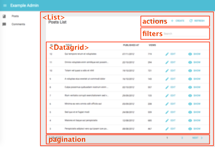
The <List> Component
The <List> component renders the list layout (title, buttons, filters, pagination), and fetches the list of records from the REST API. It then delegates the rendering of the list of records to its child component. Usually, it’s a <Datagrid>, responsible for displaying a table with one row for each post.
Tip: In Redux terms, <List> is a connected component, and <Datagrid> is a dumb component.
Here are all the props accepted by the <List> component:
titleactionsfilters(a React element used to display the filter form)perPagesortfilter(the permanent filter used in the REST request)pagination
Here is the minimal code necessary to display a list of posts:
// in src/App.js
import React from 'react';
import { jsonServerRestClient, Admin, Resource } from 'admin-on-rest';
import { PostList } from './posts';
const App = () => (
<Admin restClient={jsonServerRestClient('http://jsonplaceholder.typicode.com')}>
<Resource name="posts" list={PostList} />
</Admin>
);
export default App;
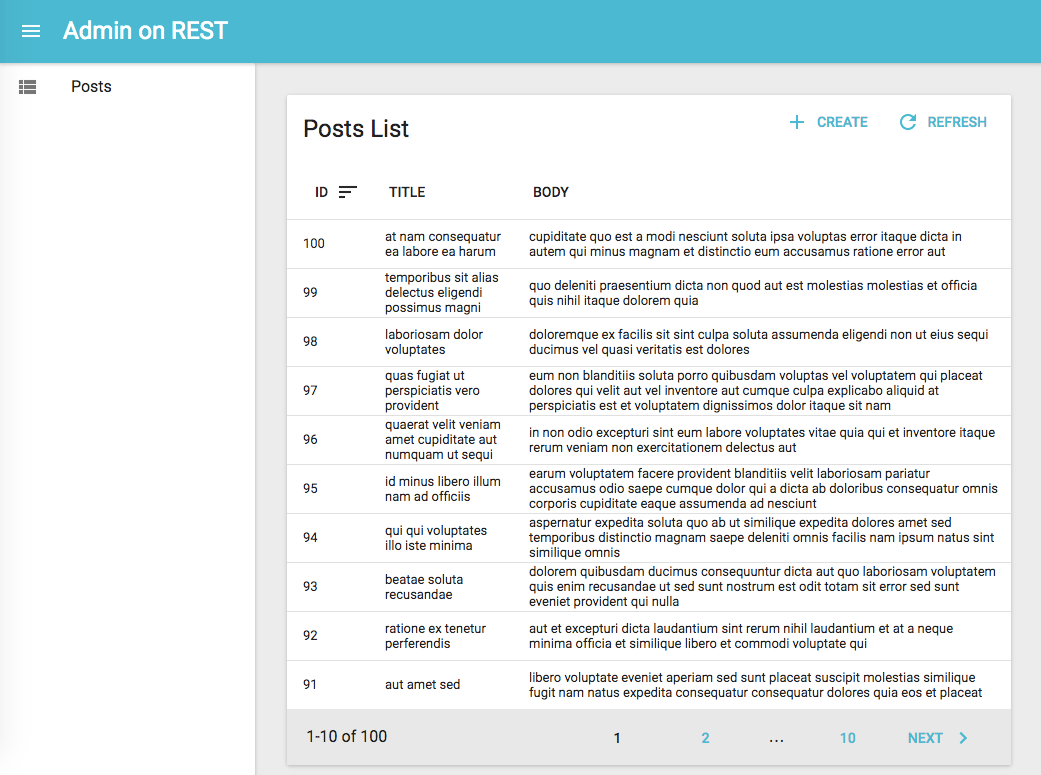
// in src/posts.js
import React from 'react';
import { List, Datagrid, TextField } from 'admin-on-rest';
export const PostList = (props) => (
<List {...props}>
<Datagrid>
<TextField source="id" />
<TextField source="title" />
<TextField source="body" />
</Datagrid>
</List>
);
That’s enough to display the post list:
Page Title
The default title for a list view is “[resource] list” (e.g. “Posts list”). Use the title prop to customize the List view title:
// in src/posts.js
export const PostList = (props) => (
    <List {...props} title="List of posts">
        ...
    </List>
);
The title can be either a string, or an element of your own.
Actions
You can replace the list of default actions by your own element using the actions prop:
import { CardActions } from 'material-ui/Card';
import FlatButton from 'material-ui/FlatButton';
import { CreateButton, RefreshButton } from 'admin-on-rest';

const cardActionStyle = {
    zIndex: 2,
    display: 'inline-block',
    float: 'right',
};

const PostActions = ({ resource, filters, displayedFilters, filterValues, basePath, showFilter }) => (
    <CardActions style={cardActionStyle}>
        {filters && React.cloneElement(filters, { resource, showFilter, displayedFilters, filterValues, context: 'button' }) }
        <CreateButton basePath={basePath} />
        <RefreshButton />
        {/* Add your custom actions */}
        <FlatButton primary label="Custom Action" onClick={customAction} />
    </CardActions>
);

export const PostList = (props) => (
    <List {...props} actions={<PostActions />}>
        ...
    </List>
);
Filters
You can add a filter element to the list using the filters prop:
const PostFilter = (props) => (
    <Filter {...props}>
        <TextInput label="Search" source="q" alwaysOn />
        <TextInput label="Title" source="title" defaultValue="Hello, World!" />
    </Filter>
);

export const PostList = (props) => (
    <List {...props} filters={<PostFilter />}>
        ...
    </List>
);
The filter component must be a <Filter> with <Input> children.
Tip: <Filter> is a special component, which renders in two ways:
- as a filter button (to add new filters)
- as a filter form (to enter filter values)
It does so by inspecting its context prop.
Tip: Don’t mix up this filters prop, expecting a React element, with the filter props, which expects an object to define permanent filters (see below).
Records Per Page
By default, the list paginates results by groups of 10. You can override this setting by specifying the perPage prop:
// in src/posts.js
export const PostList = (props) => (
    <List {...props} perPage={25}>
        ...
    </List>
);
Default Sort Field
Pass an object literal as the sort prop to determine the default field and order used for sorting:
// in src/posts.js
export const PostList = (props) => (
    <List {...props} sort={{ field: 'published_at', order: 'DESC' }}>
        ...
    </List>
);
sort defines the default sort order ; the list remains sortable by clicking on column headers.
Disabling Sorting
It is possible to disable sorting for a specific field by passing a sortable property set to false:
// in src/posts.js
import React from 'react';
import { List, Datagrid, TextField } from 'admin-on-rest/lib/mui';

export const PostList = (props) => (
    <List {...props}>
        <Datagrid>
            <TextField source="id" sortable={false} />
            <TextField source="title" />
            <TextField source="body" />
        </Datagrid>
    </List>
);
Permanent Filter
You can choose to always filter the list, without letting the user disable this filter - for instance to display only published posts. Write the filter to be passed to the REST client in the filter props:
// in src/posts.js
export const PostList = (props) => (
    <List {...props} filter={{ is_published: true }}>
        ...
    </List>
);
The actual filter parameter sent to the REST client is the result of the combination of the user filters (the ones set through the filters component form), and the permanent filter. The user cannot override the permanent filters set by way of filter.
Pagination
You can replace the default pagination element by your own, using the pagination prop. The pagination element receives the current page, the number of records per page, the total number of records, as well as a setPage() function that changes the page.
So if you want to replace the default pagination by a “<previous - next>” pagination, create a pagination component like the following:
import FlatButton from 'material-ui/FlatButton';
import ChevronLeft from 'material-ui/svg-icons/navigation/chevron-left';
import ChevronRight from 'material-ui/svg-icons/navigation/chevron-right';
import { Toolbar, ToolbarGroup } from 'material-ui/Toolbar';

const PostPagination = ({ page, perPage, total, setPage }) => {
    const nbPages = Math.ceil(total / perPage) || 1;
    return (
        nbPages > 1 &&
            <Toolbar>
                <ToolbarGroup>
                {page > 1 &&
                    <FlatButton primary key="prev" label="Prev" icon={<ChevronLeft />} onClick={() => setPage(page - 1)} />
                }
                {page !== nbPages &&
                    <FlatButton primary key="next" label="Next" icon={<ChevronRight />} onClick={() => setPage(page + 1)} labelPosition="before" />
                }
                </ToolbarGroup>
            </Toolbar>
    );
}

export const PostList = (props) => (
    <List {...props} pagination={<PostPagination />}>
        ...
    </List>
);
The <Datagrid> component
The datagrid component renders a list of records as a table. It is usually used as a child of the <List> and <ReferenceManyField> components.
Here are all the props accepted by the component:
It renders as many columns as it receives <Field> children.
// in src/posts.js
import React from 'react';
import { List, Datagrid, TextField, EditButton } from 'admin-on-rest';

export const PostList = (props) => (
    <List {...props}>
        <Datagrid>
            <TextField source="id" />
            <TextField source="title" />
            <TextField source="body" />
            <EditButton />
        </Datagrid>
    </List>
);
The datagrid is an iterator component: it receives an array of ids, and a data store, and is supposed to iterate over the ids to display each record. Another example of iterator component is <SingleFieldList>.
Custom Grid Style
You can customize the datagrid styles by passing a styles object as prop. The object should have the following properties:
const datagridStyles = {
    table: { },
    tbody: { },
    tr: { },
    header: {
        th: { },
        'th:first-child': { }, // special style for the first header column
    },
    cell: {
        td: { },
        'td:first-child': { }, // special style for the first column
    },
};

export const PostList = (props) => (
    <List {...props}>
        <Datagrid styles={datagridStyles}>
            ...
        </Datagrid>
    </List>
);
Tip: If you want to override the header and cell styles independently for each column, use the headerStyle and style props in <Field> components:
export const PostList = (props) => (
    <List {...props}>
        <Datagrid>
            <TextField source="id" />
            <TextField source="title" />
            <TextField
                source="views"
                style={{ textAlign: 'right' }}
                headerStyle={{ textAlign: 'right' }}
            />
        </Datagrid>
    </List>
);
Tip: if you want to go even further and apply a custom style cell by cell, check out the Conditional Formatting section of the Theming chapter
Row Style Function
You can customize the datagrid row style (applied to the <tr> element) based on the record, thanks to the rowStyle prop, which expects a function.
For instance, this allows to apply a custom background to the entire row if one value of the record - like its number of views - passes a certain threshold.
const postRowStyle = (record, index) => ({
    backgroundColor: record.nb_views >= 500 ? '#efe' : 'white',
});
export const PostList = (props) => (
    <List {...props}>
        <Datagrid rowStyle={postRowStyle}>
            ...
        </Datagrid>
    </List>
);
options, headerOptions, bodyOptions, and rowOptions
Admin-on-rest relies on material-ui’s <Table> component for rendering the datagrid. The options, headerOptions, bodyOptions, and rowOptions props allow your to override the props of <Table>, <TableHeader>, <TableBody>, and <TableRow>.
For instance, to get a fixed header on the table, override the <Table> props with options:
export const PostList = (props) => (
    <List {...props}>
        <Datagrid options={{ fixedHeader: true, height: 400 }}>
            ...
        </Datagrid>
    </List>
);
To enable striped rows and row hover, override the <TableBody> props with bodyOptions:
export const PostList = (props) => (
    <List {...props}>
        <Datagrid bodyOptions={{ stripedRows: true, showRowHover: true }}>
            ...
        </Datagrid>
    </List>
);
For a list of all the possible props that you can override via these options, please refer to the material-ui <Table> component documentation.
The <SimpleList> component
For mobile devices, a <Datagrid> is often unusable - there is simply not enough space to display several columns. The convention in that case is to use a simple list, with only one column per row. The <SimpleList> component serves that purpose, leveraging material-ui’s <List> and <ListItem> components. You can use it as <List> or <ReferenceManyField> child:
// in src/posts.js
import React from 'react';
import { List, SimpleList } from 'admin-on-rest';

export const PostList = (props) => (
    <List {...props}>
        <SimpleList
            primaryText={record => record.title}
            secondaryText={record => `${record.views} views`}
            tertiaryText={record => new Date(record.published_at).toLocaleDateString()}
        />
    </List>
);
<SimpleList> iterates over the list data. For each record, it executes the primaryText, secondaryText, leftAvatar, leftIcon, rightAvatar, and rightIcon props function, and passes the result as the corresponding <ListItem> prop.
Tip: To use a <SimpleList> on small screens and a <Datagrid> on larger screens, use the <Responsive> component:
// in src/posts.js
import React from 'react';
import { List, Responsive, SimpleList, Datagrid, TextField, ReferenceField, EditButton } from 'admin-on-rest';

export const PostList = (props) => (
    <List {...props}>
        <Responsive
            small={
                <SimpleList
                    primaryText={record => record.title}
                    secondaryText={record => `${record.views} views`}
                    tertiaryText={record => new Date(record.published_at).toLocaleDateString()}
                />
            }
            medium={
                <Datagrid>
                    ...
                </Datagrid>
            }
        />
    </List>
);
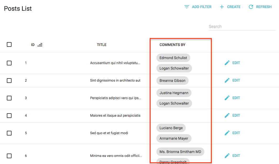
The <SingleFieldList> component
When you want to display only one property of a list of records, instead of using a <Datagrid>, use the <SingleFieldList>. It expects a single <Field> as child. It’s especially useful for <ReferenceManyField> components:
// Display all the books by the current author
<ReferenceManyField reference="books" target="author_id">
    <SingleFieldList>
        <ChipField source="title" />
    </SingleFieldList>
</ReferenceManyField>
Using a Custom Iterator
A <List> can delegate to any iterator component - <Datagrid> is just one example. An iterator component must accept at least two props:
idsis an array of the ids currently displayed in the listdatais an object of all the fetched data for this resource, indexed by id.
For instance, what if you prefer to show a list of cards rather than a datagrid?
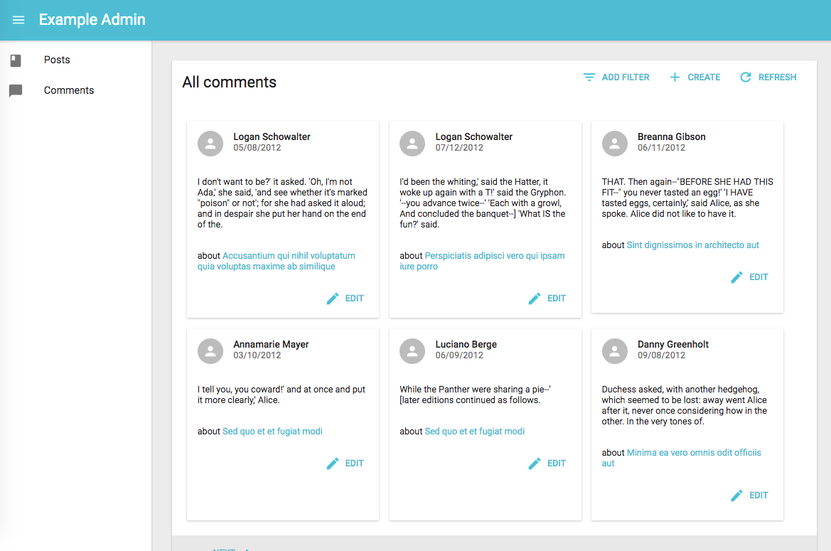
Simple: Create your own iterator component as follows:
// in src/comments.js
const cardStyle = {
width: 300,
minHeight: 300,
margin: '0.5em',
display: 'inline-block',
verticalAlign: 'top'
};
const CommentGrid = ({ ids, data, basePath }) => (
<div style={{ margin: '1em' }}>
{ids.map(id =>
<Card key={id} style={cardStyle}>
<CardHeader
title={<TextField record={data[id]} source="author.name" />}
subtitle={<DateField record={data[id]} source="created_at" />}
avatar={<Avatar icon={<PersonIcon />} />}
/>
<CardText>
<TextField record={data[id]} source="body" />
</CardText>
<CardText>
about
<ReferenceField label="Post" resource="comments" record={data[id]} source="post_id" reference="posts" basePath={basePath}>
<TextField source="title" />
</ReferenceField>
</CardText>
<CardActions style={{ textAlign: 'right' }}>
<EditButton resource="posts" basePath={basePath} record={data[id]} />
</CardActions>
</Card>
)}
</div>
);
CommentGrid.defaultProps = {
data: {},
ids: [],
};
export const CommentList = (props) => (
<List title="All comments" {...props}>
<CommentGrid />
</List>
);
As you can see, nothing prevents you from using <Field> components inside your own components… provided you inject the current record. Also, notice that components building links require the basePath component, which is also injected.