React Admin March 2023 Update

Back in December, we published a react-admin update blog post breaking down the new features brought to react-admin, our open-source frontend framework for building B2B applications on top of REST/GraphQL APIs.
Since then, we released 2 minor versions: 4.7 and 4.8. These two versions introduce many exciting features, among which:
- DataProvider Lifecycle Callbacks
- Count Components
- A New Filtering UI Alternative:
<StackedFilters> - Security
- Realtime: Easier and More Powerful
- Improved Supabase Integration
- List page changes
- UI Changes
- Nested Resource URLs
DataProvider Lifecycle Callbacks
Sometimes you can’t put business logic on the server side, and you have to put that logic in the dataProvider. As you add more and more special cases, the dataProvider code quickly becomes a mess of if (resource ==='...') snippets that are hard to read and maintain.
React-admin 4.7 introduces a decorator function to add resource-specific logic to an existing dataProvider. It uses pre- and post- event handlers like beforeGetOne and afterSave. This function expects an array of objects defining the callbacks for one resource as a parameter.
For instance, to delete the comments related to a post before deleting the post itself:
// in src/dataProvider.jsimport { withLifecycleCallbacks } from "react-admin";import simpleRestProvider from "ra-data-simple-rest";
const baseDataProvider = simpleRestProvider("http://path.to.my.api/");
export const dataProvider = withLifecycleCallbacks(baseDataProvider, [  {    resource: "posts",    beforeDelete: async (params, dataProvider) => {      // delete all comments related to the post      // first, fetch the comments      const { data: comments } = await dataProvider.getList("comments", {        filter: { post_id: params.id },        pagination: { page: 1, perPage: 1000 },        sort: { field: "id", order: "DESC" },      });      // then, delete them      await dataProvider.deleteMany("comments", {        ids: comments.map((comment) => comment.id),      });
      return params;    },  },]);
Lifecycle callbacks are a good way to:
- Add custom parameters before a
dataProvidermethod is called (e.g. to set the querymetaparameter based on the user profile), - Clean up the data before it’s sent to the API (e.g. to transform two
latandlongvalues into a singlelocationfield), - Add or rename fields in the data returned by the API before using it in react-admin (e.g. to add a
fullNamefield based on thefirstNameandlastNamefields), - Update related records or computed fields when a record is created, updated, or deleted (e.g. update the
post.nb_commentsfield after acommentis created or deleted) - Remove related records when a record is deleted (similar to a server-side
ON DELETE CASCADE)
If you’re stuck with a CRUD backend, this helper is a lifesaver.
Discover more usage examples in the withLifecycleCallbacks documentation.
Count Components
It is very common to show a count of records - for instance in a menu. Developers also often need to count the number of records related to the current one.
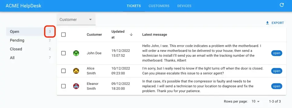
Until react-admin 4.7, you had to make your own components for that. Two new components now make this much easier: <Count> and <ReferenceManyCount>.
Here’s how you can build an aside menu for tickets with different statuses, as in the screenshot above:
import { Count, useStore } from "react-admin";import { MenuList, MenuItem, ListItemText } from "@mui/material";import { isEqual } from "lodash";
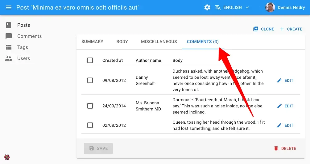
const TicketListAside = () => { const [statusFilter, setStatusFilter] = useStore("statusMenu", { status: "open", }); return ( <MenuList> <MenuItem onClick={() => setStatusFilter({ status: "open" })} selected={isEqual(statusFilter, { status: "open" })} > <ListItemText>Open</ListItemText> <Count filter={{ status: "open" }} /> </MenuItem> <MenuItem onClick={() => setStatusFilter({ status: "pending" })} selected={isEqual(statusFilter, { status: "pending" })} > <ListItemText>Pending</ListItemText> <Count filter={{ status: "pending" }} /> </MenuItem> <MenuItem onClick={() => setStatusFilter({ status: "closed" })} selected={isEqual(statusFilter, { status: "closed" })} > <ListItemText>Closed</ListItemText> <Count filter={{ status: "closed" }} /> </MenuItem> <MenuItem onClick={() => setStatusFilter({})} selected={isEqual(statusFilter, {})} > <ListItemText>All</ListItemText> <Count filter={{}} /> </MenuItem> </MenuList> );};We also added the ability to show a count to the <TabbedShowLayout.Tab> and <TabbedForm.Tab> components.
Tip: <TabbedShowLayout.Tab> and <TabbedForm.Tab> are more discoverable aliases for the <Tab> and <FormTab> components.
Here’s how to combine the <ReferenceManyCount> and the <TabbedShowLayout.Tab> to show the number of comments in a show view for posts:
const PostShow = () => ( <Show> <TabbedShowLayout> <TabbedShowLayout.Tab label="post.form.summary"> {/*...*/} </TabbedShowLayout.Tab> <TabbedShowLayout.Tab label="post.form.body"> {/*...*/} </TabbedShowLayout.Tab> <TabbedShowLayout.Tab label="post.form.miscellaneous"> {/*...*/} </TabbedShowLayout.Tab> <TabbedShowLayout.Tab label="post.form.comments" count={<ReferenceManyCount reference="comments" target="post_id" />} > {/*...*/} </TabbedShowLayout.Tab> </TabbedShowLayout> </Show>);Under the hood, <Count> and <ReferenceManyCount> call dataProvider.getList() with the pagination parameter set to retrieve no data - only the total number of records.
But there’s more. They both accept a filter prop allowing you to get the total of a subset of resources such as the published posts only:
<Count resource="posts" filter={{ is_published: true }} />Count components follow the declarative approach of react-admin components. Check the documentation for these new components to get more details:
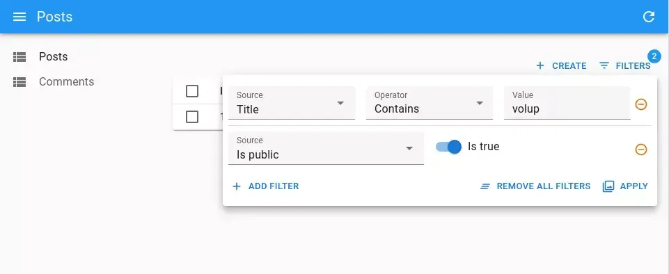
A New Filtering UI Alternative: <StackedFilters>
The default filter button/form combo lets you build basic filters for a list view quickly, but for complex filters, the UI is too limited.
When users need more freedom to apply various operators on list fields, you can now use the <StackedFilters> component.
Use a filter configuration object to define the allowed fields and operators:
import { Datagrid, List, TextField, NumberField, BooleanField, ReferenceArrayField } from 'react-admin';import { StackedFilters, FiltersConfig, textFilter, numberFilter, referenceFilter, booleanFilter } from '@react-admin/ra-form-layout';
const postListFilters: FiltersConfig = {    title: textFilter(),    views: numberFilter(),    tag_ids: referenceFilter({ reference: 'tags' }),    published: booleanFilter(),};const PostList = () => (    <List filters={<StackedFilters config={postListFilters} />}>        <Datagrid>            <TextField source="title" />            <NumberField source="views" />            <ReferenceArrayField tags="tags" source="tag_ids" />            <BooleanField source="published" />        </Datagrid>    </List>);
We provide some helper functions such as textFilter or referenceFilter to make it easier to create the filter configuration. You’re also free to configure filters by hand using the operators key:
import { FiltersConfig } from '@react-admin/ra-form-layout';import { NumberInput } from 'react-admin';import { MyNumberRangeInput } from './MyNumberRangeInput';
const postListFilters: FiltersConfig = {    views: {        operators: [            { value: 'eq', label: 'Equals' },            { value: 'neq', label: 'Not Equals' },            {                value: 'between',                label: 'Between',                input: ({ source }) => <MyNumberRangeInput source={source} />            },        ],        input: ({ source }) => <NumberInput source={source} />,    }};
Besides, if popovers are not your thing, you can reuse the underlying components to show those filters in an <Accordion> for instance:
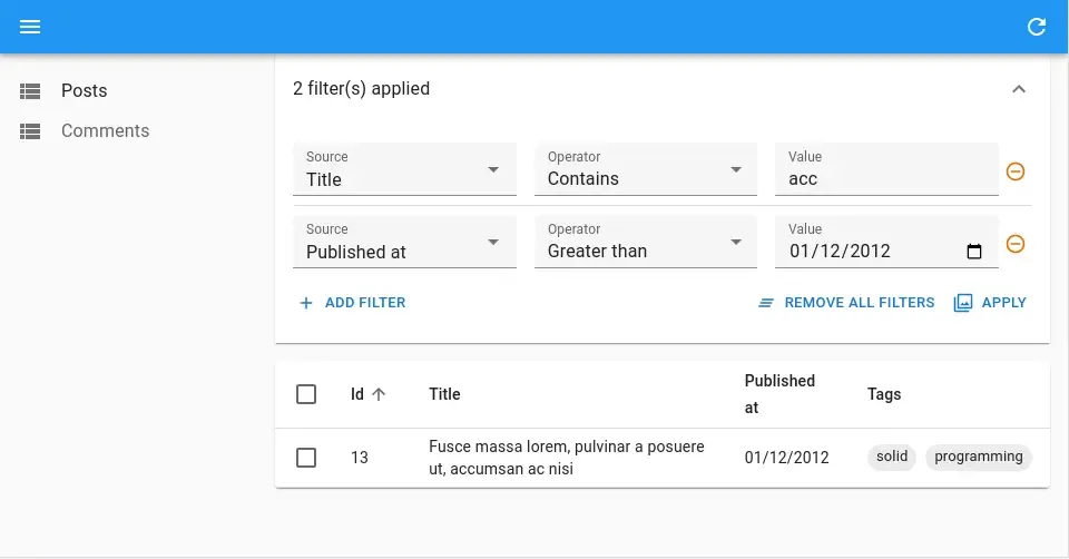
<StackedFilters> is a very flexible component that lets you build sophisticated filtering UIs. It is part of ra-form-layout, an Enterprise Edition package, and is exclusively for paying customers. Check its online documentation
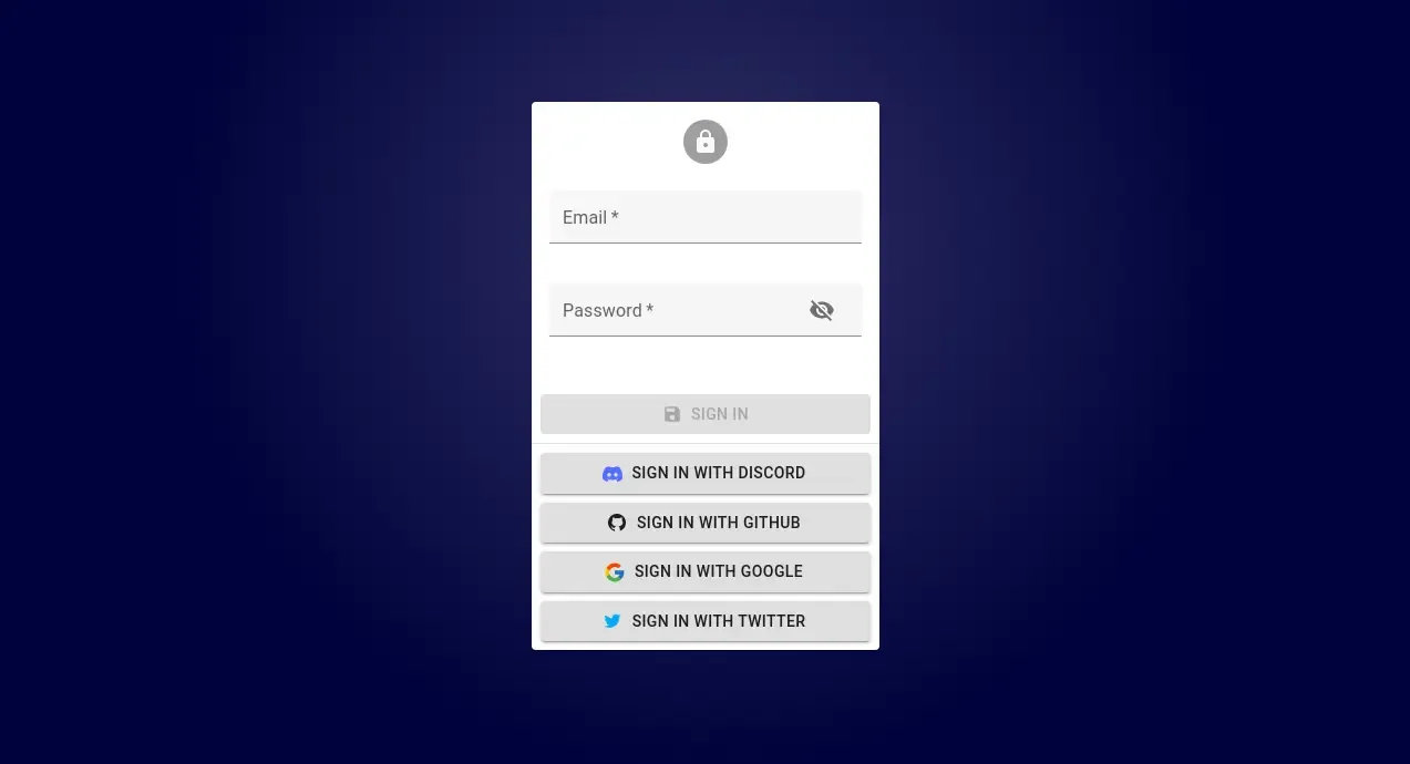
Easier OAuth Support
Setting up OAuth (or any third-party authentication services that redirect to another page) used to require setting up a custom page and fiddling with the authProvider to avoid notifications and redirects.
React-admin 4.7 introduces a new default route at /login-callback that can be set as the callback endpoint for third-party authentication services.
The default component for this route calls the new authProvider.handleCallback method, allowing you to validate that users are indeed authenticated before redirecting them as usual.
Here’s an example that leverages Auth0, a popular authentication service:
// in authProvider.jsimport { Auth0Client } from './Auth0Client';import { PreviousLocationStorageKey } from 'react-admin';
export const authProvider = {    async checkAuth() {        const isAuthenticated = await client.isAuthenticated();        if (isAuthenticated) {            return;        }        // Store the current user location. React-admin will redirect them once handleCallback succeeds        localStorage.setItem(PreviousLocationStorageKey, window.location.href);
        // If users are not authenticated, redirect them immediately to Auth0        client.loginWithRedirect({            authorizationParams: {                redirect_uri: `${window.location.origin}/auth-callback`,            },        });    },    async handleCallback() {        const query = window.location.search;        // If we did receive the Auth0 parameters        if (query.includes('code=') && query.includes('state=')) {            try {                // Request the Auth0 client to validate them                await Auth0Client.handleRedirectCallback();                return;            } catch (error) {                console.log('error', error);                throw error;            }        }        throw new Error('Failed to handle login callback.');    },    ...}
// In App.jsimport { Admin } from 'react-admin';import { authProvider } from './authProvider';
export const App = () => (    // Look Ma, no loginPage!    <Admin loginPage={false} authProvider={authProvider}>        // ...    </Admin>)
You can learn more about this feature in the authProvider.handleCallback() documentation.
This should streamline the configuration of new react-admin projects using third-party authentication providers.
Auth0, Cognito and MSAL Auth Providers
The work on OAuth allowed us to rewrite and extend old Auth Providers that were hard to use. Please meet three new Auth Providers developed and maintained by the core team:
ra-auth-auth0for the popular authentication service Auth0ra-auth-cognitofor AWS Cognitora-auth-msalfor Azure Active Directory
Realtime: Easier and More Powerful
Real-time features have tons of edge cases that can easily break your app if not properly handled. But developers want a simple API to implement these features, regardless of the underlying complexity. That’s why react-admin introduces a rich API of hooks and components to facilitate the addition of real-time features.
Take, for instance, <ListLive>. It’s a drop-in replacement for <List> that subscribes to updates on the list and reflects them in real time - with the simplest API possible:
import { List, Datagrid, TextField } from 'react-admin';import { Datagrid, TextField } from 'react-admin';import { ListLive } from '@react-admin/ra-realtime';
const MovieList = () => (   <List>   <ListLive>        <Datagrid>            <TextField source="id" />            <TextField source="title" />            <TextField source="director" />            <TextField source="year" />        </Datagrid>   </List>   </ListLive>);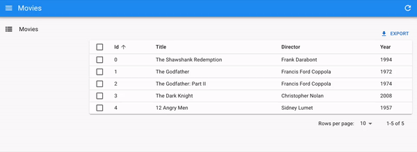
React-admin provides many such realtime-reactive components:
<ListLive>,<EditLive>,<ShowLive>, and<MenuLive>.
These components rely on low-level hooks that let you build custom real-time experiences:
useGetListLive, anduseGetOneLive.
One of the main features required by collaborative applications is a lock system. React-admin now exposes hooks and components to implement locks easily:
The hooks make working with locks faster and safer:
Other common real-time scenarios include progress bars, live notifications, menu badges, etc. All these use cases are now addressed by the new ra-realtime package - check the brand new Realtime documentation to learn more. These features are backend-agnostic, so you can use them with Mercure, Supabase, Socket.io, Ably, or any other real-time provider.

Finally, we built a new demo app, a Help Desk for an imaginary refrigerator company, to demo these real-time features. Meet Acme Refrigerator Helpdesk:
Check it out yourself on https://marmelab.com/react-admin-helpdesk and study its source code to see how it works, it’s open source!
There are too many changes in version 4.3 of ra-realtime to be listed here. To discover all the new hooks and components, check out the ra-realtime changelog.
ra-realtime is an Enterprise Edition package, and is exclusively for paying customers.
Improved Supabase Integration
We released an initial version of ra-supabase, the data provider for the awesome Firebase alternative Supabase, a few years ago. We’ve published version 2.0 this month to leverage PostgREST for the data provider. This means you can use operators for filtering (Hello <StackedFilters>!).
We also introduced support for all the OAuth providers you can configure on your Supabase instance.
We plan to support magic links soon. Feel free to give us a hand!
Multiple Children Support For <List> And <Create>
The Show and Edit views accept multiple child components, allowing you to customize them easily. Starting from react-admin v4.7, this is now possible for the Create and List views as well!
This is particularly useful when you want to add a component that needs the page context, such as the ListContext in the List view.
For instance, the <ListLiveUpdate> component from ra-realtime needs access to the refetch function from the ListContext so that it can reload the data when changes happen in the backend. Setting it up is now really easy:
import { List, Datagrid } from "react-admin";import { ListLiveUpdate } from "@react-admin/ra-realtime";
const PostList = () => (  <List>    <ListLiveUpdate />    <Datagrid>      <TextField source="title" />    </Datagrid>  </List>);
No need to make a new component wrapping the <Datagrid> anymore!
Empty State Customization For <List> Through It Children
For historical reasons, the <List> empty state was handled by the <Pagination> component. Please don’t ask…
As such, it was difficult to provide advanced customization of this empty state as you would sometimes end up with both the custom one and the <Pagination> message.
Moreover, when using a <Datagrid> inside a <ReferenceManyField> for instance, an empty list would be, well, just empty.

We fixed that in version 4.8. The <Pagination> component now renders nothing when the <List> is empty. Data components such as the <Datagrid> and <SimpleList> display a message when they have no data to show.
This also makes it easier to colocate responsive empty states in a <List> for custom UIs:
import { useMediaQuery } from "@mui/material";import {  List,  SimpleList,  Datagrid,  TextField,  NumberField,  DateField,} from "react-admin";import { MySimpleListEmpty } from "./MySimpleListEmpty";import { MySimpleListEmpty } from "./MySimpleListEmpty";
export const PostList = () => {  const isSmall = useMediaQuery((theme) => theme.breakpoints.down("sm"));  return (    <List empty={false}>      {isSmall ? (        <SimpleList          primaryText={(record) => record.title}          secondaryText={(record) => `${record.views} views`}          tertiaryText={(record) =>            new Date(record.published_at).toLocaleDateString()          }          linkType={(record) => (record.canEdit ? "edit" : "show")}          empty={<MySimpleListEmpty />}        />      ) : (        <Datagrid empty={<MyDatagridEmpty />}>          <TextField source="title" />          <TextField source="views" />          <DateField source="published_at" />        </Datagrid>      )}    </List>  );};
Revamped Search
We drastically improved both the UI and UX of the full-text search feature, enabled through the <Search> component. The UI is clearer (we adjusted opacities, and placeholder colors) and cleaner (better alignment):
It also renders well in dark mode:
On the UX side, we ensured the search panel shows up reliably and consistently and that users are actually notified when there is no result. Finally, we improved the search history to ensure it is not cluttered with partial queries or queries yielding no results.
The <Search> component is part of ra-search, an Enterprise Edition package.
More Notifications Customization
Version 4.7 lets you customize where each notification is displayed via useNotify. for instance, to display a notification on the top right:
const AnchorOriginNotification = () => { const notify = useNotify(); React.useEffect(() => { notify("hello, world", { anchorOrigin: { vertical: "top", horizontal: "right" }, }); }, [notify]); return null;};
Besides, as a simple string is often not enough, version 4.8 now allows you to provide a ReactNode as the notification. This means you can leverage MUI’s <Alert> component in notifications:
import { useSubscribe } from "@react-admin/ra-realtime";import { useNotify, useDataProvider } from "react-admin";import { Alert } from "@mui/material";
export const ConnectionWatcher = () => {  const notify = useNotify();  const dataProvider = useDataProvider();  useSubscribe("connectedUsers", (event) => {    if (event.type === "connected") {      dataProvider        .getOne("agents", { id: event.payload.agentId })        .then(({ data }) => {          notify(            <Alert severity="info">              Agent ${data.firstName} ${data.lastName} just logged in            </Alert>,          );        });    }    if (event.type === "disconnected") {      dataProvider        .getOne("agents", { id: event.payload.agentId })        .then(({ data }) => {          notify(            <Alert severity="info">              Agent ${data.firstName} ${data.lastName} just logged out            </Alert>,          );        });    }  });  return null;};
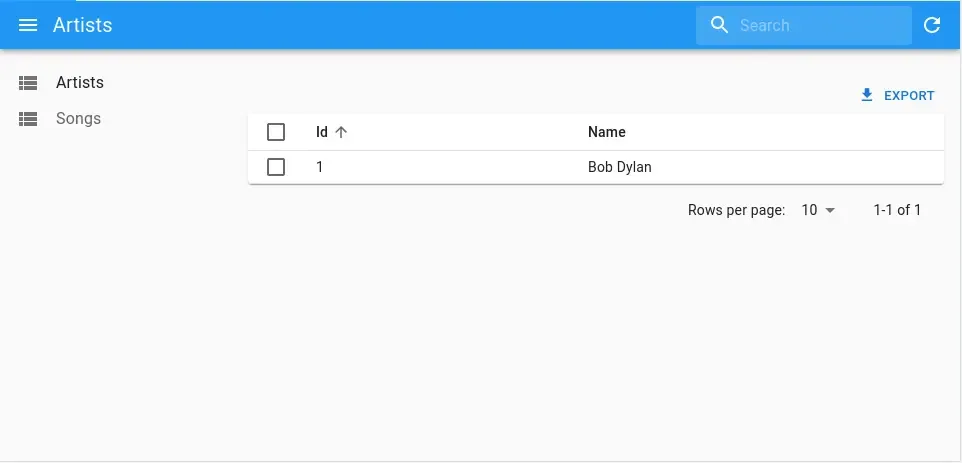
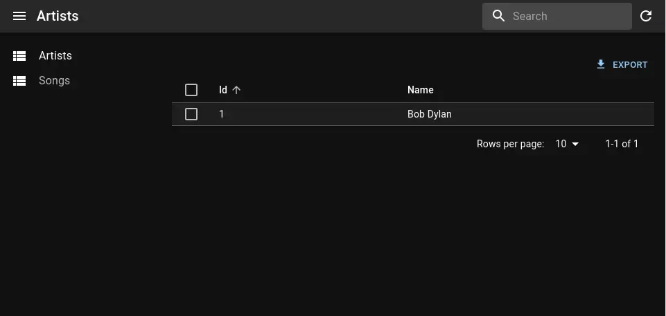
Nested Resource URLs
Developers have asked several times to be able to put resources in sub-paths, e.g. /users/:id/posts to display the posts of a user (instead of /posts?filter={userId:id}). This is now possible thanks to nested resources (check the selected menu and the breadcrumb):
You can nest resources directly in the <Admin>:
import { Admin, Resource } from "react-admin";import { Route } from "react-router-dom";
export const App = () => (  <Admin dataProvider={dataProvider}>    <Resource name="artists" list={ArtistList} edit={ArtistDetail}>      <Route path=":id/songs" element={<SongList />} />      <Route path=":id/songs/:songId" element={<SongDetail />} />    </Resource>  </Admin>);
The views for nested resources need a bit of extra work to grab the parameters from the URL via react-router’s useParams. For instance, for the songs list:
// in src/SongList.jsximport { List, Datagrid, TextField, useRecordContext } from "react-admin";import { useParams } from "react-router-dom";import { Button } from "@mui/material";
export const SongList = () => {  const { id } = useParams();  return (    <List resource="songs" filter={{ artistId: id }}>      <Datagrid rowClick="edit">        <TextField source="title" />        <DateField source="released" />        <TextField source="writer" />        <TextField source="producer" />        <TextField source="recordCompany" label="Label" />        <EditSongButton />      </Datagrid>    </List>  );};
const EditSongButton = () => {  const song = useRecordContext();  return (    <Button      component={Link}      to={`/artists/${song?.artist_id}/songs/${song?.id}`}      startIcon={<EditIcon />}    >      Edit    </Button>  );};
And for the edition view of a song:
// in src/SongDetail.jsximport { Edit, SimpleForm, TextInput } from "react-admin";import { useParams } from "react-router-dom";
export const SongDetail = () => {  const { id, songId } = useParams();  return (    <Edit resource="posts" id={songId} redirect={`/artists/${id}/songs`}>      <SimpleForm>        <TextInput source="title" />        <DateInput source="released" />        <TextInput source="writer" />        <TextInput source="producer" />        <TextInput source="recordCompany" label="Label" />      </SimpleForm>    </Edit>  );};
Nested resources need a breadcrumb to avoid confusing users. Fortunately, the <Breadcrumb> component now supports nested resources.
Miscellaneous Changes
- We’ve added a Features chapter to the documentation. It’s a great way to discover all that react-admin has to offer!
ra-data-localstoragenow reacts to changes made in another tab. This allows testing real-time collaboration features.useAuthStateanduseAuthenticatednow use react-query. This leads to reduced calls to theauthProvidermethods and brings a slight boost in navigation performance if yourauthProvideris slow.- You can now override the
hasEdit,hasCreate, andhasShowat the<Resource>level. <ExportButton>and<BulkExportButton>now accept ametaprop- Non-selectable datagrid rows now display a disabled checkbox rather than no checkbox at all
- Mutation callbacks (the functions returned by
useUpdate,useCreateanduseDelete) are now memoized, which should reduce the unwanted rerenders and give a small performance boost. <FormDataConsumer>is now generic - you can make its child function type-safe.
Conclusion
This post only covered some of the most significant changes. Since December, react-admin received a ton of small adjustments and bug fixes, both for the Open-Source and the Enterprise editions. Check the open-source changelog for the full list of 150+ changes since v4.6, and the EE modules documentation for the changelog of each individual package.
This post is also the opportunity to thank all the contributors who opened a bug report, a feature request, or a pull request to help us improve react-admin. This framework couldn’t exist without you ❤️!
We’re hard at work on improving react-admin even more. Stay tuned for more news in the coming months, and subscribe to our Discord server for fresh updates.

Authors
Full-stack web developer at marmelab, Gildas has a strong appetite for emerging technologies. If you want an informed opinion on a new library, ask him, he's probably used it on a real project already.