React Admin December 2022 Update

Back in September, we published a react-admin update blog post breaking down the new features brought to react-admin, our open-source frontend framework for building B2B applications on top of REST/GraphQL APIs.
Since then, we’ve added many more features to the framework. It’s been 3 months, so we’ve releases 3 minor versions: 4.4, 4.5 and 4.6.
Let’s dive a bit deeper into the most significant changes.
- Configurable components
- UI Changes
- Forms
- Lists
- Discord Server
- Documentation
- New Data Providers And Auth Providers
- Miscellaneous
- Better Support For Record Level Permissions
- Support The
metaParameter In Tree Components And Hooks - Add Ability To Refresh The User Identity In
useGetIdentity - Support
sort,filterAndqueryOptionsIn<ReferenceOneField> - Add Ability To Set Custom Routes As
<Resource>Children - Add
<Menu.ResourceItem>Component To Facilitate Menu Customization - Add Expand/Collapse All Toggle To
<Datagrid>Header - Specify Available Locales In
polyglotI18nProvider - Support
filterCallbackInuseList
Configurable Components
One of the major features that landed in react-admin v4.4 is the Configurable Components. With them, we want to provide end users with a way of customizing their app to their liking, without asking a developer to edit the code.
The idea is that some components now come with a Configurable counterpart, that lets an end user customize the way the component renders straight from the UI.
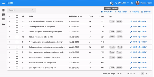
Just by clicking the <InspectorButton> (which you need to add to the <AppBar> of your <Layout>), users can select a Configurable component to reveal a small configuration panel called the Inspector. This panel displays a UI to modify the configurable properties of the component. Users can see the result directly and in real-time on the component, while the configuration is saved in the Store.
As of now, there are 4 configurable components already available:
<PageTitleConfigurable><SimpleListConfigurable><DatagridConfigurable><SimpleFormConfigurable>
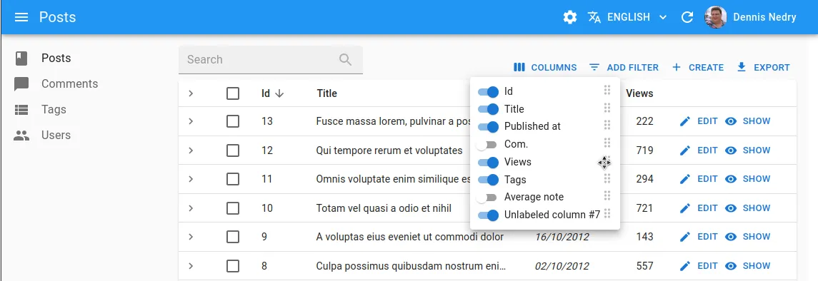
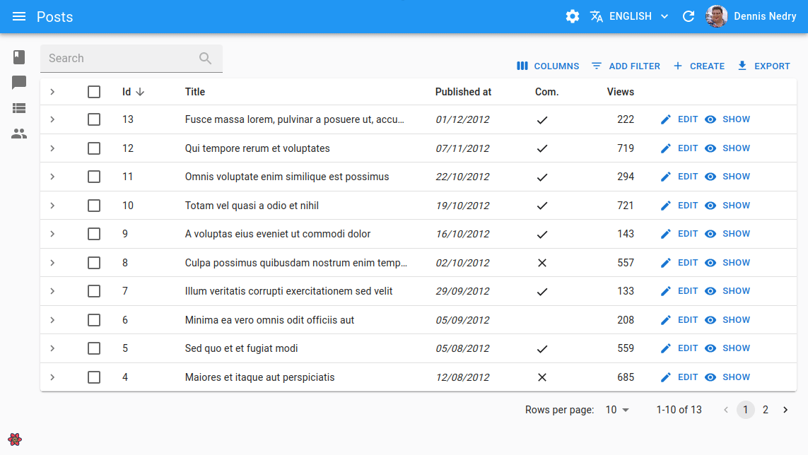
Let’s have a look at the <DatagridConfigurable> component to better understand the potential of this feature. This component displays a list of records, just like the <Datagrid> component, but also allows you to pick which columns to display, and also allows to reorder the columns.
To enable the Configurable abilities on a component that supports them, all you have to do is replace the component with its Configurable counterpart:
import {    List,   Datagrid,   DatagridConfigurable,    TextField,} from 'react-admin';
const PostList = () => (    <List>       <Datagrid>       <DatagridConfigurable>            <TextField source="id" />            <TextField source="title" />            <TextField source="author" />            <TextField source="year" />       </Datagrid>       </DatagridConfigurable>    </List>);
The Configurable Components mechanism has been built with extensibility in mind, so it’s easy to create your own Configurable Component (just have a look at how we built ours). Besides, you can expect more Configurable Components to be added to react-admin in the future, as we have more ideas!
Tip: If you want to add the ability to choose and reorder columns in a <Datagrid> without making it Configurable, you can add the <SelectColumnsButton> to your <List actions> to do just that!
<ContainerLayout> and <HorizontalMenu>
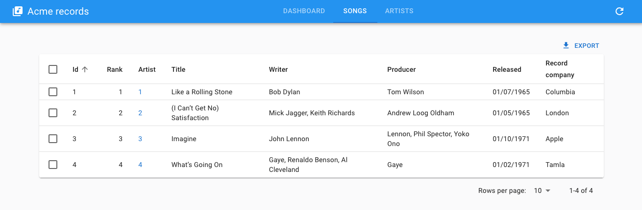
<ContainerLayout> is an alternative to react-admin’s <Layout> for applications with a limited number of resources. This layout replaces the sidebar menu with an AppBar menu and displays the content in a centered container.
To use it, you need to set <ContainerLayout> as the <Admin layout> prop value.
import { Admin, Resource } from "react-admin";import { ContainerLayout } from "@react-admin/ra-navigation";
export const App = () => (  <Admin dataProvider={dataProvider} layout={ContainerLayout}>    <Resource name="songs" list={SongList} />    <Resource name="artists" list={ArtistList} />  </Admin>);
<ContainerLayout> accepts the following props:
menu: The menu component to use. Defaults to<HorizontalMenu>.appBar: The component to use to render the top AppBar. Defaults to<Header>.toolbar: The buttons to render on the top right of the toolbar.maxWidth: The maximum width of the content<Container>. Defaults tomd.fixed: Whether the content<Container>should be fixed. Defaults to false.
By default, <ContainerLayout> renders one menu item per resource in the admin. To reorder the menu, omit resources, or add custom pages, pass a custom menu element to the menu prop. This element should be a <HorizontalMenu> component with <HorizontalMenu.Item> children. Each child should have a value corresponding to the application location of the target, and can have a to prop corresponding to the target location if different from the app location.
import {  Admin,  Resource,  CustomRoutes,  ListGuesser,  EditGuesser,} from "react-admin";import { Route } from "react-router-dom";import {  ContainerLayout,  HorizontalMenu,  useDefineAppLocation,} from "@react-admin/ra-navigation";
const Menu = () => (  <HorizontalMenu>    <HorizontalMenu.Item label="Dashboard" to="/" value="" />    <HorizontalMenu.Item label="Songs" to="/songs" value="songs" />    <HorizontalMenu.Item label="Artists" to="/artists" value="artists" />    <HorizontalMenu.Item label="Custom" to="/custom" value="custom" />  </HorizontalMenu>);
const Dashboard = () => <h1>Dashboard</h1>;const CustomPage = () => {  useDefineAppLocation("custom");  return <h1>Custom page</h1>;};
const MyLayout = (props) => <ContainerLayout {...props} menu={<Menu />} />;
export const App = () => (  <Admin dataProvider={dataProvider} layout={MyLayout} dashboard={Dashboard}>    <Resource name="songs" list={ListGuesser} edit={EditGuesser} />    <Resource name="artists" list={ListGuesser} edit={EditGuesser} />    <CustomRoutes>      <Route path="custom" element={<CustomPage />} />    </CustomRoutes>  </Admin>);
<ContainerLayout> and <HorizontalMenu> are only available to Enterprise Edition customers for now. Check the full documentation at @react-admin/ra-navigation.
Improved <SimpleFormIterator> UI
When using <SimpleFormIterator>, the UI was a bit scattered and inconsistent. With v4.4.0, we tried to improve this UI by making the style more uniform and moving the buttons closer to the inputs.
When used in combination with the inline prop, this makes for a much cleaner and more compact UI.
Of course, the inline prop remains optional, and you can still move the buttons at the end of the rows if you prefer, by setting the fullWidth prop.
Lastly, we created a new button to help remove all items at once, which will come in handy if you work with long arrays.
Thanks to Seojun-Park for providing this last feature.
Add <CSSBaseline> To The Default Layout
MUI’s <CSSBaseline> is crucial to get a good UI with react-admin, yet we never mentioned it in the documentation.
When doing our tests with the simple example, which uses <CSSBaseline>, we never realized that for most users that don’t have it, the UI is degraded.
For this reason, we decided to add it to the default <Layout>, so that it is enabled by default. This should result in better default margins.
Standalone Dialog Components
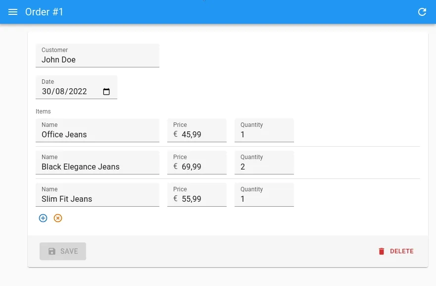
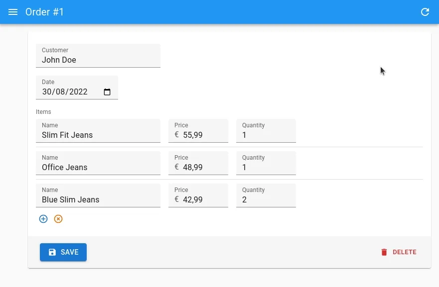
The Enterprise Edition of react-admin already offered Dialog Components, allowing to display a Dialog to Edit, Create or Show a record. We extended those components to allow for standalone usage, by creating specialized buttons - <CreateInDialogButton>, <EditInDialogButton> and <ShowInDialogButton> - allowing to open their respective Dialog Component, and responsible for managing their open/close state internally.
These buttons can for instance be used inside a form, to edit, create or show referenced records fetched with a <ReferenceManyField>.
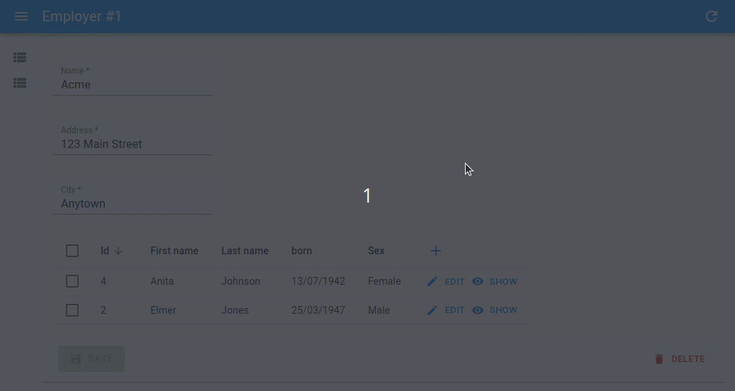
Here is how to use an <EditInDialogButton> inside a <Datagrid>:
import {  Datagrid,  ReferenceManyField,  Show,  SimpleForm,  SimpleShowLayout,  TextField,  TextInput,} from "react-admin";import { EditInDialogButton } from "@react-admin/ra-form-layout";
const CompanyShow = () => (  <Show>    <SimpleShowLayout>      <TextField source="name" />      <TextField source="address" />      <TextField source="city" />      <ReferenceManyField target="company_id" reference="employees">        <Datagrid>          <TextField source="first_name" />          <TextField source="last_name" />          <EditInDialogButton>            <SimpleForm>              <TextInput source="first_name" />              <TextInput source="last_name" />            </SimpleForm>          </EditInDialogButton>        </Datagrid>      </ReferenceManyField>    </SimpleShowLayout>  </Show>);
Tip: You can find a full example showing how to use all three buttons inside a <Datagrid> in the react-admin documentation.
Tip: You can also add a <CreateInDialogButton> next to an <AutocompleteInput>, to create a new option in the dropdown list.
<CreateInDialogButton>, <EditInDialogButton> and <ShowInDialogButton> are only available to Enterprise Edition customers for now. Check the full documentation at @react-admin/ra-form-layout.
Better Support For Empty Values In Inputs
With react-admin v4, one of the most impacting changes was the library used for forms management: react-final-form was replaced with react-hook-form. Among many other things, this changed the way values are sanitized before being sent to the dataProvider.
This turned out to be a pain point for a significant number of users. Indeed, null or undefined values got transformed into an empty string '', because of the way HTML inputs work (there is no such thing as null or undefined in HTML). This caused issues with some APIs that do not support this value, especially in the case of reference ids.
After some trial and error, we eventually came up with two solutions to deal with most use cases.
First, we made sure that all inputs now come with a default format and parse function:
- the
formatfunction transforms anynullorundefinedvalue to''(i.e. a valid HTML input value) - the
parsefunction transforms any''tonull
Besides, we also fixed an issue that prevented a parse function to return null.
Record Form State Form State Recordbefore update before change after change after update{ { { { id: 123, id: 123, id: 123, id: 123, name: 'foo', name: 'foo', name: 'bar', name: 'bar', body: 'baz', body: 'baz', body: '', body: null, user_id: null, user_id: '', user_id: '', user_id: null, post_id: '', post_id: '', post_id: null,} } } }Secondly, we introduced the sanitizeEmptyValues prop, as a means to add back the react-final-form’s flavored values sanitation.
This prop is optional. The main difference with the default parse function presented above, is that it will sanitize the values to undefined (instead of null) if the field did not yet have a value.
Record Form State Form State Recordbefore update before change after change after update{ { { { id: 123, id: 123, id: 123, id: 123, name: 'foo', name: 'foo', name: 'bar', name: 'bar', body: 'baz', body: 'baz', body: '', body: null, user_id: null, user_id: '', user_id: '', user_id: null, post_id: '', post_id: '',} } } }We are confident that these new defaults will allow for better compliance with most APIs. Of course, if you need more fine-grained control, you can always provide your own format and parse functions, or to leverage the transform prop.
useInfiniteGetList
A very common request we get from Enterprise Edition subscribers and community users, is to help them build an infinite list component, i.e. a component capable of fetching more records once a user scrolls down to the end of the list.

To make building such components easier, we released the useInfiniteGetList hook, which leverages react-query’s useInfiniteQuery hook.
It works in a similar way to the useGetList hook, but returns the following additional values:
fetchNextPagefetchPreviousPagehasNextPagehasPreviousPageisFetchingNextPageisFetchingPreviousPage
It can be used to fetch more records at the click of a button, or via a scroll listener.
import { useInfinteGetList } from "react-admin";
const LatestNews = () => {  const {    data,    total,    isLoading,    error,    hasNextPage,    isFetchingNextPage,    fetchNextPage,  } = useInfiniteGetList("posts", {    pagination: { page: 1, perPage: 10 },    sort: { field: "published_at", order: "DESC" },  });  if (isLoading) {    return <p>Loading</p>;  }  if (error) {    return <p>ERROR</p>;  }
  return (    <>      <ul>        {data?.pages.map((page) =>          page.data.map((post) => <li key={post.id}>{post.title}</li>),        )}      </ul>      {hasNextPage && (        <button disabled={isFetchingNextPage} onClick={() => fetchNextPage()}>          Next page        </button>      )}    </>  );};
Tip: You can find a full example showing how to use useInfiniteGetList with a scroll listener, leveraging the Intersection Observer API, in the react-admin documentation.
Discord Server
Another big announcement we made recently, was the promotion of the React Admin Discord channel.
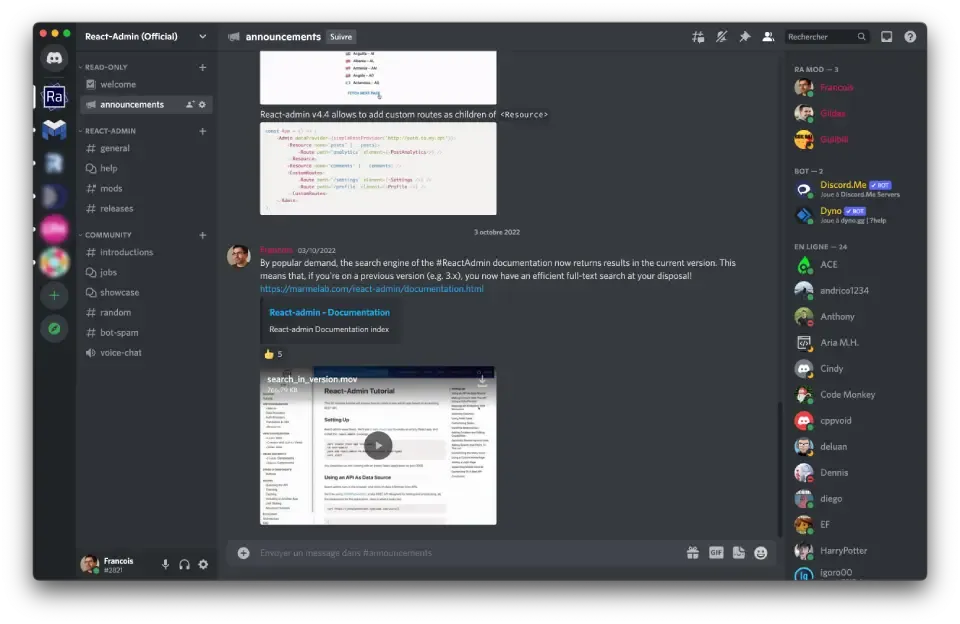
In this server, you will find:
- Support from the community
- Examples of other projects using react-admin
- Announcements and information about new releases
We’re also reducing our presence on Twitter in favor of this new channel, so the Discord server becomes the got-to place for all react-admin discussions. Please come by and say hi! We’re looking forward to seeing you there.
Improved Input Documentation Pages
A huge effort was made on the input docs, to make them easier to navigate, by ensuring they follow the same template and include dedicated sections to explain in detail how each prop work.
Have a look at the <FileInput> docs for example.
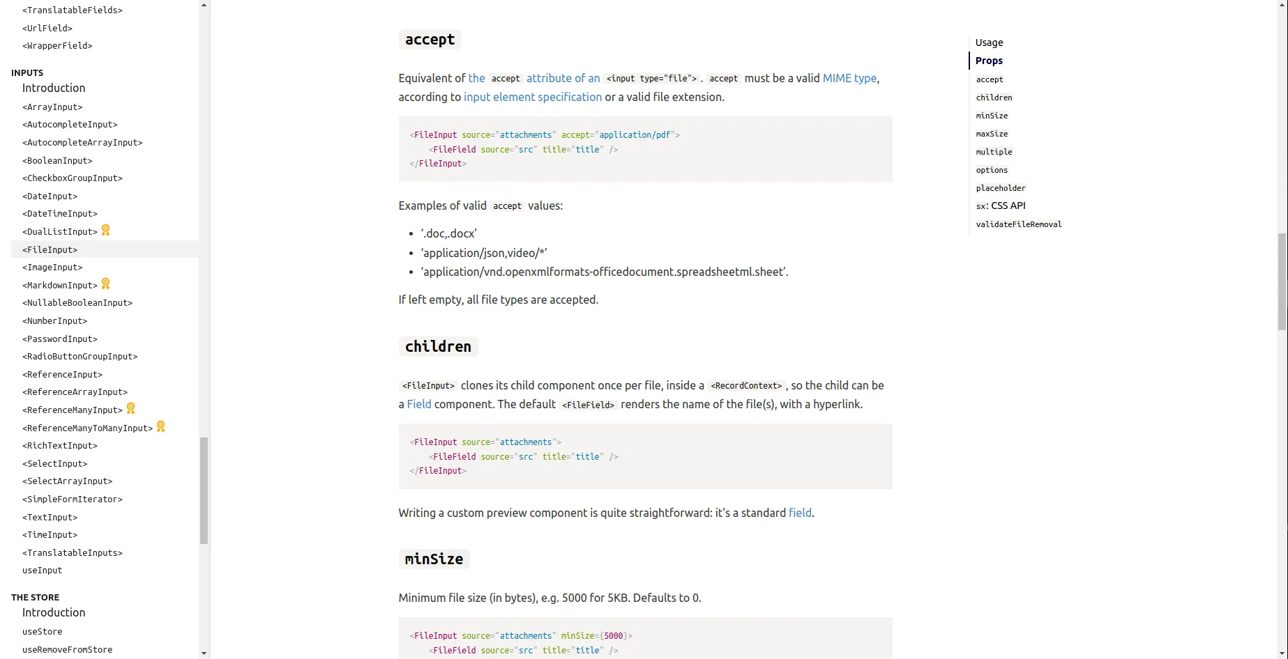
This greatly improves the developer experience when writing complex forms.
Use vite Instead Of create-react-app
Vite is an amazing tool that allows a drastic reduction of build and (re)deploy time on JS apps. Have a look at this article to learn more about why and how well it works.
React-admin is agnostic of the build tool you use for your own apps. But for the demo projects used to test new features, we’ve decided to migrate the react-admin Tutorial and the e-commerce Demo from Webpack to Vite.js. It already improved our productivity, and we recommend you do the same for your projects.
Besides, we also created a documentation page explaining how to set up a new react-admin app with Vite. Be sure to check it out!
Make The EE Components More Discoverable
We’ve pursued our efforts to improve the discoverability of Enterprise Edition features by adding dedicated sections about EE components in the main documentation. This includes documentation for the new components:
New Data Providers And Auth Providers
Two new Data Providers made their way to the react-admin docs:
- ra-data-local-forage: sponsored by marmelab, it allows to use localForage, which provides asynchronous storage (IndexedDB or WebSQL), as data provider
- ra-appwrite: created by g33kdev, it provides both a data provider and an auth provider to integrate Appwrite with react-admin
A new Auth Provider was also added to the list of supported backends:
- ra-keycloak: sponsored by marmelab, it allows to use a Keycloak server as auth provider
Lastly, we also improved the support for redirectTo responses in the auth provider hooks (useCheckAuth, useLogout and useLogoutIfAccessDenied), which should allow for more flexibility when implementing a new auth provider. In particular, this will open the door for easier setup of an Auth0 backend, which should arrive soon!
Better Support For Record-Level Permissions
ra-rbac is an Enterprise Edition package that offers many tools to implement Role-Based Access Control in your react-admin app.
With ra-rbac, you can implement restrictions for resources, pages, actions, and even specific fields.
In general, the permissions are described for each Role at the Resource level. Since ra-rbac v4.2.0, we extended the ability to define permissions at the Record level, too.
This allows for even more fine-grained permission rules, such as:
- Deny access for all posts, except if this post has the
visibilityfield equal to'public' - Deny access to the posts Edit page, except if the post has
user_idequal to123 - Only display the post’s
contentfield if the post hasallow_to_see_contentequal totrue

You can see these features in action in the ra-rbac package’s storybook (use the Guest role to see them).
Role-Based Access Control features are only available to Enterprise Edition customers for now. Check the full documentation at @react-admin/ra-rbac.
Support The meta Parameter In Tree Components And Hooks
The meta parameter is a great way to pass metadata to the API, e.g. to ask for embedded relationships or a subset of fields. That’s why we added the ability to specify a custom meta in <List>, <Show>, <Edit> and <Create> components directly since react-admin v4.2.
Following this logic, this feature is now also available in all the data provider methods of ra-tree, as well as in the <TreeWithDetails> component.
import React from 'react';import { SimpleForm, TextInput } from 'react-admin';import {    CreateNode,    EditNode,    EditNodeToolbar,    TreeWithDetails,} from '@react-admin/ra-tree';
// a Create view for a tree uses <CreateNode> instead of the standard <Create>const CategoriesCreate = () => (    <CreateNode>        <SimpleForm>            <TextInput source="name" />        </SimpleForm>    </CreateNode>);
// an Edit view for a tree uses <EditNode> instead of the standard <Edit>const CategoriesEdit = () => (    <EditNode>        <SimpleForm toolbar={<EditNodeToolbar />}>            <TextInput source="title" />        </SimpleForm>    </EditNode>);
// a List view for a tree uses <TreeWithDetails>export const CategoriesList = () => (    <TreeWithDetails        create={CategoriesCreate}        edit={CategoriesEdit}       meta={{ foo: 'bar' }}    />);
Add Ability To Refresh The User Identity In useGetIdentity
If your application contains a form letting the current user update their name and/or avatar, you must refresh the App bar, which displays this information, after the form is submitted.
It is currently cumbersome as it implies adding a context on top of the app. We solved this issue by rewriting our useGetIdentity hook to use react-query to fetch the auth provider. With this, you can now call the refresh() callback returned by useGetIdentity once the change has been successfully saved.
const IdentityForm = () => {  const { isLoading, error, identity, refetch } = useGetIdentity();  const [newIdentity, setNewIdentity] = useState("");
  if (isLoading) return <>Loading</>;  if (error) return <>Error</>;
  const handleChange = (event) => {    setNewIdentity(event.target.value);  };  const handleSubmit = (e) => {    e.preventDefault();    if (!newIdentity) return;    fetch("/update_identity", {      method: "POST",      headers: { "Content-Type": "application/json" },      body: JSON.stringify({ identity: newIdentity }),    }).then(() => {      // call authProvider.getIdentity() again and notify the listeners of the result,      // including the UserMenu in the AppBar      refetch();    });  };
  return (    <form onSubmit={handleSubmit}>      <input defaultValue={identity.fullName} onChange={handleChange} />      <input type="submit" value="Save" />    </form>  );};
Support sort, filter And queryOptions In <ReferenceOneField>
The <ReferenceOneField> component is a great way to display fields carried by a record with a one-to-one relationship with the current record.
const BookShow = () => ( <Show> <SimpleShowLayout> <TextField source="title" /> <DateField source="published_at" /> <ReferenceOneField label="Genre" reference="book_details" target="book_id" > <TextField source="genre" /> </ReferenceOneField> <ReferenceOneField label="ISBN" reference="book_details" target="book_id"> <TextField source="ISBN" /> </ReferenceOneField> </SimpleShowLayout> </Show>);But did you know you can also use <ReferenceOneField> to fetch just one record of a one-to-many relationship? This can be useful for instance to display the latest review on a book, or the latest order for a product.
Since v4.5.0, we now support a filter and a sort prop, that will help select the appropriate record to display.
const BookShow = () => ( <Show> <SimpleShowLayout> <TextField source="title" /> <DateField source="published_at" /> <ReferenceOneField label="Latest cool review" reference="book_reviews" target="book_id" sort={{ field: "createdAt", order: "DESC" }} filter={{ rating: 5 }} > <TextField source="title" /> </ReferenceOneField> </SimpleShowLayout> </Show>);Thanks to nicgirault for providing this feature.
Also, we added support for the queryOptions prop, which is super useful for customizing react-query options for a specific request, or as a handy way to pass a meta parameter.
export const QueryOptions = ({ dataProvider = defaultDataProvider }) => ( <Wrapper dataProvider={dataProvider}> <ReferenceOneField reference="book_details" target="book_id" queryOptions={{ meta: { foo: 'bar' } }} > <TextField source="ISBN" /> </ReferenceOneField> </Wrapper>);Add Ability To Set Custom Routes As <Resource> Children
React-admin already supports adding custom routes to your admin, like /settings or /profile.
Since v4.4.0, we also support adding custom routes as children of a <Resource>. This allows for routes like /posts/analytics. All you have to do is add a <Route> element as a child of a <Resource>.
import * as React from "react";import { Admin, Resource, CustomRoutes } from "react-admin";import { Route } from "react-router-dom";import simpleRestProvider from "ra-data-simple-rest";import posts, { PostAnalytics } from "./posts";import comments from "./comments";import Settings from "./Settings";import Profile from "./Profile";const App = () => ( <Admin dataProvider={simpleRestProvider("http://path.to.my.api")}> <Resource name="posts" {...posts}> <Route path="analytics" element={<PostAnalytics />} /> </Resource> <Resource name="comments" {...comments} /> <CustomRoutes> <Route path="/settings" element={<Settings />} /> <Route path="/profile" element={<Profile />} /> </CustomRoutes> </Admin>);export default App;Thanks to hiaselhans for providing this feature.
Add <Menu.ResourceItem> Component To Facilitate Menu Customization
Customizing the default menu items, for example, to add a link to a custom route, was a bit cumbersome as it required to copy and paste some boilerplate code from the default menu.
With v4.6.0, we introduced a new component to help build menu entries for resources: <Menu.ResourceItem>.
This component only needs to know the resource name, and will fetch the rest (link, primary text, icon) from the resources declaration. This makes the code simpler and easier to read.
import { Menu } from 'react-admin';
import BookIcon from '@mui/icons-material/Book';import ChatBubbleIcon from '@mui/icons-material/ChatBubble';import PeopleIcon from '@mui/icons-material/People';import LabelIcon from '@mui/icons-material/Label';
export const MyMenu = () => (    <Menu>        <Menu.DashboardItem />        <Menu.Item to="/posts" primaryText="Posts" leftIcon={<BookIcon />}/>        <Menu.Item to="/comments" primaryText="Comments" leftIcon={<ChatBubbleIcon />}/>        <Menu.Item to="/users" primaryText="Users" leftIcon={<PeopleIcon />}/>        <Menu.ResourceItem name="posts" />        <Menu.ResourceItem name="comments" >        <Menu.ResourceItem name="users" />        <Menu.Item to="/custom-route" primaryText="Miscellaneous" leftIcon={<LabelIcon />}/>    </Menu>);
Add Expand/Collapse All Toggle To <Datagrid> Header
The <Datagrid> component supports an expand prop, allowing to expand some rows to get more details about their content.
Since v4.4.0, we also support the ability to expand all rows at once, by clicking on the <ExpandAllButton> located in the <Datagrid> header.
Thanks to hiaselhans for this feature.
Specify Available Locales In polyglotI18nProvider
With v4.4.0, we simplified the setup needed to support multiple languages in your admin when using polyglotI18nProvider from ra-i18n-polyglot.
Previously, developers had to:
- instantiate the
polyglotI18nProviderby providing the translation keys and the default locale, and - create a custom App Bar containing the
<LocalesMenuButton>button, and provide it with the list of available locales.
// in src/MyAppBar.jsimport { LocalesMenuButton, AppBar } from "react-admin";import { Typography } from "@mui/material";export const MyAppBar = () => ( <AppBar> <Typography flex="1" variant="h6" id="react-admin-title" /> <LocalesMenuButton languages={[ { locale: "en", name: "English" }, { locale: "fr", name: "Français" }, ]} /> </AppBar>);Since v4.4.0, you can now directly provide the available locales to the polyglotI18nProvider. This removes the need to create a custom App Bar containing the <LocalesMenuButton> button, as it is included in the <Layout> by default, and will fetch the available locales automatically from the context.
// in src/i18nProvider.jsimport polyglotI18nProvider from 'ra-i18n-polyglot';import en from 'ra-language-english';import fr from 'ra-language-french';const translations = { en, fr };export const i18nProvider = polyglotI18nProvider( locale => translations[locale], 'en', // default locale [ { locale: 'en', name: 'English' }, { locale: 'fr', name: 'Français' } ],);// in src/App.jsimport { Admin } from 'react-admin';import { MyAppBar } from './MyAppBar';import { i18nProvider } from './i18nProvider';const MyLayout = (props) => <Layout {...props} appBar={MyAppBar} />;const App = () => ( <Admin i18nProvider={i18nProvider} dataProvider={dataProvider} layout={MyLayout} > ... </Admin>);Support filterCallback In useList
When working with local list data, react-admin provides the useList hook, which makes it easy to create a ListContext with callbacks to paginate, sort and filter the data locally.
While very convenient, this hook was still a bit limited in its ability to filter data, as it only supported filtering by exact value, or by an array of values.
React-admin v4.4.0 introduced the filterCallback parameter to the useList hook, that allows users to use a callback to filter records, hence removing this limitation completely. This allows for more complex filter operations, like ‘greater than’ or ‘not equal’, just to name a few.
const { data } = useList({ data: [ { id: 1, name: "Arnold" }, { id: 2, name: "Sylvester" }, { id: 3, name: "Jean-Claude" }, ], sort: { field: "name", order: "ASC" }, filterCallback: (record) => record.id > 1 && record.name !== "Jean-Claude",});// data will be// [// { id: 2, name: 'Sylvester' },// ]Thanks to oguhpereira for providing this feature.
Conclusion
Just like last time, that was a long post! And yet, we only covered some of the most significant changes. Since September, react-admin received a ton of small adjustments and bug fixes too, both for the Open-Source and the Enterprise editions. Check the open-source changelog for the full list of 150+ changes since v4.3, and the EE modules documentation for the changelog of each individual package.
This post is also the opportunity to thank all the contributors who opened a bug report, a feature request, or a pull request to help us improve react-admin. This framework couldn’t exist without you ❤️!
As always, we’re already working on improving react-admin even more. Stay tuned for more news in the coming months, or subscribe to our Discord server for fresh updates.

Authors
Full-stack web developer at marmelab, JB is a Software Engineer with a strong Java experience. He plays the piano and runs fast, and not only because he has long fingers and tall legs.