The Create and Edit Views
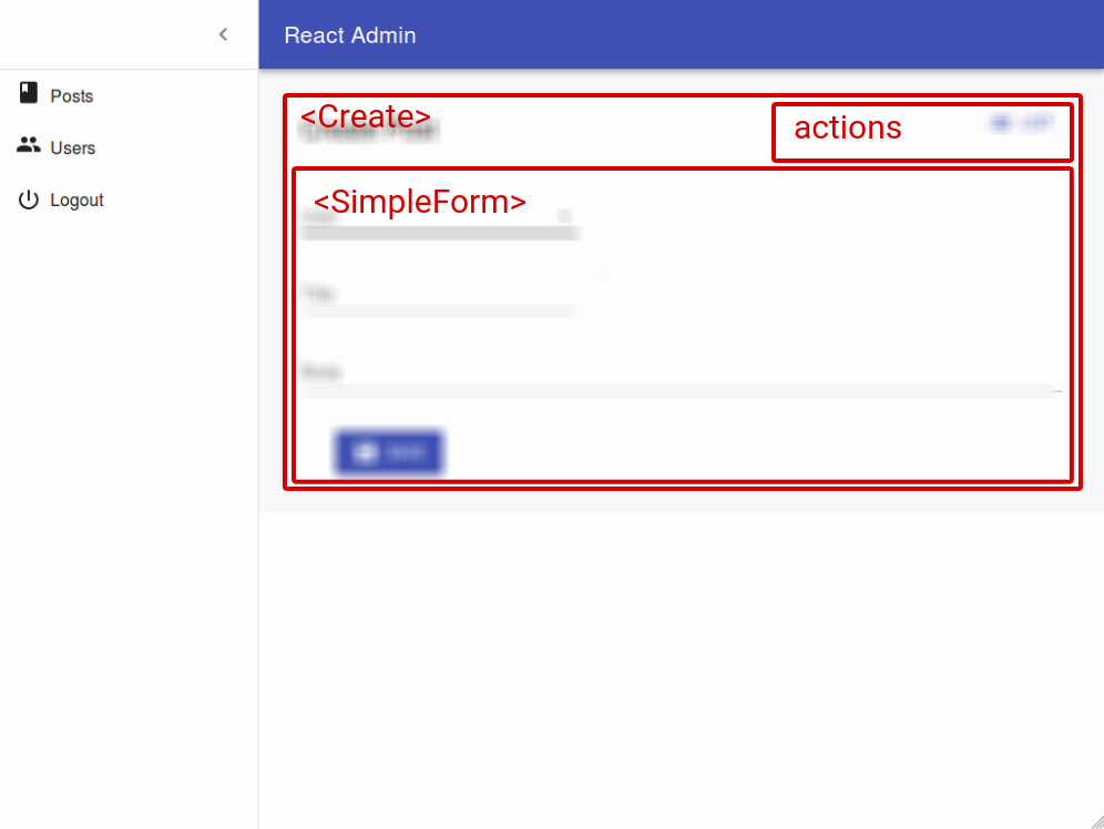
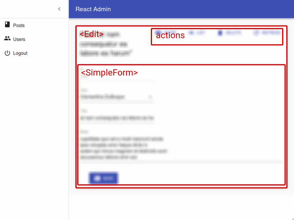
The Create and Edit views both display a form, initialized with an empty record (for the Create view) or with a record fetched from the API (for the Edit view). The <Create> and <Edit> components then delegate the actual rendering of the form to a form component - usually <SimpleForm>. This form component uses its children (<Input> components) to render each form input.
The <Create> and <Edit> components
The <Create> and <Edit> components render the page title and actions, and fetch the record from the data provider. They are not responsible for rendering the actual form - that’s the job of their child component (usually <SimpleForm>), to which they pass the record as prop.
Here are all the props accepted by the <Create> and <Edit> components:
Here is the minimal code necessary to display a form to create and edit comments:
// in src/App.js
import React from 'react';
import { Admin, Resource } from 'react-admin';
import jsonServerProvider from 'ra-data-json-server';
import { PostCreate, PostEdit } from './posts';
const App = () => (
<Admin dataProvider={jsonServerProvider('http://jsonplaceholder.typicode.com')}>
<Resource name="posts" create={PostCreate} edit={PostEdit} />
</Admin>
);
export default App;
// in src/posts.js
import React from 'react';
import { Create, Edit, SimpleForm, DisabledInput, TextInput, DateInput, LongTextInput, ReferenceManyField, Datagrid, TextField, DateField, EditButton } from 'react-admin';
import RichTextInput from 'ra-input-rich-text';
export const PostCreate = (props) => (
<Create {...props}>
<SimpleForm>
<TextInput source="title" />
<TextInput source="teaser" options={{ multiLine: true }} />
<RichTextInput source="body" />
<DateInput label="Publication date" source="published_at" defaultValue={new Date()} />
</SimpleForm>
</Create>
);
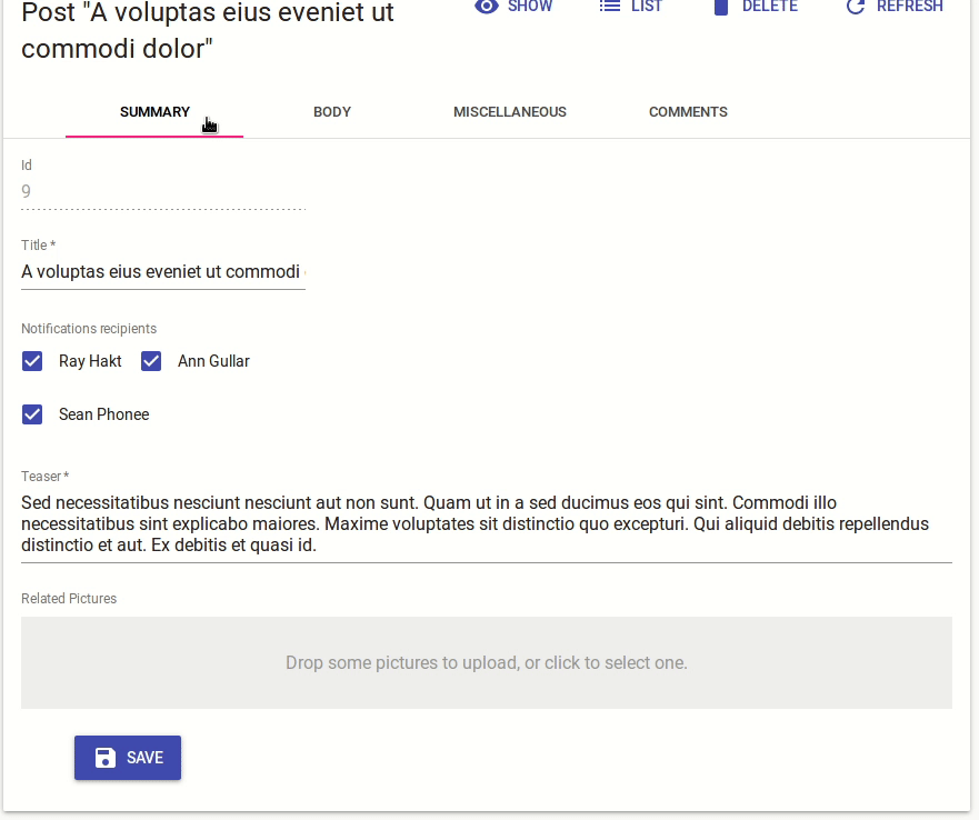
export const PostEdit = (props) => (
<Edit title={<PostTitle />} {...props}>
<SimpleForm>
<DisabledInput label="Id" source="id" />
<TextInput source="title" validate={required()} />
<LongTextInput source="teaser" validate={required()} />
<RichTextInput source="body" validate={required()} />
<DateInput label="Publication date" source="published_at" />
<ReferenceManyField label="Comments" reference="comments" target="post_id">
<Datagrid>
<TextField source="body" />
<DateField source="created_at" />
<EditButton />
</Datagrid>
</ReferenceManyField>
</SimpleForm>
</Edit>
);
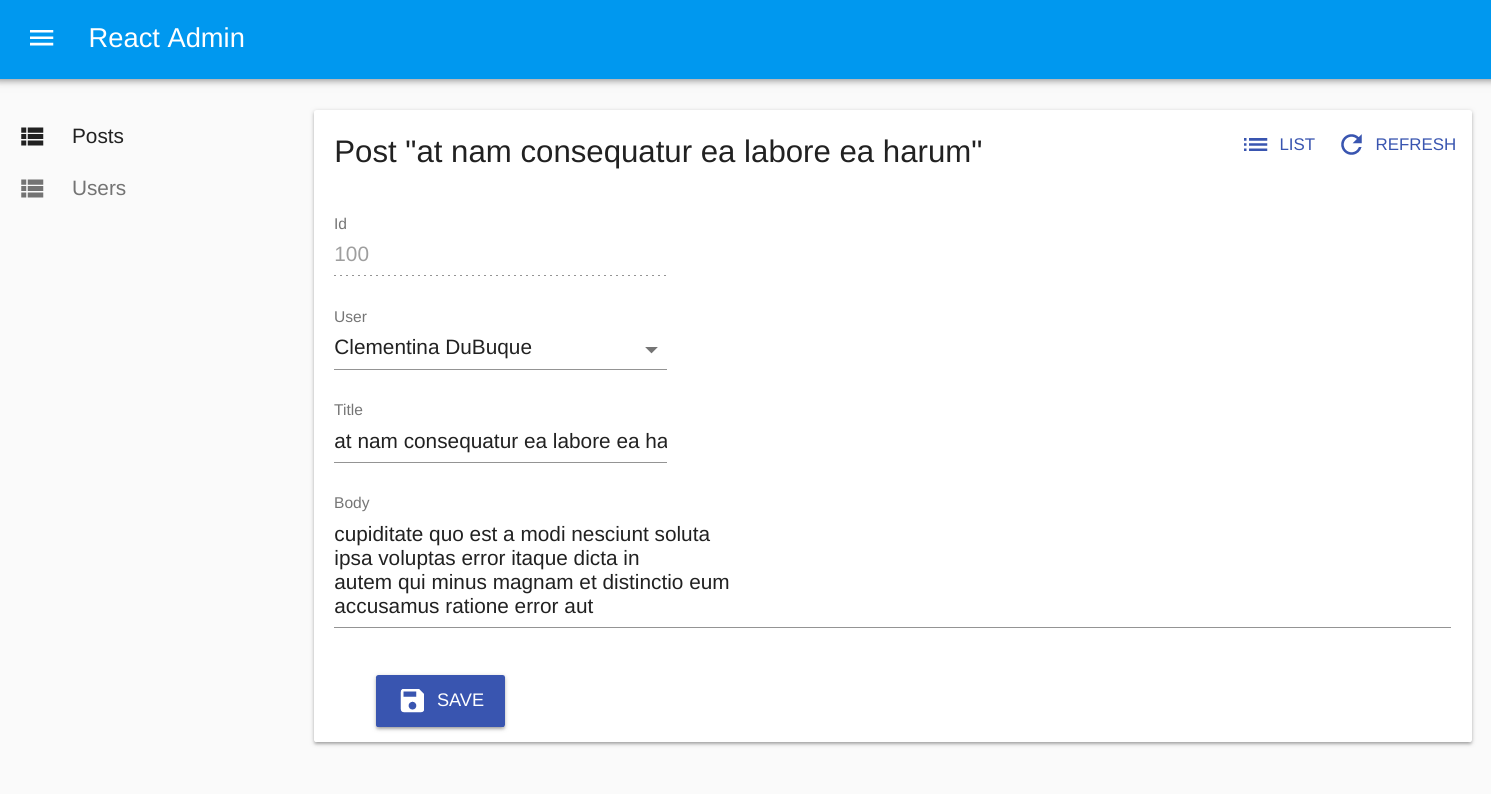
That’s enough to display the post edit form:
Tip: You might find it cumbersome to repeat the same input components for both the <Create> and the <Edit> view. In practice, these two views almost never have exactly the same form inputs. For instance, in the previous snippet, the <Edit> views shows related comments to the current post, which makes no sense for a new post. Having two separate sets of input components for the two views is therefore a deliberate choice. However, if you have the same set of input components, export them as a custom Form component to avoid repetition.
<Create> accepts a record prop, to initialize the form based on an value object.
Page Title
By default, the title for the Create view is “Create [resource_name]”, and the title for the Edit view is “Edit [resource_name] #[record_id]”.
You can customize this title by specifying a custom title prop:
export const PostEdit = (props) => (
    <Edit title="Post edition" {...props}>
        ...
    </Edit>
);
More interestingly, you can pass a component as title. React-admin clones this component and, in the <EditView>, injects the current record. This allows to customize the title according to the current record:
const PostTitle = ({ record }) => {
    return <span>Post {record ? `"${record.title}"` : ''}</span>;
};
export const PostEdit = (props) => (
    <Edit title={<PostTitle />} {...props}>
        ...
    </Edit>
);
Actions
You can replace the list of default actions by your own element using the actions prop:
import Button from '@material-ui/core/Button';
import { CardActions, ShowButton } from 'react-admin';

const PostEditActions = ({ basePath, data, resource }) => (
    <CardActions>
        <ShowButton basePath={basePath} record={data} />
        {/* Add your custom actions */}
        <Button color="primary" onClick={customAction}>Custom Action</Button>
    </CardActions>
);

export const PostEdit = (props) => (
    <Edit actions={<PostEditActions />} {...props}>
        ...
    </Edit>
);
Aside component
You may want to display additional information on the side of the form. Use the aside prop for that, passing the component of your choice:
const Aside = () => (
    <div style={{ width: 200, margin: '1em' }}>
        <Typography variant="title">Post details</Typography>
        <Typography variant="body1">
            Posts will only be published one an editor approves them
        </Typography>
    </div>
);

const PostEdit = props => (
    <Edit aside={<Aside />} {...props}>
        ...
    </Edit>
The aside component receives the same props as the Edit or Create child component: basePath, record, resource, and version. That means you can display non-editable details of the current record in the aside component:
const Aside = ({ record }) => (
    <div style={{ width: 200, margin: '1em' }}>
        <Typography variant="title">Post details</Typography>
        {record && (
            <Typography variant="body1">
                Creation date: {record.createdAt}
            </Typography>
        )}
    </div>
);
Tip: Always test that the record is defined before using it, as react-admin starts rendering the UI before the API call is over.
Undoable
By default, the Save and Delete actions are undoable, i.e. react-admin only sends the related request to the data provider after a short delay, during which the user can cancel the action. This is part of the “optimistic rendering” strategy of react-admin ; it makes the user interactions more reactive.
You can disable this behavior by setting undoable={false}. With that setting, clicking on the Delete button displays a confirmation dialog. Both the Save and the Delete actions become blocking, and delay the refresh of the screen until the data provider responds.
const PostEdit = props => (
    <Edit undoable={false} {...props}>
        ...
    </Edit>
Tip: If you want a confirmation dialog for the Delete button but don’t mind undoable Edits, then pass a custom toolbar to the form, as follows:
import {
    Toolbar,
    SaveButton,
    DeleteButton,
    Edit,
    SimpleForm,
} from 'react-admin';
import { withStyles } from '@material-ui/core';

const toolbarStyles = {
    toolbar: {
        display: 'flex',
        justifyContent: 'space-between',
    },
};

const CustomToolbar = withStyles(toolbarStyles)(props => (
    <Toolbar {...props}>
        <SaveButton />
        <DeleteButton undoable={false} />
    </Toolbar>
));

const PostEdit = props => (
    <Edit {...props}>
        <SimpleForm toolbar={<CustomToolbar />}>
            ...
        </SimpleForm>
    </Edit>
Prefilling a <Create> Record
You may need to prepopulate a record based on another one. For that use case, use the <CloneButton> component. It expects a record and a basePath (usually injected to children of <Datagrid>, <SimpleForm>, <SimpleShowLayout>, etc.), so it’s as simple to use as a regular field or input.
For instance, to allow cloning all the posts from the list:
import { List, Datagrid, TextField, CloneButton } from 'react-admin';

const PostList = props => (
    <List {...props}>
        <Datagrid>
            <TextField source="title" />
            <CloneButton />
        </Datagrid>
    </List>
)
Alternately, you may need to prepopulate a record based on a related record. For instance, in a PostList component, you may want to display a button to create a comment related to the current post. Clicking on that button would lead to a CommentCreate page where the post_id is preset to the id of the Post.
Note <CloneButton> is designed to be used in an edit view <Actions> component, not inside a <Toolbar>. The Toolbar is basically for submitting the form, not for going to another resource.
By default, the <Create> view starts with an empty record. However, if the location object (injected by react-router) contains a record in its state, the <Create> view uses that record instead of the empty object. That’s how the <CloneButton> works behind the hood.
That means that if you want to create a link to a creation form, presetting some values, all you have to do is to set the location state. React-router provides the <Link> component for that:
import Button from '@material-ui/core/Button';
import { Link } from 'react-router-dom';

const CreateRelatedCommentButton = ({ record }) => (
    <Button
        component={Link}
        to={{
            pathname: '/comments/create',
            state: { record: { post_id: record.id } },
        }}
    >
        Write a comment for that post
    </Button>
);

export default PostList = props => (
    <List {...props}>
        <Datagrid>
            ...
            <CreateRelatedCommentButton />
        </Datagrid>
    </List>
)
Tip: To style the button with the main color from the material-ui theme, use the Link component from the react-admin package rather than the one from react-router-dom.
Tip: The <Create> component also watches the location.search (the query string in the URL) in addition to location.state (a cross-page message hidden in the router memory). So the CreateRelatedCommentButton could, in theory, be written as:
import Button from '@material-ui/core/Button';
import { Link } from 'react-router-dom';

const CreateRelatedCommentButton = ({ record }) => (
    <Button
        component={Link}
        to={{
            pathname: '/comments/create',
            search: '?post_id=' + record.id,
        }}
    >
        Write a comment for that post
    </Button>
);
However, this will only work if the post ids are typed as strings in the store. That’s because the query string ?post_id=123, once deserialized, reads as { post_id: '123' } and not { post_id: 123 }. Since the <SelectInput> uses strict equality to check the selected option comparing the post_id '123' from the URL with values like 123 in the choices will fail.
So prefer location.state instead of location.search when you can, or use custom selection components.
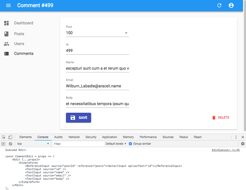
The <EditGuesser> component
Instead of a custom Edit, you can use the EditGuesser to determine which inputs to use based on the data returned by the API.
// in src/App.js
import React from 'react';
import { Admin, Resource, EditGuesser } from 'react-admin';
import jsonServerProvider from 'ra-data-json-server';

const App = () => (
    <Admin dataProvider={jsonServerProvider('http://jsonplaceholder.typicode.com')}>
        <Resource name="posts" edit={EditGuesser} />
    </Admin>
);
Just like Edit, EditGuesser fetches the data. It then analyzes the response, and guesses the inputs it should use to display a basic form with the data. It also dumps the components it has guessed in the console, where you can copy it into your own code. Use this feature to quickly bootstrap an Edit on top of an existing API, without adding the inputs one by one.
React-admin provides guessers for the List view (ListGuesser), the Edit view (EditGuesser), and the Show view (ShowGuesser).
Tip: Do not use the guessers in production. They are slower than manually-defined components, because they have to infer types based on the content. Besides, the guesses are not always perfect.
The <SimpleForm> component
The <SimpleForm> component receives the record as prop from its parent component. It is responsible for rendering the actual form. It is also responsible for validating the form data. Finally, it receives a handleSubmit function as prop, to be called with the updated record as argument when the user submits the form.
The <SimpleForm> renders its child components line by line (within <div> components). It uses redux-form.
By default the <SimpleForm> submits the form when the user presses ENTER. If you want
to change this behaviour you can pass false for the submitOnEnter property, and the user will only be able to submit by pressing the save button. This can be useful e.g. if you have an input widget using ENTER for a special function.
Here are all the props accepted by the <SimpleForm> component:
defaultValuevalidatesubmitOnEnterredirecttoolbarsave: The function invoked when the form is submitted. This is passed automatically byreact-adminwhen the form component is used insideCreateandEditcomponents.saving: A boolean indicating whether a save operation is ongoing. This is passed automatically byreact-adminwhen the form component is used insideCreateandEditcomponents.form: The name of theredux-form. It defaults torecord-formand should only be modified when using theSimpleFormoutside of aCreateorEditcomponent.
export const PostCreate = (props) => (
    <Create {...props}>
        <SimpleForm>
            <TextInput source="title" />
            <RichTextInput source="body" />
            <NumberInput source="nb_views" />
        </SimpleForm>
    </Create>
);
The <TabbedForm> component
Just like <SimpleForm>, <TabbedForm> receives the record prop, renders the actual form, and handles form validation on submit. However, the <TabbedForm> component renders inputs grouped by tab. The tabs are set by using <FormTab> components, which expect a label and an icon prop.
By default the <TabbedForm> submits the form when the user presses ENTER, if you want
to change this behaviour you can pass false for the submitOnEnter property.
Here are all the props accepted by the <TabbedForm> component:
defaultValuevalidatesubmitOnEnterredirecttoolbarsave: The function invoked when the form is submitted. This is passed automatically byreact-adminwhen the form component is used insideCreateandEditcomponents.saving: A boolean indicating whether a save operation is ongoing. This is passed automatically byreact-adminwhen the form component is used insideCreateandEditcomponents.form: The name of theredux-form. It defaults torecord-formand should only be modified when using theTabbedFormoutside of aCreateorEditcomponent.
import { TabbedForm, FormTab } from 'react-admin'

export const PostEdit = (props) => (
    <Edit {...props}>
        <TabbedForm>
            <FormTab label="summary">
                <DisabledInput label="Id" source="id" />
                <TextInput source="title" validate={required()} />
                <LongTextInput source="teaser" validate={required()} />
            </FormTab>
            <FormTab label="body">
                <RichTextInput source="body" validate={required()} addLabel={false} />
            </FormTab>
            <FormTab label="Miscellaneous">
                <TextInput label="Password (if protected post)" source="password" type="password" />
                <DateInput label="Publication date" source="published_at" />
                <NumberInput source="average_note" validate={[ number(), minValue(0) ]} />
                <BooleanInput label="Allow comments?" source="commentable" defaultValue />
                <DisabledInput label="Nb views" source="views" />
            </FormTab>
            <FormTab label="comments">
                <ReferenceManyField reference="comments" target="post_id" addLabel={false}>
                    <Datagrid>
                        <TextField source="body" />
                        <DateField source="created_at" />
                        <EditButton />
                    </Datagrid>
                </ReferenceManyField>
            </FormTab>
        </TabbedForm>
    </Edit>
);
To style the tabs, the <FormTab> component accepts two props:
classNameis passed to the tab headercontentClassNameis passed to the tab content
Default Values
To define default values, you can add a defaultValue prop to form components (<SimpleForm>, <Tabbedform>, etc.), or add a defaultValue to individual input components. Let’s see each of these options.
Global Default Value
The value of the form defaultValue prop can be an object, or a function returning an object, specifying default values for the created record. For instance:
const postDefaultValue = { created_at: new Date(), nb_views: 0 };
export const PostCreate = (props) => (
    <Create {...props}>
        <SimpleForm defaultValue={postDefaultValue}>
            <TextInput source="title" />
            <RichTextInput source="body" />
            <NumberInput source="nb_views" />
        </SimpleForm>
    </Create>
);
Tip: You can include properties in the form defaultValue that are not listed as input components, like the created_at property in the previous example.
Per Input Default Value
Alternatively, you can specify a defaultValue prop directly in <Input> components. Just like for form-level default values, an input-level default value can be a scalar, or a function returning a scalar. React-admin will merge the input default values with the form default value (input > form):
export const PostCreate = (props) => (
    <Create {...props}>
        <SimpleForm>
            <DisabledInput source="id" defaultValue={() => uuid()}/>
            <TextInput source="title" />
            <RichTextInput source="body" />
            <NumberInput source="nb_views" defaultValue={0} />
        </SimpleForm>
    </Create>
);
Validation
React-admin relies on redux-form for the validation.
To validate values submitted by a form, you can add a validate prop to the form component, to individual inputs, or even mix both approaches.
Global Validation
The value of the form validate prop must be a function taking the record as input, and returning an object with error messages indexed by field. For instance:
const validateUserCreation = (values) => {
    const errors = {};
    if (!values.firstName) {
        errors.firstName = ['The firstName is required'];
    }
    if (!values.age) {
        errors.age = ['The age is required'];
    } else if (values.age < 18) {
        errors.age = ['Must be over 18'];
    }
    return errors
};

export const UserCreate = (props) => (
    <Create {...props}>
        <SimpleForm validate={validateUserCreation}>
            <TextInput label="First Name" source="firstName" />
            <TextInput label="Age" source="age" />
        </SimpleForm>
    </Create>
);
Tip: The props you pass to <SimpleForm> and <TabbedForm> end up as reduxForm() parameters. This means that, in addition to validate, you can also pass warn or asyncValidate functions. Read the reduxForm() documentation for details.
Per Input Validation: Built-in Field Validators
Alternatively, you can specify a validate prop directly in <Input> components, taking either a function, or an array of functions. React-admin already bundles a few validator functions, that you can just require, and use as input-level validators:
required(message)if the field is mandatory,minValue(min, message)to specify a minimum value for integers,maxValue(max, message)to specify a maximum value for integers,minLength(min, message)to specify a minimum length for strings,maxLength(max, message)to specify a maximum length for strings,number(message)to check that the input is a valid number,email(message)to check that the input is a valid email address,regex(pattern, message)to validate that the input matches a regex,choices(list, message)to validate that the input is within a given list,
Example usage:
import {
    required,
    minLength,
    maxLength,
    minValue,
    maxValue,
    number,
    regex,
    email,
    choices
} from 'react-admin';

const validateFirstName = [required(), minLength(2), maxLength(15)];
const validateEmail = email();
const validateAge = [number(), minValue(18)];
const validateZipCode = regex(/^\d{5}$/, 'Must be a valid Zip Code');
const validateSex = choices(['m', 'f'], 'Must be Male or Female');

export const UserCreate = (props) => (
    <Create {...props}>
        <SimpleForm>
            <TextInput label="First Name" source="firstName" validate={validateFirstName} />
            <TextInput label="Email" source="email" validate={validateEmail} />
            <TextInput label="Age" source="age" validate={validateAge}/>
            <TextInput label="Zip Code" source="zip" validate={validateZipCode}/>
            <SelectInput label="Sex" source="sex" choices={[
                { id: 'm', name: 'Male' },
                { id: 'f', name: 'Female' },
            ]} validate={validateSex}/>
        </SimpleForm>
    </Create>
);
Tip: If you pass a function as a message, react-admin calls this function with { args, value, values,translate, ...props } as argument. For instance:
const message = ({ translate }) => translate('myroot.validation.email_invalid');
const validateEmail = email(message);
Per Input Validation: Custom Function Validator
You can also define your own validator functions. These functions should return undefined when there is no error, or an error string.
const required = (message = 'Required') =>
    value => value ? undefined : message;
const maxLength = (max, message = 'Too short') =>
    value => value && value.length > max ? message : undefined;
const number = (message = 'Must be a number') =>
    value => value && isNaN(Number(value)) ? message : undefined;
const minValue = (min, message = 'Too small') =>
    value => value && value < min ? message : undefined;

const ageValidation = (value, allValues) => {
    if (!value) {
        return 'The age is required';
    }
    if (value < 18) {
        return 'Must be over 18';
    }
    return [];
}

const validateFirstName = [required(), maxLength(15)];
const validateAge = [required(), number(), ageValidation];

export const UserCreate = (props) => (
    <Create {...props}>
        <SimpleForm>
            <TextInput label="First Name" source="firstName" validate={validateFirstName} />
            <TextInput label="Age" source="age" validate={validateAge}/>
        </SimpleForm>
    </Create>
);
React-admin will combine all the input-level functions into a single function looking just like the previous one.
Input validation functions receive the current field value, and the values of all fields of the current record. This allows for complex validation scenarios (e.g. validate that two passwords are the same).
Tip: Validator functions receive the form props as third parameter, including the translate function. This lets you build internationalized validators:
const required = (message = 'myroot.validation.required') =>
    (value, allValues, props) => value ? undefined : props.translate(message);
Tip: Make sure to define validation functions or array of functions in a variable, instead of defining them directly in JSX. This can result in a new function or array at every render, and trigger infinite rerender.
const validateStock = [required(), number(), minValue(0)];

export const ProductEdit = ({ ...props }) => (
    <Edit {...props}>
        <SimpleForm defaultValue={{ stock: 0 }}>
            ...
            {/* do this */}
            <NumberInput source="stock" validate={validateStock} />
            {/* don't do that */}
            <NumberInput source="stock" validate={[required(), number(), minValue(0)]} />
            ...
        </SimpleForm>
    </Edit>
);
Tip: The props of your Input components are passed to a redux-form <Field> component. So in addition to validate, you can also use warn.
Tip: You can use both Form validation and input validation.
Submit On Enter
By default, pressing ENTER in any of the form fields submits the form - this is the expected behavior in most cases. However, some of your custom input components (e.g. Google Maps widget) may have special handlers for the ENTER key. In that case, to disable the automated form submission on enter, set the submitOnEnter prop of the form component to false:
export const PostEdit = (props) => (
    <Edit {...props}>
        <SimpleForm submitOnEnter={false}>
            ...
        </SimpleForm>
    </Edit>
);
Redirection After Submission
By default:
- Submitting the form in the
<Create>view redirects to the<Edit>view - Submitting the form in the
<Edit>view redirects to the<List>view
You can customize the redirection by setting the redirect prop of the form component. Possible values are “edit”, “show”, “list”, and false to disable redirection. You may also specify a custom path such as /my-custom-route. For instance, to redirect to the <Show> view after edition:
export const PostEdit = (props) => (
    <Edit {...props}>
        <SimpleForm redirect="show">
            ...
        </SimpleForm>
    </Edit>
);
You can also pass a custom route (e.g. “/home”) or a function as redirect prop value. For example, if you want to redirect to a page related to the current object:
// redirect to the related Author show page
const redirect = (basePath, id, data) => `/author/${data.author_id}/show`;

export const PostEdit = (props) => {
    <Edit {...props}>
        <SimpleForm redirect={redirect}>
            ...
        </SimpleForm>
    </Edit>
);
This affects both the submit button, and the form submission when the user presses ENTER in one of the form fields.
Toolbar
At the bottom of the form, the toolbar displays the submit button. You can override this component by setting the toolbar prop, to display the buttons of your choice.
The most common use case is to display two submit buttons in the <Create> view:
- one that creates and redirects to the
<Show>view of the new resource, and - one that redirects to a blank
<Create>view after creation (allowing bulk creation)
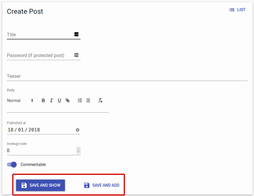
For that use case, use the <SaveButton> component with a custom redirect prop:
import { Create, SimpleForm, SaveButton, Toolbar } from 'react-admin';

const PostCreateToolbar = props => (
    <Toolbar {...props} >
        <SaveButton
            label="post.action.save_and_show"
            redirect="show"
            submitOnEnter={true}
        />
        <SaveButton
            label="post.action.save_and_add"
            redirect={false}
            submitOnEnter={false}
            variant="flat"
        />
    </Toolbar>
);

export const PostCreate = (props) => (
    <Create {...props}>
        <SimpleForm toolbar={<PostCreateToolbar />} redirect="show">
            ...
        </SimpleForm>
    </Create>
);
Another use case is to remove the <DeleteButton> from the toolbar in an edit view. In that case, create a custom toolbar containing only the <SaveButton> as child;
import { Edit, SimpleForm, SaveButton, Toolbar } from 'react-admin';

const PostEditToolbar = props => (
    <Toolbar {...props} >
        <SaveButton />
    </Toolbar>
);

export const PostEdit = (props) => (
    <Edit {...props}>
        <SimpleForm toolbar={<PostEditToolbar />}>
            ...
        </SimpleForm>
    </Edit>
);
Here are the props received by the Toolbar component when passed as the toolbar prop of the SimpleForm or TabbedForm components:
handleSubmitWithRedirect: The function to call in order to submit the form. It accepts a single parameter overriding the form’s default redirect.handleSubmitwhich is the same prop as inreact-forminvalid: A boolean indicating whether the form is invalidpristine: A boolean indicating whether the form is pristine (eg: no inputs have been changed yet)redirect: The default form’s redirectsaving: A boolean indicating whether a save operation is ongoing.submitOnEnter: A boolean indicating whether the form should be submitted when pressingenter
Tip: Use react-admin’s <Toolbar> component instead of material-ui’s <Toolbar> component. The former builds up on the latter, and adds support for an alternative mobile layout (and is therefore responsive).
Tip: Don’t forget to also set the redirect prop of the Form component to handle submission by the ENTER key.
Tip: To alter the form values before submitting, you should use the handleSubmit prop. See Altering the Form Values before Submitting for more information and examples.
Customizing Input Container Styles
The input components are wrapped inside a div to ensure a good looking form by default. You can pass a formClassName prop to the input components to customize the style of this div. For example, here is how to display two inputs on the same line:
const styles = {
    inlineBlock: { display: 'inline-flex', marginRight: '1rem' },
};
export const UserEdit = withStyles(styles)(({ classes, ...props }) => (
    <Edit {...props}>
        <SimpleForm>
            <TextInput source="first_name" formClassName={classes.inlineBlock} />
            <TextInput source="last_name" formClassName={classes.inlineBlock} />
            {/* This input will be display below the two first ones */}
            <TextInput source="email" type="email" />
        </SimpleForm>
    </Edit>
Displaying Fields or Inputs depending on the user permissions
You might want to display some fields, inputs or filters only to users with specific permissions. Those permissions are retrieved for each route and will provided to your component as a permissions prop.
Each route will call the authProvider with the AUTH_GET_PERMISSIONS type and some parameters including the current location and route parameters. It’s up to you to return whatever you need to check inside your component such as the user’s role, etc.
Here’s an example inside a Create view with a SimpleForm and a custom Toolbar:
const UserCreateToolbar = ({ permissions, ...props }) =>
    <Toolbar {...props}>
        <SaveButton
            label="user.action.save_and_show"
            redirect="show"
            submitOnEnter={true}
        />
        {permissions === 'admin' &&
            <SaveButton
                label="user.action.save_and_add"
                redirect={false}
                submitOnEnter={false}
                variant="flat"
            />}
    </Toolbar>;

export const UserCreate = ({ permissions, ...props }) =>
    <Create {...props}>
        <SimpleForm
            toolbar={<UserCreateToolbar permissions={permissions} />}
            defaultValue={{ role: 'user' }}
        >
            <TextInput source="name" validate={[required()]} />
            {permissions === 'admin' &&
                <TextInput source="role" validate={[required()]} />}
        </SimpleForm>
    </Create>;
Tip: Note how the permissions prop is passed down to the custom toolbar component.
This also works inside an Edition view with a TabbedForm, and you can hide a FormTab completely:
export const UserEdit = ({ permissions, ...props }) =>
    <Edit title={<UserTitle />} {...props}>
        <TabbedForm defaultValue={{ role: 'user' }}>
            <FormTab label="user.form.summary">
                {permissions === 'admin' && <DisabledInput source="id" />}
                <TextInput source="name" validate={required()} />
            </FormTab>
            {permissions === 'admin' &&
                <FormTab label="user.form.security">
                    <TextInput source="role" validate={required()} />
                </FormTab>}
        </TabbedForm>
    </Edit>;