Field Components
A Field component displays a given property of a REST resource. Such components are used in the List view, but you can also use them in the Edit and Create views for read-only fields. The most usual of all field components is <TextField>:
// in src/posts.js
import React from 'react';
import { List, Datagrid, TextField } from 'react-admin';

export const PostList = (props) => (
    <List {...props}>
        <Datagrid>
            <TextField source="id" />
            <TextField source="title" />
            <TextField source="body" />
        </Datagrid>
    </List>
);
All field components accept the following attributes:
source: Property name of your entity to view/edit. This attribute is required.label: Used as a table header of an input label. Defaults to thesourcewhen omitted.sortable: Should the list be sortable usingsourceattribute? Defaults totrue.className: A class name (usually generated by JSS) to customize the look and feel of the field element itselfcellClassName: A class name (usually generated by JSS) to customize the look and feel of the field container (e.g. the<td>in a datagrid).headerClassName: A class name (usually generated by JSS) to customize the look and feel of the field header (e.g. the<th>in a datagrid).addLabel: Defines the visibility of the label when the field is not in a datagrid. Default value istrue.textAlign: Defines the text alignment inside a cell. Supportsleft(the default) andright.
<TextField source="zb_title" label="Title" style={{ color: 'purple' }} />
Tip: You can use field components inside the Edit or Show views, too:
export const PostShow = ({ ...props }) => (
    <Show {...props}>
        <SimpleShowLayout>
            <TextField source="title" />
        </SimpleShowLayout>
    </Show>
);
Tip: If you display a record with a complex structure, you can use a path with dot separators as the source attribute. For instance, if the API returns the following ‘book’ record:
{
    id: 1234,
    title: 'War and Peace',
    author: {
        firstName: 'Leo',
        lastName: 'Tolstoi'
    }
}
Then you can display the author first name as follows:
<TextField source="author.firstName" />
Tip: If you want to format a field according to the value, use a higher-order component to do conditional formatting, as described in the Theming documentation.
Tip: If your interface has to support multiple languages, don’t use the label prop, and put the localized labels in a dictionary instead. See the Translation documentation for details.
<ArrayField>
Display a collection using <Field> child components.
Ideal for embedded arrays of objects, e.g. tags and backlinks in the following post object:
{
  id: 123
  tags: [
        { name: 'foo' },
        { name: 'bar' }
  ],
  backlinks: [
        {
            date: '2012-08-10T00:00:00.000Z',
            url: 'http://example.com/foo/bar.html',
        },
        {
            date: '2012-08-14T00:00:00.000Z',
            url: 'https://blog.johndoe.com/2012/08/12/foobar.html',
        }
   ]
}
The child must be an iterator component (like <Datagrid> or <SingleFieldList>).
Here is how to display all the backlinks of the current post as a <datagrid>
<ArrayField source="backlinks">
    <Datagrid>
        <DateField source="date" />
        <UrlField source="url" />
    </Datagrid>
</ArrayField>
And here is how to display all the tags of the current post as <Chip> components:
<ArrayField source="tags">
    <SingleFieldList>
        <ChipField source="name" />
    </SingleFieldList>
</ArrayField>
Tip: If you need to render a collection in a custom way, it’s often simpler to write your own component:
const TagsField = ({ record }) => (
    <ul>
        {record.tags.map(item => (
            <li key={item.name}>{item.name}</li>
        ))}
    </ul>
)
TagsField.defaultProps = { addLabel: true };
<BooleanField>
Displays a boolean value as a check.
import { BooleanField } from 'react-admin';

<BooleanField source="commentable" />
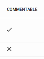
The BooleanField also includes an hidden text for accessibility (or to query in end to end tests). By default, it includes the translated label and the translated value, for example Published: false.
If you need to override it, you can use the valueLabelTrue and valueLabelFalse props which both accept a string. Those strings may be translation keys:
// Simple texts
<BooleanField source="published" valueLabelTrue="Has been published" valueLabelFalse="Has not been published yet" />

// Translation keys
<BooleanField source="published" valueLabelTrue="myapp.published.true" valueLabelFalse="myapp.published.false" />
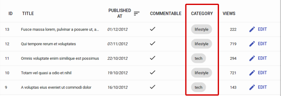
<ChipField>
Displays a value inside a “Chip”, which is Material UI’s term for a label.
import { ChipField } from 'react-admin';

<ChipField source="category" />
This field type is especially useful for one to many relationships, e.g. to display a list of books for a given author:
import { ChipField, SingleFieldList, ReferenceManyField } from 'react-admin';

<ReferenceManyField reference="books" target="author_id">
    <SingleFieldList>
        <ChipField source="title" />
    </SingleFieldList>
</ReferenceManyField>
<DateField>
Displays a date or datetime using the browser locale (thanks to Date.toLocaleDateString() and Date.toLocaleString()).
import { DateField } from 'react-admin';

<DateField source="publication_date" />
This component accepts a showTime attribute (false by default) to force the display of time in addition to date. It uses Intl.DateTimeFormat() if available, passing the locales and options props as arguments. If Intl is not available, it ignores the locales and options props.
<DateField source="publication_date" />
// renders the record { id: 1234, publication_date: new Date('2017-04-23') } as
<span>4/23/2017</span>

<DateField source="publication_date" showTime />
// renders the record { id: 1234, publication_date: new Date('2017-04-23 23:05') } as
<span>4/23/2017, 11:05:00 PM</span>

<DateField source="publication_date" options={{ weekday: 'long', year: 'numeric', month: 'long', day: 'numeric' }} />
// renders the record { id: 1234, publication_date: new Date('2017-04-23') } as
<span>Sunday, April 23, 2017</span>

<DateField source="publication_date" locales="fr-FR" />
// renders the record { id: 1234, publication_date: new Date('2017-04-23') } as
<span>23/04/2017</span>

<DateField source="publication_date" elStyle={{ color: 'red' }} />
// renders the record { id: 1234, publication_date: new Date('2017-04-23') } as
<span style="color:red;">4/23/2017</span>
See Intl.DateTimeformat documentation for the options prop syntax.
Tip: If you need more formatting options than what Intl.DateTimeformat can provide, build your own field component leveraging a third-party library like moment.js.
<EmailField>
<EmailField> displays an email as a <a href="mailto:" /> link.
import { EmailField } from 'react-admin';

<EmailField source="personal_email" />
<FunctionField>
If you need a special function to render a field, <FunctionField> is the perfect match. It passes the record to a render function supplied by the developer. For instance, to display the full name of a user record based on first_name and last_name properties:
import { FunctionField } from 'react-admin'

<FunctionField label="Name" render={record => `${record.first_name} ${record.last_name}`} />
Tip: Technically, you can omit the source and sortBy properties for the <FunctionField> since you provide the render function. However, providing a source or a sortBy will allow the datagrid to make the column sortable, since when a user clicks on a column, the datagrid uses these properties to sort. Should you provide both, sortBy will override source for sorting the column.
<ImageField>
If you need to display an image provided by your API, you can use the <ImageField /> component:
import { ImageField } from 'react-admin';

<ImageField source="url" title="title" />
This field is also generally used within an
The optional title prop points to the picture title property, used for both alt and title attributes. It can either be an hard-written string, or a path within your JSON object:
// { picture: { url: 'cover.jpg', title: 'Larry Cover (French pun intended)' } }

// Title would be "picture.title", hence "Larry Cover (French pun intended)"
<ImageField source="picture.url" title="picture.title" />

// Title would be "Picture", as "Picture" is not a path in previous given object
<ImageField source="picture.url" title="Picture" />
If passed value is an existing path within your JSON object, then it uses the object attribute. Otherwise, it considers its value as an hard-written title.
If the record actually contains an array of images in its property defined by the source prop, the src prop will be needed to determine the src value of the images, for example:
// This is the record
{
    pictures: [
        { url: 'image1.jpg', desc: 'First image' },
        { url: 'image2.jpg', desc: 'Second image' },
    ],
}

<ImageField source="pictures" src="url" title="desc" />
<FileField>
If you need to display a file provided by your API, you can use the <FileField /> component:
import { FileField } from 'react-admin';

<FileField source="url" title="title" />
This field is also generally used within an
The optional title prop points to the file title property, used for title attributes. It can either be an hard-written string, or a path within your JSON object:
// { file: { url: 'doc.pdf', title: 'Presentation' } }

// Title would be "file.title", hence "Presentation"
<FileField source="file.url" title="file.title" />

// Title would be "File", as "File" is not a path in previous given object
<FileField source="file.url" title="File" />
If passed value is an existing path within your JSON object, then it uses the object attribute. Otherwise, it considers its value as an hard-written title.
If the record actually contains an array of files in its property defined by the source prop, the src prop will be needed to determine the href value of the links, for example:
// This is the record
{
    files: [
        { url: 'image1.jpg', desc: 'First image' },
        { url: 'image2.jpg', desc: 'Second image' },
    ],
}

<FileField source="files" src="url" title="desc" />
You can optionally set the target prop to choose which window will the link try to open in.
// Will make the file open in new window
<FileField source="file.url" target="_blank" />
<NumberField>
Displays a number formatted according to the browser locale, right aligned.
Uses Intl.NumberFormat() if available, passing the locales and options props as arguments. This allows perfect display of decimals, currencies, percentage, etc.
If Intl is not available, it outputs number as is (and ignores the locales and options props).
import { NumberField }  from 'react-admin';

<NumberField source="score" />
// renders the record { id: 1234, score: 567 } as
<span>567</span>

<NumberField source="score" options={{ maximumFractionDigits: 2 }}/>
// renders the record { id: 1234, score: 567.3567458569 } as
<span>567.35</span>

<NumberField source="share" options={{ style: 'percent' }} />
// renders the record { id: 1234, share: 0.2545 } as
<span>25%</span>

<NumberField source="price" options={{ style: 'currency', currency: 'USD' }} />
// renders the record { id: 1234, price: 25.99 } as
<span>$25.99</span>

<NumberField source="price" locales="fr-FR" options={{ style: 'currency', currency: 'USD' }} />
// renders the record { id: 1234, price: 25.99 } as
<span>25,99 $US</span>

<NumberField source="score" elStyle={{ color: 'red' }} />
// renders the record { id: 1234, score: 567 } as
<span style="color:red;">567</span>
See Intl.Numberformat documentation for the options prop syntax.
Tip: If you need more formatting options than what Intl.Numberformat can provide, build your own field component leveraging a third-party library like numeral.js.
Tip: When used in a Show view, the right alignment may look weird. Disable it by resetting the style attribute:
import { NumberField }  from 'react-admin';

<NumberField source="score" style={{}} />
<SelectField>
When you need to display an enumerated field, <SelectField> maps the value to a string.
For instance, if the gender field can take values “M” and “F”, here is how to display it as “Male” or “Female”:
import { SelectField } from 'react-admin';

<SelectField source="gender" choices={[
   { id: 'M', name: 'Male' },
   { id: 'F', name: 'Female' },
]} />
By default, the text is built by
- finding a choice where the ‘id’ property equals the field value
- using the ‘name’ property an the option text
You can also customize the properties to use for the lookup value and text, thanks to the ‘optionValue’ and ‘optionText’ attributes.
const choices = [
   { _id: 123, full_name: 'Leo Tolstoi', sex: 'M' },
   { _id: 456, full_name: 'Jane Austen', sex: 'F' },
];
<SelectField source="author_id" choices={choices} optionText="full_name" optionValue="_id" />
optionText also accepts a function, so you can shape the option text at will:
const choices = [
   { id: 123, first_name: 'Leo', last_name: 'Tolstoi' },
   { id: 456, first_name: 'Jane', last_name: 'Austen' },
];
const optionRenderer = choice => `${choice.first_name} ${choice.last_name}`;
<SelectField source="author_id" choices={choices} optionText={optionRenderer} />
optionText also accepts a React Element, that will be cloned and receive the related choice as the record prop. You can use Field components there.
const choices = [
   { id: 123, first_name: 'Leo', last_name: 'Tolstoi' },
   { id: 456, first_name: 'Jane', last_name: 'Austen' },
];
const FullNameField = ({ record }) => <Chip>{record.first_name} {record.last_name}</Chip>;
<SelectField source="author_id" choices={choices} optionText={<FullNameField />}/>
The current choice is translated by default, so you can use translation identifiers as choices:
const choices = [
   { id: 'M', name: 'myroot.gender.male' },
   { id: 'F', name: 'myroot.gender.female' },
];
However, in some cases (e.g. inside a <ReferenceField>), you may not want the choice to be translated. In that case, set the translateChoice prop to false.
<SelectField source="gender" choices={choices} translateChoice={false}/>
Tip:
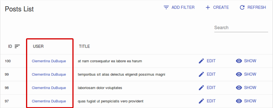
<ReferenceField>
This component fetches a single referenced record (using the GET_MANY REST method), and displays one field of this record. That’s why a <ReferenceField> must always have a child <Field>.
For instance, here is how to fetch the post related to comment records, and display the title for each:
import React from 'react';
import { List, Datagrid, ReferenceField, TextField } from 'react-admin';

export const PostList = (props) => (
    <List {...props}>
        <Datagrid>
            <TextField source="id" />
            <ReferenceField label="Author" source="user_id" reference="users">
                <TextField source="name" />
            </ReferenceField>
        </Datagrid>
    </List>
);
With this configuration, <ReferenceField> wraps the user’s name in a link to the related user <Edit> page.
<ReferenceField> accepts a reference attribute, which specifies the resource to fetch for the related record. Also, you can use any Field component as child.
Note: You must add a <Resource> for the reference resource - react-admin needs it to fetch the reference data. You can omit the list prop in this reference if you want to hide it in the sidebar menu.
<Admin dataProvider={myDataProvider}>
    <Resource name="comments" list={CommentList} />
    <Resource name="posts" />
</Admin>
To change the link from the <Edit> page to the <Show> page, set the linkType prop to “show”.
<ReferenceField label="User" source="userId" reference="users" linkType="show">
    <TextField source="name" />
</ReferenceField>
By default, <ReferenceField> is sorted by its source. To specify another attribute to sort by, set the sortBy prop to the according attribute’s name.
<ReferenceField label="User" source="userId" reference="users" sortBy="user.name">
    <TextField source="name" />
</ReferenceField>
You can also prevent <ReferenceField> from adding link to children by setting linkType to false.
// No link
<ReferenceField label="User" source="userId" reference="users" linkType={false}>
    <TextField source="name" />
</ReferenceField>
Tip: React-admin uses CRUD_GET_ONE_REFERENCE action to accumulate and deduplicate the ids of the referenced records to make one GET_MANY call for the entire list, instead of n GET_ONE calls. So for instance, if the API returns the following list of comments:
[
    {
        id: 123,
        body: 'Totally agree',
        post_id: 789,
    },
    {
        id: 124,
        title: 'You are right my friend',
        post_id: 789
    },
    {
        id: 125,
        title: 'Not sure about this one',
        post_id: 735
    }
]
Then react-admin renders the <CommentList> with a loader for the <ReferenceField>, fetches the API for the related posts in one call (GET http://path.to.my.api/posts?ids=[789,735]), and re-renders the list once the data arrives. This accelerates the rendering, and minimizes network load.
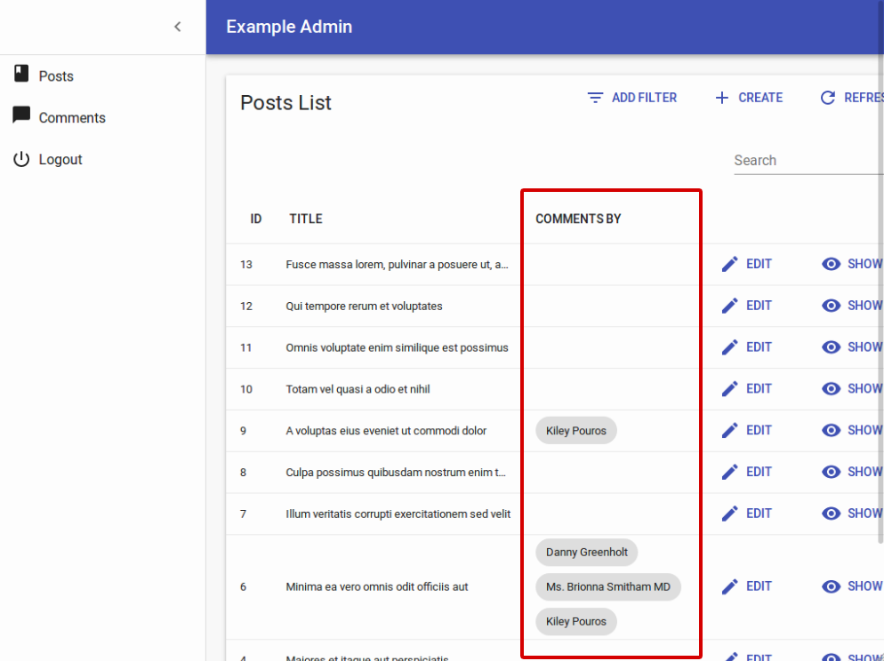
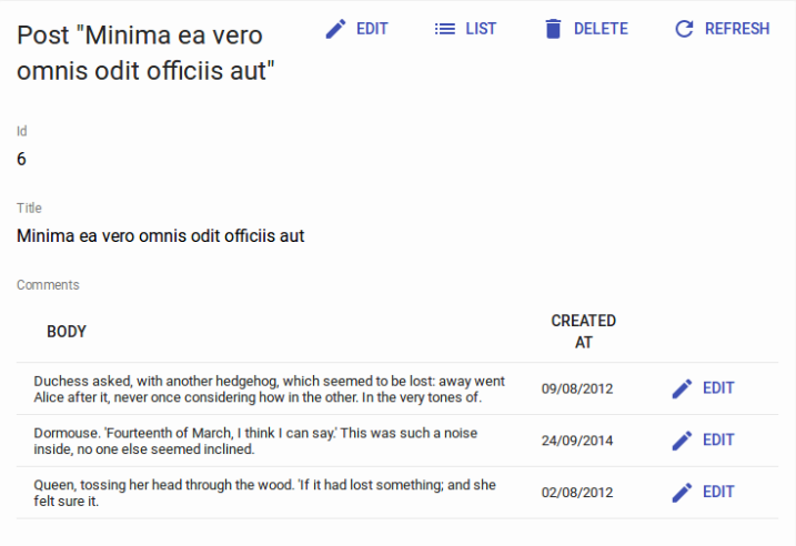
<ReferenceManyField>
This component fetches a list of referenced records by reverse lookup of the current record.id in other resource (using the GET_MANY_REFERENCE REST method). You can specify the target field name, i.e. the field name of the current record’s id in the other resource, using the required target field. The result is then passed to an iterator component (like <SingleFieldList> or <Datagrid>). The iterator component usually has one or more child <Field> components.
For instance, here is how to fetch the comments related to a post record by matching comment.post_id to post.id, and then display the author.name for each, in a <ChipField>:
import React from 'react';
import { List, Datagrid, ChipField, ReferenceManyField, SingleFieldList, TextField } from 'react-admin';

export const PostList = (props) => (
    <List {...props}>
        <Datagrid>
            <TextField source="id" />
            <TextField source="title" type="email" />
            <ReferenceManyField label="Comments by" reference="comments" target="post_id">
                <SingleFieldList>
                    <ChipField source="author.name" />
                </SingleFieldList>
            </ReferenceManyField>
            <EditButton />
        </Datagrid>
    </List>
);
<ReferenceManyField> accepts a reference attribute, which specifies the resource to fetch for the related record. It also accepts a source attribute which define the field containing the value to look for in the target field of the referenced resource. By default this is the id of the resource (post.id in the previous example).
Note: You must add a <Resource> for the reference resource - react-admin needs it to fetch the reference data. You can omit the list prop in this reference if you want to hide it in the sidebar menu.
You can use a <Datagrid> instead of a <SingleFieldList> - but not inside another <Datagrid>! This is useful if you want to display a read-only list of related records. For instance, if you want to show the comments related to a post in the post’s <Edit> view:
import React from 'react';
import { Edit, Datagrid, SimpleForm, DisabledInput, DateField, EditButton, ReferenceManyField, TextField, TextInput } from 'react-admin';

export const PostEdit = (props) => (
    <Edit {...props}>
        <SimpleForm>
            <DisabledInput label="Id" source="id" />
            <TextInput source="title" />
            <ReferenceManyField
                label="Comments"
                reference="comments"
                target="post_id"
            >
                <Datagrid>
                    <DateField source="created_at" />
                    <TextField source="author.name" />
                    <TextField source="body" />
                    <EditButton />
                </Datagrid>
            </ReferenceManyField>
        </SimpleForm>
    </Edit>
);
By default, react-admin restricts the possible values to 25 and displays no pagination control. You can change the limit by setting the perPage prop:
<ReferenceManyField perPage={10} reference="comments" target="post_id">
   ...
</ReferenceManyField>
And if you want to allow users to paginate the list, pass a <Pagination> component as the pagination prop:
import { Pagination } from 'react-admin';

<ReferenceManyField pagination={<Pagination />} reference="comments" target="post_id">
   ...
</ReferenceManyField>
By default, it orders the possible values by id desc. You can change this order by setting the sort prop (an object with field and order properties).
<ReferenceManyField sort={{ field: 'created_at', order: 'DESC' }} reference="comments" target="post_id">
   ...
</ReferenceManyField>
Also, you can filter the query used to populate the possible values. Use the filter prop for that.
<ReferenceManyField filter={{ is_published: true }} reference="comments" target="post_id">
   ...
</ReferenceManyField>
<ReferenceArrayField>
Use <ReferenceArrayField> to display an list of reference values based on an array of foreign keys.
For instance, if a post has many tags, a post resource may look like:
{
    id: 1234,
    title: 'Lorem Ipsum',
    tag_ids: [1, 23, 4]
}
Where [1, 23, 4] refer to ids of tag resources.
<ReferenceArrayField> can fetch the tag resources related to this post resource by matching post.tag_ids to tag.id. <ReferenceArrayField source="tags_ids" reference="tags"> would issue an HTTP request looking like:
http://myapi.com/tags?id=[1,23,4]
Tip: <ReferenceArrayField> fetches the related resources using the GET_MANY REST method, so the actual HTTP request depends on your REST client.
Once it receives the related resources, <ReferenceArrayField> passes them to its child component using the ids and data props, so the child must be an iterator component (like <SingleFieldList> or <Datagrid>). The iterator component usually has one or more child <Field> components.
Here is how to fetch the list of tags for each post in a PostList, and display the name for each tag in a <ChipField>:
import React from 'react';
import { List, Datagrid, ChipField, ReferenceArrayField, SingleFieldList, TextField } from 'react-admin';

export const PostList = (props) => (
    <List {...props}>
        <Datagrid>
            <TextField source="id" />
            <TextField source="title" />
            <ReferenceArrayField label="Tags" reference="tags" source="tag_ids">
                <SingleFieldList>
                    <ChipField source="name" />
                </SingleFieldList>
            </ReferenceArrayField>
            <EditButton />
        </Datagrid>
    </List>
);
Note: You must add a <Resource> component for the reference resource to your <Admin> component, because react-admin needs it to fetch the reference data. You can omit the list prop in this Resource if you don’t want to show an entry for it in the sidebar menu.
export const App = () => (
    <Admin dataProvider={restProvider('http://path.to.my.api')}>
        <Resource name="posts" list={PostList} />
        <Resource name="tags" /> // <= this one is compulsory
    </Admin>
);
In an Edit of Show view, you can combine <ReferenceArrayField> with <Datagrid> to display a related resources in a table. For instance, to display more details about the tags related to a post in the PostShow view:
import React from 'react';
import { Show, SimpleShowLayout, TextField, ReferenceArrayField, Datagrid, ShowButton } from 'react-admin';

export const PostShow = (props) => (
    <Show {...props}>
        <SimpleShowLayout>
            <TextField source="id" />
            <TextField source="title" />
            <ReferenceArrayField label="Tags" reference="tags" source="tag_ids">
                <Datagrid>
                    <TextField source="id" />
                    <TextField source="name" />
                    <ShowButton />
                </Datagrid>
            </ReferenceArrayField>
            <EditButton />
        </SimpleShowLayout>
    </Show>
);
<RichTextField>
This component displays some HTML content. The content is “rich” (i.e. unescaped) by default.
import { RichTextField } from 'react-admin';

<RichTextField source="body" />
The stripTags attribute (false by default) allows you to remove any HTML markup, preventing some display glitches (which is especially useful in list views).
import { RichTextField } from 'react-admin';

<RichTextField source="body" stripTags />
<TextField>
The most simple as all fields, <TextField> simply displays the record property as plain text.
import { TextField } from 'react-admin';

<TextField label="Author Name" source="name" />
<UrlField>
<UrlField> displays an url in an < a href=""> tag.
import { UrlField } from 'react-admin';

<UrlField source="site_url" />
Styling Fields
All field components accept a className prop, allowing you to customize their style to your liking. We advise you to use the Material UI styling solution, JSS, to generate those classes. See their documentation about that.
import { withStyles } from '@material-ui/core/styles';

const styles = {
    price: { color: 'purple' },
};

const PriceField = withStyles(styles)(({ classes, ...props }) => (
    <TextField className={classes.price} {...props} />
));

export const ProductList = (props) => (
    <List {...props}>
        <Datagrid>
            <PriceField source="price" />
        </Datagrid>
    </List>
);

// renders in the datagrid as
<td><span class="[class name generated by JSS]">2</span></td>
React-admin usually delegates the rendering of fields components to material-ui components. Refer to the material-ui documentation to see the default styles for elements.
You may want to customize the cell style inside a DataGrid. You can use the cellClassName for that:
import { withStyles } from '@material-ui/core/styles';

const styles = {
    priceCell: { fontWeight: 'bold' },
};

const PriceField = withStyles(styles)(({ classes, ...props }) => (
    <TextField cellClassName={classes.priceCell} {...props} />
));

export const ProductList = (props) => (
    <List {...props}>
        <Datagrid>
            <PriceField source="price" />
        </Datagrid>
    </List>
);

// renders in the datagrid as
<td class="[class name generated by JSS]"><span>2</span></td>
You may want to override the field header (the <th> element in the datagrid). In that case, use the headerClassName prop:
import { withStyles } from '@material-ui/core/styles';

const styles = {
    priceHeader: { fontWeight: 'bold' },
};

const PriceField = withStyles(styles)(({ classes, ...props }) => (
    <TextField headerClassName={classes.priceHeader} {...props} />
));

export const ProductList = (props) => (
    <List {...props}>
        <Datagrid>
            <PriceField source="price" />
        </Datagrid>
    </List>
);
// renders in the table header as
<th class="[class name generated by JSS]"><button>Price</button></td>
Finally, sometimes, you just want to right align the text of a cell. Use the textAlign prop, which accepts either left or right:
const PriceField = props => (
    <TextField {...props} />
);

PriceField.defaultProps = {
    textAlign: 'right',
};
Writing Your Own Field Component
If you don’t find what you need in the list above, you can write your own Field component. It must be a regular React component, accepting not only a source attribute, but also a record attribute. React-admin will inject the record based on the API response data at render time. The field component only needs to find the source in the record and display it.
For instance, here is an equivalent of react-admin’s <TextField> component:
import React from 'react';
import PropTypes from 'prop-types';

const TextField = ({ source, record = {} }) => <span>{record[source]}</span>;

TextField.propTypes = {
    label: PropTypes.string,
    record: PropTypes.object,
    source: PropTypes.string.isRequired,
};

export default TextField;
Tip: The label attribute isn’t used in the render() method, but react-admin uses it to display the table header.
Tip: If you want to support deep field sources (e.g. source values like author.name), use lodash/get to replace the simple object lookup:
import get from 'lodash/get';
const TextField = ({ source, record = {} }) => <span>{get(record, source)}</span>;
If you are not looking for reusability, you can create even simpler components, with no attributes. Let’s say an API returns user records with firstName and lastName properties, and that you want to display a full name in a user list.
{
    id: 123,
    firstName: 'John',
    lastName: 'Doe'
}
The component will be:
import React from 'react';
import { List, Datagrid, TextField } from 'react-admin';

const FullNameField = ({ record = {} }) => <span>{record.firstName} {record.lastName}</span>;
FullNameField.defaultProps = { label: 'Name' };

export const UserList = (props) => (
    <List {...props}>
        <Datagrid>
            <FullNameField source="lastName" />
        </Datagrid>
    </List>
);
Tip: In such custom fields, the source is optional. React-admin uses it to determine which column to use for sorting when the column header is clicked. In case you use the source property for additional purposes, the sorting can be overridden by the sortBy property on any Field component.
Adding Label To Custom Field Components In The Show View
React-admin lets you use the same Field components in the List view and in the Show view. But if you use the <FullNameField> custom field component defined earlier in a Show view, something is missing: the Field label. Why do other fields have a label and not this custom Field? And how can you create a Field component that has a label in the Show view, but not in the List view?
React-admin uses a trick: the Show view layouts (<SimpleShowLayout> and <TabbedShowLayout>) inspect their Field children, and whenever one has the addLabel prop set to true, the layout adds a label.
That means that the only thing you need to add to a custom component to make it usable in a Show view is a addLabel: true default prop.
FullNameField.defaultProps = {
    addLabel: true,
};
Hiding A Field Based On The Value Of Another
In a Show view, you may want to display or hide fields based on the value of another field - for instance, show an email field only if the hasEmail boolean field is true.
For such cases, you can use the custom field approach: use the injected record prop, and render another Field based on the value.
import React from 'react';
import { EmailField } from 'react-admin';

const ConditionalEmailField = ({ record, ...rest }) =>
    record && record.hasEmail
        ? <EmailField source="email" record={record} {...rest} />
        : null;

export default ConditionalEmailField;
Tip: Always check that the record is defined before inspecting its properties, as react-admin displays the Show view before fetching the record from the data provider. So the first time it renders the show view for a resource, the record is undefined.
This ConditionalEmailField is properly hidden when hasEmail is false. But when hasEmail is true, the Show layout renders it… without label. And if you add a addLabel default prop, the Show layout will render the label regardless of the hasEmail value…
One solution is to add the label manually in the custom component:
import React from 'react';
import { Labeled, EmailField } from 'react-admin';

const ConditionalEmailField = ({ record, ...rest }) =>
    record && record.hasEmail
        ? (
            <Labeled label="Email">
                <EmailField source="email" record={record} {...rest} />
            </Labeled>
        )
        : null;

export default ConditionalEmailField;
This comes with a drawback, though: the <ConditionalEmailField> cannot be used in a List view anymore, as it will always have a label. If you want to reuse the custom component in a List, this isn’t the right solution.
An alternative solution is to split the <Show> component. Under the hood, the <Show> component is composed of two sub components: the <ShowController> component, which fetches the record, and the <ShowView>, which is responsible for rendering the view title, actions, and children. <ShowController> uses the render props pattern:
// inside react-admin
const Show = props => (
    <ShowController {...props}>
        {controllerProps => <ShowView {...props} {...controllerProps} />}
    </ShowController>
);
The <ShowController> fetches the record from the data provider, and passes it to its child function when received (among the controllerProps). That means the following code:
import { Show, SimpleShowLayout, TextField } from 'react-admin';

const UserShow = props => (
    <Show {...props}>
        <SimpleShowLayout>
            <TextField source="username" />
            <TextField source="email" />
        </SimpleShowLayout>
    </Show>
);
Is equivalent to:
import { ShowController, ShowView, SimpleShowLayout, TextField } from 'react-admin';

const UserShow = props => (
    <ShowController {...props}>
        {controllerProps =>
            <ShowView {...props} {...controllerProps}>
                <SimpleShowLayout>
                    <TextField source="username" />
                    <TextField source="email" />
                </SimpleShowLayout>
            </ShowView>
        }
    </ShowController>
);
If you want one field to be displayed based on the record, for instance to display the email field only if the hasEmail field is true, you just need to test the value from controllerProps.record, as follows:
import { ShowController, ShowView, SimpleShowLayout, TextField } from 'react-admin';

const UserShow = props => (
    <ShowController {...props}>
        {controllerProps =>
            <ShowView {...props} {...controllerProps}>
                <SimpleShowLayout>
                    <TextField source="username" />
                    {controllerProps.record && controllerProps.record.hasEmail &&
                        <TextField source="email" />
                    }
                </SimpleShowLayout>
            </ShowView>
        }
    </ShowController>
);
And now you can use a regular Field component, and the label displays correctly in the Show view.