The Show View
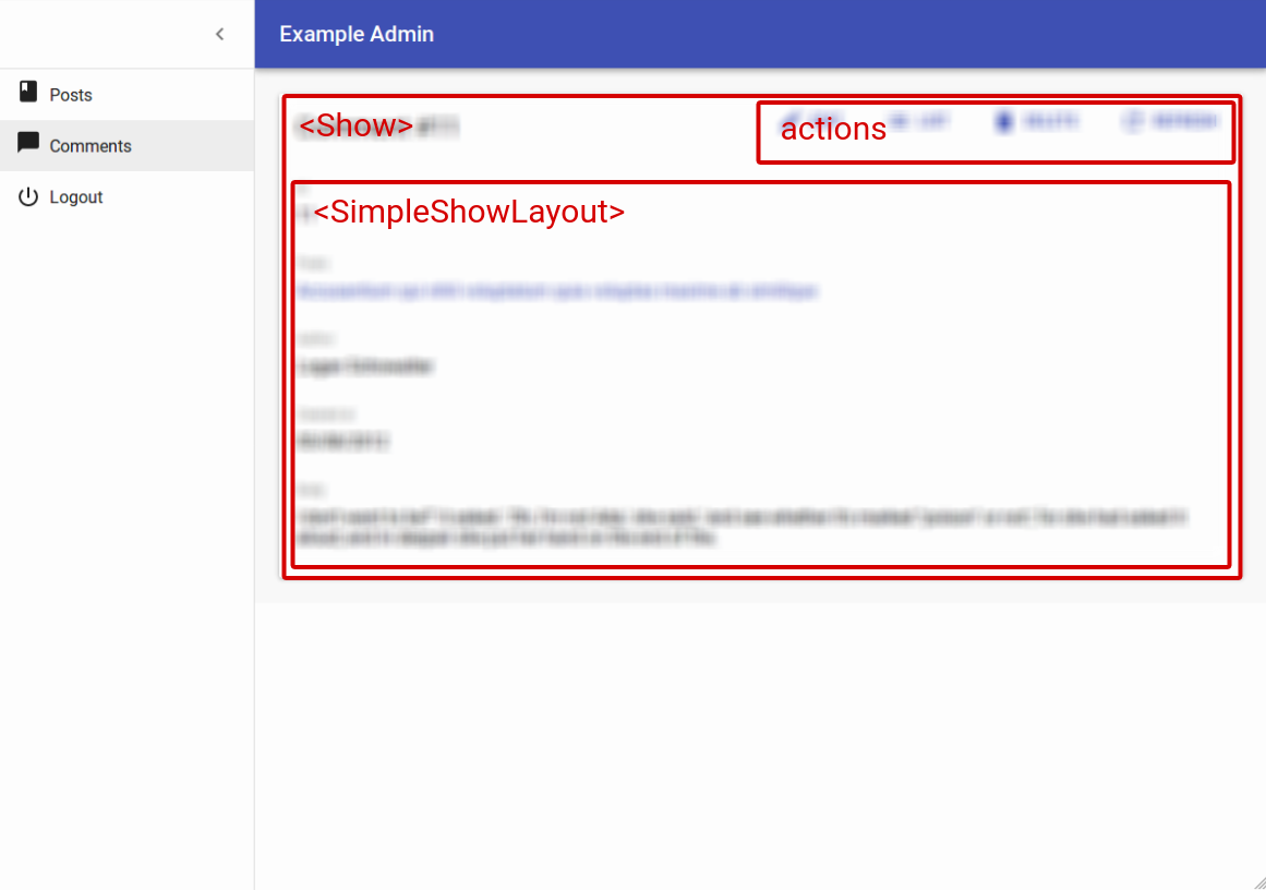
The Show view displays a record fetched from the API in a read-only fashion. It delegates the actual rendering of the record to a layout component - usually <SimpleShowLayout>. This layout component uses its children (<Fields> components) to render each record field.
The <Show> component
The <Show> component renders the page title and actions, and fetches the record from the REST API. It is not responsible for rendering the actual record - that’s the job of its child component (usually <SimpleShowLayout>), to which they pass the record as prop.
Here are all the props accepted by the <Show> component:
Here is the minimal code necessary to display a view to show a post:
// in src/App.js
import React from 'react';
import { Admin, Resource } from 'react-admin';
import jsonServerProvider from 'ra-data-json-server';

import { PostCreate, PostEdit, PostShow } from './posts';

const App = () => (
    <Admin dataProvider={jsonServerProvider('http://jsonplaceholder.typicode.com')}>
        <Resource name="posts" show={PostShow} create={PostCreate} edit={PostEdit} />
    </Admin>
);

export default App;

// in src/posts.js
import React from 'react';
import { Show, SimpleShowLayout, TextField, DateField, EditButton, RichTextField } from 'react-admin';

export const PostShow = (props) => (
    <Show {...props}>
        <SimpleShowLayout>
            <TextField source="title" />
            <TextField source="teaser" />
            <RichTextField source="body" />
            <DateField label="Publication date" source="created_at" />
        </SimpleShowLayout>
    </Show>
);
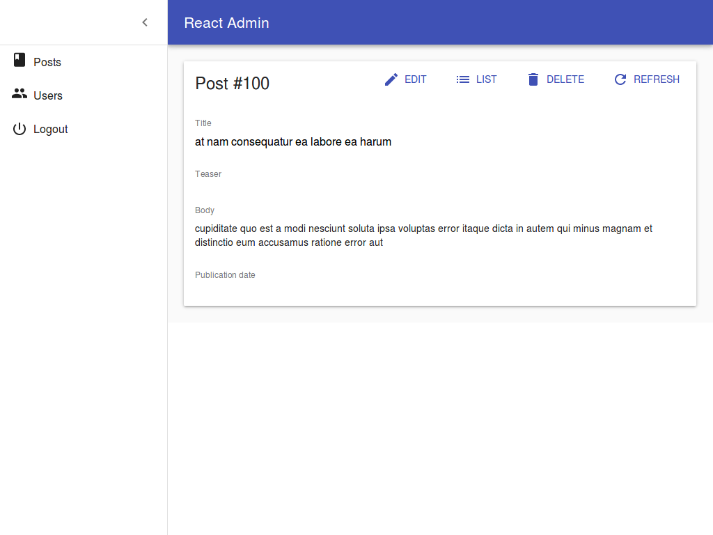
That’s enough to display the post show view:
Page Title
By default, the title for the Show view is “[resource_name] #[record_id]”.
You can customize this title by specifying a custom title prop:
export const PostShow = (props) => (
    <Show title="Post view" {...props}>
        ...
    </Show>
);
More interestingly, you can pass a component as title. React-admin clones this component and, in the <ShowView>, injects the current record. This allows to customize the title according to the current record:
const PostTitle = ({ record }) => {
    return <span>Post {record ? `"${record.title}"` : ''}</span>;
};
export const PostShow = (props) => (
    <Show title={<PostTitle />} {...props}>
        ...
    </Show>
);
Actions
You can replace the list of default actions by your own element using the actions prop:
import CardActions from '@material-ui/core/CardActions';
import Button from '@material-ui/core/Button';
import { EditButton } from 'react-admin';

const cardActionStyle = {
    zIndex: 2,
    display: 'inline-block',
    float: 'right',
};

const PostShowActions = ({ basePath, data, resource }) => (
    <CardActions style={cardActionStyle}>
        <EditButton basePath={basePath} record={data} />
        {/* Add your custom actions */}
        <Button color="primary" onClick={customAction}>Custom Action</Button>
    </CardActions>
);

export const PostShow = (props) => (
    <Show actions={<PostShowActions />} {...props}>
        ...
    </Show>
);
Aside component
You may want to display additional information on the side of the resource detail. Use the aside prop for that, passing the component of your choice:
const Aside = () => (
    <div style={{ width: 200, margin: '1em' }}>
        <Typography variant="title">Post details</Typography>
        <Typography variant="body1">
            Posts will only be published one an editor approves them
        </Typography>
    </div>
);

const PostShow = props => (
    <Show aside={<Aside />} {...props}>
        ...
    </Show>
The aside component receives the same props as the Show child component: basePath, record, resource, and version. That means you can display secondary details of the current record in the aside component:
const Aside = ({ record }) => (
    <div style={{ width: 200, margin: '1em' }}>
        <Typography variant="title">Post details</Typography>
        {record && (
            <Typography variant="body1">
                Creation date: {record.createdAt}
            </Typography>
        )}
    </div>
);
Tip: Always test that the record is defined before using it, as react-admin starts rendering the UI before the API call is over.
The <ShowGuesser> component
Instead of a custom Show, you can use the ShowGuesser to determine which fields to use based on the data returned by the API.
// in src/App.js
import React from 'react';
import { Admin, Resource, ShowGuesser } from 'react-admin';
import jsonServerProvider from 'ra-data-json-server';

const App = () => (
    <Admin dataProvider={jsonServerProvider('http://jsonplaceholder.typicode.com')}>
        <Resource name="posts" show={ShowGuesser} />
    </Admin>
);
Just like Show, ShowGuesser fetches the data. It then analyzes the response, and guesses the fields it should use to display a basic page with the data. It also dumps the components it has guessed in the console, where you can copy it into your own code. Use this feature to quickly bootstrap a Show on top of an existing API, without adding the inputs one by one.
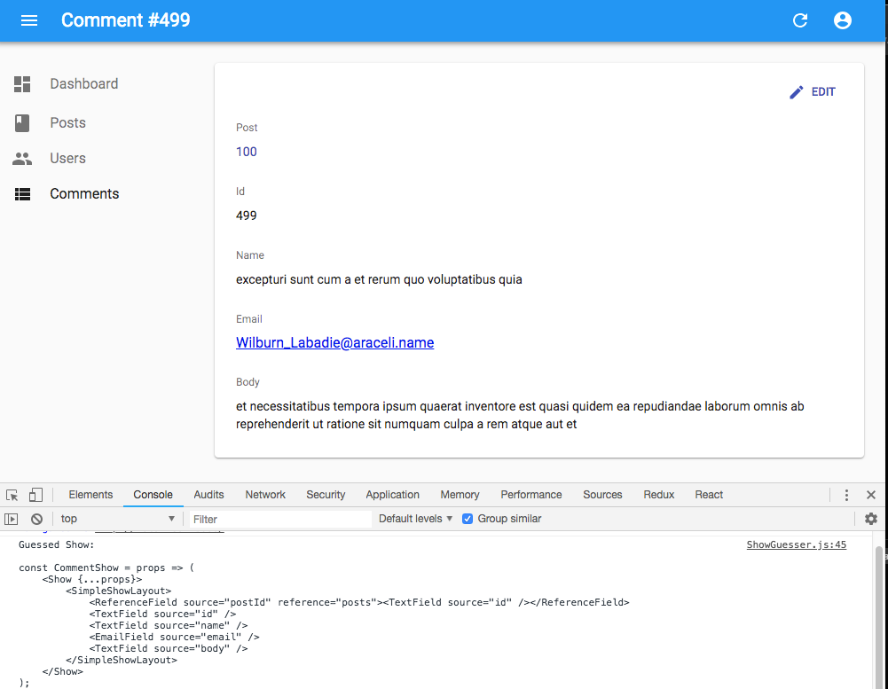
React-admin provides guessers for the List view (ListGuesser), the Edit view (EditGuesser), and the Show view (ShowGuesser).
Tip: Do not use the guessers in production. They are slower than manually-defined components, because they have to infer types based on the content. Besides, the guesses are not always perfect.
The <SimpleShowLayout> component
The <SimpleShowLayout> component receives the record as prop from its parent component. It is responsible for rendering the actual view.
The <SimpleShowLayout> renders its child components line by line (within <div> components) inside a material-ui <CardContent/>.
export const PostShow = (props) => (
    <Show {...props}>
        <SimpleShowLayout>
            <TextField source="title" />
            <RichTextField source="body" />
            <NumberField source="nb_views" />
        </SimpleShowLayout>
    </Show>
);
It accepts a className prop to let you override the style of the <CardContent/>.
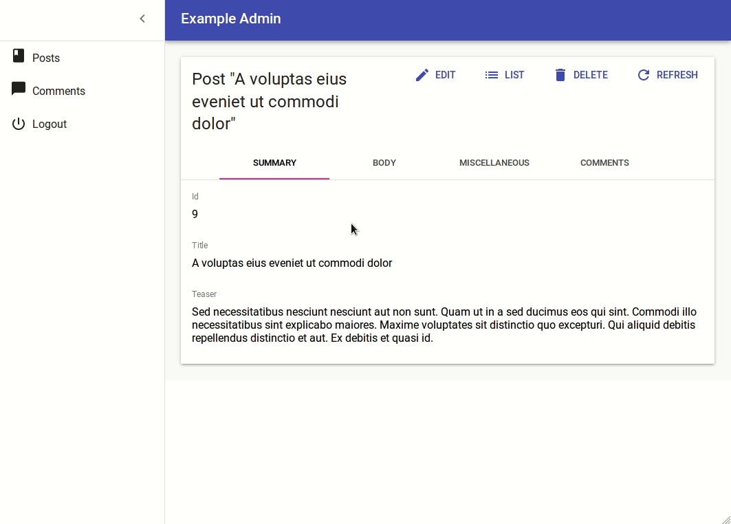
The <TabbedShowLayout> component
Just like <SimpleShowLayout>, <TabbedShowLayout> receives the record prop and renders the actual view. However, the <TabbedShowLayout> component renders fields grouped by tab. The tabs are set by using <Tab> components, which expect a label and an optional icon prop. Switching tabs will update the current url. By default, it uses the tabs indexes and the first tab will be displayed at the root url. You can customize the path by providing a path prop to each Tab component. If you’d like the first one to act as an index page, just omit the path prop.
import { TabbedShowLayout, Tab } from 'react-admin'

export const PostShow = (props) => (
    <Show {...props}>
        <TabbedShowLayout>
            <Tab label="summary">
                <TextField label="Id" source="id" />
                <TextField source="title" />
                <TextField source="teaser" />
            </Tab>
            <Tab label="body" path="body">
                <RichTextField source="body" addLabel={false} />
            </Tab>
            <Tab label="Miscellaneous" path="miscellaneous">
                <TextField label="Password (if protected post)" source="password" type="password" />
                <DateField label="Publication date" source="published_at" />
                <NumberField source="average_note" />
                <BooleanField label="Allow comments?" source="commentable" defaultValue />
                <TextField label="Nb views" source="views" />
            </Tab>
            <Tab label="comments" path="comments">
                <ReferenceManyField reference="comments" target="post_id" addLabel={false}>
                    <Datagrid>
                        <TextField source="body" />
                        <DateField source="created_at" />
                        <EditButton />
                    </Datagrid>
                </ReferenceManyField>
            </Tab>
        </TabbedShowLayout>
    </Show>
);
To style the tabs, the <Tab> component accepts two props:
classNameis passed to the tab headercontentClassNameis passed to the tab content
Tabs element
By default, <TabbedShowLayout> renders its tabs using <TabbedShowLayoutTabs>, an internal react-admin component. You can pass a custom component as the tabs prop to override that default. Also, props passed to <TabbedShowLayoutTabs> are passed to the material-ui’s <Tabs> component inside <TabbedShowLayoutTabs>. That means you can create a custom tabs component without copying several components from the react-admin source.
For instance, to make use of scrollable <Tabs>, you can pass a scrollable props to <TabbedShowLayoutTabs> and use it in the tabs prop from <TabbedShowLayout> as follows:
import {
    Show,
    TabbedShowLayout,
    TabbedShowLayoutTabs,
} from 'react-admin';

const ScrollableTabbedShowLayout = props => (
    <Show{...props}>
        <TabbedShowLayout tabs={<TabbedShowLayoutTabs scrollable={true}/>}>
            ...
        </TabbedShowLayout>
    </Show>
);

export default ScrollableTabbedShowLayout;
Displaying Fields depending on the user permissions
You might want to display some fields only to users with specific permissions. Those permissions are retrieved for each route and will provided to your component as a permissions prop.
Each route will call the authProvider with the AUTH_GET_PERMISSIONS type and some parameters including the current location and route parameters. It’s up to you to return whatever you need to check inside your component such as the user’s role, etc.
Here’s an example inside a Show view with a SimpleShowLayout and a custom actions component:
import CardActions from '@material-ui/core/CardActions';
import Button from '@material-ui/core/Button';
import { EditButton, DeleteButton } from 'react-admin';

const cardActionStyle = {
    zIndex: 2,
    display: 'inline-block',
    float: 'right',
};

const PostShowActions = ({ permissions, basePath, data, resource }) => (
    <CardActions style={cardActionStyle}>
        <EditButton basePath={basePath} record={data} />
        {permissions === 'admin' &&
            <DeleteButton basePath={basePath} record={data} resource={resource} />
        }
    </CardActions>
);

export const PostShow = ({ permissions, ...props }) => (
    <Show actions={<PostShowActions permissions={permissions} />} {...props}>
        <SimpleShowLayout>
            <TextField source="title" />
            <RichTextField source="body" />
            {permissions === 'admin' &&
                <NumberField source="nb_views" />
            }
        </SimpleShowLayout>
    </Show>
);
Tip Note how the permissions prop is passed down to the custom actions component.
This also works inside a TabbedShowLayout, and you can hide a Tab completely:
export const UserShow = ({ permissions, ...props }) =>
    <Show {...props}>
        <TabbedShowLayout>
            <Tab label="user.form.summary">
                {permissions === 'admin' && <TextField source="id" />}
                <TextField source="name" />
            </Tab>
            {permissions === 'admin' &&
                <Tab label="user.form.security">
                    <TextField source="role" />
                </Tab>}
        </TabbedShowLayout>
    </Show>;