Input Components
An Input component displays an input, or a dropdown list, a list of radio buttons, etc. Such components allow to edit a record property, and are common in the <Edit>, <Create>, and <Filter> views.
// in src/posts.js
import React from 'react';
import { Edit, DisabledInput, LongTextInput, ReferenceInput, SelectInput, SimpleForm, TextInput } from 'react-admin';

export const PostEdit = (props) => (
    <Edit title={<PostTitle />} {...props}>
        <SimpleForm>
            <DisabledInput source="id" />
            <ReferenceInput label="User" source="userId" reference="users">
                <SelectInput optionText="name" />
            </ReferenceInput>
            <TextInput source="title" />
            <LongTextInput source="body" />
        </SimpleForm>
    </Edit>
);
All input components accept the following attributes:
source: Property name of your entity to view/edit. This attribute is required.defaultValue: Value to be set when the property isnullorundefined.validate: Validation rules for the current property (see the Validation Documentation)label: Used as a table header of an input label. Defaults to thesourcewhen omitted.style: A style object to customize the look and feel of the field container (e.g. the<div>in a form).elStyle: A style object to customize the look and feel of the field element itself
<TextInput source="zb_title" label="Title" />
Additional props are passed down to the underlying component (usually a material-ui component). For instance, when setting the fullWidth prop on a TextInput component, the underlying material-ui <TextField> receives it, and goes full width.
Tip: If you edit a record with a complex structure, you can use a path as the source parameter. For instance, if the API returns the following ‘book’ record:
{
    id: 1234,
    title: 'War and Peace',
    author: {
        firstName: 'Leo',
        lastName: 'Tolstoi'
    }
}
Then you can display a text input to edit the author first name as follows:
<TextInput source="author.firstName" />
Tip: If your interface has to support multiple languages, don’t use the label prop, and put the localized labels in a dictionary instead. See the Translation documentation for details.
<ArrayInput>
To edit arrays of data embedded inside a record, <ArrayInput> creates a list of sub-forms.
import { ArrayInput, SimpleFormIterator, DateInput, TextInput } from 'react-admin';

<ArrayInput source="backlinks">
    <SimpleFormIterator>
        <DateInput source="date" />
        <TextInput source="url" />
    </SimpleFormIterator>
</ArrayInput>
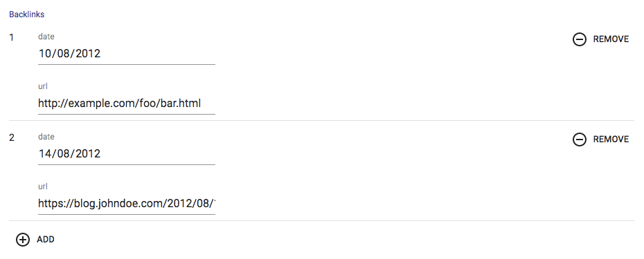
<ArrayInput> allows editing of embedded arrays, like the backlinks field in the following post record:
{
  id: 123
  backlinks: [
        {
            date: '2012-08-10T00:00:00.000Z',
            url: 'http://example.com/foo/bar.html',
        },
        {
            date: '2012-08-14T00:00:00.000Z',
            url: 'https://blog.johndoe.com/2012/08/12/foobar.html',
        }
   ]
}
<ArrayInput> expects a single child, which must be a form iterator component. A form iterator is a component accepting a fields object as passed by redux-form’s <FieldArray> component, and defining a layout for an array of fields. For instance, the <SimpleFormIterator> component displays an array of fields in an unordered list (<ul>), one sub-form by list item (<li>). It also provides controls for adding and removing a sub-record (a backlink in this example).
You can pass disableAdd and disableRemove as props of SimpleFormIterator, to disable ADD and REMOVE button respectively. Default value of both is false.
import { ArrayInput, SimpleFormIterator, DateInput, TextInput } from 'react-admin';

<ArrayInput source="backlinks">
    <SimpleFormIterator disableRemove >
        <DateInput source="date" />
        <TextInput source="url" />
    </SimpleFormIterator>
</ArrayInput>
<AutocompleteInput>
To let users choose a value in a list using a dropdown with autocompletion, use <AutocompleteInput>. It renders using react-autosuggest and a fuzzySearch filter. Set the choices attribute to determine the options list (with id, name tuples).
import { AutocompleteInput } from 'react-admin';

<AutocompleteInput source="category" choices={[
    { id: 'programming', name: 'Programming' },
    { id: 'lifestyle', name: 'Lifestyle' },
    { id: 'photography', name: 'Photography' },
]} />
You can also customize the properties to use for the option name and value, thanks to the optionText and optionValue attributes:
const choices = [
    { _id: 123, full_name: 'Leo Tolstoi', sex: 'M' },
    { _id: 456, full_name: 'Jane Austen', sex: 'F' },
];
<AutocompleteInput source="author_id" choices={choices} optionText="full_name" optionValue="_id" />
optionText also accepts a function, so you can shape the option text at will:
const choices = [
   { id: 123, first_name: 'Leo', last_name: 'Tolstoi' },
   { id: 456, first_name: 'Jane', last_name: 'Austen' },
];
const optionRenderer = choice => `${choice.first_name} ${choice.last_name}`;
<AutocompleteInput source="author_id" choices={choices} optionText={optionRenderer} />
The choices are translated by default, so you can use translation identifiers as choices:
const choices = [
   { id: 'M', name: 'myroot.gender.male' },
   { id: 'F', name: 'myroot.gender.female' },
];
However, in some cases (e.g. inside a <ReferenceInput>), you may not want the choice to be translated. In that case, set the translateChoice prop to false.
<AutocompleteInput source="gender" choices={choices} translateChoice={false}/>
By default the component matches choices with the current input searchText: if it finds a match, this choice will be selected. For example, given the choices [{ id: 'M', name: 'Male', id: 'F', name: 'Female' }], when the user enters the text male, then the component will set the input value to M. If you need to change how choices are matched, pass a custom function as inputValueMatcher prop. For example, given the choices: [{id:1,iso2:'NL',name:'Dutch'},{id:2,iso2:'EN',name:'English'},{id:3,iso2:'FR',name:'French'}], if you want to match choices on the iso2 code, you can create the following inputValueMatcher function:
<AutocompleteInput inputValueMatcher={
    (input, suggestion, getOptionText) =>
        input.toUpperCase().trim() === suggestion.iso2 ||
        input.toLowerCase().trim() === getOptionText(suggestion).toLowerCase().trim()
}/>
If you want to limit the initial choices shown to the current value only, you can set the limitChoicesToValue prop.
When dealing with a large amount of choices you may need to limit the number of suggestions that are rendered in order to maintain usable performance. The shouldRenderSuggestions is an optional prop that allows you to set conditions on when to render suggestions. An easy way to improve performance would be to skip rendering until the user has entered 2 or 3 characters in the search box. This lowers the result set significantly, and might be all you need (depending on your data set).
Ex. <AutocompleteInput shouldRenderSuggestions={(val) => { return val.trim().length > 2 }} /> would not render any suggestions until the 3rd character was entered. This prop is passed to the underlying react-autosuggest component and is documented here.
<AutocompleteInput> renders a material-ui <TextField> component. Use the options attribute to override any of the <TextField> attributes:
<AutocompleteInput source="category" options={{
    fullWidth: true,
}} />
Tip: If you want to populate the choices attribute with a list of related records, you should decorate <AutocompleteInput> with <ReferenceInput>, and leave the choices empty:
import { AutocompleteInput, ReferenceInput } from 'react-admin'

<ReferenceInput label="Post" source="post_id" reference="posts">
    <AutocompleteInput optionText="title" />
</ReferenceInput>
Lastly, would you need to override the props of the suggestions container (a Popper element), you can specify them using the options.suggestionsContainerProps. For example:
<AutocompleteInput source="category" options={{
    suggestionsContainerProps: {
        disablePortal: true,
}} />
Tip: <AutocompleteInput> is a stateless component, so it only allows to filter the list of choices, not to extend it. If you need to populate the list of choices based on the result from a fetch call (and if <ReferenceInput> doesn’t cover your need), you’ll have to write your own Input component based on material-ui <AutoComplete> component.
Tip: React-admin’s <AutocompleteInput> has only a capital A, while material-ui’s <AutoComplete> has a capital A and a capital C. Don’t mix up the components!
Properties
| Prop | Required | Type | Default | Description |
|---|---|---|---|---|
choices |
Required | Object[] |
- | List of items to autosuggest |
resource |
Required | string |
- | The resource working on. This field is passed down by wrapped components like Create and Edit. |
source |
Required | string |
- | Name of field to edit, its type should match the type retrieved from optionValue |
allowEmpty |
Optional | boolean |
false |
If false and the searchText typed did not match any suggestion, the searchText will revert to the current value when the field is blurred. If true and the searchText is set to '' then the field will set the input value to null. |
inputValueMatcher |
Optional | Function |
(input, suggestion, getOptionText) => input.toLowerCase().trim() === getOptionText(suggestion).toLowerCase().trim() |
Allows to define how choices are matched with the searchText while typing. |
optionValue |
Optional | string |
id |
Fieldname of record containing the value to use as input value |
optionText |
Optional | string | Function |
name |
Fieldname of record to display in the suggestion item or function which accepts the correct record as argument ((record)=> {string}) |
setFilter |
Optional | Function |
null | A callback to inform the searchText has changed and new choices can be retrieved based on this searchText. Signature searchText => void. This function is automatically setup when using ReferenceInput. |
suggestionComponent |
Optional | Function | ({ suggestion, query, isHighlighted, props }) => <div {...props} /> |
Allows to override how the item is rendered. |
shouldRenderSuggestions |
Optional | Function | () => true |
A function that returns a boolean to determine whether or not suggestions are rendered. Use this when working with large collections of data to improve performance and user experience. This function is passed into the underlying react-autosuggest component. Ex.(value) => value.trim() > 2 |
<AutocompleteArrayInput>
To let users choose multiple values in a list using a dropdown with autocompletion, use <AutocompleteArrayInput>. It renders using material-ui-chip-input, react-autosuggest and a fuzzySearch filter. Set the choices attribute to determine the options list (with id, name tuples).
import { AutocompleteArrayInput } from 'react-admin';

<AutocompleteArrayInput source="category" choices={[
    { id: 'programming', name: 'Programming' },
    { id: 'lifestyle', name: 'Lifestyle' },
    { id: 'photography', name: 'Photography' },
]} />
You can also customize the properties to use for the option name and value, thanks to the optionText and optionValue attributes:
const choices = [
    { _id: 123, full_name: 'Leo Tolstoi', sex: 'M' },
    { _id: 456, full_name: 'Jane Austen', sex: 'F' },
];
<AutocompleteArrayInput source="author_id" choices={choices} optionText="full_name" optionValue="_id" />
optionText also accepts a function, so you can shape the option text at will:
const choices = [
   { id: 123, first_name: 'Leo', last_name: 'Tolstoi' },
   { id: 456, first_name: 'Jane', last_name: 'Austen' },
];
const optionRenderer = choice => `${choice.first_name} ${choice.last_name}`;
<AutocompleteArrayInput source="author_id" choices={choices} optionText={optionRenderer} />
The choices are translated by default, so you can use translation identifiers as choices:
const choices = [
   { id: 'M', name: 'myroot.gender.male' },
   { id: 'F', name: 'myroot.gender.female' },
];
However, in some cases (e.g. inside a <ReferenceInput>), you may not want the choice to be translated. In that case, set the translateChoice prop to false.
<AutocompleteArrayInput source="gender" choices={choices} translateChoice={false}/>
By default the component matches choices with the current input searchText. For example, given the choices [{ id: 'M', name: 'Male', id: 'F', name: 'Female' }], when the user enters the text male, then the component will set the input value to M. If you need to change how choices are matched, pass a custom function as inputValueMatcher prop. For example, given the choices: [{id:1,iso2:'NL',name:'Dutch'},{id:2,iso2:'EN',name:'English'},{id:3,iso2:'FR',name:'French'}], if you want to match choices on the iso2 code, you can create the following inputValueMatcher function:
<AutocompleteArrayInput inputValueMatcher={
    (input, suggestion, getOptionText) =>
        input.toUpperCase().trim() === suggestion.iso2 ||
        input.toLowerCase().trim() === getOptionText(suggestion).toLowerCase().trim()
}/>
If you want to limit the initial choices shown to the current value only, you can set the limitChoicesToValue prop.
When dealing with a large amount of choices you may need to limit the number of suggestions that are rendered in order to maintain usable performance. The shouldRenderSuggestions is an optional prop that allows you to set conditions on when to render suggestions. An easy way to improve performance would be to skip rendering until the user has entered 2 or 3 characters in the search box. This lowers the result set significantly, and might be all you need (depending on your data set).
Ex. <AutocompleteArrayInput shouldRenderSuggestions={(val) => { return val.trim().length > 2 }} /> would not render any suggestions until the 3rd character was entered. This prop is passed to the underlying react-autosuggest component and is documented here.
Lastly, <AutocompleteArrayInput> renders a material-ui-chip-input component. Use the options attribute to override any of the <ChipInput> attributes:
<AutocompleteArrayInput source="category" options={{
    fullWidthInput: true,
}} />
Tip: Like many other inputs, <AutocompleteArrayInput> accept a fullWidth prop.
Tip: If you want to populate the choices attribute with a list of related records, you should decorate <AutocompleteArrayInput> with <ReferenceArrayInput>, and leave the choices empty:
import { AutocompleteArrayInput, ReferenceArrayInput } from 'react-admin'

<ReferenceArrayInput label="Tags" reference="tags" source="tags">
    <AutocompleteArrayInput />
</ReferenceArrayInput>
If you need to override the props of the suggestions container (a Popper element), you can specify them using the options.suggestionsContainerProps. For example:
<AutocompleteArrayInput source="category" options={{
    suggestionsContainerProps: {
        disablePortal: true,
}} />
Tip: <ReferenceArrayInput> is a stateless component, so it only allows to filter the list of choices, not to extend it. If you need to populate the list of choices based on the result from a fetch call (and if <ReferenceArrayInput> doesn’t cover your need), you’ll have to write your own Input component based on material-ui-chip-input.
Tip: React-admin’s <AutocompleteInput> has only a capital A, while material-ui’s <AutoComplete> has a capital A and a capital C. Don’t mix up the components!
Properties
| Prop | Required | Type | Default | Description |
|---|---|---|---|---|
choices |
Required | Object[] |
- | List of items to autosuggest |
resource |
Required | string |
- | The resource working on. This field is passed down by wrapped components like Create and Edit. |
source |
Required | string |
- | Name of field to edit, its type should match the type retrieved from optionValue |
allowEmpty |
Optional | boolean |
false |
If false and the searchText typed did not match any suggestion, the searchText will revert to the current value when the field is blurred. If true and the searchText is set to '' then the field will set the input value to null. |
inputValueMatcher |
Optional | Function |
(input, suggestion, getOptionText) => input.toLowerCase().trim() === getOptionText(suggestion).toLowerCase().trim() |
Allows to define how choices are matched with the searchText while typing. |
optionValue |
Optional | string |
id |
Fieldname of record containing the value to use as input value |
optionText |
Optional | string | Function |
name |
Fieldname of record to display in the suggestion item or function which accepts the current record as argument ((record)=> {string}) |
setFilter |
Optional | Function |
null | A callback to inform the searchText has changed and new choices can be retrieved based on this searchText. Signature searchText => void. This function is automatically setup when using ReferenceInput. |
suggestionComponent |
Optional | Function | ({ suggestion, query, isHighlighted, props }) => <div {...props} /> |
Allows to override how the item is rendered. |
shouldRenderSuggestions |
Optional | Function | () => true |
A function that returns a boolean to determine whether or not suggestions are rendered. Use this when working with large collections of data to improve performance and user experience. This function is passed into the underlying react-autosuggest component. Ex.(value) => value.trim() > 2 |
fullWith |
Optional | Boolean | If true, the input will take all the form width |
<BooleanInput> and <NullableBooleanInput>
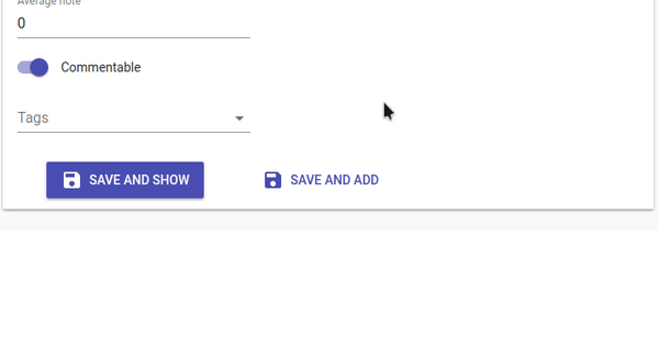
<BooleanInput /> is a toggle button allowing you to attribute a true or false value to a record field.
import { BooleanInput } from 'react-admin';

<BooleanInput label="Commentable" source="commentable" />

This input does not handle null values. You would need the <NullableBooleanInput /> component if you have to handle non-set booleans.
You can use the options prop to pass any option supported by the Material UI Switch components. For example, here’s how to set a custom checked icon:
import { BooleanInput } from 'react-admin';
import FavoriteIcon from '@material-ui/icons/Favorite';

<BooleanInput
    source="favorite"
    options={{
        checkedIcon: <FavoriteIcon />,
    }}
/>
Refer to Material UI Switch documentation for more details.
<NullableBooleanInput /> renders as a dropdown list, allowing to choose between true, false, and null values.
import { NullableBooleanInput } from 'react-admin';

<NullableBooleanInput label="Commentable" source="commentable" />

<CheckboxGroupInput>
If you want to let the user choose multiple values among a list of possible values by showing them all, <CheckboxGroupInput> is the right component. Set the choices attribute to determine the options (with id, name tuples):
import { CheckboxGroupInput } from 'react-admin';

<CheckboxGroupInput source="category" choices={[
    { id: 'programming', name: 'Programming' },
    { id: 'lifestyle', name: 'Lifestyle' },
    { id: 'photography', name: 'Photography' },
]} />

You can also customize the properties to use for the option name and value, thanks to the optionText and optionValue attributes:
const choices = [
    { _id: 123, full_name: 'Leo Tolstoi', sex: 'M' },
    { _id: 456, full_name: 'Jane Austen', sex: 'F' },
];
<CheckboxGroupInput source="author_id" choices={choices} optionText="full_name" optionValue="_id" />
optionText also accepts a function, so you can shape the option text at will:
const choices = [
   { id: 123, first_name: 'Leo', last_name: 'Tolstoi' },
   { id: 456, first_name: 'Jane', last_name: 'Austen' },
];
const optionRenderer = choice => `${choice.first_name} ${choice.last_name}`;
<CheckboxGroupInput source="author_id" choices={choices} optionText={optionRenderer} />
optionText also accepts a React Element, that will be cloned and receive the related choice as the record prop. You can use Field components there.
const choices = [
   { id: 123, first_name: 'Leo', last_name: 'Tolstoi' },
   { id: 456, first_name: 'Jane', last_name: 'Austen' },
];
const FullNameField = ({ record }) => <span>{record.first_name} {record.last_name}</span>;
<CheckboxGroupInput source="gender" choices={choices} optionText={<FullNameField />}/>
The choices are translated by default, so you can use translation identifiers as choices:
const choices = [
    { id: 'programming', name: 'myroot.category.programming' },
    { id: 'lifestyle', name: 'myroot.category.lifestyle' },
    { id: 'photography', name: 'myroot.category.photography' },
];
However, in some cases (e.g. inside a <ReferenceInput>), you may not want the choice to be translated. In that case, set the translateChoice prop to false.
<CheckboxGroupInput source="gender" choices={choices} translateChoice={false}/>
Lastly, use the options attribute if you want to override any of Material UI’s <Checkbox> attributes:
import { FavoriteBorder, Favorite } from '@material-ui/icons';

<CheckboxGroupInput source="category" options={{
    icon: <FavoriteBorder />,
    checkedIcon: <Favorite />
}} />
Refer to Material UI Checkbox documentation for more details.
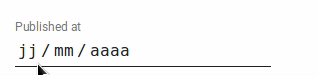
<DateInput>
Ideal for editing dates, <DateInput> renders a standard browser Date Picker, so the appearance depends on the browser (and falls back to a text input on safari).
import { DateInput } from 'react-admin';

<DateInput source="published_at" />
Tip: For a material-ui styled <DateInput> component, check out vascofg/react-admin-date-inputs.
<DateTimeInput>
An input for editing dates with time. <DateTimeInput> renders a standard browser Date and Time Picker, so the appearance depends on the browser (and falls back to a text input on safari).
import { DateTimeInput } from 'react-admin';

<DateTimeInput source="published_at" />
Tip: For a material-ui styled <DateTimeInput> component, check out vascofg/react-admin-date-inputs.
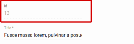
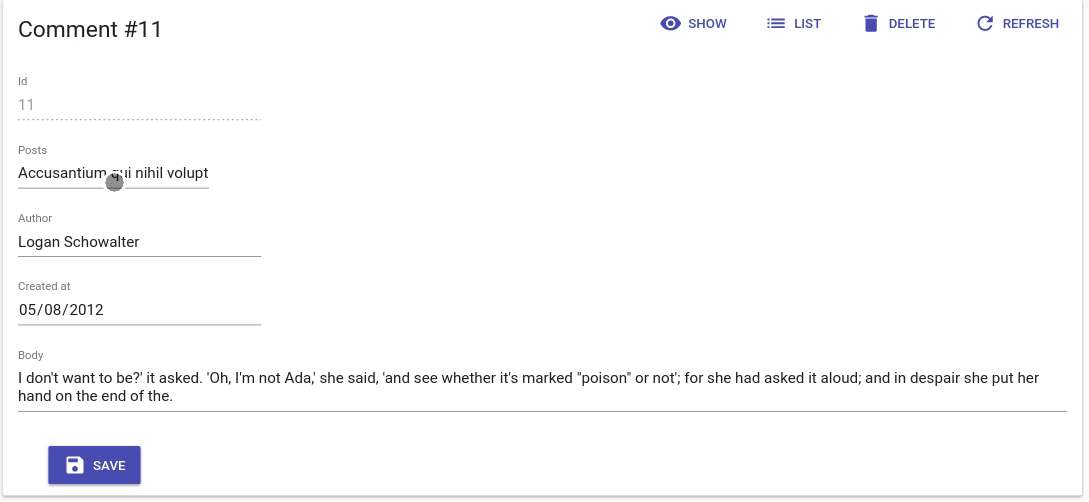
<DisabledInput>
When you want to display a record property in an <Edit> form without letting users update it (such as for auto-incremented primary keys), use the <DisabledInput>:
import { DisabledInput } from 'react-admin';

<DisabledInput source="id" />
Tip: To add non-editable fields to the <Edit> view, you can also use one of react-admin Field components:
// in src/posts.js
import { Edit, LongTextInput, SimpleForm, TextField } from 'react-admin';

export const PostEdit = (props) => (
    <Edit {...props}>
        <SimpleForm>
            <TextField source="title" /> {/* NOT EDITABLE */}
            <LongTextInput source="body" />
        </SimpleForm>
    </Edit>
);
Tip: You can even use a component of your own, provided it accepts a record prop:
// in src/posts.js
import { Edit, Labeled, LongTextInput, SimpleForm } from 'react-admin';

const titleStyle = { textOverflow: 'ellipsis', overflow: 'hidden', maxWidth: '20em' };
const Title = ({ record, label }) => (
    <Labeled label={label}>
        <span style={titleStyle}>{record.title}</span>
    </Labeled>
);

export const PostEdit = (props) => (
    <Edit {...props}>
        <SimpleForm>
            <Title label="Title" />
            <LongTextInput source="body" />
        </SimpleForm>
    </Edit>
);
<ImageInput>
<ImageInput> allows to upload some pictures using react-dropzone.
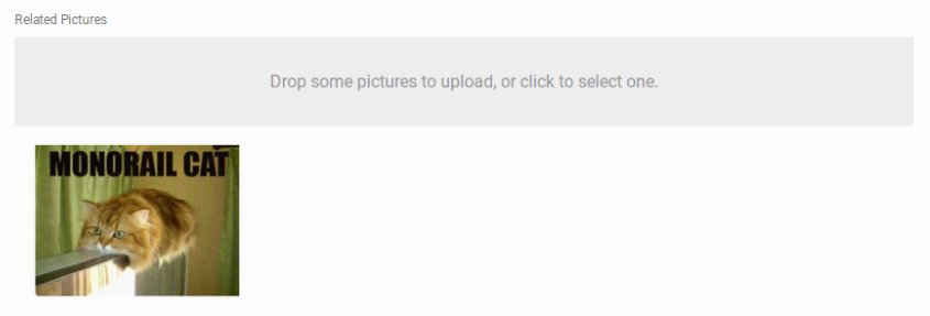
Previews are enabled using <ImageInput> children, as following:
<ImageInput source="pictures" label="Related pictures" accept="image/*">
    <ImageField source="src" title="title" />
</ImageInput>
Writing a custom field component for displaying the current value(s) is easy: it’s a standard field.
When receiving new files, ImageInput will add a rawFile property to the object passed as the record prop of children. This rawFile is the File instance of the newly added file. This can be useful to display information about size or mimetype inside a custom field.
The ImageInput component accepts an options prop into which you can pass all the react-dropzone properties. However, some of the most useful props should be passed directly on the ImageInput: maxSize, minSize, multiple.
If the default Dropzone label doesn’t fit with your need, you can pass a placeholder attribute to overwrite it. The attribute can be anything React can render (PropTypes.node):
<ImageInput source="pictures" label="Related pictures" accept="image/*" placeholder={<p>Drop your file here</p>}>
    <ImageField source="src" title="title" />
</ImageInput>
Note that the image upload returns a File object. It is your responsibility to handle it depending on your API behavior. You can for instance encode it in base64, or send it as a multi-part form data. Check this example for base64 encoding data by extending the REST Client.
<FileInput>
<FileInput> allows to upload some files using react-dropzone.
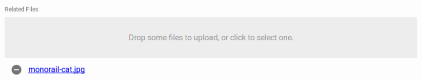
Previews (actually a simple list of files names) are enabled using <FileField> children, as following:
<FileInput source="files" label="Related files" accept="application/pdf">
    <FileField source="src" title="title" />
</FileInput>
Writing a custom field component for displaying the current value(s) is easy: it’s a standard field.
When receiving new files, FileInput will add a rawFile property to the object passed as the record prop of children. This rawFile is the File instance of the newly added file. This can be useful to display information about size or mimetype inside a custom field.
The FileInput component accepts an options prop into which you can pass all the react-dropzone properties. However, some of the most useful props should be passed directly on the FileInput: maxSize, minSize, multiple.
If the default Dropzone label doesn’t fit with your need, you can pass a placeholder attribute to overwrite it. The attribute can be anything React can render (PropTypes.node):
<FileInput source="files" label="Related files" accept="application/pdf" placeholder={<p>Drop your file here</p>}>
    <ImageField source="src" title="title" />
</FileInput>
Note that the file upload returns a File object. It is your responsibility to handle it depending on your API behavior. You can for instance encode it in base64, or send it as a multi-part form data. Check this example for base64 encoding data by extending the REST Client.
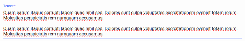
<LongTextInput>
<LongTextInput> is the best choice for multiline text values. It renders as an auto expandable textarea.
import { LongTextInput } from 'react-admin';

<LongTextInput source="teaser" />
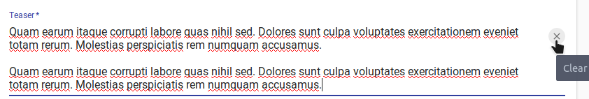
You can make the LongTextInput component resettable using the resettable prop. This will add a reset button which will be displayed only when the field has a value and is focused.
import { LongTextInput } from 'react-admin';

<LongTextInput source="title" resettable />
<NumberInput>
<NumberInput> translates to a HTML <input type="number">. It is necessary for numeric values because of a known React bug, which prevents using the more generic <TextInput> in that case.
import { NumberInput } from 'react-admin';

<NumberInput source="nb_views" />
You can customize the step props (which defaults to “any”):
<NumberInput source="nb_views" step={1} />
<RadioButtonGroupInput>
If you want to let the user choose a value among a list of possible values by showing them all (instead of hiding them behind a dropdown list, as in <SelectInput>), <RadioButtonGroupInput> is the right component. Set the choices attribute to determine the options (with id, name tuples):
import { RadioButtonGroupInput } from 'react-admin';

<RadioButtonGroupInput source="category" choices={[
    { id: 'programming', name: 'Programming' },
    { id: 'lifestyle', name: 'Lifestyle' },
    { id: 'photography', name: 'Photography' },
]} />

You can also customize the properties to use for the option name and value, thanks to the optionText and optionValue attributes:
const choices = [
    { _id: 123, full_name: 'Leo Tolstoi', sex: 'M' },
    { _id: 456, full_name: 'Jane Austen', sex: 'F' },
];
<RadioButtonGroupInput source="author_id" choices={choices} optionText="full_name" optionValue="_id" />
optionText also accepts a function, so you can shape the option text at will:
const choices = [
   { id: 123, first_name: 'Leo', last_name: 'Tolstoi' },
   { id: 456, first_name: 'Jane', last_name: 'Austen' },
];
const optionRenderer = choice => `${choice.first_name} ${choice.last_name}`;
<RadioButtonGroupInput source="author_id" choices={choices} optionText={optionRenderer} />
optionText also accepts a React Element, that will be cloned and receive the related choice as the record prop. You can use Field components there.
const choices = [
   { id: 123, first_name: 'Leo', last_name: 'Tolstoi' },
   { id: 456, first_name: 'Jane', last_name: 'Austen' },
];
const FullNameField = ({ record }) => <span>{record.first_name} {record.last_name}</span>;
<RadioButtonGroupInput source="gender" choices={choices} optionText={<FullNameField />}/>
The choices are translated by default, so you can use translation identifiers as choices:
const choices = [
   { id: 'M', name: 'myroot.gender.male' },
   { id: 'F', name: 'myroot.gender.female' },
];
However, in some cases (e.g. inside a <ReferenceInput>), you may not want the choice to be translated. In that case, set the translateChoice prop to false.
<RadioButtonGroupInput source="gender" choices={choices} translateChoice={false}/>
Lastly, use the options attribute if you want to override any of Material UI’s <RadioButtonGroup> attributes:
<RadioButtonGroupInput source="category" options={{
    labelPosition: 'right'
}} />
Refer to Material UI RadioGroup documentation for more details.
Tip: If you want to populate the choices attribute with a list of related records, you should decorate <RadioButtonGroupInput> with <ReferenceInput>, and leave the choices empty:
import { RadioButtonGroupInput, ReferenceInput } from 'react-admin'

<ReferenceInput label="Author" source="author_id" reference="authors">
    <RadioButtonGroupInput optionText="last_name" />
</ReferenceInput>
<ReferenceArrayInput>
Use <ReferenceArrayInput> to edit an array of reference values, i.e. to let users choose a list of values (usually foreign keys) from another REST endpoint.
<ReferenceArrayInput> fetches the related resources (using the CRUD_GET_MANY REST method) as well as possible resources (using the
CRUD_GET_MATCHING REST method) in the reference endpoint.
For instance, if the post object has many tags, a post resource may look like:
{
    id: 1234,
    tag_ids: [1, 23, 4]
}
Then <ReferenceArrayInput> would fetch a list of tag resources from these two calls:
http://myapi.com/tags?id=[1,23,4]
http://myapi.com/tags?page=1&perPage=25
Once it receives the deduplicated reference resources, this component delegates rendering to a subcomponent, to which it passes the possible choices as the choices attribute.
This means you can use <ReferenceArrayInput> with <SelectArrayInput>, or with the component of your choice, provided it supports the choices attribute.
The component expects a source and a reference attributes. For instance, to make the tag_ids for a post editable:
import { ReferenceArrayInput, SelectArrayInput } from 'react-admin'

<ReferenceArrayInput source="tag_ids" reference="tags">
    <SelectArrayInput optionText="name" />
</ReferenceArrayInput>
Note: You must add a <Resource> for the reference resource - react-admin needs it to fetch the reference data. You can omit the list prop in this reference if you want to hide it in the sidebar menu.
<Admin dataProvider={myDataProvider}>
    <Resource name="posts" list={PostList} edit={PostEdit} />
    <Resource name="tags" />
</Admin>
Set the allowEmpty prop when you want to add an empty choice with a value of null in the choices list.
Disabling allowEmpty does not mean that the input will be required. If you want to make the input required, you must add a validator as indicated in Validation Documentation. Enabling the allowEmpty props just adds an empty choice (with null value) on top of the options, and makes the value nullable.
import { ReferenceArrayInput, SelectArrayInput } from 'react-admin'

<ReferenceArrayInput source="tag_ids" reference="tags" allowEmpty>
    <SelectArrayInput optionText="name" />
</ReferenceArrayInput>
Tip: allowEmpty is set by default for all Input components children of the <Filter> component
You can tweak how this component fetches the possible values using the perPage, sort, and filter props.
// by default, fetches only the first 25 values. You can extend this limit
// by setting the `perPage` prop.
<ReferenceArrayInput
     source="tag_ids"
     reference="tags"
     perPage={100}>
    <SelectArrayInput optionText="name" />
</ReferenceArrayInput>

// by default, orders the possible values by id desc. You can change this order
// by setting the `sort` prop (an object with `field` and `order` properties).
<ReferenceArrayInput
     source="tag_ids"
     reference="tags"
     sort={{ field: 'title', order: 'ASC' }}>
    <SelectArrayInput optionText="name" />
</ReferenceArrayInput>

// you can filter the query used to populate the possible values. Use the
// `filter` prop for that.
<ReferenceArrayInput
     source="tag_ids"
     reference="tags"
     filter={{ is_published: true }}>
    <SelectArrayInput optionText="name" />
</ReferenceArrayInput>
<ReferenceInput>
Use <ReferenceInput> for foreign-key values, for instance, to edit the post_id of a comment resource. This component fetches the possible values in the reference resource (using the GET_LIST data provider verb) and the referenced record (using the GET_MANY data provider verb), then delegates rendering to a subcomponent, to which it passes the possible choices as the choices attribute.
This means you can use <ReferenceInput> with any of <SelectInput>, <AutocompleteInput>, or <RadioButtonGroupInput>, or even with the component of your choice, provided it supports the choices attribute.
The component expects a source and a reference attributes. For instance, to make the post_id for a comment editable:
import { ReferenceInput, SelectInput } from 'react-admin'

<ReferenceInput label="Post" source="post_id" reference="posts">
    <SelectInput optionText="title" />
</ReferenceInput>
Note: You must add a <Resource> for the reference resource - react-admin needs it to fetch the reference data. You can omit the list prop in this reference if you want to hide it in the sidebar menu.
<Admin dataProvider={myDataProvider}>
    <Resource name="comments" list={CommentList} />
    <Resource name="posts" />
</Admin>
Tip: Why does <ReferenceInput> use the GET_MANY verb with a single value [id] instead of GET_ONE to fetch the record for the current value? Because when there are many <ReferenceInput> for the same resource in a form (for instance when inside an <ArrayInput>), react-admin aggregates the calls to GET_MANY into a single one with [id1, id2, ...)]. This speeds up the UI and avoids hitting the API too much.
Set the allowEmpty prop when you want to add an empty choice with a value of null in the choices list.
Disabling allowEmpty does not mean that the input will be required. If you want to make the input required, you must add a validator as indicated in Validation Documentation. Enabling the allowEmpty props just adds an empty choice (with null value) on top of the options, and makes the value nullable.
import { ReferenceInput, SelectInput } from 'react-admin'

<ReferenceInput label="Post" source="post_id" reference="posts" allowEmpty>
    <SelectInput optionText="title" />
</ReferenceInput>
Tip: allowEmpty is set by default for all Input components children of the <Filter> component:
const CommentFilter = (props) => (
    <Filter {...props}>
        <ReferenceInput label="Post" source="post_id" reference="posts"> // no need for allowEmpty
            <SelectInput optionText="title" />
        </ReferenceInput>
    </Filter>
);
You can tweak how this component fetches the possible values using the perPage, sort, and filter props.
// by default, fetches only the first 25 values. You can extend this limit
// by setting the `perPage` prop.
<ReferenceInput
     source="post_id"
     reference="posts"
     perPage={100}>
    <SelectInput optionText="title" />
</ReferenceInput>

// by default, orders the possible values by id desc. You can change this order
// by setting the `sort` prop (an object with `field` and `order` properties).
<ReferenceInput
     source="post_id"
     reference="posts"
     sort={{ field: 'title', order: 'ASC' }}>
    <SelectInput optionText="title" />
</ReferenceInput>

// you can filter the query used to populate the possible values. Use the
// `filter` prop for that.
<ReferenceInput
     source="post_id"
     reference="posts"
     filter={{ is_published: true }}>
    <SelectInput optionText="title" />
</ReferenceInput>
The child component may further filter results (that’s the case, for instance, for <AutocompleteInput>). ReferenceInput passes a setFilter function as prop to its child component. It uses the value to create a filter for the query - by default { q: [searchText] }. You can customize the mapping
searchText => searchQuery by setting a custom filterToQuery function prop:
<ReferenceInput
     source="post_id"
     reference="posts"
     filterToQuery={searchText => ({ title: searchText })}>
    <SelectInput optionText="title" />
</ReferenceInput>
The child component receives the following props from <ReferenceInput>:
isLoading: whether the request for possible values is loading or notfilter: the current filter of the request for possible values. Defaults to{}.pagination: the current pagination of the request for possible values. Defaults to{ page: 1, perPage: 25 }.sort: the current sorting of the request for possible values. Defaults to{ field: 'id', order: 'DESC' }.error: the error message if the form validation failed for that inputwarning: the warning message if the form validation failed for that inputonChange: function to call when the value changessetFilter: function to call to update the filter of the request for possible valuessetPagination: : function to call to update the pagination of the request for possible valuessetSort: function to call to update the sorting of the request for possible values
<RichTextInput>
<RichTextInput> is the ideal component if you want to allow your users to edit some HTML contents. It
is powered by Quill.
Note: Due to its size, <RichTextInput> is not bundled by default with react-admin. You must install it first, using npm:
npm install ra-input-rich-text
Then use it as a normal input component:
import RichTextInput from 'ra-input-rich-text';

<RichTextInput source="body" />

You can customize the rich text editor toolbar using the toolbar attribute, as described on the Quill official toolbar documentation.
<RichTextInput source="body" toolbar={[ ['bold', 'italic', 'underline', 'link'] ]} />
<SelectInput>
To let users choose a value in a list using a dropdown, use <SelectInput>. It renders using Material ui’s <Select>. Set the choices attribute to determine the options (with id, name tuples):
import { SelectInput } from 'react-admin';

<SelectInput source="category" choices={[
    { id: 'programming', name: 'Programming' },
    { id: 'lifestyle', name: 'Lifestyle' },
    { id: 'photography', name: 'Photography' },
]} />

You can also customize the properties to use for the option name and value, thanks to the optionText and optionValue attributes:
const choices = [
    { _id: 123, full_name: 'Leo Tolstoi', sex: 'M' },
    { _id: 456, full_name: 'Jane Austen', sex: 'F' },
];
<SelectInput source="author_id" choices={choices} optionText="full_name" optionValue="_id" />
optionText also accepts a function, so you can shape the option text at will:
const choices = [
   { id: 123, first_name: 'Leo', last_name: 'Tolstoi' },
   { id: 456, first_name: 'Jane', last_name: 'Austen' },
];
const optionRenderer = choice => `${choice.first_name} ${choice.last_name}`;
<SelectInput source="author_id" choices={choices} optionText={optionRenderer} />
optionText also accepts a React Element, that will be cloned and receive the related choice as the record prop. You can use Field components there.
const choices = [
   { id: 123, first_name: 'Leo', last_name: 'Tolstoi' },
   { id: 456, first_name: 'Jane', last_name: 'Austen' },
];
const FullNameField = ({ record }) => <span>{record.first_name} {record.last_name}</span>;
<SelectInput source="gender" choices={choices} optionText={<FullNameField />}/>
Enabling the allowEmpty props adds an empty choice (with a default null value, which you can overwrite with the emptyValue prop) on top of the options, and makes the value nullable:
<SelectInput source="category" allowEmpty emptyValue="" choices={[
    { id: 'programming', name: 'Programming' },
    { id: 'lifestyle', name: 'Lifestyle' },
    { id: 'photography', name: 'Photography' },
]} />
The choices are translated by default, so you can use translation identifiers as choices:
const choices = [
   { id: 'M', name: 'myroot.gender.male' },
   { id: 'F', name: 'myroot.gender.female' },
];
However, in some cases, you may not want the choice to be translated. In that case, set the translateChoice prop to false.
<SelectInput source="gender" choices={choices} translateChoice={false}/>
Note that translateChoice is set to false when <SelectInput> is a child of <ReferenceInput>.
Lastly, use the options attribute if you want to override any of Material UI’s <SelectField> attributes:
<SelectInput source="category" options={{
    maxHeight: 200
}} />
Refer to Material UI Select documentation for more details.
Tip: If you want to populate the choices attribute with a list of related records, you should decorate <SelectInput> with <ReferenceInput>, and leave the choices empty:
import { SelectInput, ReferenceInput } from 'react-admin'

<ReferenceInput label="Author" source="author_id" reference="authors">
    <SelectInput optionText="last_name" />
</ReferenceInput>
If, instead of showing choices as a dropdown list, you prefer to display them as a list of radio buttons, try the <RadioButtonGroupInput>. And if the list is too big, prefer the <AutocompleteInput>.
You can make the SelectInput component resettable using the resettable prop. This will add a reset button which will be displayed only when the field has a value.

You can set disabled values by setting the disabled property of one item:
const choices = [
    { _id: 123, full_name: 'Leo Tolstoi', sex: 'M' },
    { _id: 456, full_name: 'Jane Austen', sex: 'F' },
    { _id: 1, full_name: 'System Administrator', sex: 'F', disabled: true },
];
<SelectInput source="author_id" choices={choices} optionText="full_name" optionValue="_id" />
You can use a custom field name by setting disableValue prop:
const choices = [
    { _id: 123, full_name: 'Leo Tolstoi', sex: 'M' },
    { _id: 456, full_name: 'Jane Austen', sex: 'F' },
    { _id: 987, full_name: 'Jack Harden', sex: 'M', not_available: true },
];
<SelectInput source="contact_id" choices={choices} optionText="full_name" optionValue="_id" disableValue="not_available" />
<SelectArrayInput>
To let users choose several values in a list using a dropdown, use <SelectArrayInput>. It renders using Material ui’s <Select>. Set the choices attribute to determine the options (with id, name tuples):
import { SelectArrayInput } from 'react-admin';

<SelectArrayInput label="Tags" source="categories" choices={[
    { id: 'music', name: 'Music' },
    { id: 'photography', name: 'Photo' },
    { id: 'programming', name: 'Code' },
    { id: 'tech', name: 'Technology' },
    { id: 'sport', name: 'Sport' },
]} />
You can also customize the properties to use for the option name and value,
thanks to the optionText and optionValue attributes.
const choices = [
   { _id: '1', name: 'Book', plural_name: 'Books' },
   { _id: '2', name: 'Video', plural_name: 'Videos' },
   { _id: '3', name: 'Audio', plural_name: 'Audios' },
];
<SelectArrayInput source="categories" choices={choices} optionText="plural_name" optionValue="_id" />
optionText also accepts a function, so you can shape the option text at will:
const choices = [
   { id: '1', name: 'Book', quantity: 23 },
   { id: '2', name: 'Video', quantity: 56 },
   { id: '3', name: 'Audio', quantity: 12 },
];
const optionRenderer = choice => `${choice.name} (${choice.quantity})`;
<SelectArrayInput source="categories" choices={choices} optionText={optionRenderer} />
The choices are translated by default, so you can use translation identifiers as choices:
const choices = [
   { id: 'books', name: 'myroot.category.books' },
   { id: 'sport', name: 'myroot.category.sport' },
];
Lastly, use the options attribute if you want to override any of the <Select> attributes:
<SelectArrayInput source="category" options={{ fullWidth: true }} />
Refer to the Select documentation for more details.
The SelectArrayInput component cannot be used inside a ReferenceInput but can be used inside a ReferenceArrayInput.
import React from 'react';
import {
    ChipField,
    Create,
    DateInput,
    LongTextInput,
    ReferenceArrayInput,
    SelectArrayInput,
    TextInput,
} from 'react-admin';

export const PostCreate = props => (
    <Create {...props}>
        <SimpleForm>
            <TextInput source="title" />
            <LongTextInput source="body" />
            <DateInput source="published_at" />

            <ReferenceArrayInput reference="tags" source="tags">
                <SelectArrayInput>
                    <ChipField source="name" />
                </SelectArrayInput>
            </ReferenceArrayInput>
        </SimpleForm>
    </Create>
);
Tip: As it does not provide autocompletion, the SelectArrayInput might not be suited when the referenced resource has a lot of items.
<TextInput>
<TextInput> is the most common input. It is used for texts, emails, URL or passwords. In translates to an HTML <input> tag.
import { TextInput } from 'react-admin';

<TextInput source="title" />
You can choose a specific input type using the type attribute, for instance text (the default), email, url, or password:
<TextInput label="Email Address" source="email" type="email" />
You can make the TextInput component resettable using the resettable prop. This will add a reset button which will be displayed only when the field has a value and is focused.
import { TextInput } from 'react-admin';

<TextInput source="title" resettable />

Warning: Do not use type="number", or you’ll receive a string as value (this is a known React bug). Instead, use <NumberInput>.
Transforming Input Value to/from Record
The data format returned by the input component may not be what your API desires. Since React-admin uses Redux Form, we can use its parse() and format() functions to transform the input value when saving to and loading from the record. It’s better to understand the input value’s lifecycle before you start.
Mnemonic for the two functions:
parse(): input -> recordformat(): record -> input
Say the user would like to input values of 0-100 to a percentage field but your API (hence record) expects 0-1.0. You can use simple parse() and format() functions to archive the transform:
<NumberInput source="percent" format={v => v*100} parse={v => v/100} label="Formatted number" />
<DateInput> stores and returns a string. If you would like to store a JavaScript Date object in your record instead:
const dateFormatter = v => {
  // v is a `Date` object
  if (!(v instanceof Date) || isNaN(v)) return;
  const pad = '00';
  const yy = v.getFullYear().toString();
  const mm = (v.getMonth() + 1).toString();
  const dd = v.getDate().toString();
  return `${yy}-${(pad + mm).slice(-2)}-${(pad + dd).slice(-2)}`;
};

const dateParser = v => {
  // v is a string of "YYYY-MM-DD" format
  const match = /(\d{4})-(\d{2})-(\d{2})/.exec(v);
  if (match === null) return;
  const d = new Date(match[1], parseInt(match[2], 10) - 1, match[3]);
  if (isNaN(d)) return;
  return d;
};

<DateInput source="isodate" format={dateFormatter} parse={dateParser} />
Third-Party Components
You can find components for react-admin in third-party repositories.
- vascofg/react-admin-color-input: a color input using React Color, a collection of color pickers.
- LoicMahieu/aor-tinymce-input: a TinyMCE component, useful for editing HTML
- vascofg/react-admin-date-inputs: a collection of Date Inputs, based on material-ui-pickers
Writing Your Own Input Component
If you need a more specific input type, you can also write it yourself. You’ll have to rely on redux-form’s <Field> component, so as to handle the value update cycle.
For instance, let’s write a component to edit the latitude and longitude of the current record:
// in LatLongInput.js
import { Field } from 'redux-form';
const LatLngInput = () => (
<span>
<Field name="lat" component="input" type="number" placeholder="latitude" />
<Field name="lng" component="input" type="number" placeholder="longitude" />
</span>
);
export default LatLngInput;
// in ItemEdit.js
const ItemEdit = (props) => (
<Edit {...props}>
<SimpleForm>
<LatLngInput />
</SimpleForm>
</Edit>
);
LatLngInput takes no props, because the <Field> component can access the current record via its context. The name prop serves as a selector for the record property to edit. All Field props except name and component are passed to the child component/element (an <input> in that example). Executing this component will render roughly the following code:
<span>
    <input type="number" placeholder="latitude" value={record.lat} />
    <input type="number" placeholder="longitude" value={record.lng} />
</span>
Tip: The <Field> component supports dot notation in the name prop, to edit nested props:
const LatLongInput = () => (
<span>
<Field name="position.lat" component="input" type="number" placeholder="latitude" />
<Field name="position.lng" component="input" type="number" placeholder="longitude" />
</span>
);
This component lacks a label. React-admin provides the <Labeled> component for that:
// in LatLongInput.js
import { Field } from 'redux-form';
import { Labeled } from 'react-admin';
const LatLngInput = () => (
<Labeled label="position">
<span>
<Field name="lat" component="input" type="number" placeholder="latitude" />
<Field name="lng" component="input" type="number" placeholder="longitude" />
</span>
</Labeled>
);
export default LatLngInput;
Now the component will render with a label:
<label>Position</label>
<span>
    <input type="number" placeholder="longitude" value={record.lat} />
    <input type="number" placeholder="longitude" value={record.lng} />
</span>
Instead of HTML input elements, you can use a material-ui component. To compose material-ui and Field, use a field renderer function to map the props:
// in LatLongInput.js
import TextField from '@material-ui/core/TextField';
import { Field } from 'redux-form';
const renderTextField = ({ input, label, meta: { touched, error }, ...custom }) => (
<TextField
label={label}
error={!!(touched && error)}
helperText={touched && error}
{...input}
{...custom}
/>
);
const LatLngInput = () => (
<span>
<Field name="lat" component={renderTextField} label="latitude" />
<Field name="lng" component={renderTextField} label="longitude" />
</span>
);
Material-ui’s <TextField> component already includes a label, so you don’t need to use <Labeled> in this case. <Field> injects two props to its child component: input and meta. To learn more about these props, please refer to the <Field> component documentation in the redux-form website.
Tip: If you only need one <Field> component in a custom input, you can let react-admin do the <Field> decoration for you by using the addField Higher-order component:
// in SexInput.js
import SelectField from '@material-ui/core/SelectField';
import MenuItem from '@material-ui/core/MenuItem';
import { addField } from 'react-admin';

const SexInput = ({ input, meta: { touched, error } }) => (
    <SelectField
        floatingLabelText="Sex"
        errorText={touched && error}
        {...input}
    >
        <MenuItem value="M" primaryText="Male" />
        <MenuItem value="F" primaryText="Female" />
    </SelectField>
);
export default addField(SexInput); // decorate with redux-form's <Field>

// equivalent of
import SelectField from '@material-ui/core/SelectField';
import MenuItem from '@material-ui/core/MenuItem';
import { Field } from 'redux-form';

const renderSexInput = ({ input, meta: { touched, error } }) => (
    <SelectField
        floatingLabelText="Sex"
        errorText={touched && error}
        {...input}
    >
        <MenuItem value="M" primaryText="Male" />
        <MenuItem value="F" primaryText="Female" />
    </SelectField>
);
const SexInput = ({ source }) => <Field name={source} component={renderSexInput} />
export default SexInput;
Tip: addField takes a list of props as second argument, so you can set <Field> props there. It’s useful for instance if you need to set the format and parse props of the field:
const parse = value => // ...
const format = value => // ...

const MyDateInput = props => // ...

export default addField(MyDateInput, { parse, format });
For more details on how to use redux-form’s <Field> component, please refer to the redux-form doc.
Instead of HTML input elements or material-ui components, you can use react-admin input components, like <NumberInput> for instance. React-admin components are already decorated by <Field>, and already include a label, so you don’t need either <Field> or <Labeled> when using them:
// in LatLongInput.js
import { NumberInput } from 'react-admin';
const LatLngInput = () => (
<span>
<NumberInput source="lat" label="latitude" />
<NumberInput source="lng" label="longitude" />
</span>
);
export default LatLngInput;
// in ItemEdit.js
const ItemEdit = (props) => (
<Edit {...props}>
<SimpleForm>
<DisabledInput source="id" />
<LatLngInput />
</SimpleForm>
</Edit>
);
Linking Two Inputs
Edition forms often contain linked inputs, e.g. country and city (the choices of the latter depending on the value of the former).
React-admin relies on redux-form, so you can grab the current form values using redux-form formValueSelector(). Alternatively, you can use the react-admin <FormDataConsumer> component, which grabs the form values, and passes them to a child function.
This facilitates the implementation of linked inputs:
import { FormDataConsumer } from 'react-admin';

const OrderEdit = (props) => (
    <Edit {...props}>
        <SimpleForm>
            <SelectInput source="country" choices={countries} />
            <FormDataConsumer>
                {({ formData, ...rest }) =>
                     <SelectInput
                         source="city"
                         choices={getCitiesFor(formData.country)}
                         {...rest}
                     />
                }
            </FormDataConsumer>
        </SimpleForm>
    </Edit>
);
Tip: When using a FormDataConsumer inside an ArrayInput, the FormDataConsumer will provide three additional properties to its children function:
scopedFormData: an object containing the current values of the currently rendered item from theArrayInputgetSource: a function which will translate the source into a valid one for theArrayInputdispatch: Redux’ function to dispatch an action. Useful to update another input value.
Here is an example usage for dispatch: A country input that resets a city input on change.
import React, { Fragment } from 'react';
import { change } from 'redux-form';
import { FormDataConsumer, REDUX_FORM_NAME } from 'react-admin';

const OrderEdit = (props) => (
    <Edit {...props}>
        <SimpleForm>
            <FormDataConsumer>
                {({ formData, dispatch, ...rest }) => (
                    <Fragment>
                        <SelectInput
                            source="country"
                            choices={countries}
                            onChange={value => dispatch(
                                change(REDUX_FORM_NAME, 'city', null)
                            )}
                             {...rest}
                        />
                        <SelectInput
                            source="city"
                            choices={getCitiesFor(formData.country)}
                             {...rest}
                        />
                    </Fragment>
                )}
            </FormDataConsumer>
        </SimpleForm>
    </Edit>
);
And here is an example usage for getSource inside <ArrayInput>:
import { FormDataConsumer } from 'react-admin';

const PostEdit = (props) => (
    <Edit {...props}>
        <SimpleForm>
            <ArrayInput source="authors">
                <SimpleFormIterator>
                    <TextInput source="name" />

                    <FormDataConsumer>
                        {({
                            formData, // The whole form data
                            scopedFormData, // The data for this item of the ArrayInput
                            getSource, // A function to get the valid source inside an ArrayInput
                            ...rest,
                        }) =>
                            scopedFormData.name ? (
                                <SelectInput
                                    source={getSource('role')} // Will translate to "authors[0].role"
                                    choices={['main', 'coauthor']}
                                    {...rest}
                                />
                            ) : null
                        }
                    </FormDataConsumer>
                </SimpleFormIterator>
            </ArrayInput>
        </SimpleForm>
    </Edit>
);
Hiding Inputs Based On Other Inputs
You may want to display or hide inputs base on the value of another input - for instance, show an email input only if the hasEmail boolean input is ticked to true.
For such cases, you can use the approach described above, using the <FormDataConsumer> component.
import { FormDataConsumer } from 'react-admin';

 const PostEdit = (props) => (
     <Edit {...props}>
         <SimpleForm>
             <BooleanInput source="hasEmail" />
             <FormDataConsumer>
                 {({ formData, ...rest }) => formData.hasEmail &&
                      <TextInput source="email" {...rest} />
                 }
             </FormDataConsumer>
         </SimpleForm>
     </Edit>
 );