Theming
Whether you need to adjust a CSS rule for a single component, or change the color of the labels in the entire app, you’re covered!
Overriding A Component Style
Every react-admin component provides a className property, which is always applied to the root element.
Here is an example customizing an EditButton component inside a Datagrid, using its className property and the withStyles Higher Order Component from Material-UI:
import { NumberField, List, Datagrid, EditButton } from 'react-admin';
import { withStyles } from '@material-ui/core/styles';

const styles = {
    button: {
        fontWeight: 'bold',
        // This is JSS syntax to target a deeper element using css selector, here the svg icon for this button
        '& svg': { color: 'orange' }
    },
};

const MyEditButton = withStyles(styles)(({ classes, ...props }) => (
    <EditButton
        className={classes.button}
        {...props}
    />
));

export const ProductList = (props) => (
    <List {...props}>
        <Datagrid>
            <TextField source="sku" />
            <TextField source="price" />
            <MyEditButton />
        </Datagrid>
    </List>
);
For some components, you may want to override not only the root component style, but also the style of components inside the root. In this case, the className property isn’t enough. You can take advantage of the classes property to customize the classes that the component uses internally.
Here is an example using the classes property of the Filter and List components:
import React from 'react';
import {
BooleanField,
Datagrid,
DateField,
DateInput,
EditButton,
Filter,
List,
NullableBooleanInput,
NumberField,
TextInput,
} from 'react-admin';
import Icon from '@material-ui/icons/Person';
import { withStyles } from '@material-ui/core/styles';
export const VisitorIcon = Icon;
// The Filter component supports the `form` and `button` CSS classes. Here we override the `form` class
const filterStyles = {
form: {
backgroundColor: 'Lavender',
},
};
const VisitorFilter = withStyles(filterStyles)(({ classes, ...props }) => (
<Filter classes={classes} {...props}>
<TextInput
className={classes.searchInput}
label="pos.search"
source="q"
alwaysOn
/>
<DateInput source="last_seen_gte" />
<NullableBooleanInput source="has_ordered" />
<NullableBooleanInput source="has_newsletter" defaultValue />
</Filter>
));
// The List component supports the `root`, `header`, `actions` and `noResults` CSS classes. Here we override the `header` and `actions` classes
const listStyles = {
actions: {
backgroundColor: 'Lavender',
},
header: {
backgroundColor: 'Lavender',
},
};
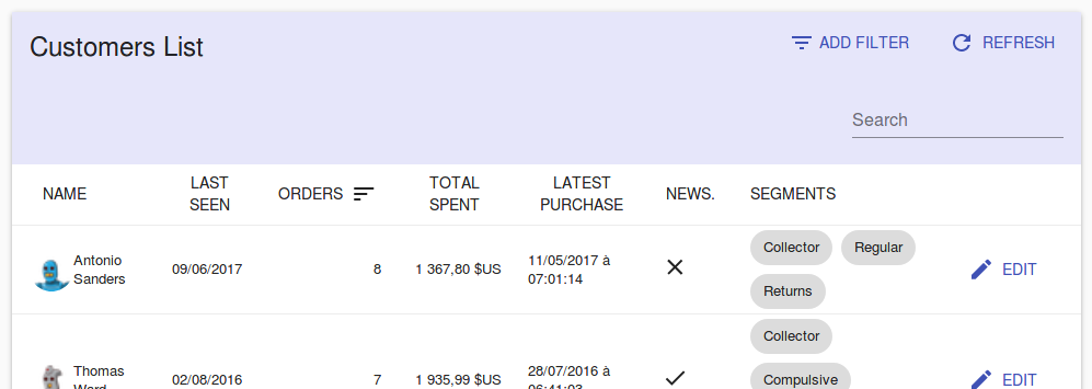
export const VisitorList = withStyles(listStyles)(({ classes, ...props }) => (
<List
classes={classes}
{...props}
filters={<VisitorFilter />}
sort={{ field: 'last_seen', order: 'DESC' }}
perPage={25}
>
<Datagrid classes={classes} {...props}>
<DateField source="last_seen" type="date" />
<NumberField
source="nb_commands"
label="resources.customers.fields.commands"
/>
<NumberField
source="total_spent"
options={{ style: 'currency', currency: 'USD' }}
/>
<DateField source="latest_purchase" showTime />
<BooleanField source="has_newsletter" label="News." />
<EditButton />
</Datagrid>
</List>
));
This example results in:
Take a look at a component documentation and source code to know which classes are available for styling. For instance, you can have a look at the Datagrid CSS documentation.
If you need more control over the HTML code, you can also create your own Field and Input components.
Conditional Formatting
Sometimes you want the format to depend on the value. The following example shows how to create a new custom NumberField component which highlight its text in red when its value is 100 or higher.
import { NumberField, List, Datagrid, EditButton } from 'react-admin';
import { withStyles } from '@material-ui/core/styles';
import classnames from 'classnames';

const coloredStyles = {
    small: { color: 'black' },
    big: { color: 'red' },
};

const ColoredNumberField = withStyles(coloredStyles)(
    ({ classes, ...props }) => (
        <NumberField
            className={classnames({
                [classes.small]: props.record[props.source] < 100,
                [classes.big]: props.record[props.source] >= 100,
            })}
            {...props}
        />
    ));

// Ensure the original component defaultProps are still applied as they may be used by its parents (such as the `Show` component):
ColoredNumberField.defaultProps = NumberField.defaultProps;

export const PostList = (props) => (
    <List {...props}>
        <Datagrid>
            <TextField source="id" />
            ...
            <ColoredNumberField source="nb_views" />
            <EditButton />
        </Datagrid>
    </List>
);
Furthermore, you may extract this highlighting strategy into an Higher Order Component if you’d like to reuse it for other components as well:
import { NumberField, List, Datagrid, EditButton } from 'react-admin';
import { withStyles } from '@material-ui/core/styles';
import classnames from 'classnames';

const coloredStyles = {
    small: { color: 'black' },
    big: { color: 'red' },
};

const colored = WrappedComponent => withStyles(coloredStyles)(
    ({ classes, ...props }) => (
        <WrappedComponent
            className={classnames({
                [classes.small]: props.record[props.source] < 500,
                [classes.big]: props.record[props.source] >= 500,
            })}
            {...props}
        />
    ));


const ColoredNumberField = colored(NumberField);
// Ensure the original component defaultProps are still applied as they may be used by its parents (such as the `Show` component):
ColoredNumberField.defaultProps = NumberField.defaultProps;

export const PostList = (props) => (
    <List {...props}>
        <Datagrid>
            <TextField source="id" />
            ...
            <ColoredNumberField source="nb_views" />
            <EditButton />
        </Datagrid>
    </List>
);
If you want to read more about higher-order components, check out this SitePoint tutorial: Higher Order Components: A React Application Design Pattern
Responsive Utility
To provide an optimized experience on mobile, tablet, and desktop devices, you often need to display different components depending on the screen size. That’s the purpose of the <Responsive> component, which offers a declarative approach to responsive web design.
It expects element props named small, medium, and large. It displays the element that matches the screen size (with breakpoints at 768 and 992 pixels):
// in src/posts.js
import React from 'react';
import { List, Responsive, SimpleList, Datagrid, TextField, ReferenceField, EditButton } from 'react-admin';

export const PostList = (props) => (
    <List {...props}>
        <Responsive
            small={
                <SimpleList
                    primaryText={record => record.title}
                    secondaryText={record => `${record.views} views`}
                    tertiaryText={record => new Date(record.published_at).toLocaleDateString()}
                />
            }
            medium={
                <Datagrid>
                    <TextField source="id" />
                    <ReferenceField label="User" source="userId" reference="users">
                        <TextField source="name" />
                    </ReferenceField>
                    <TextField source="title" />
                    <TextField source="body" />
                    <EditButton />
                </Datagrid>
            }
        />
    </List>
);
Tip: If you only provide small and medium, the medium element will also be used on large screens. The same kind of smart default exists for when you omit small or medium.
Tip: You can specify null as the value for small, medium or large to avoid rendering something on a specific size without falling back to others.
Tip: You can also use material-ui’s withWidth() higher order component to have the with prop injected in your own components.
Using a Predefined Theme
Material UI also supports complete theming out of the box. Material UI ships two base themes: light and dark. React-admin uses the light one by default. To use the dark one, pass it to the <Admin> component, in the theme prop (along with createMuiTheme()).
import { createMuiTheme } from '@material-ui/core/styles';

const theme = createMuiTheme({
  palette: {
    type: 'dark', // Switching the dark mode on is a single property value change.
  },
});

const App = () => (
    <Admin theme={theme} dataProvider={simpleRestProvider('http://path.to.my.api')}>
        // ...
    </Admin>
);
Writing a Custom Theme
If you need more fine tuning, you’ll need to write your own theme object, following Material UI themes documentation. Material UI merges custom theme objects with the default theme.
import { createMuiTheme } from '@material-ui/core/styles';
import indigo from '@material-ui/core/colors/indigo';
import pink from '@material-ui/core/colors/pink';
import red from '@material-ui/core/colors/red';

const myTheme = createMuiTheme({
    palette: {
        primary: indigo,
        secondary: pink,
        error: red,
        contrastThreshold: 3,
        tonalOffset: 0.2,
    },
    typography: {
        // Use the system font instead of the default Roboto font.
        fontFamily: [
            '-apple-system',
            'BlinkMacSystemFont',
            '"Segoe UI"',
            'Arial',
            'sans-serif',
        ].join(','),
    },
    overrides: {
        MuiButton: { // override the styles of all instances of this component
            root: { // Name of the rule
                color: 'white', // Some CSS
            },
        },
    },
});
The muiTheme object contains the following keys:
breakpointsdirectionmixinsoverridespalettepropsshadowstypographytransitionsspacingzIndex
Tip: Check Material UI default theme documentation to see the default values and meaning for these keys.
Once your theme is defined, pass it to the <Admin> component, in the theme prop.
const App = () => (
    <Admin theme={myTheme} dataProvider={simpleRestProvider('http://path.to.my.api')}>
        // ...
    </Admin>
);
Using a Custom Layout
Instead of the default layout, you can use your own component as the admin layout. Just use the appLayout prop of the <Admin> component:
// in src/App.js
import MyLayout from './MyLayout';

const App = () => (
    <Admin appLayout={MyLayout} dataProvider={simpleRestProvider('http://path.to.my.api')}>
        // ...
    </Admin>
);
Your custom layout can extend the default <Layout> component if you only want to override the sidebar, the appBar, the menu, the notification component, or the error page. For instance:
// in src/MyLayout.js
import { Layout } from 'react-admin';
import MyAppBar from './MyAppBar';
import MySidebar from './MySidebar';
import MyMenu from './MyMenu';
import MyNotification from './MyNotification';

const MyLayout = props => <Layout
    {...props}
    appBar={MyAppBar}
    sidebar={MySidebar}
    menu={MyMenu}
    notification={MyNotification}
/>;

export default MyLayout;
UserMenu Customization
You can replace the default user menu by your own by setting the userMenu prop of the <AppBar> component. For instance, to add custom menu items, just decorate the default <UserMenu> by adding children to it:
import { AppBar, UserMenu, MenuItemLink } from 'react-admin';
import SettingsIcon from '@material-ui/icons/Settings';

const MyUserMenu = props => (
    <UserMenu {...props}>
        <MenuItemLink
            to="/configuration"
            primaryText="Configuration"
            leftIcon={<SettingsIcon />}
        />
    </UserMenu>
);

const MyAppBar = props => <AppBar {...props} userMenu={<MyUserMenu />} />;

const MyLayout = props => <Layout {...props} appBar={MyAppBar} />;
You can also customize the default icon by setting the icon prop to the <UserMenu /> component.
import { AppBar, UserMenu } from 'react-admin';
import { withStyles } from '@material-ui/core/styles';
import Avatar from '@material-ui/core/Avatar';

const myCustomIconStyle = {
    avatar: {
        height: 30,
        width: 30,
    },
};

const MyCustomIcon = withStyles(myCustomIconStyle)(
    ({ classes }) => (
        <Avatar
            className={classes.avatar}
            src="https://marmelab.com/images/avatars/adrien.jpg"
        />
    )
);

const MyUserMenu = props => (<UserMenu {...props} icon={<MyCustomIcon />} />);

const MyAppBar = props => <AppBar {...props} userMenu={<MyUserMenu />} />;
Sidebar Customization
You can specify the Sidebar size by setting the size property:
import { Sidebar } from 'react-admin';

const MySidebar = props => <Sidebar {...props} size={200} />;
const MyLayout = props => <Layout
    {...props}
    sidebar={MySidebar}
/>;
Layout From Scratch
For more custom layouts, write a component from scratch. It must contain a {children} placeholder, where react-admin will render the resources. Use the default layout as a starting point. Here is a simplified version (with no responsive support):
// in src/MyLayout.js
import React, { Component } from 'react';
import PropTypes from 'prop-types';
import { connect } from 'react-redux';
import { withStyles, MuiThemeProvider, createMuiTheme } from '@material-ui/core/styles';
import {
    AppBar,
    Menu,
    Notification,
    Sidebar,
    setSidebarVisibility,
} from 'react-admin';

const styles = theme => ({
    root: {
        display: 'flex',
        flexDirection: 'column',
        zIndex: 1,
        minHeight: '100vh',
        backgroundColor: theme.palette.background.default,
        position: 'relative',
    },
    appFrame: {
        display: 'flex',
        flexDirection: 'column',
        overflowX: 'auto',
    },
    contentWithSidebar: {
        display: 'flex',
        flexGrow: 1,
    },
    content: {
        display: 'flex',
        flexDirection: 'column',
        flexGrow: 2,
        padding: theme.spacing.unit * 3,
        marginTop: '4em',
        paddingLeft: 5,
    },
});

class MyLayout extends Component {
    componentWillMount() {
        this.props.setSidebarVisibility(true);
    }

    render() {
        const {
            children,
            classes,
            dashboard,
            isLoading,
            logout,
            open,
            title,
        } = this.props;
        return (
            <div className={classes.root}>
                <div className={classes.appFrame}>
                    <AppBar title={title} open={open} logout={logout} />
                    <main className={classes.contentWithSidebar}>
                        <Sidebar>
                            <Menu logout={logout} hasDashboard={!!dashboard} />
                        </Sidebar>
                        <div className={classes.content}>
                            {children}
                        </div>
                    </main>
                    <Notification />
                </div>
            </div>
        );
    }
}

MyLayout.propTypes = {
    children: PropTypes.oneOfType([PropTypes.func, PropTypes.node]),
    dashboard: PropTypes.oneOfType([
        PropTypes.func,
        PropTypes.string,
    ]),
    isLoading: PropTypes.bool.isRequired,
    logout: componentPropType,
    setSidebarVisibility: PropTypes.func.isRequired,
    title: PropTypes.string.isRequired,
};

const mapStateToProps = state => ({ isLoading: state.admin.loading > 0 });
export default connect(mapStateToProps, { setSidebarVisibility })(withStyles(styles)(MyLayout));
Customizing the AppBar Content
By default, the react-admin <AppBar> component displays the page title. You can override this default by passing children to <AppBar> - they will replace the default title. And if you still want to include the page title, make sure you include an element with id react-admin-title in the top bar (this uses React Portals).
Here is an example customization for <AppBar> to include a company logo in the center of the page header:
// in src/MyAppBar.js
import React from 'react';
import { AppBar } from 'react-admin';
import Typography from '@material-ui/core/Typography';
import { withStyles } from '@material-ui/core/styles';

import Logo from './Logo';

const styles = {
    title: {
        flex: 1,
        textOverflow: 'ellipsis',
        whiteSpace: 'nowrap',
        overflow: 'hidden',
    },
    spacer: {
        flex: 1,
    },
};

const MyAppBar = withStyles(styles)(({ classes, ...props }) => (
    <AppBar {...props}>
        <Typography
            variant="title"
            color="inherit"
            className={classes.title}
            id="react-admin-title"
        />
        <Logo />
        <span className={classes.spacer} />
    </AppBar>
));

export default MyAppBar;
To use this custom MyAppBar component, pass it as prop to a custom Layout, as shown below:
// in src/MyLayout.js
import { Layout } from 'react-admin';
import MyAppBar from './MyAppBar';

const MyLayout = (props) => <Layout {...props} appBar={MyAppBar} />;

export default MyLayout;
Then, use this layout in the <Admin> with the appLayout prop:
// in src/App.js
import MyLayout from './MyLayout';

const App = () => (
    <Admin appLayout={MyLayout} dataProvider={simpleRestProvider('http://path.to.my.api')}>
        // ...
    </Admin>
);
Replacing The AppBar
For more drastic changes of the top component, you will probably want to create an <AppBar> from scratch instead of just passing children to react-admin’s <AppBar>.
By default, React-admin uses Material-ui’s <AppBar> component together with react-headroom to hide the AppBar on scroll. Here is an example top bar rebuilt from scratch to remove the “headroom” effect:
// in src/MyAppBar.js
import AppBar from '@material-ui/core/AppBar';
import Toolbar from '@material-ui/core/Toolbar';
import Typography from '@material-ui/core/Typography';

const MyAppBar = props => (
    <AppBar {...props}>
        <Toolbar>
            <Typography variant="title" id="react-admin-title" />
        </Toolbar>
    </AppBar>
);

export default MyAppBar;
Take note that this uses material-ui’s <AppBar> instead of react-admin’s <AppBar>. To use this custom AppBar component, pass it as prop to a custom Layout, as explained in the previous section.
Using a Custom Menu
By default, React-admin uses the list of <Resource> components passed as children of <Admin> to build a menu to each resource with a list component.
If you want to add or remove menu items, for instance to link to non-resources pages, you can create your own menu component:
// in src/MyMenu.js
import React from 'react';
import { connect } from 'react-redux';
import { MenuItemLink, getResources, Responsive } from 'react-admin';
import { withRouter } from 'react-router-dom';

const MyMenu = ({ resources, onMenuClick, logout }) => (
    <div>
        {resources.map(resource => (
            <MenuItemLink
                key={resource.name}
                to={`/${resource.name}`}
                primaryText={resource.options && resource.options.label || resource.name}
                leftIcon={createElement(resource.icon)}
                onClick={onMenuClick}
            />
        ))}
        <MenuItemLink to="/custom-route" primaryText="Miscellaneous" onClick={onMenuClick} />
        <Responsive
            small={logout}
            medium={null} // Pass null to render nothing on larger devices
        />
    </div>
);

const mapStateToProps = state => ({
    resources: getResources(state),
});

export default withRouter(connect(mapStateToProps)(MyMenu));
Tip: Note the MenuItemLink component. It must be used to avoid unwanted side effects in mobile views.
Tip: Note that we include the logout item only on small devices. Indeed, the logout button is already displayed in the AppBar on larger devices.
Tip: Note that we use React Router withRouter Higher Order Component and that it is used before Redux `connect. This is required if you want the active menu item to be highlighted.
Tip: The primaryText prop accepts a React node. You can pass a custom element in it. For example:
    import Badge from '@material-ui/core/Badge';

    <MenuItemLink to="/custom-route" primaryText={
        <Badge badgeContent={4} color="primary">
            Notifications
        </Badge>
    } onClick={onMenuClick} />
To use this custom menu component, pass it to a custom Layout, as explained above:
// in src/MyLayout.js
import { Layout } from 'react-admin';
import MyMenu from './MyMenu';

const MyLayout = (props) => <Layout {...props} menu={MyMenu} />;

export default MyLayout;
Then, use this layout in the <Admin> appLayout prop:
// in src/App.js
import MyLayout from './MyLayout';

const App = () => (
    <Admin appLayout={MyLayout} dataProvider={simpleRestProvider('http://path.to.my.api')}>
        // ...
    </Admin>
);
Tip: If you use authentication, don’t forget to render the logout prop in your custom menu component. Also, the onMenuClick function passed as prop is used to close the sidebar on mobile.
The MenuItemLink component make use of the React Router NavLink component, hence allowing to customize its style when it targets the current page.
If the default active style does not suit your tastes, you can override it by passing your own classes:
// in src/MyMenu.js
import React from 'react';
import { connect } from 'react-redux';
import { MenuItemLink, getResources, Responsive } from 'react-admin';
import { withStyles } from '@material-ui/core/styles';
import { withRouter } from 'react-router-dom';

const styles = {
    root: {}, // Style applied to the MenuItem from material-ui
    active: { fontWeight: 'bold' }, // Style applied when the menu item is the active one
    icon: {}, // Style applied to the icon
};

const MyMenu = ({ classes, resources, onMenuClick, logout }) => (
    <div>
        {resources.map(resource => (
            <MenuItemLink
                key={resource.name}
                classes={classes}
                to={`/${resource.name}`}
                primaryText={resource.options && resource.options.label || resource.name}
                leftIcon={createElement(resource.icon)}
                onClick={onMenuClick}
            />
        ))}
        <MenuItemLink classes={classes} to="/custom-route" primaryText="Miscellaneous" onClick={onMenuClick} />
        <Responsive
            small={logout}
            medium={null} // Pass null to render nothing on larger devices
        />
    </div>
);

const mapStateToProps = state => ({
    resources: getResources(state),
});

export default withRouter(connect(mapStateToProps)(withStyles(styles)(Menu)));
Using a Custom Login Page
Changing the Background Image
By default, the login page displays a random background image changing every day. If you want to change that background image, you can use the default Login page component and pass an image URL as the backgroundImage prop.
import { Admin, Login } from 'react-admin';

const MyLoginPage = () => <Login backgroundImage="/background.jpg" />;

const App = () => (
    <Admin loginPage={MyLoginPage}>
        // ...
    </Admin>
);
Notifications
You can override the notification component, for instance to change the notification duration. It defaults to 4000, i.e. 4 seconds, and you can override it using the autoHideDuration prop. For instance, to create a custom Notification component with a 5 seconds default:
// in src/MyNotification.js
import { Notification } from 'react-admin';

const MyNotification = props => <Notification {...props}autoHideDuration={5000} />;

export default MyNotification;
Tip: if you use the showNotification action, then you can define autoHideDuration per message as the third parameter of the showNotification action creator.
To use this custom notification component, pass it to a custom Layout, as explained above:
// in src/MyLayout.js
import { Layout } from 'react-admin';
import MyNotification from './MyNotification';

const MyLayout = (props) => <Layout {...props} notification={MyNotification} />;

export default MyLayout;
Then, use this layout in the <Admin> applayout prop:
// in src/App.js
import MyLayout from './MyLayout';

const App = () => (
    <Admin appLayout={MyLayout} dataProvider={simpleRestProvider('http://path.to.my.api')}>
        // ...
    </Admin>
);
Customizing The Error Page
Whenever a client-side error happens in react-admin, the user sees a default error message. If you want to customize this page, or log the error to a third-party service, create your own <Error> component. The following snippet is a simplified version of the react-admin Error component, that you can use as a base for your own:
// in src/MyError.js
import React from 'react';
import Button from '@material-ui/core/Button';
import ErrorIcon from '@material-ui/icons/Report';
import History from '@material-ui/icons/History';
import { Title } from 'react-admin';

const MyError = ({
    error,
    errorInfo,
    ...rest
}) => (
    <div>
        <Title title="Error" />
        <h1><ErrorIcon /> Something Went Wrong </h1>
        <div>A client error occurred and your request couldn't be completed.</div>
        {process.env.NODE_ENV !== 'production' && (
            <details>
                <h2>{translate(error.toString())}</h2>
                {errorInfo.componentStack}
            </details>
        )}
        <div>
            <Button
                variant="raised"
                icon={<History />}
                onClick={() => history.go(-1)}
            >
                Back
            </Button>
        </div>
    </div>
);

export default MyError;
To use this custom error component, pass it to a custom Layout, as explained above:
// in src/MyLayout.js
import { Layout } from 'react-admin';
import MyError from './MyError';

const MyLayout = (props) => <Layout {...props} error={MyError} />;

export default MyLayout;
Then, use this layout in the <Admin> applayout prop:
// in src/App.js
import MyLayout from './MyLayout';

const App = () => (
    <Admin appLayout={MyLayout} dataProvider={simpleRestProvider('http://path.to.my.api')}>
        // ...
    </Admin>
);
Loading
Display a circular progress component with optional messages. Display the same loading component as react-admin on custom pages for consistency.
Supported props:
| Prop | Type | Default | Descriptions |
|---|---|---|---|
loadingPrimary |
String |
ra.page.loading |
Label to use for primary loading message |
loadingSecondary |
String |
ra.message.loading |
Label to use for secondary loading message |
Usage:
<Loading loadingPrimary="app.page.loading" loadingSecondary="app.message.loading" />
LinearProgress
Display a linear progress component. Display the same loading component as react-admin on custom inputs for consistency.
Usage:
({ data, ...props }) => !data?
        <LinearProgress /> :
        <MyInput data={data} />