The List View
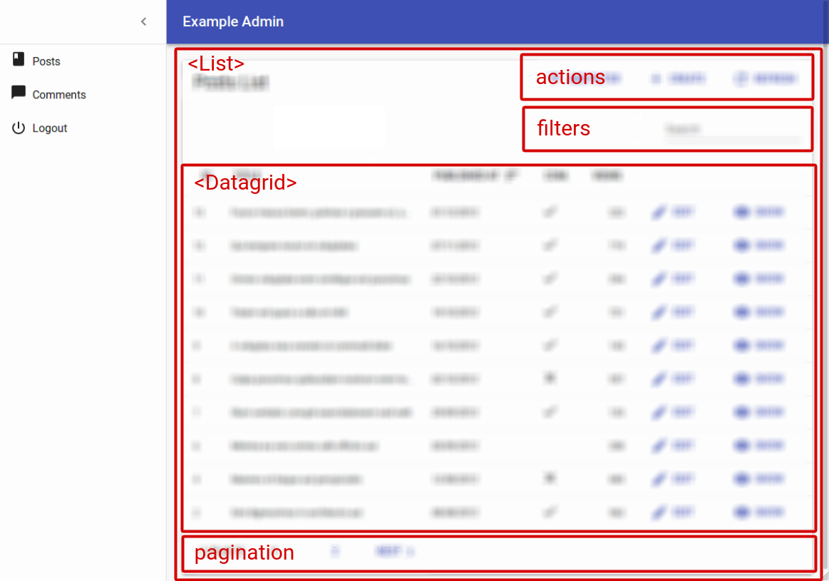
The List view displays a list of records fetched from the API. The entry point for this view is the <List> component, which takes care of fetching the data. Then, it passes the data to an iterator view - usually <Datagrid>, which then delegates the rendering of each record property to <Field> components.
The <List> Component
The <List> component renders the list layout (title, buttons, filters, pagination), and fetches the list of records from the REST API. It then delegates the rendering of the list of records to its child component. Usually, it’s a <Datagrid>, responsible for displaying a table with one row for each post.
Tip: In Redux terms, <List> is a connected component, and <Datagrid> is a dumb component.
Here are all the props accepted by the <List> component:
titleactionsexporterbulkActionButtonsfilters(a React element used to display the filter form)perPagesortfilter(the permanent filter used in the REST request)filterDefaultValues(the default values foralwaysOnfilters)paginationaside
Here is the minimal code necessary to display a list of posts:
// in src/App.js
import React from 'react';
import { Admin, Resource } from 'react-admin';
import jsonServerProvider from 'ra-data-json-server';

import { PostList } from './posts';

const App = () => (
    <Admin dataProvider={jsonServerProvider('http://jsonplaceholder.typicode.com')}>
        <Resource name="posts" list={PostList} />
    </Admin>
);

export default App;

// in src/posts.js
import React from 'react';
import { List, Datagrid, TextField } from 'react-admin';

export const PostList = (props) => (
    <List {...props}>
        <Datagrid>
            <TextField source="id" />
            <TextField source="title" />
            <TextField source="body" />
        </Datagrid>
    </List>
);
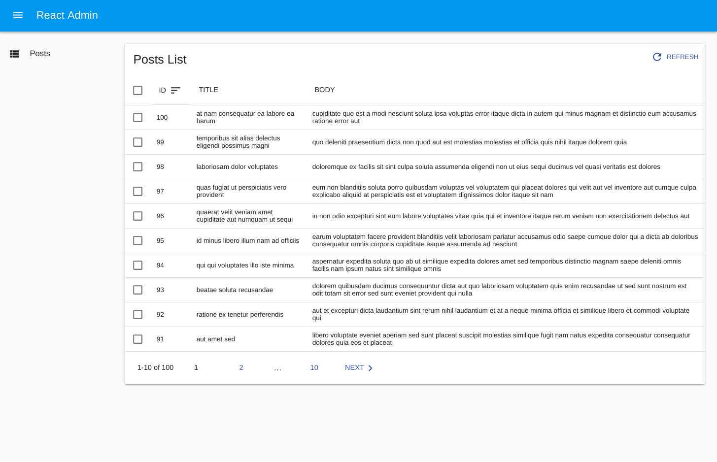
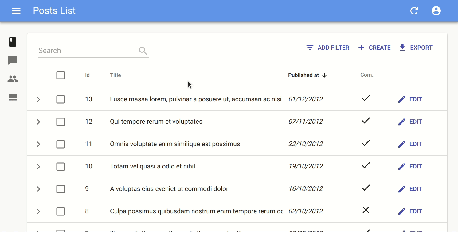
That’s enough to display the post list:
Page Title
The default title for a list view is “[resource] list” (e.g. “Posts list”). Use the title prop to customize the List view title:
// in src/posts.js
export const PostList = (props) => (
    <List {...props} title="List of posts">
        ...
    </List>
);
The title can be either a string, or an element of your own.
Actions
You can replace the list of default actions by your own element using the actions prop:
import Button from '@material-ui/core/Button';
import { CardActions, CreateButton, ExportButton, RefreshButton } from 'react-admin';

const PostActions = ({
    bulkActions,
    basePath,
    currentSort,
    displayedFilters,
    exporter,
    filters,
    filterValues,
    onUnselectItems,
    resource,
    selectedIds,
    showFilter,
    total
}) => (
    <CardActions>
        {bulkActions && React.cloneElement(bulkActions, {
            basePath,
            filterValues,
            resource,
            selectedIds,
            onUnselectItems,
        })}
        {filters && React.cloneElement(filters, {
            resource,
            showFilter,
            displayedFilters,
            filterValues,
            context: 'button',
        }) }
        <CreateButton basePath={basePath} />
        <ExportButton
            disabled={total === 0}
            resource={resource}
            sort={currentSort}
            filter={filterValues}
            exporter={exporter}
        />
        <RefreshButton />
        {/* Add your custom actions */}
        <Button color="primary" onClick={customAction}>Custom Action</Button>
    </CardActions>
);

export const PostList = (props) => (
    <List {...props} actions={<PostActions />}>
        ...
    </List>
);
You can also use such a custom ListActions prop to omit or reorder buttons based on permissions. Just pass the permissions down from the List component:
export const PostList = ({ permissions, ...props }) => (
    <List {...props} actions={<PostActions permissions={permissions} />}>
        ...
    </List>
);
Exporter
Among the default list actions, react-admin includes an <ExportButton>. This button is disabled when there is no record in the current <List>.
By default, clicking this button will:
- Call the
dataProviderwith the current sort and filter (but without pagination), - Transform the result into a CSV string,
- Download the CSV file.
The columns of the CSV file match all the fields of the records in the dataProvider response. That means that the export doesn’t take into account the selection and ordering of fields in your <List> via Field components. If you want to customize the result, pass a custom exporter function to the <List>. This function will receive the data from the dataProvider (after step 1), and replace steps 2-3 (i.e. it’s in charge of transforming, converting, and downloading the file).
Tip: For CSV conversion, you can import Papaparse, a CSV parser and stringifier which is already a react-admin dependency. And for CSV download, take advantage of react-admin’s downloadCSV function.
Tip: You may also remove the <ExportButton> by passing false to the exporter prop: exporter={false}
Here is an example for a Posts exporter, omitting, adding, and reordering fields:
// in PostList.js
import { List, downloadCSV } from 'react-admin';
import { unparse as convertToCSV } from 'papaparse/papaparse.min';

const exporter = posts => {
    const postsForExport = posts.map(post => {
        const { backlinks, author, ...postForExport } = post; // omit backlinks and author
        postForExport.author_name = post.author.name; // add a field
        return postForExport;
    });
    const csv = convertToCSV({
        data: postsForExport,
        fields: ['id', 'title', 'author_name', 'body'] // order fields in the export
    });
    downloadCSV(csv, 'posts'); // download as 'posts.csv` file
})

const PostList = props => (
    <List {...props} exporter={exporter}>
        ...
    </List>
)
In many cases, you’ll need more than simple object manipulation. You’ll need to augment your objects based on relationships. For instance, the export for comments should include the title of the related post - but the export only exposes a post_id by default. For that purpose, the exporter receives a fetchRelatedRecords function as second parameter. It fetches related records using your dataProvider and Redux, and returns a promise.
Here is an example for a Comments exporter, fetching related Posts:
// in CommentList.js
import { List, downloadCSV } from 'react-admin';
import { unparse as convertToCSV } from 'papaparse/papaparse.min';

const exporter = (records, fetchRelatedRecords) => {
    fetchRelatedRecords(records, 'post_id', 'posts').then(posts => {
        const data = records.map(record => ({
                ...record,
                post_title: posts[record.post_id].title,
        }));
        const csv = convertToCSV({
            data,
            fields: ['id', 'post_id', 'post_title', 'body'],
        });
        downloadCSV(csv, 'comments');
    });
};

const CommentList = props => (
    <List {...props} exporter={exporter}>
        ...
    </List>
)
Under the hood, fetchRelatedRecords() uses react-admin’s sagas, which trigger the loading spinner while loading. As a bonus, all the records fetched during an export are kepts in the main Redux store, so further browsing the admin will be accelerated.
Tip: If you need to call another dataProvider verb in the exporter, take advantage of the third parameter passed to the function: dispatch(). It allows you to call any Redux action. Combine it with the callback side effect to grab the result in a callback.
Tip: The <ExportButton> limits the main request to the dataProvider to 1,000 records. If you want to increase or decrease this limit, pass a maxResults prop to the <ExportButton> in a custom <ListActions> component, as explained in the previous section.
Tip: For complex (or large) exports, fetching all the related records and assembling them client-side can be slow. In that case, create the CSV on the server side, and replace the <ExportButton> component by a custom one, fetching the CSV route.
Bulk Action Buttons
Bulk action buttons are buttons that affect several records at once, like mass deletion for instance. In the <Datagrid> component, the bulk actions toolbar appears when a user ticks the checkboxes in the first column of the table. The user can then choose a button from the bulk actions toolbar. By default, all list views have a single bulk action button, the bulk delete button. You can add other bulk action buttons by passing a custom element as the bulkActionButtons prop of the <List> component:
import React, { Fragment } from 'react';
import Button from '@material-ui/core/Button';
import { BulkDeleteButton } from 'react-admin';
import ResetViewsButton from './ResetViewsButton';

const PostBulkActionButtons = props => (
    <Fragment>
        <ResetViewsButton label="Reset Views" {...props} />
        {/* Add the default bulk delete action */}
        <BulkDeleteButton {...props} />
    </Fragment>
);

export const PostList = (props) => (
    <List {...props} bulkActionButtons={<PostBulkActionButtons />}>
        ...
    </List>
);
Tip: You can also disable bulk actions altogether by passing false to the bulkActionButtons prop. When using a Datagrid inside a List with disabled bulk actions, the checkboxes column won’t be added.
Bulk action button components receive several props allowing them to perform their job:
resource: the currently displayed resource (egposts,comments, etc.)basePath: the current router base path for the resource (eg/posts,/comments, etc.)filterValues: the filter values. This can be useful if you want to apply your action on all items matching the filter.selectedIds: the identifiers of the currently selected items.
Here is an example leveraging the UPDATE_MANY crud action, which will set the views property of all posts to 0:
// in ./ResetViewsButton.js
import React, { Component } from 'react';
import { connect } from 'react-redux';
import { Button, crudUpdateMany } from 'react-admin';

class ResetViewsButton extends Component {
    handleClick = () => {
        const { basePath, crudUpdateMany, resource, selectedIds } = this.props;
        crudUpdateMany(resource, selectedIds, { views: 0 }, basePath);
    };

    render() {
        return (
            <Button label="Reset Views" onClick={this.handleClick} />
        );
    }
}

export default connect(undefined, { crudUpdateMany })(ResetViewsButton);
But most of the time, bulk actions are mini-applications with a standalone user interface (in a Dialog). Here is the same ResetViewsAction implemented behind a confirmation dialog:
// in ./ResetViewsButton.js
import React, { Fragment, Component } from 'react';
import { connect } from 'react-redux';
import { Button, Confirm, crudUpdateMany } from 'react-admin';

class ResetViewsButton extends Component {
    state = {
        isOpen: false,
    }

    handleClick = () => {
        this.setState({ isOpen: true });
    }

    handleDialogClose = () => {
        this.setState({ isOpen: false });
    };

    handleConfirm = () => {
        const { basePath, crudUpdateMany, resource, selectedIds } = this.props;
        crudUpdateMany(resource, selectedIds, { views: 0 }, basePath);
        this.setState({ isOpen: true });
    };

    render() {
        return (
            <Fragment>
                <Button label="Reset Views" onClick={this.handleClick} />
                <Confirm
                    isOpen={this.state.isOpen}
                    title="Update View Count"
                    content="Are you sure you want to reset the views for these items?"
                    onConfirm={this.handleConfirm}
                    onClose={this.handleDialogClose}
                />
            </Fragment>
        );
    }
}

export default connect(undefined, { crudUpdateMany })(ResetViewsButton);
Tip: <Confirm> leverages material-ui’s <Dialog> component to implement a confirmation popup. Feel free to use it in your admins!
Tip: <Confirm> text props such as title and content are translatable. You can pass them translation keys.
Tip: You can customize the text of the two <Confirm> component buttons using the cancel and confirm prop which accepts translation keys too.
Tip: React-admin doesn’t use the <Confirm> component internally, because deletes and updates are applied locally immediately, then dispatched to the server after a few seconds, unless the user chooses to undo the modification. That’s what we call optimistic rendering. You can do the same for the ResetViewsButton by wrapping the crudUpdateMany() action creator inside a startUndoable() action creator, as follows:
// in ./ResetViewsButton.js
import React, { Component } from 'react';
import { connect } from 'react-redux';
import { Button, crudUpdateMany, startUndoable } from 'react-admin';

class ResetViewsButton extends Component {
    handleClick = () => {
        const {  basePath, resource, selectedIds, startUndoable } = this.props;
        startUndoable(
            crudUpdateMany(resource, selectedIds, { views: 0 }, basePath)
        );
    };

    render() {
        return (
            <Button label="Reset Views" onClick={this.handleClick} />
        );
    }
}

export default connect(undefined, { startUndoable })(ResetViewsButton);
Note that the crudUpdateMany action creator is not present in the mapDispatchToProps argument of connect() in that case. Only startUndoable needs to be dispatched in this case, using the result of the crudUpdateMany() call as parameter.
Filters
You can add a filter element to the list using the filters prop:
const PostFilter = (props) => (
    <Filter {...props}>
        <TextInput label="Search" source="q" alwaysOn />
        <TextInput label="Title" source="title" defaultValue="Hello, World!" />
    </Filter>
);

export const PostList = (props) => (
    <List {...props} filters={<PostFilter />}>
        ...
    </List>
);
The filter component must be a <Filter> with <Input> children.
Tip: <Filter> is a special component, which renders in two ways:
- as a filter button (to add new filters)
- as a filter form (to enter filter values)
It does so by inspecting its context prop.
Tip: Don’t mix up this filters prop, expecting a React element, with the filter props, which expects an object to define permanent filters (see below).
The Filter component accepts the usual className prop but you can override many class names injected to the inner components by React-admin thanks to the classes property (as most Material UI components, see their documentation about it). This property accepts the following keys:
form: applied to the root element when rendering as a form.button: applied to the root element when rendering as a button.
Children of the <Filter> form are regular inputs. <Filter> hides them all by default, except those that have the alwaysOn prop.
Tip: For technical reasons, react-admin does not accept children of <Filter> having both a defaultValue and alwaysOn. To set default values for always on filters, use the filterDefaultValues prop of the <List> component instead (see below).
Records Per Page
By default, the list paginates results by groups of 10. You can override this setting by specifying the perPage prop:
// in src/posts.js
export const PostList = (props) => (
    <List {...props} perPage={25}>
        ...
    </List>
);
Default Sort Field
Pass an object literal as the sort prop to determine the default field and order used for sorting:
// in src/posts.js
export const PostList = (props) => (
    <List {...props} sort={{ field: 'published_at', order: 'DESC' }}>
        ...
    </List>
);
sort defines the default sort order ; the list remains sortable by clicking on column headers.
Disabling Sorting
It is possible to disable sorting for a specific field by passing a sortable property set to false:
// in src/posts.js
import React from 'react';
import { List, Datagrid, TextField } from 'react-admin';

export const PostList = (props) => (
    <List {...props}>
        <Datagrid>
            <TextField source="id" sortable={false} />
            <TextField source="title" />
            <TextField source="body" />
        </Datagrid>
    </List>
);
Specify Sort Field
By default, a column is sorted by the source property. To define another attribute to sort by, set it via the sortBy property:
// in src/posts.js
import React from 'react';
import { List, Datagrid, TextField } from 'react-admin';

export const PostList = (props) => (
    <List {...props}>
        <Datagrid>
            <ReferenceField label="Post" source="id" reference="posts" sortBy="title">
                <TextField source="title" />
            </ReferenceField>
            <FunctionField
                label="Author"
                sortBy="last_name"
                render={record => `${record.author.first_name} ${record.author.last_name}`}
            />
            <TextField source="body" />
        </Datagrid>
    </List>
);
Permanent Filter
You can choose to always filter the list, without letting the user disable this filter - for instance to display only published posts. Write the filter to be passed to the REST client in the filter props:
// in src/posts.js
export const PostList = (props) => (
    <List {...props} filter={{ is_published: true }}>
        ...
    </List>
);
The actual filter parameter sent to the REST client is the result of the combination of the user filters (the ones set through the filters component form), and the permanent filter. The user cannot override the permanent filters set by way of filter.
Filter Default Values
To set default values to filters, you can either pass an object literal as the filterDefaultValues prop of the <List> element, or use the defaultValue prop of any input component.
There is one exception: inputs with alwaysOn don’t accept defaultValue. You have to use the filterDefaultValues for those.
// in src/posts.js
const PostFilter = (props) => (
    <Filter {...props}>
        <TextInput label="Search" source="q" alwaysOn />
        <BooleanInput source="is_published" alwaysOn />
        <TextInput source="title" defaultValue="Hello, World!" />
    </Filter>
);

export const PostList = (props) => (
    <List {...props} filters={<PostFilter />} filterDefaultValues={{ is_published: true }}>
        ...
    </List>
);
Tip: The filter and filterDefaultValues props have one key difference: the filterDefaultValues can be overridden by the user, while the filter values are always sent to the data provider. Or, to put it otherwise:
const filterSentToDataProvider = { ...filterDefaultValues, ...filterChosenByUser, ...filters };
Pagination
Here are all the props required by the
page: The current page number (integer). First page is1.perPage: The number of records per page.setPage:function(page: number) => void. A function that set the current page number.total: The total number of records.
You don’t need to fill these props when you pass the Pagination component to the List component through the pagination prop: <List pagination={<Pagination />}>.
You can also replace the default pagination element by your own. For instance, you can modify the default pagination by adjusting the “rows per page” selector.
// in src/MyPagination.js
import { Pagination } from 'react-admin';

const PostPagination = props => <Pagination rowsPerPageOptions={[10, 25, 50, 100]} {...props} />

export const PostList = (props) => (
    <List {...props} pagination={<PostPagination />}>
        ...
    </List>
);
Tip: Pass an empty array to rowsPerPageOptions to disable the rows per page selection.
Alternately, if you want to replace the default pagination by a “<previous - next>” pagination, create a pagination component like the following:
import Button from '@material-ui/core/Button';
import ChevronLeft from '@material-ui/icons/ChevronLeft';
import ChevronRight from '@material-ui/icons/ChevronRight';
import Toolbar from '@material-ui/core/Toolbar';

const PostPagination = ({ page, perPage, total, setPage }) => {
    const nbPages = Math.ceil(total / perPage) || 1;
    return (
        nbPages > 1 &&
            <Toolbar>
                {page > 1 &&
                    <Button color="primary" key="prev" icon={<ChevronLeft />} onClick={() => setPage(page - 1)}>
                        Prev
                    </Button>
                }
                {page !== nbPages &&
                    <Button color="primary" key="next" icon={<ChevronRight />} onClick={() => setPage(page + 1)} labelPosition="before">
                        Next
                    </Button>
                }
            </Toolbar>
    );
}

export const PostList = (props) => (
    <List {...props} pagination={<PostPagination />}>
        ...
    </List>
);
Aside component
You may want to display additional information on the side of the list. Use the aside prop for that, passing the component of your choice:
const Aside = () => (
    <div style={{ width: 200, margin: '1em' }}>
        <Typography variant="title">Post details</Typography>
        <Typography variant="body1">
            Posts will only be published one an editor approves them
        </Typography>
    </div>
);

const PostList = props => (
    <List aside={<Aside />} {...props}>
        ...
    </List>
The aside component receives the same props as the List child component, including the following:
basePath,currentSort,data,defaultTitle,filterValues,ids,page,perPage,resource,selectedIds,total,version,
That means you can display additional details of the current list in the aside component:
const Aside = ({ data, ids }) => (
    <div style={{ width: 200, margin: '1em' }}>
        <Typography variant="title">Posts stats</Typography>
        <Typography variant="body1">
            Total views: {ids.map(id => data[id]).reduce((sum, post) => sum + post.views, 0)}
        </Typography>
    </div>
);
CSS API
The List component accepts the usual className prop but you can override many class names injected to the inner components by React-admin thanks to the classes property (as most Material UI components, see their documentation about it). This property accepts the following keys:
root: alternative to usingclassName. Applied to the root element.header: applied to the page headeractions: applied to the actions containernoResults: applied to the component shown when there is no result
Here is an example of how you can override some of these classes:
You can customize the list styles by passing a classes object as prop, through withStyles(). Here is an example:
const styles = {
    header: {
        backgroundColor: '#ccc',
    },
};

const PostList = ({ classes, ...props }) => (
    <List {...props} classes={{ header: classes.header }}>
        <Datagrid>
            ...
        </Datagrid>
    </List>
);

export withStyles(styles)(PostList);
The <ListGuesser> component
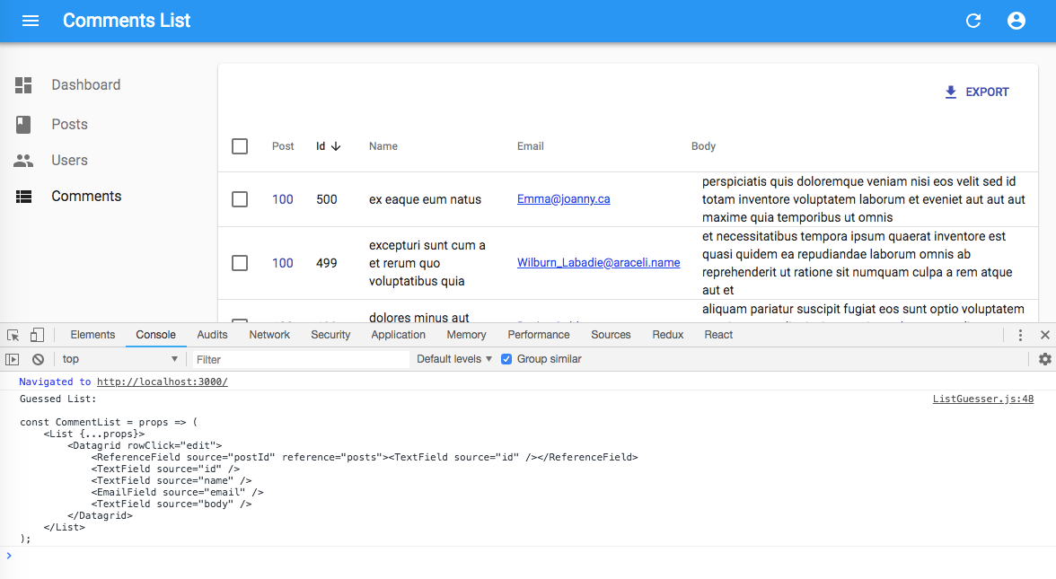
Instead of a custom List, you can use the ListGuesser to determine which fields to use based on the data returned by the API.
// in src/App.js
import React from 'react';
import { Admin, Resource, ListGuesser } from 'react-admin';
import jsonServerProvider from 'ra-data-json-server';

const App = () => (
    <Admin dataProvider={jsonServerProvider('http://jsonplaceholder.typicode.com')}>
        <Resource name="posts" list={ListGuesser} />
    </Admin>
);
Just like List, ListGuesser fetches the data. It then analyzes the response, and guesses the fields it should use to display a basic datagrid with the data. It also dumps the components it has guessed in the console, where you can copy it into your own code. Use this feature to quickly bootstrap a List on top of an existing API, without adding the fields one by one.
React-admin provides guessers for the List view (ListGuesser), the Edit view (EditGuesser), and the Show view (ShowGuesser).
Tip: Do not use the guessers in production. They are slower than manually-defined components, because they have to infer types based on the content. Besides, the guesses are not always perfect.
The <Datagrid> component
The datagrid component renders a list of records as a table. It is usually used as a child of the <List> and <ReferenceManyField> components.
Here are all the props accepted by the component:
It renders as many columns as it receives <Field> children.
// in src/posts.js
import React from 'react';
import { List, Datagrid, TextField, EditButton } from 'react-admin';

export const PostList = (props) => (
    <List {...props}>
        <Datagrid>
            <TextField source="id" />
            <TextField source="title" />
            <TextField source="body" />
            <EditButton />
        </Datagrid>
    </List>
);
The datagrid is an iterator component: it receives an array of ids, and a data store, and is supposed to iterate over the ids to display each record. Another example of iterator component is <SingleFieldList>.
Body element
By default, <Datagrid> renders its body using <DatagridBody>, an internal react-admin component. You can pass a custom component as the row prop to override that default. And by the way, <DatagridBody> has a row property set to <DatagridRow> by default for the same purpose. <DatagridRow> receives the row record, the resource, and a copy of the datagrid children. That means you can create a custom datagrid logic without copying several components from the react-admin source.
For instance, to show the selection checkbox only for records that have a selectable field set to true, you can override <DatagridRow> and <DatagridBody> as follows:
// in src/PostList.js
import { Datagrid, DatagridBody, List, TextField } from 'react-admin';
import TableCell from '@material-ui/core/TableCell';
import TableRow from '@material-ui/core/TableRow';
import Checkbox from '@material-ui/core/Checkbox';

const MyDatagridRow = ({ record, resource, id, onToggleItem, children, selected, basePath }) => (
    <TableRow key={id}>
        {/* first column: selection checkbox */}
        <TableCell padding="none">
            {record.selectable && <Checkbox
                checked={selected}
                onClick={() => onToggleItem(id)}
            />}
        </TableCell>
        {/* data columns based on children */}
        {React.Children.map(children, field => (
            <TableCell key={`${id}-${field.props.source}`}>
                {React.cloneElement(field, {
                    record,
                    basePath,
                    resource,
                })}
            </TableCell>
        ))}
    </TableRow>
)

const MyDatagridBody = props => <DatagridBody {...props} row={<MyDatagridRow />} />;
const MyDatagrid = props => <Datagrid {...props} body={<MyDatagridBody />} />;

const PostList = props => (
    <List {...props}>
        <MyDatagrid>
            <Textfield source="title" />
            ...
        </MyDatagrid>
    </List>
)

export default PostList;
Row Style Function
You can customize the datagrid row style (applied to the <tr> element) based on the record, thanks to the rowStyle prop, which expects a function.
For instance, this allows to apply a custom background to the entire row if one value of the record - like its number of views - passes a certain threshold.
const postRowStyle = (record, index) => ({
    backgroundColor: record.nb_views >= 500 ? '#efe' : 'white',
});
export const PostList = (props) => (
    <List {...props}>
        <Datagrid rowStyle={postRowStyle}>
            ...
        </Datagrid>
    </List>
);
rowClick
You can catch clicks on rows to redirect to the show or edit view by setting the rowClick prop:
export const PostList = (props) => (
    <List {...props}>
        <Datagrid rowClick="edit">
            ...
        </Datagrid>
    </List>
);
rowClick accepts the following values:
- “edit” to redirect to the edition vue
- “show” to redirect to the show vue
- “expand” to open the
expandpanel - a function
(id, basePath, record) => pathto redirect to a custom path
Tip: If you pass a function, it can return edit, show or a router path. This allows to redirect to either edit or show after checking a condition on the record. For example:
const postRowClick = (id, basePath, record) => record.editable ? 'edit' : 'show';
Tip: If you pass a function, it can also return a promise allowing you to check an external API before returning a path. For example:
import fetchUserRights from './fetchUserRights';

const postRowClick = (id, basePath, record) => fetchUserRights().then(({ canEdit }) canEdit ? 'edit' : 'show');
expand
To show more data from the resource without adding too many columns, you can show data in an expandable panel below the row on demand, using the expand prop. For instance, this code shows the body of a post in an expandable panel:
const PostPanel = ({ id, record, resource }) => (
    <div dangerouslySetInnerHTML={{ __html: record.body }} />
);

const PostList = props => (
    <List {...props}>
        <Datagrid expand={<PostPanel />}>
            <TextField source="id" />
            <TextField source="title" />
            <DateField source="published_at" />
            <BooleanField source="commentable" />
            <EditButton />
        </Datagrid>
    </List>
)
The expand prop expects an element as value. When the user chooses to expand the row, the Datagrid clones the element, and passes the current record, id, and resource.
Tip: Since the expand element receives the same props as a detail view, you can actually use a <Show> view as element for the expand prop:
const PostShow = props => (
    <Show
        {...props}
        /* disable the app title change when shown */
        title=" "
    >
        <SimpleShowLayout>
            <RichTextField source="body" />
        </SimpleShowLayout>
    </Show>
);

const PostList = props => (
    <List {...props}>
        <Datagrid expand={<PostShow />}>
            <TextField source="id" />
            <TextField source="title" />
            <DateField source="published_at" />
            <BooleanField source="commentable" />
            <EditButton />
        </Datagrid>
    </List>
)
The result will be the same as in the previous snippet, except that <Show> encloses the content inside a material-ui <Card>.
Tip: You can go one step further and use an <Edit> view as expand element, albeit with a twist:
const PostEdit = props => (
    <Edit
        {...props}
        /* disable the app title change when shown */
        title=" "
    >
        <SimpleForm
            /* The form must have a name dependent on the record, because by default all forms have the same name */
            form={`post_edit_${props.id}`}
        >
            <RichTextInput source="body" />
        </SimpleForm>
    </Edit>
);

const PostList = props => (
    <List {...props}>
        <Datagrid expand={<PostEdit />}>
            <TextField source="id" />
            <TextField source="title" />
            <DateField source="published_at" />
            <BooleanField source="commentable" />
            <EditButton />
        </Datagrid>
    </List>
)
CSS API
The Datagrid component accepts the usual className prop but you can override many class names injected to the inner components by React-admin thanks to the classes property (as most Material UI components, see their documentation about it). This property accepts the following keys:
table: alternative to usingclassName. Applied to the root element.tbody: applied to the tbodyheaderCell: applied to each header cellrow: applied to each rowrowEven: applied to each even rowrowOdd: applied to each odd rowrowCell: applied to each row cell
Here is an example of how you can override some of these classes:
You can customize the datagrid styles by passing a classes object as prop, through withStyles(). Here is an example:
const styles = {
    row: {
        backgroundColor: '#ccc',
    },
};

const PostList = ({ classes, ...props) => (
    <List {...props}>
        <Datagrid classes={{ row: classes.row }}>
            ...
        </Datagrid>
    </List>
);

export withStyles(styles)(PostList);
Tip: If you want to override the header and cell styles independently for each column, use the headerClassName and cellClassName props in <Field> components. For instance, to hide a certain column on small screens:
import { withStyles } from '@material-ui/core/styles';

const styles = theme => ({
    hiddenOnSmallScreens: {
        [theme.breakpoints.down('md')]: {
            display: 'none',
        },
    },
});

const PostList = ({ classes, ...props }) => (
    <List {...props}>
        <Datagrid>
            <TextField source="id" />
            <TextField source="title" />
            <TextField
                source="views"
                headerClassName={classes.hiddenOnSmallScreens}
                cellClassName={classes.hiddenOnSmallScreens}
            />
        </Datagrid>
    </List>
);

export default withStyles(styles)(PostList);
Tip: You can use the Datagrid component with custom queries:
import keyBy from 'lodash/keyBy'
import { Datagrid, Query, TextField, Pagination, Loading } from 'react-admin'

const CustomList = () => {
  const [page, setPage] = useState(1)
  const perPage = 50

  return (
    <Query
      type="GET_LIST"
      resource="posts"
      payload={{
        pagination: { page, perPage },
        sort: { field: 'id', order: 'ASC' },
        filter: {},
      }}
    >
      {({ data, total, loading, error }) => {
        if (loading) {
          return <Loading />
        }
        if (error) {
          return <p>ERROR: {error}</p>
        }
        return (
          <>
            <Datagrid
              data={keyBy(data, 'id')}
              ids={data.map(({ id }) => id)}
              currentSort={{ field: 'id', order: 'ASC' }}
              basePath="/posts" // required only if you set use "rowClick"
              rowClick="edit"
            >
              <TextField source="id" />
              <TextField source="name" />
            </Datagrid>
            <Pagination
              page={page}
              perPage={perPage}
              setPage={setPage}
              total={total}
            />
          </>
        )
      }}
    </Query>
  )
}
The <SimpleList> component
For mobile devices, a <Datagrid> is often unusable - there is simply not enough space to display several columns. The convention in that case is to use a simple list, with only one column per row. The <SimpleList> component serves that purpose, leveraging material-ui’s <List> and <ListItem> components. You can use it as <List> or <ReferenceManyField> child:
// in src/posts.js
import React from 'react';
import { List, SimpleList } from 'react-admin';

export const PostList = (props) => (
    <List {...props}>
        <SimpleList
            primaryText={record => record.title}
            secondaryText={record => `${record.views} views`}
            tertiaryText={record => new Date(record.published_at).toLocaleDateString()}
        />
    </List>
);
<SimpleList> iterates over the list data. For each record, it executes the primaryText, secondaryText, leftAvatar, leftIcon, rightAvatar, and rightIcon props function, and passes the result as the corresponding <ListItem> prop.
Tip: To use a <SimpleList> on small screens and a <Datagrid> on larger screens, use the <Responsive> component:
// in src/posts.js
import React from 'react';
import { List, Responsive, SimpleList, Datagrid, TextField, ReferenceField, EditButton } from 'react-admin';

export const PostList = (props) => (
    <List {...props}>
        <Responsive
            small={
                <SimpleList
                    primaryText={record => record.title}
                    secondaryText={record => `${record.views} views`}
                    tertiaryText={record => new Date(record.published_at).toLocaleDateString()}
                />
            }
            medium={
                <Datagrid>
                    ...
                </Datagrid>
            }
        />
    </List>
);
Tip: The <SimpleList> items link to the edition page by default. You can set the linkType prop to show to link to the <Show> page instead.
// in src/posts.js
import React from 'react';
import { List, SimpleList } from 'react-admin';

export const PostList = (props) => (
    <List {...props}>
        <SimpleList
            primaryText={record => record.title}
            secondaryText={record => `${record.views} views`}
            tertiaryText={record => new Date(record.published_at).toLocaleDateString()}
            linkType="show"
        />
    </List>
);
Setting the linkType prop to false (boolean, not string) removes the link in all list items.
The <SingleFieldList> component
When you want to display only one property of a list of records, instead of using a <Datagrid>, use the <SingleFieldList>. It expects a single <Field> as child. It’s especially useful for <ReferenceManyField> or <ReferenceArrayField> components:
// Display all the tags for the current post
<ReferenceArrayField
    label="Tags"
    reference="tags"
    source="tags"
>
    <SingleFieldList>
        <ChipField source="name" />
    </SingleFieldList>
</ReferenceArrayField>
Tip: The <SingleFieldList> items link to the edition page by default. You can set the linkType prop to show to link to the <Show> page instead.
// Display all the tags for the current post
<ReferenceArrayField
    label="Tags"
    reference="tags"
    source="tags"
>
    <SingleFieldList linkType="show">
        <ChipField source="name" />
    </SingleFieldList>
</ReferenceArrayField>
The <Tree> component
When you want to display a hierarchized list of records, instead of using a <Datagrid>, use the <Tree> component. This component is available in an addon package: ra-tree-ui-materialui.
Important: This package is part of our Labs experimentations. This means it misses some features and might not handle all corner cases. Use it at your own risks. Besides, we would really appreciate some feedback!
It expects that every resource returned from the List has a parent_id property by default:
[
    { "id": 1, "name": "Clothing" },
    { "id": 2, "name": "Men", "parent_id": 1 },
    { "id": 3, "name": "Suits", "parent_id": 2 },
    { "id": 6, "name": "Women", "parent_id": 1 },
    { "id": 7, "name": "Dresses", "parent_id": 6 },
    { "id": 10, "name": "Skirts", "parent_id": 6 },
    { "id": 11, "name": "Blouses", "parent_id": 6 }
]
Here’s an example showing how to use it:
// in src/categories.js
import React from 'react';
import { List, TextField, EditButton, DeleteButton } from 'react-admin';
import { Tree, NodeView, NodeActions } from 'ra-tree-ui-materialui';

const CategoriesActions = props => (
    <NodeActions {...props}>
        <EditButton />
        <DeleteButton />
    </NodeActions>
);

export const CategoriesList = (props) => (
    <List {...props} perPage={10000}>
        <Tree>
            <NodeView actions={<CategoriesActions />}>
                <TextField source="name" />
            </NodeView>
        </Tree>
    </List>
);
Tip: The <Tree> component supports drag & drop operations:
export const CategoriesList = (props) => (
    <List {...props} perPage={10000}>
        <Tree enableDragAndDrop>
            <NodeView actions={<CategoriesActions />}>
                <TextField source="name" />
            </NodeView>
        </Tree>
    </List>
);
To learn more about this component features, please refers to its README.
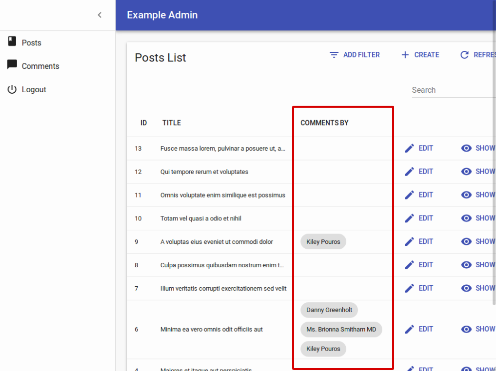
Using a Custom Iterator
A <List> can delegate to any iterator component - <Datagrid> is just one example. An iterator component must accept at least two props:
idsis an array of the ids currently displayed in the listdatais an object of all the fetched data for this resource, indexed by id.
For instance, what if you prefer to show a list of cards rather than a datagrid?
You’ll need to create your own iterator component as follows:
// in src/comments.js
import Card from '@material-ui/core/Card';
import CardActions from '@material-ui/core/CardActions';
import CardContent from '@material-ui/core/CardContent';
import CardHeader from '@material-ui/core/CardHeader';
import Avatar from '@material-ui/core/Avatar';
import PersonIcon from '@material-ui/core/Avatar';
import { List, TextField, DateField, ReferenceField, EditButton } from "react-admin";
const cardStyle = {
width: 300,
minHeight: 300,
margin: '0.5em',
display: 'inline-block',
verticalAlign: 'top'
};
const CommentGrid = ({ ids, data, basePath }) => (
<div style={{ margin: '1em' }}>
{ids.map(id =>
<Card key={id} style={cardStyle}>
<CardHeader
title={<TextField record={data[id]} source="author.name" />}
subheader={<DateField record={data[id]} source="created_at" />}
avatar={<Avatar icon={<PersonIcon />} />}
/>
<CardContent>
<TextField record={data[id]} source="body" />
</CardContent>
<CardContent>
about
<ReferenceField label="Post" resource="comments" record={data[id]} source="post_id" reference="posts" basePath={basePath}>
<TextField source="title" />
</ReferenceField>
</CardContent>
<CardActions style={{ textAlign: 'right' }}>
<EditButton resource="posts" basePath={basePath} record={data[id]} />
</CardActions>
</Card>
)}
</div>
);
CommentGrid.defaultProps = {
data: {},
ids: [],
};
export const CommentList = (props) => (
<List title="All comments" {...props}>
<CommentGrid />
</List>
);
As you can see, nothing prevents you from using <Field> components inside your own components… provided you inject the current record. Also, notice that components building links require the basePath component, which is also injected.
Displaying Fields depending on the user permissions
You might want to display some fields or filters only to users with specific permissions. Those permissions are retrieved for each route and will provided to your component as a permissions prop.
Each route will call the authProvider with the AUTH_GET_PERMISSIONS type and some parameters including the current location and route parameters. It’s up to you to return whatever you need to check inside your component such as the user’s role, etc.
const UserFilter = ({ permissions, ...props }) =>
    <Filter {...props}>
        <TextInput
            label="user.list.search"
            source="q"
            alwaysOn
        />
        <TextInput source="name" />
        {permissions === 'admin' ? <TextInput source="role" /> : null}
    </Filter>;

export const UserList = ({ permissions, ...props }) =>
    <List
        {...props}
        filters={<UserFilter permissions={permissions} />}
        sort={{ field: 'name', order: 'ASC' }}
    >
        <Responsive
            small={
                <SimpleList
                    primaryText={record => record.name}
                    secondaryText={record =>
                        permissions === 'admin' ? record.role : null}
                />
            }
            medium={
                <Datagrid>
                    <TextField source="id" />
                    <TextField source="name" />
                    {permissions === 'admin' && <TextField source="role" />}
                    {permissions === 'admin' && <EditButton />}
                    <ShowButton />
                </Datagrid>
            }
        />
    </List>;
Tip Note how the permissions prop is passed down to the custom filters component.